Art really does wash the dust of everyday life from my soul. That’s why it’s something I do nearly every day. Creating art soothes my soul, my emotions, my mind. It helps me find balance when life has me all topsy-turvy. It helps me find the touchstone of contentment that now resides inside my chest, within my heart. I know that if I can’t settle to doing something artsy, then I’m seriously out of kilter.
I finished this drawing this morning. I think it’s taken me around 6 hours to do, give or take an hour or so. It’s a little smaller than A4 in size (6.75″ x 10.25″). The design was drawn with Faber-Castell Pitt Artist pens (F and S). I added shadows with grey Pitt Artist Brush pens.
I was rather clumsy with the shading in some places, so I took advantage of digital tools to smooth and blend the grey out.
My final digital task was to add a background texture to the artwork, which also added some colour. I do have a bit of a thing for grungy, distressed backgrounds.
On the whole, I’m pleased with this, though I must admit I didn’t think I was going to be so, especially with the heavy-handed shading really bothering me.
This is my current work in progress (WIP), where drawing is concerned anyway.
I’m sure I’ve used this quote before, but I stumbled upon it again and it seemed appropriate I should used it again.
I’ve often blogged about how one of my self-soothing, self-caring activities on days where life has overwhelmed me is art. And so it is the case at the moment as I recover from a tummy bug and from a busy time during November and into December too.
So, I printed out the quote, along with some framing lines, using Affinity Publisher to do the typography, on a piece of Bristol Paper from Frisk.
I’m using F and S Faber-Castell Pitt Artist Pens to draw the design and a grey Pitt Artist brush pen to add some shadow to the design.
I’ve added the coloured and textured background, along with my watermarks, digitally.
I’m almost half way through this drawing and it’s taken me around two and a half hours so far.
My other main WIP is the New Year coloring template for the Angela Porter’s Coloring Book Fans facebook group. These should keep me busy for the next day or so for sure.
This morning, I made a video of me drawing and colouring this festive dangle design and turning it into a card.
This video shows me drawing in real time, and I hope you enjoy it, despite the wobbliness in places.
Here’s a list of materials I used:
8″x 8″ Winsor and Newton Bristol Board folded to make an 8″ x 4″ card
7″ x 3″ piece of Winsor and Newton Bristol Board to draw the design on
Faber-Castell Pitt Artist Pen, medium
Pencil and ruler
Various Chameleon Color tones marker pens
White Uniball Signo gel pen
Tombow Mono glue
Tumbled Glass Distress Ink and a mini foam blending tool
I hope you have a go at drawing this dangle design and making your own papercraft or craft projects with it. If you do, I’d love to see them!
If you’d like to know more about drawing dangle designs, or would like more inspiration, step by step instructions, and encouraging words, then my book “A Dangle A Day” is a good place to start.
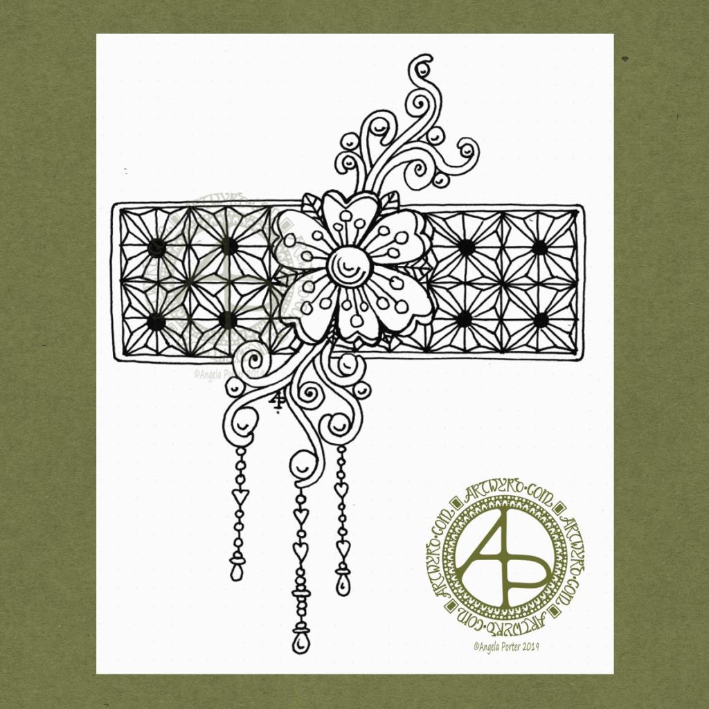
I woke this morning, refreshed after a long, deep sleep, and wanted to draw something relatively simple, something I could work on in the future.
I used a Uniball Vision Elite pen on a sheet of dot grid paper from Claire Fontaine. If you zoom in, you can still see the dots of the dot grid.
I had no idea of what I was going to draw. All I knew was I wanted to draw, and I wanted to start with a flower. Which I did.
I then started to grow the design by adding the swirls. Those swirls had shapes in them perfect to add some round seeds.
Next, I thought a rectangular background panel, filled with a geometric design, would be a good counterpoint to the more organic flower and swirls. So, I did draw in a pencil grid to use as a guide for my inked lines.
After adding a narrow border to the panel, I decided to add some simple dangles to the lower swirls. I thought the design needed to be lengthened a little.
When I’d finished the dangles, I knew the design was complete. I felt no need to add anything more to it, despite having a lot of white space! So, I scanned it in and prepared it for posting to social media.
I’d like to work this one with some colour to the flower and swirls, maybe the dangles too. The geometric pattern I’d like to add shading to bring out a more dimensional appearance to it. I may add that shading as shades of grey, or maybe as lines.
If you’d like more ideas about drawing dangles, then my book “A Dangle A Day” is a good place to start.
That’s where I have to leave it for now as I have a busy day away from home today.
A new month means a new colouring template exclusively for members of the Angela Porter’s Coloring Book Fans facebook group. If you’d like to download, print and colour a template, then pop over to the group, join (it’s free!).
A few, simple terms and conditions apply. All I ask is that you follow them and mention myself and the facebook group when you share the coloured template on social media. Tag me in your posts and I’ll definitely get to see them!
Autumn is well established here in the UK, so I wanted to combine leaves, berries and some acorns in a mandala.
I used an autumnal colour palette to bring the template to life. I think mine looks like a rich, decorative rug. However, I love to see how creative you people are with your colour schemes, particularly those of you who are heading into Spring or who don’t really experience Autumn in your part of the world.
I did draw and colour this mandala digitally, using Autodesk Sketchbook Pro along with my Microsoft Surface pen and the paper that is the screen of my Microsoft Surface Studio.
I need some quietly creative, self-care, self-comforting time today. What is more perfect for doing this than creating a mandala?
I turned to my digital tools to do this – Autodesk Sketchbook Pro, Microsoft Surface Pen and Microsoft Surface Studio. I also wanted to work with just colour – no black outlines and no sketches to start me off. I just wanted to let the design flow and unfold as it needed to. And it did.
This mandala isn’t finished, it is a work in progress. The outer ring may disappear as I work on it more; it seems to help to create a finished mandala at this point in time.
I knew the mandala needed to titled ‘Hope is rekindled’. That seems to be quite apt for me at the moment.
So, Angela, how are you feeling today?
I’ve had a heck of a busy couple of days. Monday I popped in to see Russell at the Time to Change Wales offices to pick up some resources for an upcoming stand. Then, I had therapy followed by an extremely late lunch and a slightly late tea before going to something in the evening. I eventually got home less than an hour before midnight feeling exhausted.
Tuesday was an early start to get myself to Llantrisant Leisure Centre by 9:30am to set up a Time to Change Wales stand at Rhondda Cynon Taff Council’s corporate induction day. That lasted until nearly 4pm, so it was a mad dash home to get something to eat and to warm up. I was cold and chilly. I was also feeling quite low – mental exhaustion does not help with my emotional resilience. I’d not had time to recover from therapy on Monday nor the rest of the busy day.
I was glad to look after the stand, but interacting with strangers, as lovely as that was, took it’s toll on me emotionally and energetically. Not only do I have CPTSD but I’m also an introvert so a double whammy! My protective mask of jolly, happy, extrovert Angela during the stand; keeping that mask in place is exhausting. Yesterday I got a glimpse of just how exhausting it is to keep the mask raised.
Yesterday, I also realised how I don’t raise that mask too often nowadays.
After something to eat and a hot drink, I had a meeting to go. The meeting had some parts that had me quite fraught. I was glad to come home, deal with bits and bobs of emails and then go to bed, snuggled up under the comforting weight of my weighted blanket.
I’m tired today. However, later this afternoon I’m on the go yet again. My sister has asked me to accompany her to an appointment. I then have something on this evening too, if I have the energy to go there!
Time to get another big mug of tea and start to get myself ready for this afternoons outings.
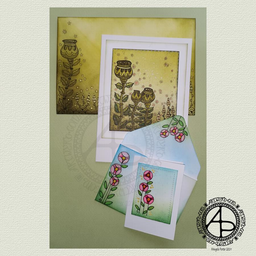
I’ve woken to a grey, wet, fresh day here in the Welsh Valleys. The coolness is actually quite delicious on my skin. The rain is freshening the air and world up, clearing the dust away. What a way for the weather to see out August!
It’s a perfect morning to do some artsy crafty stuff. For me, that meant finishing off a pair of cards with coordinating envelopes.
Making the larger entangled seed pods card.
The top panel measures 3″ x 3.75″, mounted on an A6 card (UK sizes).
I coloured The envelope, top panel and the border of the middle panel envelope and the edge of the middle panel with Crushed Olive, Forest Moss and Shabby Shutters Distress inks. I used a mini foam blending tool to achieve a gradient.
I sprayed water onto the top panel. Distress Inks react with water and results in some interesting textural patterns. I didn’t spray water onto the envelope; the paper is too thin to take such treatment.
My next task was to draw the entangled designs; I chose to go with some seed pods, leaves, a geometric pattern and some little flowers too. I added some ‘sparkle’ patterns around the main elements to give the illusion of little things floating in the air.
Next, I added some sparkle and shine with some gold and copper ink. I placed ink inside the sparkles, the seeds inside the larger seed pods and the flowers too.
I used a brush and Distress inks to add some depth of colour to the design on the card. I decided not to do this on the envelope, again because of the quality of the paper.
Once I have someone to send the card to, I will address the envelope and seal it with Distress Micro Glaze so that moisture won’t damage the envelope.
The colour choice on this card is unusual for me, but it’s worked out nicely, particularly with the gold and copper accents.
The tiny floral card.
This card is tiny, measuring just 2.25″ x 3.25″. It’s envelope is a little larger than needed, but the We R Memory Keepers Envelope Punch Board didn’t have measurements on it for a card this size, so I just used the closest available.
The panel on the card measures 1.75″ x 2.375″. It is one of the panels from the Foursquare background frames I messed up while making yesterdays cards.
I used one of my ideas from yesterdays musings on the cards I’d made. I drew a simple design on both the card panel and the envelope front and flap using Uniball Unipin pens and then coloured it with Copic markers. I added some gold glitter dots with a Uniball Signo gel pen.
Once all was dry, I used a Versamark Pen to colour over the flowers, leaves and gold sparkles. Versamark ink is colourless and sticky and is made by Tsukineko; it comes in ink pads but also in double-ended pens – a bullet point at one end and a brush tip at the other. The ink takes a little while to dry.
I covered the sticky areas with WOW super fine clear embossing powder and used a heat tool from Ranger to melt it, giving the design elements a glossy, protective and slightly raised finish. It also intensifies the colours somewhat, which I rather like.
So, I could now colour the background and envelope with Distress Inks without affecting the colours of the flowers, leaves and gold dots. I used a mini foam blending tool along with Pine Needles, Mowed Lawn, Tumbled Glass and Salty Ocean Distress Inks.
The final task was to glue the card panel to the card blank as well as the envelope flaps.
Again, once I’ve addressed the envelope, I’ll use Distress Micro Glaze to seal the inks and prevent any damage to the artwork while journeying to the recipient.
Reflecting on the cards.
I enjoyed making these cards. I particularly like the simplicity of the small card and the effect of the embossing powder. There’s something about teeny-tiny cards that really pleases me. I think it’s that their size makes them just so darned cute!
The larger card I am also pleased with, particularly in my use of colours that are unusual for me. I’m glad I added colour to the seedpods on the card; it helps them to stand out. I do love the copper and gold ink on this darker background too and how well they stand out.
Making envelopes that coordinate with the card is also something I enjoy doing; hopefully, the recipients see them as something a bit special dropping through their letterbox.
So, what’s on the cards for today?
It’s the last day of August, so I need to get a wiggle on to create a September colouring template for the Angela Porter’s Coloring Book Fans facebook group. I feel the need to include some autumn imagery in this one as we are in the dog days of summer for sure.
Tell me, Angela, how are you feeling today?
I’m tired but feeling quite content and optimistic again. I slept well last night; the weighted blanket really is working wonders for me as far as sleep is concerned. One problem is that I don’t want to get out from under it in the morning, so it must be comforting or soothing me.
I seem to have turned in a magnet for people who have escaped narcissistic abuse of all kinds. It’s nice to be able to help others by giving them space where I will believe their experiences, and I can help them, hopefully, to understand that they are not at fault but are victims.
Synchronicity pointing out to me how much I have learned and understood and healed and am now able to help others, perhaps?
Today I have two card designs for you, both featuring dangle designs, but in different ways.
If you like dangle designs and you’d like to give drawing them yourself but need a little help or inspiration, then you may find my book “A Dangle A Day”of interest. In the book, I take you, step by step, through how to draw over 100 dangle designs, along with some ideas of how you could use them.
Love Ya and With Love Card.
I started by using the Foursquare Backdrop: Portrait die from lawn fawn to cut the frames and panels from a piece of Winsor and Newton Bristol Board. I purchased this die, and the one in the second card, from Seven Hills Crafts here in the UK.
Next, I used Stormy Skies and Broken China Distress Inks to add a subtle colour gradient to the panels.
My idea was to draw four different dangle designs for each small square panel. I also wanted to include some hand-lettering, which I did.
So, I used Unipin pens from Uniball to do the drawings and lettering. I did use pencil outlines for the ribbon banners and lettering to make sure their placement was just right.
I coloured the design elements and charms using Copic markers. As the individual design elements were so small, I just used two colours to achieve shading in the bigger ones.
I also added a drop shadow around the designs using a BV marker that is a greyish-violet. It’s a very subtle drop shadow.
I had to add some sparkle and shine to the card, so I used a clear Spectrum Noir Sparkle brush pen along with a gold glitter Signo gel pen to do this.
To assemble the card, I glued the frame to the card base using Tombow Mono adhesive. Then, I glued the square panels into place.
I managed to get glue onto the front of the card and trying to rub it off while wet just left a dark, dirty smear. I’ve ordered some Tombow Sand erasers to see if they’ll remove the mark. If not, I’ll have to either work out another way to cover it up or just consign the card to the pile of things not to do again!
Black and white floral card.
Again, my first job was to cut out the frame and panels using a die. For this card, I used the Foursquare Backdrop: Landscape die from lawn fawn along with Winsor and Newton Bristol Board. I also decided to use this die in portrait mode.
To draw the design elements, I used Unipin pens from Uniball. I hung dangle designs from the top of each card to fill in some of the space that was there. I wish I’d used a slightly thicker pen than the 01 though. They look almost like an afterthought.
Anyway, once I finished the drawings, I wasn’t sure whether to add colour or not. So, I’ve left the pictures as black and white line art for now.
I used Tombow Mono glue to attach the frame and panels to a 5″x7″ piece of Winsor and Newton Bristol board. I did this as I realised that the dies are made to fit card blanks made from half a sheet of US letter-sized paper folded in half. In the UK, we use A4 sized paper, which is different enough in size to make it awkward to cut the paper to fit the card. I have ordered some 5″ x 7″ card blanks with envelopes, and then I can finish assembling this card. I’m likely to trim the foundation panel down a little and maybe try to carefully add some colour around the edge. Maybe.
It’s at this point I’ll decide whether or not to add colour and to see if I can thicken the lines around the dangles without messing it up. Mind you, if I do mess it up, it’s another experiment I can learn from, hopefully remembering not to do this again.
Things I’ve learned and techniques I want to try.
The lawn fawn dies work great! They come with smaller dies – heart, cloud, small star, large star, sun, small sun and speech bubble – which may be useful in the future. I had made my mind up that I’d limit myself to die sets that are simple in shape to for cutting out panels to draw on and maybe for layering.
I rolled my eyes at myself when I worked out that dies from an American company would work best with American sized paper for card bases. However, I can work around that now I’ve realised that. I’m comfortable working with inches; most of my craft tools have both inches and centimetres on them. However, the inches are visibly the most dominant measurement system.
Glue. Me and glue. Not sure how I can avoid smearing in the future. Hopefully, the sand eraser will help to remove my gluey, sticky, dirty-looking mistakes.
I like using Distress Inks for backgrounds. However, the pale colours of markers that I prefer to use are translucent and so combine with the background. I could use other media such as coloured pencils for colouring. Or I could use distress inks or water-based marker pens with a damp brush to add colour. I could also use a damp brush to remove some of the distress inks. In that case, I may have to use watercolour paper instead of Bristol Board.
I could also use a Versamark pen – which contains transparent, sticky ink – to colour over my design elements once coloured and then use clear embossing powder and a heat gun to protect the colours. I could then add the distress inks after heat-setting the embossing powder. The embossing powder would add some dimension and shine to the cards. If I used a sparkle pen or gold gel pen, for example, the embossing would encase it and highlight these embellishments Ieven more, I think. I need to try this idea out!
So, there are lots of possibilities for going forward with this.
So, Angela, how are you feeling today?
I’m feeling the more content and optimistic than I have for the past two or three weeks.
I’m still feeling out of kilter; changes are happening in my perceptions around my emotional/mental wellbeing. I’m also aware of shifts that are happening in other parts of me.
I’m still poop-scared about what is going on in the world. I can’t see that ending anytime soon, however. This, and the rest of the emotional rollercoaster I seem to be on, are still upsetting my digestive system, so I’m not feeling too well much of the time.
Yesterday, I was so unsettled and scared that I couldn’t settle to do much art, and I became so dissatisfied and frustrated with whatever I did. I couldn’t settle to anything else either – not crochet, reading, nothing.
As I’ve said, today I do feel better, so I need to turn my attention to trying out Affinity Publisher to create some materials I’ve been commissioned to do (the artwork and inserts for a CD by a band!). I’ll see about setting the templates up first and go from there. I’ve not tried to do this the past couple of days as I know my head and my emotions weren’t in the right place. I’m not sure that they are today; it’s only by doing that I will find out whether they are or not.
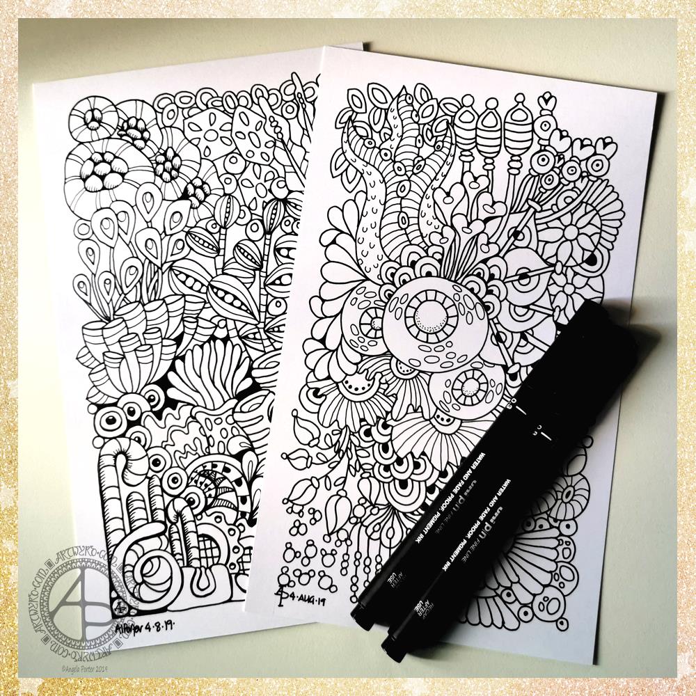
Yesterday, I had an interesting day. I did manage to get these two illustrations done in between listening to a friend in need and taking care of a very upset tummy along with quite painful cramps.
I used 5″ x 7″ pieces of Winsor and Newton Bristol board along with some Uniball Unipin pens to draw the designs. This time, I didn’t add any grey shading. I will scan then print if I decide to colour them with traditional media.
The drawings turned out well, I think. I chose the size of paper for a reason, which I’m not about to divulge! It’s just an idea rattling around my noggin.
It’s Monday, so that means it’s EMDR therapy day.
I know on a Monday that my day can be broken up with a 3 hour or so trip to Neath and back for EMDR.
Today, I’m feeling more like I did last Monday before I received some post that threw me a curveball. I am tired as rather painful tummy cramps woke me from time to time through the night. I’m still getting them now, but a couple of Anadin Extra has taken the edge off them. I must leave early enough to pick up some more painkillers on my way to therapy.
I’ve had some flashbacks this week to events I thought I’d put to bed via EMDR. It seems that these events have several facets to them. Each of these facets relates to a negative belief I hold about myself, so each will need to be processed separately.
I’ve been trying to keep a record of the insights I gain from these flashbacks, and also any other negative beliefs that crop up from them. However, they often happen when I don’t have my BuJo to hand, and by the time I do, they’ve evaporated from my mind.
Hmm. Not really evaporated, the flashbacks have just been automatically shut away in their box once again.
I’ve learned not to try to second-guess what is going to happen in therapy each week. Whatever I have thought may happen rarely if ever happens. So I try to go with an open mind unless something has cropped up in the week that needs discussing.
I’ve had some fun this morning! I wanted to create a cute and whimsical dangle design for today. A cute fish came to mind, so I went with that. See, you can create a dangle using any kind of design elements!
I also thought that it would be fun as well as a bit of a challenge to use the digital art techniques I’ve been using lately.
If you just focus on the outline shapes, it’s not a complex design. There are many ways to fill a fish shape with pattern and colour and you can make it as simple or intricate as you like.
My love of bright, almost psychedelic colours, has also crept out for the fish and I love the happy smile on the fish’s face.
The shell is a bit out of place, perhaps. A bit too realistic in colour and so on. But that’s OK. It’s shown me that I can digitally paint more realistic, if quite stylised, designs. That’s going to be an interesting path to explore.
The seaweed forming the ‘string’ for the dangle is very stylised and I just thought some pearls would be in keeping with the ocean theme.
This isn’t a design in my book “A Dangle A Day“. However there are many, many other designs that I give step by step instructions for within its pages.
I used Autodesk Sketchbook Pro, a Microsoft Surface Pen and a Microsoft Surface Studio.
So, Angela. How are you today?
I’m fine today. Content. It’s warm here in the Valleys of South Wales so I think it’ll be a quiet day for me. I don’t do well in the heat; I wilt.
Nothing else about CPTSD, mental health, emotional health or EMDR today. Not after that humongous blog post I did yesterday.
I do need to sort out my anti-stigma presentation for Time to Change Wales as I’m giving a talk next week and it’s time to change things around and change the focus of my talk from my life story to ■ what CPTSD is ■ more about how CPTSD affects me ■ the stigma and discrimination I’ve faced ■ how people have supported, helped me ■ what support I would have liked to have from people
I’ve already created a CPTSD ‘graphic’ to use in the presentation. I do need to gather information together.
Ha! I’m glad I’ve written this as I now I have a clear outline to follow to create my presentation. I was fretting and worrying about that.
Before I do anything else, I need some tea I think.