Sketchbook / Art Journal

©Angela Porter | Artwyrd.com

I woke at around 4:30am again today and couldn’t get back to sleep. So, I got up, made tea, and did some work on my art journal / sketchbook.

Making Distressed Paper

I spent a good two or three hours making the papers you can see to the left. I used the following:

  • printer and layout paper, cut to A6 in size (UK size)
  • Distress Oxide Inks
  • 5″ x 7 ” Gelli plate
  • small Brayer roller
  • water in a spray bottle
  • heat tool
  • craft mat
  • pieces of cut and dry foam
  • metallic inks and paints

For some of the pieces, I brayered the Distress Oxides onto a Gelli plate and then pulled the print onto a piece of paper. For others, I used the Brayer to apply the ink to the paper. I also used the black side of a piece of cut and dry foam to apply ink to some of the papers.

I sprayed the papers with water to activiate the Distress Oxide, and used the heat tool to dry them. After doing this, I crumpled up a lot of the papers and then used the brayer to flatten them out. Both of these techniques resulted in textured paper. So, I used the cut and dry foam and some Distress Oxide ink to lightly brush the paper to help to accentuate that texture.

Finally I used cut and dry foam to brush metallic paint or ink over the paper to add some shimmer and shine. I used some textured cut and dry foam to add patterns too.

I now have quite a stash of very distressed papers to use in my art journal in the future.

Both the printer paper and the layout paper are much thinner than I would usually use for such a task. The light spritz of water on each, however, created a lovely, bumpy texture. They were also easy to crumple up, adding that kind of leathery texture.

The subtle shine that the gold metallic ink gave is rather lovely, though I do like the bright, shiny gold of some paint I found in my stash.

I can see me using these papers for collage, for making pockets/envelopes and other bits and bobs for a journal, and no doubt for other things I’ve not yet thought of.

Storing my custom papers.

I realised the papers I’ve made over the past couple of weeks have been piling up and I really needed to do something that would let me find them easily. So, the quickest and easiest solution was to use A4 poly-pockets and a ring binder, both of which I had to hand! That certainly has let me have a tidier desk, and I’ll be able to find the papers easily too.

Art journal pages.

I also finished up the two pages shown to the right. I attached inchies, to fill in some gaps.

I used simple paper hinges to attach the ATC cards on page seen in the bottom image. If I ever wish to remove them to swap/share/gift, then I can remove them easily. That simple solution has relieved my anxiety about adhering them permanently into the sketchbook!

I’ve also folded some squared paper, used distress inks to colour the edges and folds, and put them in the vellum pockets I’d made earlier, all ready for me to journal on. Unusually for me, I made use of some washi tape to embellish the pockets.

I’ve also noticed that I’m very ‘regimented’ about how I put things in my art journal. I much prefer carefully cut paper to torn edges most of the time. Everything needs to be arranged ‘just so’ with me. Just as it is with my line-art – precise and neat. I suppose it’s another example of me expressing my personality through my art.

So, Angela, how are you today?

I’m exhausted. I’m practically falling asleep as I type this; that’s what happens when I wake up at stupid o’clock once again. I’m now officially overtired! I may try to get back to sleep soon; I do have work I need to do today!

As far as me being under the weather goes…

Well, I still have a sensitive digestive system and I feel nauseous from time to time. I did wake with a bit of a headache today, but that could just be lack of sleep, as is the tiredness I feel. I have eaten and my tummy doesn’t seem to be objecting as it has done. This all makes me hopeful that I’m almost over this bout illness. I was really quite grumpy about it yesterday, and I’m entirely sure I’m not grumpy today!

Other than that, emotionally I’m doing just fine. The sunshine helps with my mood for sure, as did being able to hear the bird song as the world was slowly waking up this morning.

Zentangle ‘toppers’ for cards

©Angela Porter | Artwyrd.com

I’ve been awake way too long already today. I just couldn’t settle to get back to sleep when I woke around 4am. I gave up trying just before 6am and thought I’d do some drawing to see if it would settle me.

The soothing style of choice at the moment is zentangle, so I made use of some of the coloured ’tiles’ I made yesterday, and these are the result. I’ve yet to decide whether I will actually turn them into cards, or whether I’ll just keep them as references for the future.

I thought plain black line looked a bit ‘flat’. That may be a consequence of me working digitally so much and the way I achieve dimensionality in my art.

So, in the top design, I used brush, water and some colour from Zig Clean Colour Real Brush Pens by Kuretake. I enjoyed adding shading with colour, though it was hard work with the fine brush I’d chosen, especially when I turned my attention to the one on the bottom left. So, I used a Tombow Blender pen with the colour for the third card on the bottom right. I’m much happier with the smoothness of the gradients here, compared to the other two.

What I’m not happy with is the way the pigment from the black lines seems to move, particularly when I used the brush. I’m not sure whether this is a result of me drawing on top of the distress ink coloured paper, or whether it’s to do with the friction of brush on the lines. I did get a little bit of movement of the pigment with the Tombow blender pen, but not so much it seems.

As I’m digging into my stash of media from past times, I remembered I had some Nuvo Drops from Tonic. So, instead of using a metallic gel pen to add some embellishments, I added some of these drops.

I’m not entirely sure they work. I think I’ll have to look at these cards again after I’ve had a good sleep and a break from them

I am glad I tried adding more saturated colour to the designs to give that illusion of dimension, even though I had to rediscover the joys of using a blender pen. I do find pens so much easier to work with than brushes, that’s for sure. That may be a knock on effect of me using pen ‘brushes’ so much in digital art.

I’m exhausted now, but I won’t go back to bed until my grocery deliveries have arrived.

Dangle Design Greeting Cards

Dangle Design Greeting Cards © Angela Porter | Artwyrd.com

Today I have two card designs for you, both featuring dangle designs, but in different ways.

If you like dangle designs and you’d like to give drawing them yourself but need a little help or inspiration, then you may find my book “A Dangle A Day” of interest. In the book, I take you, step by step, through how to draw over 100 dangle designs, along with some ideas of how you could use them. 

Love Ya and With Love Card.

I started by using the Foursquare Backdrop: Portrait die from lawn fawn to cut the frames and panels from a piece of Winsor and Newton Bristol Board. I purchased this die, and the one in the second card, from Seven Hills Crafts here in the UK.

Next, I used Stormy Skies and Broken China Distress Inks to add a subtle colour gradient to the panels.

My idea was to draw four different dangle designs for each small square panel. I also wanted to include some hand-lettering, which I did.

So, I used Unipin pens from Uniball to do the drawings and lettering. I did use pencil outlines for the ribbon banners and lettering to make sure their placement was just right.

I coloured the design elements and charms using Copic markers. As the individual design elements were so small, I just used two colours to achieve shading in the bigger ones.

I also added a drop shadow around the designs using a BV marker that is a greyish-violet. It’s a very subtle drop shadow.

I had to add some sparkle and shine to the card, so I used a clear Spectrum Noir Sparkle brush pen along with a gold glitter Signo gel pen to do this.

To assemble the card, I glued the frame to the card base using Tombow Mono adhesive. Then, I glued the square panels into place.

I managed to get glue onto the front of the card and trying to rub it off while wet just left a dark, dirty smear. I’ve ordered some Tombow Sand erasers to see if they’ll remove the mark. If not, I’ll have to either work out another way to cover it up or just consign the card to the pile of things not to do again!

Black and white floral card.

Again, my first job was to cut out the frame and panels using a die. For this card, I used the Foursquare Backdrop: Landscape die from lawn fawn along with Winsor and Newton Bristol Board. I also decided to use this die in portrait mode.

To draw the design elements, I used Unipin pens from Uniball. I hung dangle designs from the top of each card to fill in some of the space that was there. I wish I’d used a slightly thicker pen than the 01 though. They look almost like an afterthought.

Anyway, once I finished the drawings, I wasn’t sure whether to add colour or not. So, I’ve left the pictures as black and white line art for now.

I used Tombow Mono glue to attach the frame and panels to a 5″x7″ piece of Winsor and Newton Bristol board. I did this as I realised that the dies are made to fit card blanks made from half a sheet of US letter-sized paper folded in half. In the UK, we use A4 sized paper, which is different enough in size to make it awkward to cut the paper to fit the card. I have ordered some 5″ x 7″ card blanks with envelopes, and then I can finish assembling this card. I’m likely to trim the foundation panel down a little and maybe try to carefully add some colour around the edge. Maybe.

It’s at this point I’ll decide whether or not to add colour and to see if I can thicken the lines around the dangles without messing it up. Mind you, if I do mess it up, it’s another experiment I can learn from, hopefully remembering not to do this again.

Things I’ve learned and techniques I want to try.

The lawn fawn dies work great! They come with smaller dies – heart, cloud, small star, large star, sun, small sun and speech bubble – which may be useful in the future. I had made my mind up that I’d limit myself to die sets that are simple in shape to for cutting out panels to draw on and maybe for layering. 

I rolled my eyes at myself when I worked out that dies from an American company would work best with American sized paper for card bases. However, I can work around that now I’ve realised that. I’m comfortable working with inches; most of my craft tools have both inches and centimetres on them. However, the inches are visibly the most dominant measurement system. 

Glue. Me and glue. Not sure how I can avoid smearing in the future. Hopefully, the sand eraser will help to remove my gluey, sticky, dirty-looking mistakes.

I like using Distress Inks for backgrounds. However, the pale colours of markers that I prefer to use are translucent and so combine with the background. I could use other media such as coloured pencils for colouring. Or I could use distress inks or water-based marker pens with a damp brush to add colour. I could also use a damp brush to remove some of the distress inks. In that case, I may have to use watercolour paper instead of Bristol Board.

I could also use a Versamark pen – which contains transparent, sticky ink – to colour over my design elements once coloured and then use clear embossing powder and a heat gun to protect the colours. I could then add the distress inks after heat-setting the embossing powder. The embossing powder would add some dimension and shine to the cards. If I used a sparkle pen or gold gel pen, for example, the embossing would encase it and highlight these embellishments Ieven more, I think. I need to try this idea out!

So, there are lots of possibilities for going forward with this.

So, Angela, how are you feeling today?

I’m feeling the more content and optimistic than I have for the past two or three weeks.

I’m still feeling out of kilter; changes are happening in my perceptions around my emotional/mental wellbeing. I’m also aware of shifts that are happening in other parts of me.

I’m still poop-scared about what is going on in the world. I can’t see that ending anytime soon, however. This, and the rest of the emotional rollercoaster I seem to be on, are still upsetting my digestive system, so I’m not feeling too well much of the time. 

Yesterday, I was so unsettled and scared that I couldn’t settle to do much art, and I became so dissatisfied and frustrated with whatever I did. I couldn’t settle to anything else either – not crochet, reading, nothing. 

As I’ve said, today I do feel better, so I need to turn my attention to trying out Affinity Publisher to create some materials I’ve been commissioned to do (the artwork and inserts for a CD by a band!). I’ll see about setting the templates up first and go from there. I’ve not tried to do this the past couple of days as I know my head and my emotions weren’t in the right place. I’m not sure that they are today; it’s only by doing that I will find out whether they are or not.

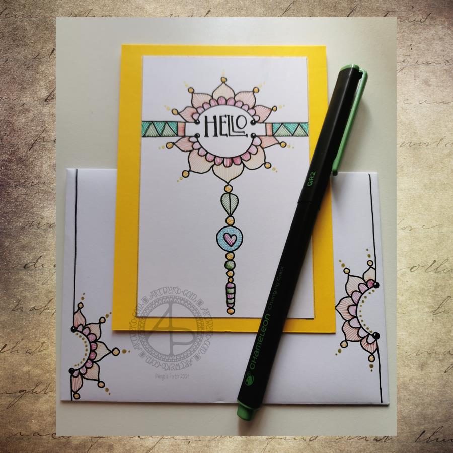
Hello – A dangle design card with coordinating envelope.

Hell - A Dangle Design card with coordinating envelope © Angela Porter | Artwyrd.com
Hell – A Dangle Design card with coordinating envelope © Angela Porter | Artwyrd.com

Yesterday I decided to make a second card with a coordinating envelope. I wanted to try out using the Chameleon fine-liners to add colour in the form of lines and cross-hatching. Finally, I added some gold dots to the points of the petals on the flower design.

To draw the design and execute the hand-lettering, I used a Uniball Unipin pen. I then used various pairs of Chameleon fineliners to add the colour.

I prefer this way of adding colour with the Chameleon fine-liners, though I’m not entirely happy about it either. Looking at it now, in the clear light of dawn, I think I could have added a flat colour below the coloured lines. I may go and add that colour in a little while. After all, it’s just a card, an experiment, and if I mess it up, I can always make another one! A lesson learned, an experience gained is worth the few pennies worth of materials and the time it took just as long as I remember the lesson in the future.

I’m also not happy with my hand-lettering; I like the idea of the letter layout, but it’s not centred between the arcs.

I do like the ‘banner’ I’ve used to enclose the hand-lettering. However, there’s something about the rectangular ribbons and the patterns within that I don’t particularly like. I’ll work out what it is in time.

For now, I’ll try adding flat colour to the coloured sections to see how that works out and not worry about messing up the card. I’ll use it as a learning experience.

And that reminds me, I’ve still not set up my One Note journal for my private critiques and what kinds of methods and techniques I use in my art.

Materials

A piece of yellow card cut to 4″ x 11″, scored and folded in half to make a top-fold card measuring 4″ x 5½”.

A piece of white card approx. 4″ x 5″ for the top layer.

A We R Memory Keepers Envelope Punch board and an piece of paper measuring 7⅞” x 7⅞” or a blank envelope that will fit a 4″ x 5½” card.

A pencil and ruler for the guide-lines and a good eraser to remove them.

A black fineliner pen for drawing and hand-lettering; I used a Uniball Unipin pen.

Pens to colour the design; I used Chameleon fineliner pens.

A gold gel pen for the dot embellishments; I used a Uniball Signo gold gel pen.

If you’d like to learn more about dangle designs or are looking for some more inspiration for them and how they can be used in cards, BuJos, scrapbooks, bookmarks, journals, and more then my book ‘A Dangle A Day’ is a good place to start. It takes you through how to draw monograms and dangle designs for all kinds of occasions around the year in simple steps.