World Art Day 2020

Poppy Mandala ©Angela Porter | Artwyrd.com

The aim of art is to represent not the outward appearance of things, but their inward significance.

-Aristotle

Today is World Art Day.  It is meant to be an international celebration of the fine arts which was declared by the International Association of Art (IAA) in order to promote awareness of creative activity worldwide.

Each year, on 15 April (Leonardo da Vinci’s birthday), World Art Day celebrations help reinforce the links between artistic creations and society, encourage greater awareness of the diversity of artistic expressions and highlight the contribution of artists to sustainable development. (UNESCO)

“Our Organization would thus like to pay tribute to the solidarity shown by artists and institutions at a time when art is suffering the full force of the effects of a global health, economic and social crisis.”

— Audrey Azoulay, Director General of UNESCO

About today’s art

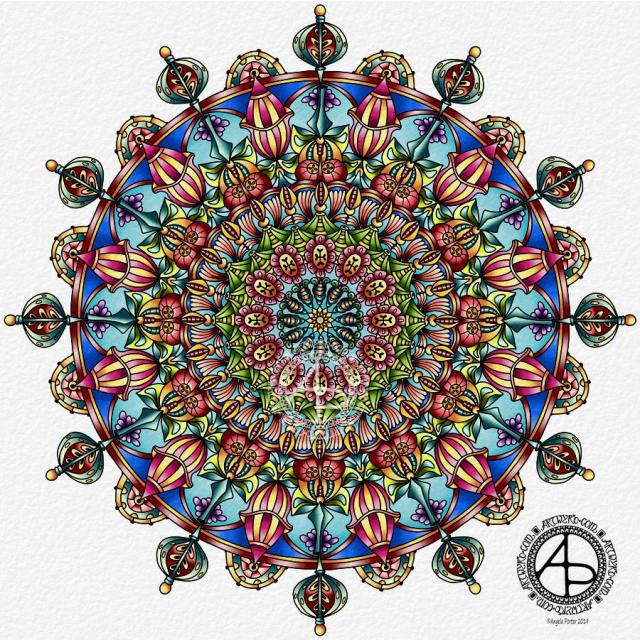
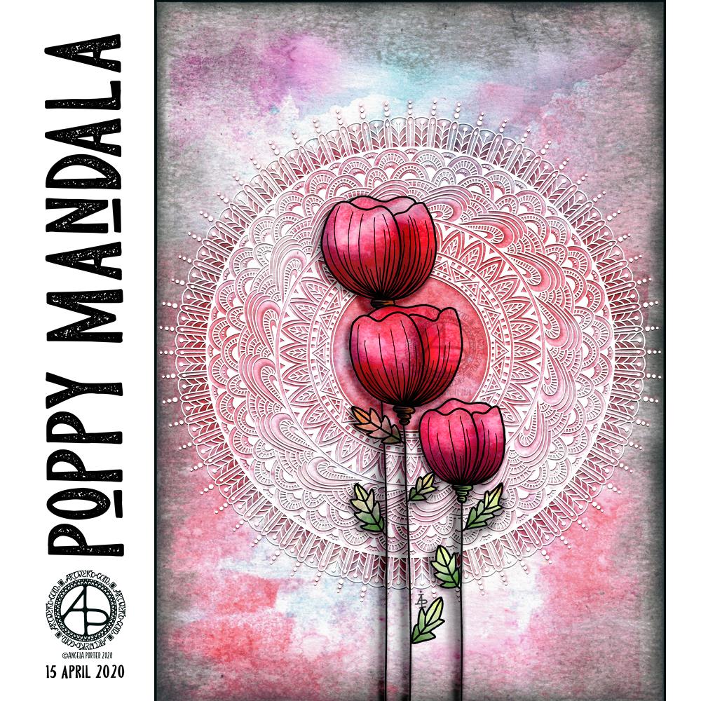
I started by choosing one of my Distress Oxide backgrounds to use for today’s art.

I woke knowing I wanted to do an arrangement of stylised poppies with a mandala for a background, and this is the result.

Poppies symbolise, among other things, a lively imagination, messages delivered in dreams, beauty and success, as well as remembrance. They, along with their seed heads, often appear in my art.

It took me many iterations of colour, shadow and highlight to get the mandala appearing as I wanted it to – lacy, light, in the background but still standing out. I think I’ve managed to achieve that fairly well.

Overall, I’m pleased with the finished artwork. I do think the poppies and mandala could be moved towards the top of the background, something that is easy enough to do as I have the layers saved. However, the artwork is good enough for now.

I suspect I’ll be creating more art using a couple of the backgrounds I’ve created through the day. It’s a satisfying process to use backgrounds I’ve created myself rather than using ones that I have purchased.

Tuesday Thoughts

Tuesday Thoughts 5 November 2019 ©Angela Porter | Artwyrd.com

Another mandala today, this time with my favourite Hafiz quote in the centre.

I wanted a mandala that seemed to be almost glowing for this quote. Also, I added a very subtle rainbow colouring to it too. I’m quite happy with this mandala, though some darker shading behind some of the parts, along with some subtle highlights, would’ve helped with the dimensionality of the design.

I didn’t hand-letter the quote; instead I used a clear and simple pair of fonts. I do want to learn how to create circles of typography; I think the quotes would then be more sympathetic to the circular geometry of mandalas. I’ll need a bit of time to play around in Affinity Publisher and Affinity Designer to see if I can achieve this. Mind you, I do need to practice my hand lettering a lot more too.

All the same, I’m still happy with this design. The lettering will do – for now.

I always enjoy drawing mandalas, and it’s nice to revisit the line-art style of mandalas with lots of intricate patterns in them once again. They are so delicate, airy, lacy in feel compared to my more arty, abstract, coloured mandalas. They’re also a lot quicker to create!

Some More Reef Illustrations

More Reef Illustrations ©Angela Porter - Artwyrd.com
More Reef Illustrations ©Angela Porter – Artwyrd.com

Reef Illustrations

Yesterday, I had an interesting day. I did manage to get these two illustrations done in between listening to a friend in need and taking care of a very upset tummy along with quite painful cramps.

I used 5″ x 7″ pieces of Winsor and Newton Bristol board along with some Uniball Unipin pens to draw the designs. This time, I didn’t add any grey shading. I will scan then print if I decide to colour them with traditional media.

The drawings turned out well, I think. I chose the size of paper for a reason, which I’m not about to divulge! It’s just an idea rattling around my noggin.

It’s Monday, so that means it’s EMDR therapy day.

I know on a Monday that my day can be broken up with a 3 hour or so trip to Neath and back for EMDR.

Today, I’m feeling more like I did last Monday before I received some post that threw me a curveball. I am tired as rather painful tummy cramps woke me from time to time through the night. I’m still getting them now, but a couple of Anadin Extra has taken the edge off them. I must leave early enough to pick up some more painkillers on my way to therapy.

I’ve had some flashbacks this week to events I thought I’d put to bed via EMDR. It seems that these events have several facets to them. Each of these facets relates to a negative belief I hold about myself, so each will need to be processed separately.

I’ve been trying to keep a record of the insights I gain from these flashbacks, and also any other negative beliefs that crop up from them. However, they often happen when I don’t have my BuJo to hand, and by the time I do, they’ve evaporated from my mind.

Hmm. Not really evaporated, the flashbacks have just been automatically shut away in their box once again.

I’ve learned not to try to second-guess what is going to happen in therapy each week. Whatever I have thought may happen rarely if ever happens. So I try to go with an open mind unless something has cropped up in the week that needs discussing.

A little reef tangle

A little reef tangle ©Angela Porter | Artwyrd.com

I’ve had a quietly arty morning today. I’ve been adding to my visual zibladone (journal, reference book).

Then, I had the urge to create a little tangled, entangled drawing. So I did.

I cut up some Winsor and Newton Bristol Board into 4″ squares (approx. 10cm squares) and used some Uniball Unipin pens to do the drawing and shading.

I’m quite happy with the result. I may add some colour, perhaps with my Chameleon pens and pencils; I may need the sharp point of a pencil to get into some of the small spaces to add some shadow.

I do need to get out for a walk today. I’ve been letting myself stay in the safety of my home. Mind you, and I think that’s what I’ve needed this week as part of my self-care.

However, I now am feeling a lot less anxious than at the start of the week. So, it’s time to venture forth for more than just a quick trip out for vittles.

Maybe. I do need to have breakfast first. Oh, I’ve just seen the time. I need lunch first!

Entangled Monograms

Entangled Monograms © Angela Porter 2019 - Artwyrd.com
Entangled Monograms © Angela Porter 2019 – Artwyrd.com

One of the things that is really nice about being between contracts is the opportunity to create art just for the fun of creating art and not having to stay within the limits of the contract. Not that drawing to fulfil contracts isn’t fun, it is. It’s just that I have to work within the remit of the contract.

Yesterday evening and this morning I’ve been having a contented time creating some entangled monograms. I’ve cut some Winsor and Newton Bristol Board down to approx 15cm x 15cm (approx 5.75″ x 5.75″).

I penciled in some guidelines for the edges of the artwork and for the position of the monogram.

First job was to hand letter the monogram. I did start with pencil guidelines for each letter, then used a hard Tombow Fudenosuke pen to ink them in.

Then, the real fun begins, which is the entangling of the space around the monogram. I used the Fudenosuke pen along with a Sakura Pigma Sensei 04 and Uniball Unipin 0.2 and 0.1 pens.

All done in plain black and white, with just the weight and concentration of lines adding depth and dimension to the finished design.

I do want to add colour to these at some point. I love pure black and white artwork, but colour can bring them to life as well. Digital colouring is my favourite way of adding colour these days, but I may print copies out on to marker friendly paper and then use Chameleon Duotones and Color Tops to add colour. I’ll see how I feel about that.

As is my wont, I had no preconceptions of how the entangling would unfold. I just let it flow. Some of my favourite motifs and patterns have been used. I did refer to my visual BuJo for ideas/inspiration from time to time too.

Visual BuJo

Yes, a visual BuJo (bullet journal). Or, rather, it’s a collection of motifs and patterns that are being organised using ideas from the Bullet Journal system of keeping a journal. It works for me. I have a way to help me find continuations of collections, or to start a new one, and not worry about a collection being on consecutive pages.

My visual BuJo is an A5 sized, dot grid notebook from Claire Fontaine. It’s a soft back one so isn’t quite as weighty as Leuchtturms and the like. It is also a little less bulky in size, which helps when I want to travel light on a day out.

Mind you, when fill this present visual BuJo I may use a Leuchtturm for my next one. We’ll see…

It is also something that encourages me to seek out new patterns and motifs to add to it, as if I didn’t have enough already! Doing this is a good way to just practice my drawing skills and observation skills, as well as analysing a motif or pattern, breaking it down into simple shapes and steps to draw a stylised version.

I do tend to favour more stylised motifs and patterns in my art, that’s for sure.

So, I now no longer feel the need to try new ideas out for keeping my reference material, constantly redrawing them again and again. The visual BuJo is working for me for sure.

When I’m having a tough time emotionally/mentally with my CPTSD and/or EMDR it can be soothing, comforting for me to use the familiar, and of course I can still do that. I just don’t need to spend a lot of time drawing and redrawing and redrawing again the same things in my search for a perfect record keeping system for patterns and motifs.

The BuJo inspired system may not be perfect, but it works for me.

One other positive that has come from me using a BuJo is that I’ve had to learn to let mistakes go and just leave them in the notebook. The mistakes are what I need to make in order to understand how to draw a pattern or motif. Sometimes, though, a new pattern or motif arises from the mistakes.

Something else I’m starting to do is to make notes alongside the patterns with where to start, the order in which to draw the parts of the pattern or motif, and ideas for varying it.

Mandala

Mandala © Angela Porter 2019 Artwyrd.com

I worked on this mandala over a couple of days. it has a whole range of new motifs in it and is rather organic in nature, with plenty of pods and seeds included. I’m quite happy with it. I think there’s a kind of flow of design and the colours are vibrant enough to please me.

I really wasn’t at all sure about my colour choices as I added colour to the mandala. The beauty of digital art is that it’s much easier to change the colour, which I did do in just a couple of sections. The colour changes means I’m a lot happier with it.

It has no name as I’m not very good at thinking up names for my artwork. Perhaps I should just find some kind of quirky way of lettering or numbering the designs in future.

Drawn and coloured using Autodesk Sketchbook Pro, Microsoft Surface Pen and Microsoft Surface Studio.

Mental Wellbeing

Today I’m feeling really tired and I don’t feel I have many words at the moment – despite what my blog may suggest.

My fingers, hands and wrists are also rather achy which is making typing or drawing (either digitally or traditionally) rather painful. I don’t know what’s caused that. Yesterday I did do a lot of drawing with pencil on paper – sketches for my new book – and a lot of digital art too. No more than I often do though.

I suspect a bit of self-care is needed. I am feeling a bit low. Tiredness doesn’t help, but I’ve slept really well the last couple of days.

Maybe it’s the grey, wet, windy day.

Maybe it’s just emotional weather with no real cause.

Maybe it’s the start of the buildup to EMDR on Monday.

I just know that like the weather my mood will change and brighten.

Entangled art

©Angela Porter 2019

I found this lovely quote a couple of days ago and knew I wanted to add entangled patterns around it.

About the art.

Rather than hand letter, I decided to print the quote by J.M. Storm out, along with the outlines to the boxes. I do very much like a well defined space to work within. I know I’ve done art where I’ve left an organic, uneven edge in the past, but I still like those clear boundaries.

To draw the patterns I used a Sheaffer fountain pen along with 06 and 04 Pigma Sensei pens from Sakura. The 06 led to me using some heavy lines to define the patterns and sections, something I’ve not often done for a very, very long time and I find it pleasing. Again, clear boundaries. I also like when art like this is coloured; it looks like stained glass and I love stained glass.

I may spend time colouring this today. I woke with a terrific headache this morning. Although it’s mostly passed, thanks to some Anadin Extras and copious quantities of tea, I still feel kind of spacey and tired and not able to focus much.

Why I like this quote.

She is a beautiful piece of broken pottery, put back together by her own hands. And a critical world judges her cracks while missing the beauty of how she made herself whole again.
J.M. Storm

I like it because it almost perfectly describes how I think about what is happening to me during therapy, about my journey to recovery.

The traumas of my life, right from a very young age, left me cracked and over time those cracks led to my mental health and emotional health breaking into pieces.

I’m the one who has to put the pieces back together, however I don’t have the skills and tools to do that. That’s where my therapist, my counsellor comes in. EMDR therapy helps to reprocess the traumas that led to me developing cPTSD and helps me to change the old, unhealthy, harmful thoughts and behaviours that I have into healthy thoughts and behaviours. My therapist helps me learn the tools I need to do this as well as to be more resilient as my life progresses, and so much more I’m sure.

I don’t know if it’s possible to make myself whole. My aim, though, is to be whole enough to have a life where I can do what I currently am unable to do – set healthy boundaries, be confident in myself, be less scared of the world around me, and so on.

I’ll always have cracks – evidence of the life I have led – but I want those cracks to be filled with gold or silver or copper so that they are things of beauty in themselves. They are evidence of where I’ve come from and what has led me to be the person I am.

I’m well aware that as I heal I won’t be quite the same person I was and many people won’t be happy about that. But those are the people who have wanted me to fit into their image of how they have thought I should be for their own ends, not least of which is my narcissistic mother.

No doubt my becoming the person I was meant to be, a mentally and emotionally healthy, resilient, self-aware, self-compassionate woman would be a source of great criticism for those who don’t like the changes in me as I heal the mental and emotional wounds.

Part of the process is learning from the past and freeing myself from the limitations placed upon me in the past by others with their own agenda, whether conscious or unconscious.

I’m sure there’s a lot more reasons why I like this quote, but the fluff-filled post-headache spaced out mind just can’t focus just now.

Entangled Monogram N

©Angela Porter 2019

Fountain pen and ink on marker paper. A4 in size.

Enjoyable few hours (around 6) drawing this one. I have toyed with the idea of mocking up gold foil for the N…not sure if it works though having tried it out.

I still think the edges of the N are either too wobbly or too straight … not sure if the patterns should just peek over the edge in places with clear lines in others …

Let’s go try another letter out! I will eventually crack this … I will …

Abstract Entangled Art 18 Nov 2018

Another abstract entangled drawing for today. The original art is black and white line art with grey shadows and shading. It’s been drawn on A4 acid-free paper. I used various sizes of OHTO Graphic liner pens for the line work and Chamaeleon Color Tones cool grey marker pens for the shading.

However, I’ve altered the colour from black and grey pen and ink to a gradient of blue, purple and magenta digitally, just as an experiment. I’m really surprised with how the grey shadows/shading has turned out – pleasantly surprised and really pleased.

A nice start to my Sunday, a day to be filled with art and completing the transfer of information into my new bullet journal.

Abstract Entangled Art 17 November 2018

I’ve worked on this image over the past three days or so. Adding the shading took a surprisingly large amount of time.

I really enjoyed creating this one. I say that about all my art though, but this one was particularly enjoyable as it helped me to calm and relax after the crazyily emotionally exhausting week I’d had.

It reminds me very much of work I used to do before I had so much work to do for colouring books, not that I’m complaining about that, not one bit. I love doing the drawings for them as much, but I can’t work in this kind of detail for them. I can’t put in all the fine line shading and shadow for them, nor the teeny-tiny details in the patterns as they’d be nigh on impossible to colour the gaps individually.

In my past couple of drawings like this, I haven’t added any shadow to them in the way I have in this particular design. The shadow really helps with that sense of ‘dimension’, though I do think I could have added some deeper shadows in some places.

Though it reminds me of the kind of drawings i used to do a lot pre-coloring books, it’s also shows a change in perhaps sophistication of line but also in the variety of patterns and design elements I like to include in my designs. I’ve even left some ares not heavily patterned so they give the eye spaces to rest without being overwhelmed with pattern and design.

Now to the nitty gritty of how I drew this.

After yesterdays discussion about digital vs traditional art I’d like to say I did this digitally, but I didn’t. I used Unipin Uniball and Sakura Pigma Micron pens on an A4 sheet of Bristol Board from Daler-Rowney. Pencil lines were sometimes used, especially for the circles, which I used stencils to draw them in lightly before inking them in free-hand. I’ve noticed I’ve not erased the pencil lines before scanning the artwork in.

To add the shading I used Chameleon Color Tones and Color Tops in shades of cool grey and neutral grey.

Today, I plan to do some more drawing similar to this before my new bullet journal arrives to replace the one I wrecked by spilling mocha over it and my lovely flowery bag. Thankfully, the notes I need to keep from the media training and events this week are still readable so I can transfer them across, as well as edit them in the process.