My latest page in my lettering sketchbook. I’m still working on finding how lettering can work for me. It seems that these kinds of letters are something I keep circling back to.
All drawn with various fineliners and some coloured with Arteza Everblend markers. Some highlight dots of white gel pen too.
Again, I woke before 5am today, even though I didn’t go to sleep until nearly midnight. This is getting ridiculous!
What else to do until I’m either ready to sleep again or give up on sleep and start my day proper? Oh, art of course!
So, I decided to divide a page up in my lettering sketchbook. Then, I coloured the vertical sections with distress inks. The colour themes from left to right are blue, pink and green, with bits of crossover.
Next step? Collage some papers to create areas for hand lettering to go. That squared paper needs to be toned back a bit – white gesso will be just the ticket!
Then, I did some hand lettering and added some patterns. I thought I’d use some fineliners – Inktonic Pens from Arteza to be exact. the collaged paper does like to soak the ink up when just the edge of the pen nib touches it.
Fineliners are not my favourite pens to colour in with. But, they usually have water-soluble ink in them. So, on the lower panel, I used a damp brush to move the ink around to even out the colour.
On the upper panel, I splattered some water on it and used a paper towel to lift the water up. That created a nice splatter pattern. Then I had a thought, “What would happen if I sprayed water on it, lightly and used a paper towel to pick the water up?” I lost the pretty water-bleached spatter patterns. But, some of that ink really bled into the edge of the collaged paper. That was unexpected and rather interesting.
So, some more interesting experiments with this idea I’m working with.
Oh, the letters of lacuna had colour added with a deep indigo Inktense pencil, brush and water.
Oh, I did use a pencil to write out the letters and position them, and I still made a pig’s ear of the ‘And still I rise”. Sheesh! Perhaps I’m being way too critical of my own lettering and what is there. I focus on all the imperfections I perceive, rather than taking a step back and trying to see what I’ve drawn and lettered through someone else’s eyes.
How I spent my afternoon – adding colour to this particular design. The colour isn’t even, but I’m fine with that as I do want to add subtle patterns in the coloured sections eventually, I think.
I’m now taking a break from this as I just don’t know what to do next. Do I add more colour? Or is it time to add more pattern or texture? Or, do the patterned areas need shadows and highlights added rather than colour. Dare I add any sparkle and shimmer in places?
I just don’t know at the moment. What I do know is I quite like this way of combining words and patterns – two things I love very much.
A second thing I know is that it’s time for a mug of tea, a biscuit, maybe, and some slow stitching. Oh, and watch episode 3 of Obi-Wan Kenobi!
Finishing my work quota for the day deserves a treat, and that involved some hand lettering practice and exploration. So, these two pages from my A4 lettering sketchbook have been worked on over the past couple of evenings.
I still haven’t found a way of lettering that resonates with me, though both of these pages resonate with me more than other lettering work I’ve done. I really want to combine lettering and my love of patterns and abstract design. Working out how to do that in a way that feels right and makes my heart smile, is proving to be a difficult task!
I think, however, that I may be circling in on some ways of achieving this. One style that may bear fruit I stumbled upon several days ago and I blogged about it then (Hand Lettering and Entangled Art). Thoughts and quotes and words in shapes with entangled, zentangle inspired, patterns connecting them and creating a background pattern. I’m still not sure about this particular mode of expression. But I’ll work with it and see where it leads me in time.
Another way of lettering I stumbled upon was in lettering an alphabet in the style of “Hand-lettered capital I”. That was the inspiration for the image on the left above.
Last weekend, I bumbled my way through “Choose to Shine”, and the abstract patterns in the background gave me an idea to try out. Which I did in the right-hand image above.
There’s a fair amount for me to think about with these experiments. I’ve finally found a way to make use of Gelly Roll Moonlight pens – both for drawing patterns in letters, but also as patterns that flow over or behind letters – as in Shine and Because in the right-hand image. I also used the Moonlight pens, along with some Zig Writers and some vintage coloured gel pens in the left-hand image and the “A Curious Pattern” and “Never give up” designs in the right-hand image.
It’s so unusual for me to draw in colour. I usually stick to black ink for drawing, but suddenly I may have found a way for colour to appear in my whimsical and entangled worlds.
At the moment, though, I’m still not at all sure about this. My head hurts (another migraine feels like it’s on the way) and I’m not able to think clearly or write all that coherently, or so it seems to me.
One last thought to share. For both of these pages, the only thing I may have looked back on was my own work. I didn’t look in books or at work online for inspiration, I only used my lettering sketchbook and my love of abstract patterns. Learning not to compare my work to others, trusting myself that what I produce is good enough because it is an expression of myself, is not an easy thing to do. But I’m working on it and here it may have paid off with examples of lettering by me that I kind of like.
I’m still on the mushroom kick it seems. Today’s sketches/drawings for Sketchtember feature some mushrooms. One is a typically, perhaps, entangled style of art. The other is much more of a pen and ink drawing, making use of stippling and cross-hatching to add shadow and a sense of volume.
I used a Uniball Eye micro pen to draw on a piece of Distress Ink coloured mixed media paper from Claire Fontaine for the entangled drawing on the left.
For the drawing on the right, I used a Tombow Fudenosuke pen on a piece of Ohuhu marker paper. This paper is surprisingly nice to draw on.
I’ve yet to decide if I’m going to add colour to these drawings. I have scanned them in so that I have a record of them as they are.
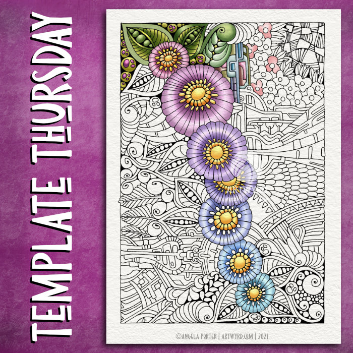
This week, the design is botanical, entangled and a tad on the abstract ‘mechanical’. As is my want, I’ve partly coloured the template to start to breathe life into it.
Drawn with Unipin pens on Claire Fontaine Paint On mixed media paper. Digitally coloured in Clip Studio Paint Pro.
I’ve also created a video. The drawing and colouring took me over 3 hours this morning, so I’ve sped the video up so it takes just a few seconds over 20 minutes.
Still not too well…
I’m feeling better today, but I’m still not right. My stomach/digestive system is still delicate and I have a headache on and off. I did get a bit more sleep last night, but not enough really.
Still, I’m on the mend and taking it easy again today.
Having said that, while this video was processing and then uploading and processing again in YouTube, I managed to edit two templates I drew on Tuesday and then ink in the one I wanted to use a symmetry tool to draw it. So, I’ve got some more templates done for the book I’m working on. The total is now 13 out of 31.
I don’t know if I’ll get any more done today. I’m flagging badly now and feel the need to sleep. I may have another mug of tea before I take a nap and see if that perks me up a tad.
Two drawings today, both done over the night as I couldn’t sleep as I really wasn’t at all well.
The larger one is a Zentangle ‘cartouche’. The central floral image is from one of Tim Holtz’s Ephemera packs. The paper is natural coloured mixed media paper by ClaireFontaine. I used a mixture of black, gold and rusty-red pens to draw the frame around the image. To add colour and shadow I used a mixture of pastel and graphite pencils, along with some tortillons. The design is approx. 12.5cm x 16cm (approx 3″ x 5″).
The smaller design is approx. 13cm x 8.5cm (3.3″ x 5.2″) in size. The paper is a piece of Medioevalis paper by Fabriano. This is lovely soft, gently textured paper that has a high cotton content. It’s easily damaged by the use of tortillons, however. So, I did add some shadows with a graphite pencil, but then added colour with Inktense pencils, brush and water. The paper really works well with wet media it seems. To draw the design I used a black fineliner, a brush pen and white and gold gelly roll pens.
I saw the ideas of cartouches, as a decorative frame around writing or image, and Zentangle designs on a youtube video and wanted to try it out. I decided to do that in the dark depths of the night when I wasn’t able to sleep. I may very well experiment with this idea as time goes on – particularly using drawings of my own as the focal point. I’ll see how it goes.
I’ve enjoyed doing these! The squares are 3.25″ x 3.25, 3.5″ x 3.5″ or 4″ x 4″ in size. The circles are almost 3.5″ in diameter.
The tiles were cut from a variety of papers – watercolour, bristol vellum and heavyweight smooth cartridge paper. I used Distress Inks to colour the paper tiles before drawing on them.
I’ve used Sakura Pigma Micron pens (05 and 01), along with some brown and one blue-green Stabilio fineliner pens.
I like them all, But my favourites are the ones that are much more geometric in nature – my initials and the A in particular. My least favourite is the E; the background to the letter just feels disjointed. I think that’s why I like the more symmetrical, geometrical designs more.
I’ve enjoyed using one or two tones of colour to add variety, interest and ‘dimension’ to the tiles. I’ve not added any shadow or highlight to these. That’s when things tend to go wrong for me as far as traditional media is concerned!
It also occurred to me that if I were to draw these on a different shaped paper, I could add dangle designs to them. (My book “A Dangle A Day” is still available). Maybe I’ll try that out in a while. Of course, I’d like to get a full set of monograms done too.
Another day, and the inner need to create a mandala. I’m not entirely sure about this one. Whether it’s the red colour I’ve chosen, or the dense texture of the widest ring, or something else.
It may not be the mandala itself, but how I’m feeling today and how the mandala is, perhaps, a reflection of that.
Perhaps I’m just trying to read too much into it.
Though I’m not too sure about the finished mandala, the process of creating it was pleasant, calming, satisfying in it’s own right. Maybe as the day goes on the mandala will reveal more about myself today.
Yesterday and today my focus has been on colouring some templates for my Entangled Gardens coloring book that is due out next year – March 1st 2021 here in the UK to be precise.
This is just a small part of the second of three templates I need to colour. I thought I’d go with a night sky for this one. The first one I’ve given a sunshiny sky to, the third I’m going to go with a sunset colour scheme for the background.
It takes me quite a few hours to colour each template, which is a nod to how intricate and detailed my artwork usually is.
This template, like many in the book, was drawn with pen on paper. However, I like to colour the templates digitally, so I’m using Autodesk Sketchbook Pro along with my Surface Studio and Surface Slim pen to add colour.
I’ve spent so long working at my computer that I’m feeling a bit stiff and uncomfortable. I’m able to tilt the screen of my Surface Studio so that’s at a comfortable position to work at with pen on screen. Still, I’m feeling somewhat stiff. So as soon as I’ve finished my social media stuff for the day, I’m going to take a walk to ease some of the stiffness before I return to the task.