Sneak peek at this week’s coloring template

Over the past few days, I’ve been creating YouTube tutorials on drawing my style of whimsical things – fish, flowers, circles filled with patterns, fungi, and leaves. So, I thought I’d use some of these for this week’s template. And for some reason, I wanted to add a fishy totem pole, or three maybe.

Whimsical things do make me smile. And with whimsical, imaginative kinds of line art, it gives permission to use any colours that seem fun. I add colour digitally, and the colours are often vibrant and cheerful when I add them to such cute drawings.

Of course, the drawing has to be completed, but you can watch me draw this section by clicking on this link. Maybe even draw along or create your own version!

As far as I am concerned, there’s never enough whimsy in life. This kind of art lets me escape into a cute world of my own making and, at the same time, take a break from the sad, bad, heartbreaking news that can flood in from all directions. Art is something I do have some control over and, for a while, I can imagine that I’m journeying in a world that has none of our earthly problems.

Adding colour to some whimsical flowers

Click on this link to watch the video where I add colour to some of the whimsical flowers in my sketchbook.

I took a short break from social media over the last couple of days. I had other things that needed to be done, not least a trip out for brunch in a local cafe with a friend. That’s the first time in over two years I’ve eaten out!

I was highly anxious and stressed, but had a lovely time. The cafe was quiet, thankfully. The food and drink were delicious. It’s our new favourite cafe to go to, one that’s close to us both as we, like most people, are mindful of the cost of fuel at the moment.

The comedown from anxiety and stress leaves me exhausted, and unable to focus my mind. So, some simple colouring of my whimsical flowers sketchbook page from my last blog was just the thing I needed. Nothing to tax my mind. Sketchbook work is a place to experiment, practice, and enjoy the creative process with no pressure for anything to be perfect!

To add colour I used a mixture of Pentel Brush Sign and Tombow Dual Brush pens, along with a water brush. Both of these pens are filled with water-soluble inks and so work a bit like watercolours. I feel I have much more success with these media than I do watercolours, especially as the colours are so bright and vibrant – saturated I think the arty term is.

Just a bit of colour brings the line art to life. It’s its own kind of magic.

Template Thursyay!

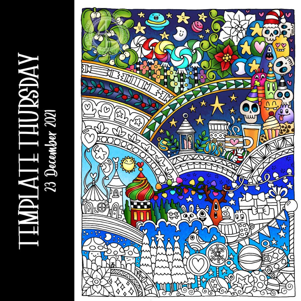
Here’s a partly coloured version of this week’s colouring page / coloring template for the members of the Angela Porter’s Coloring Books Fans facebook group.

It’s a Doodleworlds one, full of cuteness and whimsy, even the drunken party skulls! Definitely winter themed, though it would be interesting to colour it in tropical colours, just for fun!

Drawn with an 05 Sakura Pigma Micron pen on ClaireFontaine dot grid paper. Colour added digitally using Clip Studio Paint.

Color Palette Challenge for August 2021

Link to today’s vlog on YouTube. In it I draw some of the coloring template for tomorrow.

It’s the last Wednesday in the month, so it’s the end of this month’s color palette challenge.

I chose to add colour to the first coloring page of the month for Angela Porter’s Coloring Book Fans facebook group. The colours are bright, cheerful and tropical. I always enjoy a limited palette, though I also mix colours to add some variation in colours, particularly the greens.

I spent the morning drawing this week’s template for the facebook group. If you’d like a sneak peek of some of it, have a look at today’s vlog.

Template Thursday

It’s Thursday, so time for another template for the Angela Porter’s Coloring Book Fans facebook group.

This week’s template is a template I created for the Whimsical Cats book that didn’t make the cut. So, what a better way to make use of it than to release it for the members of the group to colour.

I did the inking in of the sketch in Autodesk Sketchbook. The colour was added using Clip Studio Paint.

I do have a timelapse video of how I added colour to part of this sample. Unfortunately, I forgot to record sound so it’s just video with music.

I like working on a darker, or coloured, background. The colours seem to much more alive than on white. Also, it saves me some eye strain!

It’s always fun to see how the template comes to life with colour. I’m often really unsure about my templates. Are they too simple, too naive, too intricate, not intricate enough. Adding colour helps me to see that they’re good enough, and also that they are created in my own artistic style. Cute, whimsical, imaginary. Places to play with colour and not worry too much about realism, if you wish. A skeleton that can be fleshed with colour however you wish.

I like that. It ties in with my exploration of abstract art. That’s on hold until later today, maybe tomorrow. I first need to focus on getting the last couple of templates inked in, though I am awaiting the review of the final one submitted. I have three to do, plus that last one. So, it shouldn’t take me all day to do!

It’s always exciting coming to the end of a book. Though not quite the end. I will still have three templates to colour in. I let the editorial team choose them; I never can! Also, they have a more objective view about what images will best represent the book.

Each of those images will take me a couple of days to add colour to, each! Not a quick process at all.

So, It’s time for me to finish my social media posts for today, get some breakfast while my computer installs and update, and then settle to work.

Entangled Frame | Part 2

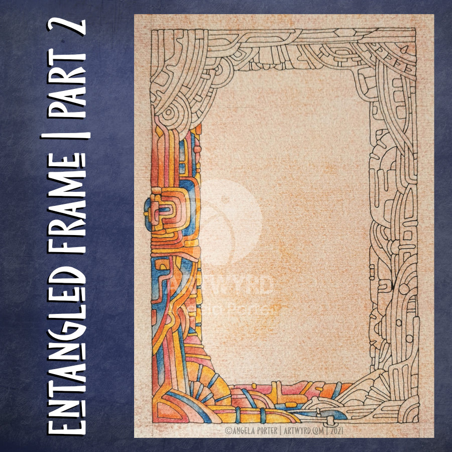
My morning warm up drawing was to do some more work on the entangled, abstract frame I started yesterday.

With fresh eyes, I could see I wanted to make the width of the design more consistent around the frame. So, my first job was to do a little bit more pen drawing.

Then, I could carry on with adding colour with Inktense pencils, the same colour palette as I used yesterday.

As is becoming my daily…habit? practice?…I also filmed the process and chattered away as I did so. And my chattering, rather, my thinking out loud actually helped me make some connections between my experiences of art from childhood through to the present day. And that helped me understand my perceived problems with using colour in drawings from real life.

I will need to spend some time with these memories and insights and journal later on. I can then work with them to help, hopefully, to overcome some blocks and difficulties in how I feel about my artistic expression. And then, hopefully I can become accepting of and comfortable with the way that I work.

I’ve been following a few courses on Domestika, and one of the common themes in the introduction by each artist is what has influenced them. Many go back to their childhood passions and how they have influenced their artistic voices.

That, I have discovered today, is so true!

Perhaps I’ll condense my words from today’s video at some point, once I’ve processed them myself. However, if you’d like to hear my thinking out loud while drawing/colouring today, then here’s the link to the video.

Entangled Frame – Part 4

This is the final installment of the frame/background I’ve been creating as my morning warm up art.

Today, I finish adding colour and also apply Distress Microglaze to bring out the colours.

Thanks to everyone who’s taken some time to watch my videos, leave a comment, like the videos and/or subscribe to my YouTube channel.

It’s nice to be able to share my art in process, but also to share insights into myself, my artistic processes. Indeed, giving voice to my thoughts makes me aware of them. As I work, I’m usually oblivious to the thoughts that happen as I create. Either they’re mostly in my subconscious, or so ephemeral and passing that I don’t notice them.

March’s Color Palette Challenge

At the start of March, we launched the first month-long colour palette challenge for the members of the Angela Porter’s Coloring Book Fans facebook group. I also posted a template that could be used for those who have access to a printer (or any template from any of my books if not).

Here is my coloured version of the template.

I like working with limited palettes. I don’t find limited choices confining or a challenge. Instead I find myself liberated from the choice of colours to use when completing an artwork. I end up with a more coherent/cohesive artwork than if I’m allowed to play in the sweetie-shop of the limitless colours of the digital realms. The limited palette makes me focus on the work in a different way, usually on shadow and highlight, as shades of these colours are always allowed!

In hindsight, these colours wouldn’t be a natural choice for me to use. I chose colours that reminded me of spring-time flowers and leaves and the lovely clear blue skies we ca get. Black and white are there, of course, for various shades, shadows and highlights.

So, tomorrow there’ll not only be a new template, but a new color palette challenge. I already have the template drawn and good to go, I just have to choose the colours to use.

March Color Palette Challenge…

At the start of March, along with the weekly template, I set a color palette challenge for members of the Angela Porter’s Coloring Book fans. I asked for all of you who took part to hold off sharing your wonderful colorations until the last Wednesday of the month, which happens to be tomorrow!

I’ve finished colour the template using the rather spring-like colour palette, and here is a fragment, a snippet of my completed template.

Template Thursday

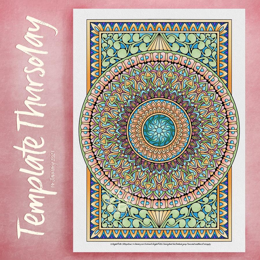
This week’s coloring template for members of the Angela Porter’s Coloring Books Fans facebook group is a typically “Angela” style mandala. It’s quite abstract, entangled, a bit zentangle-like.

What isn’t typical is, perhaps, the colour palette. I chose the colours rather intuitively, letting my emotions guide me. I started with cool, calming blues and greens in the centre. All the colours are quite soft and gentle, until I got to the outside border where I used brighter yellows and oranges and complementary blues and purples. The brighter colours appeared as my anxiety ebbed and the clouds parted to let some sunshine through.

I had a weird night’s sleep with both hot flashes and disturbing dreams. I often feel out of sorts for a long while after such dreams and they may be the source of my anxiety. I’m feeling calmer now though. Art has worked it’s magic, and the intermittent sunshine is helping.

I think it’s forecast to be cloudy with sunny breaks for the rest of the daylight hours, so I may very well get myself out for a walk in a short while.