It’s been a few weeks or so since I last posted on here, YouTube, and other social media. The reasons are simple yet complex.
Simple because I’ve been low in energy and oompf once again. I’m not entirely sure why, and that’s why it’s also complex.
Having some people-y times is one thing. A kind of low mood and sadness have been lingering, and along with it, the shadows of comfort eating have encroached on my being. My ability to focus is limited, too. I have a fairly firm inkling that there are a couple of other things rumbling under the surface of the blanket of antidepressant meds. Ultimately, I think it may be a combination of menopause and the lingering effects of the huge burnout last year. Recovery from such burnouts can take a lot longer than I think they will. When I push myself, such as people-y times, then all I do is cause a bit of a relapse.
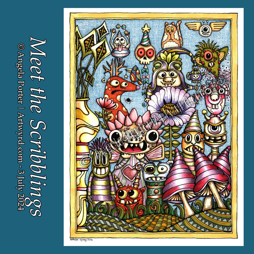
Still, throughout these weeks, I have been creating art. Creepy, Cute stuff was a staple of my arty being for a number of weeks, and I thoroughly enjoyed creating it. It makes me smile, and sometimes, it almost feels like there’s a tale to tell about the images.
Over the past week or two, however, I’ve been delving into the worlds of Danielle Donaldson. I have owned her two books for a while, though I haven’t done much with them. They’re based on watercolour, and that is still a medium that vexes me greatly.
I love her style of art very much. It really appeals to my sense of whimsy. So, as watercolour is something I struggle with, I thought I’d approach some of her exercises to develop some skills and understanding. I have to say that the ones that involve colour mixing and creating squares of colour have been a lot of fun! Some success has been had with the exercises, especially in mixing colours I never would’ve tried mixing. I am fascinated with watercolour’s ‘magic’ qualities, whether in paint form or watercolour pencils.
When I try to add watercolour to drawings, it all tends to go to pot …
As far as drawing goes, I got it into my head to try to draw some of Danielle’s ‘Littles’ – people, that is!
Yes, I know. I’ve always said I don’t do people! However, there is something quite delightful about her style of drawing ‘littles’. Also, it was a little change from the creepy-cute critters and characters!
I have had a lot of fun drawing ‘littles’ inspired by Danielle Donaldson. Indeed, the ‘little’ above is one I drew today, and it kind of represents me! Is it coloured with watercolour? NO! I gave in and used marker pens; that is the way forward for now.
Another thing I explored from Danielle’s tutorials in her books was using a fine mechanical pencil to draw the designs instead of ink.
Pencil instead of pen just doesn’t feel right to me. I don’t know why. I have, however, used a finer pen to draw the designs than I usually would. In the example above, I used a 01 Unipin fineliner; usually, I use an 05!
The hand-lettering in the drawing above *rolls eyes*has let me down. However, the words have meaning to me. Recognising and accepting the differences in me and understanding their source has been an adventure over the past twenty months or so. It’s an adventure that will continue for the rest of my days, I’m sure.
Naturally, I will persevere with the ‘littles’, which are delightfully wonky, as are the whimsical critters and creepy cuties I love to draw. Learning to embrace that wonkiness is a work in progress; the perfectionist in me demands symmetry, not wonky! I can see how wonky adds to the whimsy, interest, and delight of the drawings.