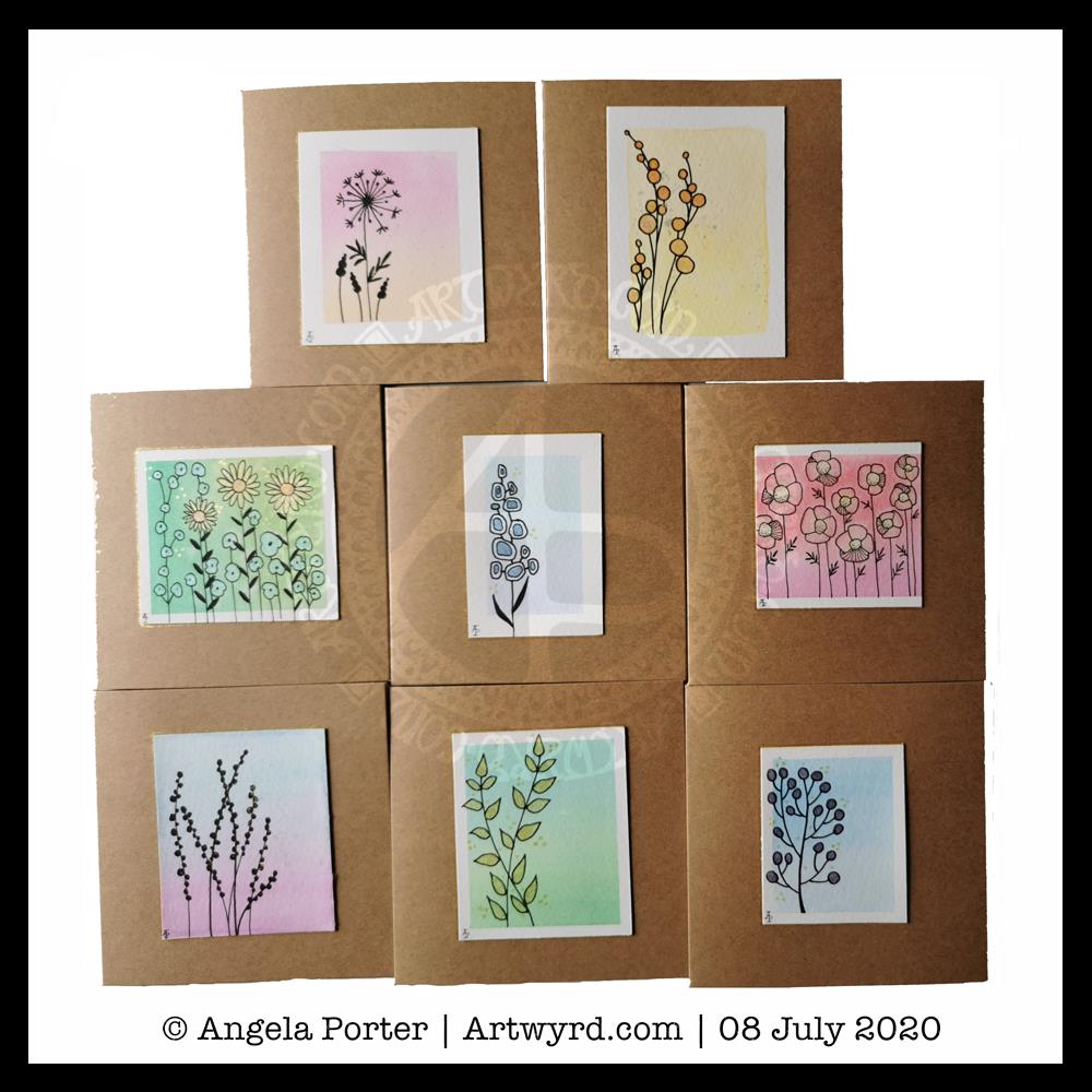
Instead of one large image, I created a sheet of eight, slightly smaller than ATC sized drawings.
ATCs (Artist Trading Cards) are 3½” x 2½” in size. The original idea was for artists, crafters, creatives to make small pieces of art and to swap them with other artists as a way to share and collect art. The idea was to swap and not sell, though people do sell them now, but many more do swap and collect work from other artists.
In today’s vlog, I colour and embellish one of the designs. Then, I turn it and another into first ATC cards and then into greeting cards.
This idea came about through a conversation with a group member who asked permission to create ATCs from my coloring templates for the group.
I do not have an Angel Policy for any of my templates in the group to allow them to be sold in any form. However, gifting or swapping them, or items made using them, is fine so long as the artist (me) is credited and the items are not sold.
For the individual coloring books, terms and conditions are mentioned in the books and should always be referred to.
Good news – the headache has gone! Yay! The sun is shining, I have uplifting music playing, and I’ve spent some of the morning practicing watercolour skills and working out how to subtly draw/paint on top with white.
The little tiles at the bottom have designs painted on them with white gouache. There’s a lot more variability in line width with these.
The book marks have had the designs drawn using a white Soufflé pen by Sakura. The ink goes on clear but dries a matt and opaque white.
I used som Molin du Roy watercolour paper from Canson for these. The tiles are approx 2″ x 2″, the book marks are approx 2″ x 7″.
I may mount the tiles on greeting card blanks. The bookmarks need a hole punching in the top and then some string/ribbon threaded through.
I did try out the Sakura Quickie Glue pen and embossing powder yesterday, but really wasn’t happy with it. I also tried using a variety of Sakura pens to draw the outlines before watercolouring – black Glaze, metallic siver Gelly Roll and silver Stardust. They were waterproof, but just didn’t give me the borders for the patterns that I wanted. The black was very bold and gave a rather stained-glass feel to the tile. But, white turns out to be my favourite.
It’s been nice to spend quite a few hours working with watercolours and trying out ideas without any pressure to create anything that is finished. Sometimes making art for the fun of making art is enough and much needed to soothe some rather battered emotions.
It was a morning for some simple art. Art just for fun, relaxation and self-soothing. So, I thought that small watercolour gradient panels with really simple drawings on them and metallic and pearlescent paint highlights would be perfect.
For the first time ever I managed to create smooth colour gradients with watercolour. The secret, for me, was using a mix of water and gum arabic to wet the paper before applying the colour. Of course, working on such small pieces of watercolour paper helped. Still, it’s a personal achievement!
Once the panels were all done, itseemed a good idea to mount the little panels on some 4″ x 4″ blank cards. So I did just that and added a few more cards to my stash.
Stress and self-care
I had a really poor night’s sleep after the stress of my trip out to the pharmacy yesterday. I woke around 2:30am with a splitting headache and found it hard to get back to sleep. When I did, my alarm went off and woke me with quite a jolt.
I’d set my alarm last night as Wednesday is my delivery day with Able & Cole, and I like to get the deliver in and stored asap.
Once the delivery had come, around 6:30am. I had breakfast and then went back to bed to sleep.
I’m feeling a bit more centred and content now, but I’m still exhausted. So, today will be a quiet, self-care kind of day for me. I’ll be doing my best not to give in to the temptation to take a nap this afternoon so that I can sleep myself our properly tonight.
Two fairly quick, small projects this morning – small botanical cards. Simple, cute, whimsical, darling. Little treasures.
These were fun to make, relatively quick too. They’d be darling little cards to receive in the post or in person. They’d also work nicely as an addition to a journal – a place to journal or keep little memory making bits and bobs in the envelope too.
Each card is 3″ x 4″ in size and the panels are approx 3.5″ x 2″ in size. I made the envelopes to fit and decorated them with one of the motifs from the designs on each card. I did a tiny bit of hand lettering on one of them too.
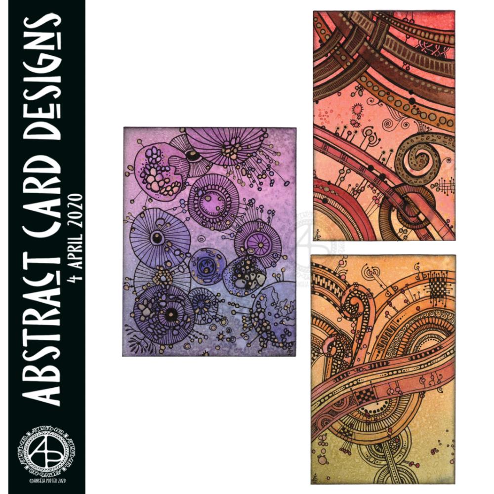
I had so much fun making these little abstract art creations! They really do go back to my roots, but in the way I like to create now.
To give you an idea of size, the purple one is 3″ x 4″, the other two are 2½” x 4″ in size. I have mounted them on cards that are 4½” x 5″ in size, made from some white Daler-Rowney mixed media paper, and I love how they look!
I started by creating the backgrounds using Distress Inks, a mini foam blending tool and a spritz of water.
Then, I painted on some basic shapes using a brush, water and either colour from Zig Clean Real Brush pens or Distress Inks, followed by some splatters of colour.
The the real fun began. Taking some things I really wasn’t happy with and adding line and pattern to them to give them form, definition, and some dimension.
I used Sakura Pigma Micron pens (05 and 02). I also used a glass pen and gold ink in the top right design. For all designs, I used a gold Sakura Gelly Roll pen to add gold highlights, which haven’t shown up well in the scans.
There was something so satisfying and pleasing in working with vague shapes and patterns, the random nature of the background, and using them to inform how my art would develop in each case.
I really, really enjoyed creating these, and I will do more in the future.
I’m not sure how I could create similar digitally – the randomness of wet media isn’t something I’ve worked out how to do…yet. Maybe I never will. Maybe it’s the case of me creating the backgrounds separately using traditional media, then adding the lines digitally. I don’t know yet, however. It may be that this is something I reserve solely for traditional media.
What I do know, is that each design is a work of art in it’s own right and these would look fab framed. In fact, I had a huge inner smile as I mounted them on the card blanks, giving them a simple frame, and saw how finished they then looked. Teeny, tiny pieces of art, by me, Angela.
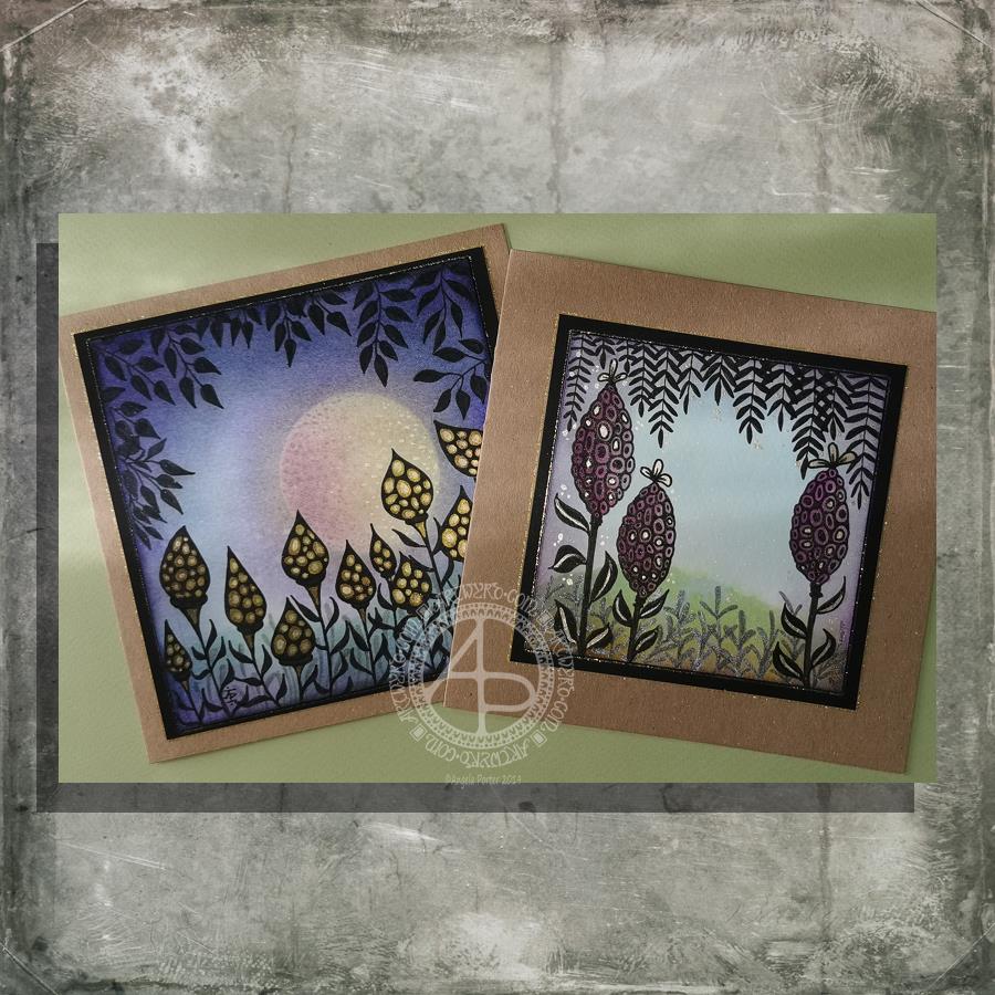
I had a lovely time this morning making the card on the left. Before I started drawing, I added a moon or planet to the background. It really adds something to the card, I think. Something like this is needed on the card to the right I think. However, as I’ve assembled the card it’s not going to be easy to alter!
How I made the cards.
I used Distress Inks and a mini-foam blending tool to colour the backgrounds. I used a circle of paper as a mask for the moon/planet in the left-hand card. To create the land, I used a torn piece of paper to mask off part of the card.
Once I was pleased with the backgrounds, I sprayed the image with a mixture of Perfect Pearls and water and let it dry.
The next step was to draw the designs. I used black and grey Pitt Artist Pens by Faber Castell.
Metallic/iridescent highlights were added; I used Cosmic Shimmer watercolour paints and a fine brush.
The final steps were to adhere the top layer to a black mat, and then this to the card base. Finally, I edged the mat and the top layer with a gold glitter Uniball Signo gel pen.
I have made coordinating envelopes for each card.
My thoughts on the cards.
I think you can tell that the card on the left is the second made. I can see how I’ve learned from the first card. I do like them both.
I would, if I could, add a moon/planet to the right hand card. It would fill that space rather nicely and give a more magical, mystical, ethereal feel to the landscape.
As to the left hand card, I wish I hadn’t done the pods all in black; they appear a tad ‘flat’. In hindsight, I could have used just black outlines and then filled the pod with a colour gradient before adding the metallic highlights.
I also am glad I didn’t try to add a spine to each leaf as I did on the right hand card. However, a highlight at the top of each leaf, suggesting the moon/planet light is reflecting from them.
Oh the whole, however, I am pleased with these cards. They are a new style of working for me. leaving open space is never easy for me, but I’ve managed it with these cards.
Would you like some happy mail?
I’ve already got some recipients in mind for these cards. However, if you’d like some happy mail then send me a message.
I had a lovely time this morning making the card on the left. Before I started drawing, I added a moon or planet to the background. It really adds something to the card, I think. Something like this is needed on the card to the right, I guess. However, as I’ve assembled the card, it’s not going to be easy to alter!
How I made the cards.
I used Distress Inks and a mini-foam blending tool to colour the backgrounds. I used a circle of paper as a mask for the moon/planet in the left-hand card. To create the land, I used a torn piece of paper to mask off part of the card.
Once I was pleased with the backgrounds, I sprayed the image with a mixture of Perfect Pearls and water and let it dry.
The next step was to draw the designs. I used black and grey Pitt Artist Pens by Faber Castell.
Metallic/iridescent highlights were added; I used Cosmic Shimmer watercolour paints and a fine brush.
The final steps were to adhere the top layer to a black mat and then this to the card base. Finally, I edged the mat and the top layer with a gold glitter Uniball Signo gel pen.
I have made coordinating envelopes for each card.
My thoughts on the cards.
I think you can tell that the card on the left is the second made. I can see how I’ve learned from the first card. I do like both cards, though.
I would, if I could, add a moon/planet to the right-hand card. It would fill that space rather nicely and give a more magical, mystical, ethereal feel to the landscape.
As to the left-hand card, I wish I hadn’t done the pods all in black; they appear a tad ‘flat’. In hindsight, I could have used just black outlines and then filled the pod with a colour gradient before adding the metallic highlights.
I also am glad I didn’t try to add a spine to each leaf as I did on the right-hand card. However, a highlight at the top of each leaf, suggesting the moon/planet light is reflecting from them.
Oh the whole, however, I am pleased with these cards. They are a new style of working for me. Leaving open space is never easy for me, but I’ve managed it with these cards.
Would you like some happy mail?
I’ve already got some recipients in mind for these cards. However, if you’d like some happy mail then send me a message.
I’ve already got some recipients in mind for these cards. However, if you’d like some happy mail then send me a message.
I’ve woken to a grey, wet, fresh day here in the Welsh Valleys. The coolness is actually quite delicious on my skin. The rain is freshening the air and world up, clearing the dust away. What a way for the weather to see out August!
It’s a perfect morning to do some artsy crafty stuff. For me, that meant finishing off a pair of cards with coordinating envelopes.
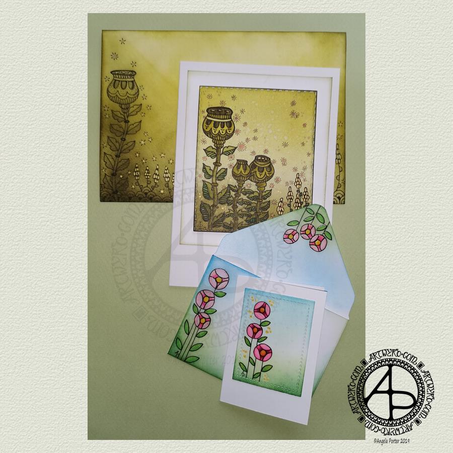
Making the larger entangled seed pods card.
The top panel measures 3″ x 3.75″, mounted on an A6 card (UK sizes).
I coloured The envelope, top panel and the border of the middle panel envelope and the edge of the middle panel with Crushed Olive, Forest Moss and Shabby Shutters Distress inks. I used a mini foam blending tool to achieve a gradient.
I sprayed water onto the top panel. Distress Inks react with water and results in some interesting textural patterns. I didn’t spray water onto the envelope; the paper is too thin to take such treatment.
My next task was to draw the entangled designs; I chose to go with some seed pods, leaves, a geometric pattern and some little flowers too. I added some ‘sparkle’ patterns around the main elements to give the illusion of little things floating in the air.
Next, I added some sparkle and shine with some gold and copper ink. I placed ink inside the sparkles, the seeds inside the larger seed pods and the flowers too.
I used a brush and Distress inks to add some depth of colour to the design on the card. I decided not to do this on the envelope, again because of the quality of the paper.
Once I have someone to send the card to, I will address the envelope and seal it with Distress Micro Glaze so that moisture won’t damage the envelope.
The colour choice on this card is unusual for me, but it’s worked out nicely, particularly with the gold and copper accents.
The tiny floral card.
This card is tiny, measuring just 2.25″ x 3.25″. It’s envelope is a little larger than needed, but the We R Memory Keepers Envelope Punch Board didn’t have measurements on it for a card this size, so I just used the closest available.
The panel on the card measures 1.75″ x 2.375″. It is one of the panels from the Foursquare background frames I messed up while making yesterdays cards.
I used one of my ideas from yesterdays musings on the cards I’d made. I drew a simple design on both the card panel and the envelope front and flap using Uniball Unipin pens and then coloured it with Copic markers. I added some gold glitter dots with a Uniball Signo gel pen.
Once all was dry, I used a Versamark Pen to colour over the flowers, leaves and gold sparkles. Versamark ink is colourless and sticky and is made by Tsukineko; it comes in ink pads but also in double-ended pens – a bullet point at one end and a brush tip at the other. The ink takes a little while to dry.
I covered the sticky areas with WOW super fine clear embossing powder and used a heat tool from Ranger to melt it, giving the design elements a glossy, protective and slightly raised finish. It also intensifies the colours somewhat, which I rather like.
So, I could now colour the background and envelope with Distress Inks without affecting the colours of the flowers, leaves and gold dots. I used a mini foam blending tool along with Pine Needles, Mowed Lawn, Tumbled Glass and Salty Ocean Distress Inks.
The final task was to glue the card panel to the card blank as well as the envelope flaps.
Again, once I’ve addressed the envelope, I’ll use Distress Micro Glaze to seal the inks and prevent any damage to the artwork while journeying to the recipient.
Reflecting on the cards.
I enjoyed making these cards. I particularly like the simplicity of the small card and the effect of the embossing powder. There’s something about teeny-tiny cards that really pleases me. I think it’s that their size makes them just so darned cute!
The larger card I am also pleased with, particularly in my use of colours that are unusual for me. I’m glad I added colour to the seedpods on the card; it helps them to stand out. I do love the copper and gold ink on this darker background too and how well they stand out.
Making envelopes that coordinate with the card is also something I enjoy doing; hopefully, the recipients see them as something a bit special dropping through their letterbox.
So, what’s on the cards for today?
It’s the last day of August, so I need to get a wiggle on to create a September colouring template for the Angela Porter’s Coloring Book Fans facebook group. I feel the need to include some autumn imagery in this one as we are in the dog days of summer for sure.
Tell me, Angela, how are you feeling today?
I’m tired but feeling quite content and optimistic again. I slept well last night; the weighted blanket really is working wonders for me as far as sleep is concerned. One problem is that I don’t want to get out from under it in the morning, so it must be comforting or soothing me.
I seem to have turned in a magnet for people who have escaped narcissistic abuse of all kinds. It’s nice to be able to help others by giving them space where I will believe their experiences, and I can help them, hopefully, to understand that they are not at fault but are victims.
Synchronicity pointing out to me how much I have learned and understood and healed and am now able to help others, perhaps?
I’ve been busy today, doing this and that and the other.
First was a #sneakpreview of one of the templates in the soon to be released #eerieentangledart book of mine. I made the #sneakpreview an exclusive to the #angelaporterscoloringbookfans #facebookgroup, so if you’d like to pop over there, you can see it and one from #entangledbutterflies.
I also worked on a #dangledesign for #dangleday #tomorrow, so that’s all ready to be posted in the morning. My book #adangleaday is available for preorder now and is due for release in September.
Then, this afternoon, after a #walkinthepark and a trip for some #shopping I decided to have a go at creating some #atc #aceo #artisttradingcard sized pieces of #entangledart. These are the results. I #handlettered the quotes on two, and then I remembered I had some sticky sayings from #timholtz #ideaology range #chitchat so thought I’d have a go with them.
Not sure which I prefer … which do you prefer? Let me know!
I’m still struggling with accepting my hand lettering as #goodenough
These would be cute as #greetingcards. They’d also look rather nice on a #bujospread. They’d be a nice #gift for someone to #colourin that’s if I don’t colour them in first! That’s my next job I think…maybe