I took a short break from social media over the last couple of days. I had other things that needed to be done, not least a trip out for brunch in a local cafe with a friend. That’s the first time in over two years I’ve eaten out!
I was highly anxious and stressed, but had a lovely time. The cafe was quiet, thankfully. The food and drink were delicious. It’s our new favourite cafe to go to, one that’s close to us both as we, like most people, are mindful of the cost of fuel at the moment.
The comedown from anxiety and stress leaves me exhausted, and unable to focus my mind. So, some simple colouring of my whimsical flowers sketchbook page from my last blog was just the thing I needed. Nothing to tax my mind. Sketchbook work is a place to experiment, practice, and enjoy the creative process with no pressure for anything to be perfect!
To add colour I used a mixture of Pentel Brush Sign and Tombow Dual Brush pens, along with a water brush. Both of these pens are filled with water-soluble inks and so work a bit like watercolours. I feel I have much more success with these media than I do watercolours, especially as the colours are so bright and vibrant – saturated I think the arty term is.
Just a bit of colour brings the line art to life. It’s its own kind of magic.
Yesterday, I shared a partly digitally coloured version of this week’s coloring template. Today, I’ve coloured some of the original template using Tombow Dual Brush markers with a waterbrush.
I filmed this process and turned it into a vlog. I speeded the footage up, as the original colouring took over an hour and a half.
I then spent another half hour or so experimenting with fineliners and white, metallic and glitter gel pens to add texture and pattern to the coloured areas. I didn’t film that though, but the results are in the photo above.
I set myself three intentions for this morning: a) enjoy the process of working with the media b) experiment with fineliners and pens to add pattern, highlight/shadow and texture c) to not invest in the outcome or fret about colour choices
I think I achieved those intentions.
Sometimes, often even, just enjoying the process of creating, with no expectations or pressures of any particular outcome is so important. To be able to relax and enjoy the process, the colours, the way the media work is as valuable an experience as producing for a specific purpose.
It’s nice to be able to take the time to do this, without worrying about any particular project. Being able to put aside the “I should be doing x, y and z” and realising that just taking time to do something that makes me smile inside is as important as doing projects that fulfill a contract or business thingy.
This is the final installment of the frame/background I’ve been creating as my morning warm up art.
Today, I finish adding colour and also apply Distress Microglaze to bring out the colours.
Thanks to everyone who’s taken some time to watch my videos, leave a comment, like the videos and/or subscribe to my YouTube channel.
It’s nice to be able to share my art in process, but also to share insights into myself, my artistic processes. Indeed, giving voice to my thoughts makes me aware of them. As I work, I’m usually oblivious to the thoughts that happen as I create. Either they’re mostly in my subconscious, or so ephemeral and passing that I don’t notice them.
Thursday seems to come around both quickly and as if it’s been an age since last Thursday. As it’s Thursday, that means it’s time for a new colouring template /coloring page for the members of Angela Porter’s Coloring Book Fans facebook group.
This week’s template is a typically ‘Angela’ entangled style drawing. A stylised dragonfly floats above an entangled background containing arches and seed pods, flowers and foliage, along with various patterns and an intricate border.
I’ve chosen to part colour the template in a monochrome scheme of greens. I don’t really pay attention to light source much. mostly I use light and shadow as part of the patterns and a way to introduce a sense of depth and dimension to my art. This is something I realised only recently.
I often say to myself, “Angela, what on earth were you thinking?” This is one of those times.
I started with hand lettering the words. Ok-ish Good enough to mess around with. And mess around them I did – with an “aura” and pattern, then more patterns and repeated motifs … until I’d mostly filled a square sketchbook page.
The drawing was OK. I liked some bits, others I didn’t.
Then, I thought, “What would it look like with colour? Let’s try Inktense and water!”
How often have I mused here about how I struggle with colour? All was going OK-ish with just pinks and greens … and then I added blues and browns…
The geometric pattern at the bottom were colours that didn’t fit well. So, I added watercolours to glaze the colours. Big mistake. I lost any sense of shadow and highlight …
So, I used a white graphite/chalk pencil to try to add the highlights back in …
YEUCH!
So, I put it to one side while I did some other stuff and had lunch.
Then, it caught my eye and with fresh eyes I thought that maybe it’s not as bad as I thought it was .. maybe.
I constantly do this – try to add colour with traditional media and fail. Monochrome seems to work best for me. Monochrome where I can play with shadow and light. Monochrome colours that are added digitally seems to work the best of all.
No matter how often I tell myself this, put notes up to remind me of this, I still insist on trying to use traditional coloured media.
I just think that I hope one day that something will just ‘click’ with me. Today wasn’t that day it seems!
So, back to either white or simple coloured backgrounds, and adding monochrome colours for the sense of dimensionality I like. And I have no hopes that I’ll remember this in a day, a week, or a month or two and I’ll end up asking myself the exact same question; “Angela, what were you thinking?”
The end result may be something I’m unhappy with, but adding colour was enjoyable. I just seem unable to stick to just one or two colours, with variations in their intensity and tone. Then, I descend, bit by bit, into insecurity and self-doubt and incredulity that I did it again!
Ho hum! Not to worry, it’s only pen, paper and some other media. It’s yet another experience to help me, hopefully, learn more and be more comfortable with my artistic style. If we did everything perfectly every time we’d never learn and grow.
So, back to a blank piece of paper with pens I go, and may make some art to remind me, “Angela, monochrome is best!”
This week, the design has one big focal point motif of a zentangle-inspired Christmas Tree. It’s cute and whimsical, and is surrounded by holly, mistletoe, gifts, stars and baubles. Of course there’s some hearts there too.
Although the drawing is quite detailed, it’s split into smaller sections. This is great if you only have a bit of time or feel overwhelmed by the whole image. This way you can do one section at a time.
There’s a couple of reasons I usually only colour part of the template. One is a question of time when I have other things that have to be done. The other is that it shows the difference colour makes to the drawing, how it brings it to life.
I love to see how colourists bring my drawings to life with colour and how unique each person’s approach to colouring is. Every time I see one coloured it brings a smile to my face. I have so many colouring books published, so many templates drawn that I don’t have time to colour them all myself.
But when I see a template I wasn’t happy with all coloured in and how wonderful it looks, it not only makes me smile, but it gives me a little confidence boost that my drawings may be just good enough after all.
Yes, I suffer with imposter syndrome and a lack of self-confidence still.
For the rest of the day I really do need to get on with my Christmas card design for this year and get the moonpig ones sorted out and sent off.
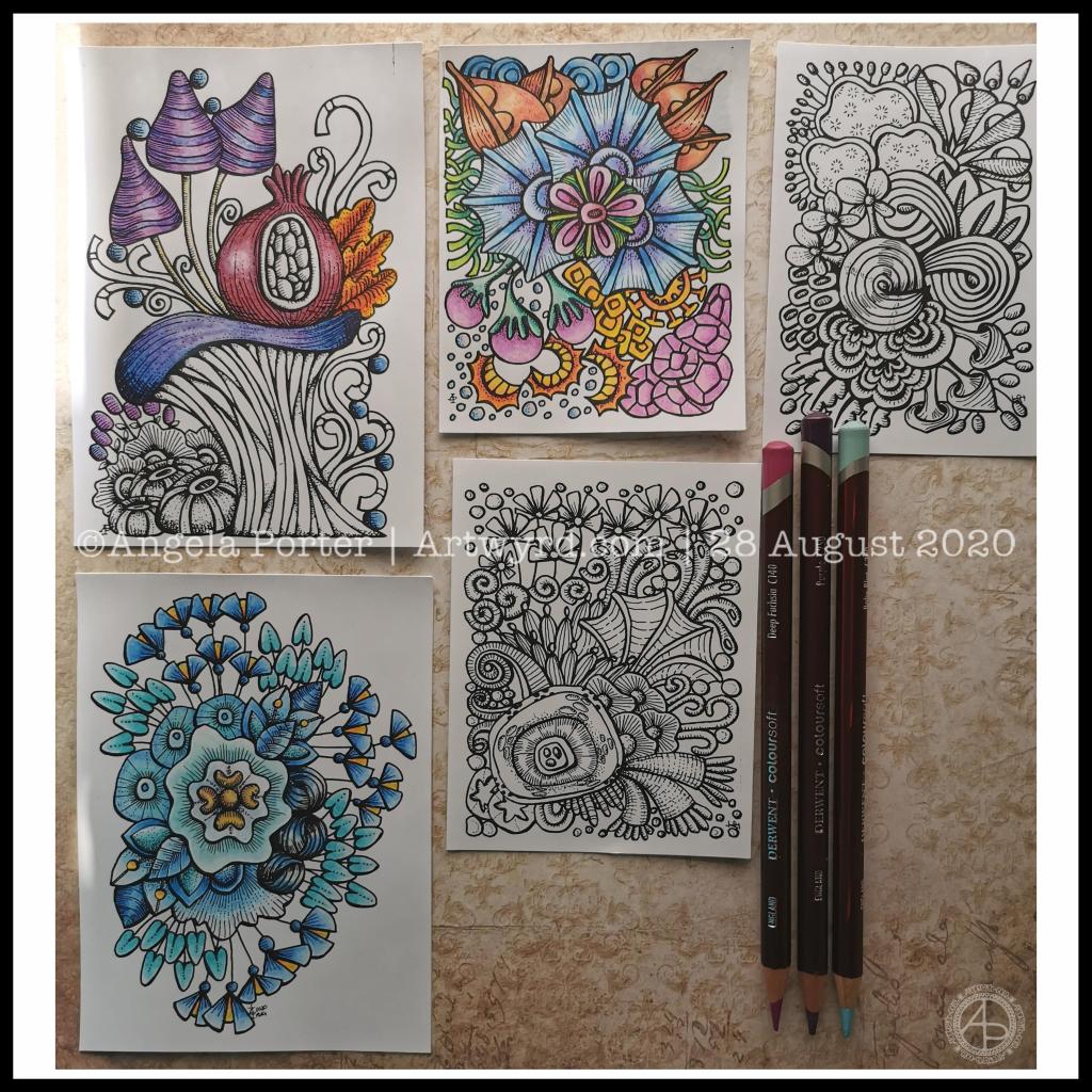
Over the past couple of days I’ve been drawing small designs in pen, including plenty of line detail to add volume and shadow.
Today, I scanned the drawings in and printed them out (after cleaning them up a tad digitally) so I could try colouring them.
I wanted to print them on mixed media paper, which I know my printer will take. However, even with clean scans, the prints were really messy. However, when printed on ordinary paper, the prints were pristine.
I wasn’t happy as I wanted to use a paper with a bit more ‘tooth’ so I could make use of the Derwent Colorsoft pencils. But, I persevered and the results are above.
The first I coloured is in the top middle. My colour sense isn’t always wonderful. Lots of colours, but it just doesn’t feel coherent in any kind of way.
So, I moved on to the next design. This time, I thought I’d use analogous colours (colours next to each other on the colour wheel), with a touch of a complementary colour to add brightness. Complementary colours are opposite each other on the colour wheel.
I like this second one much more. It feels cohesive, like everything belongs together. And the little bursts of yellow/orange just lift it all.
The third design I’ve been colouring is only partly done. I’ve veered away from entirely analogous colours, but I am trying to keep the colour palette simple and with, perhaps, an autumnal feel to it.
As I was working on printer paper, I needed to use some way to blend the colours. I remembered I had some ‘Zest-It’ blending solution and some paper torchons. They worked well. The big frustration was that I couldn’t lay down intense colour. However, as these are prints, I’m not too worried. I do need to find some toothy paper which will go in the main paper drawer of my printer. I do have some cartridge paper here somewhere which should go through it.
Of course, scanning the drawings in means I can also work on adding colour digitally. It means I can try things out until I’m happy with the results.
Pesky printers
I never have much luck with printers. Inkjet printers die on my quickly, even the more expensive professional ones. I thought I’d try a laser printer, but I seem to have problems with this one now not giving clean prints when I use the sheet feeder for specialist papers.
I don’t print much out, to be honest, but it’s frustrating when I want to print artwork out on specialist paper.
A note to self about colour.
What I have learned is that I like to watercolour the designs, but then the addition of coloured pencils to intensify the colours and add shadows works really well for me. I like the intense contrasts that I can get with coloured pencils that I just can’t seem to achieve with watercolours.
Of course, I can always colour digitally, which lets me play with colours, change them, until I get something I really like.
Today, I’ve had a reminder that limited palettes, particularly of analogous colours, seem to be working rather well for me, especially with those accents of complementary colours.
I really do need to put a big ‘note to self’ where I can see it to remind me of this. I can get carried away with colours
This week, I have an entangled mandala design, with a zentangle-style background. It always seems a shame to waste the space around a mandala when it’s a page for breathing life into a design with colour.
I drew this design in Autodesk Sketchbook Pro using a brush that changed width with pressure. That allowed me to add some dimension to the lineart. But it is colour and shading that really brings a sense of volume to the design.
One of the members suggested a Christmas in July template, so that’s what I did. A page full of iconic Christmas motifs, admittedly not all of them, but a fair selection.
If you fancy printing this template off, all you need to do is join the group! It’s completely free, as are all the templates I design for the group. All I ask is that you follow the terms and condtions of use.
I drew these little designs on Rhodia dot grid paper with a Tombow Fudenosuke (hard) pen. I cleaned the drawing up in Autodesk Sketchbook Pro, then digitally added colour. Some are in the more traditional Christmas colours, others are less so. No rules for colouring! Whatever makes you happy or peaceful is fine! The most important thing is to have fun and enjoy what you do.
As for me, today I’m taking a break from the typographic portrait of Nye Bevan that I shared yesterday. My artistic intuition needs some time to work out what to do with it, both to complete the blank areas and to edit places that aren’t working.
I need to pop out for a walk too. I’ve been sat down, focused on art too much over the past couple of days. It’s overcast and there’s a stiff breeze, so it’s perfect for me!