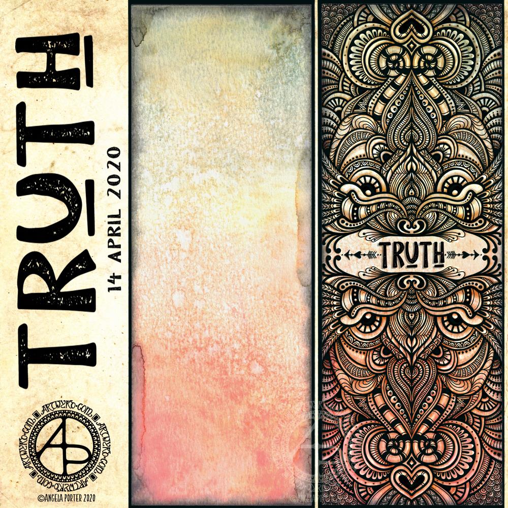
I like to use a word in my artwork from time to time. Truth was the word I knew I had to use as the central point for some artwork, and that’s where I started, along with one of the Distress Oxide backgrounds I made yesterday (in the middle of the image).
After I’d decided on the typography and placed it centrally, I then started to draw digitally. I made use of the symmetry tools in Autodesk Sketchbook Pro, along with a flexible nib and fineliner brushes.
I had no idea what kind of design would result, I just went with the flow and intuition and thoroughly enjoyed doing so and losing myself in the art.
I added shadows and highlights once the drawing was finished for that sense of dimension and ‘life’.
I am really pleased with the finished artwork. There’s something about symmetry, spirals, repeating patterns, and intricate, abstract designs like this that just makes my arty heart smile and sing. I always return to this style, it seems to be at the core of my being.
I also love to draw on coloured and textured backgrounds. I also think I’ve found a way to combine more traditional media (making the backgrounds) with digital art (drawing and adding shadows and highlights) in a way that really works for me.
My only problem is that I do tend to try to branch out into other kinds of art and never seem quite so satisfied with them. This doesn’t mean I’m going to abandon them; they need a lot more work and thought and maybe structure.
Perhaps that’s why I like this particular piece of art so much – it has clearly defined structure. The colour palette is defined by the background and so I’m not struggling with what colours to use. Having the black line structure defines clearly where shadows and highlights need to go.

