Wishing each and every one of you the very best of the season’s blessings, not just for the seasonal holidays, but for each and every day ahead of you.

All the best of the blessings of the season to you one and all!
Today, the Sun passes into Capricorn, marking the astronomical start of winter. It’s one of the shortest days of the year as well, and so it seems right that as the days get longer, the intensity of sunlight that reaches the Earth in the Northern Hemisphere strengthens, that it is seen as the ending of one orbit around the Sun, and the start of a new one.
Of course, if you’re in the Southern Hemisphere, Happy Summer Solstice!

This morning, the rain has finally stopped once again, albeit for a short while no doubt. Blue skies and sunlight shine betwixt the broken clouds. Yesterday and last night the rain was relentless, including high winds at times, thanks to Storm Jorge.
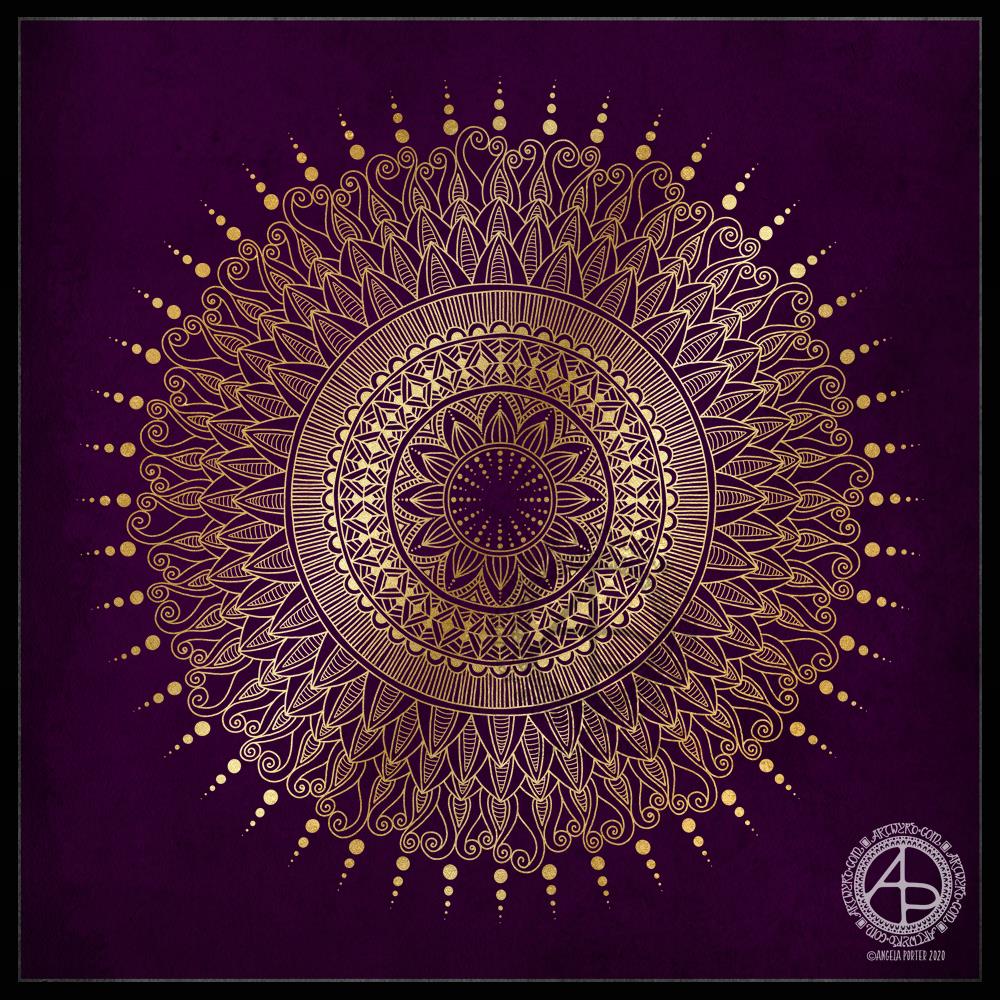
I thought I’d do a golden mandala this morning, while I come around. A simple line-art drawing.

Yesterday, I was out with the DSLR and my friend Liz. We had a need to visit the sea. As we live in the Valleys of South Wales in the UK, we’re not far from either the sea or mountains, towns or country. So, we paid a visit to The Glamorgan Heritage Coast, specifically Southerndown and Newton in Porthcawl. If you’d like to read more about our day out and see some of my photos, visit Curious Stops and Tea Shops.
Today, after a busy week with people and errands, I need a day at home. I also needed some time to just create.
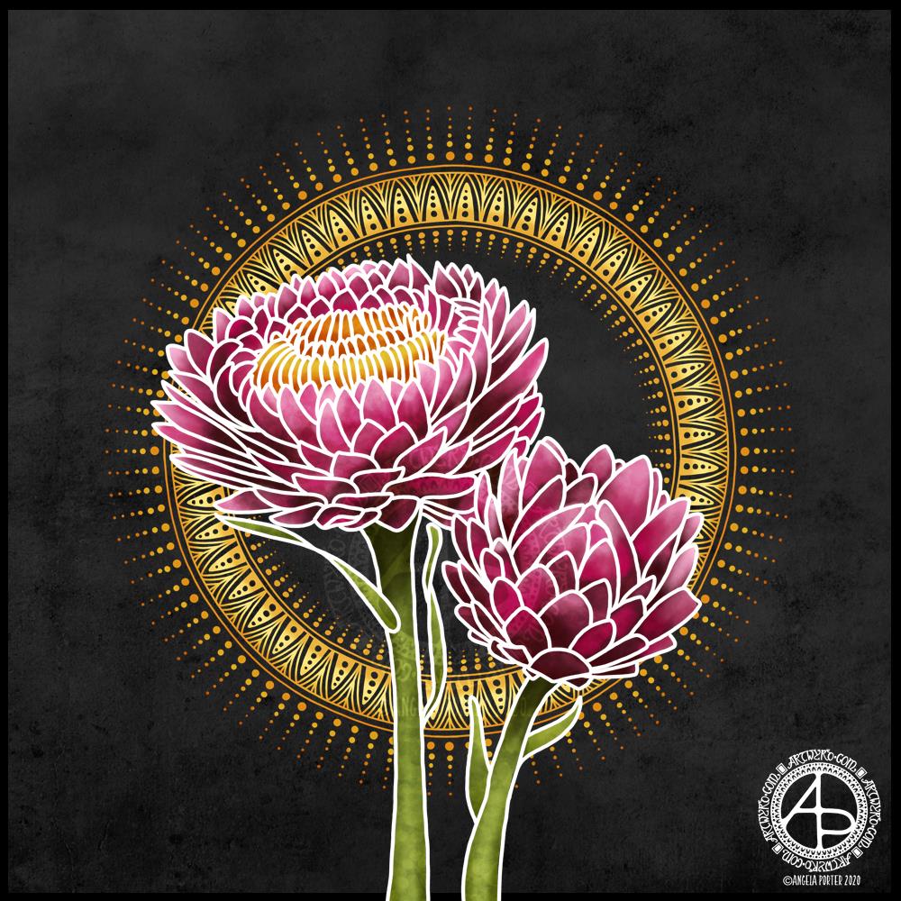
I turned to my folder of photos from my trip to the National Botanic Gardens of Wales last August and found a picture of flowers that inspired me to create this floral design.
I started with the line art with the intention of using it as a guide for painting each petal. However, once I’d completed the line art and added the base colour and some of the brighter tones, I realised I wanted to keep the white lines because it was reminding me of batik or silk painting, particularly as I’d chosen a black background to work against.
I love the vibrance of the colours against the dark background, again very reminiscent of silk painting/batik.
I reined in my usual inclination to intricate, detailed mandalas and kept this particular one quite simple. I decided to echo the golden tones of the stamens in the centre of the flower, and I think that has worked out really, really well.
If I were to try to change something in this artwork, I may try a gold outline – metallic gold. But I like it very much, just as it is.
My tools were Autodesk Sketchbook Pro, Microsoft Surface Studio and Microsoft Surface Slim Pen.

I’ve woken to a grey, wet, fresh day here in the Welsh Valleys. The coolness is actually quite delicious on my skin. The rain is freshening the air and world up, clearing the dust away. What a way for the weather to see out August!
It’s a perfect morning to do some artsy crafty stuff. For me, that meant finishing off a pair of cards with coordinating envelopes.
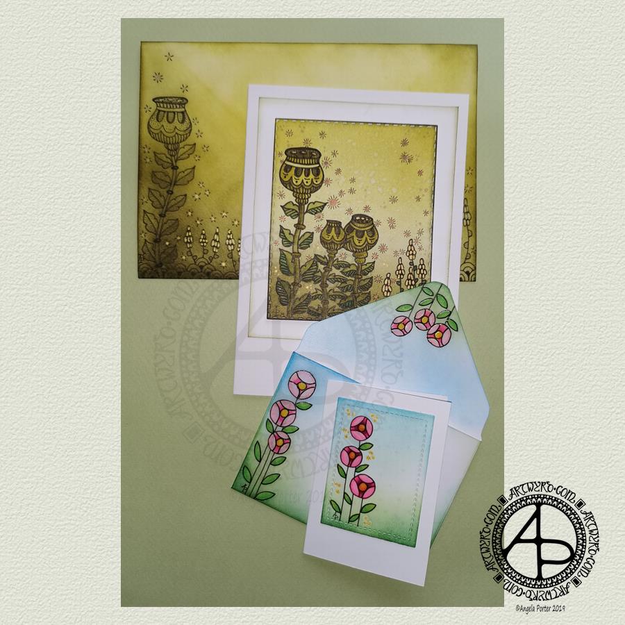
Making the larger entangled seed pods card.
The top panel measures 3″ x 3.75″, mounted on an A6 card (UK sizes).
I coloured The envelope, top panel and the border of the middle panel envelope and the edge of the middle panel with Crushed Olive, Forest Moss and Shabby Shutters Distress inks. I used a mini foam blending tool to achieve a gradient.
I sprayed water onto the top panel. Distress Inks react with water and results in some interesting textural patterns. I didn’t spray water onto the envelope; the paper is too thin to take such treatment.
My next task was to draw the entangled designs; I chose to go with some seed pods, leaves, a geometric pattern and some little flowers too. I added some ‘sparkle’ patterns around the main elements to give the illusion of little things floating in the air.
Next, I added some sparkle and shine with some gold and copper ink. I placed ink inside the sparkles, the seeds inside the larger seed pods and the flowers too.
I used a brush and Distress inks to add some depth of colour to the design on the card. I decided not to do this on the envelope, again because of the quality of the paper.
Once I have someone to send the card to, I will address the envelope and seal it with Distress Micro Glaze so that moisture won’t damage the envelope.
The colour choice on this card is unusual for me, but it’s worked out nicely, particularly with the gold and copper accents.
The tiny floral card.
This card is tiny, measuring just 2.25″ x 3.25″. It’s envelope is a little larger than needed, but the We R Memory Keepers Envelope Punch Board didn’t have measurements on it for a card this size, so I just used the closest available.
The panel on the card measures 1.75″ x 2.375″. It is one of the panels from the Foursquare background frames I messed up while making yesterdays cards.
I used one of my ideas from yesterdays musings on the cards I’d made. I drew a simple design on both the card panel and the envelope front and flap using Uniball Unipin pens and then coloured it with Copic markers. I added some gold glitter dots with a Uniball Signo gel pen.
Once all was dry, I used a Versamark Pen to colour over the flowers, leaves and gold sparkles. Versamark ink is colourless and sticky and is made by Tsukineko; it comes in ink pads but also in double-ended pens – a bullet point at one end and a brush tip at the other. The ink takes a little while to dry.
I covered the sticky areas with WOW super fine clear embossing powder and used a heat tool from Ranger to melt it, giving the design elements a glossy, protective and slightly raised finish. It also intensifies the colours somewhat, which I rather like.
So, I could now colour the background and envelope with Distress Inks without affecting the colours of the flowers, leaves and gold dots. I used a mini foam blending tool along with Pine Needles, Mowed Lawn, Tumbled Glass and Salty Ocean Distress Inks.
The final task was to glue the card panel to the card blank as well as the envelope flaps.
Again, once I’ve addressed the envelope, I’ll use Distress Micro Glaze to seal the inks and prevent any damage to the artwork while journeying to the recipient.
Reflecting on the cards.
I enjoyed making these cards. I particularly like the simplicity of the small card and the effect of the embossing powder. There’s something about teeny-tiny cards that really pleases me. I think it’s that their size makes them just so darned cute!
The larger card I am also pleased with, particularly in my use of colours that are unusual for me. I’m glad I added colour to the seedpods on the card; it helps them to stand out. I do love the copper and gold ink on this darker background too and how well they stand out.
Making envelopes that coordinate with the card is also something I enjoy doing; hopefully, the recipients see them as something a bit special dropping through their letterbox.
So, what’s on the cards for today?
It’s the last day of August, so I need to get a wiggle on to create a September colouring template for the Angela Porter’s Coloring Book Fans facebook group. I feel the need to include some autumn imagery in this one as we are in the dog days of summer for sure.
Tell me, Angela, how are you feeling today?
I’m tired but feeling quite content and optimistic again. I slept well last night; the weighted blanket really is working wonders for me as far as sleep is concerned. One problem is that I don’t want to get out from under it in the morning, so it must be comforting or soothing me.
I seem to have turned in a magnet for people who have escaped narcissistic abuse of all kinds. It’s nice to be able to help others by giving them space where I will believe their experiences, and I can help them, hopefully, to understand that they are not at fault but are victims.
Synchronicity pointing out to me how much I have learned and understood and healed and am now able to help others, perhaps?

Friday is dangle day!
Today I thought I’d create a monogram dangle design for ‘F’ with some cute fish, as well as a couple of shells. Of course a whimsical crown with golden foliage tops the design off just nicely!
Fish means a water theme, so I used blues, and blue-greens quite liberally. However, golds and shades of red and magenta really give a tropical feel to the jolly little fish.
Fairly simple gradient colouring this week. No drop shadows, other than the one around the whole design.
Looking at it now, I think the monogram might benefit from a drop shadow or two. However, it’ll do just fine as it is I think.
It would be lovely on a card for someone with the initial F, especially if they love fish or fishing. Of course the colours can be adjusted accordingly, as can the particular kind of fish. I’m particularly fond of cute, whimsical, happy little fish.
It could happily find a place in a BuJo, scrapbook, planner, journal or diary. Making the monogram narrower and the dangles longer, it would make a lovely bookmark too, I think.
Just a little mention here about my book “A Dangle A Day”. It’s a dangle design tutorial book, Angela -style dangles that is. Lots of monograms as well as dangle designs for use around the year. It’s a good place for beginners, but is also full of ideas for the more experienced among you. And, of course, I add a new dangle design on this blog most Fridays which you can use for inspiration.
I’d love to see what you create! Tag me on social media!

It’s Friday and that means it’s dangle day!
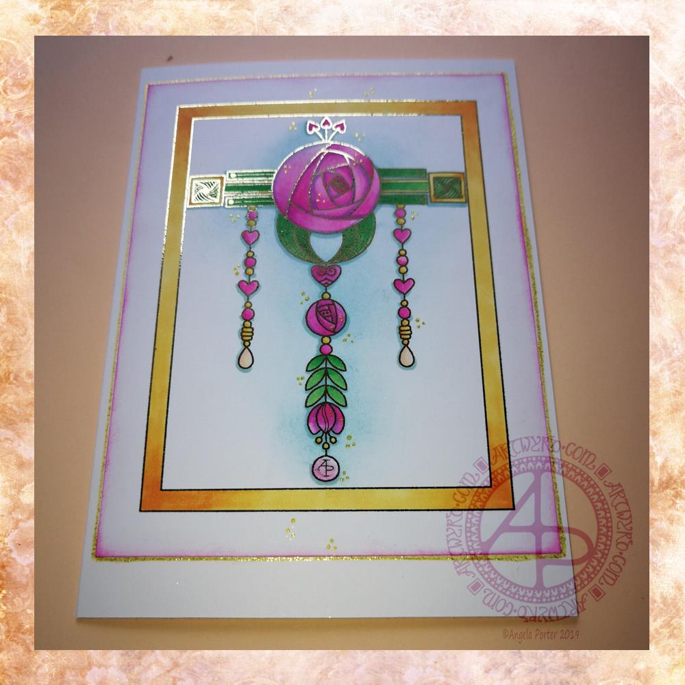
Given my experiments with thermal foiling this week, today’s dangle had to be foiled, in gold this time.
As I enjoyed creating a dangle design inspired by Art Nouveau last week I thought I’d like to do that again this week, and this is the result.
I drew the design digitally, using my usual tools of choice viz. Autodesk Sketchbook Pro, Microsoft Surface Pen and Microsoft Surface Studio.
I coloured the design in using Chameleon Markers. Then I added the blue background with Distress Inks, followed by a pink edge to the card. Not sure pink was the right choice, but it’s ok I suppose.
I mounted the design on an A5 card blank and drew a glittery gold line around it with a Uniball Signo gel pen. I also added some small groups of glittery gold drops to the design.
Overall, I’m quite pleased with this one. I like the combination of the more geometric designs with the more organic motifs.
I didn’t add any hand lettering or a sentiment so it makes it perfect for any occasion or as a note card. It would also make a fantastic page design for a BuJo (bullet journal) or as part of a scrapbook, journal, diary or notebook spread.
If you’d like to try your hand at creating your own dangle design but don’t think you could, well you could find my book ‘A Dangle A Day’ helpful. Not only are well over 100 different monograms and dangle designs included that you can use, but help and advice is given for creating your own, as well as plenty of words of encouragement. I’d love to see your dangle designs too.
I really needed some quiet, creative time this morning. Some time without any pressure on me in terms of requirements from publishers and others. Dangle designs are simple to draw, and there is a soothing quality in simplicity. Colouring is also a very soothing activity and the magic of hot foiling always makes me smile.
I’m feeling a bit below par in terms of my mental and emotional wellbeing. I have a stinking headache, which isn’t helping, and I’m feeling exhausted again. That’s all to do with emotional exhaustion.
Fortunately, I can take time today to just do what I need to do in terms of self-care. I managed to get three and a half out of the four edits for my next coloring book done. I have until Monday to get the other half finished, so that’s definitely do-able, either later today when the headache subsides or tomorrow.
My emotional and mental sea has some smooth waves on it, not stormy, not choppy, just swells that come and go. I may be in a bit of a trough at the moment, but I’ll soon be heading back up to the crest of the gentle swells.

I love the combination of teals and coppery tones so I chose to use them as part of the colour scheme in this mandala. A simple black outline mandala with no crazily intricate detailed patterns included. I’m not so sure about the purple-ish I used for the ‘crystals’ in the other most rings of the mandala though.
Drawn and coloured in Autodesk Sketchbook Pro using a Microsoft Surface Pen on the screen of a Microsoft Surface Studio very, very late last night and into the wee small hours of this morning.
Today is likely to be another self-care day. I thought I was in a place where I could do loving kindness meditations again this morning. I’m not. So much emotional distress and even physical pain during the part of the meditation that involves bringing loving kindness to myself. I have no problem sending loving kindness to another being I feel love for. I have no problem sending it out to all of the Earth. Still, the nasty messages of the inner critic are fodder for EMDR. And it’s such a lovely sunny, late winter day here in the Welsh Valleys.

Yesterday was very much a quiet, self-care day. Today, I’m feeling better in terms of energy and concentration.
This mandala was a product of yesterday’s quiet downtime doing art for arts sake. Though it was this morning I thought I’d like golden outlines to the design rather than the usual black. It took me a while to get my head around doing that!
I like the way I’ve repeated the simple spiral pattern in three layers. Keeping the colour palette simple has also worked nicely for me, even though the combination of colours is an unusual one for me. The colours remind me of cacti with flowers and a soft, golden sun.
I could mention that green is about achieving balance, the red is the energy I need to stoke up on, but a softer, more gentle kind of motivational energy. Golden sunshine is the healing I see. The way the spirals flow outwards and are unfurling suggests growth , springing forth from seeds long lain dormant in the ground of my soul. There’s hints of buds ready to bloom there too. Maybe the golden background and lines are suggesting that I am worth more than I think I am, that I do deserve better.
Oops, I have mentioned that! But somehow this mandala seems to show how I’m progressing in my recovery from cPTSD.
Now how’s that for an insightful piece of art?
No matter whether you agree with the interpretation of the mandala or not, it was definitely a calming and soothing experience, both the drawing and colouring.
It is a piece of digital art. I used my usual Microsoft Surface Pen, Microsoft Surface Studio and Autodesk Sketchbook Pro to create this mandala.

Yesterday was a day where I was out of sorts for some unspecified reason. Drawing little, intricate bits of art was the only thing that helped to soothe me and calm me. Along with comfort eating, which was not good way to cope.
I get days like this. I have no idea what triggered this response. It may have been a visit to my accountant on Tuesday and the tax bill to pay – I have absolutely nothing to worry about with either, but dealing with finances is a trigger for the anxiety and depression that are part of my cPTSD.
I know I was on edge about the meeting, even though I knew there would be nothing to worry about. The anxiety had been gradually growing through the previous few days. This anxiety provoked the warning signs of an incipient migraine/stress headache on Tuesday morning. Luckily I caught it in time with painkillers so that it didn’t develop into a full blown migraine and after the meeting I was left tired but feeling more at ease.
Yesterday, the anxiety ramped up again as I went to get the paperwork and bank card to make the payments. So, yesterday I needed to manage my anxiety and tiny, intricate drawings were what was needed.
Today, I know I have to do these things, and I will. I don’t have the anxiety I had about them yesterday. I think yesterday was just too close to a few days of spiralling anxiety as accounts day approached closer and closer.
cPTSD can make doing the simple things in life far more difficult to do. I do get things done, though I do have to be kind to myself at times, making sure I have plenty of time before the deadline.
I used fountain pens on white paper to draw the designs. The M is on paper that is around 4″ x 4″, the G is a little narrower than 4″ for some reason.
After scanning them in, I did a bit of digital wizardry to fill the letters with a gold foil texture, just to see what it would look like, and they look OK to me. I’m not too keen on the black line around the G though. I do like the contrast of the golden letters and the black and white designs around them.
Today, I have to colour the cover for my next book for Dover Publications Creative Haven series. And keep warm and safe. I woke up to a lovely sunrise with a frosty world – everything was covered with white. I know the temperature was down to -3ºC last night as I came home around 10:30 pm, and it would only have got colder as the skies were clear and starry. It’s beginning to go now, but clouds have covered the sky.
The frost is beginning to disappear now, but clouds have covered the blue skies. Snow is forecast for a bit later on today. I like to see snow. I like the way the world falls silent in heavy snow as it seems to muffle the usual background noise of modern times. I’m wise enough to know that for me to go out in snow is never a wise idea; I tend to slip and slide and fall and hurt myself. So, as I have nothing pressing that requires me to leave home, I’ll be staying safe and warm indoors! Once the cover is coloured, my attention will go to February’s templates for the Angela Porter’s Coloring Book Fans Facebook group. Someone there has asked for some simpler templates like my dangle designs, so I think that’s exactly what I’m going to do!