Sketchbook Experiments and Arty Vlog

Saturday is becoming sketchbook Saturday with a vlog on YouTube!

As well as showing the most recent page(s) in my sketchbook and talking about the media/techniques/inspiration, I spend some time working on the current, higgledy-piggledy page.

I’ve become intrigued with using the humble biro / ballpoint pen in art, especially as they are waterproof. There’s some amazing portraits and other work out there by seriously talented artists.

However, I’m working out how they may work for me, especially in my sketchbook when out and about (when that finally happens!).

As well as talking about the various techniques and inspiration for the art on this page, I also talk about how I want to include more writing in my sketchbooks. I’m intrigued with using creative writing record my experiences, feelings, thoughts and the presence of place alongside any sketches done when visiting somewhere.

I’m also thinking that if I take photographs of what interests me, then sketches and further work could be done later. This is going to be important when I’m not by myself and don’t have the luxury of spending as much time as I’d like.

I’d like to create a story that is in words and pictures, recording my whole experience. Perhaps, I may want to share this with others, so that they can get a glimpse into my mind and emotions.

I’m not too bothered about creating a work of fiction, but to capture all those abstract feelings and observations and communicate them with others…

Actually, it would be about sharing them with myself by becoming more aware of them and giving an outlet for those abstract thoughts and impressions I rarely verbalise as I’m unaware of them unless I’m asked to verbalise them.

Something else I’d like to do is to revisit typographic art with all of this in mind. Finding a way to incorporate words and imagery that expresses who I am, rather than taking quotes from other people.

I do love words, always have. During this past year, I’ve had so few opportunities to speak out loud, that I’m finding it hard to dredge up the right word at times. Previously this was so easy for me. So, it would be good to give my vocabulary a good work out as well as add new words to it!

It’s going to be a work in progress for sure. I doubt I can do this, or that it will be interesting to others, or that it will be any good at all. However, if I don’t take the first tentative steps on this strand of my life’s tapestry, then I may never discover if it is something I can do, nor will I discover where it will lead me.

All that it will take are basic supplies, and to create a new ‘habit’ of writing throughout the day, whether I’m at home, or elsewhere, and drawing things that are of interest/importance to me at the time.

A bit of a challenge, but do-able I think.

New Watercolours, & arty lessons learned

New Watercolours

Late yesterday evening, my new set of watercolours arrived. I’m now the proud owner of a set of 36 tubes of Mijello Mission Gold Class watercolour paints, and a pretty neat palette too.

It was too late last night for me to think about adding the paints to the palette and setting up some colour swatches,. So I set to that this morning with a big mug of tea and a headache.

I used them to continue adding colour to this drawing, and I can easily tell the difference between the Mission Gold and Cotman Watercolours, not just because I know where I added each colour, but from the intensity and vibrance of the colours.

I know I got more vibrance from the Cotman colours when I was adding colour to this by adding water to the pans and letting them sit for a while to soften the pigments. But, it was so much easier with the Mission Gold to do this. Indeed, I had to be careful that I didn’t use colour that was too intense!

Some insight into watercolour and me

It was, and will continue to be, an absolute joy and pleasure to use watercolour paint tubes. I’m so glad I splurged out on them after I had a memory of using tube watercolours years and years ago.

They were such a pleasure to use, both to create the swatches and in adding colour to this drawing. Bear in mind that this drawing wasn’t done on watercolour paper, but on creamy coloured Arteza mixed media paper! Also, I created the swatches on SeaWhite all media cartridge paper, which is a lovely bright white colour.

Now, I realise that a lot of my frustration with pan watercolours is with getting colours intense enough for my taste. That won’t be a problem with the Mission Gold set I’m sure.

I also feel that exploring and learning more about watercolour and colour mixing is something that I’d like to do now, and that I may not be quite so frustrated as I have in the past.

Coloring Template doubts and frustrations

Yesterday, I got a couple more templates drawn and edited, so I now have ten out of the thirty-one I need completed, editorial team’s feedback allowing that is.

However, I was really doubting whether what I’d done would work, was good enough. So, I thought I’d try colouring the template I was least happy with to see if that made a difference to how I viewed it, and hopefully the others.

That really did the trick! Just by adding a background colour/texture first, I started to feel better about it. Once I’d added colour and the line-art started to come to life, I started to feel even more confident.

This is something I need to remember going forward, when I doubt my ability to create colouring templates. All I need to do is see if they work with colour!

A bonus was that I really enjoyed adding colour.

Vlogging along …

I touch on all these things in today’s vlog, as well as showing the swatches and adding colour to the drawing.

I’ve also decided that I’m going to mostly keep my vlogs to no more than around 20 minutes, whether that’s real time or a time lapse version. I think they may work the best, though I may still record longer ones if there’s a need to do so.

Passion – Part 4

I finished drawing ‘Passion’ this morning. The original is black pen on white paper, but I’ve manipulated it a little for the social media post. I kept to a relatively small number of motifs in the design, which gives it a bit more of a coherent ‘feel’.

Adding colour to the design was on my mind as I completed the design. This can be seen in the larger motifs that I’ve drawn.

In fact, I did start to add colour during my morning drawing vlog – and to a disastrous effect, in my opinion. I’m just so glad that I scanned the drawing in before adding colour. Now, I can work on it at my leisure digitally.

I may very well start another drawing in the series tomorrow morning. I don’t know what word I’ll choose yet. Maybe you’d like to leave a suggestion or two in the comments!

Here’s the vlog I recorded this morning:

WIP Wednesday

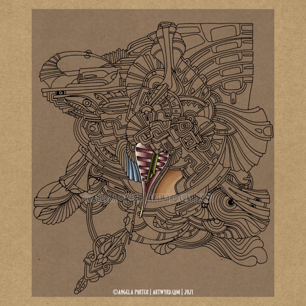
An abstract drawing that I started yesterday. I think the drawing is complete, maybe. But I wanted to start to add colour to work out what palette I want to use.

This is it so far, after a couple of hours mucking about with colours, layer settings and so on. I’m quite happy with the dusky pink and mossy green, but not so sure about the dusty blue.

This isn’t my only work in progress. I’ve just finished uploading my daily morning drawing vlog on YouTube:

I started to draw another abstract drawing in this vlog as I talk about inner critics, overly talkative me, and other stuff.

Both drawings are being done with a micro sized Uniball Eye pen on Canson marker paper. The paper is so smooth and a pleasure to draw on with pens that dry quite quickly, like the Eye pen.

For now, once I’ve done my social media posts, I need a break. The sun is shining and my feet are feeling eager for a little walk. So that’s what I’ll be doing in about an hour!

Morning Drawing Vlog

This morning, I finished drawing the entangled design on parchment and started to add colour. I did a really untidy job of using masking tape to hold down the curled parchment. It worked though. I’ve not completed adding colour, yet. I may do so through the day today, once I’ve done other errands.

Then, I have to decide what to do with this small piece of art. Do I mount it on black or white? Do I turn it into a card or something else? Or should I just let it live in a sketchbook of some kind of mine? I dunno.

It’s nice, every now and then, to do something a little different. There are things I learn and realise, especially as memories of the last times I created something with parchment come back to my awareness.

All good fun, that’s for sure!

Mandala Monday WIP

Mandala Monday

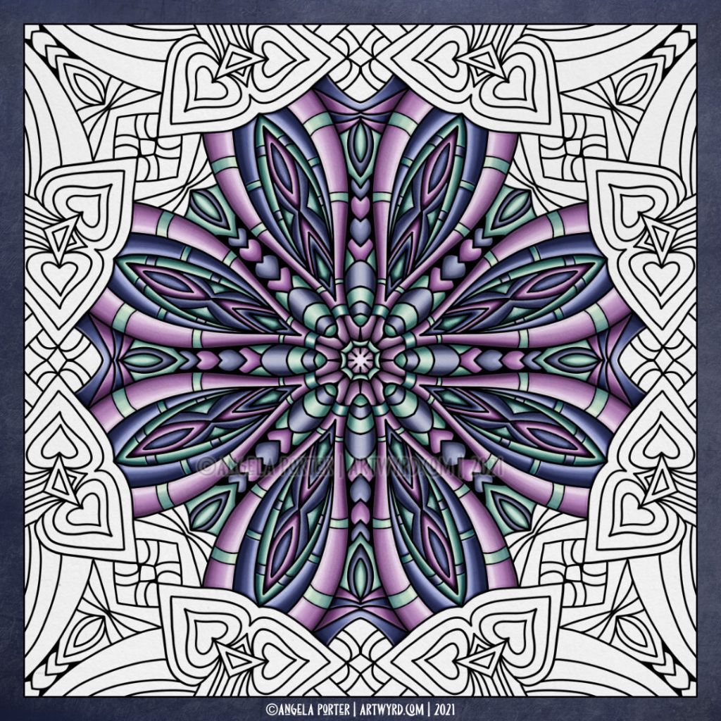
Monday is definitely mandala day! I’ve been working on this mandala for the past week, on and off. It’s taken me lots of attempts to get the colours and brushes to work the way I’d like. I’m quite happy with it now.

I like the combination of warm and cool violets and teal-ish greens. They’re close enough together on the colour wheel to work harmoniously together.

I’m just adding colour at the moment. I will think about adding patterns to the various areas once the colour is all complete.

Although the black lines are quite bold in this design, the colour seems to make them almost disappear. They seem to become, almost, the darkest shadows that separate the different colour areas, deep cuts that delineate the different sections. I’ve never really noticed that before, and I think it’s a nice observation.

I’ve been enjoying, as always, adding shadow and highlight to give that sense of volume and layers to the design. It’s always fascinating to me how such simple use of colour can add so much interest.

Vlogging

I’ve worked out that all the youtube videos I’ve been creating are really vlogs. I can be incredibly dense at times about such things. I do talk about different things in them than I do on this blog. My thoughts are different when I write and when I talk it seems. Or perhaps the process of writing slows my thoughts down in a way speaking out loud doesn’t.

Anyway, I’m enjoying creating the vlogs. As I draw every morning just for fun and to warm up my muscles, joints and creative mind and heart, it’s nice to share that process with others. I hope people gain inspiration and insight from the vlogs.

It’s been heart-warming and humbling for the lovely comments people have left there. I really appreciate every like and new subscriber.

In today’s vlog, I draw on vellum, and then paper when the vellum curls too much to be easy to hold down.

Zoom get togethers

Saturday I hosted a Zoom get together for any members of the Angela Porter’s Coloring Book Fans facebook group who’d like to join in. Last night, I was chatting to Brett, one of the founders of the group and the person who keeps everything running smoothly there. She often has trouble getting onto Zoom, and so we decided to give it a go and we worked out the best way for her to join in.

So, after a short chat, we both suggested about the same time that we could open the meeting up to the group. One member joined us and we chatted until just past midnight for me.

I’ve also set up a meeting for Tuesday tea-time, UK time and the details will be posted in the group for members to join in.

Anyway, I didn’t really settle down to sleep until around 2 am, and I’m really feeling the lack of a good night’s sleep now. I suspect another nap will be on the cards sooner rather than later. However, I do want to get out for a walk again today. I’ll be trying to time it to dodge the heavy rain showers we seem to have.

Coloring Template

©Angela Porter | Artwyrd

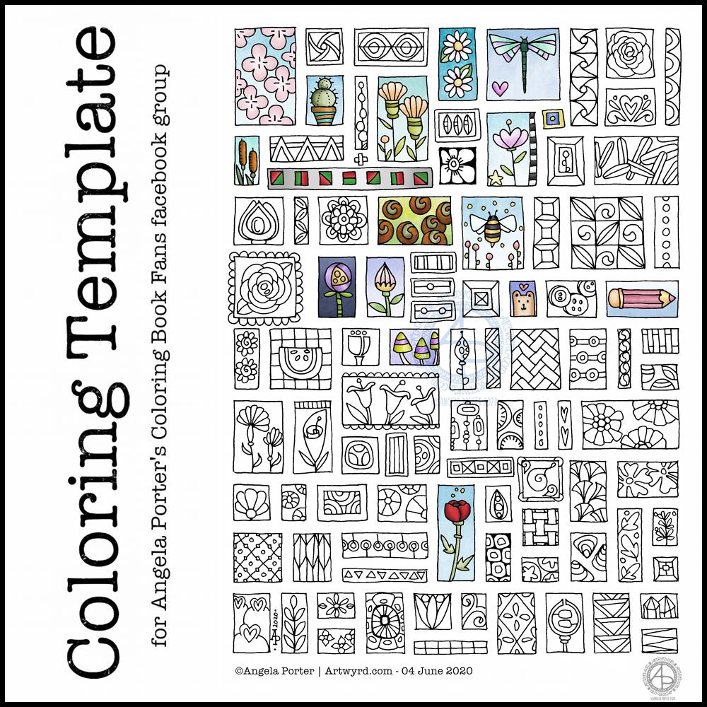
Another week of lock-down during the Covid-19 pandemic has passed, so it’s time for another coloring template for members of the Angela Porter’s Coloring Book Fans facebook group.

I enjoyed drawing last week’s one so much that I thought I’d do a similar one this week. Lots of tiny templates, or windows, in each one.

I drew the designs on dot grid paper using a 04 Sakura Pigma Sensei pen and scanned it in to clean it up. I used Autodesk Sketchbook Pro to colour some of the little drawings in.

Entangled Garden drawing

©Angela Porter | Artwyrd.com

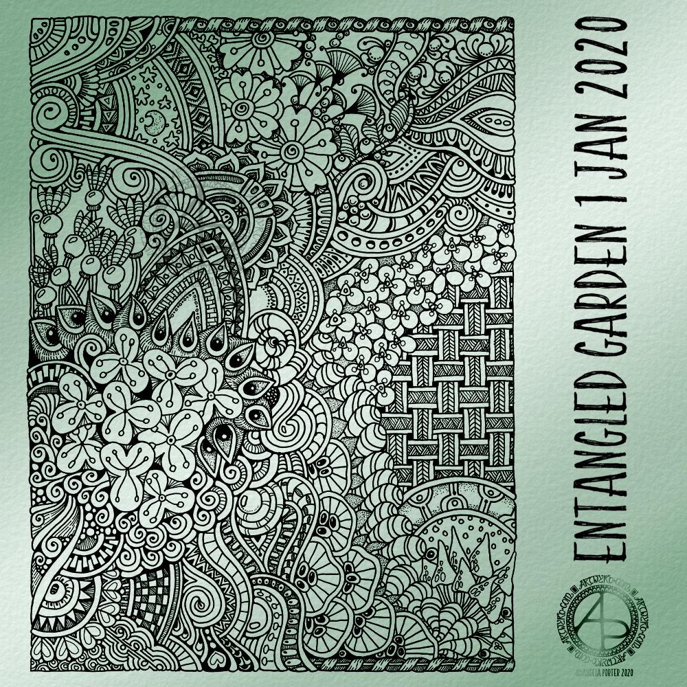
Today, I have another entangled drawing for you to enjoy. I worked on it over the past couple of days. I think it’s taken me around six or seven hours to complete.

Because of all the floral and botanical motifs I’ve called it an Entangled Garden. A garden that has grown from my intuition and imagination.

I’m enjoying drawing these kind of illustrations at the moment. I really do have a fondness for botanical motifs, but also for arches and patterns inspired by Romanesque and Gothic architecture. There’s also some influence from Zentangle patterns too.

I’ve not added any shading to increase depth and dimension. There are places in the design that could benefit from a hint of shadow. However, I’m happy with it as it is.

As a drawing, it is a bit too fussy with intricate details to work as a coloring page as far as traditional media are concerned. However, I do know some colourists who would love the challenge of colouring a design like this!

Having said that, this kind of design, with less details, would be perfect for my next coloring book which I do need to start work on soon. I need the cover done for the publishers by the end of this month. So, I can take inspiration from the drawings I’ve been doing recently, though I do have some other ideas rattling around my brainbox too.

I used Uniball Unipin pens, along with ClaireFontaine dot grid paper. The size of the drawing is approx. 7.5″ x 10″.

I added the background colour and texture digitally, after removing the dots from the dot grid paper.

Happy New Year! Welcome to 2020

©Angela Porter | Artwyrd.com

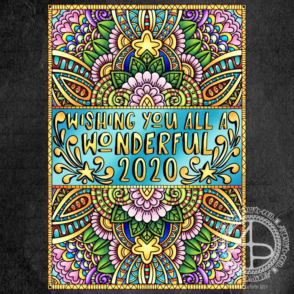
Wishing each and everyone of you the most wonderful wishes for 2020!

Entangled flora

©Angela Porter | Artwyrd.com

One of the nice things about being between contracts is being able to indulge myself in art. It’s also a chance for me to do ‘comfort art’, art that is in a familiar style that I don’t often do.

This is an example of ‘comfort art’. Art that is soothing to do, is intuitive and surprising in how it turns out. I start with pen and paper (dot grid in this case), and just start with a single motif. I then let the design grow from that point, organically and intuitively.

There are always sticking points where I want to give up as it doesn’t look right, or I’m not happy with what I’ve just drawn. However, I’ve learned to persevere past these points and the end design is usually one I’m happy enough with.

There were many sticking points in this one, some of which I thought were going to be shatter points.

Although I’ve deemed this illustration ‘done’, as I reflect on it now, I can see places where some added line texture would help the design be less homogeneous in places and would add some contrast.

Also, some shadows would help add dimension to the illustration. Having said that, colour would really bring the drawing to life too.

For now, though, this design is finished. Whether I work some more on it remains to be seen.

I used Uniball Unipin pens to draw this design, along with ClaireFontaine Sketch dotgrid paper. The only things I did digitally were to scan the design in, remove the dots of the dot grid, and add the background colour and texture and watermarks.