Entangled Mandala Colouring Page

I love drawing mandalas. I love the symmetry, the flow, the sense of calmness that they bring when being drawn or coloured. I am fascinated with the never-ending possibilities of mandala design. They also make it easier for me to arrange motifs and patterns when my head is filled with pink fluffy and sparkly fairy dust (all due to prescribed medication).

This one was fun and a bit different, with some new kinds of motifs in it. The colour palette is soft and soothing, with the splashes of gold give those sunshiny-joyful accents that lift it.

Yes, I know I’ve not finished adding colour. But I really, really need to finish the social media stuff and then go and get something to eat!

This is available as a colouring page to members of the Angela Porter’s Coloring Book Fans facebook group.

Abstract Flowers for an Illustrated Journal

Link to draw with me video on Youtube for the flower to the left.

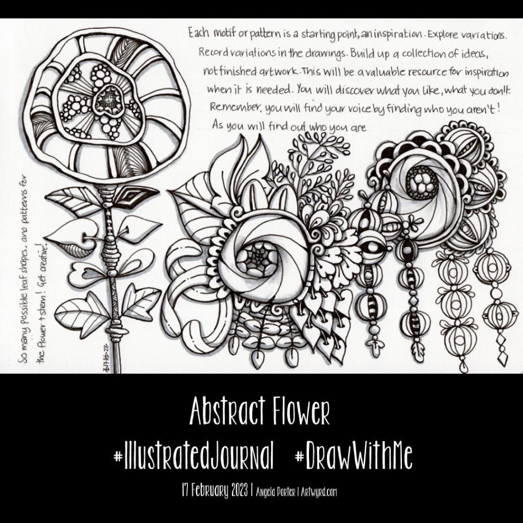
I have decided to keep an illustrated journal full of my favourite patterns and motifs, accompanied by some words of encouragement and, perhaps, advice.

I’ve kept a collection in a dot grid notebook for a few years. However, some people have asked if I’d share it. I thought it was high time to create something similar instead of sharing a battered and dog-eared book. So, that’s precisely what I started in today’s video.

So, I purchased a Talens Art Creation A5 landscape sketchbook for this purpose. I like the paper in it; it’s creamy in colour, so it’s more soothing on my eyes. The scanned page in the image above doesn’t show the cream colour; the struggle with scanners is real! The paper is 140gsm (90lb). It will take a very light wash of water, but I like the fairly smooth surface to draw upon.

For this page, I used a selection of pens:
A micro Uniball Eye for most of the drawing
01 and 03 Sakura Pigma Microns for details
0.38 Uniball Signo DX for the writing.
Faber-Castell Pitt Artist Brush Pens in Cold Grey 1 and Cold Grey III

I’m fairly happy with how the page looks. However, my handwritten notes are a bit … untidy. Hey ho, they’ll do!

I only drew the flower on the left in today’s YouTube video. I couldn’t find the first drawing for this new journal. Stupidly, I’d done that on a loose sheet of A5 dot grid paper and didn’t put it into a folder for safe keeping. I have no idea where I’ve put it. So, that was another good reason to get a sketchbook; it’s harder for me to misplace a sketchbook, though it has been known to happen. So the arrangement from the centre to the right is a replication of the motifs from the lost page.

As I typed that, my mind thought of the Moody Blues album title “In search of the lost chord”. I’m forever in search of my lost artwork!

This is going to be another interesting project. I do seem to pick up and drop projects a lot. The reason is I need variety in what I’m focusing on. Sometimes, I need a bit of a break from a particular project or focus. At other times, I’m just not well enough to do anything more than some challenging ‘comfort art’.

I now need to decide if I’m going to add some colour to this page. I have shadows in place, so transparent/transluscent media will work with that. I’ll think on it. For now, I need tea and something to eat!

Starting to draw some motifs/patterns for a reference book/journal/zibaldone

I’ve been asked several times if I’d make my visual dictionary, pattern and motif collection, journal or art zibaldone available for others. I’ve shown it a few times in videos. It’s my go-to reference when I need some inspiration for my art.

So, today, I thought I’d take some elements from a current WIP and start to put a page together.

I used a piece of A5 dot grid paper with holes punched in it for a six-ring binder. However, I may use an A5 dot grid notebook. To draw the design, I used an 05 Sakura Pigma Micron Pen. Shade was added with a 2B matt Pitt graphite pencil and paper stump/tortillon.

I enjoyed doing this. It was fun to add alternative ways of approaching various elements. That’s how I like to work in my visual zibaldone. And, of course, the variations are not exhaustive! No doubt more will appear in time, either in the zibaldone or in some artwork.

That is what I love doing. Varying and shifting the pattern or motif into something new and different.

Of course, I have filmed myself drawing this page so far, and you can draw along with me by clicking this YouTube video link.

Hearts and flowers mandala

Today’s art is a mandala with hearts and flowers as the main themes. I’ve only used three colours – red, green and gold! That’s surprising to me; usually, I go to town on colour. However, in this case, it gives a coherency to the design I prefer.

One thing I may do is to revisit it and add textures to the spaces between the design elements. And a drop shadow would help to lift it off the paper a bit more.

Mandalas are really soothing and meditative to draw and add colour to. And I certainly need that today.

The last few days have had me intensely inking in colouring pages and adding colour to some of them. Yesterday I was determined to get the last couple done, and I overdid it a bit; my damaged muscles/tendons/ligaments between two ribs are rather stiff and sore. But I got it done! Whimsical Houses is complete, and the cover and back art for the next book is also done. So, now I can take a bit of a breather and spend some time on personal projects.

I’m also so tired today. My mind was working twenty-nine to the dozen last night. I woke before 4 a.m. and couldn’t get back to sleep. So, I see a nap not too far in the future. But before that tea. Lots of tea. Probably some lunch too!

Entangled Art Infinity Card – Parts 1 and 2

I’ve had some fun with this, and there’s more to come. And a bit of a story to tell first.

I was asked on my YouTube channel how I know which patterns go with each other. That’s not an easy question to answer; experience, experimenting, trusting instincts, and having some patterns or motifs that are your go-to ones.

Then, yesterday morning, as I was slowly coming around from sleep, I watched a video on YouTube at Jen’s Arty Inclinations on how to make a fast and simple infinity card for a junk journal.

Jen recommended going to Lynn at Playing with Paper and Glue to watch her video about making a slightly different infinity card. So I did that.

And as I watched and saw how easy it was to make the infinity card (yes, it really is!), I realised that this would be a lovely and different way to collect together my favourite go-to motifs and patterns. And that thought linked back to the comment on my YouTube channel.

So, I made an infinity card, mucked it up a bit, but learned from that. Then I made a HUGE one, which was ridiculously big! So, I made another one to the sizes Lynn gave, which you can see me doing in part 1. Then, I had to add the first panel on the left of the image above.

I went with variations of pokeroot, pokeleaf and pokepods! I’m not sure there’s a pattern called pokepods, but there is now. I cut a notch out of the card and created a little pocket for a drawing, note, colour palette, or something else to be hidden.

I drew with Copic Multiliner Sp pens (0.5 and 0.25, I think). Colour was added with yellow-grey and neutral-grey Ohuhu markers. A white gel pen was used to add dotty highlights and the pattern to the back.

In the video for part 2, I created the panel to the right. Daisies are always a flower I love to draw; I have many variations of them in my memory hoard. The flowy pattern and Diva Dance are two of my go-to patterns; they share some similarities in my head.

For this panel, I used a Uni Emott 0.4 ever fine pen to draw the design, then green-grey Ohuhu markers to add colour. Then, I used a white gellyroll pen to add the dotty highlights.

I wasn’t sure about the Tim Holtz scrapbook paper I used to make the infinity card, but as I added the panels, it mostly got covered up, just a hint of a background behind the drawings.

It may not be the best choice of paper to make the infinity card from, in terms of colour and pattern. However, as I’ve never done anything like this, it was a sacrifice I was willing to make!

Actually, I wasn’t sure about the entire project. I thought it may be a bit odd, whacky, and weird. But, now two panels are done, I’m looking forward to completing the infinity card.

I will be adding more pocketses, possibly even panels that open out to reveal more. There are, possibly, 32 panels to be done, though I’m not sure as I keep losing count! But it’s a longer-term project.

Having said that, the panels are small. Cute even. Perfect for when I have just a little time to draw.

Medieval Inspired Botanical Bookmark

I have no idea why, but tall, thin drawings (bookmarks) just appeal to me. Indeed, they always have.

I enjoyed drawing this one, and I’m fairly pleased with the chosen colours. There’s a soft, muted, vintage palette along with the flowers, seed pods, berries and leaves mainly inspired by Medieval Illuminated Manuscripts and the work of the Arts and Crafts Movement artists.

If you’d like to follow a #comedrawwithme video for this design, just click on this link!

Colouring Page – 28 October 2022

October is nearly at a close. So, this week’s colouring template for Angela Porter’s Coloring Book Fans Facebook group is my last Halloween-themed one for this year.

I absolutely love Halloween; it’s the only yearly celebration that isn’t filled with triggers for emotional upsets. If I could change the date of my birthday, it would be Halloween! It’s not the horror-filled aspects that grab me, it’s the fun and laughter I associate with this time of year.

I love creating whimsical art all year round, but changing the scary for cute is a lot of fun at Halloween. It makes me smile and fills my heart with joy. As far as I’m concerned, skulls and pumpkins, ravens and potions, ghosts and ghoulies and all the other wonderful things associated with Halloween are not just for Halloween!

William Morris Inspired Botanica

Click on this link to view the accompanying Draw With Me tutorial video on YouTube.

William Morris, one of the primary founders of the Arts and Crafts Movement, is one of my favourite artists. I love the ornate botanical and nature-inspired designs of quite stylised motifs. I also love the way that colour is used simply in them. That is definitely something I can learn from!

It can take a while for pennies to drop with me, and I don’t know how it has taken so long before I took a look at Morris’s work.

Like myself, Morris was inspired and influenced by Medieval manuscripts. That explains a lot!

I use some motifs from Morris’s designs in this drawing. I applied colour with chalk pastels to the pen drawings, with subtle white highlights from white charcoal. I’m quite happy with the result; I’ve not decided what to do about the background.

Where is this study going to take me? I don’t really know! But I know it’s going to be an interesting one. I’m particularly interested in how Morris used colour, and I hope that will make me comfortable with my own simple way of adding colour to my art.

Coloring Page – 29 Sept ’22

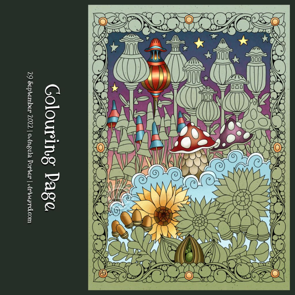
I drew this colouring page for Angela Porter’s Coloring Book Fans Facebook group this morning. It definitely has a fair few autumnal motifs; however, any kind of colours could be used!

I’ve partly added colour to the design, mainly to highlight some trickier areas with lots of detail.

Picture Perfect Pumpkins! – A #DrawWithMe video

Click on this link to view the accompanying video on YouTube.

You can tell I love autumn! I just couldn’t resist another drawing with pumpkins and assorted autumnal motifs. In the video accompanying this picture, I get all the drawing done and start adding colour. This photo is of the completed drawing so far. There’s plenty of space for some more autumnal goodies!

As I worked on some warm, grey paper (‘Clay’ Toned Paper from Fabriano), the colours are muted and feel a bit washed out. Usually, Inktense pencils with a light wash of water are bright and vibrant, but the grey tones mute them somewhat. But I like that. It gives a vintage and nostalgic air to the artwork.

From time to time, I can circle back to drawing styles that I’ve not done for a long time. This kind of drawing, which has an etched ‘feel’ to it, is an example of something I’ve not done for what seems an age. I am, however, enjoying it very much. Exploring working on toned paper with various colouring media is fascinating for sure.