Dandelion Card and Envelope Mail Art

Dandelion Card and Envelope Mail Art © Angela Porter | Artwyrd.com

About the art.

Materials:

  • 5″ x 2.5″ piece of watercolour paper.
  • 5.25″ x 2.75″ piece of black card.
  • 6″ x 6″ blank kraft card with matching envelope.
  • Distress Inks in Bundled Sage, Weathered Wood and Stormy Sky.
  • Distress Oxide Inks in Iced Spruce and Peeled paint.
  • Small paint brushes – I used a 0 for the details and a 4 for the circles.
  • Mini foam blending tool.
  • A spray bottle containing a mixture of gold Perfect Pearls and water.
  • Tim Holtz’s Distress Micro Glaze and a dedicated foam blending pad. (or just your fingers!).
  • A glass pen or other fine nib dip pen.
  • Gold and Silver inks from J Herbin
  • White Sakura Glaze pen.
  • Gold glitter Uniball Signo Pen.
  • Light grey 05 Unipin pen by Uniball.
  • Glue or strong tape to adhere the card layers (I used Tombow Mono glue)

Method:

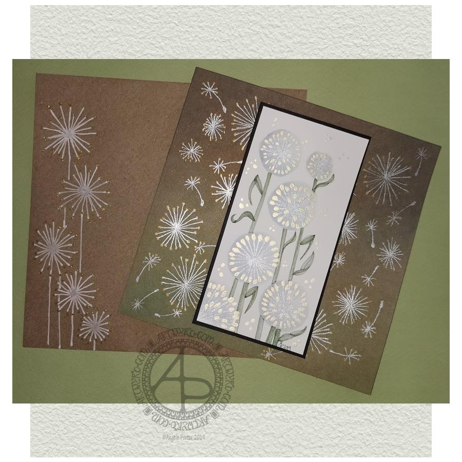
I started with a 2.5″ x 5″ piece of watercolour paper and a brush. I used water to draw circles where I wanted the dandelion heads to be. I then used the brush to add Stormy Skies and Weathered Wood Distress Inks into the water, letting it spread as it liked. To ensure I had a darker area of the seedhead, I dropped the watered-down inks to the bottom and left of the circles.

While the circles were drying, I worked on the card base. I applied Peeled Paint and Iced Spruce Distress Oxide Inks with a mini foam blending tool. Then, I sprayed the card with a mixture of gold Perfect Pearls and water and let it dry. Finally, I used Tim Holtz’s Micro Glaze to seal in the Distress Oxides – they react all too quickly with the sweat in fingers.

By the time I’d set the card base aside to dry I could return to the dandelion seed heads. I used a fine paintbrush, and some Titanium Iridescent Watercolour paint from Cosmic Shimmer to add the stems of the seeds. Once they had dried, I added dots of Enchanted Gold Iridescent Watercolour paint to the stems and set the panel aside to dry.

I wanted to add some dandelion heads and seeds to the card base. I used a glass pen along with silver and gold inks from J Herbin. I didn’t think these would adhere to the micro glaze treated surface, but they did. On a darker background, I could really see how these inks look like liquid metals as they flow onto the paper. They didn’t dull as they dried, thanks to the micro glaze acting as a barrier to the Distress Oxide ink.

Next, I wanted to add the stems and leaves to the dandelions on the watercolour paper panel. I used some Bundled Sage, Weathered Wood and Stormy Skies Distress inks for this. I pressed them onto a sheet of plastic, diluted and mixed them with water and a brush and then used the mixture to add the stems and leaves. I started with a lighter colour wash, adding darker colours to the left of the stem and also under the dandelion heads to add some dimension.

Once I was reasonably happy with the stems, I worked on the leaves. Again, I started with a pale-coloured wash to get the shape of the leaves in place. Then I gradually added darker tones to give a sense of dimension.

When I’d finished this, I looked at the panel, and I wasn’t happy with the stems and leaves. They looked unfinished. So, I dug out a light grey Uniball Unipin pen and proceded to outline the stems and leaves. This improved matters greatly to my mind. I like the way the stems and leaves are now defined and how they contrast nicely with the airy, ephemeral feel of the seedheads.

I then set about adding some dots of the gold watercolour around the arrangement of dandelion seedheads, added my symbol and year, and that completed the top panel.

I cut a piece of black card that was approx. 5.25″ x 2.75″ and adhered the top panel to it. I then adhered these layers to the card base.

My last task was to decorate the envelope. I used a white Sakura Glaze pen to draw some dandelion seedheads. When the Glaze pen lines had dried, I used a gold glitter Uniball Signo gel pen to add dots.

My reflections.

I started with a 2.5″ x 5″ piece of watercolour paper and a brush. I used water to draw circles where I wanted the dandelion heads to be. I then used the brush to add Stormy Skies and Weathered Wood Distress Inks into the water, letting it spread as it liked. To ensure I had a darker area of the seedhead, I dropped the watered-down inks to the bottom and left of the circles.

While the circles were drying, I worked on the card base. I applied Peeled Paint and Iced Spruce Distress Oxide Inks with a mini foam blending tool. Then, I sprayed the card with a mixture of gold Perfect Pearls and water and let it dry. Finally, I used Tim Holtz’s Micro Glaze to seal in the Distress Oxides – they react all too quickly with the sweat in fingers.

By the time I’d set the card base aside to dry I could return to the dandelion seed heads. I used a fine paintbrush, and some Titanium Iridescent Watercolour paint from Cosmic Shimmer to add the stems of the seeds. Once they had dried, I added dots of Enchanted Gold Iridescent Watercolour paint to the stems and set the panel aside to dry.

I wanted to add some dandelion heads and seeds to the card base. I used a glass pen along with silver and gold inks from J Herbin. I didn’t think these would adhere to the micro glaze treated surface, but they did. On a darker background, I could really see how these inks look like liquid metals as they flow onto the paper. They didn’t dull as they dried, thanks to the micro glaze acting as a barrier to the Distress Oxide ink.

Next, I wanted to add the stems and leaves to the dandelions on the watercolour paper panel. I used some Bundled Sage, Weathered Wood and Stormy Skies Distress inks for this. I pressed them onto a sheet of plastic, diluted and mixed them with water and a brush and then used the mixture to add the stems and leaves. I started with a lighter colour wash, adding darker colours to the left of the stem and also under the dandelion heads to add some dimension.

Once I was reasonably happy with the stems, I worked on the leaves. Again, I started with a pale-coloured wash to get the shape of the leaves in place. Then I gradually added darker tones to give a sense of dimension.

When I’d finished this, I looked at the panel, and I wasn’t happy with the stems and leaves. They looked unfinished. So, I dug out a light grey Uniball Unipin pen and proceded to outline the stems and leaves. This improved matters greatly to my mind. I like the way the stems and leaves are now defined and how they contrast nicely with the airy, ephemeral feel of the seedheads.

I then set about adding some dots of the gold watercolour around the arrangement of dandelion seedheads, added my symbol and year, and that completed the top panel.

I cut a piece of black card that was approx. 5.25″ x 2.75″ and adhered the top panel to it. I then adhered these layers to the card base.

My last task was to decorate the envelope. I used a white Sakura Glaze pen to draw some dandelion seedheads. When the Glaze pen lines had dried, I used a gold glitter Uniball Signo gel pen to add dots.

Reflections on this project.

When I started, I only had a rough idea of what I’d like to do. I knew I wanted to use watercolour media and stylised dandelion heads.

At first, I tried to make the circles for the seed heads by using a Tombow Dual Brush pen to draw the outer circle. Then, I used water and a brush to get the ink to bleed into the circle.

The result wasn’t pretty.

So, I regrouped and tried Distress Inks and water, and I was much happier with the result, and the card grew from there.

I’m pleased that I ran with a more stylised dandelion head than I’d initially considered. One of my artistic strengths is my ability to create stylised motifs. I certainly think I managed to do that with the dandelion heads and their leaves, especially as watercolour media is not a strength of mine.

I’m also glad I used the iridescent paints to add the details. That makes my inner raven very happy. The use of metallic inks on the card base increased the happiness of the raven even further!

I was about to give up on the card when I’d added the stems and leaves with just Distress Inks; I wasn’t happy with them. However, trying the grey line made all the difference in the world. The dandelions went from almost being consigned to the waste bin to being good enough.

I’m now happy with the card and the envelope; it’s something I’ll try again in the future, maybe. After all, I do have a few more watercolour paper panels that need to be used!

So, Angela, how are you today?

Yesterday, I had EMDR therapy. The session was quite painful, physically, and a bit distressing emotionally. I felt content and optimistic going to the appointment, and I left feeling pretty much the same. However, I suddenly became exhausted when I was half-way home. And I do mean exhausted. I felt my eyes trying to cross and close.

I made it safely home and, after having a little something to eat, I collapsed into bed and slept until early evening.

I was still really tired when I woke, but a random chancing upon crochet patterns for hyperbolic surfaces and ammonites kept me up for a while. Indeed, I lost myself in crocheting hyperbolic forms.

This morning I woke feeling content and optimistic and cheerful. The sun was shining, which always helps my mood for sure.

Even though I was feeling sunny inside, I wanted to spend time on a little project or two today. I didn’t want to push myself after what turned out to be a gruelling EMDR session yesterday. So, that’s why I threw myself into creating this little card.

Now, it’s nearly 7 pm here in the UK, and I’m bone-tired once again. I’ll spend the evening either creating another card or crocheting. Either way, it’s self-care time.

Dangle Design Greeting Cards

Dangle Design Greeting Cards © Angela Porter | Artwyrd.com

Today I have two card designs for you, both featuring dangle designs, but in different ways.

If you like dangle designs and you’d like to give drawing them yourself but need a little help or inspiration, then you may find my book “A Dangle A Day” of interest. In the book, I take you, step by step, through how to draw over 100 dangle designs, along with some ideas of how you could use them. 

Love Ya and With Love Card.

I started by using the Foursquare Backdrop: Portrait die from lawn fawn to cut the frames and panels from a piece of Winsor and Newton Bristol Board. I purchased this die, and the one in the second card, from Seven Hills Crafts here in the UK.

Next, I used Stormy Skies and Broken China Distress Inks to add a subtle colour gradient to the panels.

My idea was to draw four different dangle designs for each small square panel. I also wanted to include some hand-lettering, which I did.

So, I used Unipin pens from Uniball to do the drawings and lettering. I did use pencil outlines for the ribbon banners and lettering to make sure their placement was just right.

I coloured the design elements and charms using Copic markers. As the individual design elements were so small, I just used two colours to achieve shading in the bigger ones.

I also added a drop shadow around the designs using a BV marker that is a greyish-violet. It’s a very subtle drop shadow.

I had to add some sparkle and shine to the card, so I used a clear Spectrum Noir Sparkle brush pen along with a gold glitter Signo gel pen to do this.

To assemble the card, I glued the frame to the card base using Tombow Mono adhesive. Then, I glued the square panels into place.

I managed to get glue onto the front of the card and trying to rub it off while wet just left a dark, dirty smear. I’ve ordered some Tombow Sand erasers to see if they’ll remove the mark. If not, I’ll have to either work out another way to cover it up or just consign the card to the pile of things not to do again!

Black and white floral card.

Again, my first job was to cut out the frame and panels using a die. For this card, I used the Foursquare Backdrop: Landscape die from lawn fawn along with Winsor and Newton Bristol Board. I also decided to use this die in portrait mode.

To draw the design elements, I used Unipin pens from Uniball. I hung dangle designs from the top of each card to fill in some of the space that was there. I wish I’d used a slightly thicker pen than the 01 though. They look almost like an afterthought.

Anyway, once I finished the drawings, I wasn’t sure whether to add colour or not. So, I’ve left the pictures as black and white line art for now.

I used Tombow Mono glue to attach the frame and panels to a 5″x7″ piece of Winsor and Newton Bristol board. I did this as I realised that the dies are made to fit card blanks made from half a sheet of US letter-sized paper folded in half. In the UK, we use A4 sized paper, which is different enough in size to make it awkward to cut the paper to fit the card. I have ordered some 5″ x 7″ card blanks with envelopes, and then I can finish assembling this card. I’m likely to trim the foundation panel down a little and maybe try to carefully add some colour around the edge. Maybe.

It’s at this point I’ll decide whether or not to add colour and to see if I can thicken the lines around the dangles without messing it up. Mind you, if I do mess it up, it’s another experiment I can learn from, hopefully remembering not to do this again.

Things I’ve learned and techniques I want to try.

The lawn fawn dies work great! They come with smaller dies – heart, cloud, small star, large star, sun, small sun and speech bubble – which may be useful in the future. I had made my mind up that I’d limit myself to die sets that are simple in shape to for cutting out panels to draw on and maybe for layering. 

I rolled my eyes at myself when I worked out that dies from an American company would work best with American sized paper for card bases. However, I can work around that now I’ve realised that. I’m comfortable working with inches; most of my craft tools have both inches and centimetres on them. However, the inches are visibly the most dominant measurement system. 

Glue. Me and glue. Not sure how I can avoid smearing in the future. Hopefully, the sand eraser will help to remove my gluey, sticky, dirty-looking mistakes.

I like using Distress Inks for backgrounds. However, the pale colours of markers that I prefer to use are translucent and so combine with the background. I could use other media such as coloured pencils for colouring. Or I could use distress inks or water-based marker pens with a damp brush to add colour. I could also use a damp brush to remove some of the distress inks. In that case, I may have to use watercolour paper instead of Bristol Board.

I could also use a Versamark pen – which contains transparent, sticky ink – to colour over my design elements once coloured and then use clear embossing powder and a heat gun to protect the colours. I could then add the distress inks after heat-setting the embossing powder. The embossing powder would add some dimension and shine to the cards. If I used a sparkle pen or gold gel pen, for example, the embossing would encase it and highlight these embellishments Ieven more, I think. I need to try this idea out!

So, there are lots of possibilities for going forward with this.

So, Angela, how are you feeling today?

I’m feeling the more content and optimistic than I have for the past two or three weeks.

I’m still feeling out of kilter; changes are happening in my perceptions around my emotional/mental wellbeing. I’m also aware of shifts that are happening in other parts of me.

I’m still poop-scared about what is going on in the world. I can’t see that ending anytime soon, however. This, and the rest of the emotional rollercoaster I seem to be on, are still upsetting my digestive system, so I’m not feeling too well much of the time. 

Yesterday, I was so unsettled and scared that I couldn’t settle to do much art, and I became so dissatisfied and frustrated with whatever I did. I couldn’t settle to anything else either – not crochet, reading, nothing. 

As I’ve said, today I do feel better, so I need to turn my attention to trying out Affinity Publisher to create some materials I’ve been commissioned to do (the artwork and inserts for a CD by a band!). I’ll see about setting the templates up first and go from there. I’ve not tried to do this the past couple of days as I know my head and my emotions weren’t in the right place. I’m not sure that they are today; it’s only by doing that I will find out whether they are or not.

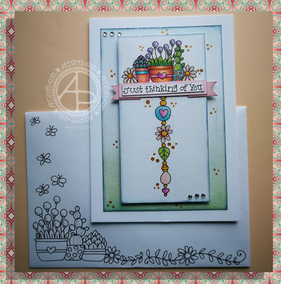
Thinking of you – a dangle design card

© Angela Porter 2019

This little card and envelope took me around 3 hours to make. I had to remember how to do various things and find my supplies to do them with!

My first task was to make the sentiment banner. I had the idea for this one after someone asked me for recommendations of good books for learning hand lettering as they’re not at all happy with their handwriting.

Hand lettering and handwriting are not the same thing. Hand lettering is something you unconsciously do. Hand lettering is the conscious and deliberate drawing of letters, one by one. Practice, like everything else you want to learn and become good enough at, is important. I suggested that they try printing the sentiments out on their computer or using words cut out of books or magazines or stickers or stamps and ink pads used by card makers until they’re comfortable with their own lettering style.

That led me to thinking that rather than writing the sentiment directly onto the paper that I’m going to draw the dangle design on, what about if I hand lettered it on paper again and again until I’m happy with it and then cut that version out. I could then layer it onto coloured card to make a border, or onto the paper or or or…

So, that’s what I wanted to use here. A variation on what I’ve done in previous cards. I cut two trips of mixed media paper, one around 1cm wide, the other around 0.7cm wide.

On the narrow strip I wrote my sentiment. I did this confidently as I knew if I got it wrong I could always write it again – I’d not ruin my dangle design in any way. I then trimmed the strip close to the start and end of the sentiment.

Next, I coloured the wider strip of paper with victorian velvet Distress Ink. I trimmed one piece so it was just a little longer than the sentiment. Then, I cut two rectangles from the coloured strip. I cut triangular notches into one end of each of the rectangles. I used the sponge applicator to make sure the edges of the coloured pieces, including inside the notches, and the sentiment strip coloured. By doing this, there’s a darker edge to the pieces and this defines them against the background. The final step in making the banner was to glue the pieces together as shown in the photo.

I cut two pieces of mixed media paper for the front of the card. The smaller one I made a little narrower than the sentiment banner; I wanted the ribbon to hang over the edge a little. I used a pencil to mark where I wanted the banner to sit on the card. I then used a pencil to mark out the centre of the card so I could position my dangle centrally.

Above where the ribbon would sit I wanted to place an arrangement of pot plants – succulents and a cacti. Below I wanted a fairly simple dangle, but one that had elements that appeared in the arrangement of pot plants. I drew these with a 05 Uniball Unipin Pen.

I then wanted to colour the two pieces of mixed media paper before I coloured the designs in.

For the larger one I used Peacock Feathers, Bundled Sage, Weathered Wood and Tumbled Glass Distress Inks to colour the whole of the paper panel. I edged this panel with Faded Denim Distress Ink. Then, I lightly sprayed the panel with water so that I’d get some faded watermarks as a texture in the colour.

For the upper panel, I used a very light hand to add the same Distress Inks to the paper, but in a much paler shade. I also edged this panel with the Faded Denim Distress Ink. I realised it hadn’t erased the pencil guidelines before I added the Distress Ink so when I went to erase them they wouldn’t fully erase. I’d forgotten that I had to do that! Still, it adds a bit to the distressed feel of the cards, that and the damage marks that were on the larger panel too.

To colour the dangle design I used Mitsubishi Uni coloured pencils. I used a fairly limited palette across the design.

The last two steps before assembling the card were add dots of gold ink and some shiny adhesive crystal gems.

To assemble the card I used glue to adhere the lower panel directly to the card. I then used foam squares to adhere the dangle design panel to the lower panel and the sentiment ribbon to the dangle design panel. This card has quite a bit of dimension to it.

My final job was to decorate the envelope. I decided to draw some pot plants and some of the daisies along the bottom. I added some butterflies to the left as the area above the pot plant seemed empty, unbalance. I haven’t coloured the envelope in as I’m in two minds whether to or not. Also, it would be nice to edge the envelope with the Faded Jeans Distress ink too, maybe even colouring the envelope with the same Distress Inks as the card. There’s also the back flap of the envelope that would benefit from a little potted succulent drawing I think.

Distress Inks are water-reactive, so if I do this, once the envelope is addressed a light application of Micro Glaze would seal the colour in so it wouldn’t be damaged in the mail.

I’m actually quite pleased with this card. It’s got me thinking about how to do more of this kind of stuff – card making the ‘Angela’ way!

If you give making cards like this a go, I’d love to see what you create! Happy art-ing, lettering and crafting!

Lots of ideas for dangle designs are shown in my book
‘A Dangle A Day’.