As I was coming around from yesterday’s headache, I plopped yesterday’s drawing into Repper to see what geometric patterns and tiles I could create.
Repper is a browser app that is great fun to play around with and makes the creation of tiling patterns from my artwork so simple.
Rather than save the patterns, I saved the tiles as so many of them looked like perfect inspiration for mandalas.
So, I chose one design, popped it into Autodesk Sketchbook Pro, and used it to inspire this particular pattern.
I chose a colour palette of soft pinks and greens, colours that are related to self-love, self-care, balance and harmony. Perfect for how I was feeling yesterday!
Today, I’m still feeling somewhat tired and fragile. That’s mainly due to a really poor night’s sleep. Emotionally, however, I feel a lot better than I have the past few days. There was an emotional storm brewing and it the headache was the torrential downpour that was needed to clear the skies by forcing me to take care and shelter myself.
So, the rest of today is going to be a quiet. nurturing kind of time to shake off the lingering wisps of stormy clouds.
Finished! The addition of coppery tones was a bit of a surprise, even to me. But it seemed the right thing to do. I do like the combination of copper and the verdigris tones of teals, greens and blues.
I spent some time darkening the shadows in the inner rings of the mandala, as well as adding some depth of colour. They looked so washed out against today’s additions.
Also, I changed the colour of the background. Everything was so lost against the teal background.
Digital art – Autodesk Sketchbook Pro – Microsoft Surface Studio and Surface Slim Pen.
This morning, I felt the need to draw a mandala. So I did.
Intricate, detailed drawing, with one of my favourite colour combinations that remind me of verdigris on copper. Just what I needed this morning as I gradually work myself into a creative mood. So it’s time to turn my attention to work for Entangled Starry Skies. Once I get a fresh mug of Yorkshire Tea that is.
Insomnia, again.
I didn’t sleep too well last night. I woke and drew for a while as I waited to become drowsy enough to fall back to sleep. I’m still not really with it at this time, but I’ve been focused enough over the past few hours to complete this mandala.
I now have some more weird, anthropomorphic intuitive drawings to work with in the coming weeks. Just not today.
Media used.
Autodesk Sketchbook Pro is still my art app of choice, along with my Surface Studio.
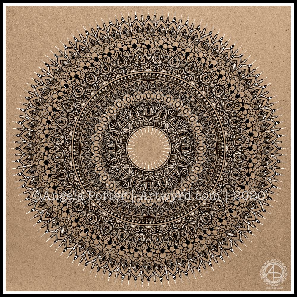
I really enjoyed creating this mandala this morning! I used some of my favourite motifs in this one. it was lovely to use white on the kraft background, to bring out some highlights and add dimension here and there.
I love to use Autodesk Sketchbook Pro to draw my mandalas in. It streamlines the process and allows me to focus on creating the design rather than the mechanics/geometrics. Of course the design is drawn by hand, just as it would be on paper. That’s the beauty of having a Microsoft Surface Studio and Surface Slim Pen – I can draw with the pen on the screen just as I would with pen on paper. The advantages are that if I mess up, it’s easy to correct, and the symmetry tool saves time, allowing me to focus on the fiddly details that I love so much.
Sunday morning is always a time to breathe, relax and create something easy and pleasurable to do. Comfort art. Today, that meant a mandala and a quote that is quite appropriate for this morning.
Mandala creation makes me smile inwardly. It’s a familiar process and I can create a mandala that is complex and detailed, or simple, and the calming, relaxing effect is the same.
I do draw my mandalas digitally. By using Autodesk Sketchbook Pro’s symmetry tools, it streamlines the process for me. There’s also the removal of the frustration that is caused by an error or a smudge. I can focus on the relaxing, soothing process and on being creative.
In that vein, I decided to draw the mandala in black on white. But when it was finished, I wanted to use a background and a monochrome colour scheme.
I love kraft paper. I don’t know why. I think it’s that colours seem to almost glow against it. So, I chose that for the background. Then, I created a layer of creamy, orange-yellow tones to highlight the line art. Nice warm, comforting, gently glowing colours.
Finally, I created some drop shadows for the text and mandala.
I look at the finished mandala and I smile, gently. I feel my heart fill with some warmth and a sense of lightness.
Creating art, including mandalas, lets my soul shine. What makes your soul shine? Take time today to indulge your soul in activities that let it do so.
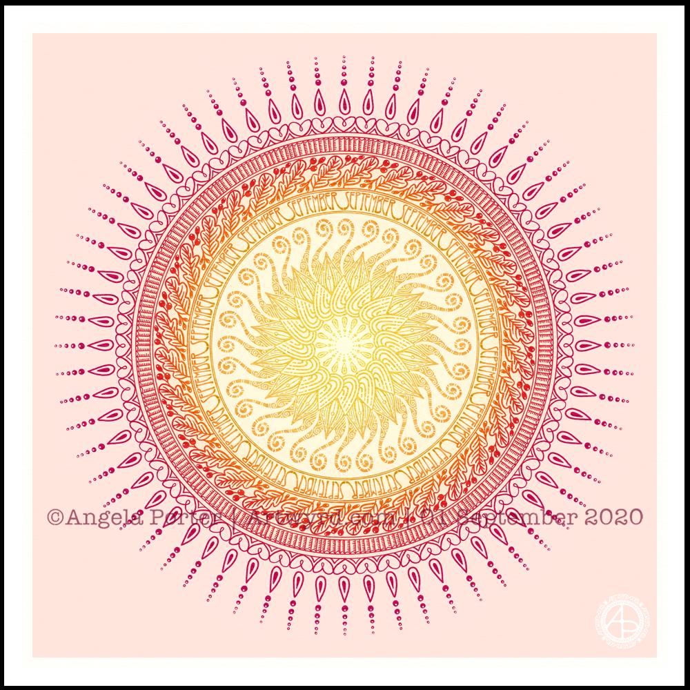
It’s a sunshiny, blue-sky morning with a distinctly cool and freshness to the air. It really feels like autumn is on it’s way. So, I’ve created a mandala to welcome the change of month, and the incipient change of season. I even practised my hand-drawn typography / hand-lettering.
What I missed out on doing was having a 9-fold symmetry for the ninth month. Ho hum. Perhaps I’ll just create another!
I’m also not at all sure of the background colour. It’ll do for now. After all, this is my morning warm up art.
Drawn in Autodesk Sketchbook Pro using Microsoft Surface Studio and Microsoft Surface Slim Pen.
This week, I have an entangled mandala design, with a zentangle-style background. It always seems a shame to waste the space around a mandala when it’s a page for breathing life into a design with colour.
I drew this design in Autodesk Sketchbook Pro using a brush that changed width with pressure. That allowed me to add some dimension to the lineart. But it is colour and shading that really brings a sense of volume to the design.
Yesterday, I thought I’d give Clip Studio Paint a go. The bottom part of the template above was coloured in Clip Studio, the top part in Autodesk Sketchbook Pro.
I spent yesterday afternoon, and a bit of this morning, colouring part of the template above in Clip Studio Paint. So, these are my first impressions of Clip Studio Paint and a comparison with Autodesk Sketchbook Pro.
I think it’s impossible to tell the difference between the colouring I’ve achieved with both programs. What is different is the user interface more than anything else.
I’ve long been a fan of Autodesk Sketchbook Pro, and that isn’t going to change. I love the intuitive and rather beautiful interface of the software, the menus on screen and the colour and brush ‘pucks’. Everything is done easily and simply through the quite minimalist, yet powerful, tool bars and menus. Keyboard shortcuts are available, but I prefer to use my pen directly on the screen as I work. It makes working digitally as natural as working with traditional media.
As I’m familiar with the Affinity suite of programs from Serif, working out what the different menus and tools,, which are similar to Photoshop, wasn’t as confusing as it would’ve been in the past. Thanks to working with Sketchbook Pro, I have a better understanding of what the various tools do.
While the tools and options are all accessible on the screen, I find it frustrating and time consuming as I seem to have to perform more steps in Clip Studio Paint to do the same task as I would in Sketchbook Pro. I’m sure there must be keyboard shortcuts, which may help streamline the process somewhat. However, I work directly on the screen with Sketchbook Pro and the only time I use my keyboard is name the file before saving it, or if I want to add text to the art. Usually, they keyboard is out of the way so that I can adjust the angle and distance of the screen to suit my comfort.
I do prefer the way I can choose colours in Autodesk Sketchbook Pro, as well as the ease of creating a custom palette. Sketchbook Pro also comes with a separate Copic color palette. Being able to move them around the screen means I can pop them where I like, make them easily and quickly accessible for me.
Don’t get me wrong, there’s a comprehensive colour palette and various options of viewing colours in Clip Studio Pro, but I like the more intuitive and streamline way of doing it in Autodesk Sketchbook Pro. It’s just personal preference more than anything.
Having the colour puck makes it easy to alter the saturation and tone of a chosen colour really quickly. The brush puck makes changing the size and opacity a breeze. I keep the pucks close to where I work for convenience.
Again, there’s nothing wrong with how all this is done in Clip Studio Paint, but I just prefer the ease with which I can do everything in Sketchbook Pro.
The Sketchbook brush palette is a great tool too; I have all my favourite brushes available in one, easily accessible place. A click on this palette and I can access all the brush sets I’ve either downloaded or created so I can add or remove brushes as I need to.
The zoom and rotate touch functions only work separately. I found this a clunky and awkward way to work. I think that’s because I’m used to doing both at the same time and at will in Sketchbook Pro.
What I did like are the many more choices of brush effects in Clip Studio Paint. However, I think I can replicate many of them in Sketchbook. There are some interesting brushes in Clip Studio Paint, but nothing that I couldn’t replicate if I found I really wanted to use them.
Anyway, I will persevere with Clip Studio, working with it from time to time to become more familiar with it. The ability to draw vectors may be helpful in the future, but then I have Affinity Designer on my ‘puter, which is Serif’s version of Adobe Illustrator.
Also, I’m hoping I can find a way in Clip Studio Paint to work in CMYK rather than RGB. When I convert files to CMYK for printing, the colours shift and I’d like to work in roughly the colours that would be printed.
Overall, I think it’s a good, affordable application. It’s a fraction of the cost of any Adobe Product. I paid £40 for the Clip Studio Paint version; that’s a one-off purchase and you have free upgrades for life. You also get access to online resources created by other Clip Studio Paint users.
This price is on a par with the price of each of the Affinity suite of programs (approx £50 each), and there are regular, free updates to the software.
You can get Autodesk Sketchbook for free, though I subscribe to the pro version monthly for approx. £12; it does have a few more features than the free version. Just because Sketchbook is free doesn’t mean it’s not professional; it is. It doesn’t look powerful, but it is.
How much will I use Clip Studio Paint? That I’m not sure. Perhaps with more use the frustrations I experienced with lessen as I become more familiar with the software. Perhaps I’ll gain fresh ideas on what effects I can try out in Autodesk Sketchbook Pro.
Do I think Clip Studio Paint is a bad program? Not at all. It seems to be powerful and similar to Adobe Photoshop and artists and illustrators are able to create fantastic artworks with it. I’m sure that if you are familiar with the way Photoshop works, you’ll find Clip Studio Paint an easy transition to make.
Personally, I find the way the menus are set up hard work and time consuming to use. I’ve been spoiled with the simple sophistication and intutive nature of the Autodesk Sketchbook interface, no matter which version you use. I find I spend less time clicking on menu after menu to get to what I want to use, and more time creating art in Sketchbook. That may be a function of my familiarity and comfort with the software. What I don’t want is to feel I’m struggling or working so hard to get an effect I’d like when I could do it so simply in Sketchbook.
One thing I know is that Autodesk Sketchbook Pro will be my go-to digital art program. It does all I want to do digitally, and most probably a lot more I’ve not worked out yet.
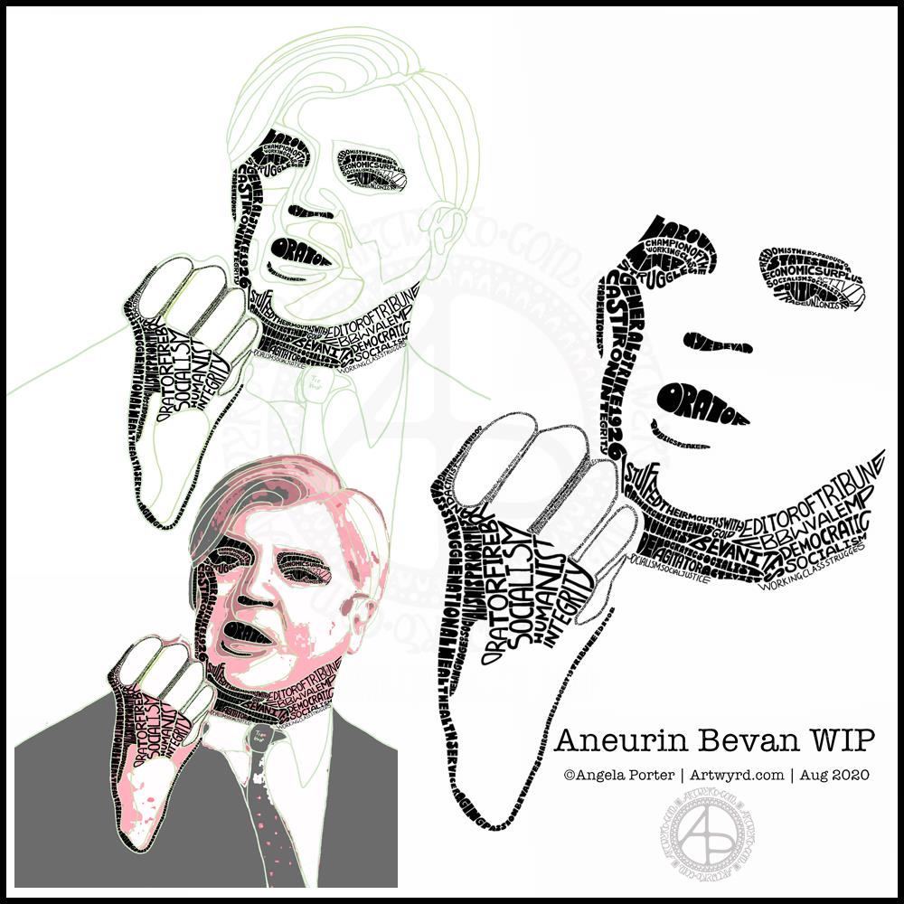
This morning I’ve been working on my typographic portrait of Aneurin Bevan. This portrait is the third iteration. I’m learning as I go along, trying out ideas as they occur to me.
I started with the photograph Nye Bevan and used the posterise tool in Affinity Photo to create areas of contrast. Then, I added colour to these areas to help me differentiate ‘twixt them. I completed this task in Autodesk Sketchbook Pro.
The next stage was to draw lines around these areas of colour, smoothing them out somewhat, and using artistic interpretation where necessary. These are the green lines that delineate the areas for different weights of text. I’ve decided to leave the white areas blank.
The green guidelines have been changed and edited as I work the portrait.
The area that was vexing me most were the fingers. However, I had an idea to use tiny lettering to add some deep shadow. I’m sure I’ll work out how to add some lighter shadow areas later on (my mind is already ticking over that issue) to give more volume to the fingers.
They typography is hand drawn and I’m having to come to terms with the struggle I’m having with my perfectionist side. This isn’t to do with the shapes of the letters, but the weight of them and making sure that they are consistent. As I’m hand-drawing the letters, then they are going to be imperfect, and I need to learn to accept when they are good enough.
Also, those imperfections and style of lettering are personal to me, and that is what will differentiate my work from others.
I’m also struggling with letting go of the desire to be as photographically accurate with the portrait as I can be. This is where learning to simplify the shapes of the different areas of contrast comes in, and recognising they don’t have to be a perfect copy of the photo in order for the resulting portrait to be recognisable as Aneurin Bevan.
One other thing I’ve done is to let go of trying to use full quotes in the portrait. I’m using repetitions of words and short phrases that represent Nye – personally, politically and in terms of achievements. I’ve realised the portrait doesn’t have to be a grammatically correct biography! I will, however, be using quotes to fill in his jacket.
I’m not sure what to do with his shirt and tie yet. It will fall into place soon enough I’m sure.
Working digitally helps me in so many ways. It takes away the frustration of starting over again if I make a mistake, and also minor frustrations. I gain a confidence to try things out, knowing that if they don’t work out I’ve not screwed up the rest of the work I’m happy with.
Working digitally, for me, is like working with pen and pencil on paper. I use a digital pen on the screen of my Surface Studio, just as I would pen on paper. It’s easy to undo and edit changes made. It removes from me the pressure to be perfect first time and helps me to persevere when things aren’t working as I’d like them to.
All the skills I’m learning digitally, in terms of the hand-drawn typography and being more patient with myself and allowing my work to be ‘perfectly imperfect’ is transferable to the work I do with traditional media too.
This morning was a morning that I needed to do some art that was familiar, calming, soothing and intricate enough that I could lose myself in it. A mandala always fits that bill. Always. It doesn’t matter if it’s drawn with pen and ink on paper or digitally. The mindful, calming effect is the same. It’s the process that matters, the repetitive shapes and patterns that are drawn that contribute greatly to the soothing effect.
I do tend to gravitate towards digital art, and I find the symmetry tool in Autodesk Sketchbook Pro helps to save a lot of time. The ability to erase ink removes the frustration that a mistake creates for the hyperperfectionist part of me.
Other than those time-saving (and frustration-saving) tools, the process of mandala drawing is the same for me.
It starts by using a compass, protractor and ruler to set out the circular grid. Then, it’s digital pen on screen to draw the mandala in exactly the same way as I would on paper, just without so much repetition of sections.
However this was created, it has served it’s purpose – given me some time and space for inner peace and contentment.