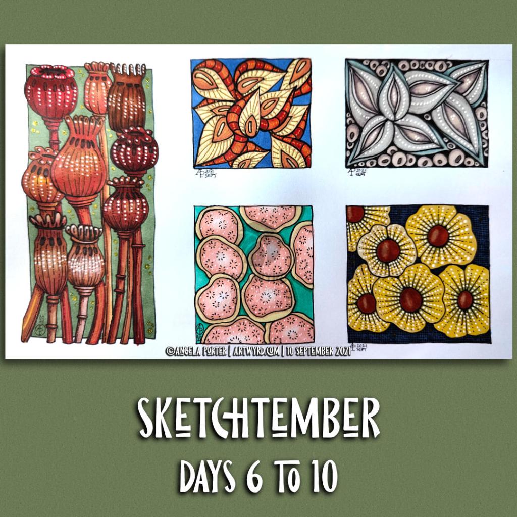
Over the past three or four days, I’ve been quietly working at Sketchtember. I’ve veered away from the list of herbs to enjoy drawing, and colouring, all kinds of seed pods – real and more imaginative.
Working with alcohol markers – Chameleon and Arteza – is the only way to get to grips with them. Marker paper does make it a little easier to blend. But not much more than the drawings on the SeaWhite all media paper that I’ve been using.
Adding highlights, lowlights, and embellishments with various Sakura and Uniball gel pens is a lovely thing to do. I have, possibly, gone a bit over the top on the poppy seed heads! Still, it’s all experiencing and learning from it.
I have quite a few more seed pod drawings done to add colour to, though not enough to see me through to the end of Sketchtember. So, I may change my theme for daily sketches when I start to come to the end of them.
Adding more colour to the entangled drawing on the left has taken quite a bit of time this morning. As well as using the Arteza Ever Blend markers, I used some of my Chameleon Color Tones pens too. There were some colours that I wanted to use that aren’t in the Arteza set.
It’s going to take quite a few hours more to finish adding colour to this drawing. That bright green section in the bottom left is going to need toning down! But that’s easy enough to do by ‘glazing’ with a duller colour. I also went over the pods on the bottom right with the colours again to intensify them a little, and added some deeper shadows as I did so.
It’s coming along nicely, apart from that bright green! Ho hum, I really do need to pay more attention to which colour I’ve actually picked up to use rather than just assuming it’s the colour I wanted to use.
Sketchtember Days 7 to 16
Yesterday evening and this morning, I spent time drawing small drawings featuring various seed pods. I’ve decided to take a different direction for Sketchtember and abandon the prompt list I’ve been following.
Why? I was a bit bored with drawing leaves, the occasional whole plant, the odd flower and various enlarged views of the various parts of flowers.
I love plants. I do. But I really love capsules, pods and seeds! So, I went with this idea
After splitting the large 9″ x 12″ sheet of Arteza marker paper up into smaller rectangles and squares, I used Copic Multiliner, Tombow fudenosuke and Uniball Unipin pens to draw the designs.
When the drawings were complete, I went to scan the sheet in and realised it wouldn’t fit on the glass plate of my A4 scanner/printer! Duh! But not a problem, I just split the page up into smaller pieces.
Next, I spent some time adding colour to a couple of the designs using the Arteza Ever Blend markers to test out the Arteza marker paper.
This paper is noticeably thicker than the Canson XL marker paper I’ve been using. But it works just as well with markers. It’s also as nice to draw on with the various pens I used.
The only thing I wished is that I’d remembered my scanner takes paper that is a little bigger than A4, but not this big! Not a problem though.
Continuing with DeadlyDots’ prompt list for Sketchtember. Thyme was day 4’s prompt, and Basil is today’s. I’ve got the title for tomorrow done (Bay leaf).
Plenty of pen drawing and some coloring with Chameleon color tones markers. A little bit of messing around with patterns on the thyme page.
It’s an enjoyable process, though today I think I’ll take a little break from it and turn my attention to projects that need some work done on them, and maybe new drawings to be done.
Yesterday’s coloring template for the Angela Porter’s Coloring Book Fans facebook group all coloured and shaded. I used Chameleon alcohol markers to add the colour and some shading. I also used a graphite pencil and a tortillon to darken the shading and add shadow to the lighter areas. It’s turned out OK.
This morning, I made a video of me drawing and colouring this festive dangle design and turning it into a card.
This video shows me drawing in real time, and I hope you enjoy it, despite the wobbliness in places.
Here’s a list of materials I used:
8″x 8″ Winsor and Newton Bristol Board folded to make an 8″ x 4″ card
7″ x 3″ piece of Winsor and Newton Bristol Board to draw the design on
Faber-Castell Pitt Artist Pen, medium
Pencil and ruler
Various Chameleon Color tones marker pens
White Uniball Signo gel pen
Tombow Mono glue
Tumbled Glass Distress Ink and a mini foam blending tool
I hope you have a go at drawing this dangle design and making your own papercraft or craft projects with it. If you do, I’d love to see them!
If you’d like to know more about drawing dangle designs, or would like more inspiration, step by step instructions, and encouraging words, then my book “A Dangle A Day” is a good place to start.
This morning I thought I’d try out a little experiment. Instead of drawing the design first, I used my Chameleon markers to lay down colour shapes and gradients and then add the line art.
I remembered to take a photo of the colour pattern I created, so you can see where I started. I had started adding some line art on it.
After adding the black line art, I then added gold embellishments using a gold gel pen. These are mainly on the background, where I wanted to add some interest.
One thing I’d change if I could do this over is to keep the same pale yellow to pink gradient background instead of the blue section to the middle left. I also meant to use pencils to add some depth of colour to some of the flat-looking areas. It would also have been a good idea to use them to increase the illusion of 3D in some of the patterned regions.
Do you know, I often say that I should’ve added some shadows when I post what I think is a finished piece of art. I need to put a huge post-it note on my Surface Studio to remind me about this!
My final step was to use a piece of foam to sponge some black Distress Ink around the edge to give it a bit of a border. I’m not so sure this was a good idea; the edges are a bit more defined, but they also look a bit dirty and grungy. One lives and learns, eventually.
It certainly was an experiment for me with traditional media. The method I’ve used here is a bit like the method I use when creating digital art. There, I start with a block of colour for the section I’m working on and then add shadow and light and ‘carve’ patterns into it using various methods.
Let me know what you think about this little design.
Oh, it is a little design. The card blank is aprox. 5½” by 4″ (14cm x 10cm)and the design is approx. 3″ by 4¾” ( 8cm x 12cm)
So, Angela, how are you doing today?
I’m doing ok. I had a good night’s sleep and so am feeling more alert and upbeat. I’m still a bit achy in the lower tummy area, but it’s nearly completely gone now.
Yesterday was a self-care day. I didn’t eat much; my appetite had departed me almost entirely. What I did eat made me feel sicky. That’s better today, as in I’ve had breakfast and though I didn’t eat much before I was full, I did eat.
I wasn’t happy with any art, or just about anything else I did; I just got frustrated with it and myself. Instead, I did spend a lot of the day cwtched up warm, crocheting and listening to Audible (Harry Potter and the Goblet of Fire read by Stephen Fry). Eventually, I settled down to sleep a little earlier than usual.
I’m glad to say that my mood seems a bit brighter and more stable today.
This morning, I’ve been busy ‘art-ing’, and I need to pop out soon. Errands to do and I need a bit of a walk as well. It looks like it’s going to stay dry for a while. That’s always a good thing. The temperature outdoors is more refreshing than it has been of late, which will make walking far more pleasant for me. It will help to blow the cobwebs away. Maybe it will also help with the stiffness/tenderness that those abdominal cramps have left in their wake. I may also find some inspiration for some more creative words in my journal too.
Yesterday, I got round to colouring my little reef drawing. And it is a little drawing – the paper is just 4″ square (10cm square).
To colour it, I used my Chameleon pens – both the Color Tones and Color Tops. I finished the illustration off with some small dots from a white Uniball Signo gel pen.
What I didn’t expect was that the pigment from the Uniball Unipin pens bled somewhat. I don’t remember that happening before. Mind you, I usually scan and print my black and white line art and colour the print. I didn’t do that today — something to remember for future reference. This is why some of the colours look a little dirty.
All the same, it’s a colourful, happy little illustration. I also like the thickness of the main lines with the variation in line thickness in the details. Diversity in line weight is something I need to remember when I draw digitally. Looking at my latest colouring templates, I think I may have used a line that was too fine. Again, this is something that I need to consider in the future.
It’s always lovely to do artwork like this, using traditional media and working in a familiar, comfortable style. It gives me a chance to reflect on what I’m doing elsewhere and to adapt and change what I’m doing to improve it.
Creating this artwork has given me ideas for some projects in the future. More on that when they come to fruition.
So, Angela, how are you doing today?
I’m doing OK. I’m feeling a lot brighter as the aftermath of Monday’s bombshell fades.
I’m aware I really don’t get out of the house and move my body around much. I either get engrossed in art and the day slips past me quite quickly. Or, my anxiety rears up and try as I might to overcome it, I just can’t seem to make it out of the house.
After a conversation with a friend the night before, I remembered that I like to walk around cemeteries and that my local cemetery might be the perfect place to go for a stroll.
And I did. Go for a stroll.
My love affair with cemeteries started when I used to walk to and from school when I was 11 and 12 years old. Walking to school was always a bit of a dash. However, I could take my time on the walk home to wander and explore the cemetery.
Even on the gloomiest, darkest winter afternoons, I never got freaked out by the cemetery. The dead have never scared me. The living, however, are an entirely different matter. The living people around me were the source of my traumas and CPTSD. The dead could do nothing to me that was any worse than the living.
I found the variation in headstone styles fascinating. I found I could chart the change in fashions over time. I also found reading them fascinating as some of them could tell me about the deceased and their families. It was history related to real people and brought them back to life. It wasn’t the dusty, dry, uninteresting facts in the history lessons I had to endure in school.
And so began my love of wandering around cemeteries.
I find them soothing, calm places to be. They’re quiet, not many people visit them. And there’s plenty of wildlife in them if you’re quiet and take the time to look.
Perfect places for me to walk and explore. Even on the days when anxiety stops me going to more people-y places like towns or parks, a cemetery can offer me that quiet space I need to take a walk.
If you’d like to see some photos and read some words about my walk and the cemetery, then please visit my other blog, Curious Stops and Tea Shops.
What a bright, sunshiny morning it is here in South Wales in the UK. The first sunshine of the new calendar!
I’ve been up for around 3 hours and have had a fairly artsy time.
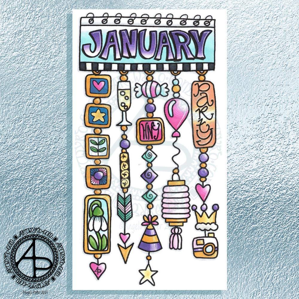
My first job was to print out the lineart for this dangle design, which is one of many in my book ‘A Dangle A Day’ which is due for release on 8 January 2019 – just a week away!
In the book, I take you through how to draw this design, one step at a time. Not only this design, but well over 100 more – designs for all seasons and many, many celebrations and occasions.
This design I drew in Autodesk Sketchbook Pro using a Microsoft Surface Pen and Microsoft Surface Book. For the book, I coloured it digitally. Today, I printed out my black and white lineart and then coloured it using Chameleon Color Tones and Color Tops marker pens. I also added some details to some elements of the design using a 08 Uniball Unipin pen and a white Sakura Gelly Roll Pen.
Yesterday, I said I need to to spelunking through my stash of mixed media and cardmaking supplies to find forgotten supplies I could use to embellish my designs.
This dangle design would make a lovely monthly cover page for a BuJo (bullet journal), planner, diary or journal. It would also make a pretty greetings card or notecard to drop a line to a friend wishing them a wonderful January. Change the words and colours to suit the occasion or recipient! It would also be a lovely, whimsical, cute design for a winter party invitation.
I realised then that my old watermark wouldn’t do for this year. So I hand lettered a new one. I made my symbol, the one I hide away in my artwork, part of the design, along with a little intricate but simple geometric pattern around it. A little touch of the uncials for my blog address, along with a typed copyright statement and it’s done and saved! I may end up changing it a little, or having variations on the theme, as time goes on. But I’m fairly happy with it.
So, I’ve already had a productive morning! It may be a Bank Holiday in the UK, but I really do need to focus on those templates that need colouring for Entangled Forests…and I may venture forth into the peopley world later on today, maybe.
I drew this a few days ago and have only got around to coloring it today.
The hand lettering and drawing was done with Uniball Unipin pens on paper. In black and white it has an almost vintage linocut feel to it.
I did scan it in and print it out on paper more suitable for alcohol markers. I used Chameleon Duo Tone and Duotop markers. Highlights were added with a white gelly roll pen from Sakura. I then added more black lines to add more dimension in places using a Staedler Mars Matic technical drawing pen.
Not sure I’ve done too good a job with the colours. Or line shading. Or the highlights in some places.
I’m quite pleased with the black and white line drawing however.
Another abstract entangled drawing for today. The original art is black and white line art with grey shadows and shading. It’s been drawn on A4 acid-free paper. I used various sizes of OHTO Graphic liner pens for the line work and Chamaeleon Color Tones cool grey marker pens for the shading.
However, I’ve altered the colour from black and grey pen and ink to a gradient of blue, purple and magenta digitally, just as an experiment. I’m really surprised with how the grey shadows/shading has turned out – pleasantly surprised and really pleased.
A nice start to my Sunday, a day to be filled with art and completing the transfer of information into my new bullet journal.