Abstract Flowers for an Illustrated Journal

Link to draw with me video on Youtube for the flower to the left.

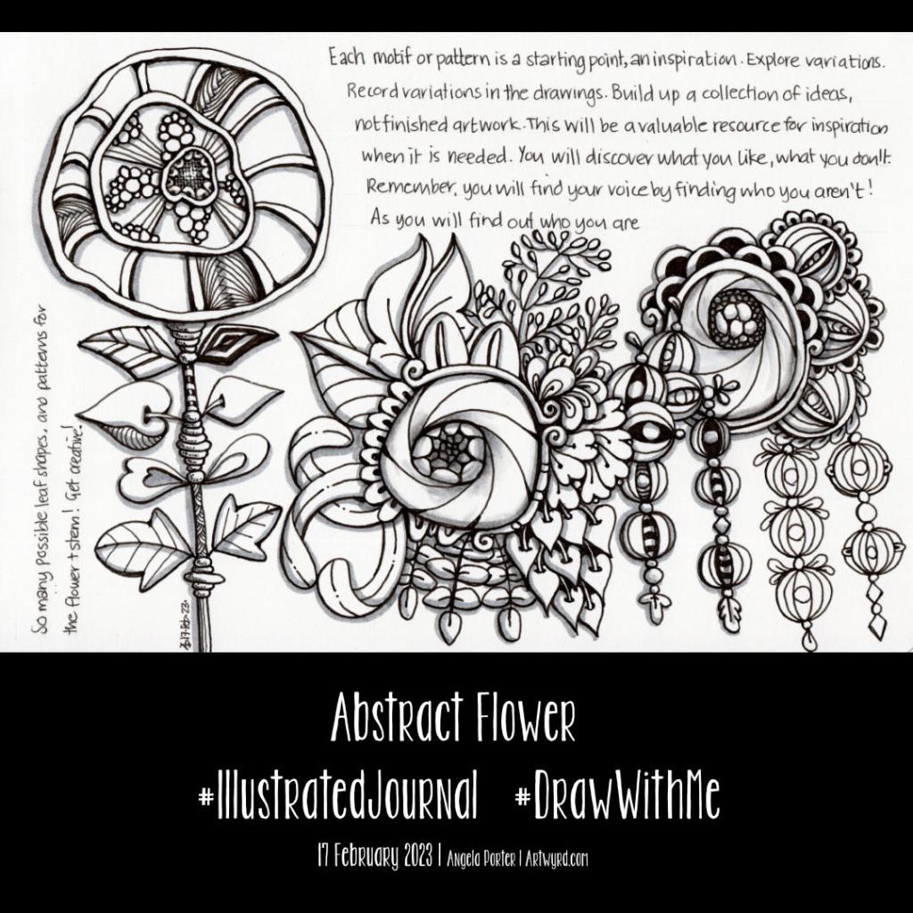
I have decided to keep an illustrated journal full of my favourite patterns and motifs, accompanied by some words of encouragement and, perhaps, advice.

I’ve kept a collection in a dot grid notebook for a few years. However, some people have asked if I’d share it. I thought it was high time to create something similar instead of sharing a battered and dog-eared book. So, that’s precisely what I started in today’s video.

So, I purchased a Talens Art Creation A5 landscape sketchbook for this purpose. I like the paper in it; it’s creamy in colour, so it’s more soothing on my eyes. The scanned page in the image above doesn’t show the cream colour; the struggle with scanners is real! The paper is 140gsm (90lb). It will take a very light wash of water, but I like the fairly smooth surface to draw upon.

For this page, I used a selection of pens:
A micro Uniball Eye for most of the drawing
01 and 03 Sakura Pigma Microns for details
0.38 Uniball Signo DX for the writing.
Faber-Castell Pitt Artist Brush Pens in Cold Grey 1 and Cold Grey III

I’m fairly happy with how the page looks. However, my handwritten notes are a bit … untidy. Hey ho, they’ll do!

I only drew the flower on the left in today’s YouTube video. I couldn’t find the first drawing for this new journal. Stupidly, I’d done that on a loose sheet of A5 dot grid paper and didn’t put it into a folder for safe keeping. I have no idea where I’ve put it. So, that was another good reason to get a sketchbook; it’s harder for me to misplace a sketchbook, though it has been known to happen. So the arrangement from the centre to the right is a replication of the motifs from the lost page.

As I typed that, my mind thought of the Moody Blues album title “In search of the lost chord”. I’m forever in search of my lost artwork!

This is going to be another interesting project. I do seem to pick up and drop projects a lot. The reason is I need variety in what I’m focusing on. Sometimes, I need a bit of a break from a particular project or focus. At other times, I’m just not well enough to do anything more than some challenging ‘comfort art’.

I now need to decide if I’m going to add some colour to this page. I have shadows in place, so transparent/transluscent media will work with that. I’ll think on it. For now, I need tea and something to eat!

Starting to draw some motifs/patterns for a reference book/journal/zibaldone

I’ve been asked several times if I’d make my visual dictionary, pattern and motif collection, journal or art zibaldone available for others. I’ve shown it a few times in videos. It’s my go-to reference when I need some inspiration for my art.

So, today, I thought I’d take some elements from a current WIP and start to put a page together.

I used a piece of A5 dot grid paper with holes punched in it for a six-ring binder. However, I may use an A5 dot grid notebook. To draw the design, I used an 05 Sakura Pigma Micron Pen. Shade was added with a 2B matt Pitt graphite pencil and paper stump/tortillon.

I enjoyed doing this. It was fun to add alternative ways of approaching various elements. That’s how I like to work in my visual zibaldone. And, of course, the variations are not exhaustive! No doubt more will appear in time, either in the zibaldone or in some artwork.

That is what I love doing. Varying and shifting the pattern or motif into something new and different.

Of course, I have filmed myself drawing this page so far, and you can draw along with me by clicking this YouTube video link.

Medieval Inspired Botanical Bookmark

I have no idea why, but tall, thin drawings (bookmarks) just appeal to me. Indeed, they always have.

I enjoyed drawing this one, and I’m fairly pleased with the chosen colours. There’s a soft, muted, vintage palette along with the flowers, seed pods, berries and leaves mainly inspired by Medieval Illuminated Manuscripts and the work of the Arts and Crafts Movement artists.

If you’d like to follow a #comedrawwithme video for this design, just click on this link!

A Fun and Whimsical Entangled Garden – #ComeDrawWithMe

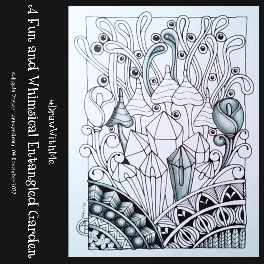
I had a lovely time drawing this little garden this morning. It includes some of my favourite things – round Romanesque-inspired arches and some Romanesque patterns, zentangle tangle patterns, crystals, flowers, mushrooms and frondage.

Naturally, I filmed this, and a #ComeDrawWithMe or #DrawWithMe video is available on YouTube.

TWISBI ECO fountain pens with medium, fine and extra-fine nibs were my drawing tools of choice. An approx. 11cm x 17cm (4.3″ x 7″) piece of Ohuhu marker paper was my drawing surface. To add some shading, I used a set of three grey-green Arteza Everblend alcohol markers. Finally, a white 08 Sakura GellyRoll pen was used to add dots of white as highlights.

I have to remember not to use Dokumentus Ink, which fills my TWISBI pens, with alcohol markers; they can pick up some of the ink and spread it around. I must remember that Copic Multiliners or fineliners such as Sakura Pigma Microns, Uni Unipins, or Emotts are perfect for alcohol markers.

I do like the monochrome nature of the shading so far. I’d be intrigued to digitally scan it and add a coloured layer. Maybe when I’ve finished it, I’ll try that.

#DrawWithMe – Botanical Motifs

In today’s YouTube video, I started to draw the design on the right. While the video was uploading, I finished drawing it. Also, I drew some motifs on a separate piece of paper so I could practice using alcohol markers (Arteza EverBlend).

Colour combinations do vex me, continually. And they certainly do on this practice sheet! But it’s best I practice somewhere before adding colour to my completed drawing. But first I’ll scan that drawing in so if all else fails I can add colour digitally!

Either way, it’s been lovely to spend time drawing and adding colour just for the joy of it. It is far too warm to do anything else.

Draw With Me… Whimsical flowers and foliage – an idea for a sketchbook page

If you’d like to see how I created this partial page for my sketchbook, take a look at this video.

I spent an hour or so doing some warm-up drawing before turning my attention to inking in some colouring pages for “Fanciful Birds”, my next colouring book in the Creative Haven series.

Whimsy is always a welcome thing, flowers and foliage in particular. I also wanted to work with colourful backgrounds for each motif.

I really wasn’t fully awake and didn’t think through the type of paper I was using. I knew I wanted to use alcohol markers to add colour gradients to the background. Did it occur to me to use marker paper? Nope! Of course not! So they bled a tad – the Ohuhu brush markers I used for some of the backgrounds are rather juicy, too juicy for the paper. I liked the backgrounds, however, and knew I could fix the bleeds with a white gel pen.

So, I thought I’d switch to Inktense pencils and a damp brush. Not quite sure that they sit well next to the alcohol marker backgrounds. There’s lots of textureand an unevenness in the colour and gradient. Again, partly down to my choice of paper (all media paper from SeaWhite of Brighton).

So, for the last couple of images, I used some Arteza EverBlend markers for the blue and warm brown backgrounds. The bullet tips let less ink flow onto the paper, minimising the bleed. There was still some bleeding, which I made worse by trying to ‘erase’ it with a colourless blender pen.

I made use of the magic of a white gel pen to cover up these bleeds.

I definitely need to write some reflections for myself to add to this page when it gets put in my sketchbook. For now, I’ll just say that I like the last two I completed the most. Those are the blue and brown backgrounds on the bottom row. I do like the other alcohol marker backgrounds too, but there’s something about the more neutral backgrounds. I just can’t put my finger on what it is.

Right then, time to finish my mug of tea and get some more inking of colouring templates in!

World Environment Day 2022

If we all do what we can, no matter how little we think it is, then collectively we can make a huge difference.

I just couldn’t fit all the ways we can do things to reduce our impact on the world’s habitats.

Hand lettering along with whimsical plants. This was definitely a labour of love and took me well over 20 hours to complete. But I got there!

Shrouded in Celestial Light WIP

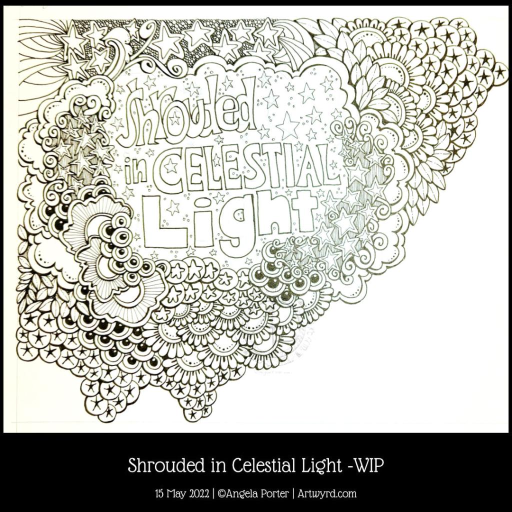
Late afternoon yesterday, I was listening to my “Liked Songs” playlist on Spotify and “Shining Light” by Ash came on. The lyrics “Shrouded in Celestial Light” just stuck in my head, so hand-lettering had to be done, followed by some entangled art!

I wanted to put the letters of “shrouded” overlapping, cwtched close together as if they were covering and protecting each other, apart from that brave S at the front (which I may alter digitally when I’ve finished this off). And that is one of the meanings of shrouded – to be protected and/or covered.

Naturally, stars had to feature in the entangled artwork around the hand lettering. What better to represent “celestial”, though the flowers and plants and seeds are related in a roundabout way.

Our sun is the star nearest to us and the source of natural light. The moon is closer, but it doesn’t generate any light itself, the light we see from the moon is reflected sunlight. Anyhoo, most life, as we know it, on Earth depends on the sun’s energy to remain alive. Without photosynthesis in green plants, there’d be no food. Some living things can exist without any energy from the sun, but they are extremophiles and live around extreme habitats, such as the deep ocean volcanically driven ‘smokers’.

I’ve digressed and slipped into science teacher mode! The point is, that though flowers and plants and seeds don’t seem to have a link to celestial light, they do, as they depend on sunlight to produce food, which gives them the energy they need to live and grow and reproduce and so on. All of us here on the Earth are shrouded in celestial light!

I really wasn’t sure how this was going to work out without a definite frame for the words, but I think by placing clouds and drifts of other things around the lettering it kind of looks like a view through to the celestial night sky, perhaps, with a bit of fanciful whimsy.

Template Thursyay! | 12 May 2022

It’s that time in the week again – Template Thursyay! Each week during the pandemic I’ve created a colouring page for the members of the Angela Porter’s Coloring books fans Facebook group. The template is only available to members, and it’s free to join the group and free to print the template for personal use.

It’s been almost two months since I last drew a mandala! So it’s understandable I felt the urge to create one today.

I used some of the motifs from my video in yesterday’s post. It’s always an enjoyable process using my favourite, organic motifs.

Using a limited, spring-time-ish colour palette also helped me get a coherent finish with the colours, almost. I’m really not at all sure about the purple pods!

Of course, the number of colour schemes that could be used is endless and down to personal preferences or desires at any time.

I can’t just leave a mandala on the page, there has to be a background of patterns too! The result looks like a huge dish floating above a window into some kind of sea habitat. I think that’s fun, even though I’ve only just realised that!

Template Thursyay!

Here’s this week’s template, full of whimsy and smiles. I’ve combined some of my favourite things to draw – flowers, foliage, fish and fungi! This time, I have sky-fish swimming in a sky filled with happy bubbles above a garden. And why not? This is my world of whimsy after all.

Sky-fish. Who would’ve thought it? Well, apparently I did, and no doubt many, many others too.