This card is now almost finished. I have learned some things from yesterday’s debacle. Mainly that I’d make a much wider border for the embossed background.
I did add Speckled Egg Distress ink to this embossed background, but it’s such a lovely, subtle colour the camera hasn’t picked it up well.
The embossed layer is so tactile! I used some Micro Glaze to seal it so that being touched won’t affect the distress ink.
Actually, I used Micro Glaze on the top layer too!
I could only find cream coloured card blanks and envelopes, and these layers really didn’t look too good on them. So, hopefully I’ll remember where my card blank stash is, or I’ll make a blank and envelope.
In the video I try embossing an envelope – a case of ‘envelope art’. I’m glad I did. The embossing works well. However, the areas where the flaps are glued together on the back of the envelope make indents in the front. Distress Ink brings these out so much. So, I’ll be sure to emboss the front of the envelope, and colour with Distress Ink, before I glue it all together!
All in all, I’m much happier with this card. Mind you, I do have ideas for others! Probably too late for Christmas now, but … there’s always lots of other reasons for sending greetings cards, including ‘just because I can’.
Winter solstice 2021 Mandala
Winter Solstice Greetings and Wishes to you all to the north of the equator! Summer Solstice Greetings and Wishes to you all south of the equator!
Some sunshine on a chilly, dull Winter Solstice day here in the Valleys of South Wales, UK.
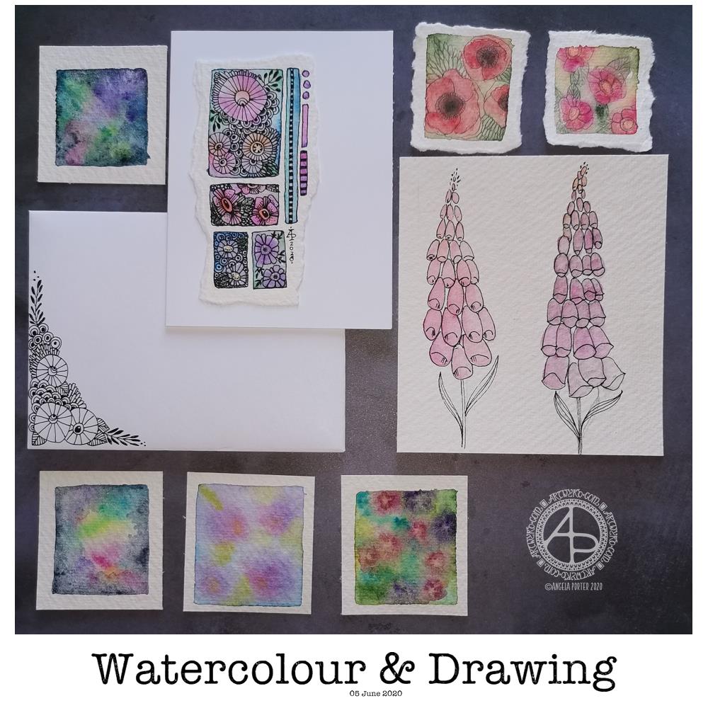
Today’s image is a collection of watercolors and drawings I’ve done over the past couple of days.
There’s a coordinating card and envelope (mail art), along with some small panels of watercolouring (approx 1.5″ x 1.5″, so a bit bigger than inchies). I’ve also included my foxglove experiments, which I did this morning.
Sometimes, black pen looks too harsh against the delicate but vibrant watercolours, so for the poppies, I tried pencil instead. I’m really not at all sure about them.
The foxgloves are symptomatic of how I feel today – out of shape, wobbly, ill-defined with harsh edges. I woke with a stinker of a headache again, definitely stress/anxiety/worry induced, as well as a lack of sleep last night. It will pass. In the meantime, I’m watching The Clone Wars on Disney+.
I don’t know if I’ll be doing any art for a few hours; my head and emotions are all bent out of shape at the moment. I’m dissatisfied with all the above; I know that’s me being so frustrated at the moment and it stops me seeing my art for how it really is. When I’m like this, I know that drawing will frustrate me, and the fact I’m not drawing will frustrate me more, especially as I have deadlines looming. However, I logically know that if I try to do things now, I’ll just prolong the feeling of frustration and I’ll end up having to do much more in the long run than if I’m kind with myself until the headache goes and my mood lifts.
The weird thing, however, is that I can sense that touchstone of contentment inside me. It’s very confusing; on one hand my emotions are really unsettled, yet there’s contentment within. My EMDR therapist mentioned that it’s a peculiarly Western view that you can only experience one feeling at a time when I mentioned this kind of thing to her. So I know it’s possible to be both discontent and content at the same time – discontent with some parts of life yet still have an inner contentedness.
So, I wander off now to sit with these paradoxical feelings, to try to relax and let the headache ease off enough that I can sleep off the extreme tiredness it will leave me with.
Two fairly quick, small projects this morning – small botanical cards. Simple, cute, whimsical, darling. Little treasures.
These were fun to make, relatively quick too. They’d be darling little cards to receive in the post or in person. They’d also work nicely as an addition to a journal – a place to journal or keep little memory making bits and bobs in the envelope too.
Each card is 3″ x 4″ in size and the panels are approx 3.5″ x 2″ in size. I made the envelopes to fit and decorated them with one of the motifs from the designs on each card. I did a tiny bit of hand lettering on one of them too.
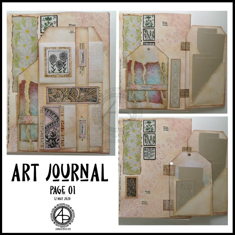
Yesterday I got lost in finishing the first page in my new A5 journal. I’ve put together three photos that show how the page looks as the tags are folded in and as each is opened out.
Every image, pattern, coloured paper, inchie, panel, envelope and tag have been made by myself. Drawing and colouring my own bits of ephemera and the pattern on the page background tool quite a bit of time, but it’s my own work.
I could’ve chosen to use paper from old books, commercially produced designer series paper or digital downloads. Those would’ve saved a lot of time, for sure. The end result would have been my own way of using them. However, I got a lot of pleasure, contentment, peace and calm from creating my own.
I made a note along the edge of the page showing which Distress Oxide inks I’d used to colour the page so that I could use the same for the other elements. Well, mostly the same Distress Ink colours; I did vary them in other places. However, this resulted in a coherent feel to this page – it feels like everything there belongs there!
I also noted on the background what pens I’d used to add the zentangle-style pattern. I then used Distress Inks and a brush and water to bring out that pattern.
Yes, I realise I could’ve used stamps, embossing ink and embossing powder to do something similar. I didn’t want to. I wanted my own, personal touch to this.
I really like how little pretties are hidden behind the tags and only get fully revealed as they are opened. The same is true for the items tucked in the pockets on the backs of the tags. I will replace the pieces of paper with journaling paper or other things as time goes on.
I may very well add danglies to the tops of the tags, possibly little tabs on their sides to help open them.
I’m quietly pleased with this page. It is very much “Angela” in style and feel. I’m feeling a bit more confident about this now, and I’m sure that I will really develop my own style as I go forward.
I really got a a sense of satisfaction and pleasure from creating every little element for this page. When I had it finished (mostly) I knew I’d worked out just how I want to create art journals going forward.
What I do need to remind myself, however, is that I can add to them when I want to – they’re not a full time project. What I could do is combine journaling with them, especially if I include elements that are specifically for journaling.
I do have some other bits and bobs to try making for the journal – little booklets, decorated paper-clips, tabbed cards to fit in pockets (or tabbed booklets, maybe). I certainly want to add quotes, notes, memories and more. And I think I need to work on my hand lettering to do such things as well.
I do plan to build up a library of digital designs I can use for inchies, twinchies, tea-cards, ATCs, panels, quotes, and more. Also, blank ‘templates’ for them, maybe.
Perhaps I should scan the backgrounds in before I add to them so I can use them in my digital art too. I shall think about that going forward. For this page, I really wasn’t sure if my idea of adding the pattern would work. I was pleased it did, I really am. I’m sure to do similar things with the following pages, and now I know what I do like, I can always replicate the background on this particular page, and the notes of which Distress Oxide Inks I used will help me in doing this for sure.
For the rest of today, however, I will be mostly doing other art rather than working on my art journal. I do have some coloring book projects that need some serious attention for starters.
I’ve become a bit obsessed with making art journal bits and bobs over the last couple of days. This morning has been no exception, other than the more I do and watch, the more ideas that come to me.
Inchies
Yesterday, I created some blank, printable, templates for inchies, twinches and tea cards. I printed them out on plain paper so I could draw in them. I also made a list of themes I could tackle for them too.
I spent an hour or two filling in a sheet of inches with various designs. Then, I printed them on plain paper and also vellum for calligraphy. The vellum has a rough texture, interesting colours and subtle patterns in them. I have a laser printer, so wasn’t sure if it would print on the vellum; it did, however the print does come off if I’m a bit rough with it.
Nevertheless, I coloured some of the inches with Distress Inks and then adhered them to some 1″ tiles of thick chipboard card. I edged them with tresure gold wax from Imagination Crafts. Then, I gently applied a thin layer of Ranger’s gloss multi-media medium, to see if it would seal the laser printing; it did! It also brought out the colours of the Distress Inks.
Seed packets/envelopes
These are simple enough to make. There are plenty of tutorials online for them. I made them from ordinary printer paper, then coloured them with Distress Inks.
Next, I added some dot embellishments using a small ball tool with Imagination Crafts’ Starlights metallic paint in rich gold. This is a beautiful, glittery, shiny paint that leaves some dimension when applied this way.
Finally, I adhered the inchies I’d made, along with some vintage book paper, to the envelopes.
I’m not sure if these envelopes are finished. I do want to use them to store either journaling notes in, or little pieces of art or mementos in them.
Tags
I haven’t been at all sure about tags and using them. However, I thought I’d see what I could do with them after yesterday’s mucking about with a tri-fold tag that turned into one single tag.
I wanted to make some templates for cutting the corners at the top of the tags, so I did that, using various widths of paper and slopes to remove the top corners.
I then realised I needed something to store them in, so I made an envelope for them.
The envelope has a more rectangular top flap and a plain front, perfect for embellishments.
Backgrounds
Something occurred to me this morning while watching someone make tags using background paper. I thought that I could use my colouring sheets and entangled designs as my own background paper. So, I thought I’d try to use some.
I found some old designs on my computer and printed a couple of them both as the black line originals and with a grey line.
I made a tag and cut out a piece of one of the designs. I coloured the design with Distress Inks and used them to subtly colour the tag.
I didn’t like the way the neatly cut out background pattern looked when I placed it on the tag. So, I tore the edges. I still wasn’t happy, so I tried tearing it into strips. That looked better, but I still wasn’t happy with it, but I stuck the pieces down.
I used a gold glitter gel pen to add lines and patterns between the torn pieces, which created some pattern and interest.
Finally, I added a distress ink coloured belly band along with a word, “creativity” to the tag. For now, I tucked one of the seed packets behind the belly band.
The background drawing may be just too busy, detailed, and varied to work well. I need to bear this in mind going forward.
Notebook
I am keeping notes of how I make tags, pockets, and other bits and bobs in an A5 dot grid notebook, along with ideas for other things to do or try. It’s turning out to be rather useful as a reference.
Acceptance
I’m struggling with accepting that what I’m creating for my art journal is “good enough”, “attractive enough”, “pretty”. It’s not like others I’ve seen, which is part of my problem.
I seem to like, mostly, neat edges, borders on work, very organised, neat, and carefully, geometrically arranged elements in my designs. I know I want to use my own artwork to create a journal, but I’m not sure it’s going to be successful in any kind of way. I have no idea if I’m on a wild goose chase.
I know I enjoy making these bits and bobs, I just don’t know if the overall end products actually work, so I’m doubting myself. I’m not sure I like what I’m creating. I mean, I really like individual elements such as the inchies and little panels on the envelopes. It’s when I start to actually combine them or put them into a journal that it all seems to go more than a bit skew-iffy.
I’m at that uncomfortable place I often find myself in when I’m creating a mandala or drawing or digital painting; partway through I want to give up as I think that what I’m creating is awful and not working. With the mandalas, drawings and digital art, I’ve learned to work through that point and, mostly, to complete the work. I’ve learned by experience and perseverance that I can produce art I’m happy with.
I’m not at all sure of that with this art journal type stuff. I’m not sure at all if I can find my own creative ‘voice’ with this, or whether I have to accept that as much as I’d like it to be one of my ‘things’ it’s not meant to be and that I can continue to watch and admire others for what they create.
Maybe, I’ll end up making digital elements for journals for others to use in their creations. Maybe, I’ll find that collections of inchies are my thing (along with twinchies and tea cards and other little designs).
For now, I’ll take a bit of a break from it all, and come back to it with fresh eyes and a fresh mind.
Yet again I woke with my mind swimming with an idea I wanted to try out. I’d had a problem when I was trying to add colour to drawings I’d done on distress ink backgrounds. Whether I used water and a brush or a Tombow Blender pen, the pigment from the Sakura Micron and Uniball Unipin pens bled, and I really wasn’t happy with that.
I spent some time yesterday trying different pens out, with no luck in finding any that didn’t smear/bleed. So, I put this to one side until I had a chance to think about it.
I slept on it and woke with an idea to try.
Why not use the Tombow blender to draw the basic shapes of my design in colour and then add black lines afterwards. Seed pods seem to be my default design when I’m experimenting, but I’m fine with that.
So that’s what I did. And this card is the result.
As I was starting to add the black lines to the design I thought I’d made a horrible mistake, had a bad idea. However, as I added more and more detail, I realised it would work out, and I think it did.
I added some gold to the seeds in the seed pod with a glitter gel pen. I also splattered some gold watercolour paint over the design.
The envelope is really simple; three seed pods, black line art with golden seeds.
Not a unique artistic approach, but it is something that has never worked for me before.
It’s not a dissimilar approach I take to my digital art, where I start with the basic shapes and then add shading and detail. I do use line art as a guide for my design, and that is an approach I can apply to traditional art in that I may need to pencil in the design, then colour, then add the line art.
Who would’ve thought it – working digitally is helping me develop my traditional art methods and skills.
I needed to draw something that would be calming and also purposeful. So, as I’ve been enjoying drawing zentangle-style designs, I thought I’d create a greeting card.
How I made the card …
To start, I cut some Claire Fontaine mixed media paper into a 5″ x 5″ tile. Then, I used a mini foam blending tool to colour the paper with Tea Dye and Old Paper Distress Inks. A quick spritz with water to add some more texture followed by a blast with a hair drier, and the paper was ready to draw on.
I used the tangle pattern generator to give me some patterns to use. Today they were: *Scena (bottom and middle top) *Sedgling (the weird mushroomy things) *Squill (the top left pattern) *Well (the top right pattern) *Arukas (the central pattern)
I also added some gold dots to the centre of the ‘flowers’ that make up the Well pattern, as well as to the central circle of Arukas.
Before adhering the design to a blank kraft paper card, I used a piece of foam to add some Black Soot Distress Ink around the edges of the card. Once adhered, I used the gold Gelly Roll pen to draw a line around the design.
It was then the envelope’s turn for attention.
I started with a lower border of Scena with some Sedgling growing from the top left and right. To finish the envelope, I added some gold dots.
Reflecting on the finished card
I actually quite like the design of this card. I started with Scena at the bottom and it ended up looking like hills and fields. So, it was a natural progression to add the Sedgling as mushrooms or trees growing on top of Scena.
The next two patterns were geometric ones, and it felt natural to join them with some more scena at the top. Scena also looks like clouds. Arukas was the final pattern to be generated, and it fit perfectly in the space left, filling it like a brightly shining sun.
I had no idea what I was going to create today, just let the random patterns lead me forward.
The only thing I need to do now is to find someone to send the card to! Mind you, I do have quite a few cards in my stash, so I need to find some ones to send them to!
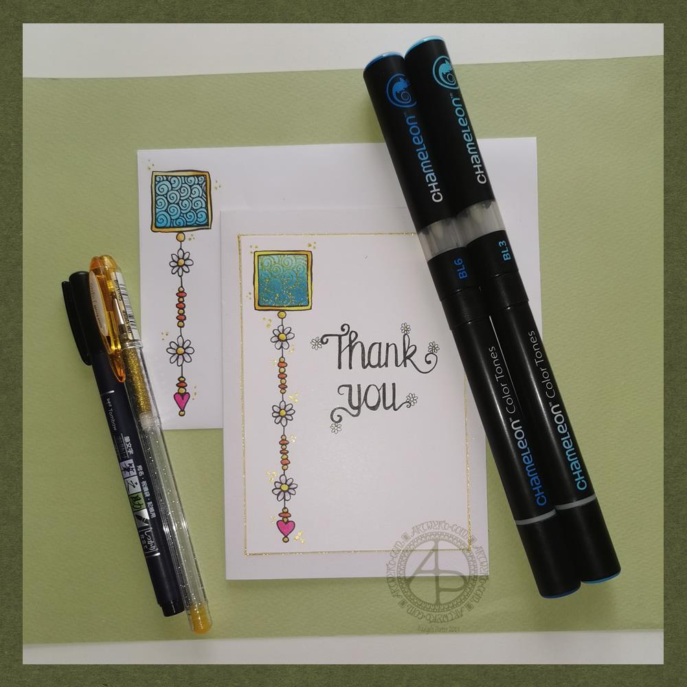
Friday means it’s time for another dangle design, this time a ‘thank you’ card and coordinating envelope.
In previous weeks I’ve had some fun adding patterns to small blocks of colour. So, I thought I’d run with that idea and turn one into a simple dangle design. The steps I used were the same for the card and envelope.
Card size.
The card is an A6 card and I cut a piece of Winsor and Newton Bristol paper to 5″ x 3.5″ for the card topper. The envelope came with the card blank so is A6 in size too.
How to…
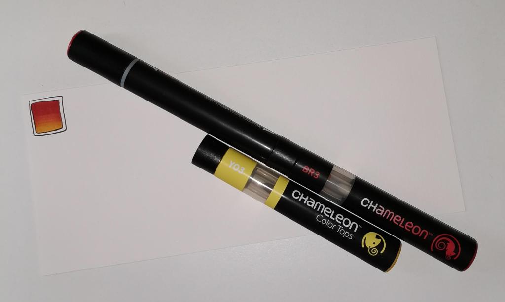
I started by drawing a square of colour using the BL3 (Sky Blue) Chameleon Color Tone pen – no gradient, just pure colour.
Then, I added a gradient of BL6 (Royal Blue) over the base colour. I added pure blender to the Royal blue bullet nib using the mixing chamber. I didn’t use the Color Tops to add Royal Blue to the tip of the Sky Blue pen as I wanted a more subtle colour gradient.
Next, I used a Tombow Fudenosuke pen to draw around the block twice. Then, I added a filler pattern of spirals to the colour block. On the card I used a gold Uniball Signo sparkle gel pen. On the envelope I used the fudenosuke pen.
Now the colour block was decorated I turned my attention to the dangle.I decided to draw one dangle as I thought the design would look too crowded if I ad more. Sometimes, less really is more!
After drawing a faint pencil guide-line, I used a combination of beads, daisy-like flowers and a heart for the dangle. I wanted to keep it nice and simple.
Then it was time to add colour to the outline and design elements. I used the Chameleon Colour tops to add very simple colours. I didn’t do any gradients as the designs were so small. Instead I coloured them in the lightest colour, added a touch of darker colour where I wanted shadow and blended that out with the lighter colour.
I decided to hand letter ‘Thank you’ on the card using a soft nib Fudenosuke pen. I also added some tiny daisies to some of the loops and swirls to tie the hand lettering in with the dangle design.
I then mounted the card ‘topper’ on the card blank and added some gold glitter gel dots around the designs. I also added a gold line around the card topper.
Before I post the card, I’ll use some Micro Glaze from Ranger on the envelope to protect the Tombow pen from water damage.
Reflecting on the project…
Overall, I’m quite pleased with this. In hindsight I wish I’d used the Tombow Fudenosuke pen to draw the spiral pattern on the card. I think it’s a cute, simple and versatile design.
It would make lovely stationery, such as note paper or note cards, along with coordinating envelopes. There are lots of ways the design could be used in BuJos, Planners, Journals, Scrapbooks, and Art Journals. The vertical nature of the design means it would make a lovely bookmark.
How would you use this design? I’d love to hear, so leave a comment!
If you have a go at drawing and using this design then please share your finished products with me – I’d love to see how people use dangle designs!
If you want to learn more about drawing dangle designs then my book ‘A Dangle A Day’ is a good place to start. There’s over 120 designs for you to use as they are or for inspiration for your own designs.
Nearly every Friday I publish a new dangle design on my blog for more inspiration.
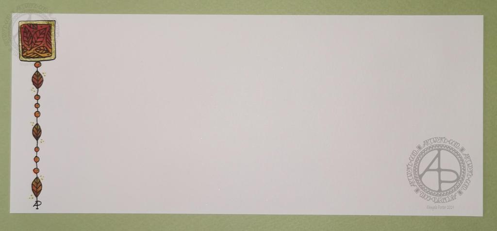
Hello to November, and farewell Inktober. My blog post today looks a bit bare compared to my Inktober creations. However, I have neglected my dangle designs during October, so now’s the time to get back on track with them
Today, I’ve created a simple and elegant dangle design with an autumn colour scheme that could be used in so many different ways. I’ve also put together a step by step set of instructions how you too can create this design (and hoping that it’s not so simple that I come across as patronising).
This is my first time posting a set of instructions – post a comment to let me know what you think of them and if you’d like to see more of them in the future.
I’ve put the dangle design on one side of a slip of paper that would make a perfect compliment slip or a note to slip in with a gift, or just as a short letter to a friend. It would also be perfect for a coordinating piece of envelope art!
This dangle design would be absolutely charming as an embellishment in a BuJo, planner, scrapbook or art journal. It would also make a darling bookmark.
It would be easy to turn this design into a greeting card as well.
So many possible uses for such a simple design.
I do hope that you will give drawing dangles a go – no matter whether you think you’re good at drawing or not! This design is made out of just simple shapes; it’s the colour that brings it to life and masks all kinds of imperfections.
If you’d like more ideas for dangle designs, then please take a look at my book ‘A Dangle A Day’ – it’s filled with examples of dangle designs with step by step instructions and helpful and encouraging words of advice.
One step at a time to a dangle design.
Step 1
Step 1 Draw a square in the top left corner of a piece of paper. I used a piece of paper measuring approx 8.25″ x 3.5″. I used a Tombow Fudenosuke brush pen to draw the box, and outline it. I deliberately made the squares less than perfect to give that human touch as well as a uniquely ‘me’ way of drawing boxes. The Fudenosuke pen allows me to draw lines of variable width quite easily, which adds to the charm of the box. The ink in the pen is also alcohol marker friendly. Letting your drawings be less than perfect is what makes them uniquely yours.
Step 2
Step 2 I used Chameleon marker pens (BR3 “Cinnamon” and YO3 “Warm Sunset”) to colour the inner box. Autumn is definitely here in the UK, and the combination of these colours reminded me of the leaves. However, you could use any colour combination you like and any medium you prefer to use. Chameleon pens make it so easy to create a colour gradient – I prefer them to other alcohol marker pens, even Copics.
Step 3
Step 3 I added a simple leaf pattern to the coloured box using a Sakura Pigma Sensei 04 pen.
Step 4
Step 4 Add the dangle! For this dangle I used the same kind of leaves as in the box for a consistent design. I added some round beads as ‘spacers’. Finally, I added my ‘symbol’ to the end of the dangle. Also, I did draw a faint pencil line with a ruler to help me keep my dangle hanging straight, more or less!
Step 5
Step 5 I coloured the beads and leaves in using the same colours of Chameleon Markers. I then decided I needed to add some shimmer and shine; I used a Uniball Signo gold glitter gel pen to colour in the border of the box and to add some dot highlights here and there. The Chameleons caused the Sakura Pigma Micron ink to smear a little – I always forget that happens! I should’ve used the Tombow pen again. Oh well, you live and learn, eventually!
This could be the last piece of mail art from me for a few days. I need to get focused on art that is ‘work’ rather than just ‘for fun’. I enjoy my art, no matter what it is, but I can be easily distracted by the metaphorical shiny, bright new toy.
Mind you, once I’ve spent time doing art ‘for fun’, the commissioned work then feels like fun. A change is as good as a rest for sure. Different styles and methods of working keep everything fresh for me.
Here’s a brief outline of how I created the card:
Distress Ink background on watercolour paper. Use torn paper to use as a mask for the landscape. Use a circular mask for the sun.
Spray with a mixture of Perfect Pearls and water.
Use Faber-Castell Pitt Artist Pens to draw the design.
Add metallic highlights using a fine brush and Cosmic Shimmer Iridescent Shimmering Watercolour paints.
Add a distress ink ‘frame’ to the image.
Mount the design on black card. Attach the black card to the 6″ x 6″ card blank.
Use a gold glitter Uniball Signo gel pen to outline the top panel and black panel.
And here’s a brief outline of how I created the envelope:
Use a white Sakura Glaze pen to draw the flower motifs.
Use a fine paintbrush to add Cosmic Shimmer Iridescent Shimmering Watercolour paints.
For the envelope, I used a rainbow of colours for the flowers.
I like using Sakura Glaze pens to draw motifs when I’m adding watercolour; the ink dries to give a raised line that is waterproof. The thicker line width can also give stained glass feel to the artwork; this is particularly true for the black Glaze pens.