Friday work in progress

The artwork

Started yesterday evening, worked on during my hours of mid-night waking, and on waking this morning, this measures 21 cm x 21 cm (approx 8.25″ x 8.25″) The paper is natural coloured Claire Fontaine Paint-On mixed media paper coloured with Aged Mahogany Distress Ink. The design is being drawn with a mix of 03 Unipin and 01 Sakura Micron pens.

I’m using a mixture of Stadedtler Triplus and Chameleon Fineliner pens to add colour to the design, along with a barely damp waterbrush to spread the colour out. Interestingly, some of the colour lines added remain visible, to a greater or lesser extent, depending on how much I work the colour with the waterbrush. Also, I’m finding that I really enjoy adding colour and texture like this.

The finishing bright white highlights are added using a Sakura Gelly Roll pen.

I find the fineliners used in this way give me much greater control over how much the colour spreads in the small areas in my drawing. They also don’t spread as much as, say, Tombow Dual Brush pens or Inktense pencils. That helps to control the spread of colour too.

I rather like the vintage-y look that the palette of browns and olive greens confers on the design, helped along by the background colour and texture of the paper.

Oh, I do intend to leave a ‘hole’ in this first layer of designs. I’m not sure I’ll do inside the space; a quote, more layers of design. For now I’m not sure. But once this first layer is done, I can scan it in and use it in different ways digitally.

There are lots of my favourite motifs appearing in this one, rather organic ones for the most part. What will appear from the tip of my pen in the rest of the design? I don’t know yet! It could be more of the same, or not. All I know is that the intricacy, detail and revisiting old favourite motifs is making my arty crafty heart smile.

Cognitive dissonance

“The state of having inconsistent thoughts, beliefs, or attitudes, especially as relating to behavioural decisions and attitude change.”

Finally, the penny dropped as to why I’m feeling so out of sorts. Oddly, it was while I was listening to a documentary about the cult NXIVM as I was drawing during the stupid o’clock hours of drawing. Don’t worry, I’m not a member of a cult! However cognitive dissonance was mentioned and that was the ‘ta-da!’ moment for me.

Cognitive dissonance causes emotional distress related to holding contradictory beliefs or values. I’ve experienced this before during breakthrough moments in therapy where I’ve had to accept that I was a victim of trauma, that I really do have CPTSD and I’m not (as my mother would tell me) making it up, for example.

I’m poised on a knife edge, wanting to make a decision to leave something, but feeling guilty about thinking that way. I need to find a way to find some clarity to help me make that decision, and it has to do with my core values and beliefs.

Recognising this doesn’t make me feel any better, but it helps me understand what is going on, and that understanding will help me work my way through it! Making a decision won’t make it any easier for me to act upon it as there’ll be a lot of guilt and the old reactive feeling of believing I’m letting other people down.

However, I can’t put other people ahead of my own mental and emotional well-being. It’s never been easy for me to say ‘no’ to people, to leave organisations or people who are contributing to emotional and mental distress in myself. But I have done so occasionally, more so in the last year or two. And I will do so this time if it’s what I need to do to find that sense of balance, harmony, peace in myself once again.

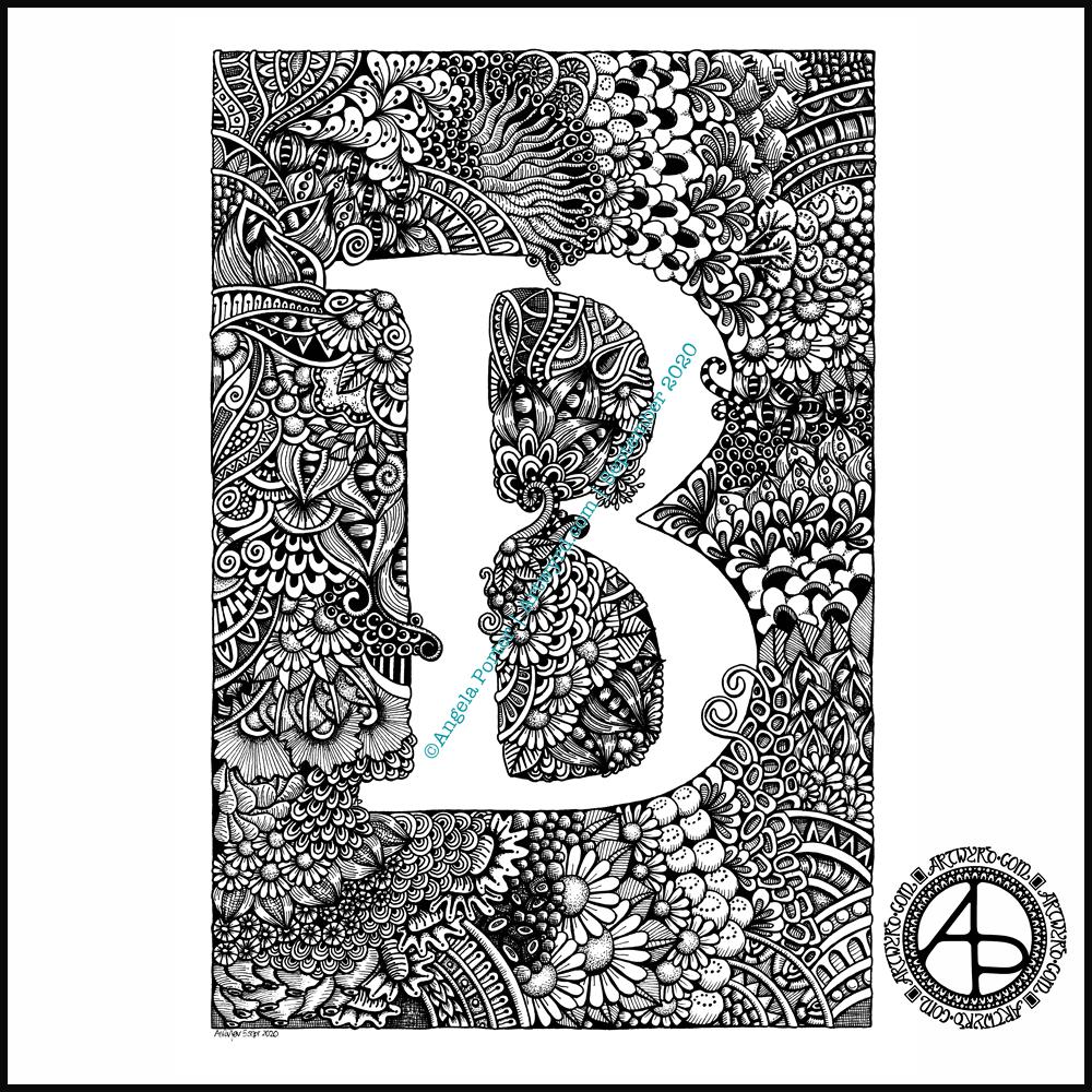
Monogram B

Finally finished it! It’s taken many hours to do – probably around 15 I think, and it’s taken some perseverance by myself to get it done.

Uniball Unipin pens (05, 03 and 01) on Claire Fontaine Paint-on mixed media paper. Two pen nibs now wrecked; the paper is velvety smooth to touch, but just too rough for the tips of the Unipin pens. Will move to Bristol board for the next monogram.

Dangle Design Greeting Cards

Dangle Design Greeting Cards © Angela Porter | Artwyrd.com

Today I have two card designs for you, both featuring dangle designs, but in different ways.

If you like dangle designs and you’d like to give drawing them yourself but need a little help or inspiration, then you may find my book “A Dangle A Day” of interest. In the book, I take you, step by step, through how to draw over 100 dangle designs, along with some ideas of how you could use them. 

Love Ya and With Love Card.

I started by using the Foursquare Backdrop: Portrait die from lawn fawn to cut the frames and panels from a piece of Winsor and Newton Bristol Board. I purchased this die, and the one in the second card, from Seven Hills Crafts here in the UK.

Next, I used Stormy Skies and Broken China Distress Inks to add a subtle colour gradient to the panels.

My idea was to draw four different dangle designs for each small square panel. I also wanted to include some hand-lettering, which I did.

So, I used Unipin pens from Uniball to do the drawings and lettering. I did use pencil outlines for the ribbon banners and lettering to make sure their placement was just right.

I coloured the design elements and charms using Copic markers. As the individual design elements were so small, I just used two colours to achieve shading in the bigger ones.

I also added a drop shadow around the designs using a BV marker that is a greyish-violet. It’s a very subtle drop shadow.

I had to add some sparkle and shine to the card, so I used a clear Spectrum Noir Sparkle brush pen along with a gold glitter Signo gel pen to do this.

To assemble the card, I glued the frame to the card base using Tombow Mono adhesive. Then, I glued the square panels into place.

I managed to get glue onto the front of the card and trying to rub it off while wet just left a dark, dirty smear. I’ve ordered some Tombow Sand erasers to see if they’ll remove the mark. If not, I’ll have to either work out another way to cover it up or just consign the card to the pile of things not to do again!

Black and white floral card.

Again, my first job was to cut out the frame and panels using a die. For this card, I used the Foursquare Backdrop: Landscape die from lawn fawn along with Winsor and Newton Bristol Board. I also decided to use this die in portrait mode.

To draw the design elements, I used Unipin pens from Uniball. I hung dangle designs from the top of each card to fill in some of the space that was there. I wish I’d used a slightly thicker pen than the 01 though. They look almost like an afterthought.

Anyway, once I finished the drawings, I wasn’t sure whether to add colour or not. So, I’ve left the pictures as black and white line art for now.

I used Tombow Mono glue to attach the frame and panels to a 5″x7″ piece of Winsor and Newton Bristol board. I did this as I realised that the dies are made to fit card blanks made from half a sheet of US letter-sized paper folded in half. In the UK, we use A4 sized paper, which is different enough in size to make it awkward to cut the paper to fit the card. I have ordered some 5″ x 7″ card blanks with envelopes, and then I can finish assembling this card. I’m likely to trim the foundation panel down a little and maybe try to carefully add some colour around the edge. Maybe.

It’s at this point I’ll decide whether or not to add colour and to see if I can thicken the lines around the dangles without messing it up. Mind you, if I do mess it up, it’s another experiment I can learn from, hopefully remembering not to do this again.

Things I’ve learned and techniques I want to try.

The lawn fawn dies work great! They come with smaller dies – heart, cloud, small star, large star, sun, small sun and speech bubble – which may be useful in the future. I had made my mind up that I’d limit myself to die sets that are simple in shape to for cutting out panels to draw on and maybe for layering. 

I rolled my eyes at myself when I worked out that dies from an American company would work best with American sized paper for card bases. However, I can work around that now I’ve realised that. I’m comfortable working with inches; most of my craft tools have both inches and centimetres on them. However, the inches are visibly the most dominant measurement system. 

Glue. Me and glue. Not sure how I can avoid smearing in the future. Hopefully, the sand eraser will help to remove my gluey, sticky, dirty-looking mistakes.

I like using Distress Inks for backgrounds. However, the pale colours of markers that I prefer to use are translucent and so combine with the background. I could use other media such as coloured pencils for colouring. Or I could use distress inks or water-based marker pens with a damp brush to add colour. I could also use a damp brush to remove some of the distress inks. In that case, I may have to use watercolour paper instead of Bristol Board.

I could also use a Versamark pen – which contains transparent, sticky ink – to colour over my design elements once coloured and then use clear embossing powder and a heat gun to protect the colours. I could then add the distress inks after heat-setting the embossing powder. The embossing powder would add some dimension and shine to the cards. If I used a sparkle pen or gold gel pen, for example, the embossing would encase it and highlight these embellishments Ieven more, I think. I need to try this idea out!

So, there are lots of possibilities for going forward with this.

So, Angela, how are you feeling today?

I’m feeling the more content and optimistic than I have for the past two or three weeks.

I’m still feeling out of kilter; changes are happening in my perceptions around my emotional/mental wellbeing. I’m also aware of shifts that are happening in other parts of me.

I’m still poop-scared about what is going on in the world. I can’t see that ending anytime soon, however. This, and the rest of the emotional rollercoaster I seem to be on, are still upsetting my digestive system, so I’m not feeling too well much of the time. 

Yesterday, I was so unsettled and scared that I couldn’t settle to do much art, and I became so dissatisfied and frustrated with whatever I did. I couldn’t settle to anything else either – not crochet, reading, nothing. 

As I’ve said, today I do feel better, so I need to turn my attention to trying out Affinity Publisher to create some materials I’ve been commissioned to do (the artwork and inserts for a CD by a band!). I’ll see about setting the templates up first and go from there. I’ve not tried to do this the past couple of days as I know my head and my emotions weren’t in the right place. I’m not sure that they are today; it’s only by doing that I will find out whether they are or not.

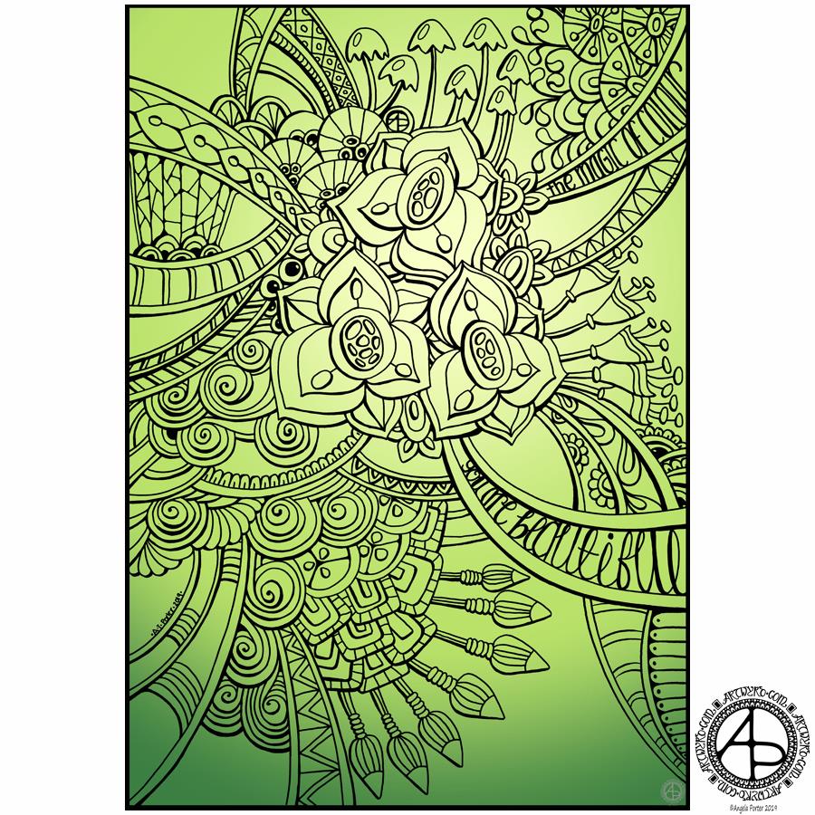
It’s June! Time for another exclusive coloring template for the facebook group!

June Template for members of the Angela Porter's Coloring Book Fans Facebook group ©Angela Porter 2019
June Template for members of the Angela Porter’s Coloring Book Fans Facebook group ©Angela Porter 2019

New month, new coloring template for the Angela Porter’s Coloring Book Fans facebook group.

If you’d like to print and colour it, then pop over to the group, join up and follow the terms and conditions for use of this template. You’d be made most welcome there; the members are lovely people and they produce amazing coloured versions of my templates – either the group ones or ones from my many coloring books (visit my Amazon author page to see all of my books, I think I’m close to 20 now!).

This template was drawn on Winsor and Newton Bristol board using Unipin pens then scanned in to clean up smudges and adjust the image for sharing digitally. I’ve added a colour background to share on social media outside of the group, until I colour this one in myself.

So, how are you doing today Angela?

I’m ok. Tired-ish but fairly content.

I was anxious going out yesterday and that unsettled feeling stayed with me, sometimes rising up, other times just being the familiar background ‘noise’ that I’ve lived with all my life.

I enjoyed drawing this coloring template. I’ve also enjoyed doing some crochet – yet another shawl. I need to find homes for some of the shawls I’ve made as I have way too many for myself, perhaps.

Anyways, I’m ok today. Content-ish. Not feeling very motivated to go out and about but I’ll see how I feel as the day goes on. I really could do with a walk.

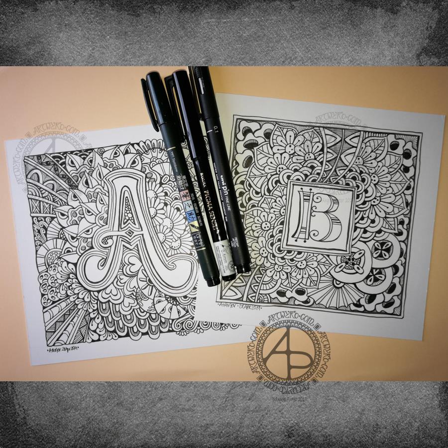
Entangled Monograms

Entangled Monograms © Angela Porter 2019 - Artwyrd.com
Entangled Monograms © Angela Porter 2019 – Artwyrd.com

One of the things that is really nice about being between contracts is the opportunity to create art just for the fun of creating art and not having to stay within the limits of the contract. Not that drawing to fulfil contracts isn’t fun, it is. It’s just that I have to work within the remit of the contract.

Yesterday evening and this morning I’ve been having a contented time creating some entangled monograms. I’ve cut some Winsor and Newton Bristol Board down to approx 15cm x 15cm (approx 5.75″ x 5.75″).

I penciled in some guidelines for the edges of the artwork and for the position of the monogram.

First job was to hand letter the monogram. I did start with pencil guidelines for each letter, then used a hard Tombow Fudenosuke pen to ink them in.

Then, the real fun begins, which is the entangling of the space around the monogram. I used the Fudenosuke pen along with a Sakura Pigma Sensei 04 and Uniball Unipin 0.2 and 0.1 pens.

All done in plain black and white, with just the weight and concentration of lines adding depth and dimension to the finished design.

I do want to add colour to these at some point. I love pure black and white artwork, but colour can bring them to life as well. Digital colouring is my favourite way of adding colour these days, but I may print copies out on to marker friendly paper and then use Chameleon Duotones and Color Tops to add colour. I’ll see how I feel about that.

As is my wont, I had no preconceptions of how the entangling would unfold. I just let it flow. Some of my favourite motifs and patterns have been used. I did refer to my visual BuJo for ideas/inspiration from time to time too.

Visual BuJo

Yes, a visual BuJo (bullet journal). Or, rather, it’s a collection of motifs and patterns that are being organised using ideas from the Bullet Journal system of keeping a journal. It works for me. I have a way to help me find continuations of collections, or to start a new one, and not worry about a collection being on consecutive pages.

My visual BuJo is an A5 sized, dot grid notebook from Claire Fontaine. It’s a soft back one so isn’t quite as weighty as Leuchtturms and the like. It is also a little less bulky in size, which helps when I want to travel light on a day out.

Mind you, when fill this present visual BuJo I may use a Leuchtturm for my next one. We’ll see…

It is also something that encourages me to seek out new patterns and motifs to add to it, as if I didn’t have enough already! Doing this is a good way to just practice my drawing skills and observation skills, as well as analysing a motif or pattern, breaking it down into simple shapes and steps to draw a stylised version.

I do tend to favour more stylised motifs and patterns in my art, that’s for sure.

So, I now no longer feel the need to try new ideas out for keeping my reference material, constantly redrawing them again and again. The visual BuJo is working for me for sure.

When I’m having a tough time emotionally/mentally with my CPTSD and/or EMDR it can be soothing, comforting for me to use the familiar, and of course I can still do that. I just don’t need to spend a lot of time drawing and redrawing and redrawing again the same things in my search for a perfect record keeping system for patterns and motifs.

The BuJo inspired system may not be perfect, but it works for me.

One other positive that has come from me using a BuJo is that I’ve had to learn to let mistakes go and just leave them in the notebook. The mistakes are what I need to make in order to understand how to draw a pattern or motif. Sometimes, though, a new pattern or motif arises from the mistakes.

Something else I’m starting to do is to make notes alongside the patterns with where to start, the order in which to draw the parts of the pattern or motif, and ideas for varying it.

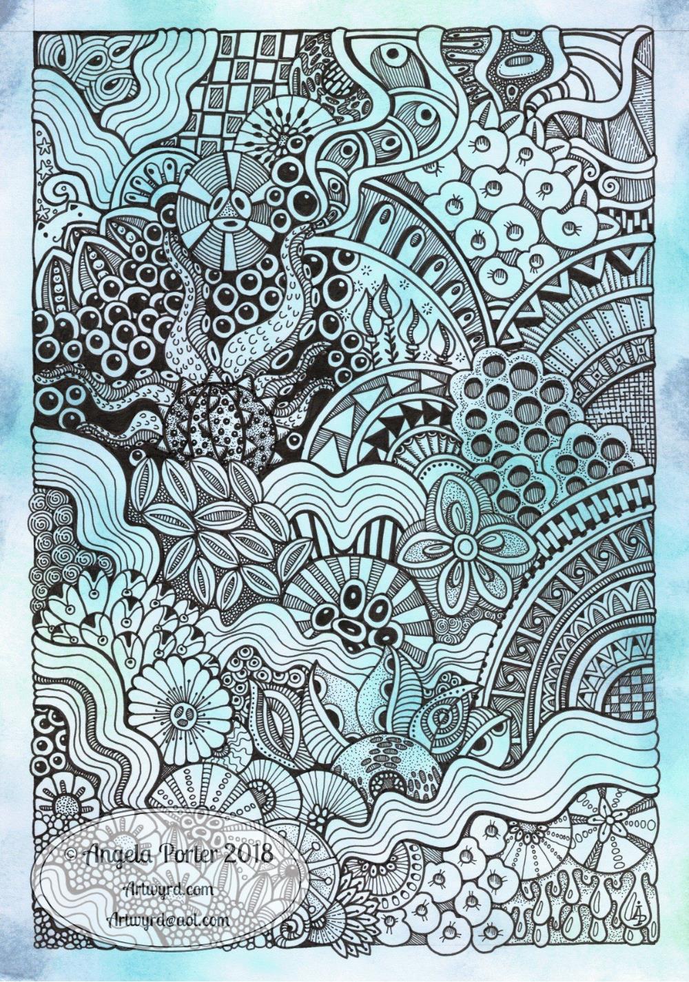
Inktober 2018 Day 10 ‘Flowing’ and World Mental Health Day 2018 #wmhd

Angela Porter Inktober 2018 Day 10 Flowing watermarked

Today’s #inktober2018 prompt is ‘Flowing’, so I knew I had to incorporate ripples into my art for today. I also wanted a blue-green colour scheme, so I used Distress Inks and an ink blending tool to colour an A4 piece of Bristol Board from Frisk.

After drawing pencil lines to allow me margins, I set to work with a range of Uniball Unipin pens to draw my design.

I started with the wavy lines in the bottom left corner and just let everything flow out from there quite intuitively, as is usual for myself.

It’s taken me quite a while to do; I think I started it around 7:30am and it’s now nearly 3pm. Sheesh, that’s nearly 8 hours!  Here was me at the beginning of Inktober stating I was going to do little drawings and so on.

However, there’s a dual purpose in today’s art.

Although I’m not doing anything specific for World Mental Health Day (#wmhd #worldmentalhealthday #wmhd2018) I am taking care of my own mental and emotional health by creating this drawing.

Yesterday was a tough day for me emotionally. In my role as a champion for Time to Change Wales (#ttcw) I gave an anti-stigma talk to HR people in a college, both of which triggered some quite strong emotional flashbacks for me.

A couple of hours after that talk ended, I had my weekly EMDR therapy session which resulted in some strong and painful releases of trauma stored in my body as well as some emotional flashbacks of trauma in my childhood that I’d dissociated from.

So between the two, I was emotionally exhausted yesterday evening and night and I woke up headachy and tired today.

Part of my self-care for my emotional and mental well-being is being creative and it just so happens that Inktober’s prompt was a perfect one for today, yet again.

When I get lost in my artwork I enter a state called ‘flow’. It’s a kind of meditative state of calm, peacefulness. My self-talk (which is often so very negative) is either quieted or loses it’s power over me. It’s almost like I’m outside of time and space.

So, the approx 8 hours of drawing (well more like 6 or 7 as I had a break to meditate mid-morning and took a short time out to get a veggie bacon sandwich for a late lunch) had just flown by.

I’m still tired, but there’s a peace there within me that wasn’t there when I woke.

Creating a drawing that is rather intricate is something I don’t get to do often when I’m working on coloring books, but it is definitely something that soothes my sore emotions and mind.

Not only is it time that the stigma and discrimination around mental health is brought to an end, it’s time we all looked after our mental and emotional health as much as we do our physical health.

I have a couple of chronic health problems and during my regular checkups I’m asked about my mental and emotional health as it’s known that people can develop mental ill-health when they live day to day with a chronic illness.

I know from personal experience that when I don’t take care of my emotional/mental health I become physically ill, so the state of our mental health, emotional health and physical health interact with one another, of that I’m sure.

So, try everyday to take the time to do something that lets you relax and find joy and peace in doing. There are so many things that people use for this – drawing, coloring, painting, playing music, gardening, walking, cooking, exercising, dancing, singing, meditation, mindful activities, taking a relaxing bath by candle light, a massage, a cup of tea somewhere with a beautiful view, a walk in the surf’s edge on a sunset beach, yoga, tai chi….the list goes on!

What do you do for your own mental and emotional self-care? What do you love to do where you can find yourself in ‘flow state’ or a meditative state that gives your mind a rest?


Perfectly Imperfect and an Abstract Botanical 21 August 2018

Angela Porter 21 August 2018

My latest design. It took nearly 2 days work to complete, though I may add some metallic highlights here.

I used Inktense pencils and blocks with water brushes, Uniball Unipin pens and Daler-Rowney Aquafine smooth watercolour paper.

Black line definitely keeps my need for that high contrast work happy, but the ability to add layers of colour or create gradations in colour with the Inktense also keeps me happy. Together, they work for me.

I did start off the central area with shapes of colour, but then I started to draw in the designs around the edge and then add colour. Both ways work for me for sure. Also, there’s a kind of randomness to the colour and some over-spill outside the lines, and that is something I’m learning to live with and like.

Perfectly imperfect.

Just like me. Just like us all. We are all perfectly imperfect and that is OK. In fact, it’s more than ok, it’s just perfect and I think we should all embrace it. The imperfections are what contribute to our uniqueness, our individuality as much as anything else (perhaps even more). Society sends a message we all need to be perfect as people with perfect lives and perfect homes and perfect bodies and perfect smiles, hair and so on.

The reality is, however, that we aren’t.

We are all imperfect. Life is imperfect. Nature is imperfect.

But all is perfectly imperfect.

And that is good. It is. At any moment in our lives we are all doing the best we can.  Sometimes things work out perfectly. Sometimes they go wrong. The balance of it all is that it is all perfectly imperfect.

My artwork is perfectly imperfect. I do my best with digital art, but I’m not really happy with what I do often. I learn each time I do some, and move forward, improving. The same is true when I use traditional media.

The same is true of life. Of my life. Of all our lives, our perfectly imperfect lives from which we can learn and grow as people.


Dangle Day Friday – new BuJo spreads for August

August BuJo Spreads

Angela Porter 27 July 2018

The last days of July are upon us, which means it’s time for new BuJo pages.

I’ve settled into a kind of pattern for myself as far as a BuJo/Planner goes. It’s really minimalistic in terms of what I keep track of, but not so minimal in terms of artsy-ness!

I have two designs for the monthly cover page. One, a dangle design, the other one of my zentangly, entangled style drawings. Yes, I hand lettered these ones, not like the quotes where I am printing out the words before drawing on the paper.

Like my dangle designs? You can pre-order ‘A Dangle A Day’, my book where I take you through how to draw your own dangle designs!

I like both of my monthly cover spreads, but I know the more complex one may never get completely coloured in – it would need a lot of time invested in it.

I like to have a monthly overview page for my events and appointments, and I’ve added dangle elements to that, though I do like a simple layout for the days.

The final planned-out page I like to have is a mood tracker. As you may be aware if you’ve been following my blog for a while, I have CPTSD and keeping track of my mood is useful. For August, I’ve decided on some bunting. The spaces are large enough that I can, if I wish, record different moods throughout the day.  Also, I like to keep the key for my moods simple, with just five different ones.

Hearts and stars are the theme for this month, which are common with me. They are two motifs that I really, really like.

The stars this month represent the Perseid meteor shower which happens around my birthday each  year, natures own fireworks. Hopefully the skies will be clear this year so there can be a good view of them.

A little about the materials used

  • A Leuchtturm 1918 A5 dot grid notebook
  • Unipin pens from Uniball and a mechanical pencil to sketch out the letters and so on.
  • Chameleon duotone pencils for colouring
  • A metallic gold Sakura Gelly Roll pen for some metallic highlights on the cover page.

Furbaby Friday and a new facebook group

Today it’s #furbabyfriday over on the Angela Porter’s Coloring Book Fans facebook group. The members love to show their beautiful furbabies, especially when they’re ‘helping’ with their colouring! You’d be most welcome to join the group and share your beautiful furbabies.

One of the admins of this group has started a new facebook group called Pet Love, Care & Happiness. If you love pets and animals you’d be more than welcome to join in. I believe they have a competition at the moment to win some Amazon gift vouchers.


Doodle, illustration from 11 Feb 2017

angela-porter20170211_0016-watermarked

I’ve done it!  I’ve worked out how to easily add a watermark to my scanned artwork to try to protect it as I share it online.

Autodesk Sketchbook Pro made it a doddle to do and so I’ll make sure I do this in the future.

To draw this one I found, after much searching, my Rotring Rapidograph pens.  It’s been a while since we were acquainted with each other, but yesterday was the day!  I’d forgotten what a joy they can be to draw with.  Also, unlike the UniBall UniPin or Sakura Micron pens I generally favour to draw with, I don’t wreck the nibs in a short space of time. I must press a lot harder than I think I do with them…

So, onwards to more art.  A lesson learned about protecting my ownership of my art and some control of it when I release an image of it into the wilds of the world weird web.

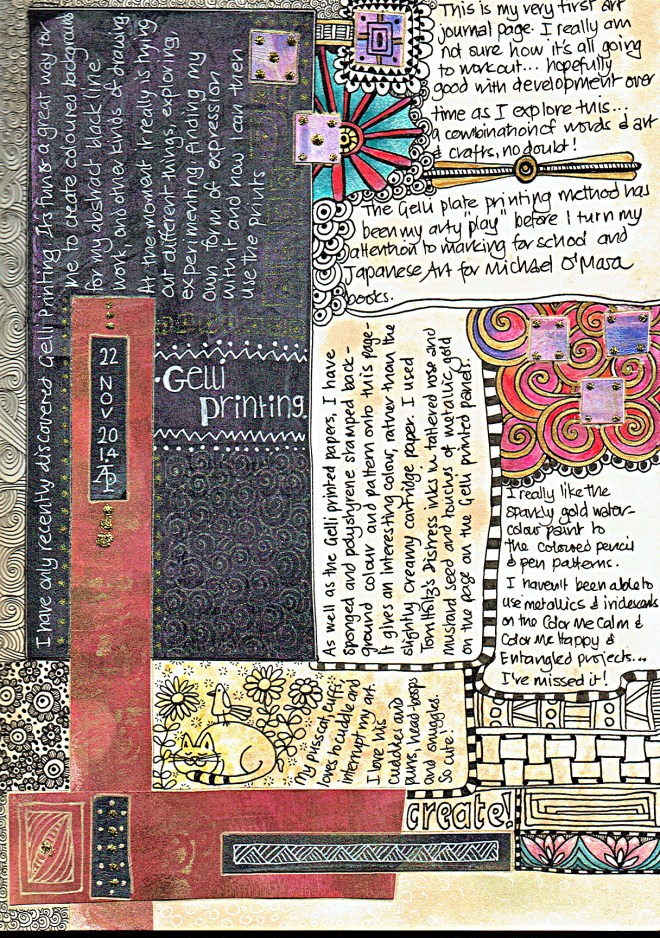
Starting an art journal

For a long, long while I’ve wanted to keep an art journal. However, I’ve been puzzled and confused and not sure what to do with it.

Yesterday, I decided the only way to find out how to do it or what to do with it was to just do it, and to use it as a way to experiment with media/techniques I don’t usually use (certainly when I’m doing the black and white line art for the various publishers I’ve done/doing work for).

It’s actually quite fun. I’ve found a way to make use of the sheets of Gelli printed patterns which aren’t much use for anything else as I’m playing with the Gelli plate(s). I’m using Tim Holtz’s Distress inks with sponges and home-made stamps/texture plates too.

It’s also a way for me to combine words and art, something I’ve never really been happy with.

AngelaPorter_Artwyrd_Journal Page 1

AngelaPorter_Artwyrd_Journal Page 2