Do you ever have one of them days when all that you try seems to go awry? That’s today for me.
I tried three times to create a video and ended up with total messes. I then tried a stop motion project. My camera wouldn’t hold autofocus. So, I think I’ll give up on this for today.
So, instead, I have an oldie of mine, but with words that perhaps make sense. Maybe today I’ve not been working delicately, trying to force it. A rest may be in order.
A time lapse video of me adding colour to yesterday’s drawing. Please click on ‘view in YouTube’ so it can count the views! If you like the video, give it a thumbs up and consider subscribing to my channel.
I’m not paid, sponsored nor gifted any product in order to promote or review any product. I show them just in case you’re interested in what I use, that’s all.
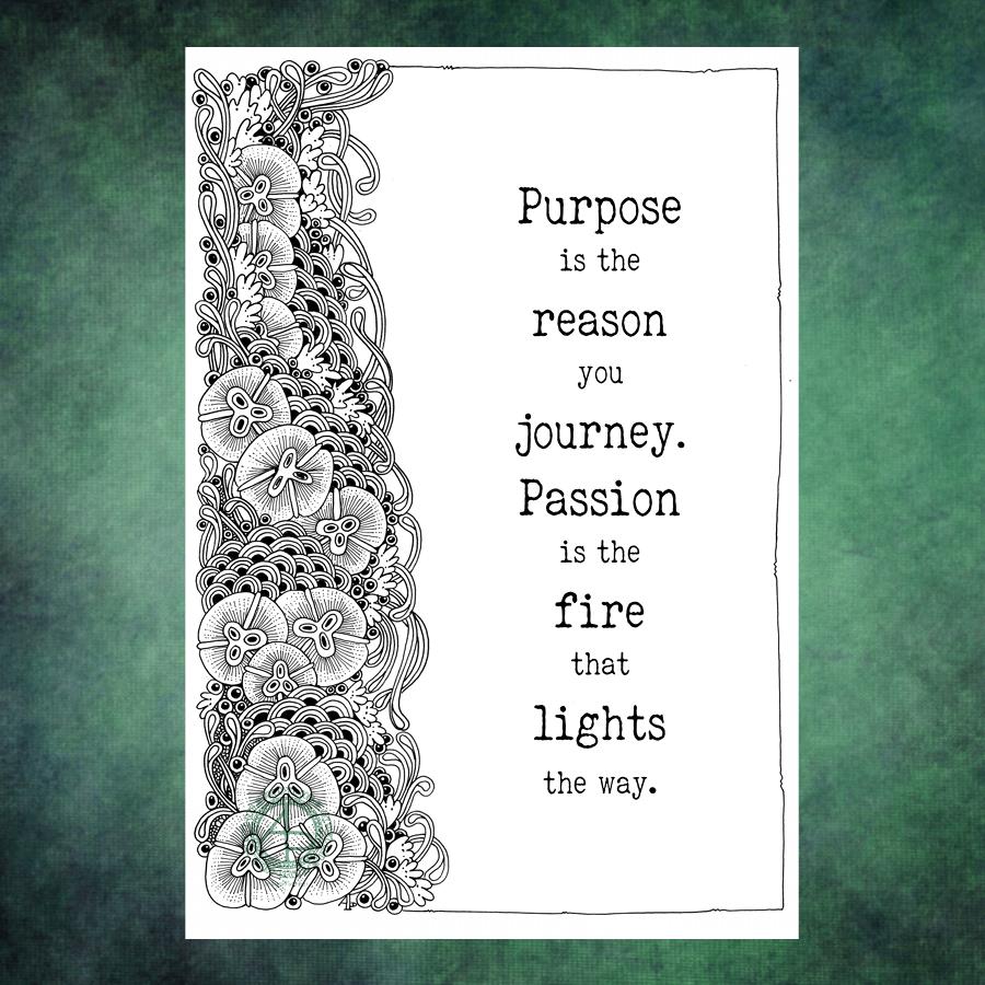
A little bit of wisdom on a Wednesday. A Zentangle frame and a quote. Vintage colour palette. Geometric patterns, repeating patterns, all put together to try an idea I woke with out. Whether it works or not, I don’t know. But was fun creating this little bit of art.
There are bits I’m not too happy about, the shadowing behind the humpy bumpy border around the quote itself in particular. But you have to try things out. No matter what they end up like, there’s always lessons to learn, things to store away for future use. And this, perhaps is one of those things.
What to do with an entangled design that seems to want to take up just one side of a page? Add a quote!
The design was drawn on Bristol Board with a fine Uniball ‘eye’ gel pen and a 01 Unipin pen for the fine lines. The quote was added in Affinity Designer.
It was a quote that just ‘spoke’ to me this morning. Art is one of my passions and something I indulge myself in daily, whether for work or pleasure. I’m so grateful I can combine my work with my passion. Not only that, my coloring templates and books allow others to share in my passion and expressing theirs through colour.
I do get disheartened at times. I doubt myself often. I often judge myself very harshly, especially if I compare my work to others. It’s not always plain sailing. But, I’ve learned that if I persevere, I end up with work that I’m happy with, including this one.
I often say to myself, “Angela, what on earth were you thinking?” This is one of those times.
I started with hand lettering the words. Ok-ish Good enough to mess around with. And mess around them I did – with an “aura” and pattern, then more patterns and repeated motifs … until I’d mostly filled a square sketchbook page.
The drawing was OK. I liked some bits, others I didn’t.
Then, I thought, “What would it look like with colour? Let’s try Inktense and water!”
How often have I mused here about how I struggle with colour? All was going OK-ish with just pinks and greens … and then I added blues and browns…
The geometric pattern at the bottom were colours that didn’t fit well. So, I added watercolours to glaze the colours. Big mistake. I lost any sense of shadow and highlight …
So, I used a white graphite/chalk pencil to try to add the highlights back in …
YEUCH!
So, I put it to one side while I did some other stuff and had lunch.
Then, it caught my eye and with fresh eyes I thought that maybe it’s not as bad as I thought it was .. maybe.
I constantly do this – try to add colour with traditional media and fail. Monochrome seems to work best for me. Monochrome where I can play with shadow and light. Monochrome colours that are added digitally seems to work the best of all.
No matter how often I tell myself this, put notes up to remind me of this, I still insist on trying to use traditional coloured media.
I just think that I hope one day that something will just ‘click’ with me. Today wasn’t that day it seems!
So, back to either white or simple coloured backgrounds, and adding monochrome colours for the sense of dimensionality I like. And I have no hopes that I’ll remember this in a day, a week, or a month or two and I’ll end up asking myself the exact same question; “Angela, what were you thinking?”
The end result may be something I’m unhappy with, but adding colour was enjoyable. I just seem unable to stick to just one or two colours, with variations in their intensity and tone. Then, I descend, bit by bit, into insecurity and self-doubt and incredulity that I did it again!
Ho hum! Not to worry, it’s only pen, paper and some other media. It’s yet another experience to help me, hopefully, learn more and be more comfortable with my artistic style. If we did everything perfectly every time we’d never learn and grow.
So, back to a blank piece of paper with pens I go, and may make some art to remind me, “Angela, monochrome is best!”
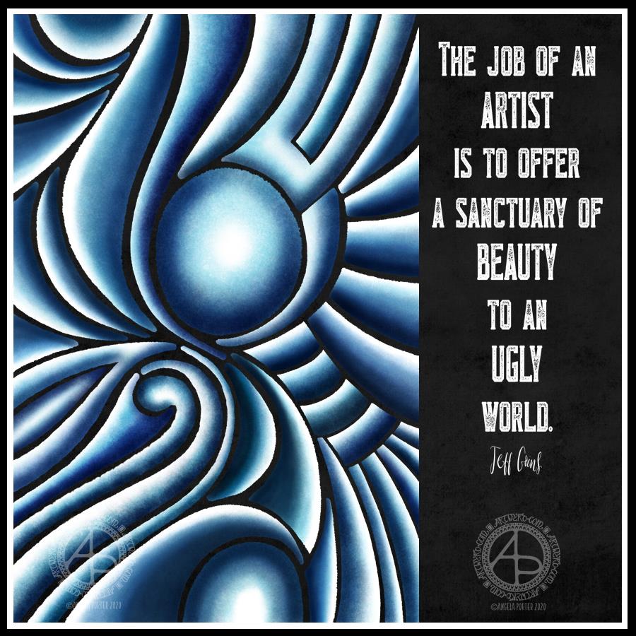
The patterns here remind me of the folds of fabric in Romanesque sculpture. The memories of visiting Romanesque churches, cathedrals and abbeys are filled with the sense of awe and wonder at the beauty of the sculpture, as well being fascinated, contented and happy.
The smooth curving forms, the play of light and shadow – these are things I love to play with in my work, whether pure abstract or with coloring templates.
The quote is how I feel about what I create. I know I put more of myself into my art than I realise, but creating beauty, allowing others to share in what I find to be beautiful and fascinating is what I do. And there is nothing wrong with that.
When I create, I carve out time to find a space of peace, calm, contentment in my life. Creating art is my sanctuary, a time and place where I can forget about the pressures of life, the pains of the past, and worry about the future for a while. If viewing my art, or colouring my colouring pages, even for a moment, gives another person a sanctuary from the pressures upon them, then that is a good thing.
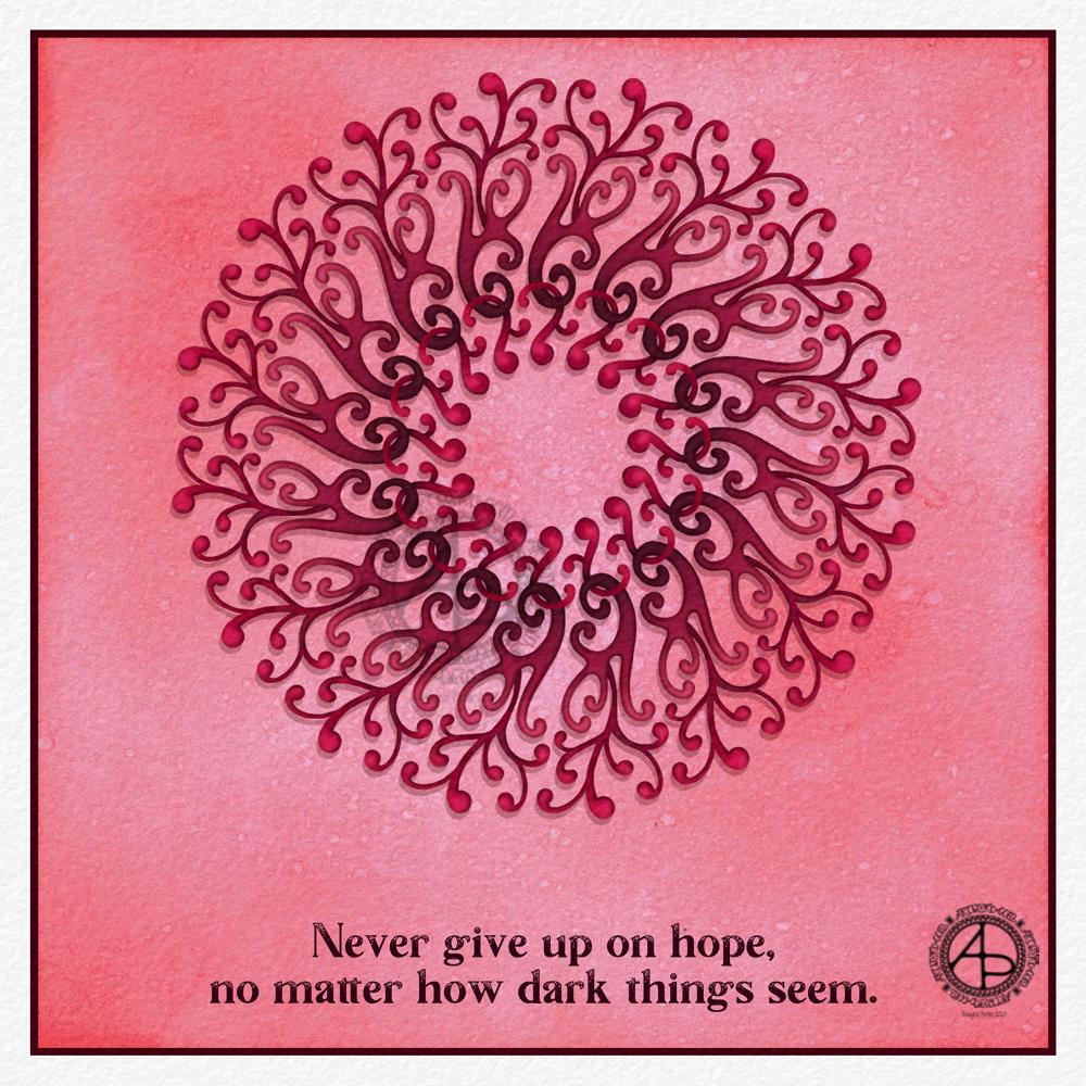
A small drawing/painting, repeated to make a simple border for one of my favourite Kandinsky quotes. Kandinsky is one of my favourite artists, not just his art but his philosophy of art.
All artists and creatives put something of ourselves into our creations, whether we are aware of it or not. Colours, words, shapes, lines, textures, tools, media, and more are how we express our uniqueness – both in how we create our work and how we relate to the world that surrounds us, but also to our inner worlds of imagination, thoughts, dreams, emotions, and our subconscious minds.
Everytime an artist or creative creates, they share something of themselves with others. What that something is, is there for those who take the time to look for it.
I started my arty day with this little drawing. It’s echoing the kind of drawing that’s happening in my sketchbook, but drawn digitally making use of symmetry tools.
As I made it as a border for a quote, I had to find a quote. And I did.
Another ‘pen went for a walk drawing’ along with a quote today.
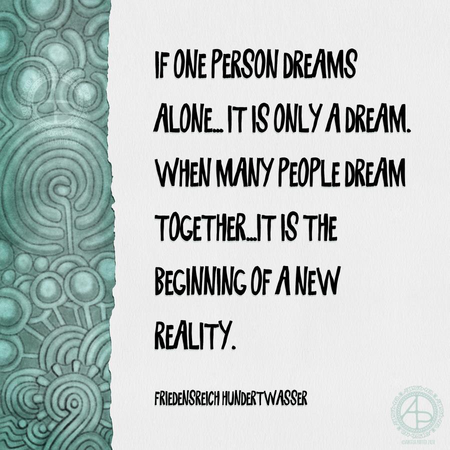
After I’d exhausted my creativity for coloring templates yesterday, I switched to playing around with digital art for a short while to create this border.
To go with it, I chose a quote from Hundertwasser.
I remember reading somewhere, somewhen, that the intricate swirls and abstract patterns of prehistoric rock art may have been representations of those shapes and patterns we see when we close our eyes, when we fall asleep. Or even what is seen in psychedelic visions.
So, this quote about dreams seemed to fit just nicely with the design I created yesterday.
The colour I chose for the artwork reminds me of verdigris – the dusty surface that copper or bronze gets when it’s weathered and aged. It’s a calming, soothing, peaceful kind of colour, and that is the mood I am reflecting through my art at the moment.
In the evening, I sat with sketchbook and pens/pencils and just drew abstract patterns. I really enjoyed using pencil to draw with. I all too often draw directly with pen and I forget how pleasant and ‘soft’ working with pencil feels.