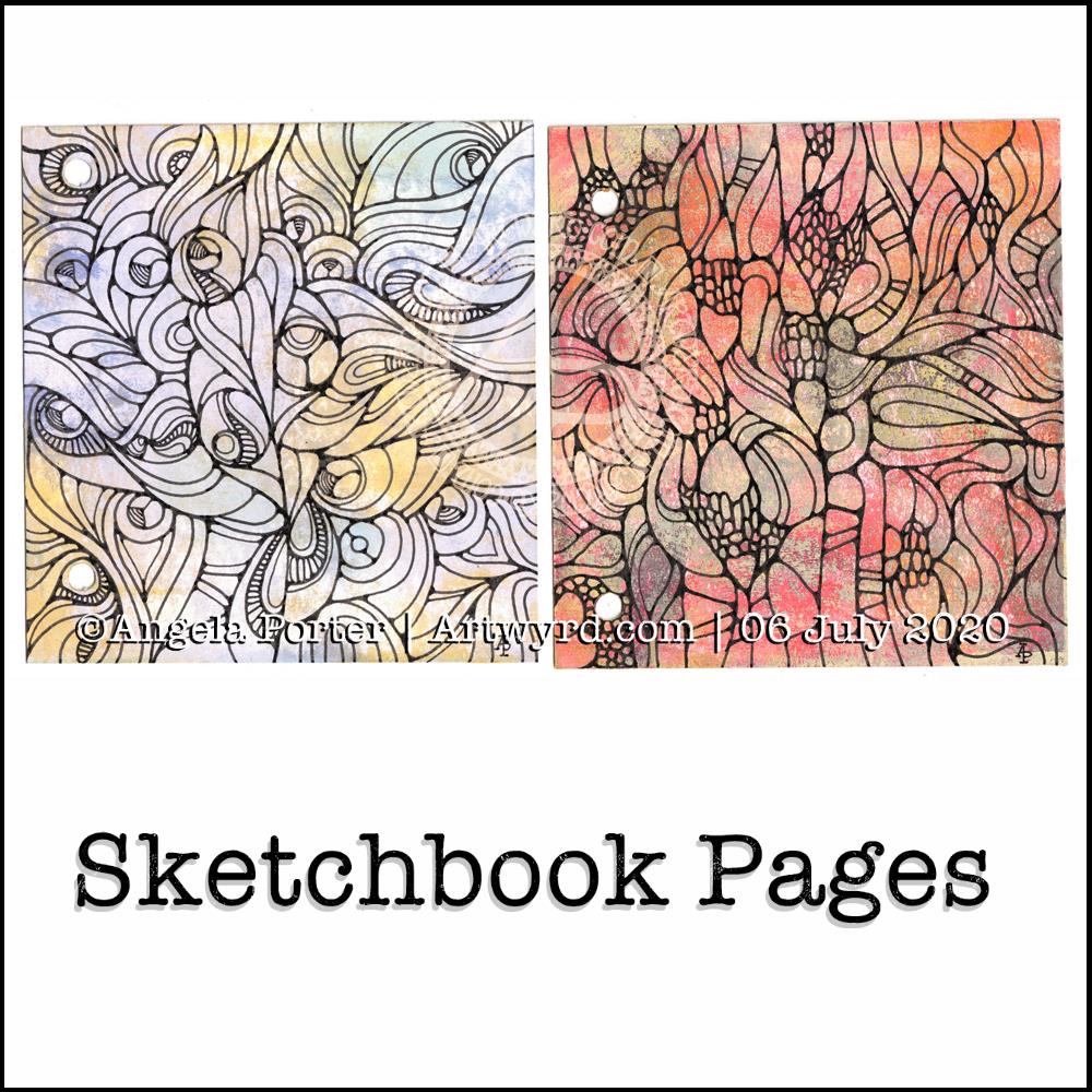
Yesterday, I made a pair of covers for a custom sketchbook. I also spent some time cutting up watercolour and mixed media paper to go into it. Each piece of paper is approx. 4″ square.
I then added colour to both sides of four of the pieces of mixed media paper (Claire Fontaine brand) using PaperArtsy Fresco paints, Daler-Rowney gold acrylic paint and a piece of Cut’n’Dry foam from Ranger.
I also added watercolour to four pieces of watercolour paper, just on one side. I used this as an opportunity to just play with colour, no idea in my head of what to create.
Later on in the day, I wielded Faber-Castell Pitt artist pens on one of the Fresco paint coloured pages (the one on the right). I just wanted to draw. No preconceptions of what would appear on the page.
It’s been quite a while since I’ve created art like this and I actually got a great deal of satisfaction out of the process. That surprised me, as black lines on colour had really not felt right to me for a long while now. It may be that I just needed a break from this style of art.
This morning, I took another piece of the Fresco paints coloured paper and drew a different design. Again, it was something I really enjoyed doing.
I’m really quite pleased with both designs. I think I’ll be using them for inspiration for some watercolour pieces in the near future. My only problem is whether to draw the designs out in black ink, dark pencil or faint pencil before adding watercolour! I think I’ll need to try these out before settling on a method.
What I also really like is working on a small scale. I’ve always been a ‘dainty’ artist; I find it hard to work on large scale artworks. It’s the fine, intricate detailed drawings and paintings that I enjoy creating, as well as abstract art.
Also, I really like the texture the Fresco paints leave on the paper – both for drawing on and the visual interest they create in the background. I’m so glad I haven’t done that destash and tidy-up yet as I know these paints were some of the items that were due to go. Now, they’ll be kept. I’m also glad I have a good supply of the Cut’n’Dry foam too.
I wish I’d placed the holes in the covers of my custom sketchbook closer together. That way I’d be able to add rectangular pieces of paper more easily. That’s something for me to consider the next time I make such a sketchbook.
I have some discs and a punch for disc binding in my stash. This may be something to consider using for another custom sketchbook as it would easily allow the inclusion of different sized papers in the sketchbook. Now my mind is working on using that! I think I need to jot my ideas down in my journal.
What I like about these kinds of systems is the ability to add different papers in where I want them – to shuffle things around as needed.
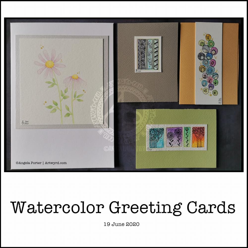
I needed a quiet morning, again, today. So, I thought I’d dig out my Caran D’Ache Supracolor Soft watercolour pencils and try some stuff with them.
I wanted to use them to draw a flower, or two, and then use water to create a watercolour effect. The result you can see on the left-hand side card. I’ve left loads of white space on this card, which is unusual for me. I couldn’t resist, however, adding some gold dots around the flowers. The colour of the petals was so delicate that I used a 2H 3mm pencil to outline them and the leaves. Just for info, the piece of watercolour paper measures 4″ x 4″.
For the other cards, I just wanted to work with the pencils to create gradients and abstract patterns in colour. I drew on the little panels using a 0.25 Copic Multiliner SP pen and added some lines and details with metallic gold watercolour. These cards are approx 3″ x 4″ in size.
Watercolor pencils are nice to use when it comes to drawing in colour with them, then activiating the colour with water. They really glow on 100% cotton rag paper (bottom right) compared to the other cellulose papers.
Cute and whimsical cards, some very detailed, one not quite so. But a nice way to spend my morning.
Self-care time, again.
There’s a situation going on around me that is draining my emotions greatly at this time. I’m doing my best to not become overly emotionally involved in it, but it’s difficult when it’s to do with people you care about.
It all has a knock on effect with me. I’m anxious, tired verging on exhausted, really grumpy, irritable, and lacking patience at this time. I’m also not able to concentrate too well. These are all behaviours I could do without in dealing with this situation. Yet I’m exhausted by it.
I have been meditating, making sure I take time to do self-calming and self-soothing activities, such as my morning art, Though I have work to do for contracts, I need to take a day away from everything, if I can.
I know there are lessons for me to learn about myself in how I’m reacting ot the situation, stuff from my past that wasn’t processed during my EMDR therapy. If I can work out what it is, I can work through it myself now. Organising EMDR therapy isn’t possible at this time, with lockdown still very much in operation and me being very nervous of going out into the world as well.
So, I’m going to make time today to drink tea, meditate, journal and try to get to the bottom of my own issues and start doing what I can to work through them and heal the past traumas that are causing my reactions at this time.
I think I’ll also take time to crochet (I started a mosaic blanket earlier this week) and watch films or crafting shows on the TV. Eat healthily – I have a yearning for brussel sprouts, of all things! And take time away from social media and news. I may even pick up my flute and play it, for the first time in months and months.
Two fairly quick, small projects this morning – small botanical cards. Simple, cute, whimsical, darling. Little treasures.
These were fun to make, relatively quick too. They’d be darling little cards to receive in the post or in person. They’d also work nicely as an addition to a journal – a place to journal or keep little memory making bits and bobs in the envelope too.
Each card is 3″ x 4″ in size and the panels are approx 3.5″ x 2″ in size. I made the envelopes to fit and decorated them with one of the motifs from the designs on each card. I did a tiny bit of hand lettering on one of them too.
This morning, I made a video of me drawing and colouring this festive dangle design and turning it into a card.
This video shows me drawing in real time, and I hope you enjoy it, despite the wobbliness in places.
Here’s a list of materials I used:
8″x 8″ Winsor and Newton Bristol Board folded to make an 8″ x 4″ card
7″ x 3″ piece of Winsor and Newton Bristol Board to draw the design on
Faber-Castell Pitt Artist Pen, medium
Pencil and ruler
Various Chameleon Color tones marker pens
White Uniball Signo gel pen
Tombow Mono glue
Tumbled Glass Distress Ink and a mini foam blending tool
I hope you have a go at drawing this dangle design and making your own papercraft or craft projects with it. If you do, I’d love to see them!
If you’d like to know more about drawing dangle designs, or would like more inspiration, step by step instructions, and encouraging words, then my book “A Dangle A Day” is a good place to start.
Yesterday was a crazy busy day with no time for art, let alone blogging!
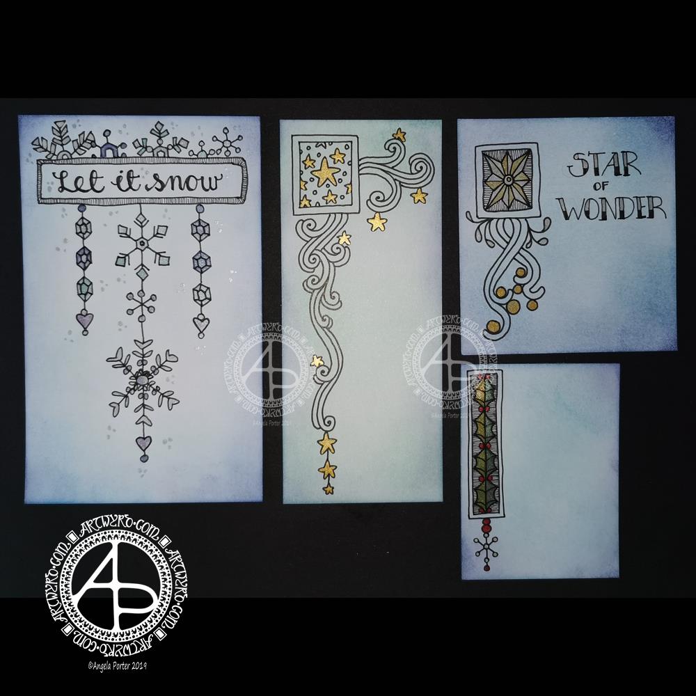
This morning, I finally had some time to myself. As it’s Friday I wanted to do a dangle design, and I ended up doing four!
I cut the card into the wrong dimensions to create a card, so I thought I’d just make use of the pieces I had and make some custom card blanks and envelopes for them another time.
I coloured the pieces of card with Distress Inks in shades of blue and green. I used Chipped Sapphire, Tumbled Glass, Broken China, Evergreen Bough, Cracked Pistachio and Salty Ocean in various combinations.
These colours gave the card a frosty kind of feel, so I went with some snowy, icy, wintry designs.
I drew the designs and completed the hand lettering with Faber-Castell Pitt Artist pens, which are waterproof.
Plain black lines on the coloured background did look a tad lacking. So, I added some shimmer and colour using Cosmic Shimmer watercolour paints.
I’m not so fussed on the ‘Let it snow’ design. However, I am quite pleased with the others.
I am going to mount them as greeting or note cards. However, the designs would look charming in a BuJo, journal, planner, diary or scrapbook. They could easily be adapted to make bookmarks too, or place cards for a special meal.
I hope you’ll give drawing these designs a go, or use them as inspiration for your own projects. I’d love to see what you create – please tag me on social media so I don’t miss them!
If you’d like to know more about dangle designs and have some guidance and inspiration for them, then my book ‘A Dangle A Day’ is a good place to start.
It’s been nice to have a couple of hours to indulge myself in art. The past four weeks or so have been crazy busy with other projects being quite demanding of my time, mind and energy. However, they will soon be over and my focus can return, properly, to art.
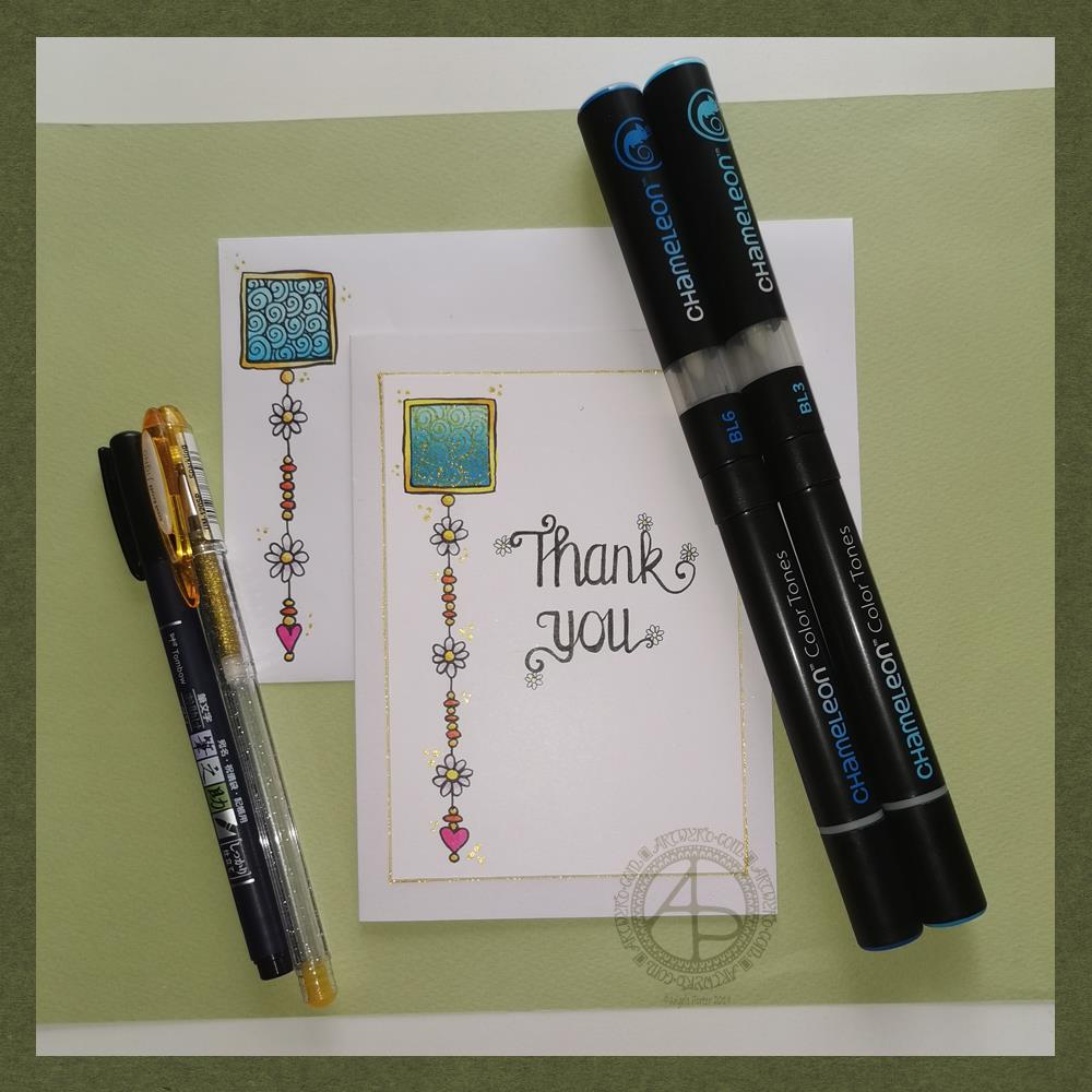
Friday means it’s time for another dangle design, this time a ‘thank you’ card and coordinating envelope.
In previous weeks I’ve had some fun adding patterns to small blocks of colour. So, I thought I’d run with that idea and turn one into a simple dangle design. The steps I used were the same for the card and envelope.
Card size.
The card is an A6 card and I cut a piece of Winsor and Newton Bristol paper to 5″ x 3.5″ for the card topper. The envelope came with the card blank so is A6 in size too.
How to…
I started by drawing a square of colour using the BL3 (Sky Blue) Chameleon Color Tone pen – no gradient, just pure colour.
Then, I added a gradient of BL6 (Royal Blue) over the base colour. I added pure blender to the Royal blue bullet nib using the mixing chamber. I didn’t use the Color Tops to add Royal Blue to the tip of the Sky Blue pen as I wanted a more subtle colour gradient.
Next, I used a Tombow Fudenosuke pen to draw around the block twice. Then, I added a filler pattern of spirals to the colour block. On the card I used a gold Uniball Signo sparkle gel pen. On the envelope I used the fudenosuke pen.
Now the colour block was decorated I turned my attention to the dangle.I decided to draw one dangle as I thought the design would look too crowded if I ad more. Sometimes, less really is more!
After drawing a faint pencil guide-line, I used a combination of beads, daisy-like flowers and a heart for the dangle. I wanted to keep it nice and simple.
Then it was time to add colour to the outline and design elements. I used the Chameleon Colour tops to add very simple colours. I didn’t do any gradients as the designs were so small. Instead I coloured them in the lightest colour, added a touch of darker colour where I wanted shadow and blended that out with the lighter colour.
I decided to hand letter ‘Thank you’ on the card using a soft nib Fudenosuke pen. I also added some tiny daisies to some of the loops and swirls to tie the hand lettering in with the dangle design.
I then mounted the card ‘topper’ on the card blank and added some gold glitter gel dots around the designs. I also added a gold line around the card topper.
Before I post the card, I’ll use some Micro Glaze from Ranger on the envelope to protect the Tombow pen from water damage.
Reflecting on the project…
Overall, I’m quite pleased with this. In hindsight I wish I’d used the Tombow Fudenosuke pen to draw the spiral pattern on the card. I think it’s a cute, simple and versatile design.
It would make lovely stationery, such as note paper or note cards, along with coordinating envelopes. There are lots of ways the design could be used in BuJos, Planners, Journals, Scrapbooks, and Art Journals. The vertical nature of the design means it would make a lovely bookmark.
How would you use this design? I’d love to hear, so leave a comment!
If you have a go at drawing and using this design then please share your finished products with me – I’d love to see how people use dangle designs!
If you want to learn more about drawing dangle designs then my book ‘A Dangle A Day’ is a good place to start. There’s over 120 designs for you to use as they are or for inspiration for your own designs.
Nearly every Friday I publish a new dangle design on my blog for more inspiration.
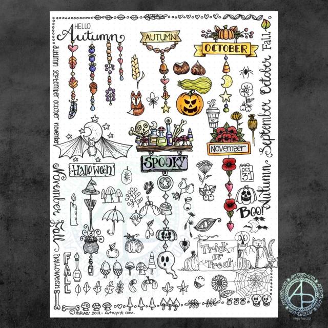
It’s been a while since I did any whimsical dangle designs, so here’s an A4 sheet full of ideas!
There are six complete dangle designs on this sheet along with lots of ideas for motifs to use. I’ve also done some hand lettering, something I don’t do often enough these days.
I know there are likely to be things associated with autumn missing from the sheet, but it is a collection of some of my favourites. I had a lot of fun filling in some of the space around the dangle designs with the lettering and design elements.
I used Tombow Fudenosuke and Faber-Castell Pitt Artist pens to draw and hand letter on an A4 sheet of dot grid paper by Claire Fontaine.
After scanning in, I decided I’d like to add some colour digitally. I used a different kind of brush setting – natural blend with an airbrush. I’ve not quite worked out how it works, but I like the way it’s turned out here. The colour blends turn out quite soft and gentle, however this brush setting does need some more experimentation by me.
These are lovely, simple designs that would be perfect for using in bullet journals (BuJos), planners, diaries, scrapbooks and journals as well as for greeting cards, bookmarks and more.
My book “A Dangle A Day” is a great resource for dangle designs and design elements (called ‘charms’ in the book), even if I say so myself. It also has easy to follow step by step instructions for beginners to more confident creatives, as well as lots of inspiration – there’s nearly 200 dangle designs in the book!
So, Angela, how are you feeling today?
I’m feeling content, fairly upbeat and the exhaustion of the past few days seems to have mostly subsided. There’s still some tiredness there, but I feel more able to cope with the demands of daily life.
I do have to venture forth into the world; in my rather emotionally fragile state the thought of going grocery shopping filled me with, well not horror but trepidation. Fortunately, I keep a fairly well stocked fridge, freezer and cupboard, but now I do need to go get some fresh fruit and veg, which I will do in a short while I expect.
It is good to be back to having the contentedness the dominant feeling – it’s not as strong as it has been which tells me there’s still some emotional distress lingering. However, it is the prevalent emotion.
I’ve weathered another emotional storm. I do try to remind myself that I’ve come through plenty of hurricane force emotional and mental storms in the past and I can come through them again. Nowadays, I know what contentedness feels like and during emotional storms it acts a lighthouse to guide me back to emotionally calm waters.
Today I have two card designs for you, both featuring dangle designs, but in different ways.
If you like dangle designs and you’d like to give drawing them yourself but need a little help or inspiration, then you may find my book “A Dangle A Day”of interest. In the book, I take you, step by step, through how to draw over 100 dangle designs, along with some ideas of how you could use them.
Love Ya and With Love Card.
I started by using the Foursquare Backdrop: Portrait die from lawn fawn to cut the frames and panels from a piece of Winsor and Newton Bristol Board. I purchased this die, and the one in the second card, from Seven Hills Crafts here in the UK.
Next, I used Stormy Skies and Broken China Distress Inks to add a subtle colour gradient to the panels.
My idea was to draw four different dangle designs for each small square panel. I also wanted to include some hand-lettering, which I did.
So, I used Unipin pens from Uniball to do the drawings and lettering. I did use pencil outlines for the ribbon banners and lettering to make sure their placement was just right.
I coloured the design elements and charms using Copic markers. As the individual design elements were so small, I just used two colours to achieve shading in the bigger ones.
I also added a drop shadow around the designs using a BV marker that is a greyish-violet. It’s a very subtle drop shadow.
I had to add some sparkle and shine to the card, so I used a clear Spectrum Noir Sparkle brush pen along with a gold glitter Signo gel pen to do this.
To assemble the card, I glued the frame to the card base using Tombow Mono adhesive. Then, I glued the square panels into place.
I managed to get glue onto the front of the card and trying to rub it off while wet just left a dark, dirty smear. I’ve ordered some Tombow Sand erasers to see if they’ll remove the mark. If not, I’ll have to either work out another way to cover it up or just consign the card to the pile of things not to do again!
Black and white floral card.
Again, my first job was to cut out the frame and panels using a die. For this card, I used the Foursquare Backdrop: Landscape die from lawn fawn along with Winsor and Newton Bristol Board. I also decided to use this die in portrait mode.
To draw the design elements, I used Unipin pens from Uniball. I hung dangle designs from the top of each card to fill in some of the space that was there. I wish I’d used a slightly thicker pen than the 01 though. They look almost like an afterthought.
Anyway, once I finished the drawings, I wasn’t sure whether to add colour or not. So, I’ve left the pictures as black and white line art for now.
I used Tombow Mono glue to attach the frame and panels to a 5″x7″ piece of Winsor and Newton Bristol board. I did this as I realised that the dies are made to fit card blanks made from half a sheet of US letter-sized paper folded in half. In the UK, we use A4 sized paper, which is different enough in size to make it awkward to cut the paper to fit the card. I have ordered some 5″ x 7″ card blanks with envelopes, and then I can finish assembling this card. I’m likely to trim the foundation panel down a little and maybe try to carefully add some colour around the edge. Maybe.
It’s at this point I’ll decide whether or not to add colour and to see if I can thicken the lines around the dangles without messing it up. Mind you, if I do mess it up, it’s another experiment I can learn from, hopefully remembering not to do this again.
Things I’ve learned and techniques I want to try.
The lawn fawn dies work great! They come with smaller dies – heart, cloud, small star, large star, sun, small sun and speech bubble – which may be useful in the future. I had made my mind up that I’d limit myself to die sets that are simple in shape to for cutting out panels to draw on and maybe for layering.
I rolled my eyes at myself when I worked out that dies from an American company would work best with American sized paper for card bases. However, I can work around that now I’ve realised that. I’m comfortable working with inches; most of my craft tools have both inches and centimetres on them. However, the inches are visibly the most dominant measurement system.
Glue. Me and glue. Not sure how I can avoid smearing in the future. Hopefully, the sand eraser will help to remove my gluey, sticky, dirty-looking mistakes.
I like using Distress Inks for backgrounds. However, the pale colours of markers that I prefer to use are translucent and so combine with the background. I could use other media such as coloured pencils for colouring. Or I could use distress inks or water-based marker pens with a damp brush to add colour. I could also use a damp brush to remove some of the distress inks. In that case, I may have to use watercolour paper instead of Bristol Board.
I could also use a Versamark pen – which contains transparent, sticky ink – to colour over my design elements once coloured and then use clear embossing powder and a heat gun to protect the colours. I could then add the distress inks after heat-setting the embossing powder. The embossing powder would add some dimension and shine to the cards. If I used a sparkle pen or gold gel pen, for example, the embossing would encase it and highlight these embellishments Ieven more, I think. I need to try this idea out!
So, there are lots of possibilities for going forward with this.
So, Angela, how are you feeling today?
I’m feeling the more content and optimistic than I have for the past two or three weeks.
I’m still feeling out of kilter; changes are happening in my perceptions around my emotional/mental wellbeing. I’m also aware of shifts that are happening in other parts of me.
I’m still poop-scared about what is going on in the world. I can’t see that ending anytime soon, however. This, and the rest of the emotional rollercoaster I seem to be on, are still upsetting my digestive system, so I’m not feeling too well much of the time.
Yesterday, I was so unsettled and scared that I couldn’t settle to do much art, and I became so dissatisfied and frustrated with whatever I did. I couldn’t settle to anything else either – not crochet, reading, nothing.
As I’ve said, today I do feel better, so I need to turn my attention to trying out Affinity Publisher to create some materials I’ve been commissioned to do (the artwork and inserts for a CD by a band!). I’ll see about setting the templates up first and go from there. I’ve not tried to do this the past couple of days as I know my head and my emotions weren’t in the right place. I’m not sure that they are today; it’s only by doing that I will find out whether they are or not.
I woke this morning and had a fancy to make a card along with a coordinating envelope. I’m going to be sending these to someone, so I didn’t want to show the whole design, so a sneak peek it is. I don’t think it gives much away about the mail art. I hope it doesn’t spoil the surprise for the recipient.
I used a pre-made card blank and envelope. The card is nearly 8½” x 4¼” in size and is plain white.
I cut a piece of Winsor and Newton Bristol board to 3½” x 7½”. I added some score lines ⅛” in from each edge and let them overlap to form little squares at the corners. To do this I used a score board and bone folder. I’ve never done this before, but it actually adds a nice touch. It also gives me an even border to work within, which is always useful.
My next step was to add colour to the top layer and the envelope. I decided to do some ink blending with Distress Inks. Here’s a list of the colours I used:
scattered straw
wild honey
crushed olive
candied apple
evergreen bough
Once I was happy with the colour gradient, I broke out my Uniball Unpin pens and started to draw the design. As I had a coloured background, I made use of lines and patterns to add texture and dimension.
When I was happy with the design, it was missing something. It needed some colour or shading. I decided to add some colour with Copic markers, being mindful of using colours that would work harmoniously with the background.
My final step was to add some dots of gold glitter to add some ‘bling’ to the card.
My attention then turned to the envelope.
First, I added some pencil lines to help me keep my hand lettering level and neat. I then used a black Tombow Fudenosuke pen to brush letter the recipient’s name. I then used a grey Tombow Fudenosuke pen to add shadow to the letters.
I then used a Uniball Unipin 08 pen to add the address. For this, I used simple capital letters for the hand-lettering.
My next task was to draw the design on the envelope. I used some elements from the card for this, plus a couple of extra ones. I also added texture and shadow with lines.
My final task, after I’d written my name and address on the back of the envelope, was to seal the envelope art with a thin layer of Distress Micro Glaze, carefully avoiding the area where stamps will be affixed. The Micro Glaze creates a waterproof layer so the Distress and Tombow inks shouldn’t run if they get wet.
Once the recipient has the card, I’ll post a full image of the mail art, carefully obscuring their information.
So, Angela, how are you today?
I’m ok today. I’m a tad tired, but I don’t seem as emotionally fragile as I have been. There’s still a bit of ‘flatness’ or ‘heaviness’ inside me, but the contentedness is of equal or greater intensity.
Today I need a quiet day at home; the last week or so has been crazy busy with either emotional upsets occurring or commitments I have to keep. The next commitment I have is on Thursday evening, so I’m going to make the most of the time I have to myself. Creating mail art was one activity in self-soothing.
I doubted that I would find this more settled state any time soon. That it’s appeared today is a real bonus. How long it stays for I don’t know as I know what is in my diary.
I’m not going to worry about that, well not much. I’m going to enjoy the contentedness and Use my quiet time to soothe my still fragile emotions.
Yes, I feel mostly content, but I also know that it won’t take much to provoke me to tears and some emotional distress.
One thing we talked about in therapy on Monday was the need for me to protect myself in situations where I’m emotionally vulnerable. I’ve had a lot of time interacting with people over the past few days. I now need time to relax, breathe, re-energise.
I enjoy being with people, but it also drains me. That’s one of the consequences of being an introvert. When I’m socially exhausted, it makes me more emotionally vulnerable than I usually am. So, I need time to recover from this.
I will recover. Nowadays, I always do given enough self-care and self-soothing time.
I also am self-aware enough to know that to start important projects is not a good idea at this time. It becomes all too easy for me to find fault with everything I do and for me to end up spiralling downwards into a mood where I am harsh to myself.
It is still hard to be kind to myself on days like this. There’s a nagging voice that I should be doing this or doing that and not indulging myself in activities that help me to heal. Other inner critics join in, telling me I’m worthless, useless, a failure, unloveable then join in, sensing the vulnerability in me. So, I’m learning to ignore that voice, even if I still feel a little guilty. As I feel better, refreshed and re-energised and more emotionally resilient, the inner critics become inaudible once again.
So, as hard as it is to accept that I need to be kind and to spend today doing what will help me heal, this is precisely what I am going to do. And that starts with me writing a letter to accompany the mail art. I also want to create some designs that I can print to colour and use to create greeting cards.