Inktober 2019 Day 15

Day 15 #Inktober2019 #Inktober ©Angela Porter | Artwyrd.com

This morning has been getting the day 15 of Inktober 2019 drawings done, but also catching up on those I didn’t get done yesterday.

I’ve gone, yet again, for a sketchbook style montage; focusing on line and pattern is something I enjoy. I’ve even managed to create a stylised motif from the cap of Lactarius resimus.

As before, I drew the mushrooms and tangle patterns on Rhodia dot grid paper with a Sakura Pigma Sensei 04 pen. After I’d scanned the page, I increased the contrast to remove the dot grid.

I drew and coloured the cat skull digitally in Autodesk Sketchbook Pro. I just copied my illustration and made it greyscale for the smaller drawing. I thought purple would be a fun way to colour the skull in; cats are my favourite animal and purple is my favourite colour.

I’ve also included a little more hand lettering on this page than in the past. I know my hand lettering needs regular practice, and I do tend to neglect it.
I’m using Inktober 2019 prompts from three Instagrammers:

  • Animal skulls from @book_polygamist
  • Mushrooms from @nyan_sun
  • Tangle patterns from @havepen_willdraw

So, Angela, how are you feeling today?

Today I’m feeling tired and have a rather tender digestive system. I had a really upset stomach yesterday afternoon and through the night, which disturbed my sleep.

Yesterday I was really upbeat, ebullient even. However, that drifted away as I drove home, my head full of the thoughts that I’ll soon be finishing therapy. Today, I feel content, a bit weepy, but the dull grey, dampness of the weather is having its effect. I really do need to get one of the SAD therapy lamps to help me on gloomy days.

I had therapy yesterday, but no EMDR. Instead, I talked about my trip to Llandudno last week and how proud I was of myself for walking in a strange town and going out for a meal by myself.

I also needed to talk about the flash of anger that rose up in me when I saw my narcissistic mother at a family thing on Friday. My therapist was pleased when I told her I felt anger; that is a perfectly healthy response to someone who has abused and neglected you. That I didn’t express that anger in a negative manner, such as screaming, shouting, abusiveness, was also a healthy thing to do.

My therapist was also pleased that I was self-aware enough to recognise this. We had a conversation about how far I had come since I started seeing her over six years ago.

Then, I talked about how I thought it would soon be time for me to end therapy, for now. I got all emotional and tearful about that. I still am as I type it.

I’m working on one trauma in EMDR at the moment, so I’d like to finish that. Also, a couple more have come to mind that need processing. Still, it won’t be long until I leave therapy.

First, I need to complete processing the trauma I’ve been working on, and there are another two that I need to process. But shortly I will be leaving therapy feeling I am good enough for now.

I need to continue with the positive steps made in being out and about by myself with some confidence and not much in the way of fear/anxiety, particularly when I am at home. I am, however, going to plan a short trip away over one or two nights in November, most probably to West Wales. I first need to finish my contracts and commissions.

I need to remember that I can always return to Linda should I have problems in the future. I don’t know what my life is going to bring me and what interactions with people there will be that may bring up a trauma response. Linda will always be there for me to go back to help process the traumas.

Mandala WIP – today’s update

Mandala WIP © Angela Porter 2019 Artwyrd.com

I’ve made some more progress on this mandala. It took me a good couple of hours to settle on the colour way for the black portion of the mandala. Whatever colour I tried it just seemed to be ‘too much’ against the bright motifs already in place. Black seems a little stark at the moment, maybe.

As I’m creating this digitally, I can always alter the black section. However, I think that as I ‘sit’ with the design the black will make some kind of sense.

As I put the simple shapes of the ‘shells’ or ‘flowers’ beyond the black section, I worried that they wouldn’t work. it was only by adding the details that I have become pleased with these motifs. They’re very textural in nature. I’ve even worked out how to have the ‘pearls’ or ‘pollen grains’ floating above the sections.

What I’m really pleased with, though, is the addition of some simple but effective details to the lighter parts of these motifs, including a couple of spirals that are in the same colour scheme. Sutble, but I think they’re lovely details.

It’s taken me a good five to six hours to complete these two sections You can also see I still have quite a bit left to do. I’m going to take a break from it for a while now. I didn’t realise how long I’ve been hunched over the Surface Studio working on this. Oh, I’ve been using my Surface Pen along with Autodesk Sketchbook Pro with the Surface Studio and it is a pleasure to do so.

My trio of tools are allowing me to create my own bit of personal artistic magic. Well, I think that’s what I’m doing. Something rather pretty, beautiful even, and colourful too.

Gosh, what am I saying? Me, recognising that something I’ve created is pretty even beautiful? Blimey! That doesn’t happen often I can tell you. But I really am rather proud of this mandala and the style in which I am working at the moment.

So, how are you today Angela?

I’m ok today. Quite content really. I also have the sense of satisfaction that I’m doing a good job with this mandala.

Yes, a sense of satisfaction and the recognition I’m doing a good job. These are emotions that I’m only just becoming aware of in myself.

Another small sign of progress being made on my journey to recovery from CPTSD.

My interview with nfreads.com

I recently did an interview with Tony Eames from nfreads.com about my books, my art, and my quirky self.

You can read the interview here.

Easter Dangle Design and another moan about stolen artwork.

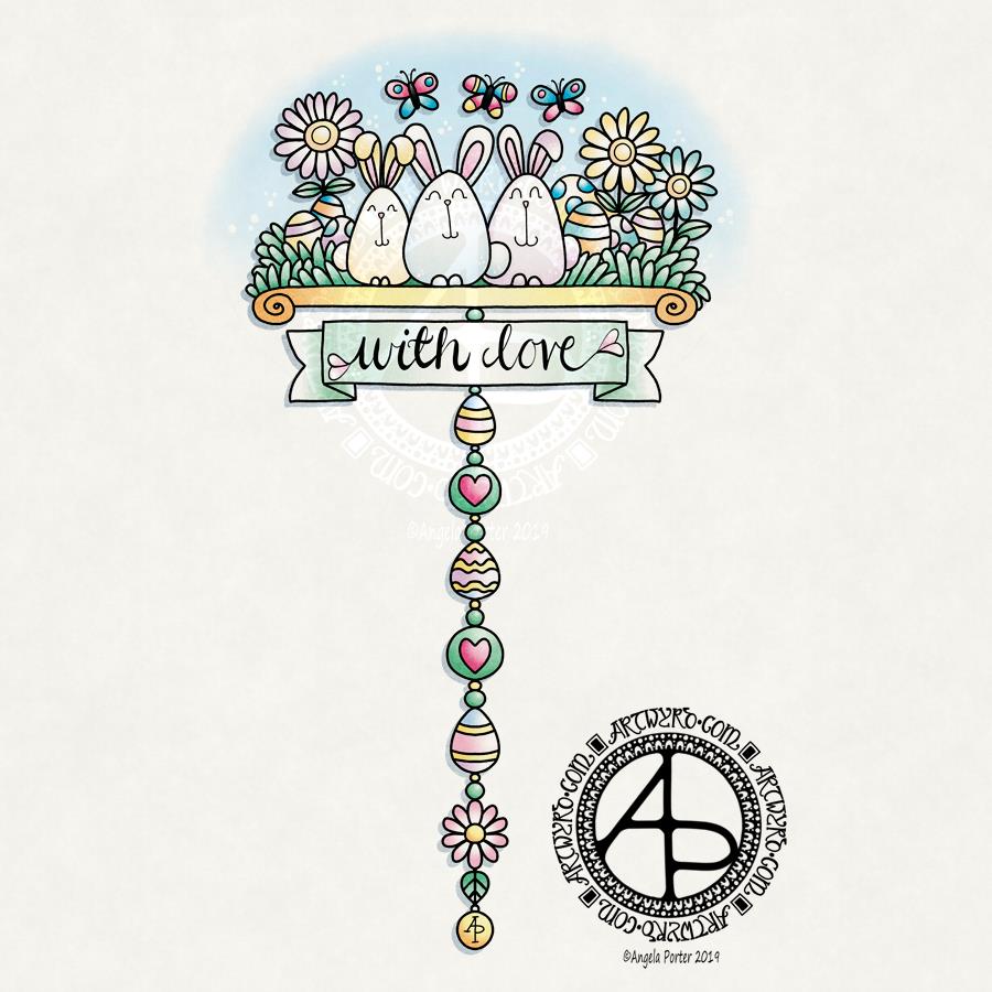
Easter Dangle Design ©Angela Porter 2019 - Artwyrd.com
Easter Dangle Design ©Angela Porter 2019 – Artwyrd.com

Notes on the Dangle Design

A trio of cute bunnies along with their stash of chocolate eggs looking all happy and also a little bit smug with themselves. A really cute and whimsical dangle design for you to use as inspiration for your own designs. I kept the dangle to just one strand to let the bunnies be the stars of this design.

The ‘with love’ sentiment was hand lettered. Yes, on the paper that is the screen of my Surface Studio using my Surface pen with a brush in Autodesk Sketchbook Pro that I’ve set up to mimic a brush pen, such as the Tombow Fudenosuke pens I’ve been using lately to draw with.

I’ve chosen soft, pastel colours, which are quite fitting for spring time I think. The textured background paper dulls and darkens them a little. However, I think that gives a bit of a vintagey, aged feeling to the design.

I did sketch the design out on Rhodia Dot Grid paper before scanning in and inking and colouring the design digitally.

My book ‘A Dangle A Day’ takes you step by step through drawing dangle designs, with plenty of helpful advice and encouragement throughout.

Yet another theft of my artwork

Yup, it’s happened again. This time on teespring.com.

One of my dragonfly designs, which incidentally has been sold to a private collector, has been used on products that someone is selling to make profit, without even bothering to search out who the artist was (me in this case) and approach them (me).

I mean, it’s not a difficult task these days. Drag and drop the image into the search bar of Google images!

I’ve emailed the company. They have a week to reply. I’m not going to hold my breath though.

How did I find out about this particular theft? The product appeared on my facebook news feed as an advert!

I left a comment on the facebook advert saying the artwork had been stolen and I was the artist who created it too. And shared the advert on facebook on my timeline and my facebook page and on my twitter account too.

Not that it’ll shame the shameless intellectual property thieves who perpetrate copyright infringement for their own financial gain.

Not that it’ll shame the company (companies) that allow this to happen.

It’s really annoying though.

It really makes me very sad, disheartened, and absolutely worthless too. The people who do this shameless theft don’t care about the effect it has on the owners of the artwork, or other intellectual property.

Yes, that’s right I feel worthless as a person, that my art is good enough for you to steal but not good enough for you to give me credit for it, to contact me about being able to use it, or to pay me for the use of it.

I’d never, ever do that to anyone. Never.

It also makes me wonder how much of my artwork that I’ve shared via deviantART, facebook, instagram, Pinterest, twitter and so on has been stolen and used without permission from myself. There’s no way I can actually tell.

Yes, it’s flattering that people like my art enough to do this. But it’s annoying that they don’t even have the decency to either state who created it and how to contact them ( that’s me in both cases here) and don’t even have the decency to contact myself about licensing the artwork, as that is the honorable, decent, law abiding thing to do, isn’t it?

I don’t have the time to go through the interwebs and find all my artwork and either delete it, complain about it being stolen, or add very distinctive watermarks and copyright notices to older work.

I will keep adding watermarks and copyright notices to all the artwork I share on the interwebs for the foreseeable future in the hope it will deter some people.

The last thing I’d want to do is to stop sharing my creations with people who just like it to look at, for a bit of ‘eye candy’, for something that makes them smile, and fascinates them, particularly with my more intricate works.

I bet even then there’ll be unscrupulous people out there who won’t give a damn anyway, but I will do my best to make it as difficult as possible for them to make a product from my art that is of good enough quality for them to make any money from. Watermarks. Background textures. Low resolution images.

Perhaps I shouldn’t let it get to me.

No, I should. If someone stole my car, my bank cards, my money, my home I’d be upset.

I make my living through my artwork.

You who steal my artwork are stealing from me as if you were reaching into my bank account with your grubby, sticky, unscrupulous, thieving fingers. How would you like it if I did that to YOU?????? Ah, that’s right. I wouldn’t happen to you as you don’t have the skills, talent to create artwork like mine do you, but the only skills you have are to steal.

The difference colour makes …continued

©Angela Porter 2019 Artwyrd.com

I thought I’d show you the progress I’ve made on this drawing. I hope you find it interesting to see how things are progressing with it.

Yesterday, I didn’t get much done as I was whacked out after EMDR therapy in the afternoon. It was very intense with some very powerful physical pains as well as some emotionally upsetting insights. Tears flowed. An hour of discomfort to help to release years and years of emotional/mental pain and suffering isn’t too bad is it?

Today I’ve not done anything. I did an anti-stigma talk to a group of health-care employees for the ABMU Health Board at Singleton Hospital in Swansea. This was on behalf of Time to Change Wales in my role as a champion.

The drive there was horrendous. The rain was absolutely hammering down. Then, it was really difficult to find somewhere to park. I did find somewhere eventually. Then, there was the walk to the hospital and the problem of finding my way to the Chapel/Multi-faith Centre. By that time, the stress of not finding parking easily had caused me to flip into hypervigilance mode and it wasn’t easy to see or decode information.

Eventually I must’ve looked totally lost, a nice man asked me if he could help. When I said the chapel, I noticed another chap had come over and he had a Time to Change Wales badge on and it turns out he was Martin, one of two new champions who had come to observe me.

We had directions to the chapel and the other champion was waiting outside.

I did my talk, became, for me, quite emotional, and left, after chatting with people and Martin and Connor, the other TTCW champion.

I was glad to find my way back to my car, and started to feel a bit spaced out as I drove home. Thankfully the rain had mostly stopped though the spray was horrible.

I’ve eaten and had some tea but I still feel drifty and floaty and I really, really could do with a long nap now. It’s taken nearly 4 hours for me to feel ready to nap. However, I can’t take a nap as I have to drive to Hereford this evening for around 7:15pm. My sat nav said it would be an hour and a half journey there. Perhaps I could have a quick nap …

I know tomorrow I have another anti-stigma talk to do – this time with a group of police officers at Ton Pentre police station – and a medical appointment later in the day. Thursday I’m doing another antistigma-talk to a group of trainee nurses and midwives over in Abergavenny.

I foresee some early nights ahead of me, though most probably not tonight!

Dangle Day Friday 21 September 2018

Angela Porter Dangle Day 21 September 2018

It’s Friday, so that means it’s #dangleday!

A simple, elegant design with a sweet sentiment for this week’s dangle design. I like the symmetrical nature of the dangles.

I did sketch the design out in pencil on dot grid paper which I scanned in to ink in digitally and make use of the symmetry tool in Autodesk Sketchbook Pro. I also coloured and added texture with various brushes in Sketchbook. Naturally, I made use of a Microsoft Surface Pen and Microsoft Surface Studio to do this.

I kept to a really simple colour scheme, using just one pink, golden, blue and green colour gradient for the design, with the exception of the rainbow beads in the central dangle.

It would be really easy to put a different sentiment or greeting in the box, but I like this one.

A different colour scheme, of course, would result in a very different ‘feel’ to the card, matching all kinds of seasons and occasions.

This would make a lovely greetings card or note card. I think I’d like to use it for the beginning of each month in a BuJo, planner or diary, changing the colour scheme as appropriate for that month. I do like playing with themes for my BuJo, but there’s something in me that likes a cohesiveness in design/style.

What would you do with this design? Let me know by leaving a comment.

Of course, I could print the uncoloured version out and colour with different media. It would be no great chore to re-draw the design on paper more suitable for, say, watercolours, where my printer doesn’t cope with decent quality watercolour paper.

Just a little reminder that my book ‘A Dangle A Day’ is available for pre-order, just click on this linkIn the book I give help, guidance and advice on creating your own dangle designs, as well as providing many examples of monogram dangles and dangle designs that you can use for your own projects.

Abstract Botanical 19 September 2018

Angela Porter 19 September 2018

It’s a lovely, sunny late summer morning here in the UK and it’s been a perfect time to finish this design off.

Yes, it’s another abstract, zentangly, entangled botanical design, which seems to be my signature style of art, though I do dabble in other styles, as you know, particularly my kind of dangle designs.

This one, like many of my previous ones, was completed in these stages:

  1. Draw the black and white line art on Rhodia dot grid paper using a black 08 Sakura Pigma Micron pen.
  2. Scan the drawing into GiMP. Use tools to remove the dot grid and remove the noise. Save with a transparent background.
  3. Import the image into Autodesk Sketchbook Pro. Any edits to lines can be made here using a pen ‘brush’ that mimics the texture of the Micron pen on the dot grid paper. Then layers are used to create the background, add colour to the design before adding texture and highlights.

It takes a day or more to create a piece of art like this. The drawing of the design alone can take anywhere from 2 to 10 hours, depending on the intricacy and size. This one was A4 in size and isn’t very detailed; I let the colour and texture add details to the design in this instance. I want the colours to shine. The colouring etc. has taken a few hours to do.

It takes me at least as long to create a piece of digital mixed media art as it does to draw and colour the design using traditional methods such as Chameleon markers or Inktense pencils.

What I love about working digitally is the ability to change the colours I use for the elements, and then being able to add texture and highlights/shadows. I can see where I need to go back to the image and add or deepen shadows to increase the sense of depth in the design. A drop shadow on the background isn’t really needed as I think the background is like a sunset sky or alien sea.

The other thing about digital work, is the ability to use the black and white outline to re-work the design using a different colour palette, different textures. I also have the option to print the design out and colour using other media, such as marker pens, perhaps changing the size of the image so that I can create, say, a greetings card or note card, or even a page for my BuJo.

I spent some time on Monday playing with Repper Pro and had some fun creating repeating patterns using the last couple of abstract botanical images. Just from a couple of artworks, I have more than a hundred seamless tiles for patterns; it’s just sorting through them and working out which are the best. I may post some of the best ones later today or tomorrow, and maybe create some based on today’s art above too.

I actually think some of the tiles would, with a border, make amazing patterns for square cushions/pillows worked in tapestry, canvaswork, cross-stitch or similar. You can decide for yourselves when I post them.

Abstract Botanical 16 September 2016

Angela Porter 16 September2018

Another abstract botanical. Here are the steps I took in creating it.

  1. Draw the black and white line art design on dot-grid paper from Rhodia using Sakura Micron pens.
  2. Scanned the drawing in, removed the dot-grid, removed noise and created a transparent background in GiMP opensource photo editing software.
  3. Imported the image with a transparent image into Autodesk Sketchbook Pro and added colour and texture.

It took a couple of hours to draw the design and several hours to colour and so on.

My digital tools are a Microsoft Surface Pen and Microsoft Surface Studio.

I love the way many of the elements seem to glow against the dark green-blue background.

Many of my latest works like this seem to have an ocean, watery background going on. So, in the one I have on the go at the moment I’ve done a kind of sunset background. I’ll see how that turns out. Working digitally means I can alter my backgrounds really easily for sure.

I’ve been creating backgrounds digitally, but I want to create some on paper with Distress Inks and scan them in to use instead of the digital backgrounds.

I also made use of a more limited colour palette in this work – going for a more cohesive look/feel. These aren’t colours I’d normally choose to go together, but they seem to work fine.

I now have a fair few of these images and so now really need to try to work out what to do with them. I may try to import them into Repper and create repeating patterns from parts of them; that could be an interesting exercise for sure, but a fun one!

If you have any ideas of how my artwork could be used, leave a comment – I’d love to hear!


Dangle Day Friday

Angela Porter Dangle Day 14 September 2018

Here’s two dangle designs for dangle day Friday. Simple designs, perfect for getting into the weekend vibe.

These are both experiments where I’ve worked on vellum/parchment, the kind that is used for Pergamano.

The one on the left – the monogram A – is nowhere near as garish in colour in real-life; I really don’t know what the scanner has done to the colours. I drew the design with a metallic gold Sakura Gellyroll pen. I then used Tombow Dual brush pens to colour the design on the reverse. I used shades of yellow, orange, red and magenta, but the scanner seems to have removed much of the red. I also managed to smudge the colours too. I don’t think I’ll be using Tombows on Vellum again.

I do like the gold linework and I think I’ll draw this design out again and colour on the reverse with coloured pencils, like in the dangle design on the right.

You may recognise the design on the right as last weeks dangle design. I traced that design onto vellum using a white Uniball Signo pen. I altered some of the details and the style of lettering.

Next, I did a little bit of ‘whitework’ on the reverse. This gave the highlights on the design that help to give the illusion of dimension as well as some texture. I let the design rest under a heavy book for an hour or so.

Finally, I used my Chameleon coloured pencils to colour the design in, again doing this on the reverse.

I like the colours on this one. The vellum mutes the colours somewhat, but it also softens any imperfections in the colouring.

I’m not sure about the white lines though. I need to try this one with some coloured paper underneath to help the lines stand out a bit more. I’ll post an image of it if it works.

I’d like to draw this design in gold and see how that looks. I may try black too. As well as using coloured pencils, I want to try using Copic  or Chameleon markers to colour the designs in, to see how they work on vellum.

These certainly were experiments, which I’ve learned from. Not only that, I’ve got some ideas to try out the next time I use vellum. I’m trusting I’ll find the combination of line colour and colouring medium that works for me and my style of working.

What would I do with these designs? Well, they would both work really well as spreads in Bujos, planners, journals and scrapbooks. I also think the monogram would make a lovely bookmark. They’d both make nice greetings cards or notecards. I’m sure there’s lots of other things they could be used for, such as framed pictures.

If you have any suggestions for how they could be used, leave a comment.

Abstract botanical 13 September 2018

Angela Porter 13 September

I managed to finish colouring my WIP from yesterday. I have changed the colours of some elements and darkened the background.

Now, I’m working on the drawing for the next one.

One day, I’ll work on completing one or more of these with just colour and not black outlines, maybe.

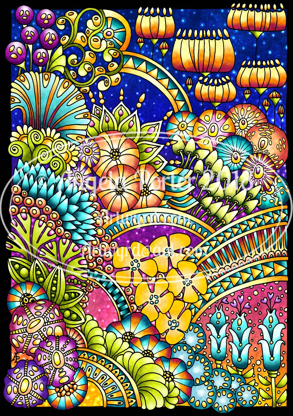
Line art drawn with Sakura Micron pens on paper.

Scanned art coloured using Autodesk Sketchbook Pro, Microsoft Surface Pen and Microsoft Surface Studio.