July 2019 Dangle Design

July 2019 Dangle Design © Angela Porter | Artwyrd.com

July Dangle Design

July is nearly upon us. It seems hardly anytime at all since June started! So, close to the eve of a new month it’s time for a dangle design.

This month I wanted to do a floral wreath with a little hand lettering. As I live in the Northern Hemisphere July means summer. So, my charms are a glowing sun, an ice cream cornet, and a tiny feather. I chose colours that remind me of summer too.

Now, for those of you in the Southern Hemisphere where winter has begun, feel free to substitute different charms – perhaps a snowflake instead of a sun and a steaming mug of hot chocolate instead of the ice cream cornet. Of course, a more wintry colour palette would be lovely.

I designed this to be A5 in size so that it would fit nicely in a BuJo, but equally it would look lovely in any planner, journal, diary or scrapbook. Of course the sentiment could be changed too.

I don’t know if you’ve noticed, but the wreath has a seven-fold symmetry. Well, July is the seventh month after all!

If you’d like to learn more about how I design and draw dangle designs, along with plenty of designs to use or adapt, then my book “A Dangle A Day” is a good place to look.

I did create this dangle design digitally, using my trifecta of Autodesk Sketchbook Pro, Microsoft Surface Pen and Microsoft Surface Studio. It would be quite easy to draw with pen on paper and then use any media you like to add colour.

So Angela, how are you today?

I’m feeling quite content today within myself. I seem to have rested quite well. My digestive system still doesn’t feel quite right, but it’s certainly a lot better than post-EMDR on Monday.

In my blog yesterday, I wrote about my CPTSD and the prejudices I seem to face for having therapy. I’m amazed at how that post garnered a lot of interest on twitter; a lot of interest for a tweet by me that is, the most I’ve ever had.

I was humbled by this, but the best thing for me was someone letting me know my blog post had helped them.

That’s why I write about my CPTSD, mental health and emotional health. It’s not for attention (I don’t deal well with being shown attention of any kind – all part of the CPTSD). I share my story and journey so that it may help others.

It took me nearly 50 years of life to work out that I had a problem, and a couple longer to work out that it wasn’t just anxiety and depression, that it was something more, that it was CPTSD.

This is a label I needed to have. As I learn more about CPTSD it helps me accept that I am stuck in the past; not in terms of reliving memories and events over and over, but in the way I behave, feel, react to life.

Being traumatised means continuing to organise your life as if the trauma were still going on – unchanged and immutable – as every new encounter or event is contaminated by the past.

After trauma … the survivor’s energy now becomes focused on suppressing inner chaos, at the expense of spontaneous involvement in their lives. These attempts to maintain control over unbearable physiological reactions can result in a whole range of physical symptoms including fibromyalgia, chronic fatigue and other autoimmune diseases.

“The Body Keeps the Score” Bessel Van Der Kolk

Today, as I read a little of “The Body Keeps the Score” this quote really struck me.

If I think back to the weeks, months and years before my first bout of serious anxiety and depression, I can see how I was trying to control the inner chaos during my daily life. I struggled every single day with exhaustion, fear, fighting back the tears and wanting to hide away or run away. I also hoped I would die in my sleep so I didn’t have to continue with this.

I certainly had physical symptoms of illnesses for which there were no physical causes – upset stomach, losing my voice, problems with my lungs, outbreaks of weird spots on my skin. I’ve also developed a couple of chronic illnesses along the way too.

I don’t lose my voice anymore, but I certainly still get a dodgy digestive system and asthma attacks when the lightly napping anxiety monster is provoked and awakens. Oh, and I still get weird flare-ups of skin problems.

It’s taking me quite a while to read this book. I lost my ability to read during my first big ‘breakdown’; I still have problems retaining what I read. Sometimes I even have trouble making sense of what I’m reading. I used to be an avid reader. I miss that. However, I am aware that my ability to read is returning… slowly. In the meantime, audiobooks are a great source of pleasure for me.

May – entangled hand lettering

May ©Angela Porter 2019 Artwyrd.com

BuJo Cover for May

This morning, I’ve spent a pleasant four hours or so drawing this A5 design for the month of May.

It combines some hand lettering along with my signature style of entangled art. I’ve included plenty of floral motifs as here in the Northern Hemisphere the world is filled with flowers, especially on the trees.

Of course I’ve included more abstract motifs that are inspired by seedpods and patterns found in nature and architecture and so on.

I drew the design on white Bristol Board by Winsor and Newton. My pens of choice today were Tombow Fudenosuke, Sakura Pigma Sensei 04 and 0.1 Unball Unipin. Also, I’ve used some digital wizardry to add coloured paper as the background, along with my watermarks.

This would be lovely in a BuJo I think. I think it would be lovely in a planner, a journal or diary.

It’s perfect for colouring, as long as you’d be happy to colour across sections that have fine lines in them.

I think if I was more confident with metallic inks and either dip nib pens or fine brushes I’d’ve liked to do the lettering in metallic gold or copper. Of course, I could’ve done the lettering, scanned, laser printed it and then added the patterns around the lettering. I didn’t think of that until now though! Duh!

I’m fairly happy with adding ‘auras’ around the lettering to separate it from the entangled design around/below it.

I’m not sure I’m happy with the design spilling out over the edge as it has done; it doesn’t feel balanced to me, but other than that I’m quite happy with the design. Of course I could edit the image to even up the edges, but it is what it is for now.

Post EMDR

EMDR was quite gentle yesterday but lots of body work occurring. During EMDR stored trauma is released through pains and other sensations in the body. Yesterday I had eyes that hurt, part of my head, my throat, my thumbs and wrists. I had a lot of pain where I broke my leg when I was six. Lots of prickling as well as electric shocks in various parts of my body.

I actually felt quite upbeat, if a little tired, when I left the session. But by late evening I was really tired and feeling a bit teary and lonely.

I’m tired today. I didn’t sleep too well last night. I had hoped to go out for the day today, but I really wanted to stay home and draw and I think I’ll be back in bed before too much longer. I really am tired.

One thing that I was asked about, without me mentioning it first, was what I was going to do about getting out and about a bit more! I’m sure my therapist must read my blog. Just joking, I know she doesn’t!

I need to make a list of places I’d like to visit. Familiar places to revisit to ease me back into getting out and about by myself. Then ones not so familiar that could involve some time away from home too.

I will be going out later this week. I have something to do this evening and tomorrow, however. Another reason I am having a quiet day today. I’m not just tired; I know that I’m also emotionally fragile still.

I am determined to heal as much as I can from the CPTSD and to do the things I’d like to do that the inner critic sabotages way too often.

April Dangle Design

April Dangle Design by Angela Porter 2019

I had a lovely time this morning looking at Arts and Crafts Movement, Rennie Mackintosh and Art Nouveau designs. I’ve always love these styles of art with their organic lines and stylised motifs and it’s certainly influenced my style of art in some little way.

I got inspired as I looked at these styles and decided to use them as a start for my April BuJo page design, which you can see above.

The had lettering is a little heavy handed where the squares are concerned, but over all I’m fairly happy with it.

There’s definitely a touch of the Rennie Mackintosh’s there with the organic motifs and lines contrasted with the graphic squares and diamonds.

I chose warm and sunny yellows with light, fresh greens as they are so dominant in nature this early on in Spring.

A quick sketch on Rhodia Dot Grid paper followed by a scan and I inked it using some of my brushes in Autodesk Sketchbook Pro. Of course I wielded my Microsoft Surface Pen with some happiness on the screen of my Microsoft Surface Studio.

A simple but, I think, and elegant design. One which would look fab for any month in a BuJo (bullet journal), planner, diary, journal or even in a scrapbook. Of course it would make a lovely greetings or note card too. I’m sure there are many more instances of where this design would work beautifully.

Want to know more about creating your own dangle designs? My tutorial book ‘A Dangle A Day’ is now published.

Second version of my BuJo Monthly Cover page for November

Angela Porter November Bujo 2018 v2

Ah! That’s better!

I wasn’t happy with my first version, so I thought I’d use it as a start to create a digital version of my November BuJo page.

Done with the magic of my Microsoft Surface Pen and Studio and Autodesk Sketchbook Pro.

The only place I made use of gradient fills were the hearts, the rest was coloured as if I was using marker pens, with the use of a blending tool.

A couple of simple dangles add some interest to the space below the wreath of poppies, foliage and berries.

I kept the colour scheme really simple to the reds, greens and dark greys so that the design is much more cohesive. The use of a texture brush makes the colouring a little less perfect, as it does on the background too.

I also added a drop shadow to give the illusion that the design is floating a little bit above the page.

My current thoughts on BuJo-ing

My current BuJo is a very minimalist one, though I enjoy designing pages like this. I found I was spending more time on my BuJo in terms of prettying it up rather than using it in a functional way. I do add dangles to the daily logs, when I feel the urge to.

This means I’m making far more use of my BuJo than I was when it was just an artistic/creative endeavour.

Not that there is anything wrong in that. It’s just that I wanted to immerse myself in bullet journaling in a way that it could help me with memories, thoughts, tasks and so on, in a way that I wasn’t doing previously.

And, not worrying if it’s not perfectly written/drawn/recorded is quite liberating actually! It takes a lot of pressure off BuJo-ing.

If I’d thought about it, I could’ve left a page blank at the start of the November logs for a pretty page like this. However, everything is getting rather more mixed up in my BuJo than when it was in my first versions of BuJos, and that makes me feel it’s working more for me as a record of my life, as well as planning a little more, though I don’t over-work that. Keeping track of ideas and notes and events is far more important to me, a more reflective kind of BuJo.

What I love about the BuJo system is it evolves as you need it to. You’re not limited by someone else’s structure, such as in a planner or diary. As your needs for it change, it changes.

Now, that doesn’t mean I don’t make use of colour. Of course I do! That helps in the index to pick out different kinds of contents and helps me separate tasks from events from notes – the symbols are great, but colour really helps me see them. That is a personal preference.

Collections, as always, are really important, and after reading a fair amount of Ryder Carroll’s book on the Bullet Journal Method the idea of threading and indexing back to earlier BuJos actually makes sense to me and seems to be a really valuable thing for me to do as I move forward with this.

As I’m typing away my mind is working on how I could work pretty pages into my working BuJo. I don’t think it’s working pages I need, more like book marks or maybe a postcard or a print out of my design I can use as a book mark …

Oh, the one thing I do pretty up a little bit are my monthly logs, with a pretty border next to the name of the month and year. At present they’re just black and white linework and I rather like the graphic nature of them.

What’s surprised me is how I’ve gone with this more minimal way of doing it. I mean, I love to see how people organise their BuJos ahead of time and so on and the beautiful things they create and there is absolutely nothing wrong with this and if it’s someone’s way to express themselves and/or be creative then I’m definitely all for it!

However, for me I’ve found that setting my daily logs up ahead of time can be a problem as some days I need a LOT more space than I’ve allowed for, and I do like to to make notes in the daily log.

What I have to do is work out if I’m going to do more than the monthly cover and monthly logs for my BuJo or whether I’m still going to come up with ideas for the weekly/daily logs or trackers and collections just for fun.

I don’t know the answer to that rhetorical question at the moment. It will work itself out over time I’m sure.

I have wondered about making some of my monthly cover designs and others available as digital downloads so people can print and add them to their BuJo’s, or use as greetings cards or note cards or or or … leave me a comment with your ideas!

Bujo month page – November 2018

Angela Porter November Bujo 2018

I’m a tad late with the design for the November cover page for my BuJo. It’s very sketchy and rough and the scan has missed the edge of the page to the left. I used Crayola Supertips for the colours and a variety of black drawing pens, a white gel pen and a gold Sakura gelly roll pen for the outlines and highlights. Of course it’s a dangle design too – but a very simple dangle design with just hearts dangling from the wreath. No one ever said that dangle designs themselves have to be complicated, but dangles can add fun little embellishments to other things, such as this wreath.

November to me always means poppies. My dad passed away 10 years ago on the 10th November. He was nearly 87 and a veteran of WWII, Korea and Burma. He saw the effects of fascist Nazi Germany on the everyday citizens there. He was at the opening of a concentration camp. He never spoke of what he saw. In fact, he only mentioned it once when he was very, very drunk after celebrating Hogmany here in the Valleys of South Wales. As soon as he realised what he’d said, he refused to say any more about it and you could see the pain of the memory etched on his face and in his eyes. He joined the British Army to bring an end to the hate and the genocide and the desire for the end of freedom of speech and beliefs and human rights.

He was a kind, caring man who would do his best to help anyone, no matter of their religious or political persuasion. He did so without any expectation of anything in return. He loved to make wine and would share bottles of it around the community. Even when he couldn’t drink much anymore, he would still make wine and would give it away. He enjoyed the process of making it and he enjoyed seeing other people have the pleasure of  drinking the wine. This is a quality I only recently recognised in myself.

Last weekend, I took my amigurumi monsters and knitted pumpkins to the hallowe’en coffee morning. All the pumpkins had new homes with people asking me ‘are you sure you want to give them away after the time you’ve put into making them?’

My answer was that I enjoy making them and if I can find new homes for them, my home would be too full for me to make any more. I added that it’s lovely to see other people enjoy them. At a meeting last night I was told some of the boys at a youth club were fighting over the pumpkins and the lady who’d taken them said ‘I’m sorry, I had to give them to the boys’. My reply was, ‘It’s ok, I’ll make some more for you and them. I enjoy making them and that others enjoy having them warms my heart too’.

Something else I realised about my dad as I’m writing this is that he loved the old war films – John Wayne’s films, Dambusters, 633 squadron and the like. I think they gave him an alternative narrative, something less painful for him to remember about the wars he was involved in. I remember him just throwing his medals back into their box dismissively. He didn’t think he was brave. He didn’t think he was a hero. I think they just reminded him of the horrors he must’ve seen. I do know he wanted me to have his medals when he passed away, he said I would understand what they meant to him. I think I do.

His medals didn’t come to me, as my mother decided she knew better than he did about where his medals and other belongings should go. I’m not bitter or upset about that, as the words my dad said in the hope I’d get him and understand him one day were the real legacy from him, not objects.

We used to have long conversations when he followed me out to my car when I left after a visit to the family home. I always knew I’d need to leave an hour before I needed to so we could have these long chats without my mother talking over him or telling him to shut up or making fun of him. I think he and I are a lot like each other in many ways.

He developed Alzheimer’s a few years before his passing. He caught pneumonia, was admitted to hospital and they found he had a tumour in one of his lungs.  Eight months later he passed away. At first I’d sit with him and he’d talk to me about his younger days, his childhood, things he’d never told me before. But as the days and weeks went on his memories faded away until he was unaware he was in a hospital.

I visited him as often as I could as even though he didn’t know who I was consciously, having someone with him would calm him and he’d be more settled.

I was with him when he passed away, and even then he helped me to learn and understand various things.

These are just a few things I remember about my Dad. He wasn’t perfect, no person is. But, he was the person who took me to music lessons and choir practice and came to the concerts I was involved in. He took a genuine interest in what I was doing and he features in many of the very few pleasant memories I have from childhood and beyond.

So, forgive me my indulgence writing about things not related to arty things. Except that in  many ways they are.

My art isn’t full of profound meaning and commentary on society and so on. I make art that is pretty, colourful, often abstract, sometimes whimsical. What I hope is that it makes people smile, gives them some pleasure, some joy in looking at it. By sharing it I share my pleasure, my joy, the peace that I find in doing art with others. As I do in making knitted pumpkins and amigurumi monsters and other things and gifting them to others.  Just as my dad enjoyed making wine and also enjoyed the pleasure it brought to other people.


October’s Bujo Spread

Angela Porter October BuJo Spread 2018
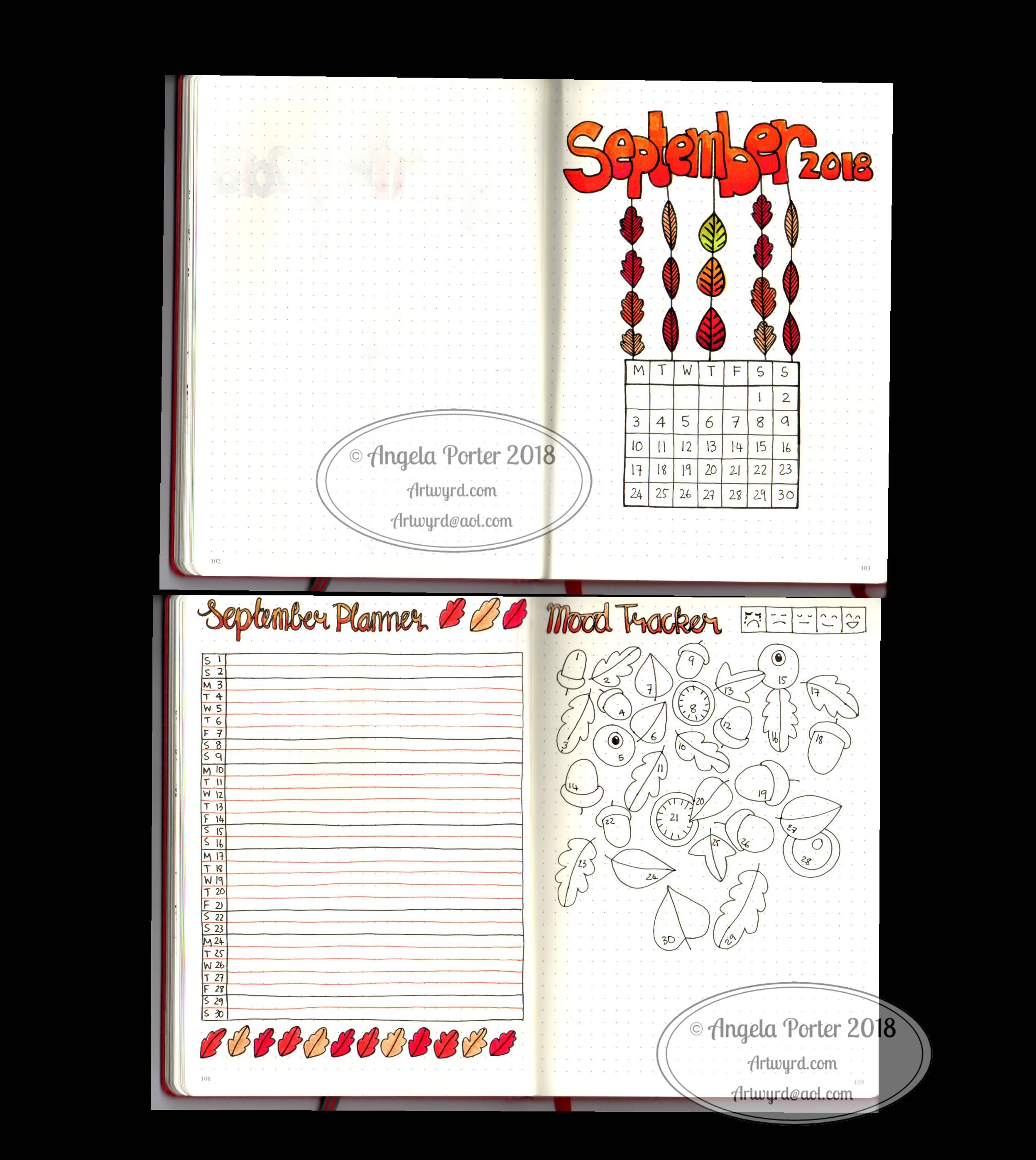
Can you believe it? September is just about all and over with. Time does seem to be flying by at the moment.

This was a really quick bujo spread due to me being away last week.

It’s also a very messily coloured one. I can tell I’ve barely wielded a pen in the last week! Talk about shaky and wobbly and lacking the fine skills I had.

Goes to show you gotta keep working it daily, even if it’s for a short while.

Mind you, I have new glasses and getting used to them is going to take a little while. For work, I have ‘occupational varifocals’. This means the lenses gradually change from intermediate distance at the top to reading distance at the bottom. I didn’t get to use them much last week, so it’s going to take a little while and some practice with them.

I also have varifocals of the usual kind (distance, intermediate and reading). They’re great if I’m sitting down and out sketching, or drawing, or knitting and watching TV. I find them a bit disconcerting for walking around and going up/down hills or stairs or twisty turny ways they cause me to feel a bit dizzy. I know my problem is that I have really good peripheral vision and there’s a part of the varifocal lens on the outside and innermost areas that causes fuzzy vision.

So, yesterday I took my favourite pairs of glasses which double up as sunglasses (they’re very cleverly designed to have removable polaroid lenses that look like they’re part of the glasses, which essentially they are) to have single vision distance lenses put in them so I can use them for walking around and driving. I can drive with the varifocals, but that fuzzy bit bothers me.

Anyways, I have a lot of practice to do with drawing in the next day or two before I return to my next Entangled Coloring book. I’m half-way through the templates and I have some lovely reference photos from my trip for the next ones, including some ideas inspired by Forbidden Corner, maybe.

Back to the BuJo spread. I drew the design on dot grid paper using Sakura Pigma Micron pens and coloured in with Chameleon pencils.

I like the design, not fussed on my colouring skills today that’s for sure.

What theme should I go with for November? Remembrance, bonfires, fireworks…feel free to leave suggestions!

Dangle Day Friday 21 September 2018

Angela Porter Dangle Day 21 September 2018

It’s Friday, so that means it’s #dangleday!

A simple, elegant design with a sweet sentiment for this week’s dangle design. I like the symmetrical nature of the dangles.

I did sketch the design out in pencil on dot grid paper which I scanned in to ink in digitally and make use of the symmetry tool in Autodesk Sketchbook Pro. I also coloured and added texture with various brushes in Sketchbook. Naturally, I made use of a Microsoft Surface Pen and Microsoft Surface Studio to do this.

I kept to a really simple colour scheme, using just one pink, golden, blue and green colour gradient for the design, with the exception of the rainbow beads in the central dangle.

It would be really easy to put a different sentiment or greeting in the box, but I like this one.

A different colour scheme, of course, would result in a very different ‘feel’ to the card, matching all kinds of seasons and occasions.

This would make a lovely greetings card or note card. I think I’d like to use it for the beginning of each month in a BuJo, planner or diary, changing the colour scheme as appropriate for that month. I do like playing with themes for my BuJo, but there’s something in me that likes a cohesiveness in design/style.

What would you do with this design? Let me know by leaving a comment.

Of course, I could print the uncoloured version out and colour with different media. It would be no great chore to re-draw the design on paper more suitable for, say, watercolours, where my printer doesn’t cope with decent quality watercolour paper.

Just a little reminder that my book ‘A Dangle A Day’ is available for pre-order, just click on this linkIn the book I give help, guidance and advice on creating your own dangle designs, as well as providing many examples of monogram dangles and dangle designs that you can use for your own projects.

BuJo September 2018

Angela Porter Bujo Sept 2018

It’s nearly the end of August so it’s time for my BuJo pages for this month.

I used Tombow Dual Brush Pens and a Chameleon Detail Pen for these pages in my Leuchtturm 1917 dot grid notebook.

My colour scheme is quite autumnal as September is the month of the Autumn Equinox here in the Northern Hemisphere.

I’ve used a simple dangle design for the Monthly Cover Page. My tutorial book, A Dangle A Day takes you through dangle designs step by step and has lots of ideas for charms and dangles. It’s available for preorder now.

I kept the monthly planner simple as that really suits my needs.

For my mood tracker, I used leaves, acorns and seeds, perfect for an autumn theme. I’ve not added colours to my key yet, but I will. I may add more leaves and seeds as the month goes on and I fill in the elements I’ve already drawn. Or maybe I’ll add some autumnal quotes instead. I’ll let my mood and the events in the month dictate what I do.

Dangle Day Friday – new BuJo spreads for August

August BuJo Spreads

Angela Porter 27 July 2018

The last days of July are upon us, which means it’s time for new BuJo pages.

I’ve settled into a kind of pattern for myself as far as a BuJo/Planner goes. It’s really minimalistic in terms of what I keep track of, but not so minimal in terms of artsy-ness!

I have two designs for the monthly cover page. One, a dangle design, the other one of my zentangly, entangled style drawings. Yes, I hand lettered these ones, not like the quotes where I am printing out the words before drawing on the paper.

Like my dangle designs? You can pre-order ‘A Dangle A Day’, my book where I take you through how to draw your own dangle designs!

I like both of my monthly cover spreads, but I know the more complex one may never get completely coloured in – it would need a lot of time invested in it.

I like to have a monthly overview page for my events and appointments, and I’ve added dangle elements to that, though I do like a simple layout for the days.

The final planned-out page I like to have is a mood tracker. As you may be aware if you’ve been following my blog for a while, I have CPTSD and keeping track of my mood is useful. For August, I’ve decided on some bunting. The spaces are large enough that I can, if I wish, record different moods throughout the day.  Also, I like to keep the key for my moods simple, with just five different ones.

Hearts and stars are the theme for this month, which are common with me. They are two motifs that I really, really like.

The stars this month represent the Perseid meteor shower which happens around my birthday each  year, natures own fireworks. Hopefully the skies will be clear this year so there can be a good view of them.

A little about the materials used

  • A Leuchtturm 1918 A5 dot grid notebook
  • Unipin pens from Uniball and a mechanical pencil to sketch out the letters and so on.
  • Chameleon duotone pencils for colouring
  • A metallic gold Sakura Gelly Roll pen for some metallic highlights on the cover page.

Furbaby Friday and a new facebook group

Today it’s #furbabyfriday over on the Angela Porter’s Coloring Book Fans facebook group. The members love to show their beautiful furbabies, especially when they’re ‘helping’ with their colouring! You’d be most welcome to join the group and share your beautiful furbabies.

One of the admins of this group has started a new facebook group called Pet Love, Care & Happiness. If you love pets and animals you’d be more than welcome to join in. I believe they have a competition at the moment to win some Amazon gift vouchers.


July 2018 BuJo

Angela Porter July 2018 BuJo Spread watermarked

Can you believe that June is nearly over? Time seems to be flying at the moment!

I’ve designed the front page for July in my BuJo, and here it is – a dangle design for the month. I felt the need to add words/phrases that epitomise July for me.

The rest of my BuJo is likely to be very plain and simple this month, and done in a Fauxdori rather than an A5 Leuchtturm as an experiment.