Easter Dangle Design

Easter Dangle Design © Angela Porter 
From 'A Dangle A Day'
Easter Dangle Design © Angela Porter
From ‘A Dangle A Day’

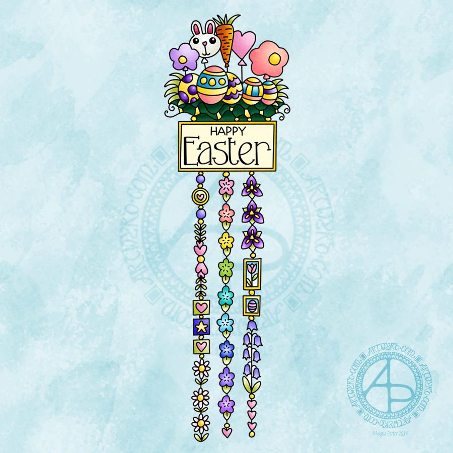
This cutely whimsical dangle design is from my tutorial book ‘A Dangle A Day’, which has the step-by-step instructions for drawing this design. They really are simple to draw, and the hand lettering is based on your own writing style too.

For this design, I chose spring-time colours, more pastel than bright. Of course Easter eggs and a bunny balloon had to feature, along with all the lovely spring flowers and a sprinkling of hearts. I even snuck a star in, hearts and stars being some of my favourite motifs to include.

This design would make a really cute greetings card or notecard. The dangles can easily be drawn shorter. It would also make a lovely bookmark. As a BuJo page, planner page or an element on a scrapbook page it would be lovely.

Using Nuvo drops or Ranger’s Stickles or similar to make dots where the beads are as well as a sprinkling of them around the top of the design would add some lovely dimension and sparkle for sure.

I do hope you give drawing dangle designs a go. They are so much fun and a lot easier to do than you think they are. They can also be used in many, many ways, especially when it comes to sharing love with others at different times and events throughout the years of our lives.

About the drawing…

When it came to designing the dangle designs and monograms for A Dangle A Day, I started off by sketching the idea out on dot grid paper using either a pencil or a pen. I could then adjust the lines and draw guidelines in to help me with the design quite easily.

When I was happy with the sketch, I scanned it in and then re-drew it in a digital form. For drawing digitally I use a Microsoft surface pen directly on the screen of a Microsoft surface book or surface studio. This is like drawing with pen or pencil on paper, or even painting or colouring.

So, although my designs were created in a digital environment, they were still very much drawn by hand.

I used very little in the way of smoothing lines – only enough to remove the wobbliness that comes from the great sensitivity of the pen and screen position sensoring stuff, and never used the predictive line tools available in Autodesk Sketchbook Pro. I worked out how to set up pens that would leave a line texture similar to the pens I like to use to draw on paper with. I determined I wouldn’t make everything perfect, that there would be that perfectly imperfect human touch to everything that I created. I also made sure I included examples of dangles drawn and coloured on paper and turned into cards, bookmarks and BuJo pages too.

Working digitally to draw and then colour the designs allowed me to edit, erase, adjust and keep the image free of smudges and blots that would require re-drawing. It also made it a lot easier to make the edits my lovely editors suggested to improve the work.

It certainly saved a lot of time scanning image after image in – something I find extremely tedious.

Although I may have used digital tools to draw with, the techniques I used were the same as if I’d drawn on paper with pen and then coloured with various traditional media.

I also have to say that the year to year and a half ago when I was colouring these I was only just starting to explore the realms of digital colouring and I hadn’t quite worked out exactly how I’d like to do it. They worked out good enough, but now I think I’d approach it a bit differently.

I had such a lot of fun creating the dangle designs season by season, month by month, celebration by celebration and I hope you have the same amount of fun doing this too.

Second version of my BuJo Monthly Cover page for November

Angela Porter November Bujo 2018 v2

Ah! That’s better!

I wasn’t happy with my first version, so I thought I’d use it as a start to create a digital version of my November BuJo page.

Done with the magic of my Microsoft Surface Pen and Studio and Autodesk Sketchbook Pro.

The only place I made use of gradient fills were the hearts, the rest was coloured as if I was using marker pens, with the use of a blending tool.

A couple of simple dangles add some interest to the space below the wreath of poppies, foliage and berries.

I kept the colour scheme really simple to the reds, greens and dark greys so that the design is much more cohesive. The use of a texture brush makes the colouring a little less perfect, as it does on the background too.

I also added a drop shadow to give the illusion that the design is floating a little bit above the page.

My current thoughts on BuJo-ing

My current BuJo is a very minimalist one, though I enjoy designing pages like this. I found I was spending more time on my BuJo in terms of prettying it up rather than using it in a functional way. I do add dangles to the daily logs, when I feel the urge to.

This means I’m making far more use of my BuJo than I was when it was just an artistic/creative endeavour.

Not that there is anything wrong in that. It’s just that I wanted to immerse myself in bullet journaling in a way that it could help me with memories, thoughts, tasks and so on, in a way that I wasn’t doing previously.

And, not worrying if it’s not perfectly written/drawn/recorded is quite liberating actually! It takes a lot of pressure off BuJo-ing.

If I’d thought about it, I could’ve left a page blank at the start of the November logs for a pretty page like this. However, everything is getting rather more mixed up in my BuJo than when it was in my first versions of BuJos, and that makes me feel it’s working more for me as a record of my life, as well as planning a little more, though I don’t over-work that. Keeping track of ideas and notes and events is far more important to me, a more reflective kind of BuJo.

What I love about the BuJo system is it evolves as you need it to. You’re not limited by someone else’s structure, such as in a planner or diary. As your needs for it change, it changes.

Now, that doesn’t mean I don’t make use of colour. Of course I do! That helps in the index to pick out different kinds of contents and helps me separate tasks from events from notes – the symbols are great, but colour really helps me see them. That is a personal preference.

Collections, as always, are really important, and after reading a fair amount of Ryder Carroll’s book on the Bullet Journal Method the idea of threading and indexing back to earlier BuJos actually makes sense to me and seems to be a really valuable thing for me to do as I move forward with this.

As I’m typing away my mind is working on how I could work pretty pages into my working BuJo. I don’t think it’s working pages I need, more like book marks or maybe a postcard or a print out of my design I can use as a book mark …

Oh, the one thing I do pretty up a little bit are my monthly logs, with a pretty border next to the name of the month and year. At present they’re just black and white linework and I rather like the graphic nature of them.

What’s surprised me is how I’ve gone with this more minimal way of doing it. I mean, I love to see how people organise their BuJos ahead of time and so on and the beautiful things they create and there is absolutely nothing wrong with this and if it’s someone’s way to express themselves and/or be creative then I’m definitely all for it!

However, for me I’ve found that setting my daily logs up ahead of time can be a problem as some days I need a LOT more space than I’ve allowed for, and I do like to to make notes in the daily log.

What I have to do is work out if I’m going to do more than the monthly cover and monthly logs for my BuJo or whether I’m still going to come up with ideas for the weekly/daily logs or trackers and collections just for fun.

I don’t know the answer to that rhetorical question at the moment. It will work itself out over time I’m sure.

I have wondered about making some of my monthly cover designs and others available as digital downloads so people can print and add them to their BuJo’s, or use as greetings cards or note cards or or or … leave me a comment with your ideas!

October’s Bujo Spread

Angela Porter October BuJo Spread 2018Can you believe it? September is just about all and over with. Time does seem to be flying by at the moment.

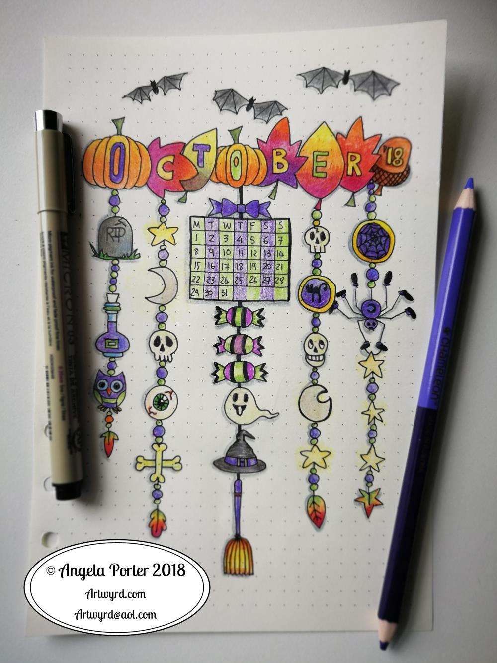
This was a really quick bujo spread due to me being away last week.

It’s also a very messily coloured one. I can tell I’ve barely wielded a pen in the last week! Talk about shaky and wobbly and lacking the fine skills I had.

Goes to show you gotta keep working it daily, even if it’s for a short while.

Mind you, I have new glasses and getting used to them is going to take a little while. For work, I have ‘occupational varifocals’. This means the lenses gradually change from intermediate distance at the top to reading distance at the bottom. I didn’t get to use them much last week, so it’s going to take a little while and some practice with them.

I also have varifocals of the usual kind (distance, intermediate and reading). They’re great if I’m sitting down and out sketching, or drawing, or knitting and watching TV. I find them a bit disconcerting for walking around and going up/down hills or stairs or twisty turny ways they cause me to feel a bit dizzy. I know my problem is that I have really good peripheral vision and there’s a part of the varifocal lens on the outside and innermost areas that causes fuzzy vision.

So, yesterday I took my favourite pairs of glasses which double up as sunglasses (they’re very cleverly designed to have removable polaroid lenses that look like they’re part of the glasses, which essentially they are) to have single vision distance lenses put in them so I can use them for walking around and driving. I can drive with the varifocals, but that fuzzy bit bothers me.

Anyways, I have a lot of practice to do with drawing in the next day or two before I return to my next Entangled Coloring book. I’m half-way through the templates and I have some lovely reference photos from my trip for the next ones, including some ideas inspired by Forbidden Corner, maybe.

Back to the BuJo spread. I drew the design on dot grid paper using Sakura Pigma Micron pens and coloured in with Chameleon pencils.

I like the design, not fussed on my colouring skills today that’s for sure.

What theme should I go with for November? Remembrance, bonfires, fireworks…feel free to leave suggestions!

Dangle Day Friday 21 September 2018

Angela Porter Dangle Day 21 September 2018

It’s Friday, so that means it’s #dangleday!

A simple, elegant design with a sweet sentiment for this week’s dangle design. I like the symmetrical nature of the dangles.

I did sketch the design out in pencil on dot grid paper which I scanned in to ink in digitally and make use of the symmetry tool in Autodesk Sketchbook Pro. I also coloured and added texture with various brushes in Sketchbook. Naturally, I made use of a Microsoft Surface Pen and Microsoft Surface Studio to do this.

I kept to a really simple colour scheme, using just one pink, golden, blue and green colour gradient for the design, with the exception of the rainbow beads in the central dangle.

It would be really easy to put a different sentiment or greeting in the box, but I like this one.

A different colour scheme, of course, would result in a very different ‘feel’ to the card, matching all kinds of seasons and occasions.

This would make a lovely greetings card or note card. I think I’d like to use it for the beginning of each month in a BuJo, planner or diary, changing the colour scheme as appropriate for that month. I do like playing with themes for my BuJo, but there’s something in me that likes a cohesiveness in design/style.

What would you do with this design? Let me know by leaving a comment.

Of course, I could print the uncoloured version out and colour with different media. It would be no great chore to re-draw the design on paper more suitable for, say, watercolours, where my printer doesn’t cope with decent quality watercolour paper.

Just a little reminder that my book ‘A Dangle A Day’ is available for pre-order, just click on this linkIn the book I give help, guidance and advice on creating your own dangle designs, as well as providing many examples of monogram dangles and dangle designs that you can use for your own projects.

Dangle Day Friday – new BuJo spreads for August

August BuJo Spreads

Angela Porter 27 July 2018

The last days of July are upon us, which means it’s time for new BuJo pages.

I’ve settled into a kind of pattern for myself as far as a BuJo/Planner goes. It’s really minimalistic in terms of what I keep track of, but not so minimal in terms of artsy-ness!

I have two designs for the monthly cover page. One, a dangle design, the other one of my zentangly, entangled style drawings. Yes, I hand lettered these ones, not like the quotes where I am printing out the words before drawing on the paper.

Like my dangle designs? You can pre-order ‘A Dangle A Day’, my book where I take you through how to draw your own dangle designs!

I like both of my monthly cover spreads, but I know the more complex one may never get completely coloured in – it would need a lot of time invested in it.

I like to have a monthly overview page for my events and appointments, and I’ve added dangle elements to that, though I do like a simple layout for the days.

The final planned-out page I like to have is a mood tracker. As you may be aware if you’ve been following my blog for a while, I have CPTSD and keeping track of my mood is useful. For August, I’ve decided on some bunting. The spaces are large enough that I can, if I wish, record different moods throughout the day.  Also, I like to keep the key for my moods simple, with just five different ones.

Hearts and stars are the theme for this month, which are common with me. They are two motifs that I really, really like.

The stars this month represent the Perseid meteor shower which happens around my birthday each  year, natures own fireworks. Hopefully the skies will be clear this year so there can be a good view of them.

A little about the materials used

  • A Leuchtturm 1918 A5 dot grid notebook
  • Unipin pens from Uniball and a mechanical pencil to sketch out the letters and so on.
  • Chameleon duotone pencils for colouring
  • A metallic gold Sakura Gelly Roll pen for some metallic highlights on the cover page.

Furbaby Friday and a new facebook group

Today it’s #furbabyfriday over on the Angela Porter’s Coloring Book Fans facebook group. The members love to show their beautiful furbabies, especially when they’re ‘helping’ with their colouring! You’d be most welcome to join the group and share your beautiful furbabies.

One of the admins of this group has started a new facebook group called Pet Love, Care & Happiness. If you love pets and animals you’d be more than welcome to join in. I believe they have a competition at the moment to win some Amazon gift vouchers.


#dangleday

Angela Porter 13 July 2018

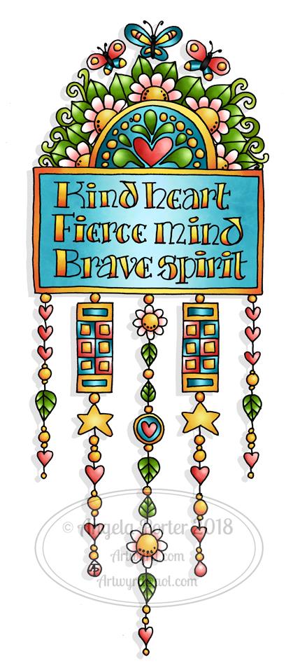
I declare today, Friday, to be #dangleday! And to celebrate, here’s a dangle design, which includes a hand-lettered quote.

Want to draw your own dangle designs? Need a bit of inspiration or advice? Then my book “A Dangle A Day” is available to pre-order from Quarto.

I drew this one on paper with a Sakura Pigma Micron PN pen, scanned it in and then edited and coloured digitally using Autodesk Sketchbook Pro, which is now totally free! My Microsoft Surface Book and Pen were used to do this.

I’d include this in my bullet journal (BUJO) as a really cute quote page.

It would look lovely as part of an art-journal page too, though cutting out all the fiddly bits could be a bit challenging, though re-drawing them would be easy enough I’m sure.

I do have some ideas about dangle designs and art journals and other stuff that’s running around my head, but they’ve not really become solid enough that I can bring them into practice…yet.

If I made the dangles a bit longer, then this would make a really nice bookmark. It would also work quite nicely as a tall and thin greetings card, I think. Especially as the quote could easily be changed for something different.

Over on the Angela Porter’s Coloring Book Fans facebook group, it’s #furbabyfriday. I’m looking forward to seeing them all! Why not pop over and say hello?

BuJo May 2018 Cover Page

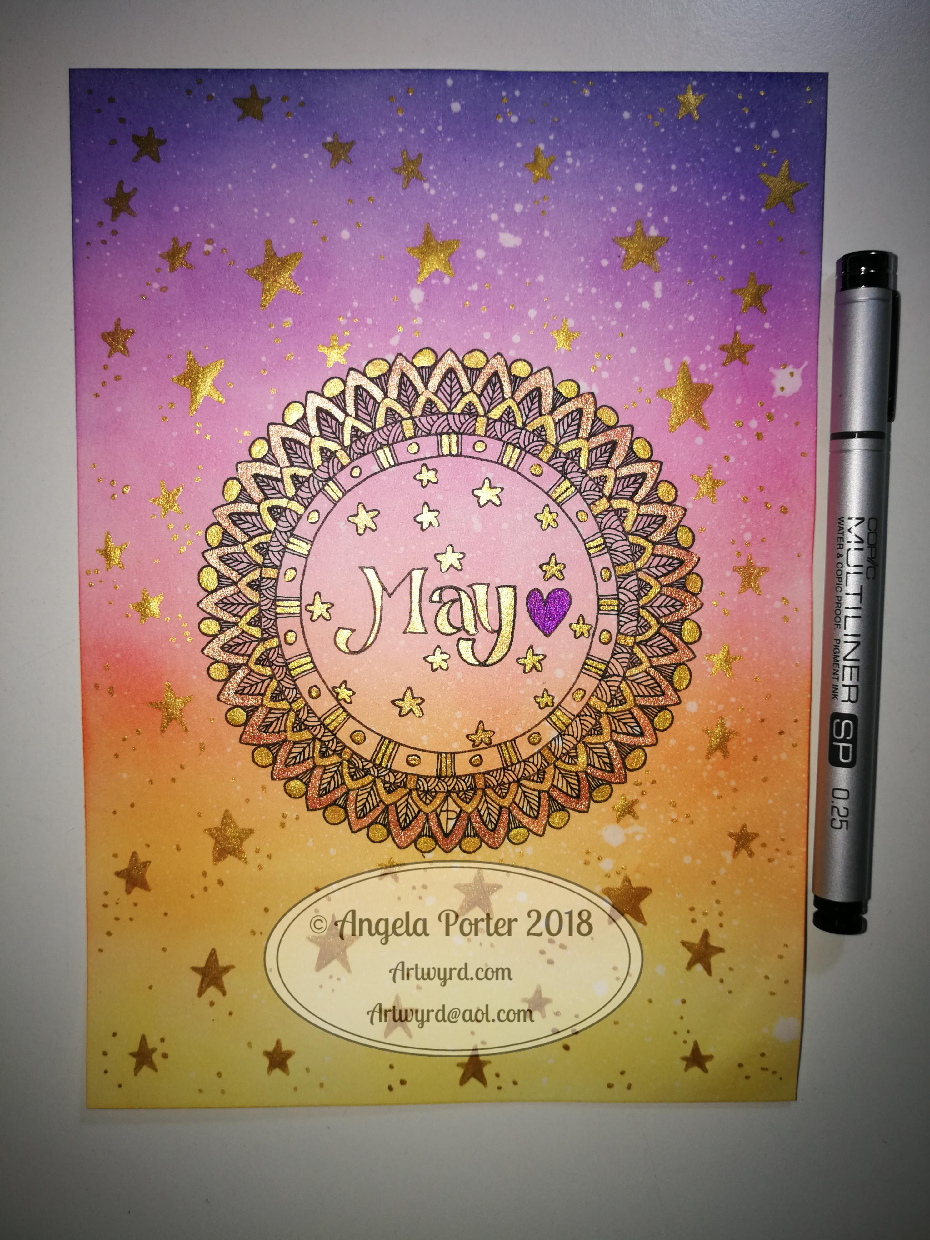
dav I know, I know – a second blog post of the day.  However, I thought you might like to see my cover page for my BuJo for May 2018.
I’m well ahead of the BuJo game here I think, but I needed a bit of sparkle and shine today, and the colourful background I created just cried out for golden stars.

I had fun doing this, but now I have to focus on the other pages for this month, which will have a starry theme, or perhaps just golden, who knows yet?

Spring Equinox 2018

sdr

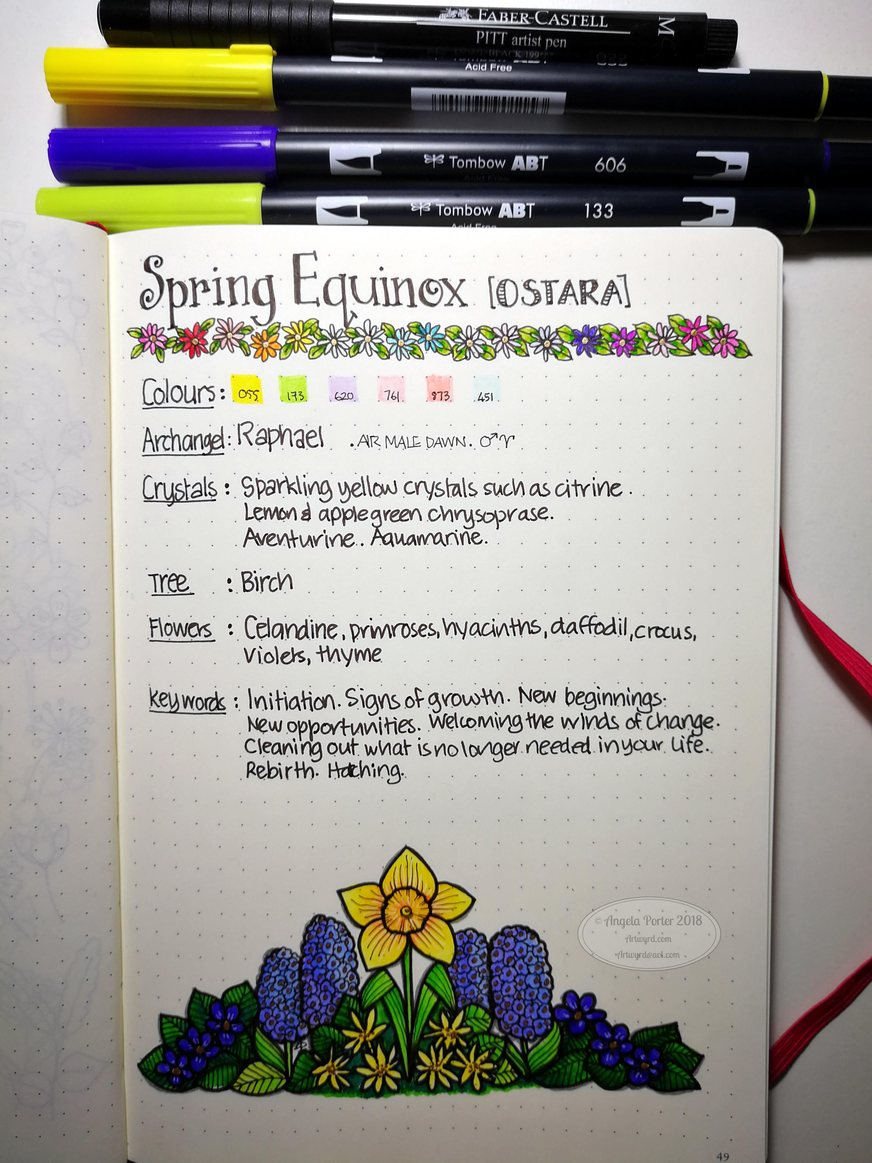
Yesterday was the Spring Equinox in the Northern Hemisphere.  The first day of spring, astronomically speaking.  I decided I’d do a little BuJo page about the equinox, and after spelunking through my memory, books and the world weird web, I pulled together some ideas about it, as well as a little illustration.

For the first time I can remember, I sketched out the flowers and leaves in pencil before colouring the shapes in.  Then I added outlines and details to the colour.  I think I got a bit heavy handed with the outlines, but it’s all learning for me, expanding my artistic ‘tool-box’.