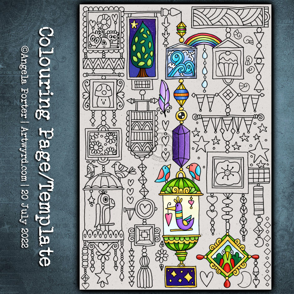
This week’s colouring page (colouring template) is a fun one. From time to time, I like to create a page like this – full of whimsy and cuteness and doodles and tangle patterns.
It’s perfect for trying out new colour combinations, new mediums, or new techniques as each image is self-contained yet part of the whole.
Also, it’s perfect if you only have a little time and struggle with leaving something partly finished. There are so many elements here that can be completed quite quickly.
I’m really busy working on the cover for my next Creative Haven book. So, no time today for a video. I’ve not even started on this week’s template!
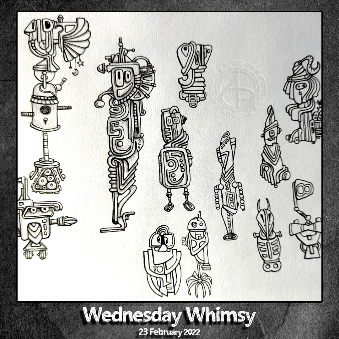
Still, I thought I’d share with you a page of weird, whimsical robots, bots, automata, thingies that I’m gradually adding to in my sketchbook. Weird is definitely the word here!
Ack to my ravens. I really do need to spend some time working out how I’d like to draw a cute, funny, cuddly kind of raven. Perhaps I need to use my cuddly toy ravens (yes, I have more than one!) as models, maybe.
Anyway, the ravens are just quick drawings/sketches. I may spend more time today drawing more iterations. Maybe.
Ayame, a tangle pattern by Eniko Kaneko CZT, is an interesting and troublesome one for me to draw. I’ve tried several times to follow the step out by Eniko, but always ended up with weird, lopsided, overly wonky versions.
So, I started by working out how one petal would work for me, then took it from there, and have some variations I’m kind of happy with.
I’ve yet to work it into a whole drawing. Maybe I’ll spend some time today doing that. I’m not sure yet what I’m going to do, other than to get all this social media stuff done and then get some breakfast!
Not only is it Thursday but it’s also a new month and also April Fools’ Day.
I needed to draw some cute kawaii goodness the other day, and as the characters are fooling around in the template I thought it would be perfect for this week’s template.
Unusually for me, I’ve gone with a cute pastel rainbow color palette for the month long color palette challenge.
The template, and the color palette challenge, are via the Angela Porter’s Coloring Book Fans facebook group. Free to join, free to download and join in, all that I ask is that you follow the terms and conditions of use.
I loved seeing everyone’s coloured version of last month’s colour palette challenge and template on the group. So much fun, and so many different ways of using the same few colours to bring life to the lineart template.
Drawn on A4 paper with Unipin 05 pen. Coloured digitally.
Over the past week or so I’ve been gradually adding to this sketchbook page. It is entirely what a sketchbook should be, in my opinion. Pages full of ideas, sketches, unfinished drawings, practice of techniques, written notes… a visual zibladone for the creative soul!
It is a reflection of what is catching my attention in my world. That world encompasses the inner worlds of imagination and emotion, as well as the outer world of books, nature, architecture, photographs, and so on.
This page includes inspiration from Mayan glyphs/sculpture, rocks, nature, mushrooms, magic wands/staves/sceptres, pen textures and some inspiration from Hundertwasser.
Everything on the page is a bit wonky (not perpendicular), and I’m OK about that – it’s a sketchbook! But then wonky art, particularly colouring pages, seems to be part of my signature style. Perfectly straight lines just don’t look right to me, nor do sharp corners. Perhaps that’s why I like Hundertwasser so much.
The English gardener William Kent said, “Nature abhors a straight line”. Hundertwasser said, ” The straight line is godless and immoral.”
A sketchbook is always a work in progress (WIP), even when every page is full, it’s full of incomplete drawings and ideas, sketches and notes, jottings and doodlings. Nothing has to be perfect. Not a single thing.
A sketchbook is a place to try things out, experiment, just see what happens. With that comes an acceptance that not everything will work out, and where surprising things happen and discoveries are made that may otherwise never happen.
Sometimes the gems of ideas and colour combinations and ways of using media remain hidden until much later. A sketchbook is a place to practice and learn, to note down what is of interest at this time, what needs to be expressed, without any pressure to produce a finished, polished artwork.
That doesn’t mean, however, that a sketchbook can’t be something interesting to look at, even with it’s own kind of beauty. They are a reflection of the artist that creates them and so is a window into their arty heart and feelings. They are very personal things.
A sketchbook encourages me to use media that are gathering dust because I do so much art digitally. In a physical sketchbook, if I want any colour, then I have to use some of these media.
On this one page I’ve used Pilot Hi-Tec C4, Pilot Maica, Rotring Rapidograph and Uniball Unipin pens. To add colour, watercolours, Tombow Dual Brush pens, Derwent ColorSoft pencils, Derwent Procolour pencils, Derwent Inktense pencils have been used.
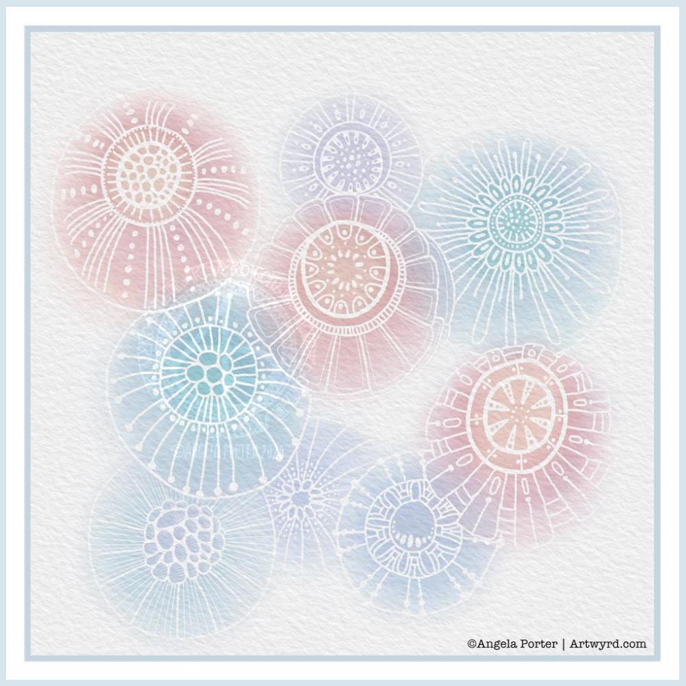
Another morning, another play around with watercolours, this time digitally.
Soft balls of watercolour, fuzzy edges, with white ink details added on top. Layers of transparent colour.
I overlaid a watercolour paper texture, which helps give the right ‘feel’.
This is my favourite attempt at digital ‘watercolours’ so far. I definitely like using white ink in this instance; black ink was just too harsh, hard and jarred uncomfortably with the softness of the watercolours.
I tried lots of ways of adding colour; not just brushes, but different brush effects. In the end I was happiest with white ink.
A nice way to spend a couple of hours as I wake up.
This morning I needed to do something arty to give me a bit of a break from the butterfly. So, I decided to create a digital sketchbook page in Autodesk Sketchbook Pro. It dawned on me that I could record the steps I took to create this page as a flipbook, which is what I did.
The little drawings include just a few of my favourite motifs/patterns that crop up in my colouring book pages or templates quite often, as well as in my artwork in general.
Creating little blocks of colour to draw on that aren’t perfect shapes is different for me, and not so easy for me to do it turns out.
I find creating flipbooks fun, and it’s a nice way to share a little of my process with people too. It’s also a nice way to shake up my creativity a little, to do something a bit different, especially when I need a break from a project I’m working on.
I used Movavi Video Suite 2020 to slow the flipbook animation down so it can be followed as a tutorial, as well as to add the intro/outro screens and music.
As always, my digital tools are Autodesk Sketchbook Pro, Microsoft Surface Studio and Microsoft Surface Slim Pen.
What else could I do for dinner other than have the etymology of the word along with a collage of just a few of my favourite foods! And I do mean only some.
I looked up the etymology of ‘dinner’ on Etymology Online, did a little bit of typography using Affinity Publisher.
I then drew the foods on Claire Fontaine dot grid paper using an 0.8 Uniball Unipin pen.
I scanned the drawing in and removed the dot grid and removed smudges and so on in Autodesk Sketchbook Pro.
My next step was to add a coloured background and some colour to some of the drawings. Only to some, as this was a ‘for fun’ project as part of the #Inktober52 challenge organised by Jake Parker, the founder of Inktober.
Missing in action…
It’s been a couple of days since my last blog. It seems that life and demands on me have taken over arty pursuits. And when I wasn’t seeing to the life demands, I was taking some time out by needlefelting.
I managed to needlefelt a cute rabbit and owl over the last two or three days. I’ll post pictures of them in another post.