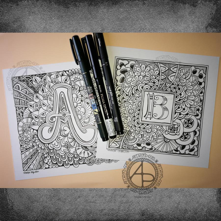
Entangled Monograms

Entangled Monograms © Angela Porter 2019 - Artwyrd.com
Entangled Monograms © Angela Porter 2019 – Artwyrd.com

One of the things that is really nice about being between contracts is the opportunity to create art just for the fun of creating art and not having to stay within the limits of the contract. Not that drawing to fulfil contracts isn’t fun, it is. It’s just that I have to work within the remit of the contract.

Yesterday evening and this morning I’ve been having a contented time creating some entangled monograms. I’ve cut some Winsor and Newton Bristol Board down to approx 15cm x 15cm (approx 5.75″ x 5.75″).

I penciled in some guidelines for the edges of the artwork and for the position of the monogram.

First job was to hand letter the monogram. I did start with pencil guidelines for each letter, then used a hard Tombow Fudenosuke pen to ink them in.

Then, the real fun begins, which is the entangling of the space around the monogram. I used the Fudenosuke pen along with a Sakura Pigma Sensei 04 and Uniball Unipin 0.2 and 0.1 pens.

All done in plain black and white, with just the weight and concentration of lines adding depth and dimension to the finished design.

I do want to add colour to these at some point. I love pure black and white artwork, but colour can bring them to life as well. Digital colouring is my favourite way of adding colour these days, but I may print copies out on to marker friendly paper and then use Chameleon Duotones and Color Tops to add colour. I’ll see how I feel about that.

As is my wont, I had no preconceptions of how the entangling would unfold. I just let it flow. Some of my favourite motifs and patterns have been used. I did refer to my visual BuJo for ideas/inspiration from time to time too.

Visual BuJo

Yes, a visual BuJo (bullet journal). Or, rather, it’s a collection of motifs and patterns that are being organised using ideas from the Bullet Journal system of keeping a journal. It works for me. I have a way to help me find continuations of collections, or to start a new one, and not worry about a collection being on consecutive pages.

My visual BuJo is an A5 sized, dot grid notebook from Claire Fontaine. It’s a soft back one so isn’t quite as weighty as Leuchtturms and the like. It is also a little less bulky in size, which helps when I want to travel light on a day out.

Mind you, when fill this present visual BuJo I may use a Leuchtturm for my next one. We’ll see…

It is also something that encourages me to seek out new patterns and motifs to add to it, as if I didn’t have enough already! Doing this is a good way to just practice my drawing skills and observation skills, as well as analysing a motif or pattern, breaking it down into simple shapes and steps to draw a stylised version.

I do tend to favour more stylised motifs and patterns in my art, that’s for sure.

So, I now no longer feel the need to try new ideas out for keeping my reference material, constantly redrawing them again and again. The visual BuJo is working for me for sure.

When I’m having a tough time emotionally/mentally with my CPTSD and/or EMDR it can be soothing, comforting for me to use the familiar, and of course I can still do that. I just don’t need to spend a lot of time drawing and redrawing and redrawing again the same things in my search for a perfect record keeping system for patterns and motifs.

The BuJo inspired system may not be perfect, but it works for me.

One other positive that has come from me using a BuJo is that I’ve had to learn to let mistakes go and just leave them in the notebook. The mistakes are what I need to make in order to understand how to draw a pattern or motif. Sometimes, though, a new pattern or motif arises from the mistakes.

Something else I’m starting to do is to make notes alongside the patterns with where to start, the order in which to draw the parts of the pattern or motif, and ideas for varying it.

Monogram B Dangle Design

©Angela Porter 2019

Originally, I drew the original version of this design with pen and ink on paper. I wanted to edit the design and add a dangle to it, so decided to work digitally (Microsoft Surface Pen, Microsoft Surface Studio and Autodesk Sketchbook Pro).

By working digitally, I could edit and amend the design easily, using the original sketch as a guide. You can see that I made quite a few changes. I’m much, much happier with the blue version. The pink one is pretty and a good start, a way to experiment, but the blue one is the more polished, finished version, and not just because it’s been drawn digitally!

For the original sketch, I used a copic marker to draw out the basic letter shape and then used Unipin and Pigma Sensei pens to add the lie details. The copic is patchy, but that’s because it was a quick sketch.

I like the increased amount of white space in the new version – it does add a bit of a stained glass look to the design. I also like the stylised roses inside the ‘B’ in the revised version; adding the patterns inside the rose rather than on the edge helps the rose to stand out from the coloured section by giving a mostly white border.

Once I’d thickened the main beams of the letter, I added dots to carry the lines on. Then, I decided it could be fun to echo these dots by carving out dots in the flared ends of these lines. These dots have lightened those lines up, adding some airiness as well as interest.

Oddly, as I look at them I am minded of a very Old  Bridge here in my home town. The bridge was built by William Edwards in 1756. When it was built it was the longest single span bridge in the world. The addition of 3 holes at each end of the bridge allowed it to bear the weight of the stone and not collapse. It is these holes, the lightness they gave to the design that I recalled when I was thinking about those ‘holes’ in my blue B.

I really wanted to add a simple dangle to this monogram – the letter is ornate enough that it could be too fussy if I’d added more than one dangle, or made the dangle ornate. Of course one of the charms had to be a heart! Simple beads and a diamond charm complete the dangle. My dangles often remind me of jewellery!

It’s not very often I show any kind of editing or reworking of my artwork, that’s because I do tend to work very intuitively and don’t really draft my work. Sometimes, I may do a pencil or pen sketch for an illustration for one of my colouring books, especially if it’s a kind of ‘scene’.

Since I’ve been working digitally, however, I do seem to be doing a lot more of the sketching out or working more roughly and using this as the sketch for the digital art.

An added advantage is that this satisfies my need to work with traditional media. Also, by working on paper I get a better idea of the scale of the finished artwork.

I think I’ve said it before that I do struggle with a sense of scale when working on a screen due to the ease of zooming in and out. Paper is a fixed size so I can appreciate the scale far more, and it seems easier for my brain to get a better idea of the whole design.

It’s all part and parcel of my artsy journey, figuring out what is best for me and not trying to work like others or being worried about how others judge me and my process. More than anything though, it’s about me learning not to be such a harsh judge and critic of myself. One negative review, and my inner critic gives itself a rocket boost and any belief in myself is kicked to the outer edges of the known universe. That’s why I don’t read reviews – I struggle enough with my own inner critic without battling others’ opinions.

I’m learning it’s far more important that I appreciate my own work rather than looking to others for approval. It’s always wonderful when people tell me they love my work. It’s always valuable when people, particularly my editors, give me honest feedback on what needs to be changed to improve things – they see things I miss by working all too close to the artwork.

I’m learning that it’s more important for me recognise that what I create is mostly good enough, sometimes I’m really pleased with what I’ve done, sometimes I can see something is truly awful or that there is room for improvement.

Reflection on my work is important as it helps me to learn, grow and develop, and helpful input is always welcome.

When I look at this blue B monogram dangle design, I can honestly say I smile. It’s an example of a design I am pleased with. It’s intricate, but not overly so. There’s empty space within the design

Less than a week now until ‘A Dangle A Day’ is released – my book showing how you too can create dangle designs, one step at a time!