Lettering practice, 23 July 2022

I’ve had a funny couple of days, not necessarily in the funny ha-ha way, though!

I had a migraine yesterday, so no video nor post was possible. I’m feeling better today, just still very, very tired.

Today, I had plans. I was awake around 5am, again, and so did some pencil lettering ‘sketches’; the finished result of one is in the photo.

I thought I’d start to digitally ink the lettering in and add colour before turning my attention to a YouTube video. And the phone rang, and it was a friend. So, during the over two-hour-long chat, I managed to mostly get this done! Yup, I can ink in a sketch and so on while chatting. I just can’t chat and sketch, generally.

My plans to record a video this afternoon were then scuppered as I couldn’t keep my eyes open! So, on waking, I completed this particular piece of lettering and doodling.

It really is practice for me. I’m not only practising my lettering skills, but I’m also trying out new brushes and tools and so on in Clip Studio Paint. That is a constant practice for me. I tend to learn how to do something when I need to do that something!

This one is probably as good as it’s going to get. Time to move along to the next mini-lettering project and learn and practice more!

Coloring page, 21 July 2022

This week’s colouring page (colouring template) is a fun one. From time to time, I like to create a page like this – full of whimsy and cuteness and doodles and tangle patterns.

It’s perfect for trying out new colour combinations, new mediums, or new techniques as each image is self-contained yet part of the whole.

Also, it’s perfect if you only have a little time and struggle with leaving something partly finished. There are so many elements here that can be completed quite quickly.

Sunday Morning had lettering and doodles.

Sunday morning, I drew this in pencil. Today I finally got it inked in by hand and colour added.

I’m quite pleased with how this turned out. I may actually be finding my way with this hand lettering lark!

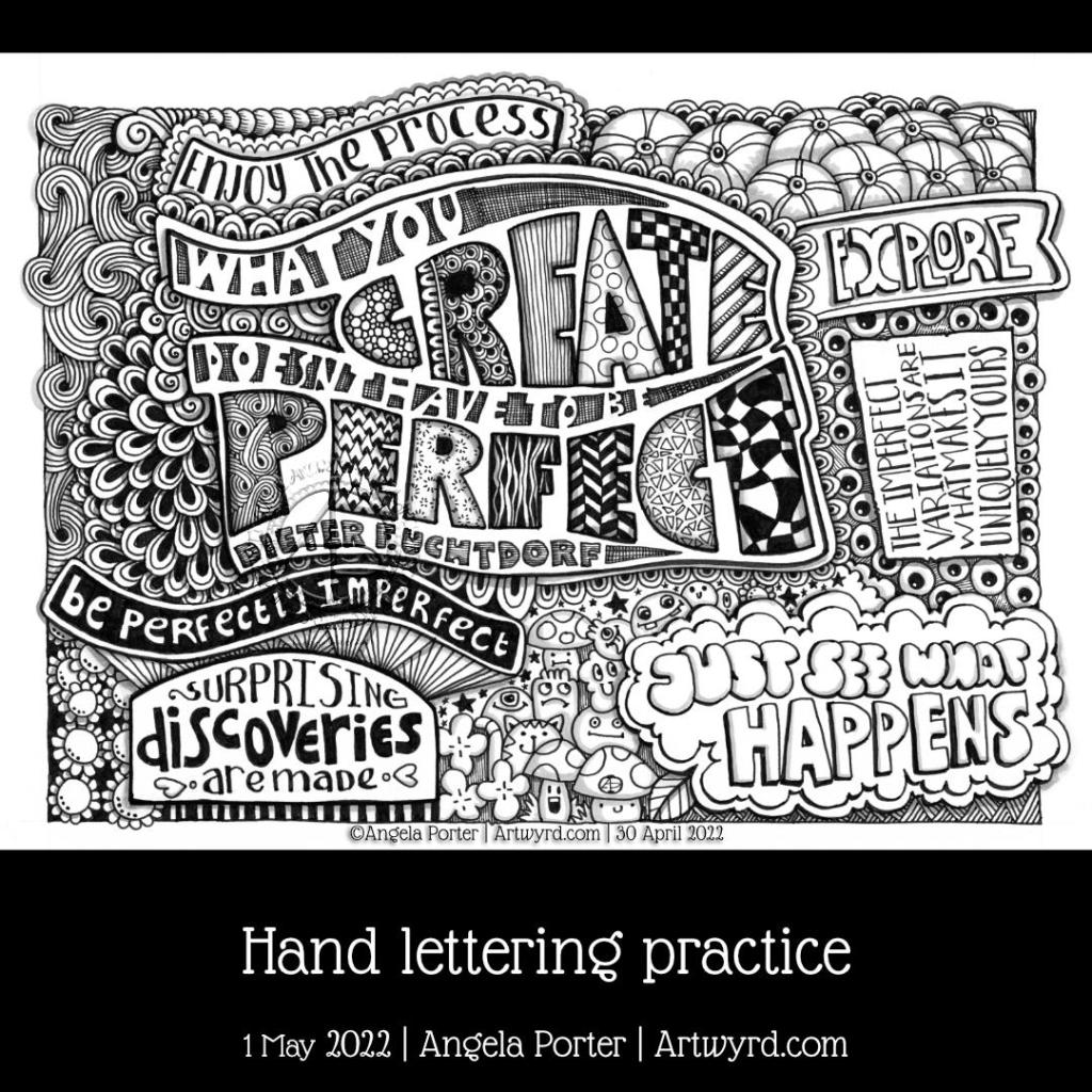
What you create … Hand lettering practice

I had fun creating this design in my lettering sketchbook, well one of my lettering sketchbooks!

The main quote is something I’ve found difficult to accept throughout my time exploring and developing my art. I’d bought into the belief that for something to be good it has to be ‘perfect’.

I’m finally accepting that a piece of art I create only has to be good enough, and that means it’s OK to be perfectly imperfect. Just as I had to accept that I am good enough as a person, imperfectly perfect as we all are, then I’m recognising that I’m doing the same thing for my art.

I can accept now, most of the time, that it’s fine if there are imperfections in it, even mistakes that become part of the design. These imperfections, rather variations, add character to the work and make it uniquely mine. Even if others work in a similar way, each is unique.

Art is a practice, a life-long process of learning and developing, and self-discovery too. Is perfection possible? I don’t know, but I’m happy to settle for this is the best I can do now and it is good enough.

This drawing is finished, with cool grey shadows added. Now, I have to decide whether to leave it like this or add colour. If I add colour, do I go with alcohol markers or digital art? I’m not sure, yet. But there’s no rush to decide.

Lettering sketchbook pages

I’m thoroughly enjoying exploring hand lettering that’s for sure. I’m still trying to find my way for how best to express myself using words and letters, or perhaps the best ways would be a better description!

I’ve absolutely loved creating these two pages. The top one was done first and is OK. I think colour may improve it somewhat.

I much prefer the bolder lines and higher contrast in the lower drawing. This one isn’t quite finished, and then I’ll have to decide whether I add colour or not.

I really like the imperfections that there are in this way of hand-lettering. Those imperfections make the lettering human and uniquely mine. This is definitely something I want to embrace, whatever directions my lettering journey goes in. And of course, combining lettering with my style of drawing is going to so important to me. I just have to figure out how to make it work for me!

I have a lot more exploration to do, but it’s a fun process and I kinda know I’ll get there!

Doodling around in a new sketchbook

Link to today’s video on YouTube.

It’s been a funny old day. A load of deliveries were scheduled today. I’d woken way too early, and by the time I’d drifted back to sleep, well it was time to get up ready for the Abel & Cole delivery, which didn’t arrive until after 11am. If only I’d known, I could’ve had a couple hours more sleep! Ho-hum.

Still, I pottered around with different colours on yesterday’s ‘Give Peace A Chance’ drawing, as well as adding colours to some other drawings.

Finally, all my deliveries had arrived, the last one being my order from CultPens, which included a pair of D&S A5 landscape Hahnemuhle sketchbooks. So I just had to try one out.

The paper is quite thick, has some tooth to it, but not too much. You can very, very faintly see the pen drawing through the paper, but that’s not a problem at all. And adding some tinted charcoal to the drawing was a pleasure as it was gently eased into the paper fibres by the careful use of a paper stump.

I’ve tried some Graphitint pencils and a damp brush to see if that would be ok on the paper. So far so good!

So, I’m quite happy with the sketchbook paper.

My current sketchbook page

This page is just a kind of doodleart that I’m exploring, along with working with alcohol markers and trying to understand how I can best work with them.

All these ‘doodles’ turned out kind of organic in a kind of mechanical way, possibly. I’ll be turning my attention to them again this evening.

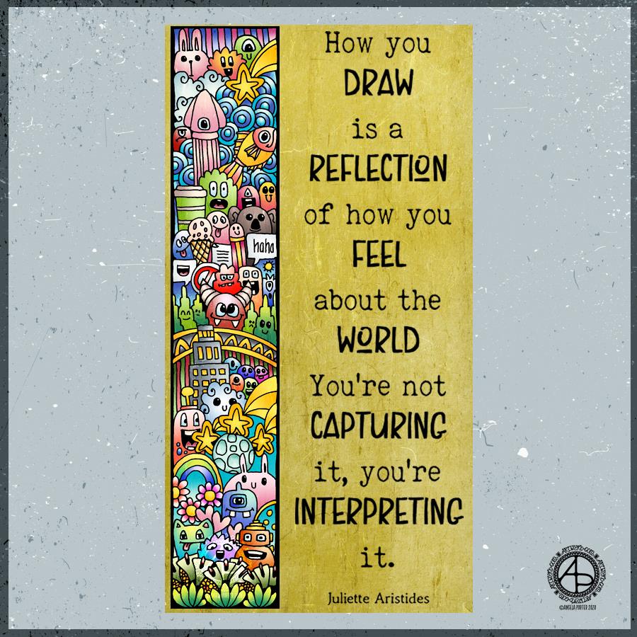
Quote

If the quote applies, I have no idea what my morning drawing says about what my art says about the world! Perhaps it says more about my inner world – imagination and emotions. I’ll let you decide that one.

All I know is that my Tuesday morning art has been influenced by the drawing I’ve been doing for the coloring book I’m currently working on. Cute. Doodle-y. Fun. Using colour for the sake of colour. Lots of colour.

I drew the design with an 0.5 Rotring Rapidograph pen on Rhodia dot grid paper. Next, I scanned it in, cleaned the drawing up and added colour digitally. Finally, background, texture and quote were added.

A nice way to spend the first three hours or so of my day before I turn to other things, like breakfast, shower and maybe even a walk if the weather keeps dry.

So long September

October Coloring Template for the Angela Porter’s Coloring Book Fans facebook group
© Angela Porter

October-eve

Can you believe that September is nearly over? I swear that the older I get the faster time seems to go.

Anyway, a new month on the horizon means a new colouring template for the members of the Angela Porter’s Coloring Book Fans facebook group. There just has to be a Hallowe’en theme for October’s page, and you can see a sneak peek of it above. I couldn’t resist colouring some of it in as a way of trying out some new digital brushes and some ideas too.

I put some of my favourite All Hallows’ Eve motifs into the drawing, including a raven, skulls, fungi and a vampire cat! I always enjoy drawing stuff to do with Hallowe’en; it’s my favourite time of year because I don’t have any past traumas associated with it.

If you’d like to colour this template, pop over to the Angela Porter’s Coloring Book Fans facebook group and become a member; each month I do one drawing exclusively for group members (terms and conditions of use and sharing apply).

About the art

I used a combination of fountain pens and fine-line pens to draw the design on dot grid paper. I then scanned the drawing in and cleaned up smudges and smears digitally.

Then, I set about adding colour digitally using my usual tools – Autodesk Sketchbook Pro, Microsoft Surface Pen and Microsoft Surface Studio. I also added a background and surface texture that I had purchased via Creative Market.

I am really quite pleased with how the colour is bringing the illustration to life, especially the skull in a jar. I hope to be able to continue to add colour as the month progresses, though I do know I have quite a bit of work to do and focus on.

To Inktober or not Inktober, that is the question.

Last year, I really enjoyed taking part in Inktober. Inktober has become a really popular social media event where artists and creatives use a daily prompt to draw (or create) something based on that prompt and share it on social media.

There is an official prompt list, but people do create alternative lists and I may look at some of them as there may be variations that might be less time intensive than last years’ was!

I shall see what I find and go from there I think.

So, Angela, how are you today?

Tired. However, I’m am quite content, my mood is good enough today. I do have EMDR later on, and I often feel ‘flat’ before my therapy session. I think my unconscious mind starts to bring stuff up in preparation for EMDR.

I know that the likelihood of me being exhausted later is rather high, so I’m not planning to do loads of stuff later on. Self care will be the order of the late afternoon and evening.

‘A Dangle A Day’ Dangle Design Mandala

‘A Dangle A Day’ Dangle Design Mandala © Angela Porter 2019

Dangles can be turned into mandalas! And ‘dangle-dalas’ satisfy my love of symmetry in an unusual way.

In this one, I have two rings to which dangles are attached. In the centre ring, they point towards the centre of the mandala. On the outer ring, they point out into space.

Then, there’s two central rings. One, I coloured in a pastel rainbow and added ‘A Dangle A Day’ in my weird take on hand-lettered uncials. The lettering isn’t perfect, but then neither am I, and neither were celtic/anglo-saxon/medieval manuscripts.

Ok, the manuscripts are more perfect than my hand lettering, but it’ll do. It’s perfectly imperfect. That is an idea I’m becoming to embrace more and more easily as time goes on, and an idea that I encourage you to adopt in my book ‘A Dangle A Day’.

I used rather graphic black and white geometric designs to separate the three main rings of the design. This contrasts nicely with the brightly colourful design elements.

I felt the need to draw cacti, flowers and some weird seeds today, so that’s what I did. Of course it goes without saying that I’d have to include stars and hearts in my design! There’s some beads in there too, particularly those teardrop shaped ones that remind me so much of medieval jewellery.

Mind you, medieval in character this design is not. It is rather cute and whimsical, which is one of my signature styles – the other is intricacy.

For this design, I hand drew and coloured it digitally using a Microsoft Surface Pen on the screen of my Microsoft Surface Studio. As always, my chosen art software was Autodesk Sketchbook Pro.

Yes, I really do draw on my Surface Studio with the Surface Pen as if I’m drawing with, say, a fountain pen on paper. Colouring I often do as if I’m colouring with traditional media, though sometimes I do use gradient fills. It just depends on the feel I want in the final artwork.

Being able to work in layers means I can do things that would be very difficult or time-consuming working traditionally. It also means that I can play with colour combinations – I love colour, but I don’t always make good choices of colour palettes, see yesterday’s Q monograms for evidence of that!

Of course, there’s so much more to digital art than this, and I’ve not discovered everything yet. But over time my experience is that I discover, workout or learn how to do what I need to do at that time when I’m ready to do that.