This morning, I thought I’d share how I’m exploring creating some Entangled art, particularly monograms, via YouTube.
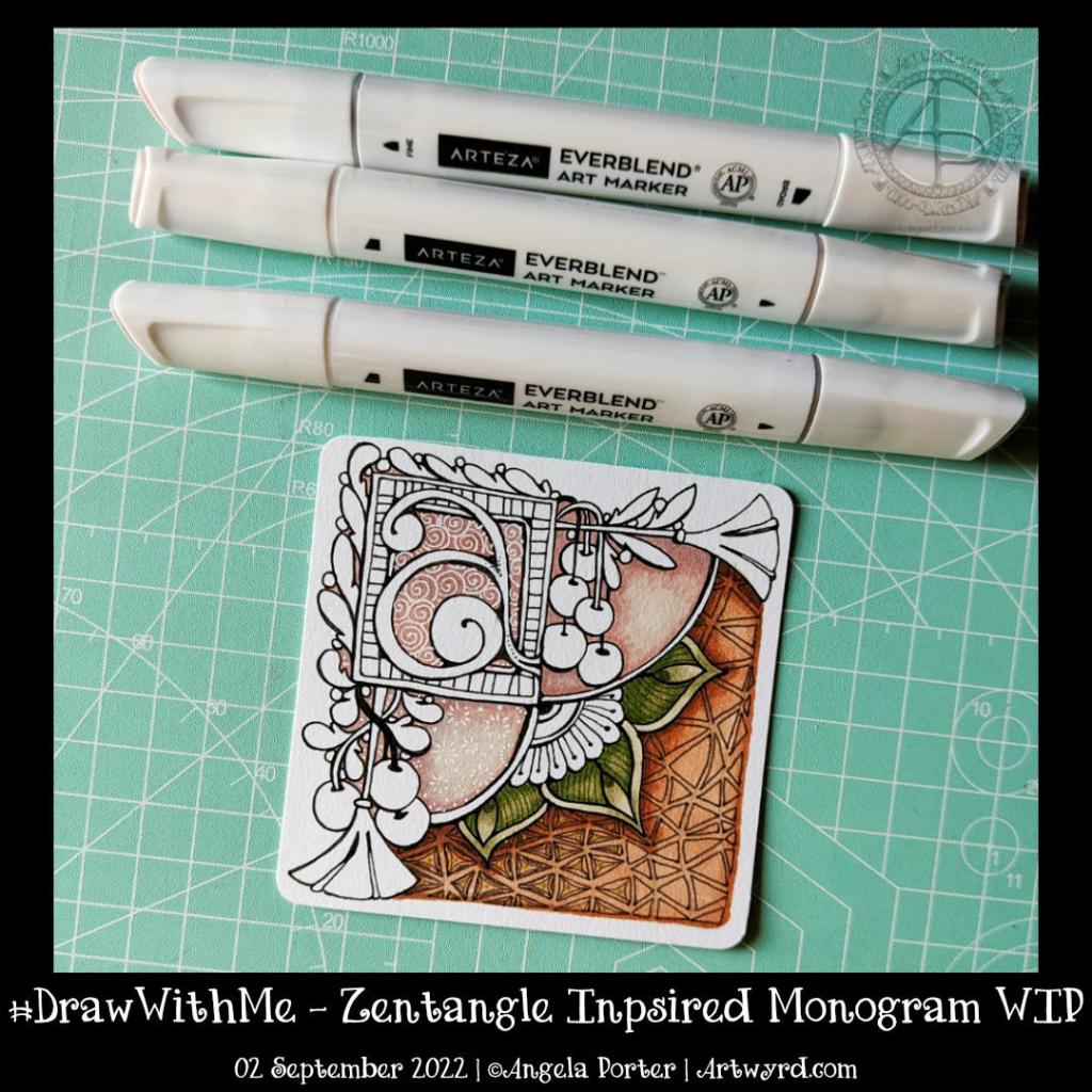
This little drawing is 11cm by 11cm, which is approximately 3.5″ square – took about an hour or so to get to this point. I wasn’t sure of the green, but I think it’ll work out just fine. There’s quite a way to go yet, but that will have to wait for another time.
The materials I used are: * 03 black Sakura Pigma Micron * Various Arteza Everblend marker pens * Various fineliners in grey and green * A white Sakura Gellyroll pen * A metallic gold Uniball Signo pen
This was just some fun! I had no idea where the drawings would lead … but drunken party skulls, mushrooms and tentacles seem to be the theme of the day! It’s nowhere near finished yet, but something fun for me to do later today, after I run an errand.
There is a video of me drawing this as far as it’s gone.
I managed to get myself totally engrossed in creating these small designs in my lettering sketchbook.
I much prefer the quote in a band across the whole design, though I do have to work on weight of line, the arrangement of words and so on.
This leaves, of course, plenty of space for bands of patterns and different colours and so on. which has been fun and kind of interesting to do.
I don’t know how many of these I had to redo the quote as I misspelt ‘believe’ in ink. Another note to self – pencil in the quote first and then check the spelling and adjust the arrangement of the words!
The one at the bottom left isn’t finished yet.
My two favourites, I think, are the top two. Monochrome colour schemes, no surprises there!
Today it’s only part of the template. Truly a sneak peek at a work in progress (WIP). I’ve used, so far, two Zentangle Patterns (oysteroid and flux) and a triangle leaf/seaweed kind of motif. I have no idea how this is going to finish, other than well, hopefully.
I’m drawing with a Tombow Fudenosuke brush pen on ClaireFontaine dot grid ‘Sketch’ paper. The pen dries quickly on this paper, there’s little to no feathering of the ink, and the dots I can remove digitally when I’ve finished the drawing. And then add colour…eek!
I started adding colour to another drawing early this morning. Mistake. A BIG mistake. You can see that drawing over on Instagram.
I have no idea why I keep inflicting the torture of colouring drawings in with traditional media upon myself. I don’t know how many times I say to myself I need to stop doing this, and then I go and do it again any way. “Insanity is doing the same thing over and over and expecting a different outcome”, is a quote mis-attributed to Einstein, but it seems relevant to myself and my colour struggles!
Today, I’m going to put it down to waking early for the weekly Abel & Cole delivery and being just plain tired. I had to return to sleep after that disastrous coloring session.
This template, when finished, will have some colour added to it digitally. I seem to do so much better when I work with colour in an art package, currently Clip Studio Paint Pro. I think it’s partly because I can make an awful colour choice and then correct/edit it easily. And I tend to stick to limited colour palettes a lot more easily than I do when I have a whole load of pencils, pens, or paints in front of me to choose from. Then it becomes a nightmare for me!
One day, I trust I’ll remember not to add colour when tired and to use limited colour palettes only. One day soon I hope!
I have an introvert ‘hangover’ today. This has absolutely nothing to do with alcohol, just a bit too much socialising on Zoom yesterday! The headache will lift soon. The tiredness will gradually go, especially after some more sleep. It was lovely to spend time with like-minded people, particularly Brett from the Angela Porter’s Coloring Book Fans facebook group.
So, doing some entangled, intuitive pen drawing was just the thing to start the day off. Gentle, familiar, enjoyable, calming and peaceful.
I have no idea what this drawing is going to turn into. Time will tell.
I have created a time-lapse vlog of this drawing. Not only do you get to see how this WIP drawing was done, I also show some of the other work I’ve been doing in my sketchbook as well.
Yesterday, I took some time to add more to my abstract watercolour work in progress. I’m continuing to work with the Ecoline brush pens, which are filled with watercolour ink. Through this process I’m learning the value of using larger brushes for larger areas.
Timing when to add wet into wet is something I’m starting to get to grips with, possibly. I like the way the colours have played with each other in the pebbles.
Once the pencilled in pebbles are coloured, I then will have to decide how I add detail and interest to other areas of the design. Do I do more pebbles?
I’m really not sure. All I am trying to be sure of is that this is something I can do to learn from, to explore this medium, and to explore abstract watercolour art in a style that is in my style.
Once the colour is added, I then will have another choice to make concerning pens. Do I use pens to add detail and/or contrast? If I do decide to use pens, what kind /colour do I use?
I think I need to do some smaller test pieces to try things out on. I’m liking how this particular painting is working out, so testing ideas out elsewhere may be the way for me to go.
Today’s vlog was suggested by a comment left by Jennifer Miller. She asked if I could do a flip-through of my visual dictionary / zibaldone. So that’s what I’ve done! You can see it by following this link.
This is the start of a watercolour and, probably, pen artwork based on fronds of seaweed and pebbles. If you’d like to see it from the start of adding watercolour to where it is at this moment, then I did record a vlog. It’s a chatty one, about the art and other stuff.
I used my biro sketch that I did yesterday as inspiration for this. I drew from memory and intuition, using red and black fine ballpoint pens on a 16cm x 16cm (6.25″ x 6.25″) piece of Canson Moulin du Roy paper.
Next, I applied watercolour, wet into wet. I realise I need to dig out my craft heat tool to dry the watercolour quickly when it’s spread in a way I like it. Well, at least try that out! I’ve not quite learned when is the right amount of wetness for this to work to the extent I’d like it to. Having said that, I did drop clean water to push some of the darker colours back in places, though not always successfully to my taste. However, as I plan to draw on top of the colour this may not be an issue.
For the seaweed I chose to use yellow ochre no.1, burnt sienna and light red. Indigo, Van Dyke green, indigo and peacock blue are the colours used for the pebbles.
I have no idea what I’m going to use for the central part of the fronds, yet. It’ll work itself out I’m sure.
I waited from the fronds to dry before doing any neighbouring fronds. I started doing this with the pebbles, but a happy accident reminded me of how much
Another day, another abstract WIP. This is an iteration of the first one from earlier this week. This time, I’m using analogous colours – Fuchsia, Thistle and Mauve Inktense pencils. I’m also using Canson Moulin du Roy 100% cotton paper, which allows the inktense pigments/dyes/inks to spread far more smoothly than other papers. The photo makes it look like the gradients aren’t all that smooth, but they are much better when seen with the eye. Though, I do have a little work to do with the purple mauve areas.
Today, I’m at a bit of a loss as to what to do with myself. I’ve done all the work I can on Whimsical cats for now. There’s just one template needed to make the total up to 31. I’m awaiting the review of the one I sent over recently. Then, I’ll need to work on colouring three templates, which are yet to be chosen.
I suspect I’ll spend some time today working on art. I’m lucky that it’s both something I love to do as well as my source of income too. Today, though, I get to spend as much time as I like on some personal projects, such as these abstract art experiments I’ve been doing.