Moth v03

Yet another artwork featuring a moth today.

I re-drew the moth from yesterday to try out some ideas I had when reflecting on the artwork. I’m not entirely sure if it’s an improvement, but it is what it is.

I also have drawn a new mandala-style pattern for the background. This time, I’ve added it as a subtle design. I think it works quite well as the moth really stands out.

Mossy green today, no idea why other than it appealed to me. It may mean a desire to be in nature to have my mood uplifted. I’m not feeling the brightest or upbeat this day. A headache isn’t helping. A walk is required in a while. It’s a sunshiny peri-autumn day, so a good day to walk I think.

Typographic Portrait WIP

Phew! This has taken me many, many hours to do, along with a lot of frustration and alterations. However, it’s getting there, possibly.

This is both the first portrait I’ve done, as well as the first large typographical project.

I’m following a Domestika course – “Hand-Drawn Typographic Portrait” by Sara King.

I’m not entirely sure that I’ve fully succeeded. I seem to have a lot of white space, and that is all to do with the photograph I used. I thought it had enough detail in terms of tones of light and dark. I guess not! Or maybe this is just part of my style.

There are areas on his jacket to the bottom left and right that need pattern or image put there. I have yet to work out what to do about the shirt. Also, I need to try removing the lines around the jacket and collar too.

Aneurin “Nye” Bevan was the main architect of the UK’s National Health Service after WWII. He’s also considered one of the best political orators of all time. There’s an Aneurin Bevan website if you’d like to know more.

While this is hand-drawn, I chose to work digitally. My Surface Studio allows me to work with a digital pen directly on the screen as if I was drawing on paper. This makes it easy to edit as I work.

I now need a break from this particular artwork, so I can look at it with fresh eyes (and any feedback people offer on it) and then return to it another day.

Perfectly Imperfect and an Abstract Botanical 21 August 2018

Angela Porter 21 August 2018

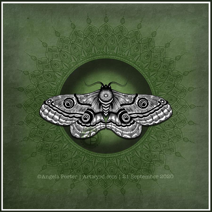
My latest design. It took nearly 2 days work to complete, though I may add some metallic highlights here.

I used Inktense pencils and blocks with water brushes, Uniball Unipin pens and Daler-Rowney Aquafine smooth watercolour paper.

Black line definitely keeps my need for that high contrast work happy, but the ability to add layers of colour or create gradations in colour with the Inktense also keeps me happy. Together, they work for me.

I did start off the central area with shapes of colour, but then I started to draw in the designs around the edge and then add colour. Both ways work for me for sure. Also, there’s a kind of randomness to the colour and some over-spill outside the lines, and that is something I’m learning to live with and like.

Perfectly imperfect.

Just like me. Just like us all. We are all perfectly imperfect and that is OK. In fact, it’s more than ok, it’s just perfect and I think we should all embrace it. The imperfections are what contribute to our uniqueness, our individuality as much as anything else (perhaps even more). Society sends a message we all need to be perfect as people with perfect lives and perfect homes and perfect bodies and perfect smiles, hair and so on.

The reality is, however, that we aren’t.

We are all imperfect. Life is imperfect. Nature is imperfect.

But all is perfectly imperfect.

And that is good. It is. At any moment in our lives we are all doing the best we can.  Sometimes things work out perfectly. Sometimes they go wrong. The balance of it all is that it is all perfectly imperfect.

My artwork is perfectly imperfect. I do my best with digital art, but I’m not really happy with what I do often. I learn each time I do some, and move forward, improving. The same is true when I use traditional media.

The same is true of life. Of my life. Of all our lives, our perfectly imperfect lives from which we can learn and grow as people.


Angela Porter 18 August 2019

Here’s today’s drawing, design, artwork; yesterday’s ‘just colour’ design.

I did try a small design using coloured pens to add lines, but it just doesn’t feel or look right.

I’m happy with this one, like I was with the one yesterday.

These last couple of artworks have been a bit of a change in the way I usually work. Perhaps more of quite a change.

Usually, I start by drawing my design and then adding colour. Over the past couple of days I’ve been drawing the basic shapes/design with colour from a brush, starting with the broad structure of the design. Then, I add the architecture of the design in pen.

The laying down of colour first means there is, for me, not a lot of control over the gradation of colour/tome and the precise shapes. Using watercolours means that colours can bleed from one shape into another if I forget to move to another area and let each shape dry before adding another next to it.

The resultant colour design, the variations as mentioned, is then the basis for my drawing. I work with the shapes as they are, trying not to be overly concerned if my pen lines done precisely match the edge of each shape. I try to work with the variations in colour/saturation/tone as I add the patterns.

I have tried doing something like this digitally, but so far haven’t been all that happy with the results. I will keep trying though. I know eventually I’ll work out how this will work for me.

It’s a nice way to spend a Sunday, no matter what I do precisely.