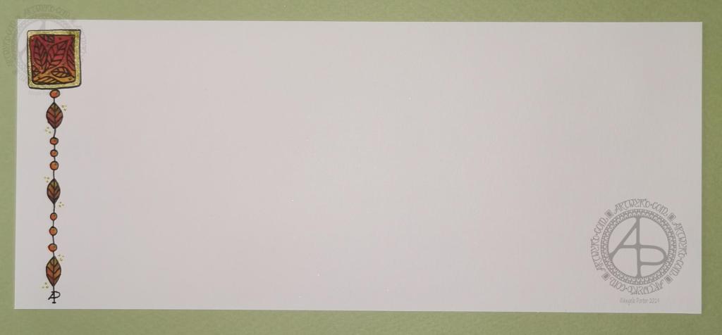
A simple and elegant Autumn Dangle Design.

Autumn Dangle Design ©Angela Porter | Artwyrd.com

Hello to November, and farewell Inktober. My blog post today looks a bit bare compared to my Inktober creations. However, I have neglected my dangle designs during October, so now’s the time to get back on track with them

Today, I’ve created a simple and elegant dangle design with an autumn colour scheme that could be used in so many different ways. I’ve also put together a step by step set of instructions how you too can create this design (and hoping that it’s not so simple that I come across as patronising).

This is my first time posting a set of instructions – post a comment to let me know what you think of them and if you’d like to see more of them in the future.

I’ve put the dangle design on one side of a slip of paper that would make a perfect compliment slip or a note to slip in with a gift, or just as a short letter to a friend. It would also be perfect for a coordinating piece of envelope art!

This dangle design would be absolutely charming as an embellishment in a BuJo, planner, scrapbook or art journal. It would also make a darling bookmark.

It would be easy to turn this design into a greeting card as well.

So many possible uses for such a simple design.

I do hope that you will give drawing dangles a go – no matter whether you think you’re good at drawing or not! This design is made out of just simple shapes; it’s the colour that brings it to life and masks all kinds of imperfections.

If you’d like more ideas for dangle designs, then please take a look at my book ‘A Dangle A Day’ – it’s filled with examples of dangle designs with step by step instructions and helpful and encouraging words of advice.

One step at a time to a dangle design.
Step 1

Step 1
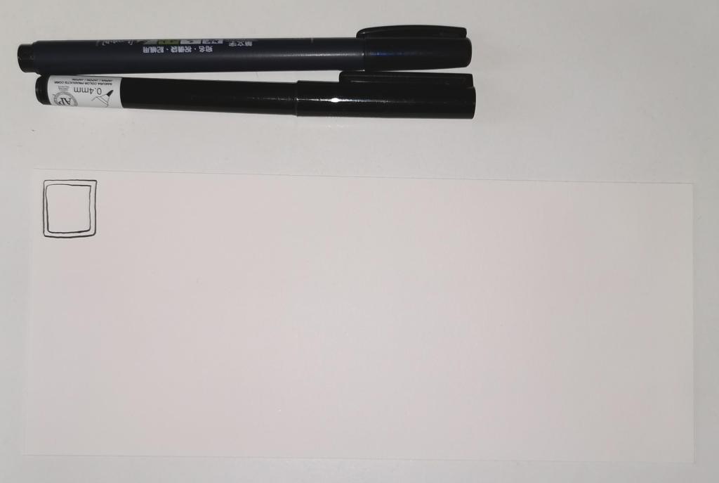
Draw a square in the top left corner of a piece of paper. I used a piece of paper measuring approx 8.25″ x 3.5″. I used a Tombow Fudenosuke brush pen to draw the box, and outline it. I deliberately made the squares less than perfect to give that human touch as well as a uniquely ‘me’ way of drawing boxes. The Fudenosuke pen allows me to draw lines of variable width quite easily, which adds to the charm of the box. The ink in the pen is also alcohol marker friendly.
Letting your drawings be less than perfect is what makes them uniquely yours.
Step 2

Step 2
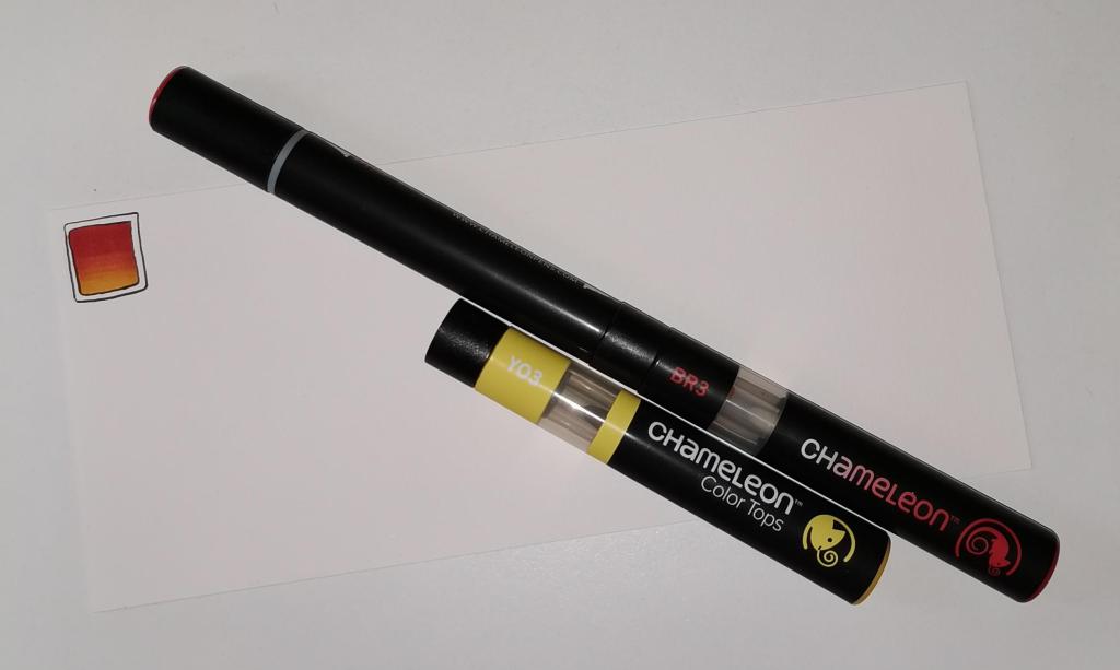
I used Chameleon marker pens (BR3 “Cinnamon” and YO3 “Warm Sunset”) to colour the inner box. Autumn is definitely here in the UK, and the combination of these colours reminded me of the leaves. However, you could use any colour combination you like and any medium you prefer to use.
Chameleon pens make it so easy to create a colour gradient – I prefer them to other alcohol marker pens, even Copics.

Step 3

Step 3
I added a simple leaf pattern to the coloured box using a Sakura Pigma Sensei 04 pen.

Step 4

Step 4
Add the dangle! For this dangle I used the same kind of leaves as in the box for a consistent design. I added some round beads as ‘spacers’. Finally, I added my ‘symbol’ to the end of the dangle.
Also, I did draw a faint pencil line with a ruler to help me keep my dangle hanging straight, more or less!

Step 5

Step 5
I coloured the beads and leaves in using the same colours of Chameleon Markers. I then decided I needed to add some shimmer and shine; I used a Uniball Signo gold glitter gel pen to colour in the border of the box and to add some dot highlights here and there.
The Chameleons caused the Sakura Pigma Micron ink to smear a little – I always forget that happens! I should’ve used the Tombow pen again. Oh well, you live and learn, eventually!

Abstract art card design

Abstract Art Card Design ©Angela Porter - Artwyrd.com
Abstract Art Card Design ©Angela Porter – Artwyrd.com

This morning I thought I’d try out a little experiment. Instead of drawing the design first, I used my Chameleon markers to lay down colour shapes and gradients and then add the line art.

I remembered to take a photo of the colour pattern I created, so you can see where I started. I had started adding some line art on it.

After adding the black line art, I then added gold embellishments using a gold gel pen. These are mainly on the background, where I wanted to add some interest.

One thing I’d change if I could do this over is to keep the same pale yellow to pink gradient background instead of the blue section to the middle left. I also meant to use pencils to add some depth of colour to some of the flat-looking areas. It would also have been a good idea to use them to increase the illusion of 3D in some of the patterned regions.

Do you know, I often say that I should’ve added some shadows when I post what I think is a finished piece of art. I need to put a huge post-it note on my Surface Studio to remind me about this!

My final step was to use a piece of foam to sponge some black Distress Ink around the edge to give it a bit of a border. I’m not so sure this was a good idea; the edges are a bit more defined, but they also look a bit dirty and grungy. One lives and learns, eventually.

It certainly was an experiment for me with traditional media. The method I’ve used here is a bit like the method I use when creating digital art. There, I start with a block of colour for the section I’m working on and then add shadow and light and ‘carve’ patterns into it using various methods.

Let me know what you think about this little design.

Oh, it is a little design. The card blank is aprox. 5½” by 4″ (14cm x 10cm)and the design is approx. 3″ by 4¾” ( 8cm x 12cm)

So, Angela, how are you doing today?

I’m doing ok. I had a good night’s sleep and so am feeling more alert and upbeat. I’m still a bit achy in the lower tummy area, but it’s nearly completely gone now.

Yesterday was a self-care day. I didn’t eat much; my appetite had departed me almost entirely. What I did eat made me feel sicky. That’s better today, as in I’ve had breakfast and though I didn’t eat much before I was full, I did eat.

I wasn’t happy with any art, or just about anything else I did; I just got frustrated with it and myself. Instead, I did spend a lot of the day cwtched up warm, crocheting and listening to Audible (Harry Potter and the Goblet of Fire read by Stephen Fry). Eventually, I settled down to sleep a little earlier than usual.

I’m glad to say that my mood seems a bit brighter and more stable today.

This morning, I’ve been busy ‘art-ing’, and I need to pop out soon. Errands to do and I need a bit of a walk as well. It looks like it’s going to stay dry for a while. That’s always a good thing. The temperature outdoors is more refreshing than it has been of late, which will make walking far more pleasant for me. It will help to blow the cobwebs away. Maybe it will also help with the stiffness/tenderness that those abdominal cramps have left in their wake. I may also find some inspiration for some more creative words in my journal too.

A colourful, small reef illustration

Reef Illustration ©Angela Porter | Artwyrd.com

A little reef illustration.

Yesterday, I got round to colouring my little reef drawing. And it is a little drawing – the paper is just 4″ square (10cm square).

To colour it, I used my Chameleon pens – both the Color Tones and Color Tops. I finished the illustration off with some small dots from a white Uniball Signo gel pen.

What I didn’t expect was that the pigment from the Uniball Unipin pens bled somewhat. I don’t remember that happening before. Mind you, I usually scan and print my black and white line art and colour the print. I didn’t do that today — something to remember for future reference. This is why some of the colours look a little dirty.

All the same, it’s a colourful, happy little illustration. I also like the thickness of the main lines with the variation in line thickness in the details. Diversity in line weight is something I need to remember when I draw digitally. Looking at my latest colouring templates, I think I may have used a line that was too fine. Again, this is something that I need to consider in the future.

It’s always lovely to do artwork like this, using traditional media and working in a familiar, comfortable style. It gives me a chance to reflect on what I’m doing elsewhere and to adapt and change what I’m doing to improve it.

Creating this artwork has given me ideas for some projects in the future. More on that when they come to fruition.

So, Angela, how are you doing today?

I’m doing OK. I’m feeling a lot brighter as the aftermath of Monday’s bombshell fades.

I’m aware I really don’t get out of the house and move my body around much. I either get engrossed in art and the day slips past me quite quickly. Or, my anxiety rears up and try as I might to overcome it, I just can’t seem to make it out of the house.

After a conversation with a friend the night before, I remembered that I like to walk around cemeteries and that my local cemetery might be the perfect place to go for a stroll.

And I did. Go for a stroll.

My love affair with cemeteries started when I used to walk to and from school when I was 11 and 12 years old. Walking to school was always a bit of a dash. However, I could take my time on the walk home to wander and explore the cemetery.

Even on the gloomiest, darkest winter afternoons, I never got freaked out by the cemetery. The dead have never scared me. The living, however, are an entirely different matter. The living people around me were the source of my traumas and CPTSD. The dead could do nothing to me that was any worse than the living.

I found the variation in headstone styles fascinating. I found I could chart the change in fashions over time. I also found reading them fascinating as some of them could tell me about the deceased and their families. It was history related to real people and brought them back to life. It wasn’t the dusty, dry, uninteresting facts in the history lessons I had to endure in school.

And so began my love of wandering around cemeteries.

I find them soothing, calm places to be. They’re quiet, not many people visit them. And there’s plenty of wildlife in them if you’re quiet and take the time to look.

Perfect places for me to walk and explore. Even on the days when anxiety stops me going to more people-y places like towns or parks, a cemetery can offer me that quiet space I need to take a walk.

If you’d like to see some photos and read some words about my walk and the cemetery, then please visit my other blog, Curious Stops and Tea Shops.

A little reef tangle

A little reef tangle ©Angela Porter | Artwyrd.com

I’ve had a quietly arty morning today. I’ve been adding to my visual zibladone (journal, reference book).

Then, I had the urge to create a little tangled, entangled drawing. So I did.

I cut up some Winsor and Newton Bristol Board into 4″ squares (approx. 10cm squares) and used some Uniball Unipin pens to do the drawing and shading.

I’m quite happy with the result. I may add some colour, perhaps with my Chameleon pens and pencils; I may need the sharp point of a pencil to get into some of the small spaces to add some shadow.

I do need to get out for a walk today. I’ve been letting myself stay in the safety of my home. Mind you, and I think that’s what I’ve needed this week as part of my self-care.

However, I now am feeling a lot less anxious than at the start of the week. So, it’s time to venture forth for more than just a quick trip out for vittles.

Maybe. I do need to have breakfast first. Oh, I’ve just seen the time. I need lunch first!

Entangled garden scene

Entangled Garden Scene © Angela Porter 2019

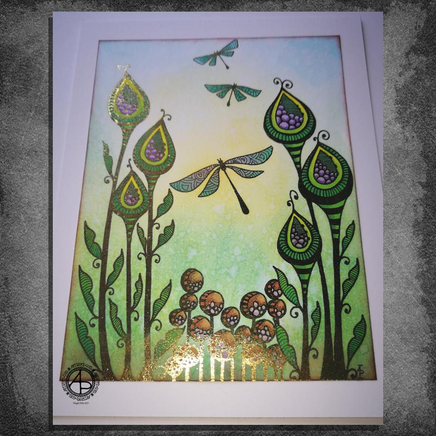
This took me a bit longer than I expected this morning. I did, however, enjoy creating this card.

First, I drew the design out on a piece of paper that is 10cm x 14cm using various sizes of Uniball Unipin pens.

I copied the image using my Brother Laser printer. I didn’t scan it in at this time, but will do later on. All I needed was a copy to play around with.

The next step involved the use of Chameleon Duo Tone and Color Top markers to colour the design elements in. Even though some areas were quite small, I still managed to get bits of shading there.

Once the colouring with the Chameleon markers was done it was time to hot foil the design, and you can see where the gold foil catches the light in places as I took the photo. A friend of mine saw some of my foiling yesterday in person and she was said she was wowed by it. She thought it was good in the photos, but the photos really don’t do it justice at all.

After foiling, it was time to colour the background. I used a selection of Distress Inks, starting with mustard seed in the centre to give a subtle glow, then tumbled glass, crushed olive, peeled paint, pine needles and evergreen bough. I used a piece of cut and dry foam and a very light touch to add the colour.

I was worried that the Distress Inks may muddy up the colouring done with the Chameleon markers. Yes, they subtly changed the colours in some places, but I was careful to choose colours that wouldn’t make mud. Also, so little Distress Ink is added it barely alters the colours.

I can tell you I was well relieved by that!

Distress Inks are water reactive, so I gave the image a light spray of water knowing that only the Distress Inks would be affected. After a short while I dabbed the water off with a piece of paper towel. This lifted some of the colour leaving a subtle background texture.

As this point, after letting the paper dry completely, I could’ve added more Distress ink. Instead, I decided to use aged mahogany, again on a small piece of cut and dry foam, to edge the paper, to give it a border, and also to add a darker layer at the bottom of the design to ‘ground’ the image.

When I can find my Wink of Stella pen from Kuretake I’ll add some very subtle shimmer to the dragonflies, maybe to the seeds in the seedpods too. I also think some gold dots in small clusters would enhance the background.

I also need to think about adding a bit more shading to the bottoms of the laves to give a more dimensional look to them I think. I could definitely do the same to the dragonflies’ wings too.

Those are simple and quite minor changes that will make a difference I think. It’s only as I’m looking at the finished image now that I can see how those things would help. I often don’t think to step back and give myself time to look at the image with fresh and kindly critical eyes, seeing what I could do to improve my work.

In hindsight, the dragonflies may have worked well as black silhouettes in the design, which would then become totally covered in foil. Or just outlines that would be foiled. That’s something for me to try another time and see if I like that idea more.

I think you can tell I’m really enjoying this branch of my artistic journey. I’ve concentrated a lot on digital art of late. I’m not going to abandon my digital art journey at all; I can do things digitally that I can’t with traditional media.

However, it is showing me that working with traditional media is also a pleasurable and successful activity for me to do.

What am I going to do with this? I don’t know. Part of me wants to add it to my BuJo. Another part wants to mount it on a blank greeting card to send to a friend. Another part of me wants to put it into a reference sketchbook or folder for inspiration in the future.

Monogram ‘Q’ dangle designs

Monogram ‘Q’ Dangle Designs – ©Angela Porter 2019

Following on from yesterday’s blog post (One dangle design, four colourways) I thought I’d do another monogram dangle design, but this time adding some embellishments.

The design for the Q monogram comes from my book ‘A Dangle A Day’ (published on 15 Jan 2019). I printed the design out on heavyweight printer paper and used a combination of Chameleon markers, Copic Markers and Chameleon pencils to colour the designs. The original drawing was hand drawn using a Microsoft Surface Pen on a Microsoft Surface Studio using Autodesk Sketchbook Pro.

Once I’d finished the colouring, I then added some embellishments. I’m not a good photographer and sparkly and shiny elements are not easy to photograph, and even worse to scan!

Here’s the details of the embellishments I added:

  1. Aqua coloured Nuvo Glitter drops can be seen dotted around and within the design. These really sparkle and catch the light; they also dry raised, like a sparkly water drop. I also used a Wink of Stella brush pen to add subtle sparkle to the hearts and flower. Then, I realised that the Q was lost in the blue background which was similar in tonal value to the letter. So, I used an extra fine fountain pen to add a pattern made of various sizes of tiny circles to the background.
  2. I just used gold Nuvo drops to embellish the design as well as Wink of Stella to add some subtle shimmer to the hearts and flower.
  3. I used a Spectrum Noir clear sparkle pen to add shimmer and shine to the letter and the hearts. Dots of silver Nuvo glitter drops were added around the design. I also used a gold glitter Uniball Signo pen to add dots to the letter and the centre of the flower. Finally, I used an extra fine fountain pen with black ink to add the patterns in the frame. This helps the letter to stand out in the design. I also used Sakura Stardust Gelly Roll pens to colour in the arrow feathers. These pens allow the underlying colour to show through in a subtle way.
  4. Orange-gold Nuvo glitter drops were added around the design. The clear Spectrum Noir sparkle pen was used to add shimmer and shine to the letter and the dark blue ‘bars’ in the frames around the Q. Finally, I used the extra fine fountain pen with black ink to add patterns to the bars and the letter as well as a solid drop shadow to the left and bottom of the design elements to help them stand out.

These designs could be used for note cards or greetings cards, bookmarks and more. However, they’d make a beautiful ‘drop capital’ at the start of a quote or message.

Of course, it would be easy to substitute the Q for another letter or numeral, or even a cute doodle drawing. Instead of a drawing, you could affix an object such as a dried flower, a metal charm, a dimensional sticker, an inchie, or anything else you can think of. You could even put a small photograph in the frame instead of the letter, and this would make a unique, charming card or feature on a scrapbook, journal or bujo page.

Your options are only limited by your imagination and creativity!

Christmas Dangle Design

©Angela Porter
Design from ‘A Dangle A Day’, authored and illustrated by Angela Porter

It’s Friday so it’s #dangleday. Today, I wanted to share a Christmas Dangle with you from my book ‘A Dangle A Day’. In the book I show how this design was drawn, step by step.

When I created this design, I first drew it in pencil on dot grid paper. The next step for me was to scan it in to the computer and then re-draw it step-by-step, saving each step as I went. For the book, the final step was to colour the design and then write the instructions to go with the images. My tools for this were a Microsoft Surface Book, a Microsoft Surface Pen and Autodesk Sketchbook Pro.

I wanted to include as many Christmas-themed charms to create the dangles as I could and still keep the design balanced. I also kept the length of the dangles uneven. The waviness in the ends of the dangles echoes the waviness of the fairy lights above the hand lettered word ‘Christmas’.

What I did this morning was to print the black and white line art design on an A4 sheet of paper. Then I used Chameleon Duo Tones and Color Tops markers to colour it in.

These pens make it easy to create gradations of colour, such as on the hand lettering. These gradations add ‘dimension’ to the charms and dangles. I keep the darker shades to the left and bottom of the designs so that there’s a consistency across the whole image. I also used a pale grey marker to add drop shadows to the left and bottom of the design elements; again this helps to add dimension to the design.

Finally, I added some highlights with a white Sakura Gelly Roll pen. I also added some sparkles around the fairy lights and individual stars with a gold glitter Uniball Signo gel pen. After all, it wouldn’t be Christmas without some sparkle!

Used individually with a monogram or Christmassy image the dangles would make lovely book marks. Printed at A5 in size, the design would make a fabulous BuJo page for the big day itself. It would also make a lovely design for greetings cards or note cards.

Of course, it would be easy to change the word at the top to, perhaps, Winter or Yule and use fewer dangles to suit the length of the word. Personally, I like to use an odd number of dangles wherever possible – it gives a more balanced design.

Abstract Entangled Art 17 November 2018

I’ve worked on this image over the past three days or so. Adding the shading took a surprisingly large amount of time.

I really enjoyed creating this one. I say that about all my art though, but this one was particularly enjoyable as it helped me to calm and relax after the crazyily emotionally exhausting week I’d had.

It reminds me very much of work I used to do before I had so much work to do for colouring books, not that I’m complaining about that, not one bit. I love doing the drawings for them as much, but I can’t work in this kind of detail for them. I can’t put in all the fine line shading and shadow for them, nor the teeny-tiny details in the patterns as they’d be nigh on impossible to colour the gaps individually.

In my past couple of drawings like this, I haven’t added any shadow to them in the way I have in this particular design. The shadow really helps with that sense of ‘dimension’, though I do think I could have added some deeper shadows in some places.

Though it reminds me of the kind of drawings i used to do a lot pre-coloring books, it’s also shows a change in perhaps sophistication of line but also in the variety of patterns and design elements I like to include in my designs. I’ve even left some ares not heavily patterned so they give the eye spaces to rest without being overwhelmed with pattern and design.

Now to the nitty gritty of how I drew this.

After yesterdays discussion about digital vs traditional art I’d like to say I did this digitally, but I didn’t. I used Unipin Uniball and Sakura Pigma Micron pens on an A4 sheet of Bristol Board from Daler-Rowney. Pencil lines were sometimes used, especially for the circles, which I used stencils to draw them in lightly before inking them in free-hand. I’ve noticed I’ve not erased the pencil lines before scanning the artwork in.

To add the shading I used Chameleon Color Tones and Color Tops in shades of cool grey and neutral grey.

Today, I plan to do some more drawing similar to this before my new bullet journal arrives to replace the one I wrecked by spilling mocha over it and my lovely flowery bag. Thankfully, the notes I need to keep from the media training and events this week are still readable so I can transfer them across, as well as edit them in the process.

Nature always wears the colours of the spirit

Angela Porter 5 July 2018

I’ve spent all day working on this, and a pleasurable day it has been.

When it came to choosing a quote to hand letter on the image, this one by Ralph Waldo Emerson seemed perfect to me.

To colour my drawing I used my Chameleon Marker pens. I haven’t used alcohol markers in quite a while. There was a point when I’d coloured a lot of the outline art in and really didn’t like the colours I’d used and nearly gave up on it.

However, I persevered in adding the patterns and highlights and it’s worked out quite nicely I think, even with a not very good photo of the image.

Artwyrd at Etsy

Last night I bit the marker pen and uploaded two sets of small greetings cards to my Etsy shop, Artwyrd.

Each set has ten cards featuring a coloured flower/mandala design stored in a small, custom made box along with matching envelopes.

The flower/mandala designs I drew myself in Autodesk Sketchbook Pro on my Microsoft Surface book.  I printed out multiple copies of the designs and then used my Chameleon Markers and Copic Markers to colour them.  Distress Ink was used to add colour around the designs.

The next step was to create colour mats for the designs; I used my marker pens to colour some Centaura Pearl card.

Before mounting them on the 3″ x 3″ (7.5cm x 7.5cm) card blanks, I embellished the designs with dots of metallic and pearlescent acrylic paint, as well as adding coloured gems.

Of course the cards sparkle!

The boxes are made from cardstock with the lids decorated with designer series paper; the colour ways chosen are complementary to the colours of the cards. I also used Distress Inks to distress the edges and corners of the boxes.   I’ve yet to embellish the boxes.

These are my fifth and sixth attempts at making the boxes.  I had to purchasing a new paper cutter that’s more accurate than the one I had been using.  I had used a template for a box that would take ten 3″ x 3″ cards, but wasn’t big enough for the envelopes.  So, I also had to work out and adjust the measurements needed for the base and lid so that the envelopes would fit in the box!  Frustrating, especially as maths isn’t my strong point …but I got there in the end.

I do have a couple of jobs to do to the cards/boxes; the boxes need some embellishment, and I need to add makers labels to them too.

The boxes will be nice for other things once the cards are used up – the lids are a snug fit.

All of the designs I have stored and may, in the fullness of time, put them together as a pack of digi-stamps so people can use them to create their own cards!