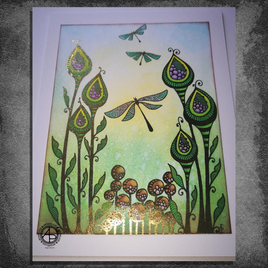
This took me a bit longer than I expected this morning. I did, however, enjoy creating this card.
First, I drew the design out on a piece of paper that is 10cm x 14cm using various sizes of Uniball Unipin pens.
I copied the image using my Brother Laser printer. I didn’t scan it in at this time, but will do later on. All I needed was a copy to play around with.
The next step involved the use of Chameleon Duo Tone and Color Top markers to colour the design elements in. Even though some areas were quite small, I still managed to get bits of shading there.
Once the colouring with the Chameleon markers was done it was time to hot foil the design, and you can see where the gold foil catches the light in places as I took the photo. A friend of mine saw some of my foiling yesterday in person and she was said she was wowed by it. She thought it was good in the photos, but the photos really don’t do it justice at all.
After foiling, it was time to colour the background. I used a selection of Distress Inks, starting with mustard seed in the centre to give a subtle glow, then tumbled glass, crushed olive, peeled paint, pine needles and evergreen bough. I used a piece of cut and dry foam and a very light touch to add the colour.
I was worried that the Distress Inks may muddy up the colouring done with the Chameleon markers. Yes, they subtly changed the colours in some places, but I was careful to choose colours that wouldn’t make mud. Also, so little Distress Ink is added it barely alters the colours.
I can tell you I was well relieved by that!
Distress Inks are water reactive, so I gave the image a light spray of water knowing that only the Distress Inks would be affected. After a short while I dabbed the water off with a piece of paper towel. This lifted some of the colour leaving a subtle background texture.
As this point, after letting the paper dry completely, I could’ve added more Distress ink. Instead, I decided to use aged mahogany, again on a small piece of cut and dry foam, to edge the paper, to give it a border, and also to add a darker layer at the bottom of the design to ‘ground’ the image.
When I can find my Wink of Stella pen from Kuretake I’ll add some very subtle shimmer to the dragonflies, maybe to the seeds in the seedpods too. I also think some gold dots in small clusters would enhance the background.
I also need to think about adding a bit more shading to the bottoms of the laves to give a more dimensional look to them I think. I could definitely do the same to the dragonflies’ wings too.
Those are simple and quite minor changes that will make a difference I think. It’s only as I’m looking at the finished image now that I can see how those things would help. I often don’t think to step back and give myself time to look at the image with fresh and kindly critical eyes, seeing what I could do to improve my work.
In hindsight, the dragonflies may have worked well as black silhouettes in the design, which would then become totally covered in foil. Or just outlines that would be foiled. That’s something for me to try another time and see if I like that idea more.
I think you can tell I’m really enjoying this branch of my artistic journey. I’ve concentrated a lot on digital art of late. I’m not going to abandon my digital art journey at all; I can do things digitally that I can’t with traditional media.
However, it is showing me that working with traditional media is also a pleasurable and successful activity for me to do.
What am I going to do with this? I don’t know. Part of me wants to add it to my BuJo. Another part wants to mount it on a blank greeting card to send to a friend. Another part of me wants to put it into a reference sketchbook or folder for inspiration in the future.

