Abstract art card design

Abstract Art Card Design ©Angela Porter - Artwyrd.com
Abstract Art Card Design ©Angela Porter – Artwyrd.com

This morning I thought I’d try out a little experiment. Instead of drawing the design first, I used my Chameleon markers to lay down colour shapes and gradients and then add the line art.

I remembered to take a photo of the colour pattern I created, so you can see where I started. I had started adding some line art on it.

After adding the black line art, I then added gold embellishments using a gold gel pen. These are mainly on the background, where I wanted to add some interest.

One thing I’d change if I could do this over is to keep the same pale yellow to pink gradient background instead of the blue section to the middle left. I also meant to use pencils to add some depth of colour to some of the flat-looking areas. It would also have been a good idea to use them to increase the illusion of 3D in some of the patterned regions.

Do you know, I often say that I should’ve added some shadows when I post what I think is a finished piece of art. I need to put a huge post-it note on my Surface Studio to remind me about this!

My final step was to use a piece of foam to sponge some black Distress Ink around the edge to give it a bit of a border. I’m not so sure this was a good idea; the edges are a bit more defined, but they also look a bit dirty and grungy. One lives and learns, eventually.

It certainly was an experiment for me with traditional media. The method I’ve used here is a bit like the method I use when creating digital art. There, I start with a block of colour for the section I’m working on and then add shadow and light and ‘carve’ patterns into it using various methods.

Let me know what you think about this little design.

Oh, it is a little design. The card blank is aprox. 5½” by 4″ (14cm x 10cm)and the design is approx. 3″ by 4¾” ( 8cm x 12cm)

So, Angela, how are you doing today?

I’m doing ok. I had a good night’s sleep and so am feeling more alert and upbeat. I’m still a bit achy in the lower tummy area, but it’s nearly completely gone now.

Yesterday was a self-care day. I didn’t eat much; my appetite had departed me almost entirely. What I did eat made me feel sicky. That’s better today, as in I’ve had breakfast and though I didn’t eat much before I was full, I did eat.

I wasn’t happy with any art, or just about anything else I did; I just got frustrated with it and myself. Instead, I did spend a lot of the day cwtched up warm, crocheting and listening to Audible (Harry Potter and the Goblet of Fire read by Stephen Fry). Eventually, I settled down to sleep a little earlier than usual.

I’m glad to say that my mood seems a bit brighter and more stable today.

This morning, I’ve been busy ‘art-ing’, and I need to pop out soon. Errands to do and I need a bit of a walk as well. It looks like it’s going to stay dry for a while. That’s always a good thing. The temperature outdoors is more refreshing than it has been of late, which will make walking far more pleasant for me. It will help to blow the cobwebs away. Maybe it will also help with the stiffness/tenderness that those abdominal cramps have left in their wake. I may also find some inspiration for some more creative words in my journal too.

Colouring Reef Illustrations

Coloring Reef Illustrations © Angela Porter - Artwyrd.com
Coloring Reef Illustrations © Angela Porter – Artwyrd.com

This morning I started to colour the reef illustrations I posted yesterday. I’m using a mixture of Chameleon marker pens and pencils to do this. My photograph of the work in progress isn’t brilliant, but you get the idea I’m sure.

In the larger motifs, I’m using the Chameleon Color Tones markers along with the Color Tops to achieve gradient colouring. Flat colour is added to smaller areas using the pen.

Then, I use Chameleon pencils to add depth and dimension. I’m also adding more depth and dimension by using a white gel pen and a fine Unipin pen to add highlights and texture.

I’m enjoying the process, but I must admit I’m finding it more ‘fussy’ to do than when I digitally colour! Continually swapping pens and pencils is a little frustrating for me.

Maybe that’s just today as I’m tired. I didn’t sleep at all well last night. Stomach cramps were plaguing me throughout the night, though they do seem better today. Painkillers have stopped the pain completely today; yesterday, they merely dulled it.

Also, when I woke, my mind was very active with flashbacks related to my EMDR therapy yesterday. It was a very emotional session, lots of tears and upset. However, my therapist tells me I’m making good progress. I believe her.

Today, everything seems like hard work as I’m so exhausted, not just from the lack of sleep, but emotionally too. These feelings will pass; they always do.

I don’t know how much more I’ll do today. I don’t think I’ll get a lot of colouring done. I do feel I need to draw though, so perhaps I’ll do that after I’ve done some errands today. Typical of ‘adulting’ to get in the way of self-soothing and self-care.

A colourful, small reef illustration

Reef Illustration ©Angela Porter | Artwyrd.com

A little reef illustration.

Yesterday, I got round to colouring my little reef drawing. And it is a little drawing – the paper is just 4″ square (10cm square).

To colour it, I used my Chameleon pens – both the Color Tones and Color Tops. I finished the illustration off with some small dots from a white Uniball Signo gel pen.

What I didn’t expect was that the pigment from the Uniball Unipin pens bled somewhat. I don’t remember that happening before. Mind you, I usually scan and print my black and white line art and colour the print. I didn’t do that today — something to remember for future reference. This is why some of the colours look a little dirty.

All the same, it’s a colourful, happy little illustration. I also like the thickness of the main lines with the variation in line thickness in the details. Diversity in line weight is something I need to remember when I draw digitally. Looking at my latest colouring templates, I think I may have used a line that was too fine. Again, this is something that I need to consider in the future.

It’s always lovely to do artwork like this, using traditional media and working in a familiar, comfortable style. It gives me a chance to reflect on what I’m doing elsewhere and to adapt and change what I’m doing to improve it.

Creating this artwork has given me ideas for some projects in the future. More on that when they come to fruition.

So, Angela, how are you doing today?

I’m doing OK. I’m feeling a lot brighter as the aftermath of Monday’s bombshell fades.

I’m aware I really don’t get out of the house and move my body around much. I either get engrossed in art and the day slips past me quite quickly. Or, my anxiety rears up and try as I might to overcome it, I just can’t seem to make it out of the house.

After a conversation with a friend the night before, I remembered that I like to walk around cemeteries and that my local cemetery might be the perfect place to go for a stroll.

And I did. Go for a stroll.

My love affair with cemeteries started when I used to walk to and from school when I was 11 and 12 years old. Walking to school was always a bit of a dash. However, I could take my time on the walk home to wander and explore the cemetery.

Even on the gloomiest, darkest winter afternoons, I never got freaked out by the cemetery. The dead have never scared me. The living, however, are an entirely different matter. The living people around me were the source of my traumas and CPTSD. The dead could do nothing to me that was any worse than the living.

I found the variation in headstone styles fascinating. I found I could chart the change in fashions over time. I also found reading them fascinating as some of them could tell me about the deceased and their families. It was history related to real people and brought them back to life. It wasn’t the dusty, dry, uninteresting facts in the history lessons I had to endure in school.

And so began my love of wandering around cemeteries.

I find them soothing, calm places to be. They’re quiet, not many people visit them. And there’s plenty of wildlife in them if you’re quiet and take the time to look.

Perfect places for me to walk and explore. Even on the days when anxiety stops me going to more people-y places like towns or parks, a cemetery can offer me that quiet space I need to take a walk.

If you’d like to see some photos and read some words about my walk and the cemetery, then please visit my other blog, Curious Stops and Tea Shops.

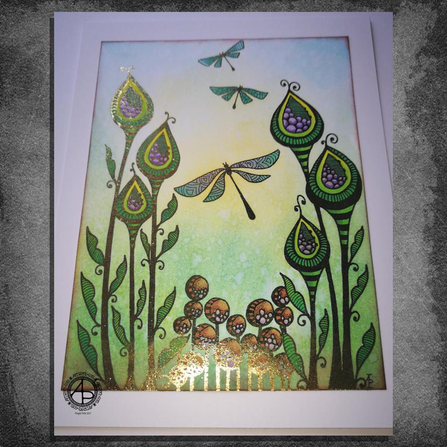
Entangled garden scene

Entangled Garden Scene © Angela Porter 2019

This took me a bit longer than I expected this morning. I did, however, enjoy creating this card.

First, I drew the design out on a piece of paper that is 10cm x 14cm using various sizes of Uniball Unipin pens.

I copied the image using my Brother Laser printer. I didn’t scan it in at this time, but will do later on. All I needed was a copy to play around with.

The next step involved the use of Chameleon Duo Tone and Color Top markers to colour the design elements in. Even though some areas were quite small, I still managed to get bits of shading there.

Once the colouring with the Chameleon markers was done it was time to hot foil the design, and you can see where the gold foil catches the light in places as I took the photo. A friend of mine saw some of my foiling yesterday in person and she was said she was wowed by it. She thought it was good in the photos, but the photos really don’t do it justice at all.

After foiling, it was time to colour the background. I used a selection of Distress Inks, starting with mustard seed in the centre to give a subtle glow, then tumbled glass, crushed olive, peeled paint, pine needles and evergreen bough. I used a piece of cut and dry foam and a very light touch to add the colour.

I was worried that the Distress Inks may muddy up the colouring done with the Chameleon markers. Yes, they subtly changed the colours in some places, but I was careful to choose colours that wouldn’t make mud. Also, so little Distress Ink is added it barely alters the colours.

I can tell you I was well relieved by that!

Distress Inks are water reactive, so I gave the image a light spray of water knowing that only the Distress Inks would be affected. After a short while I dabbed the water off with a piece of paper towel. This lifted some of the colour leaving a subtle background texture.

As this point, after letting the paper dry completely, I could’ve added more Distress ink. Instead, I decided to use aged mahogany, again on a small piece of cut and dry foam, to edge the paper, to give it a border, and also to add a darker layer at the bottom of the design to ‘ground’ the image.

When I can find my Wink of Stella pen from Kuretake I’ll add some very subtle shimmer to the dragonflies, maybe to the seeds in the seedpods too. I also think some gold dots in small clusters would enhance the background.

I also need to think about adding a bit more shading to the bottoms of the laves to give a more dimensional look to them I think. I could definitely do the same to the dragonflies’ wings too.

Those are simple and quite minor changes that will make a difference I think. It’s only as I’m looking at the finished image now that I can see how those things would help. I often don’t think to step back and give myself time to look at the image with fresh and kindly critical eyes, seeing what I could do to improve my work.

In hindsight, the dragonflies may have worked well as black silhouettes in the design, which would then become totally covered in foil. Or just outlines that would be foiled. That’s something for me to try another time and see if I like that idea more.

I think you can tell I’m really enjoying this branch of my artistic journey. I’ve concentrated a lot on digital art of late. I’m not going to abandon my digital art journey at all; I can do things digitally that I can’t with traditional media.

However, it is showing me that working with traditional media is also a pleasurable and successful activity for me to do.

What am I going to do with this? I don’t know. Part of me wants to add it to my BuJo. Another part wants to mount it on a blank greeting card to send to a friend. Another part of me wants to put it into a reference sketchbook or folder for inspiration in the future.

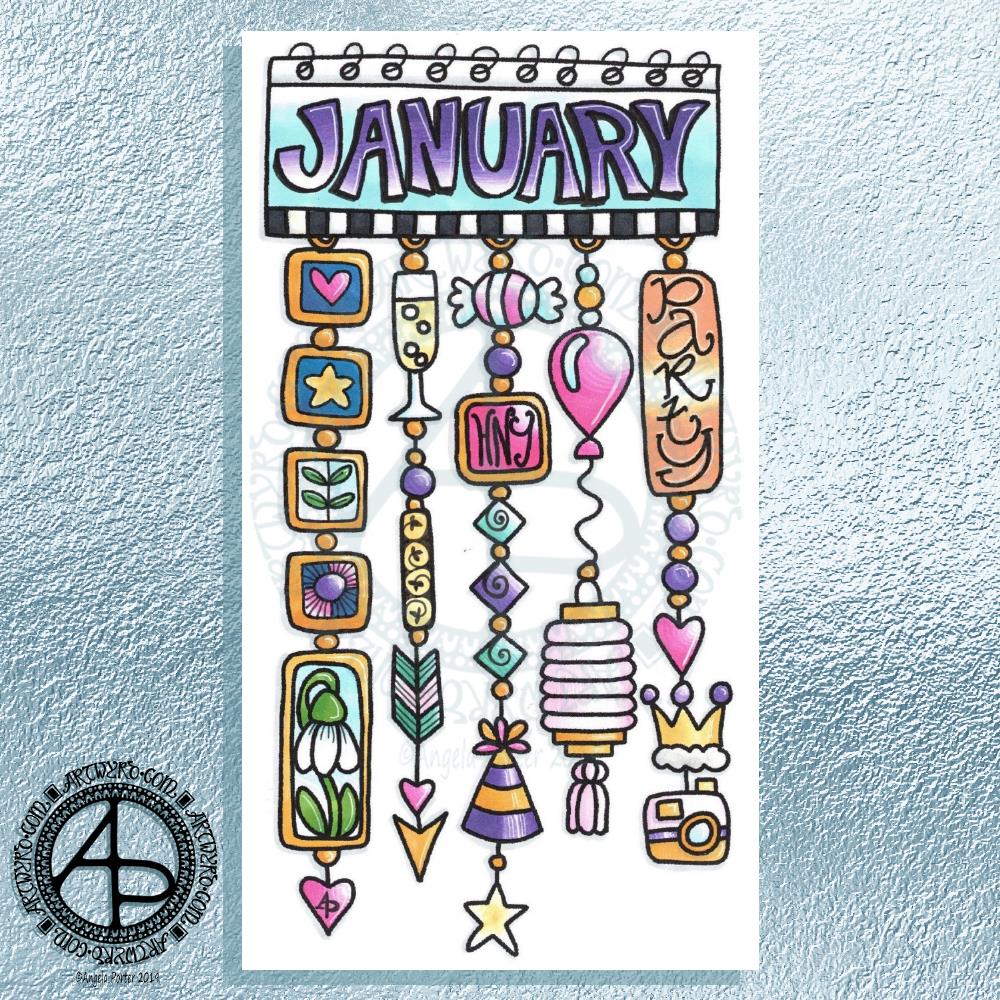
Hello January! A Dangle Design

©Angela Porter 2019

What a bright, sunshiny morning it is here in South Wales in the UK. The first sunshine of the new calendar!

I’ve been up for around 3 hours and have had a fairly artsy time.

My first job was to print out the lineart for this dangle design, which is one of many in my book ‘A Dangle A Day’ which is due for release on 8 January 2019 – just a week away!

In the book, I take you through how to draw this design, one step at a time. Not only this design, but well over 100 more – designs for all seasons and many, many celebrations and occasions.

This design I drew in Autodesk Sketchbook Pro using a Microsoft Surface Pen and Microsoft Surface Book. For the book, I coloured it digitally. Today, I printed out my black and white lineart and then coloured it using Chameleon Color Tones and Color Tops marker pens. I also added some details to some elements of the design using a 08 Uniball Unipin pen and a white Sakura Gelly Roll Pen.

Yesterday, I said I need to to spelunking through my stash of mixed media and cardmaking supplies to find forgotten supplies I could use to embellish my designs.

This dangle design would make a lovely monthly cover page for a BuJo (bullet journal), planner, diary or journal. It would also make a pretty greetings card or notecard to drop a line to a friend wishing them a wonderful January. Change the words and colours to suit the occasion or recipient! It would also be a lovely, whimsical, cute design for a winter party invitation.

I realised then that my old watermark wouldn’t do for this year. So I hand lettered a new one. I made my symbol, the one I hide away in my artwork, part of the design, along with a little intricate but simple geometric pattern around it. A little touch of the uncials for my blog address, along with a typed copyright statement and it’s done and saved! I may end up changing it a little, or having variations on the theme, as time goes on. But I’m fairly happy with it.

So, I’ve already had a productive morning! It may be a Bank Holiday in the UK, but I really do need to focus on those templates that need colouring for Entangled Forests…and I may venture forth into the peopley world later on today, maybe.

Christmas Dangle Design

©Angela Porter
Design from ‘A Dangle A Day’, authored and illustrated by Angela Porter

It’s Friday so it’s #dangleday. Today, I wanted to share a Christmas Dangle with you from my book ‘A Dangle A Day’. In the book I show how this design was drawn, step by step.

When I created this design, I first drew it in pencil on dot grid paper. The next step for me was to scan it in to the computer and then re-draw it step-by-step, saving each step as I went. For the book, the final step was to colour the design and then write the instructions to go with the images. My tools for this were a Microsoft Surface Book, a Microsoft Surface Pen and Autodesk Sketchbook Pro.

I wanted to include as many Christmas-themed charms to create the dangles as I could and still keep the design balanced. I also kept the length of the dangles uneven. The waviness in the ends of the dangles echoes the waviness of the fairy lights above the hand lettered word ‘Christmas’.

What I did this morning was to print the black and white line art design on an A4 sheet of paper. Then I used Chameleon Duo Tones and Color Tops markers to colour it in.

These pens make it easy to create gradations of colour, such as on the hand lettering. These gradations add ‘dimension’ to the charms and dangles. I keep the darker shades to the left and bottom of the designs so that there’s a consistency across the whole image. I also used a pale grey marker to add drop shadows to the left and bottom of the design elements; again this helps to add dimension to the design.

Finally, I added some highlights with a white Sakura Gelly Roll pen. I also added some sparkles around the fairy lights and individual stars with a gold glitter Uniball Signo gel pen. After all, it wouldn’t be Christmas without some sparkle!

Used individually with a monogram or Christmassy image the dangles would make lovely book marks. Printed at A5 in size, the design would make a fabulous BuJo page for the big day itself. It would also make a lovely design for greetings cards or note cards.

Of course, it would be easy to change the word at the top to, perhaps, Winter or Yule and use fewer dangles to suit the length of the word. Personally, I like to use an odd number of dangles wherever possible – it gives a more balanced design.

Winter design

I drew this a few days ago and have only got around to coloring it today. 

The hand lettering and drawing was done with Uniball Unipin pens on paper. In black and white it has an almost vintage linocut feel to it. 

I did scan it in and print it out on paper more suitable for alcohol markers. I used Chameleon Duo Tone and Duotop markers. Highlights were added with a white gelly roll pen from Sakura. I then added more black lines to add more dimension in places using a Staedler Mars Matic technical drawing pen.

Not sure I’ve done too good a job with the colours. Or line shading. Or the highlights in some places.

I’m quite pleased with the black and white line drawing however. 

I am going to make this template available on Friday 7 December 2018 in the Angela Porter’s Coloring Book Fans facebook group as an exclusive to members. Terms and conditions in it’s use apply.

Abstract Entangled Art 17 November 2018

I’ve worked on this image over the past three days or so. Adding the shading took a surprisingly large amount of time.

I really enjoyed creating this one. I say that about all my art though, but this one was particularly enjoyable as it helped me to calm and relax after the crazyily emotionally exhausting week I’d had.

It reminds me very much of work I used to do before I had so much work to do for colouring books, not that I’m complaining about that, not one bit. I love doing the drawings for them as much, but I can’t work in this kind of detail for them. I can’t put in all the fine line shading and shadow for them, nor the teeny-tiny details in the patterns as they’d be nigh on impossible to colour the gaps individually.

In my past couple of drawings like this, I haven’t added any shadow to them in the way I have in this particular design. The shadow really helps with that sense of ‘dimension’, though I do think I could have added some deeper shadows in some places.

Though it reminds me of the kind of drawings i used to do a lot pre-coloring books, it’s also shows a change in perhaps sophistication of line but also in the variety of patterns and design elements I like to include in my designs. I’ve even left some ares not heavily patterned so they give the eye spaces to rest without being overwhelmed with pattern and design.

Now to the nitty gritty of how I drew this.

After yesterdays discussion about digital vs traditional art I’d like to say I did this digitally, but I didn’t. I used Unipin Uniball and Sakura Pigma Micron pens on an A4 sheet of Bristol Board from Daler-Rowney. Pencil lines were sometimes used, especially for the circles, which I used stencils to draw them in lightly before inking them in free-hand. I’ve noticed I’ve not erased the pencil lines before scanning the artwork in.

To add the shading I used Chameleon Color Tones and Color Tops in shades of cool grey and neutral grey.

Today, I plan to do some more drawing similar to this before my new bullet journal arrives to replace the one I wrecked by spilling mocha over it and my lovely flowery bag. Thankfully, the notes I need to keep from the media training and events this week are still readable so I can transfer them across, as well as edit them in the process.

Doodleworlds design 12 November 2018

Angela Porter 12 November 2018

After the emotions surrounding Remembrance Day and all the heart-tugging posts on social media concerning issues around veterans and families and so on, I needed to create something that was a little fun.

I drew the design yesterday and I’ve spent the past 4 hours colouring it using my set of Chameleon Color Tones and Color Tops.

Not digital art this time, just some fun doodleworlds style critters and monsters and objects, along with some geometric designs as well as my trademark arches and swirls and spirals.

I love how all my critters are different and yet close together getting along, even if some of them look a bit grumpy, fierce or angry. We all have emotions, a whole range of them from ecstatic, happy to sad, angry, miserable. It’s like a weird kind of family, friendship photo. Even the single kitty to the left of the tower is part of this group, even though it’s keeping its distance.

Sometimes I need that distance from people, even groups of people I care for. I get overwhelmed so easily. I then need some quiet alone time and space to rest, recoup and recharge. I enjoy time with people I care about; the trade off is feeling drained and tired and exhausted afterwards.

It’s the same with overly emotional days. When I need to rest, recoup and recharge sometimes drawing overly whimsical, cute, simple designs with cheesily cute critters and monsters helps to soothe what’s going on inside me.

I really need a bit of that before I head out for EMDR therapy later on today.

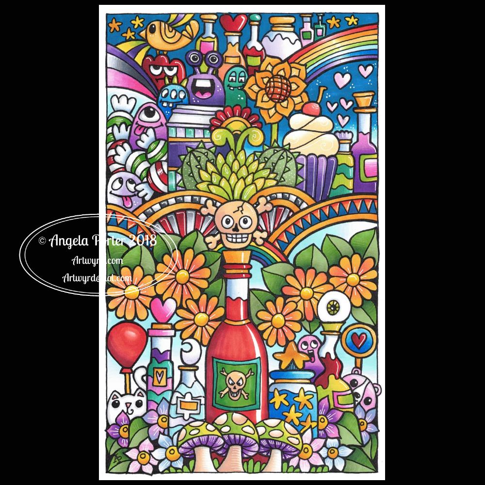
Inktober 2018 Day 18 ‘Bottle’

Angela Porter Inktober 2018 Day 18 Bottle

Not just one bottle, but several!

This was a fun one to draw – Faber-Castell Broad pen on paper. Scanned in to the Surface Studio to clean it up and print it out so I could colour it using Chameleon Color Tone and Color Tops marker pens.

I added some highlights with a white Sakura Gelly Roll pen.

I’m a bit later than usual posting the Inktober image today. I had quite a few errands to run today, including a slightly worrying recall to the opticians for photographs or my eyes, even though I only had them done around 4 weeks ago. It wasn’t pictures of my retina and optic nerve the optician wanted – it was images of the front of my eyes due to me having a wobbling blood vessel in one.

I had planned on popping into the opticians as I’d managed to drop one pair of distance glasses on a tarmac floor and had chipped the lenses (which I’d had for less than a week!) and so needed to have replacement lenses. That was the easy part…

They had trouble getting the camera to work to take pictures of the front of my eyes, so I have to have the process done on Saturday when I pick up my glasses with the new lenses in as the optician will have set the camera up. If it still won’t work, she’ll inspect my eyes with a ‘slit test’ I think it was.

I’ve never had such thorough eye tests/examinations before. I’m well impressed! And it’s with Specsavers! I’ve never had an optician comment on my differently pigmented eyes before either – one eye is mostly a light brownish-green with a small wedge of brown, the other is about half brown and the rest the same light brownish-green  as t’other eye.

Someone I met a long time ago described me as having ‘mutant eyes’ and asked if he could use them for a character in a sci-fi book he was writing. I didn’t have a problem with that!

Oh, they have no effect on my vision at all. It’s just a different level of pigmentation that has been, as far as I know, always there.

I also found out this time that my optic nerves are tilted a bit more upwards than is usual but it doesn’t affect my vision, just something noted of curiosity.

Perhaps this is why there’s an eyeball or two appearing in my latest drawings!

Anyways, my eyesight functions very well, apart from the need for glasses as I’ve aged. I’m sure the wobbling blood vessel isn’t anything to worry about either.

I’ve also ordered some beaded ‘chains’ to attach to my glasses so they don’t fall off my nose when I’m looking down again!

So, an unexpectedly extended visit to the opticians along with some shopping in the local town put me all out of sync today, but if nothing else I got my Inktober challenge of the day done!