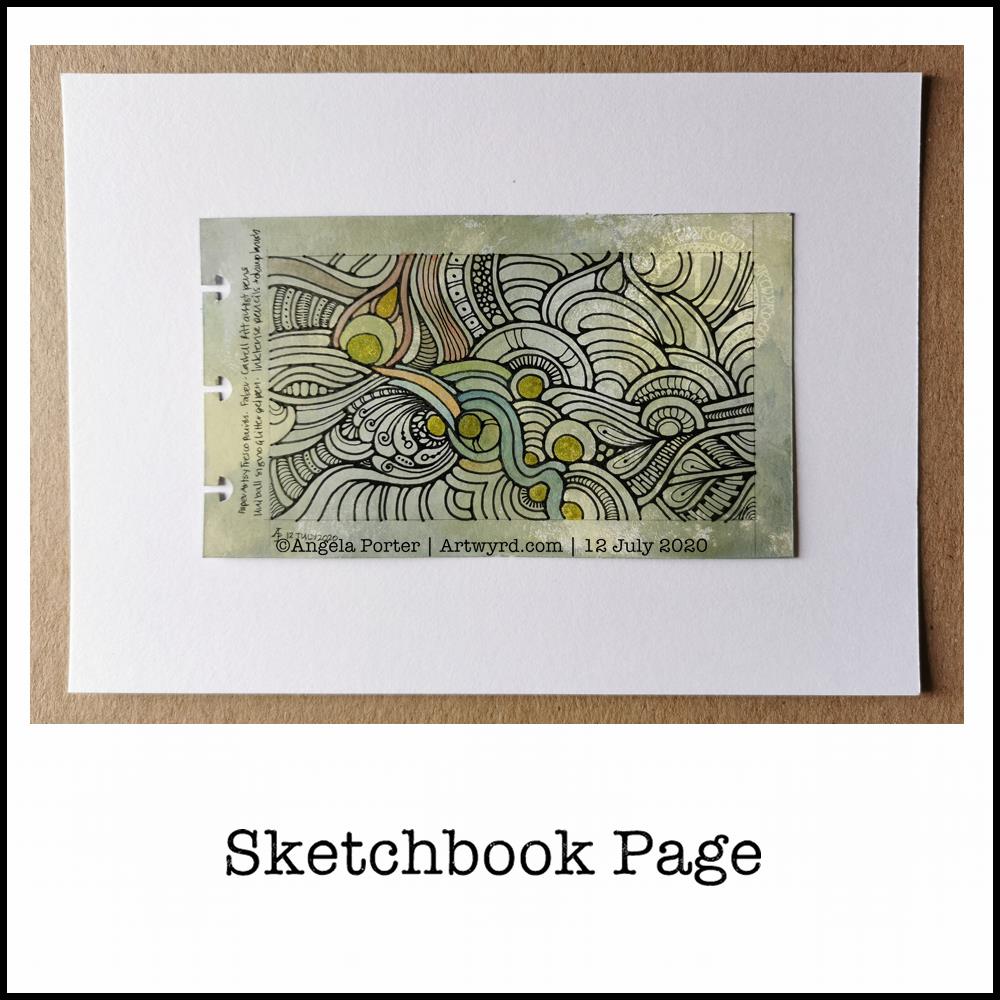
Sketchbook Page

The art

At 4¾” x 2¾”, this is a fairly small drawing.

I used a variety of PaperArtsy Fresco paints to colour a 5¾” x 3⅜” piece of ClaireFontaine Paint-On mixed media paper. I chose, for me, an unusual mixture of colours. It’s ended up looking like old, distressed and grungy painted walls.

Next, I drew the abstract design with Faber-Castell Pitt Artist pens. I did the basic outlines, leaving my decision whether or not to add details for later on.

Then, I tried adding some colour to the background with Inktense Pencils and a damp brush. As this is a sketchbook page, I tried different colours out to see which ones would work well with the background. The finish on the Inktense-d areas was rather chalky and dull, though a subtle colour was achieved on the acrylic paint background. I’m not sure if I like it or not.

I find it difficult to resist a bit of shimmer and shine on my art, so I used a Uniball Signo gold glitter gel pen to fill in some of the circles in the design.

Finally, I added some more complex patterns to some areas in the design. I could’ve filled in more areas, but I’ve decided that this is enough.

Other stuff…

This wasn’t the only piece of paper I coloured with the Fresco paints. As they’re for the sketchbook, I coloured each piece on both sides. So, I now have quite a few prepared pages in my custom sketchbook to draw on as time goes by.

I think I’ve finally settled down after the trip out on Tuesday. I seem to be more settled, for sure. Meditation, self-care, self-soothing and enough rest has worked it’s magic once again. Sunshine today is helping as well, along with the refreshing breeze that is gently flowing in through the windows.

The simple things in life are often the ones that bring most peace to me – art, meditation, quiet times, sunshine.

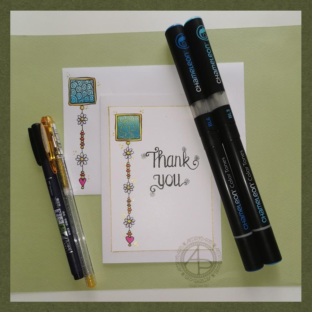
Thank you card – a dangle design

Friday means it’s time for another dangle design, this time a ‘thank you’ card and coordinating envelope.

In previous weeks I’ve had some fun adding patterns to small blocks of colour. So, I thought I’d run with that idea and turn one into a simple dangle design. The steps I used were the same for the card and envelope.

Card size.

The card is an A6 card and I cut a piece of Winsor and Newton Bristol paper to 5″ x 3.5″ for the card topper. The envelope came with the card blank so is A6 in size too.

How to…

I started by drawing a square of colour using the BL3 (Sky Blue) Chameleon Color Tone pen – no gradient, just pure colour.

Then, I added a gradient of BL6 (Royal Blue) over the base colour. I added pure blender to the Royal blue bullet nib using the mixing chamber. I didn’t use the Color Tops to add Royal Blue to the tip of the Sky Blue pen as I wanted a more subtle colour gradient.

Next, I used a Tombow Fudenosuke pen to draw around the block twice. Then, I added a filler pattern of spirals to the colour block. On the card I used a gold Uniball Signo sparkle gel pen. On the envelope I used the fudenosuke pen.

Now the colour block was decorated I turned my attention to the dangle.I decided to draw one dangle as I thought the design would look too crowded if I ad more. Sometimes, less really is more!

After drawing a faint pencil guide-line, I used a combination of beads, daisy-like flowers and a heart for the dangle. I wanted to keep it nice and simple.

Then it was time to add colour to the outline and design elements. I used the Chameleon Colour tops to add very simple colours. I didn’t do any gradients as the designs were so small. Instead I coloured them in the lightest colour, added a touch of darker colour where I wanted shadow and blended that out with the lighter colour.

I decided to hand letter ‘Thank you’ on the card using a soft nib Fudenosuke pen. I also added some tiny daisies to some of the loops and swirls to tie the hand lettering in with the dangle design.

I then mounted the card ‘topper’ on the card blank and added some gold glitter gel dots around the designs. I also added a gold line around the card topper.

Before I post the card, I’ll use some Micro Glaze from Ranger on the envelope to protect the Tombow pen from water damage.

Reflecting on the project…

Overall, I’m quite pleased with this. In hindsight I wish I’d used the Tombow Fudenosuke pen to draw the spiral pattern on the card. I think it’s a cute, simple and versatile design.

It would make lovely stationery, such as note paper or note cards, along with coordinating envelopes. There are lots of ways the design could be used in BuJos, Planners, Journals, Scrapbooks, and Art Journals. The vertical nature of the design means it would make a lovely bookmark.

How would you use this design? I’d love to hear, so leave a comment!

If you have a go at drawing and using this design then please share your finished products with me – I’d love to see how people use dangle designs!

If you want to learn more about drawing dangle designs then my book ‘A Dangle A Day’ is a good place to start. There’s over 120 designs for you to use as they are or for inspiration for your own designs.

Nearly every Friday I publish a new dangle design on my blog for more inspiration.

A simple and elegant Autumn Dangle Design.

Autumn Dangle Design ©Angela Porter | Artwyrd.com

Hello to November, and farewell Inktober. My blog post today looks a bit bare compared to my Inktober creations. However, I have neglected my dangle designs during October, so now’s the time to get back on track with them

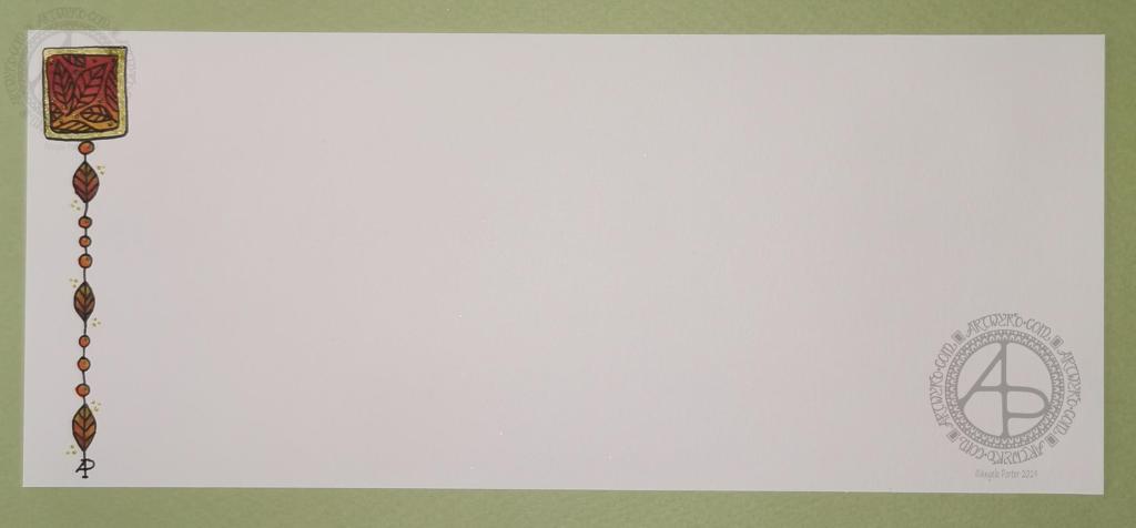
Today, I’ve created a simple and elegant dangle design with an autumn colour scheme that could be used in so many different ways. I’ve also put together a step by step set of instructions how you too can create this design (and hoping that it’s not so simple that I come across as patronising).

This is my first time posting a set of instructions – post a comment to let me know what you think of them and if you’d like to see more of them in the future.

I’ve put the dangle design on one side of a slip of paper that would make a perfect compliment slip or a note to slip in with a gift, or just as a short letter to a friend. It would also be perfect for a coordinating piece of envelope art!

This dangle design would be absolutely charming as an embellishment in a BuJo, planner, scrapbook or art journal. It would also make a darling bookmark.

It would be easy to turn this design into a greeting card as well.

So many possible uses for such a simple design.

I do hope that you will give drawing dangles a go – no matter whether you think you’re good at drawing or not! This design is made out of just simple shapes; it’s the colour that brings it to life and masks all kinds of imperfections.

If you’d like more ideas for dangle designs, then please take a look at my book ‘A Dangle A Day’ – it’s filled with examples of dangle designs with step by step instructions and helpful and encouraging words of advice.

One step at a time to a dangle design.

Step 1

Step 1
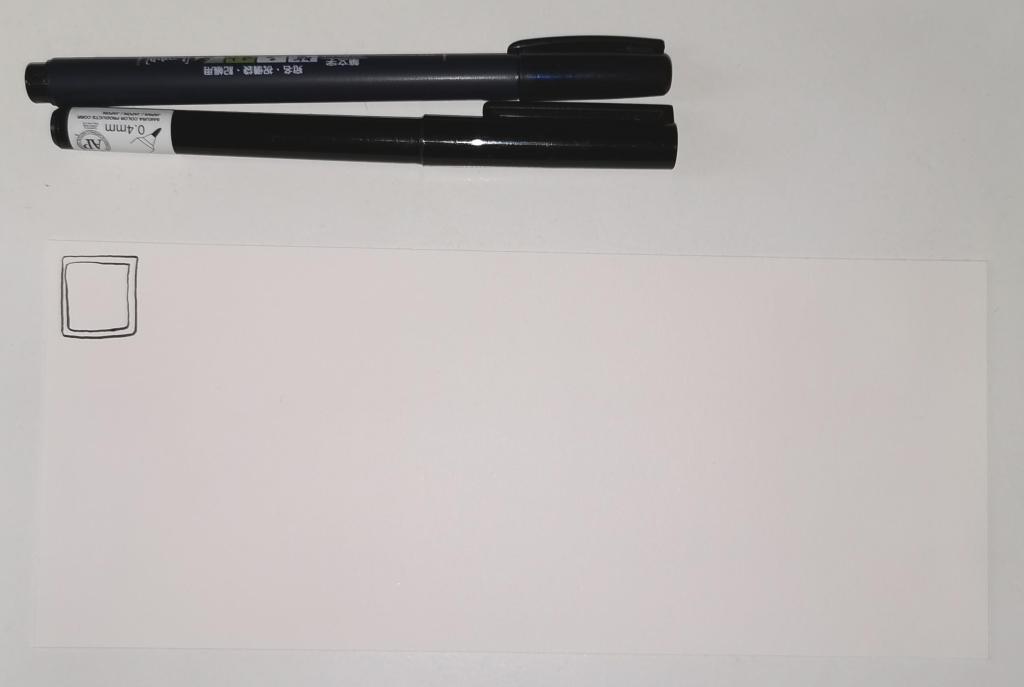
Draw a square in the top left corner of a piece of paper. I used a piece of paper measuring approx 8.25″ x 3.5″. I used a Tombow Fudenosuke brush pen to draw the box, and outline it. I deliberately made the squares less than perfect to give that human touch as well as a uniquely ‘me’ way of drawing boxes. The Fudenosuke pen allows me to draw lines of variable width quite easily, which adds to the charm of the box. The ink in the pen is also alcohol marker friendly.
Letting your drawings be less than perfect is what makes them uniquely yours.

Step 2

Step 2
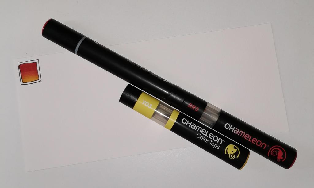
I used Chameleon marker pens (BR3 “Cinnamon” and YO3 “Warm Sunset”) to colour the inner box. Autumn is definitely here in the UK, and the combination of these colours reminded me of the leaves. However, you could use any colour combination you like and any medium you prefer to use.
Chameleon pens make it so easy to create a colour gradient – I prefer them to other alcohol marker pens, even Copics.

Step 3

Step 3
I added a simple leaf pattern to the coloured box using a Sakura Pigma Sensei 04 pen.

Step 4

Step 4
Add the dangle! For this dangle I used the same kind of leaves as in the box for a consistent design. I added some round beads as ‘spacers’. Finally, I added my ‘symbol’ to the end of the dangle.
Also, I did draw a faint pencil line with a ruler to help me keep my dangle hanging straight, more or less!

Step 5

Step 5
I coloured the beads and leaves in using the same colours of Chameleon Markers. I then decided I needed to add some shimmer and shine; I used a Uniball Signo gold glitter gel pen to colour in the border of the box and to add some dot highlights here and there.
The Chameleons caused the Sakura Pigma Micron ink to smear a little – I always forget that happens! I should’ve used the Tombow pen again. Oh well, you live and learn, eventually!

Dangle Design

Dangle design 5 Apr 2019 © Angela Porter

It’s Friday and that means it’s dangle day!

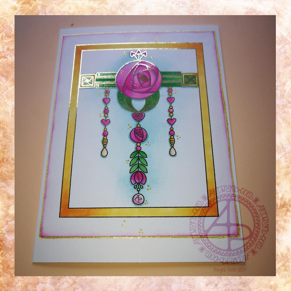
Given my experiments with thermal foiling this week, today’s dangle had to be foiled, in gold this time.

As I enjoyed creating a dangle design inspired by Art Nouveau last week I thought I’d like to do that again this week, and this is the result.

I drew the design digitally, using my usual tools of choice viz. Autodesk Sketchbook Pro, Microsoft Surface Pen and Microsoft Surface Studio.

I coloured the design in using Chameleon Markers. Then I added the blue background with Distress Inks, followed by a pink edge to the card. Not sure pink was the right choice, but it’s ok I suppose.

I mounted the design on an A5 card blank and drew a glittery gold line around it with a Uniball Signo gel pen. I also added some small groups of glittery gold drops to the design.

Overall, I’m quite pleased with this one. I like the combination of the more geometric designs with the more organic motifs.

I didn’t add any hand lettering or a sentiment so it makes it perfect for any occasion or as a note card. It would also make a fantastic page design for a BuJo (bullet journal) or as part of a scrapbook, journal, diary or notebook spread.

If you’d like to try your hand at creating your own dangle design but don’t think you could, well you could find my book ‘A Dangle A Day’ helpful. Not only are well over 100 different monograms and dangle designs included that you can use, but help and advice is given for creating your own, as well as plenty of words of encouragement. I’d love to see your dangle designs too.

I really needed some quiet, creative time this morning. Some time without any pressure on me in terms of requirements from publishers and others. Dangle designs are simple to draw, and there is a soothing quality in simplicity. Colouring is also a very soothing activity and the magic of hot foiling always makes me smile.

I’m feeling a bit below par in terms of my mental and emotional wellbeing. I have a stinking headache, which isn’t helping, and I’m feeling exhausted again. That’s all to do with emotional exhaustion.

Fortunately, I can take time today to just do what I need to do in terms of self-care. I managed to get three and a half out of the four edits for my next coloring book done. I have until Monday to get the other half finished, so that’s definitely do-able, either later today when the headache subsides or tomorrow.

My emotional and mental sea has some smooth waves on it, not stormy, not choppy, just swells that come and go. I may be in a bit of a trough at the moment, but I’ll soon be heading back up to the crest of the gentle swells.

Christmas Dangle Design

©Angela Porter
Design from ‘A Dangle A Day’, authored and illustrated by Angela Porter

It’s Friday so it’s #dangleday. Today, I wanted to share a Christmas Dangle with you from my book ‘A Dangle A Day’. In the book I show how this design was drawn, step by step.

When I created this design, I first drew it in pencil on dot grid paper. The next step for me was to scan it in to the computer and then re-draw it step-by-step, saving each step as I went. For the book, the final step was to colour the design and then write the instructions to go with the images. My tools for this were a Microsoft Surface Book, a Microsoft Surface Pen and Autodesk Sketchbook Pro.

I wanted to include as many Christmas-themed charms to create the dangles as I could and still keep the design balanced. I also kept the length of the dangles uneven. The waviness in the ends of the dangles echoes the waviness of the fairy lights above the hand lettered word ‘Christmas’.

What I did this morning was to print the black and white line art design on an A4 sheet of paper. Then I used Chameleon Duo Tones and Color Tops markers to colour it in.

These pens make it easy to create gradations of colour, such as on the hand lettering. These gradations add ‘dimension’ to the charms and dangles. I keep the darker shades to the left and bottom of the designs so that there’s a consistency across the whole image. I also used a pale grey marker to add drop shadows to the left and bottom of the design elements; again this helps to add dimension to the design.

Finally, I added some highlights with a white Sakura Gelly Roll pen. I also added some sparkles around the fairy lights and individual stars with a gold glitter Uniball Signo gel pen. After all, it wouldn’t be Christmas without some sparkle!

Used individually with a monogram or Christmassy image the dangles would make lovely book marks. Printed at A5 in size, the design would make a fabulous BuJo page for the big day itself. It would also make a lovely design for greetings cards or note cards.

Of course, it would be easy to change the word at the top to, perhaps, Winter or Yule and use fewer dangles to suit the length of the word. Personally, I like to use an odd number of dangles wherever possible – it gives a more balanced design.