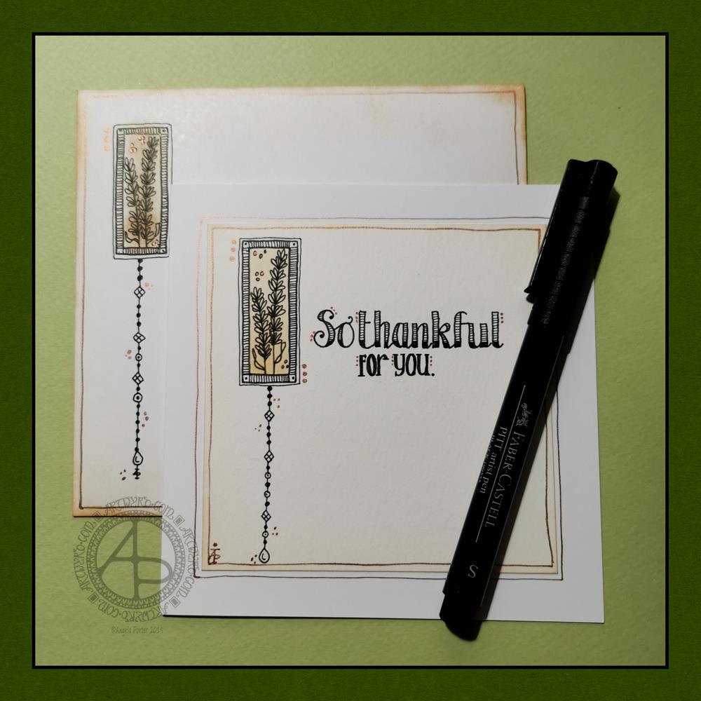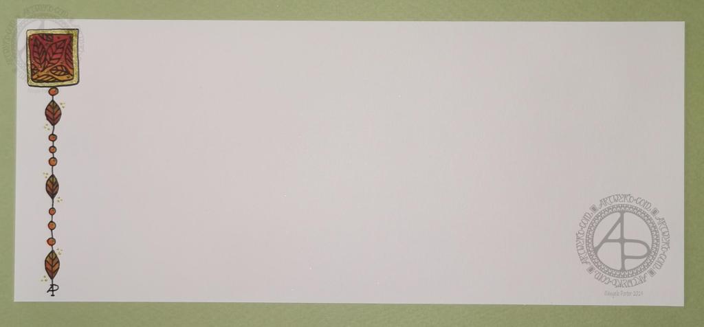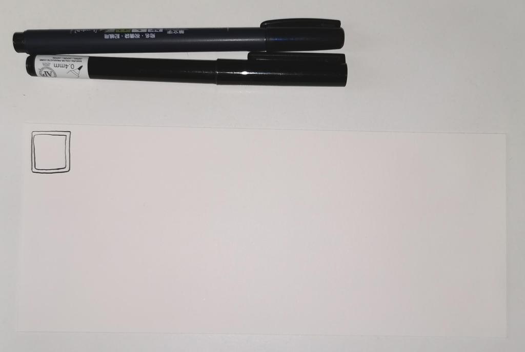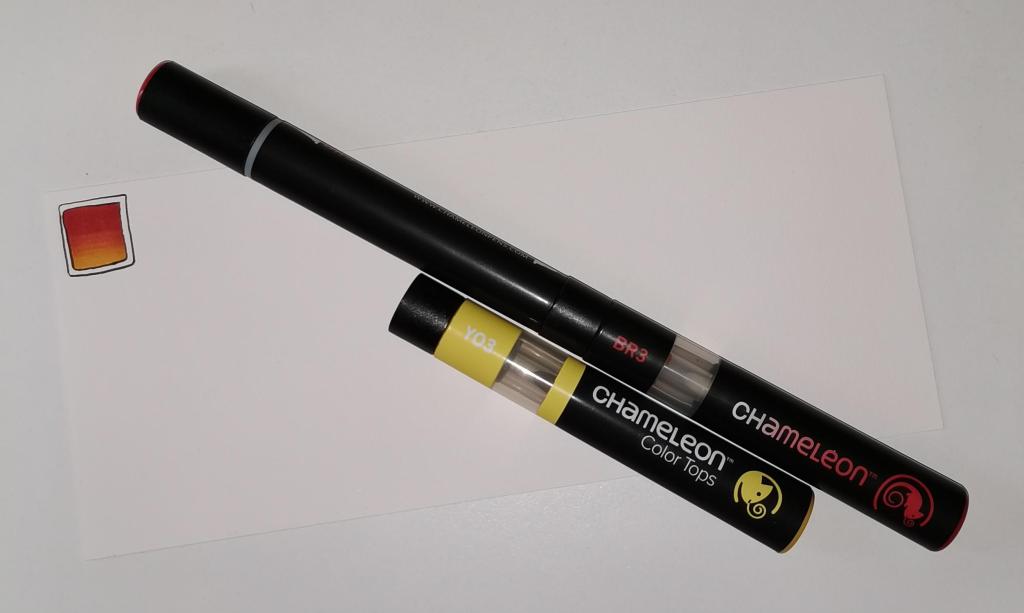
Today, I have a simple dangle design greeting card along with a coordinating envelope. If you’d like some more ideas, inspiration and step by step instructions for drawing dangle designs then my book, A Dangle A Day, is a good place to start.
Materials and dimensions
4″ x 4″ Strathmore Bristol paper with a vellum finish
5″ x 5″ acid-free white card blank
White envelope that card will fit in
Distress inks in Tea Dye and Rusty Hinge
Small piece of foam and a mini foam blending tool
A piece of card with a 1.5″ x 0.75″ window cut in it to use as a stencil.
Faber-Castell Pitt artist pens in F, S and XS
Ruler and pencil
Adhesive
Glass pen and coppper ink by J Herbin
Making the card.
- Use the card stencil and a small sponge dauber to apply a rectangle of Distress Ink in the top left of the 4″ x 4″ top layer. I used Tea Dye to colour the whole rectangle in, followed by a subtle gradient of Rusty Hinge from the bottom up.
- Use a mini foam blending tool to add Tea Dye Distress ink to the edge of the top layer.
- Use a pen to draw the rectangles around the colour block. I like to do this free-hand as it gives a more organic, human feel to the design.
- Draw the sprigs and add the lines to the border. Dots help to add some interest to the more empty parts of the design.
- Use a ruler and pencil to lightly draw a vertical line as a guide for the dangle. Also, draw pencil lines as guides for the position and size of the hand lettering. Sketch in the letters of the greeting.
- Draw round and diamond shaped beads to form the dangle. I like to finish my dangles with a ‘heavier’ or larger bead.
- Ink the letters in. I did some faux calligraphy where I made the down-strokes thicker. I added some lines and shading to the top line.
- Carefully erase the pencil lines.
- Attach the top layer to the card blank.
- I used a glass pen and copper ink to add copper dots to highlight the dangle design and the hand lettering. I also drew a box just inside the top layer and another just outside it on the card blank. Again, I free-handed the lines, embracing the wobbliness.
Making the envelope
- I used Tea Dye Distress Ink and a mini foam blending tool to edge both the front and back of the envelope.
- I then used a sponge dauber and the card stencil to add a rectangle of Tea Dye ink in the top left.
- I drew the design on the envelope as I had on the card, including adding a line border in copper ink.
- Finally, I drew similar sprigs on the envelope flap, using the glass pen and copper ink.
Before mailing…
Once I’ve addressed the envelope, I’d apply a thin layer of Distress MicroGlaze to the front and back of the envelope to protect the Distress Ink and drawing from the elements. I’ve done this to other cards and they have traversed the UK and US postal systems with no problems.
Ideas for using the design.
Although I’ve presented this dangle design as a greeting card, which is, I think, a lovely way to share a little bit of artistic loveliness with others, there are many other ways the design could be used, with or without any hand lettering.
In a BuJo, journal, planner or diary it would make a lovely little design to fill in a blank space.
This is a design that would work really well as a bookmark.
I’m sure it would look charming as part of a scrapbook spread.
I also think it would look lovely on a ‘with compliments’ slip or decorating the edge of a hand-written letter.
I’m sure there are many other ways and media that this design would be suited to.
Final thoughts…
I’m really enjoying drawing these kinds of dangle designs. They’re simple and elegant, to my mind anyway. They’re also quite easy to draw.
I do prefer to free-hand the lines and let the wobbliness be part of my signature style. It gives that human, hand-made, hand-crafted feel to the finished project, and a warmth to the finished project.
I work hard at finding a way of drawing digitally that lets me keep this uniquely ‘Angela’ way of expressing myself through line and pattern. I’m still working on it and sometimes get frustrated that, to my eye, my digital art seems too, well digitally perfect.
It’s all part of the process though – learning, developing, experimenting, trying out new ideas, techniques and methods. That’s what helps me grow as an artist.


