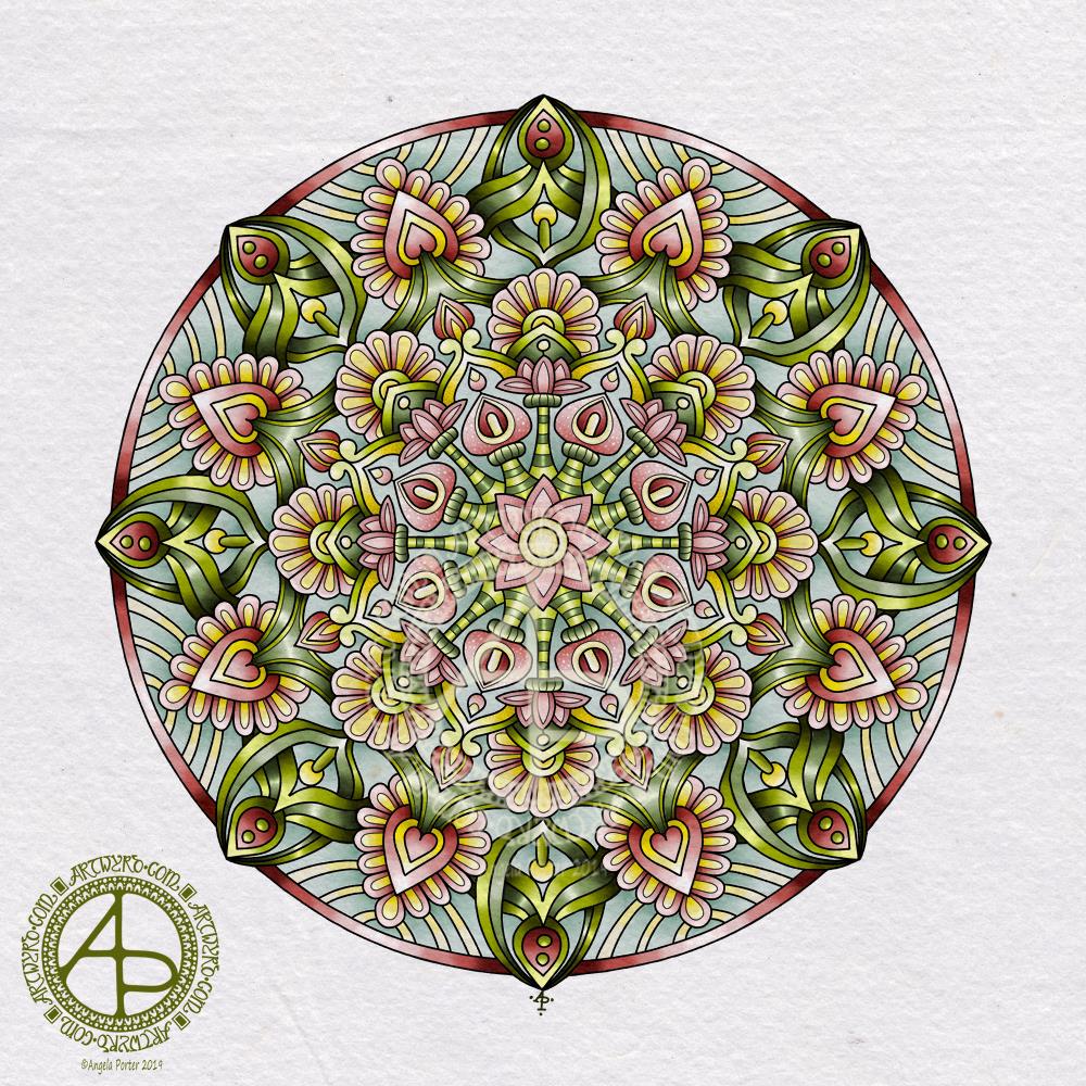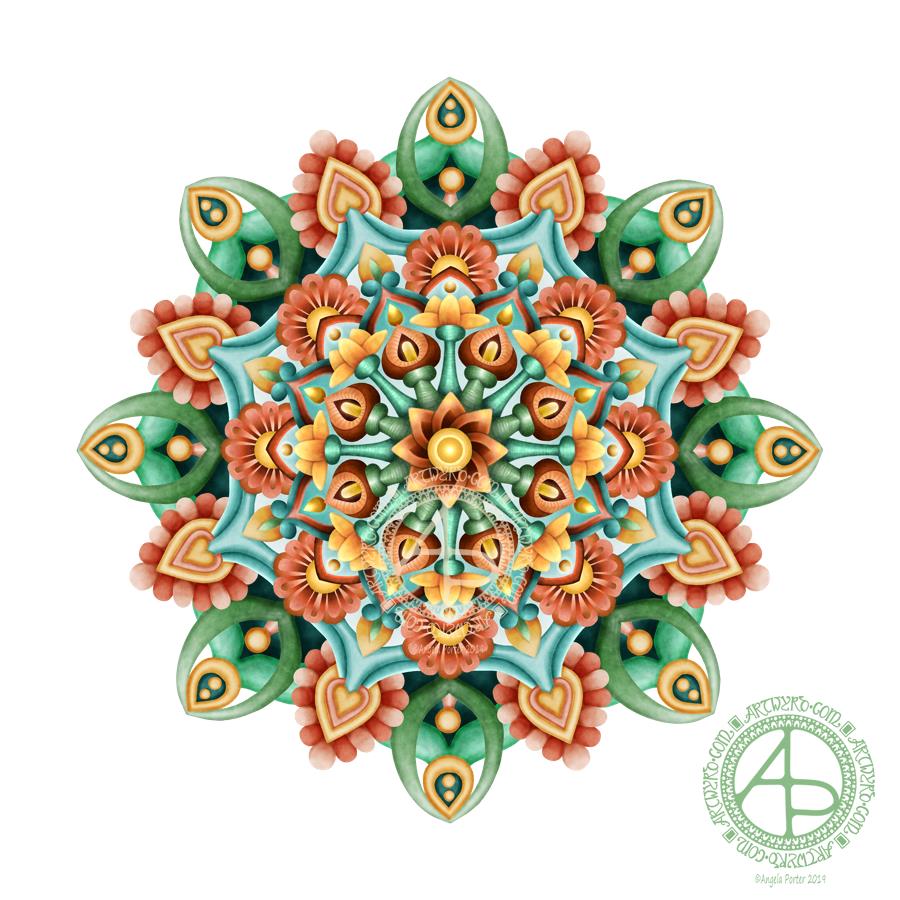
Yesterday, I had an urge to try colouring my latest mandala design but without black lines, just pure color. This is the result. I’m actually quite pleased with it, and I’ve surprised myself too, in a nice way. I’m quite eager to do more art like this as time goes on.
I chose a similar color palette to the one from yesterday, similar but not the same. I also edited the shapes and lines as I felt I needed to as the design grew out from the centre.
The color palette was of just six colours – two greens, one aqua, two orangey colours and one yellow, all muted, subdued colours. I think I could’ve done with one more colour, or used the darker version of the aqua as the background in the inner and middle ‘circles’ of the design. Of course, I can try that out without ruining this version. That’s the beauty of digital art.
I would never have done this using traditional media. My skills with colours are relatively limited in the physical realms.
The world of digital art is opening up new ways for me to express my creativity, that’s for sure. The skills required are different but equally as complex as traditional media in my opinion.
There’s also a lot of learning and exploring for me to do to get the style of coloring right for ME. The advantage of digital work is that you can try and try again until you get it how you want it to be without having to start over from the beginning. Some see that as ‘cheating’ or ‘making it easy’. I see it as learning and growing and developing in real time. Digital art is very forgiving, but that doesn’t mean it’s any easier. Far from it in my opinion.
I know my limitations with paints, markers, pencils and so on. I’m kind of competent with markers and pencils I suppose. Working digitally, however, allows me to really work at making sure I get the finish I want in each section of the design, with or without my characteristic black lines. I can try things out and adjust to get them just as I wish them to be.
Each time I do something different like this I learn. With this mandala it’s the use of high contrast to gain the depth and dimension I like, and it’s working out how to get that with the various types of brushes and effects that are available to me.
It’s a huge thing for me to use my line art as just a guide and to lose the lines to create a design such as this. It involves learning how to make the different sections separate from each other using shadow/light as well as color, something I’ve rarely done in my artistic journey.
This is definitely something I’m going to do more of in the future and develop my skills in creating art in this way too. It’s taking me a long while to get my head around it all, but little by little my digital art is developing I think, and I’ll find my own voice with it for sure, or maybe another voice.
I used my usual trifecta of Autodesk Sketchbook Pro, Microsoft Surface Pen and Microsoft Surface Studio.

