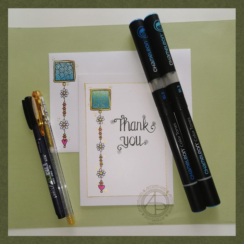
Friday means it’s time for another dangle design, this time a ‘thank you’ card and coordinating envelope.
In previous weeks I’ve had some fun adding patterns to small blocks of colour. So, I thought I’d run with that idea and turn one into a simple dangle design. The steps I used were the same for the card and envelope.
Card size.
The card is an A6 card and I cut a piece of Winsor and Newton Bristol paper to 5″ x 3.5″ for the card topper. The envelope came with the card blank so is A6 in size too.
How to…
I started by drawing a square of colour using the BL3 (Sky Blue) Chameleon Color Tone pen – no gradient, just pure colour.
Then, I added a gradient of BL6 (Royal Blue) over the base colour. I added pure blender to the Royal blue bullet nib using the mixing chamber. I didn’t use the Color Tops to add Royal Blue to the tip of the Sky Blue pen as I wanted a more subtle colour gradient.
Next, I used a Tombow Fudenosuke pen to draw around the block twice. Then, I added a filler pattern of spirals to the colour block. On the card I used a gold Uniball Signo sparkle gel pen. On the envelope I used the fudenosuke pen.
Now the colour block was decorated I turned my attention to the dangle.I decided to draw one dangle as I thought the design would look too crowded if I ad more. Sometimes, less really is more!
After drawing a faint pencil guide-line, I used a combination of beads, daisy-like flowers and a heart for the dangle. I wanted to keep it nice and simple.
Then it was time to add colour to the outline and design elements. I used the Chameleon Colour tops to add very simple colours. I didn’t do any gradients as the designs were so small. Instead I coloured them in the lightest colour, added a touch of darker colour where I wanted shadow and blended that out with the lighter colour.
I decided to hand letter ‘Thank you’ on the card using a soft nib Fudenosuke pen. I also added some tiny daisies to some of the loops and swirls to tie the hand lettering in with the dangle design.
I then mounted the card ‘topper’ on the card blank and added some gold glitter gel dots around the designs. I also added a gold line around the card topper.
Before I post the card, I’ll use some Micro Glaze from Ranger on the envelope to protect the Tombow pen from water damage.
Reflecting on the project…
Overall, I’m quite pleased with this. In hindsight I wish I’d used the Tombow Fudenosuke pen to draw the spiral pattern on the card. I think it’s a cute, simple and versatile design.
It would make lovely stationery, such as note paper or note cards, along with coordinating envelopes. There are lots of ways the design could be used in BuJos, Planners, Journals, Scrapbooks, and Art Journals. The vertical nature of the design means it would make a lovely bookmark.
How would you use this design? I’d love to hear, so leave a comment!
If you have a go at drawing and using this design then please share your finished products with me – I’d love to see how people use dangle designs!
If you want to learn more about drawing dangle designs then my book ‘A Dangle A Day’ is a good place to start. There’s over 120 designs for you to use as they are or for inspiration for your own designs.
Nearly every Friday I publish a new dangle design on my blog for more inspiration.


