Abstract Entangled Art 17 November 2018

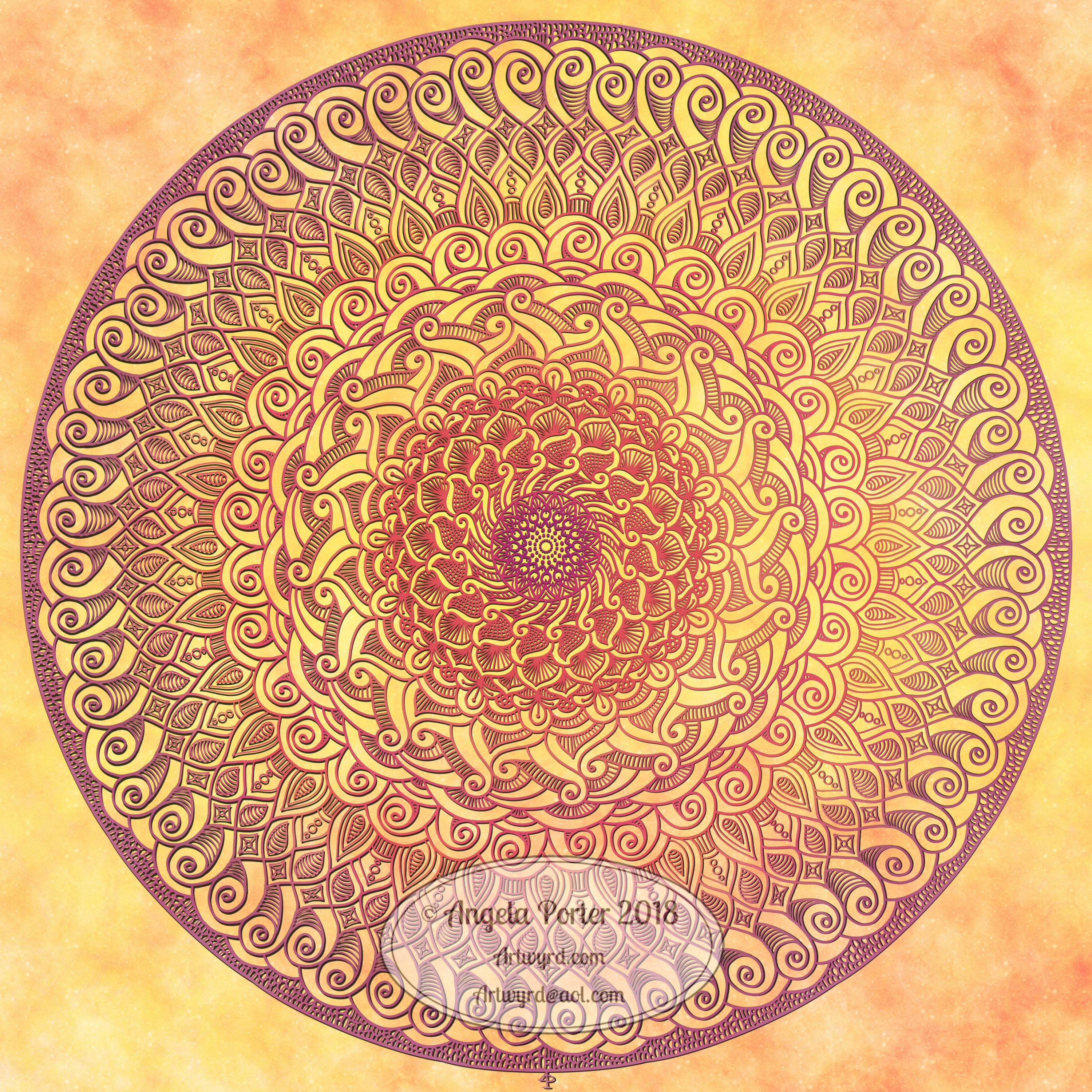
I’ve worked on this image over the past three days or so. Adding the shading took a surprisingly large amount of time.

I really enjoyed creating this one. I say that about all my art though, but this one was particularly enjoyable as it helped me to calm and relax after the crazyily emotionally exhausting week I’d had.

It reminds me very much of work I used to do before I had so much work to do for colouring books, not that I’m complaining about that, not one bit. I love doing the drawings for them as much, but I can’t work in this kind of detail for them. I can’t put in all the fine line shading and shadow for them, nor the teeny-tiny details in the patterns as they’d be nigh on impossible to colour the gaps individually.

In my past couple of drawings like this, I haven’t added any shadow to them in the way I have in this particular design. The shadow really helps with that sense of ‘dimension’, though I do think I could have added some deeper shadows in some places.

Though it reminds me of the kind of drawings i used to do a lot pre-coloring books, it’s also shows a change in perhaps sophistication of line but also in the variety of patterns and design elements I like to include in my designs. I’ve even left some ares not heavily patterned so they give the eye spaces to rest without being overwhelmed with pattern and design.

Now to the nitty gritty of how I drew this.

After yesterdays discussion about digital vs traditional art I’d like to say I did this digitally, but I didn’t. I used Unipin Uniball and Sakura Pigma Micron pens on an A4 sheet of Bristol Board from Daler-Rowney. Pencil lines were sometimes used, especially for the circles, which I used stencils to draw them in lightly before inking them in free-hand. I’ve noticed I’ve not erased the pencil lines before scanning the artwork in.

To add the shading I used Chameleon Color Tones and Color Tops in shades of cool grey and neutral grey.

Today, I plan to do some more drawing similar to this before my new bullet journal arrives to replace the one I wrecked by spilling mocha over it and my lovely flowery bag. Thankfully, the notes I need to keep from the media training and events this week are still readable so I can transfer them across, as well as edit them in the process.

B is for … a dangle design

Angela Porter 7 Nov 2018 B is for

B is for birthday balloons, birthday cupcakes, birthday gifts…baking … beads …beautiful cats, beautiful flowers…bullet journal (BuJo)…

It’s Friday and it’s taken me a couple or three days to get this monogram dangle design finished, mainly because yesterday was another jolly jaunty day with Liz (more of that on my other blog – Curious Stops and Tea Shops – when I get to write it, that is).

Today’s dangle design features some cute kitties, as is the theme of my current series of monogram dangle designs.

I started by sketching out my ideas in pencil on dot grid paper then scanning it into Autodesk Sketchbook Pro. The next step was digitally inking in and adjusting the design. Finally, colour and texture was added to the design before adding my watermarks. My digital tools were my trusty Microsoft Surface Pen and Microsoft Surface Studio.

I like the design, not so sure about the colour choices though. I also got a bit heavy handed with the added textures in some places.

After I’ve got my other tasks done today, I think I may print this design out and colour it with my Chameleon markers and see the difference. It looks like we’re going to have some heavy rain and some strong winds here today, so cwtching up indoors with some nice arty stuff to do could be the way to spend some of the day.

Friday means it’s #dangleday. My tutorial book about designing dangles, called ‘A Dangle A Day’ is available to preorder. In it I take you step by step through simple hand lettering, monogram dangle designs, and other kinds of dangle designs, showing how you too can draw and design your own. There’s lots and lots of examples in the book as well as suggestions of how to use them as greeting cards, notecards, bookmarks and framed pictures, as well as in BuJos, planners, diaries, scrapbooks…how to use them is limited only by your creativity!


Inktober 2018 Day 13 ‘Guarded’

Angela Porter Inktober Day 13 Guarded final

I like to have a hunt around for quotes that go with the Inktober prompt of the day if I’m stumped for artistic inspiration.

I like Carl Jung’s work, what I’ve read of it that is, which most probably isn’t much in the grand scheme of things. I do know how he used mandalas in therapy, both for himself and with patients. He believed they represented what was going on in our unconscious minds and so could reveal things to us about ourselves that we are unaware of, that are otherwise hidden, guarded.

I happen to like mandalas, a lot. So, today I thought I’d incorporate this quote from the man himself into a mandala and just let my creativity flow as unconsciously as I could.

I must admit, the colour choices I made aren’t ones I would ordinarily choose to plonk together, but I went with them.

I did create the lettering in Publisher and import the file into Autodesk Sketchbook Pro. My hand lettering skills aren’t, I feel, up to lettering in a circle; also, I’m very tired this morning and I think I’ll soon be back abed to continue to sleep.

I did draw and colour the mandala digitally. My past artistic records show that I am more than capable of creating mandalas on paper with the use of compasses, protractors and rulers, but the tools available digitally open up a whole new realm of possibility in creating mandalas by me.

What excites me about it is that I can draw the mandala as if I was using a pen on paper by using the Surface Pen on the screen of my Surface Studio. I still get human imperfections in my drawings – slightly wobbly lines, imperfect repetition of lines and so on.  I choose to use a pen ‘brush’ that isn’t perfectly smooth in the line it draws on my digital paper. This time, I coloured the mandala as if I was using coloured pencils and a blender pencil on paper, but did this digitally.

It does save an awful lot of time too. If I were to draw and colour this traditionally it would take me at least a whole day. It’s taken me around 3 hours to do this small mandala.

So, it’s odd that a rather more traditional mandala was created today. The simpler patterns and lines perhaps reflecting how tired I am feeling at present. It is a struggle to keep my eyes open. It was really difficult to even do the simple steps involved in watermarking, resizing and saving the finished mandala.

Entangled Art 18 August 2018

Angela Porter 18 August 2018

Planning a relaxing arty day, no digital art planned at the moment.

In the last couple of days, in between work for my next Entangled coloring book in the Creative Haven series from Dover Publications Inc, I tried something a bit different for me.

I tried drawing shapes for the design in colour first, then adding the black ink details over them.

For the completed design I used a Kuretake Zig Brush Pen and Tombow dual tip markers. I say completed, but I may return to it and add dome metallic/pearlescent/iridescent embellishments.

For the coloured design, without details, I used the same brush pen and Winsor & Newton Water Colour Markers.

I’m trying to decide if I’m going to add the details using a Uniball Unipin pen or whether I’m going to use a fine brush and watercolour.

Perhaps with this one I’ll stick with my Unipin pen(s) while creating a smaller, test piece for the use of watercolour with a fine brush.

I must admit, I do like the more graphic, high-contrast black lines, but I do think I have to give lines in colour a try.

Weekend relaxing with art, my #weekendvibes.

A monogram

Angela Porter 29 June 2018 watermarked

Carrying on my theme of playing with ideas and paper and pen, I decided to do a monogram, and here’s the result.

If I’d thought ahead and either made this smaller or made the paper bigger, I could’ve added dangles to it.

I’m not at all sure of the coloured patterns I added around the outside of the monogram display; I didn’t choose some of the colours wisely. I do like the subtle grey “feathers” there though.

I also think I may need to thicken the outlines of the letter and/or create shadows on the design behind the letter so it looks like it’s standing a bit proud of the design.

All the same, I’m enjoying creating and exploring and experimenting with my art again, and it definitely gets the #weekendvibes going!

It’s also #furbabyfriday across the interwebs, and more particularly at the facebook group ‘Angela Porter’s Coloring Book Fans’. Why not pop over, join in and share your furbabies with the lovely people there!

Watch out for an exclusive giveaway related to my book, “A Dangle A Day”, which is due to be released in September and is available to pre-order right now. It’ll be announced, along with details of how to get your free dangle design here, on twitter @wyrdsmithing, on facebook @angelaporterartist.

Friday quote

Angela Porter 1 June 2018

I am so lucky being self-employed, doing something that brings me pleasure and never feels like work; it always feels like the weekend for me!

I sketched the words and part of the design on paper, photographed it and opened it in Autodesk Sketchbook, then used my Microsoft Surface Pen on my Microsoft Surface Book to hand-draw the letters and flower wreath.

Yes, it is hand-drawing, even though it’s done in a digital environment. I use my Surface Pen as I would any pen or pencil. I do make use of some of the tools in Autodesk Sketchbook to speed up the drawing – such as the symmetry tool, and the ability to move elements in the hand-lettering around (I’m learning not to be too fussy about size and arrangement in the sketch; that just gives me the general idea of lettering styles and sizes).

All the same, it’s a nice way to start a Friday with a decorated #fridayquote, just to get those #weekendvibes going with #thatfridayfeeling #fridayfeeling.

Saturday mandala

Angela Porter 26 May 2019

A warm, sunshiny mandala.

Autodesk Sketchbook Pro, Surface Book and Surface Pen.

Sunday, sunday

Angela Porter 13 May 2018
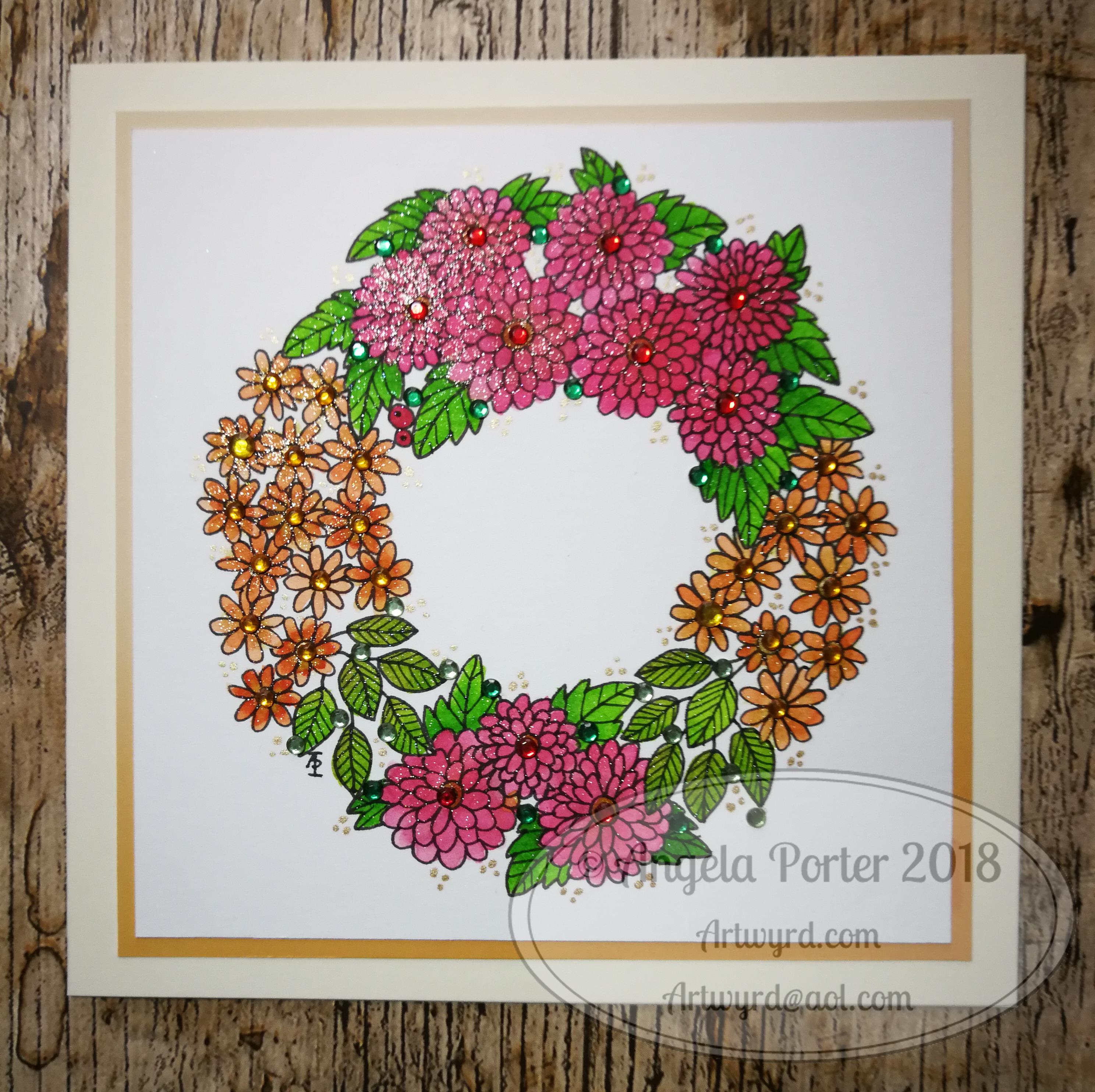
Another floral wreath card, hand drawn on watercolour paper, coloured using the Spectrum Noir Sparkle pens with a water-brush.  I added some Gold Sakura Gellyroll highlights, as well as some sparkly crystals in red, amber, and two shades of green.

Not my usual kind of colour combination, and I’m not at all sure I’m happy with it.

The design would make a pretty bujo spread or month cover, just enough space in the middle for a title.

Trying to find those #weekendvibes.

A floral wreath card

Angela Porter 12 May 2018 watermarked

Saturday morning and I do my best to settle into a creative mode, and this is the result.  A pretty, floral wreath, drawn on watercolour paper with copic multiliner sp pens.

It’s been a hard couple of weeks and being creative has been difficult for me.  I’m beginning to settle after the upheavals that have occurred, but it’s taking a while. I will get there, and being able to draw this, and colour it, shows I’m starting to settle. I am doing my best to find those weekend vibes.

The watercolour paper is 5″x 5″ and has been mounted on a 6″ x 6″ square side.


Supply Saturday

Angela Porter 5 May 2018 watermarked
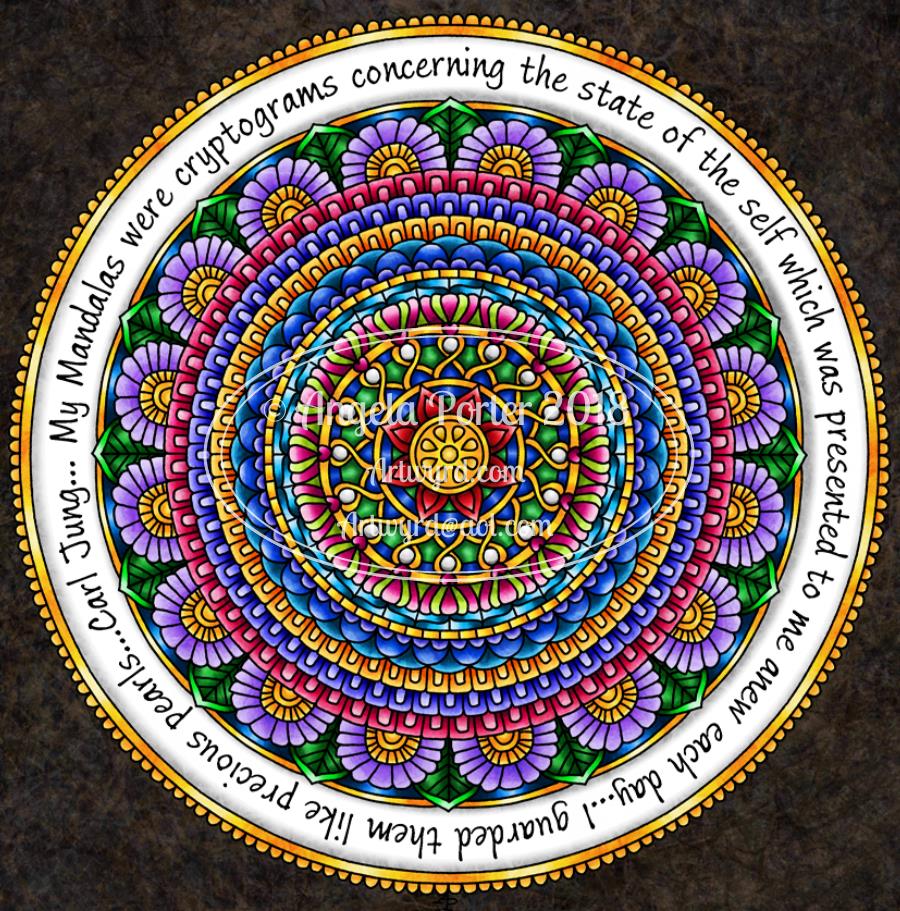
This little pattern was created using Inktense pencils from Derwent, and a Pitt Artist Pen from Faber-Castell. Oh, I also used a Kuretake Zig water-brush to blend out the Inktense pigment.

I started by using washi tape to mark out a rectangle to work in.  The washi tape did remove some of the paper to the left hand side, but as this is more of a sketchbook experiment, I’m not too bothered.

Next, I drew in the pattern of arches using a deep rose Inktense pencil and used a just damp water-brush to activate and move the Inktense colour.

Once I had the pattern of loops, and loops within loops, I added more colours to the pattern.

The colours will lie over others as a glaze, but once the wet Inktense pigments have dried, they are permanent. That makes them an excellent medium to create such a colourful pattern.

Finally, as this is an experiment, I used the Pitt Artist Pen to add black lines and details to part of the design to see what difference this makes.

I like the loops of pure colour, but there is something about black outlines and patterns that makes me feel something is finished, complete, defined. I do like how the loops without black outlines seem to recede into the background.

I may add some gold and white details to this design as well later on today, as well as resisting the temptation to add black line details to all of the loops. It would be a nice way to keep the #weekendvibes going!

It’s also supply saturday over on the facebook group called Angela Porter’s Coloring Book Fans.  There’s a lovely group of people over there and they will make you most welcome if you visit and join!