Mandala WIP – update

Mandala WIP - update © Angela Porter 2019 - Artwyrd.com
Mandala WIP – update © Angela Porter 2019 – Artwyrd.com

I have to say I am really, really pleased with how this mandala is working out. It’s not at all what I expected in the first instance, but I am so chuffed with myself.

I also think I am really getting the hang of this digital art malarkey too. I can also say that there is no way I would have been able to create this using traditional media – I’ve tried similar things in the past and it all ends up such a mess with me.

Digital art is the media I think I may have been waiting for. It’s taken me three years to get to this artistic level with digital art. Even in this mandala you can see how I have learned and developed ideas as I’ve worked from the centre out.

I absolutely love my Microsoft products – Surface Pen, Surface Book and Surface Studio. I cut my digital art teeth on the Surface Book (not literally!) and found I enjoyed digital art and when I felt I could I got a Surface Studio as the smaller size of the Surface Book screen was frustrating me a little.

The change to the Surface Studio is what has enabled me to really take to digital art. The size of the screen, the ease at which I can change the angles at which I work with the Surface Studio, the speed of the processors, the sensitivity of the pen on the screen…

I just love it! So much so I’m on the point of destashing nearly all my traditional art media and gifting them to a worthy cause.

Don’t get me wrong. I love to draw with pen on paper, that won’t ever change so my pen collection won’t be going anywhere. But the way I can use colour and texture digitally is an absolute dream. It’s also mess-free!

I hope you noticed that I said I’m really pleased with this mandala. It’s not often I’m able to say that about my art. But today I can and I am. I am actually smiling when I look at this mandala.

My only problem now is that I’ve changed the design of the mandala in the latest ‘ring’. Oh well, I can adjust accordingly or just create a new design around this one. I’ll see how I go with that.

I also quite like the ‘ghostly’ outline mandala design as a background, though silly me managed to leave the outline above the coloured design. One of the wonderful things about working in layers is that things like this aren’t a problem!

I think I may celebrate my progress with this mandala and also my digital art skills with a nice mug of tea!

Sneaky peek – Entangled Christmas

Sneaky Peek 2©Angela Porter 2019 - Artwyrd.com
Sneaky Peek 2©Angela Porter 2019 – Artwyrd.com

Today I finished colouring the templates for Entangled Christmas (available for preorder, publication date of 16 October 2019).

I thought I’d share another sneaky peek of one of the four that I’ve coloured for the book.

Unusually, I’ve drawn people in a couple of templates. Drawing people is not one of my better skills to say the least. So here’s part of the angel I’ve drawn, set in an entangled, festive landscape, and a starry sky, of course!

I’ve used my signature jewel-bright colours, of course.

And, because it’s me, I’ve coloured the templates digitally, my tools being Autodesk Sketchbook Pro, Microsoft Surface Pen and Microsoft Surface Studio.

It’s nice to just colour, though keeping to a Christmassy colour scheme can be a little frustrating at times especially as here in the UK we’re enjoying an unseasonably rather warm Easter Bank Holiday weekend!

Entangled Christmas is one of the adult coloring books in the Creative Haven range from Dover Publications.

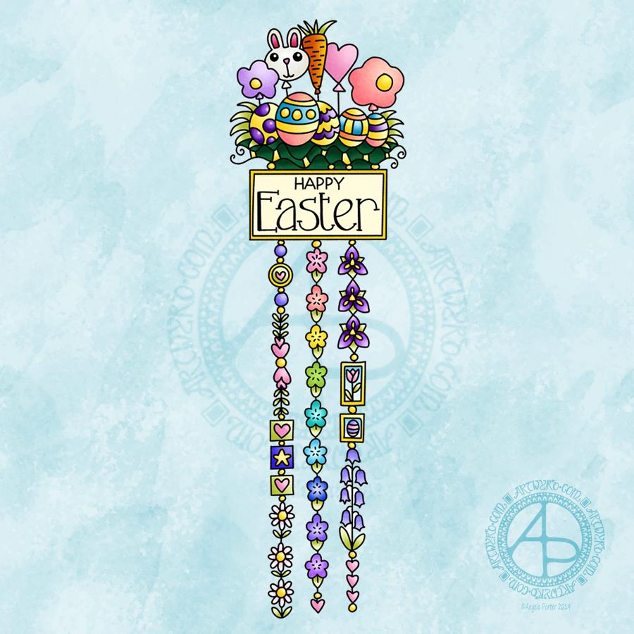
Easter Dangle Design

Easter Dangle Design © Angela Porter 
From 'A Dangle A Day'
Easter Dangle Design © Angela Porter
From ‘A Dangle A Day’

This cutely whimsical dangle design is from my tutorial book ‘A Dangle A Day’, which has the step-by-step instructions for drawing this design. They really are simple to draw, and the hand lettering is based on your own writing style too.

For this design, I chose spring-time colours, more pastel than bright. Of course Easter eggs and a bunny balloon had to feature, along with all the lovely spring flowers and a sprinkling of hearts. I even snuck a star in, hearts and stars being some of my favourite motifs to include.

This design would make a really cute greetings card or notecard. The dangles can easily be drawn shorter. It would also make a lovely bookmark. As a BuJo page, planner page or an element on a scrapbook page it would be lovely.

Using Nuvo drops or Ranger’s Stickles or similar to make dots where the beads are as well as a sprinkling of them around the top of the design would add some lovely dimension and sparkle for sure.

I do hope you give drawing dangle designs a go. They are so much fun and a lot easier to do than you think they are. They can also be used in many, many ways, especially when it comes to sharing love with others at different times and events throughout the years of our lives.

About the drawing…

When it came to designing the dangle designs and monograms for A Dangle A Day, I started off by sketching the idea out on dot grid paper using either a pencil or a pen. I could then adjust the lines and draw guidelines in to help me with the design quite easily.

When I was happy with the sketch, I scanned it in and then re-drew it in a digital form. For drawing digitally I use a Microsoft surface pen directly on the screen of a Microsoft surface book or surface studio. This is like drawing with pen or pencil on paper, or even painting or colouring.

So, although my designs were created in a digital environment, they were still very much drawn by hand.

I used very little in the way of smoothing lines – only enough to remove the wobbliness that comes from the great sensitivity of the pen and screen position sensoring stuff, and never used the predictive line tools available in Autodesk Sketchbook Pro. I worked out how to set up pens that would leave a line texture similar to the pens I like to use to draw on paper with. I determined I wouldn’t make everything perfect, that there would be that perfectly imperfect human touch to everything that I created. I also made sure I included examples of dangles drawn and coloured on paper and turned into cards, bookmarks and BuJo pages too.

Working digitally to draw and then colour the designs allowed me to edit, erase, adjust and keep the image free of smudges and blots that would require re-drawing. It also made it a lot easier to make the edits my lovely editors suggested to improve the work.

It certainly saved a lot of time scanning image after image in – something I find extremely tedious.

Although I may have used digital tools to draw with, the techniques I used were the same as if I’d drawn on paper with pen and then coloured with various traditional media.

I also have to say that the year to year and a half ago when I was colouring these I was only just starting to explore the realms of digital colouring and I hadn’t quite worked out exactly how I’d like to do it. They worked out good enough, but now I think I’d approach it a bit differently.

I had such a lot of fun creating the dangle designs season by season, month by month, celebration by celebration and I hope you have the same amount of fun doing this too.

Friday Flutterby

© Angela Porter 2019 - Artwyrd.com
© Angela Porter 2019 – Artwyrd.com

I thought I’d dig through my image archives today and I found this charming butterfly, or flutterby as I sometimes refer to them.

It’s one of my early pieces of digital drawing that I was happy with and it was done on my first Surface – a Surface Book – back in 2016, I think it was.

I drew the flutterby using a Microsoft Surface Pen and Autodesk Sketchbook Pro and the original image is black and white with some greyscale shading. Today, I thought it would be nice to add some rainbow colours to the butterfly and a textured background too. So I have done.

I also have realised that this flutterby would make a nice focal point for a dangle design. Maybe I’ll have a go at doing that later on.

I’m still reeling from EMDR on Monday, still not found my balance point. It’s been a week of self-care. I am getting better, bit by bit, but this was a surprisingly tough session.

As I reflect on it, it’s interesting that I chose to post a butterfly today as butterflies are seen symbolic of transformation. But it’s also interesting that I chose to take a greyscale drawing and add a brightly coloured rainbow to it, as well as adding a textured and slightly coloured background.

I think I’ve lived my life mostly in greyscale. Not my art, though I do tend to enjoy drawing black and white line art a lot, but when I do use colour I do tend to go for really bright colours.

No, I mean my life, my emotional life particularly. All shades of grey and black.

I am in my fifties now and I’d like to think that I’ll be able to live a more colourful life for the rest of my human existence.

Perhaps this butterfly is one of those intuitive messages that’s telling me I am transforming into someone who does have a rainbow of emotions, is able to see them now. Maybe it’s telling me I’m transforming as I heal from cPTSD too.

EMDR does turn me into a chrysalis from the caterpillar I’ve been in life – a chrysalis that needs rest and time to complete that transformation, and when ready, the butterfly emerges, colourfully resplendent, able to fly and soar… the potential that was inside the caterpillar all the time now realised.

One Frosty Morning – a mandala design

©Angela Porter 2019

I’ve had a very pleasant two or three hours this afternoon creating this mandala.

It’s quite different to my usual styles of mandalas and I rather like it. I also rather like the monochrome colour scheme which inspired the title of this mandala.

Drawing in colour is a departure for me from the usual black line drawings which are then filled in with colour and/or pattern. I’m uncomfortable drawing other things in colour without that black line to define their shape/form. But mandalas are a whole different thing. They are a way for me to explore this way of working with colour.

What is exciting is that I carve into bold shapes, removing colour and adding more designs and interest. This is something that working digitally has allowed me to both discover and to begin to explore. The ability to add colour, remove colour, refine by adding more colour, and so on is what makes creating something like this a little easier than with traditional media, but it is what is allowing me to express my creativity in different ways.

I am really pleased with this design. It’s one of those that makes me smile for two main reasons. The first is I like it, lots. The second is the satisfaction of exploring something new and discovering a new, different and personally satisfying way to work.

My drawing tool was a Microsoft Surface Pen. My paper was the screen of my Microsoft Surface Studio. Autodesk Sketchbook Pro provided my colours and other tools so I could create this mandala design, which I think is lovely.

Monogram D entangled design (with some little dangles)

I had a day or two of subconscious reflection on how to pattern around a letter after not being all that happy with the lower case b design. So, I wanted to put my vague ideas into practice.

Yes, they were vague ideas, no clear idea of how I wanted things to look, but I just wanted to try them out and see where they led.

I started with a faint pencil outline of an uncial style letter d, and then used a fine nibbed Rotring Art Pen with black ink to draw the design with.

I used the pencil line as a guide to where the entangled designs would either butt up to the edge, spill over the edge or curl over it and I just let the designs flow and grow. I also left the design in an organic shape rather than working to a square or rectangular shape.

I did work on a piece of A4 paper, but the design is a little over a quarter of the size of the paper. I can’t believe I did such teeny-tiny drawings again! I really enjoyed it!

In some places I’ve made the edge too hard, too linear. In one place I tried to correct that (lower left of the d) by adding more bits to the pattern, but that linear line is still evident. However, it’s all learning.

After scanning in, I wanted to add some texture and a bit of colour to that letter to help it stand out more. I may try doing the reverse as in colouring the design in and leaving the letter plain later. I may even try using some watercolour brushes in Autodesk Sketchbook Pro, using my Microsoft Surface Pen and Microsoft Surface Studio.

I have designated friday as #dangleday, and I did add some tiny, fine danglesto the design. Dangles don’t always have to be big and fancy or a prominent feature of designs, like in my book ‘A Dangle A Day‘.

Holly Mandala

© Angela Porter 2018

Holly is the major motif in this mandala, along with stars and geometric patterns.

Again, it’s a mandala I’m pleased with. The green metallic designworks quite nicely with the stark black background. I like the simplicity of the motifs too; they remind me of lino cuts just a little.

This one was, too, created with a Microsoft Surface Pen and Surface Studio along with Autodesk Sketchbook Pro.

Christmas Dangle Design

©Angela Porter
Design from ‘A Dangle A Day’, authored and illustrated by Angela Porter

It’s Friday so it’s #dangleday. Today, I wanted to share a Christmas Dangle with you from my book ‘A Dangle A Day’. In the book I show how this design was drawn, step by step.

When I created this design, I first drew it in pencil on dot grid paper. The next step for me was to scan it in to the computer and then re-draw it step-by-step, saving each step as I went. For the book, the final step was to colour the design and then write the instructions to go with the images. My tools for this were a Microsoft Surface Book, a Microsoft Surface Pen and Autodesk Sketchbook Pro.

I wanted to include as many Christmas-themed charms to create the dangles as I could and still keep the design balanced. I also kept the length of the dangles uneven. The waviness in the ends of the dangles echoes the waviness of the fairy lights above the hand lettered word ‘Christmas’.

What I did this morning was to print the black and white line art design on an A4 sheet of paper. Then I used Chameleon Duo Tones and Color Tops markers to colour it in.

These pens make it easy to create gradations of colour, such as on the hand lettering. These gradations add ‘dimension’ to the charms and dangles. I keep the darker shades to the left and bottom of the designs so that there’s a consistency across the whole image. I also used a pale grey marker to add drop shadows to the left and bottom of the design elements; again this helps to add dimension to the design.

Finally, I added some highlights with a white Sakura Gelly Roll pen. I also added some sparkles around the fairy lights and individual stars with a gold glitter Uniball Signo gel pen. After all, it wouldn’t be Christmas without some sparkle!

Used individually with a monogram or Christmassy image the dangles would make lovely book marks. Printed at A5 in size, the design would make a fabulous BuJo page for the big day itself. It would also make a lovely design for greetings cards or note cards.

Of course, it would be easy to change the word at the top to, perhaps, Winter or Yule and use fewer dangles to suit the length of the word. Personally, I like to use an odd number of dangles wherever possible – it gives a more balanced design.

E is for … Dangle design

It’s Friday so it’s #dangleday! E is for … echinacea (cone flower), envelope, earphones, Earth, eight (or eleven, or eighteen or eighty – you get the idea), eight-sided octagon, eighth-notes (semiquavers).

Purple and gold are complementary colours so I chose them for the pusscat, the monogram and the octagon with my initials in it. I chose silver as the colour for the frame around the monogram simply because it’s my favourite metal and I fancied a change from gold beads and so on. Pink hearts and earphone accents. Yes, the headphones had to have cat ears on them, and yes, I have a pair like this, but the ears are blue.

Cute kitties, cute charms and letters. Looking at the monogram now, the letter could do with a shadow around it, but it’ll do as is.

I sketched the design on dot grid paper. After scanning the sketch in, I inked it in using a Microsoft Surface Pen on my Microsoft Surface Studio screen. When I was happy with the line art, I added colour and texture to the dangle design. The final steps were to create a coloured and textured background and a drop shadow for the design.

A nice way to spend a couple of hours on a cool, grey, damp Friday morning.

If you like dangle designs and would like to try your hand at drawing your own then my upcoming book ‘A Dangle A Day’ is available to preorder ahead of it’s release in January 2019. In the book I take you through drawing monograms and dangle designs in easy steps. The book includes lots and lots of examples and ideas for designs too.

It’s also #furbabyfriday across the interwebs, including on Angela Porter’s Coloring Book Fans facebook group. Why not pop over and share pictures of your fur babies with the group members.

Inktober 2018 Day 29 ‘Double’

Angela Porter Inktober 2018 Day 29 'Double' coloured

This morning I wanted to do something that would be fairly quick to do as I really do have to get all the templates for my newest coloring book done before Wednesday.

So, when I saw today’s prompt for Inktober 2018 was ‘double’, my mind thought of a mandala.

Why? Well, because I used an even number of repetitions for the pattern it’s based on ‘doubling’ the designs, kind of. Maths is not one of my skills in general.

Also, there’s going to be a double take on this mandala – I really wanted to colour it more traditionally, but for speed I used the tools available in Autodesk Sketchbook Pro to create gradients and layers for the coloring.

I did draw this digitally, again using the symmetry tool for speed of drawing.

I will revisit this in terms of coloring, doubling my work on it, once my work for the book is done.

So, with no futher to-do, I will post this and head off to get another mug of tea and then start the day’s work.