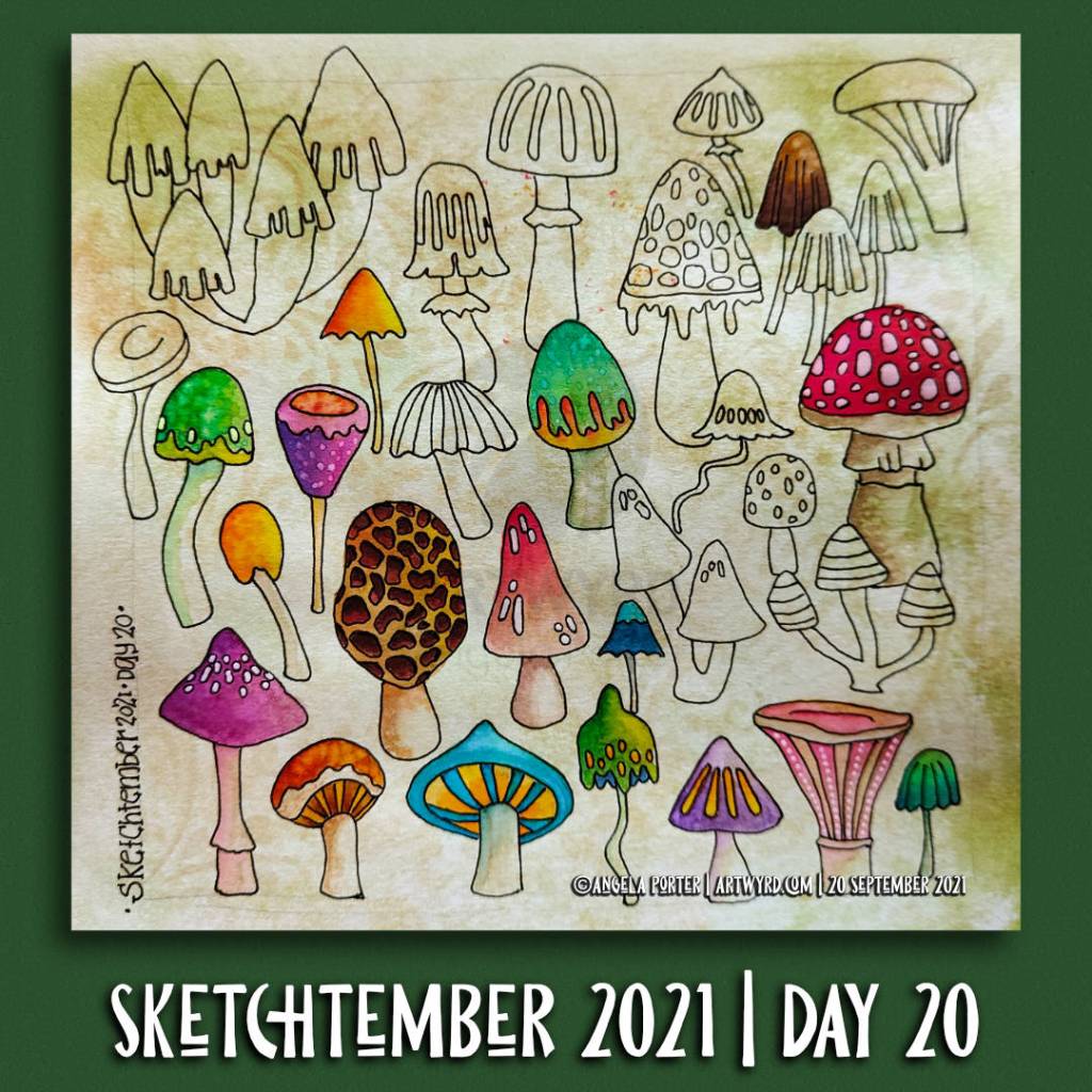
Sketchtember 2021 | Day 20

Click on this link to see today’s vlog on YouTube.

Mushrooms. Lots of mushrooms. A sketchbook page full of simple line drawings of mushrooms drawn from memory and/or imagination, some brightly coloured with Ecoline watercolour ink.

This page was a lot of fun to draw. I wasn’t aiming for realism or detail. It was all about drawing simple, stylised, imaginary mushrooms. I planned to add colour to bring volume to the drawings.

As I used imagination to draw these whimsically wonky mushrooms, it was easier to give myself permission to forgo the pressures I put on myself to be realistic in adding colour. I could use whatever colours I wanted to for each mushroom, I could be as stylised as I wished about the colour too.

Adding colour in this way is easy when I add colour to my coloring book pages/templates. As these pages are stylised, I can add colour in a simpler, more fun way. This is especially true for my Doodleworlds style of art.

Transferring that mindset to my drawings from nature, architecture and so on isn’t quite so easy for me. I still hear that critical voice of ‘It’s not good art if it doesn’t look like photograph or like the real thing’ in my head. This is a message that is repeated to us time and time again from our earliest days of starting to draw. It was these critical messages that led to me having a belief that I was no good at art, and those messages were seared deeply into my view of myself.

In fairness to myself, I have overcome some of these critical beliefs foisted upon me by others. However, some linger and rise up from time to time. I suspect their influence is most noticed in my lack of confidence in myself when it comes to colour.

Identifying these ‘inner critics’ is the first step to dispelling them. This is a multi-step process as the inner critic is armed with many weapons to destroy my self-confidence. I’ve disarmed this critic time and time again, but it always seems to find a new weapon. Eventually though, it will run out of weapons to use.

It’s a process, a long winded process, but it’s one that’s worth doing, step by step.

Sketchtember 2021 | Day 19

A page full of whimsical, wonky butterflies. Partly coloured with Ecoline Brush Pens. Embellishments with a variety of Uniball and Sakura gel pens.

I have a sheet of whimsical flutterbys drawn on a piece of marker paper that I’ve started to colour with alcohol ink pens.

A lovely way to spend a quiet Sunday at home. Mind you, every day for me is a quiet day at home, which suits me rather well.

Sketchtember 2021 | Day 18

Link to today’s ‘Sketchbook Saturday”, a sketchbook flip-through of this week’s art projects on YouTube.

Saturday is here again. So, over on my little corner of the YouTube universe, I do a flip-through of this week’s arty projects, and a bit of a chat about stuff at the same time.

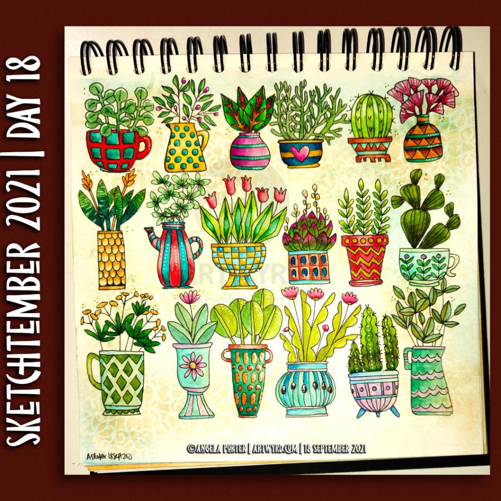
Here, above, is my sketchbook page for Sketchtember 2021. For day 18, I’ve chosen to draw plants in pots, mostly cups, mugs, teapots and jugs it seems. They’re still plants in pots. They’re all drawn from my memory and/or imagination.

After completing the pen sketches, I added colour using Ecoline Brush Pens and a Water brush. I had to try to mix colours too, particularly varieties of green. I may have done OK with some of them. Others are abject disasters, such as the succulent style plant with red tips to it’s leaves. Ho hum.

Everything is a bit wonky, but perhaps that is no bad thing at all. A lot of my artwork is a tad wonky, and that’s part of my signature style, probably.

I’ve also used a clear Glaze pen, a gold sparkle Signo gel pen and a clear Star Sakura Gelly roll pen to add shiny highlights. A white Sakura Soufflé pen added highlights to some of the areas too.

This, like yesterday’s buttons, has been a fun project. This time, though, I’ve completed adding colour, which has surprised me no end. I suspect that increasing familiarity with Ecoline watercolour inks and how I like to apply them has helped greatly with this.

Trying to work in a more ‘illustrative’ and a bit expressive way of adding colour is helping too. It’s a work in progress, but I may just get there!

Now, all I have to work out is what to do with the rest of Saturday!

Entangled Art

Entangled Art © Angela Porter | Artwyrd.com

Last night, I carried on with the Domestika Course – Modern Watercolor Techniques by Ana Victoria Calderon. The last sections are all about painting ‘galaxy’ style backgrounds. Scientific pedantry here – they’re not really ‘galaxies’, more nebulae. Just had to say that and get it off my chest.

I painted along with her, and the first background I created was really not at all good, perhaps. I used White Knights watercolours, Cosmic Shimmer metallic gold watercolour and salt. Way too much salt and probably way too much water, and trying to work how someone else does. Still, you learn by doing, even if it doesn’t work out as you’d want it to.

I let the paper dry, did my best to remove the salt and then decided to use a 0.1 Sakura Pigma Micron pen to draw on the background.

I allowed the shape and flow of patterns in the colour to inform me as to how I could draw shapes and patterns, and the end result is today’s image!

As disappointing as my first attempt at a ‘galaxy’ background was, I actually rather like the end product that includes drawing, a typically ‘Angela’ entangled design.

What I am also kind of pleased with, is that I chose to leave some areas of colour without any drawing on them. That is something unusual for me to do.

I started with the floral motifs and let the rest of the design flow from there. As it flowed, the patterns became more and more of an abstract nature.

What you can’t see in the scan, are the subtle areas of gold shimmer that resulted from the spreading of the Cosmic Shimmer metallic watercolour paint. It gives a very subtle sheen in some areas.

While the first background was drying, I had a go at creating another, using what I’d learned from creating the first. Instead of the White Knights, I used Kuretake Gansai Tambi watercolours and I had a bit more success. I’m not entirely happy with the overall balance of the colour areas, but when I’ve decided what to do with it, I’ll share it.

A colourful, small reef illustration

Reef Illustration ©Angela Porter | Artwyrd.com

A little reef illustration.

Yesterday, I got round to colouring my little reef drawing. And it is a little drawing – the paper is just 4″ square (10cm square).

To colour it, I used my Chameleon pens – both the Color Tones and Color Tops. I finished the illustration off with some small dots from a white Uniball Signo gel pen.

What I didn’t expect was that the pigment from the Uniball Unipin pens bled somewhat. I don’t remember that happening before. Mind you, I usually scan and print my black and white line art and colour the print. I didn’t do that today — something to remember for future reference. This is why some of the colours look a little dirty.

All the same, it’s a colourful, happy little illustration. I also like the thickness of the main lines with the variation in line thickness in the details. Diversity in line weight is something I need to remember when I draw digitally. Looking at my latest colouring templates, I think I may have used a line that was too fine. Again, this is something that I need to consider in the future.

It’s always lovely to do artwork like this, using traditional media and working in a familiar, comfortable style. It gives me a chance to reflect on what I’m doing elsewhere and to adapt and change what I’m doing to improve it.

Creating this artwork has given me ideas for some projects in the future. More on that when they come to fruition.

So, Angela, how are you doing today?

I’m doing OK. I’m feeling a lot brighter as the aftermath of Monday’s bombshell fades.

I’m aware I really don’t get out of the house and move my body around much. I either get engrossed in art and the day slips past me quite quickly. Or, my anxiety rears up and try as I might to overcome it, I just can’t seem to make it out of the house.

After a conversation with a friend the night before, I remembered that I like to walk around cemeteries and that my local cemetery might be the perfect place to go for a stroll.

And I did. Go for a stroll.

My love affair with cemeteries started when I used to walk to and from school when I was 11 and 12 years old. Walking to school was always a bit of a dash. However, I could take my time on the walk home to wander and explore the cemetery.

Even on the gloomiest, darkest winter afternoons, I never got freaked out by the cemetery. The dead have never scared me. The living, however, are an entirely different matter. The living people around me were the source of my traumas and CPTSD. The dead could do nothing to me that was any worse than the living.

I found the variation in headstone styles fascinating. I found I could chart the change in fashions over time. I also found reading them fascinating as some of them could tell me about the deceased and their families. It was history related to real people and brought them back to life. It wasn’t the dusty, dry, uninteresting facts in the history lessons I had to endure in school.

And so began my love of wandering around cemeteries.

I find them soothing, calm places to be. They’re quiet, not many people visit them. And there’s plenty of wildlife in them if you’re quiet and take the time to look.

Perfect places for me to walk and explore. Even on the days when anxiety stops me going to more people-y places like towns or parks, a cemetery can offer me that quiet space I need to take a walk.

If you’d like to see some photos and read some words about my walk and the cemetery, then please visit my other blog, Curious Stops and Tea Shops.

Monogram A WIP

Monogram A WIP ©Angela Porter | Artwyrd.com

Easy listening playlist on Spotify, creating art. What a lovely way to spend a Saturday morning!

I’ve been working at this monogram now for several days. It is coming along.

It really feels like a an embroidery sampler where the learning embroiderer would try out different patterns and shapes and still create something beautiful.

For me, the sampler is more about out different ideas as they come to me and increasing my knowledge and understanding of the digital art tools available to me in Autodesk Sketchbook Pro.

Of course being able to draw directly on the screen of my Microsoft Surface Studio with a Surface Pen makes creating digital art a dream for me; it’s like working with pens and pencils and so on on paper. However, I’m able to do things I don’t think I’d ever be able to do with traditional media.

I still love working with pen on paper; I currently have one drawing on the go and I may convert it into a digital artwork when it’s done.

Exploring the realms of digital art has opened doors to me that have expanded my creativity in ways I never could have imaged previously.

Yes, I learn by doing myself rather than following tutorials. My experience of watching tutorials is that I end up more confused than I started.

Don’t get me wrong, the ones I watched were excellent. However, they are by people who really know the software and what everything does, and they speak to people who have some idea of it all.

Besides, I want to do art my way, and these artists tend to show how they do things and that often doesn’t make any sense to me.

I’m grateful they share, and one day I may watch some more, but for now the exploration in my own realms of creativity is what is best for me.

As I look at my sampler monogram, I can see how I’m developing my own digital art voice in terms of techniques and effects that suit my style of rather intricate, abstract art based on patterns, curves, swirls and arches, along with a lot of motifs based on nature.

The plain curves in this monogram are adding some much needed scaffolding or girders to support and separate the patterns. Some of the fancily patterned curves are getting lost in the crazy intricacy of adjoining sections.

There are no individual sections that I really don’t like. However, some combinations of sections don’t seem to gel well, at least not to my eye.

What I do love is the layers of diversity of colour and pattern. Each glance reveals something new, whether it’s the way I’ve played with light and shadow, the way patterns look together, or the way colours I’d not normally put together seem to work together.

However, as this is turning out to be a sampler, then that’s fine. It’s all learning for me, and that’s good.

I’ve noticed I’ve not left any white space in this design, so far. I may do that in the area that is left to complete, just to contrast with the pattern-dense areas done so far.

It is a fascinating journey for me, and while this may not be an artwork that I’d offer for sale at redbubble.com or zippi, it’s something that is worth its weight in gold for me in terms of lessons learned and also gaining some confidence in my style of digital art.

A few more fish.

A few more fish © Angela Porter | Artwyrd.com

I’ve had a productive morning and early afternoon.

First, I revamped my anti-stigma presentation for Time to Change Wales. It now has nowt about my childhood and so on, just info about CPTSD, the stigma I’ve faced, and helpful/hurtful things said and done.

Of course I’ll give a bit of info about my life too and how CPTSD impacts me every day of my life so far, as well as how that impact is lessening thanks to the help and support I recieve via EMDR therapy.

Then, I turned my attention to these cute and colourful fish. I needed something cheery and happy after sorting the presentation out – it did have me feeling a bit emotional, and art is always a self-soothing, self-caring activity for me.

So, I’ve added some more fish to this illustration.

This is quite fun to do, as well as an experience where I can explore and learn more about how digital art can work for me.

I think I’m getting there, little by little, with the digital art.

My tools for digital art are a pencil sketch on paper, Autodesk Sketchbook Pro, Microsoft Surface Studio and Microsoft Surface Pen.

I now need to go and do some ‘adulting’. I have to brave a shop to get some lunch!

Fish! A WIP

Fish! A WIP © Angela Porter | Artwyrd.com

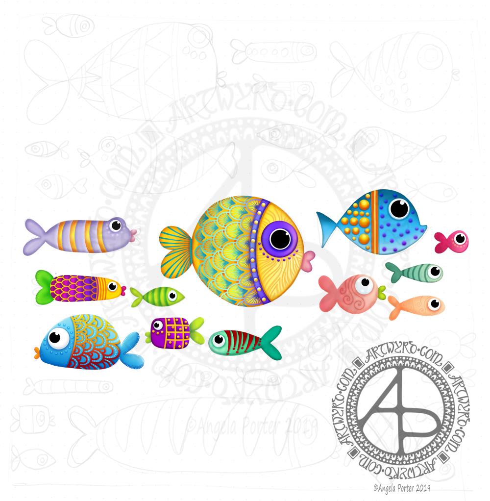
I’m having a little bit of whimsical and cute artistic fun this evening, with fish!

After drawing my fish dangle design yesterday I really realised that I enjoyed it very much and that it could be fun to explore whimsical illustrations of funny, cute and colourful fish. So, that’s what I started today.

My first step was to sketch out the basic shapes and some patterns with pencil on paper. I know, traditional media. However, working on paper on a scale that my mind can take in and look at the balance of the design and it’s intricacy is a good idea before I launch fully into creating the art digitally.

After scanning the sketch in, the fun of creating these cute fishies in colour.

This is also giving me the chance to try out ideas, hone my skills and understanding of the various digital ‘brushes’ I like to use and just see how things develop.

Naturally, my digital tools are Autodesk Sketchbook Pro, a Microsoft Surface Pen and a Microsoft Surface Studio.

International Women’s Day 2019

International Women's Day 2019 - ©Angela Porter 2019 - Artwyrd.com
International Women’s Day 2019 – ©Angela Porter 2019 – Artwyrd.com

I matter. I matter equally. Not ‘If only’, not ‘as long as’. I matter. Full Stop.”Chimamanda Adichie, Nigerian writer.

A balanced world is a better world.
How can you help forge a more gender-balanced world?
Celebrate women’s achievement. Raise awareness against bias. Take action for equality.

www.internationalwomensday.com

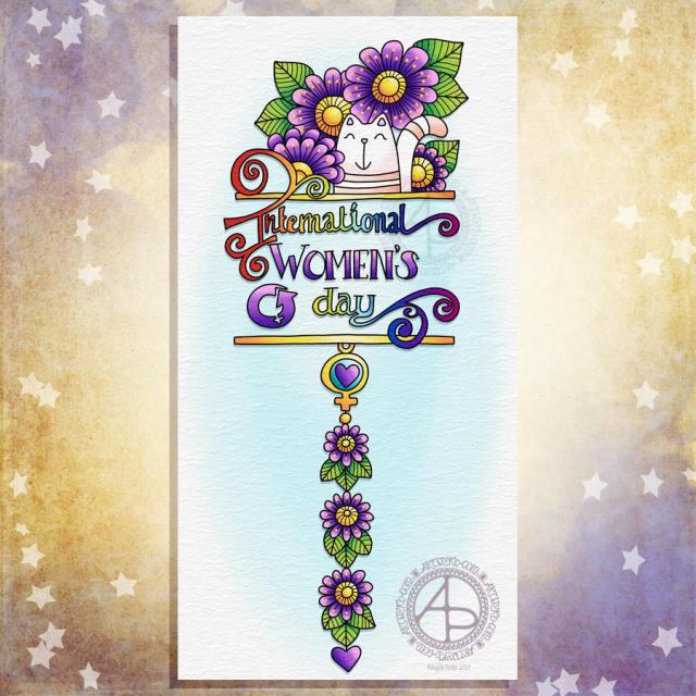
Today is International Women’s Day, Furbaby Friday and Dangle Day so what else could I do but combine them all into one design?

I started by sketching them out on dot grid paper. My favourite sketching tool at the moment is any one of the darker tones in the Koh-I-Noor Magic multicoloured pencils range. The thickness of the lead encourages me to be bold in my hand lettering and drawing. It also encourages me to draw on a larger scale than I usually do.

Something else I’ve noticed is that drawing with such a thick (but fun and coloured) pencil,I can’t put all the small details in that appear in the final image in the sketch. It really is a sketch which I can then use as the skeleton, the framework, the architecture for the final design.

The thickness of the pencil also means that my hand lettering is bigger than usual. I can also deliberately wear the lead down into more of a chisel shape which helps with the thick downstrokes and thin upstrokes.

It’s also a pleasure to write with pencil and my writing always feels neater when I do write with a pencil. I have no idea why that is, but it just is.

Anyways, once the design was sketched out, I scanned the design into the Microsoft Surface Studio and used Autodesk Sketchbook Pro and a Microsoft Surface pen to first ink in the outlines and then add colour, details and texture.

For the colours I kept to a fairly simple colour scheme with pink and purple for the flowers and hearts and the Women’s Day symbol. I just had to use a rainbow to fill the hand lettering (apart from the word ‘women’s’). And the pusscat just had to be mainly white, but I thought peachy-pink stripes would be quite nice.

My dangle design tutorial book – A Dangle A Day – is now available from all good booksellers.

Inktober 2018 Day 17 ‘Swollen’

Angela Porter Inktober 2018 Day 17 Swollen coloured

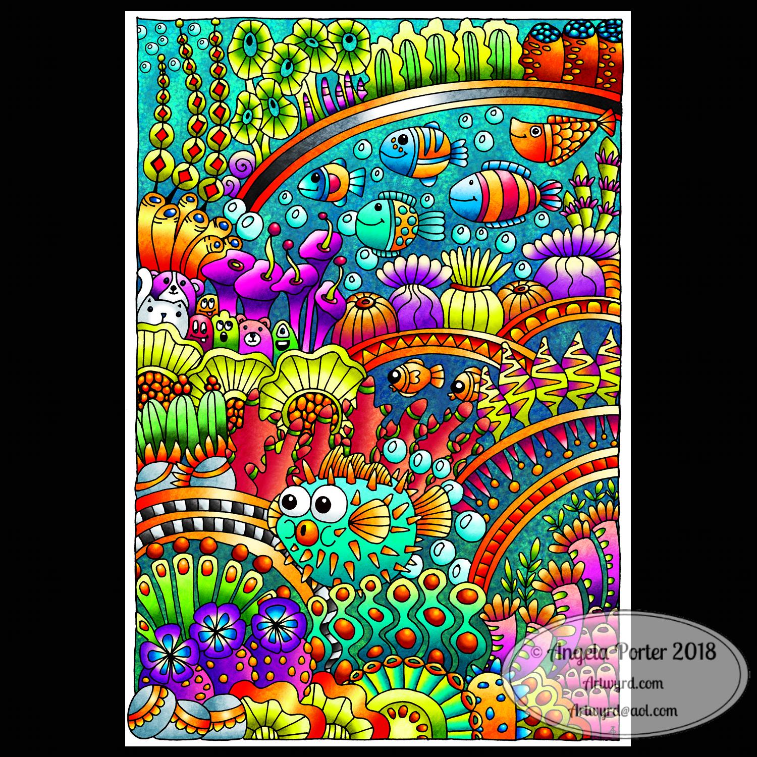
The first thing that popped into my weird head when I read the prompt ‘swollen’ was a puffer fish! I know … weird is the right word.

So, I had to draw one of my entangled drawings incorporating a puffer fish, lots of coral reef and sea inspired images, and a few cute monsters and critters – including a white cat and a pink badger (don’t ask!).

It took a couple of hours to draw the outline using a Faber-Castell broadpen on Rhodia dot grid paper.

I scanned the drawing into GiMP, removed the dot grid and created a transparent background.

The final step, which has taken around 4 hours, is to digitally colour the image.

It’s certainly bright and colourful, though if it wasn’t an Inktober challenge I’d want to go back and add some added textures and shadows to the image. But it’ll do for now as it is.

I also would like to add some patterns in black pen to some of the more ‘flat’ areas of the design, such as the bodies of the sea anemones.

I used Autodesk Sketchbook Pro, a Microsoft Surface pen and a Microsoft Surface Studio to colour the image.

#created on surface #autodesksketchbookpro #inktober #inktober2018