I was awake way too early this morning, but just couldn’t get back to sleep. So, what am I going to do? Art of course, after a while of tossing and turning that is.
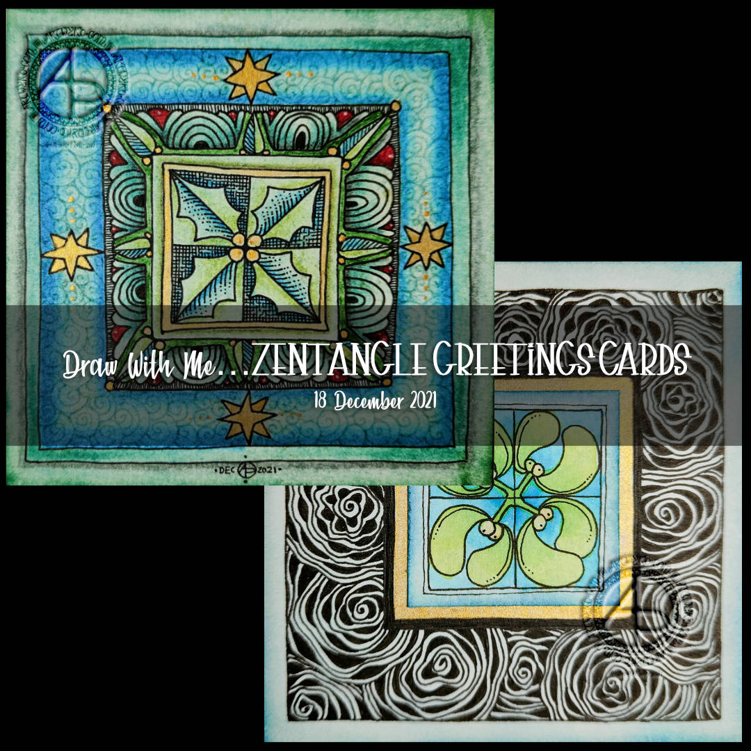
Completing the holly design.
I spent some time yesterday adding colour with various chalk pastels. I finished off the last few areas with fineliner pens. Then, I added another layer of gold to the stars and inked around their outlines again.
To finish the holly design, I wanted to seal the surface. I’d done some experiments to see how a multi-media gloss finish and micro-glaze would work. With both, there was very little shift of any of the media I’d used on my test pieces – chalk pastels, graphite pencil, tinted charcoal, and Ecoline watercolour inks. The only difference was the gloss medium was a bit glossy, while the micro glaze lacked any brush strokes.
I decided on the microglaze. It helped to bring out the colours, as well as stop them being rubbed off. There’s also less chance of me making a total mess of things too.
All in all, I’m fairly happy with this panel for a card. Despite all my doubt and misgivings during the process of drawing the design, it’s turned out quite OK.
Notes on the mistletoe design
For this design, I decided to create a separate centre panel. I also painted a square of gold beneath where this panel would go.
I used Ecoline watercolour ink to add colour to the drawing on the Distress Ink coloured panel. Then I attached it to the base ’tile’.
Next, it was time to decide what to do with that big border around the mistletoe. I went with the tangle pattern Diva Dance Rock and Roll.
I knew this tangle pattern would add a lot of black to the border, but I think I wanted that to be the case. The black helps the central panel to stand out, I think.
I still have some work to do on this panel, but I to focus on inking in more of the last couple of templates for Adorable Dogs.
If you’d like to find out more about drawing dangle designs, then my book “A Dangle A Day” is a good place to start. I’ve created over 120 designs, with step by step instructions, for you to use and inspire you.
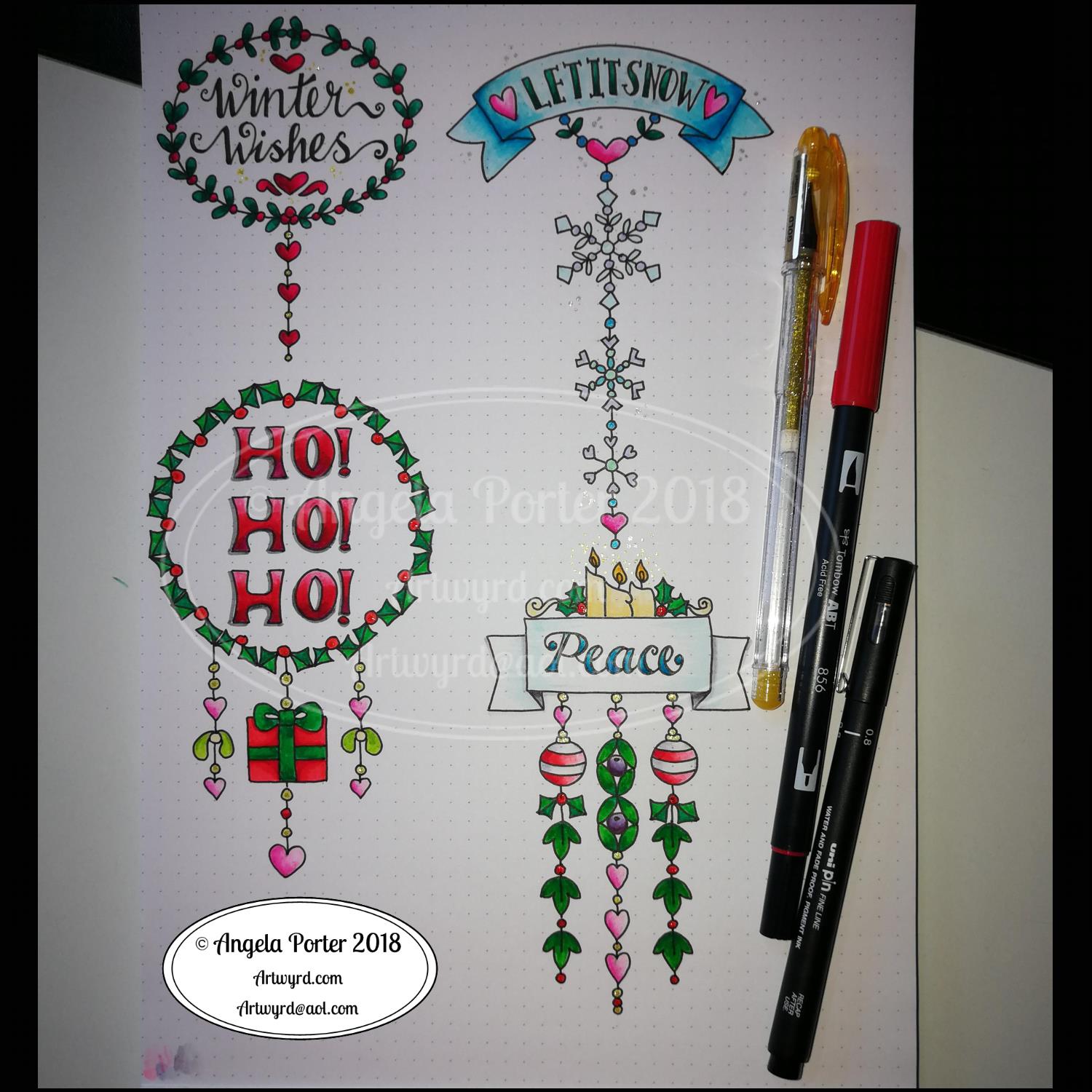
It’s Friday, so that means it’s dangle designs today!
I drew these on postcard sized (148mm x 105mm) acid free heavy cartridge paper using a mixture of Tombow fudenosuke and Faber-Castell Pitt Artist pens. I then used Chameleon Color Tones and Color Tops to add some colour to the designs.
Again, I’ve drawn some really simple, cute and whimsical dangle designs that leave plenty of space on the paper for hand lettering or a hand-written note or letter.
Dangle designs are, of course, very versatile. I put these on the edge of a postcard sized piece of paper. However, they could be used as the focal point of a greeting card or note card. Lengthen the dangle, and they’d make cute bookmarks. They’d make interesting designs to fill spaces in a BuJo or scrapbook page. They’d also make interesting focal points on art journal pages.
I’d love to see how you use dangle designs – just tag me in social media!
My morning warm up art session today was this little bit of hand lettering. I had a completely different idea in mind when I started this off but, as often happens, the creative energy flowed in a different direction.
I had wanted to do a monogram, perhaps with a dangle or maybe one set into a pattern border as a drop capital to a quote.
As I worked on first the pencil outline of the A, and then inking it in using fine and extra fine fountain pens filled with black ink, the lines that flowed out dictated the form of the letter rather than me consciously trying to force it into what I thought I wanted to create.
I think I’ve over patterned the inner space of the monogram, or not used the right kind of patterns there. However, it’ll do.
I wanted to use some birdwing copper FW Pearlescent ink from Daler-Rowney to add metallic highlights with a dip pen. I soon found out that dip pens and parchment paper that has been coloured with black ink don’t work well together. So, I ended up with the copper highlights at the bottom of the letters that fade up naturally. Adding dots of metallic colour to the monogram was easier on the unworked parchment. Over the black ink dots it wasn’t so easy. I’m also not sure that the ‘string of beads’ in the monogram actually works but I know it’s missing something. I need some time to reflect on this. As I do about adding any more copper highlights to it. I may yet decide to add some dangles to the word.
On the whole, I’m quite happy with how this turned out. I could add ‘You are’ in small letters above the letters. Either way, I think this would make a lovely notecard. I also think it could be used in a bujo, planner, journal, scrapbook or as framed art. I think I need to review the card making and mixed media techniques I once knew and have sidelined to focus on other aspects of art and adapt them to my current needs/ideas.
A knock at the door, a Fed-Ex delivery driver asking me for a signature before handing over a parcel. I saw it was from Lydia at Quarto so knew it would be a copy of ‘A Dangle A Day’. So excited to open the package and see the book in a solid, tangible form.
I’ve seen the pdf versions of the book as it was put together before going to print. But, it’s never, ever the same as having that book in my hands.
Even more so today as this is my first book with words and art done by myself. I trust it won’t be the last.
About the book
I had a lot of fun creating this book. I’m so excited about helping others to create their own dangle designs and to gain confidence that they, too, can create lovely designs for use in all kinds of ways – BuJo pages and spreads, greetings cards, note cards, framed pictures, scrapbooks, planners, journals, bookmarks, place cards, and more.
I’ve done my best to show you how to create monograms and dangle designs in easy steps both visually and with some supporting words.
Suggestions about how to approach hand lettering is scattered throughout the step by step instructions for the dangle designs.
Examples of dangle designs in use in bullet journals and more are included – with all their imperfections. Remember, work created by each of us will be perfectly imperfect. It’s those imperfections that make it uniquely ‘you’.
There’s lots and lots of examples of designs and dangles and charms that you can use as they are or as inspiration for other designs. There are designs for all seasons and many, many different events throughout the year.
I’ve included suggestions for color palettes, media to use.
A short primer for bullet journals is included; I’m no expert on bullet journaling but I do make use of one and find it very useful not just in organising my tasks for the day but in recording ideas, reflections, memories and more.
This has put a big smile on my face this morning, and that smile will continue for a long while. I never thought I’d write and illustrate an art tutorial book. I’d thought I’d like to, but didn’t have the confidence to think it would be so.
Why I chose to use digital tools
I made great use of my Microsoft Surface Book and Microsoft Surface Studio along with a Microsoft Surface Pen and Autodesk Sketchbook Pro to draw many of the designs. Working digitally made editing designs, breaking the design process down into simple steps so easy.
I used to think, as many do, that digital art is simpler, easier than traditional forms of art.
It’s not.
The skill set required is different. I wanted my digital drawing and coloring to look like I’d done it with traditional media.
Digital drawing is no easier than drawing on paper.
What is easier is correcting mistakes, smudges and removing pencil lines. It removes the frustration I experience in scanning images in and spending a lot of time cleaning the image up for the publishers. Scanning can be a frustration for me too, which would’ve been worse if I’d had to scan in step after step after step. And having to re-draw if I’d missed a step out, or re-scan would’ve driven me nuts.
What I didn’t want was artwork that looked too perfect, too inhuman. I wanted digital drawings that looked like I’d drawn them on paper. So, I worked hard to set up pen ‘brushes’ that would mimic how my favoured drawing pens would look when drawn on paper.
Also, I rarely used any line smoothing tools for any of the work so it has that slightly ‘wobbly’ line appearance that my pen and ink linework has. I also kept the design elements, called charms, imperfect just as they would be if I’d drawn them with pen on paper.
In fact, each and every design started out as either a pen or pen drawing on paper which was scanned in so I could re-create it, step by step, digitally, saving a file for each step to the computer.
There were plenty of revisions/edits required and colour changes. Again, working digitally make this a less onerous task than if I’d had to do everything with pen and ink on paper, scanning in each step all the while worrying I hadn’t missed a step as I got engrossed in the process of drawing.
Working digitally did not make the drawing any easier or simpler, what it did was allow me a different way to draw the steps.
Coloring the designs digitally was no quicker than with traditional media, in fact it took me longer! I learned a lot about this process by doing this book, and I think it was the book that allowed me to become more comfortable with digital art and how to make it look like I’d drawn with pen on paper, in my own style.
Of course, I can print out the line art and colour it with any media I choose. I also can redraw any using traditional media. And of course, adjusting the size is so easy.
I did use some circle, oval and hexagon templates to help me design the wreaths and snowflakes. The dot grid paper helped me draw mostly straight lines for the dangles.
I did sketch them in pencil first before inking them in with a Uniball Unipin pen. Colouring was done with various Tombow dual brush pen markers and some sparkly elements added with Uniball signo sparkle gel pens.
These would look lovely as greetings cards. In fact, I’m thinking of redrawing them digitally and using them to make my own christmas cards this year. Printing out the black line work and then colouring them with traditional media. In the past couple of years I’ve designed my christmas/winter/yule cards digitally and had them printed professionally. This year, I think I’ll do it the way I suggest in my book ‘A Dangle A Day’.
They’d also look great as note cards or as pages in a BuJo, planner, scrapboook or journal. They’d lend themselves to cute bookmarks too.
These relatively simple and small dangle designs are perfect for practicing hand lettering too. And in these four dangles I’ve used four different lettering styles.
I’ve also kept the finished designs simple by not adding any drop shadows, except around the ‘HO! HO! HO!’. Not only that, a lot of the colouring is very simple too.
I do hope you’ll have a go at designing your own, maybe using these as a bit of a guide. If you do, I’d love to see what you’ve created.
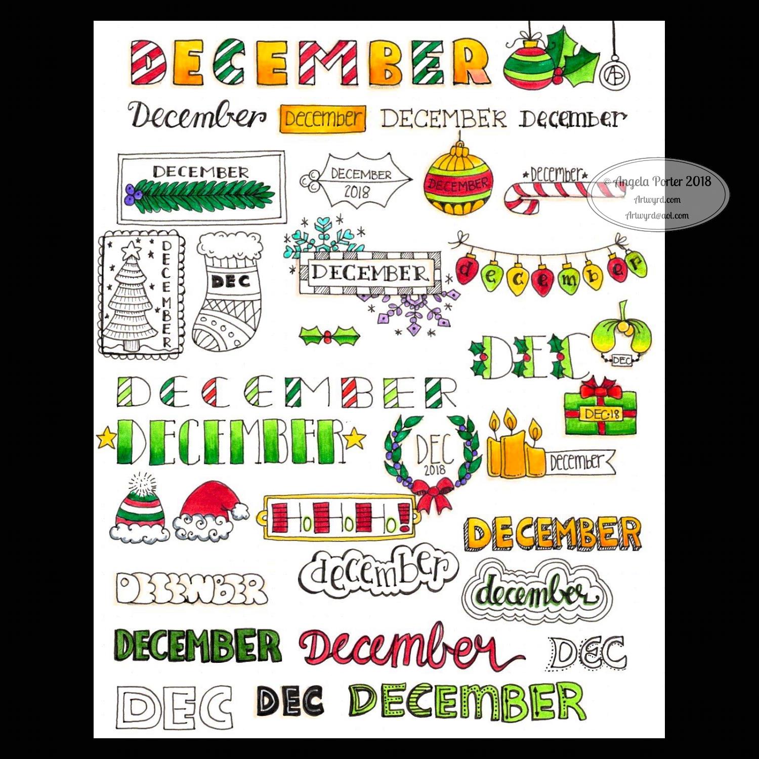
December is nearly upon us and my mind is turning to ideas that could be used to brighten up BuJo pages with simple lettering and design ideas. And this sheet is what I’ve come up with … thus far!
If you use any of them for inspiration in your BuJos, planners, journals, or in card making or any other way I would love to see how you’ve used them! If you share on Instagram then tag me in your post @angela_porter_illustrator. On twitter you can tag me as @artwyrd and you can find me on facebook as @Artwyrd
All are hand lettered and hand drawn. I used Crayola Supertips to colour the images in. I used Uniball Unipin pens for the black lines and I worked on dot grid paper to help me keep the letter sizes and spacing consistent.
I can see that the bubble lettered ‘December’ has a weird looking M. It looks more like Decewber! Oops! Practice is needed with bubble lettering methinks.
This was a fun project, that took a bit more time than I thought it would.
Of course, the next thing for me would be to choose some of these and convert them to dangle designs, a process I cover in my upcoming book ‘A Dangle A Day’.
I’m finding that I’m enjoying hand lettering a bit more now that my conversation with myself in an earlier blog is setting in – about making it mine and accepting the little imperfections as they are what make it unique, just as they do in my drawings.
Yesterday I was shattered both from the trip to Worcester the day before and by giving and anti-stigma talk for Time To Change Wales. The talk left me very emotionally exhausted and I was good for nothing the rest of the day.
This morning when I thought of the prompt for yesterday – Chop – I just had this vision of a cute Viking kitten with a big axe (the chop!). It seemed quite natural I should turn that little image into a bit of a dangle design. I tried to draw a round shield beneath the Viking kittie, not sure that’s worked out at all. I like the way the ears poking out of the helmet have ended up looking like horns with some protection around the ears!
In keeping with the theme, I did a prickly looking-cat along with a bunch of cacti. Again another dangle design.
I drew these, with some rough pencil sketchlines, on Clairefaintaine Graf it dotgrid paper using Uniball Unipin pens.
I’ve not cleaned the images up or removed the dot grid. I’ve just left them black and white line art.
Of course, these are quite simple dangle designs in terms of the dangles used. If you’d like to learn more about dangle designs and get loads of ideas on how to draw your own and designs and dangles and charms you can use, you’ll find my book ‘A Dangle A Day’ most helpful. It’s available for preorder and is due out early in 2019.
I know that colour would bring them to life; maybe I’ll do that later on.
It’s not often I get ideas for funny cats to draw. Or funny critters and so on – ones that relate to a particular theme like these. They’re actually fun to draw, give me a smile. and perhaps it’s something I can work on developing as time goes on.
I think everyone knows I love cats and I still miss my companion of over 16 years – the white purrfurrball called Cuffs. I’m not ready to let another pusscat into my life for many reasons, but I do donate the money I would’ve spent on Cuffs’ food, kitty-litter, medication and regular vets bills to the Cats Protection League so that I help other kitties to be looked after until they find their forever homes. It’s the best I can do at this time.
Dear goodness, I’m crying about that now. I’m still emotionally tired out after yesterday and so today is likely to be a day of some self-care.
Bullet Journals
Earlier this week, I had Ryder Carroll’s book ‘The Bullet Journal Method’ – delivered to my Kindle on it’s release day. I’ve spent some time reading it and have found it a really interesting read so far, not just about bullet journalling.
As I’d started a new bullet journal at the weekend, I thought I’d try out some things, particularly the daily log and the system of symbols used for notes, events and tasks. It all finally makes sense to me, well the daily logs do and seem to be something that will be useful.
I’ve also worked out that dividing pages for the daily logs up into pretty sections and so on isn’t going to work well for me if I use a bullet journal as it’s meant to be used by me. The sections limit the space available for daily notes etc – Some days I need to jot down a lot, other days not so much.
I’m certainly still going to pretty up the Monthly logs and the future log for sure, as well as any collections I create. But the daily logs are going to be far more basic, though I suspect colour will become involved at some point!
I finally get the idea of ‘threading’ after seeing examples in the book.
I certainly can recommend this book (it’s available in other formats) – not just for people wanting to learn about bullet journalling for the first time, but for more seasoned/experience bullet journallers.
I can also see my viking kittie being redrawn in my bullet journal as a cute page I can look at to make me smile. The same for any other cute kitties I have – and I do have a few drawn already! Mind you, they’d be quite nice printed out, coloured and used as markers/inserts in the BuJo too. But I’d like them as greetings cards and notes cards.
Ooooh… I need to make some notes about these ideas in my BuJo!
Today’s Inktober drawing has turned out differently, a lot differently, to how I thought it would while sketching in Hay on Wye yesterday.
I woke up this morning and had some fond memories both of my white pusscat Cuffs and a sweet, large, cuddly (read overweight) ginger and white cat called William who was also known as ‘Willie the Whale’. He was a huge cat, even without his extra weight, but he had this sweet, high-pitched purr that was totally incongruous with his size.
So, today’s drawing had to be about Willie the Whale, who also loved to sniff flowers and definitely enjoyed his food.
As it’s Friday, it’s also #dangleday, so the drawing also needed to be a dangle design. And that’s what’s above.
This time, I sketched the design out on Rhodia Dot Grid paper, scanned it in, then did the inking digitally, as well as the colouring. My digital tools are a Microsoft Surface Pen along with a Microsoft Surface Studio along with Autodesk Sketchbook Pro.
Regardless of any skill or not skill in the design, it makes me smile, lots, even if there are still tears and heartache, with memories of William, Cuffs my beautiful furrpurrball who passed away last May and who I still miss terribly, and other cats who have chosen to spend their lives with me – Gormless, Spotty Baby Girl, Tabitha, Whiskey and Toby. Quite apt as it’s furbaby friday across the interwebs, including on the facebook group ‘Angela Porter’s Coloring Book Fans’.
Just a little reminder that my book ‘A Dangle A Day‘ is available to preorder. In the book I show you how to draw and design dangle designs for yourself for use as greetings cards, notecards, bookmarks and framed pictures, as well as spreads for bullet journals, planners, scrapbooks and more!
A simple, elegant design with a sweet sentiment for this week’s dangle design. I like the symmetrical nature of the dangles.
I did sketch the design out in pencil on dot grid paper which I scanned in to ink in digitally and make use of the symmetry tool in Autodesk Sketchbook Pro. I also coloured and added texture with various brushes in Sketchbook. Naturally, I made use of a Microsoft Surface Pen and Microsoft Surface Studio to do this.
I kept to a really simple colour scheme, using just one pink, golden, blue and green colour gradient for the design, with the exception of the rainbow beads in the central dangle.
It would be really easy to put a different sentiment or greeting in the box, but I like this one.
A different colour scheme, of course, would result in a very different ‘feel’ to the card, matching all kinds of seasons and occasions.
This would make a lovely greetings card or note card. I think I’d like to use it for the beginning of each month in a BuJo, planner or diary, changing the colour scheme as appropriate for that month. I do like playing with themes for my BuJo, but there’s something in me that likes a cohesiveness in design/style.
What would you do with this design? Let me know by leaving a comment.
Of course, I could print the uncoloured version out and colour with different media. It would be no great chore to re-draw the design on paper more suitable for, say, watercolours, where my printer doesn’t cope with decent quality watercolour paper.
Just a little reminder that my book ‘A Dangle A Day’ is available for pre-order, just click on this link. In the book I give help, guidance and advice on creating your own dangle designs, as well as providing many examples of monogram dangles and dangle designs that you can use for your own projects.
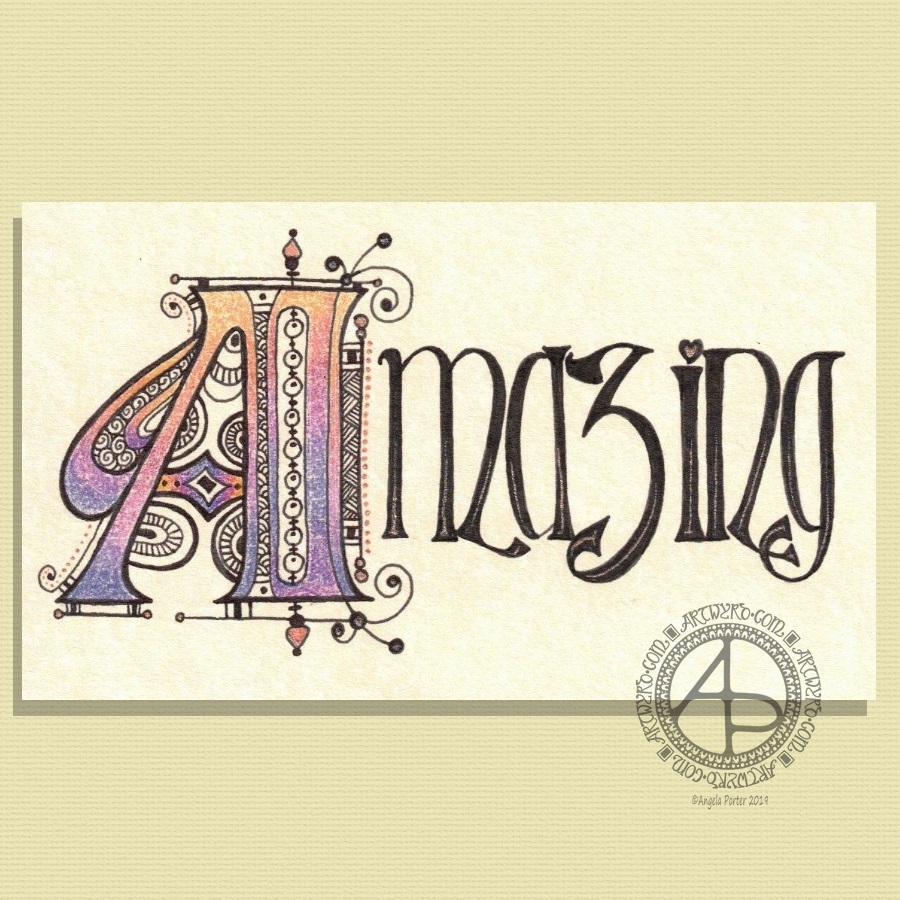
Here’s two dangle designs for dangle day Friday. Simple designs, perfect for getting into the weekend vibe.
These are both experiments where I’ve worked on vellum/parchment, the kind that is used for Pergamano.
The one on the left – the monogram A – is nowhere near as garish in colour in real-life; I really don’t know what the scanner has done to the colours. I drew the design with a metallic gold Sakura Gellyroll pen. I then used Tombow Dual brush pens to colour the design on the reverse. I used shades of yellow, orange, red and magenta, but the scanner seems to have removed much of the red. I also managed to smudge the colours too. I don’t think I’ll be using Tombows on Vellum again.
I do like the gold linework and I think I’ll draw this design out again and colour on the reverse with coloured pencils, like in the dangle design on the right.
You may recognise the design on the right as last weeks dangle design. I traced that design onto vellum using a white Uniball Signo pen. I altered some of the details and the style of lettering.
Next, I did a little bit of ‘whitework’ on the reverse. This gave the highlights on the design that help to give the illusion of dimension as well as some texture. I let the design rest under a heavy book for an hour or so.
Finally, I used my Chameleon coloured pencils to colour the design in, again doing this on the reverse.
I like the colours on this one. The vellum mutes the colours somewhat, but it also softens any imperfections in the colouring.
I’m not sure about the white lines though. I need to try this one with some coloured paper underneath to help the lines stand out a bit more. I’ll post an image of it if it works.
I’d like to draw this design in gold and see how that looks. I may try black too. As well as using coloured pencils, I want to try using Copic or Chameleon markers to colour the designs in, to see how they work on vellum.
These certainly were experiments, which I’ve learned from. Not only that, I’ve got some ideas to try out the next time I use vellum. I’m trusting I’ll find the combination of line colour and colouring medium that works for me and my style of working.
What would I do with these designs? Well, they would both work really well as spreads in Bujos, planners, journals and scrapbooks. I also think the monogram would make a lovely bookmark. They’d both make nice greetings cards or notecards. I’m sure there’s lots of other things they could be used for, such as framed pictures.
If you have any suggestions for how they could be used, leave a comment.