Chameleon Color Tones Coloring

Link to today’s vlog on YouTube.

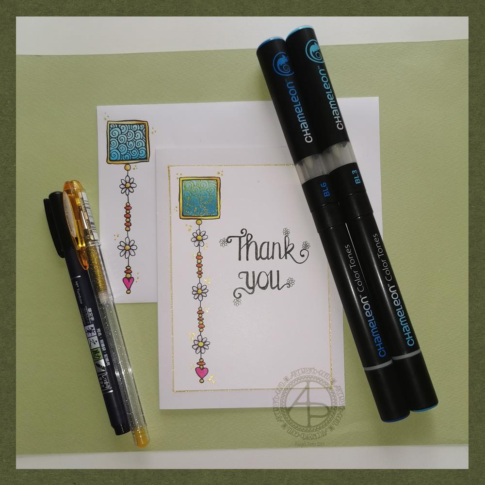
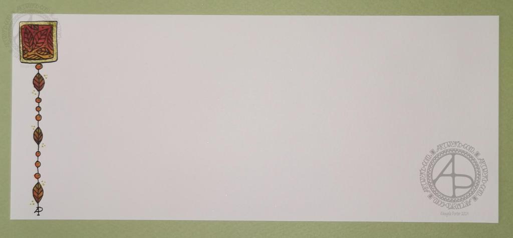
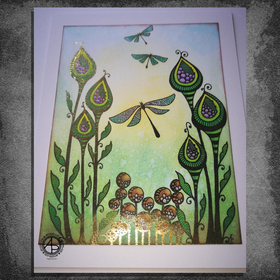
After filming yesterday’s vlog, I decided to try using marker pens with a drawing I’d done on a Distress Ink background. The drawing on the left is the result of this experiment.

To add colour, I used Chameleon Color Tones marker pens. I chose colours that would be similar to those in the background.

I really enjoyed adding colour to this drawing. I’d forgotten how much I enjoy using the Chameleon pens and the ease of achieving gradients with these pens.

I completed the drawing with embellishments of white and yellow Sakura Soufflé pens, muted Sakrua Gelly Roll Moonlight pens, and some shiny areas of clear Sakura Glaze pen.

I was so happy with the result, that I started work on the drawing to the right, some of which I do in today’s vlog.

I really love the way that the background tones down the brighter colours of the marker pens. Which shouldn’t surprise me as marker pens are transparent! But it did surprise me!

Something else that I was struck with was how similar using markers is to how I add colour digitally. I haven’t made that connection before, but it is likely to inform me on my way forward in adding colour to my artwork. I may be trying to force water-soluble media and coloured pencils into behaving like markers, which is something that they’re not meant to do. I find it hard to work with the looser, possibly more chaotic water-based media, even though I love the effects that other seem to achieve with them. No matter what I do, I’m never totally happy with the end result, something I’ve blogged and vlogged about an awful lot.

Working with alcohol markers has shown me that I can work well with colour, with the medium that matches my artistic style – precise and controlled. The more chaotic, loose, aspects of this work come from the Distress Ink coloured backgrounds.

Now, if only I can accept this and focus on using markers in my work more than other media. Well, apart from digital coloring that is!

WIP Wednesday

I was potching around last night with how to add colour to a drawing with traditional media. You’d think I’d’ve learned not to do this by now, wouldn’t you? I was getting nowhere except to the land of frustration and feeling useless.

This morning, as I tried wrangling still further, I thought to myself, “let’s break out the Chameleon markers”. I did, and I also dug out some marker paper and started to draw. And I was happy with the design.

And then I started to add colour … and that’s where it all went to pot.

Oh the colours are lovely, individually. Just not when put together.

I’d also forgotten how much I like to use Chameleon markers. However, I really need to stick to monochrome! And, I think the Chameleons will work well in a monochrome manner. But not just yet. First I need a nap.

Lack of sleep was the usual overly hot at night stuff and also the early morning Wednesday wake-up for my Abel & Cole groceries delivery. What energy I had has now gone. I’m starting to go cross-eyed with tiredness, so I think I’ll need to nap very, very soon.

Dangle Designs 22 Nov 19

Dangle Designs 22 Nov 19 ©Angela Porter | Artwyrd

If you’d like to find out more about drawing dangle designs, then my book “A Dangle A Day” is a good place to start. I’ve created over 120 designs, with step by step instructions, for you to use and inspire you.

It’s Friday, so that means it’s dangle designs today!

I drew these on postcard sized (148mm x 105mm) acid free heavy cartridge paper using a mixture of Tombow fudenosuke and Faber-Castell Pitt Artist pens. I then used Chameleon Color Tones and Color Tops to add some colour to the designs.

Again, I’ve drawn some really simple, cute and whimsical dangle designs that leave plenty of space on the paper for hand lettering or a hand-written note or letter.

Dangle designs are, of course, very versatile. I put these on the edge of a postcard sized piece of paper. However, they could be used as the focal point of a greeting card or note card. Lengthen the dangle, and they’d make cute bookmarks. They’d make interesting designs to fill spaces in a BuJo or scrapbook page. They’d also make interesting focal points on art journal pages.

I’d love to see how you use dangle designs – just tag me in social media!

Thank you card – a dangle design

Friday means it’s time for another dangle design, this time a ‘thank you’ card and coordinating envelope.

In previous weeks I’ve had some fun adding patterns to small blocks of colour. So, I thought I’d run with that idea and turn one into a simple dangle design. The steps I used were the same for the card and envelope.

Card size.

The card is an A6 card and I cut a piece of Winsor and Newton Bristol paper to 5″ x 3.5″ for the card topper. The envelope came with the card blank so is A6 in size too.

How to…

I started by drawing a square of colour using the BL3 (Sky Blue) Chameleon Color Tone pen – no gradient, just pure colour.

Then, I added a gradient of BL6 (Royal Blue) over the base colour. I added pure blender to the Royal blue bullet nib using the mixing chamber. I didn’t use the Color Tops to add Royal Blue to the tip of the Sky Blue pen as I wanted a more subtle colour gradient.

Next, I used a Tombow Fudenosuke pen to draw around the block twice. Then, I added a filler pattern of spirals to the colour block. On the card I used a gold Uniball Signo sparkle gel pen. On the envelope I used the fudenosuke pen.

Now the colour block was decorated I turned my attention to the dangle.I decided to draw one dangle as I thought the design would look too crowded if I ad more. Sometimes, less really is more!

After drawing a faint pencil guide-line, I used a combination of beads, daisy-like flowers and a heart for the dangle. I wanted to keep it nice and simple.

Then it was time to add colour to the outline and design elements. I used the Chameleon Colour tops to add very simple colours. I didn’t do any gradients as the designs were so small. Instead I coloured them in the lightest colour, added a touch of darker colour where I wanted shadow and blended that out with the lighter colour.

I decided to hand letter ‘Thank you’ on the card using a soft nib Fudenosuke pen. I also added some tiny daisies to some of the loops and swirls to tie the hand lettering in with the dangle design.

I then mounted the card ‘topper’ on the card blank and added some gold glitter gel dots around the designs. I also added a gold line around the card topper.

Before I post the card, I’ll use some Micro Glaze from Ranger on the envelope to protect the Tombow pen from water damage.

Reflecting on the project…

Overall, I’m quite pleased with this. In hindsight I wish I’d used the Tombow Fudenosuke pen to draw the spiral pattern on the card. I think it’s a cute, simple and versatile design.

It would make lovely stationery, such as note paper or note cards, along with coordinating envelopes. There are lots of ways the design could be used in BuJos, Planners, Journals, Scrapbooks, and Art Journals. The vertical nature of the design means it would make a lovely bookmark.

How would you use this design? I’d love to hear, so leave a comment!

If you have a go at drawing and using this design then please share your finished products with me – I’d love to see how people use dangle designs!

If you want to learn more about drawing dangle designs then my book ‘A Dangle A Day’ is a good place to start. There’s over 120 designs for you to use as they are or for inspiration for your own designs.

Nearly every Friday I publish a new dangle design on my blog for more inspiration.

A simple and elegant Autumn Dangle Design.

Autumn Dangle Design ©Angela Porter | Artwyrd.com

Hello to November, and farewell Inktober. My blog post today looks a bit bare compared to my Inktober creations. However, I have neglected my dangle designs during October, so now’s the time to get back on track with them

Today, I’ve created a simple and elegant dangle design with an autumn colour scheme that could be used in so many different ways. I’ve also put together a step by step set of instructions how you too can create this design (and hoping that it’s not so simple that I come across as patronising).

This is my first time posting a set of instructions – post a comment to let me know what you think of them and if you’d like to see more of them in the future.

I’ve put the dangle design on one side of a slip of paper that would make a perfect compliment slip or a note to slip in with a gift, or just as a short letter to a friend. It would also be perfect for a coordinating piece of envelope art!

This dangle design would be absolutely charming as an embellishment in a BuJo, planner, scrapbook or art journal. It would also make a darling bookmark.

It would be easy to turn this design into a greeting card as well.

So many possible uses for such a simple design.

I do hope that you will give drawing dangles a go – no matter whether you think you’re good at drawing or not! This design is made out of just simple shapes; it’s the colour that brings it to life and masks all kinds of imperfections.

If you’d like more ideas for dangle designs, then please take a look at my book ‘A Dangle A Day’ – it’s filled with examples of dangle designs with step by step instructions and helpful and encouraging words of advice.

One step at a time to a dangle design.

Step 1

Step 1
Draw a square in the top left corner of a piece of paper. I used a piece of paper measuring approx 8.25″ x 3.5″. I used a Tombow Fudenosuke brush pen to draw the box, and outline it. I deliberately made the squares less than perfect to give that human touch as well as a uniquely ‘me’ way of drawing boxes. The Fudenosuke pen allows me to draw lines of variable width quite easily, which adds to the charm of the box. The ink in the pen is also alcohol marker friendly.
Letting your drawings be less than perfect is what makes them uniquely yours.

Step 2

Step 2
I used Chameleon marker pens (BR3 “Cinnamon” and YO3 “Warm Sunset”) to colour the inner box. Autumn is definitely here in the UK, and the combination of these colours reminded me of the leaves. However, you could use any colour combination you like and any medium you prefer to use.
Chameleon pens make it so easy to create a colour gradient – I prefer them to other alcohol marker pens, even Copics.

Step 3

Step 3
I added a simple leaf pattern to the coloured box using a Sakura Pigma Sensei 04 pen.

Step 4

Step 4
Add the dangle! For this dangle I used the same kind of leaves as in the box for a consistent design. I added some round beads as ‘spacers’. Finally, I added my ‘symbol’ to the end of the dangle.
Also, I did draw a faint pencil line with a ruler to help me keep my dangle hanging straight, more or less!

Step 5

Step 5
I coloured the beads and leaves in using the same colours of Chameleon Markers. I then decided I needed to add some shimmer and shine; I used a Uniball Signo gold glitter gel pen to colour in the border of the box and to add some dot highlights here and there.
The Chameleons caused the Sakura Pigma Micron ink to smear a little – I always forget that happens! I should’ve used the Tombow pen again. Oh well, you live and learn, eventually!

Abstract art card design

Abstract Art Card Design ©Angela Porter - Artwyrd.com
Abstract Art Card Design ©Angela Porter – Artwyrd.com

This morning I thought I’d try out a little experiment. Instead of drawing the design first, I used my Chameleon markers to lay down colour shapes and gradients and then add the line art.

I remembered to take a photo of the colour pattern I created, so you can see where I started. I had started adding some line art on it.

After adding the black line art, I then added gold embellishments using a gold gel pen. These are mainly on the background, where I wanted to add some interest.

One thing I’d change if I could do this over is to keep the same pale yellow to pink gradient background instead of the blue section to the middle left. I also meant to use pencils to add some depth of colour to some of the flat-looking areas. It would also have been a good idea to use them to increase the illusion of 3D in some of the patterned regions.

Do you know, I often say that I should’ve added some shadows when I post what I think is a finished piece of art. I need to put a huge post-it note on my Surface Studio to remind me about this!

My final step was to use a piece of foam to sponge some black Distress Ink around the edge to give it a bit of a border. I’m not so sure this was a good idea; the edges are a bit more defined, but they also look a bit dirty and grungy. One lives and learns, eventually.

It certainly was an experiment for me with traditional media. The method I’ve used here is a bit like the method I use when creating digital art. There, I start with a block of colour for the section I’m working on and then add shadow and light and ‘carve’ patterns into it using various methods.

Let me know what you think about this little design.

Oh, it is a little design. The card blank is aprox. 5½” by 4″ (14cm x 10cm)and the design is approx. 3″ by 4¾” ( 8cm x 12cm)

So, Angela, how are you doing today?

I’m doing ok. I had a good night’s sleep and so am feeling more alert and upbeat. I’m still a bit achy in the lower tummy area, but it’s nearly completely gone now.

Yesterday was a self-care day. I didn’t eat much; my appetite had departed me almost entirely. What I did eat made me feel sicky. That’s better today, as in I’ve had breakfast and though I didn’t eat much before I was full, I did eat.

I wasn’t happy with any art, or just about anything else I did; I just got frustrated with it and myself. Instead, I did spend a lot of the day cwtched up warm, crocheting and listening to Audible (Harry Potter and the Goblet of Fire read by Stephen Fry). Eventually, I settled down to sleep a little earlier than usual.

I’m glad to say that my mood seems a bit brighter and more stable today.

This morning, I’ve been busy ‘art-ing’, and I need to pop out soon. Errands to do and I need a bit of a walk as well. It looks like it’s going to stay dry for a while. That’s always a good thing. The temperature outdoors is more refreshing than it has been of late, which will make walking far more pleasant for me. It will help to blow the cobwebs away. Maybe it will also help with the stiffness/tenderness that those abdominal cramps have left in their wake. I may also find some inspiration for some more creative words in my journal too.

Entangled garden scene

Entangled Garden Scene © Angela Porter 2019

This took me a bit longer than I expected this morning. I did, however, enjoy creating this card.

First, I drew the design out on a piece of paper that is 10cm x 14cm using various sizes of Uniball Unipin pens.

I copied the image using my Brother Laser printer. I didn’t scan it in at this time, but will do later on. All I needed was a copy to play around with.

The next step involved the use of Chameleon Duo Tone and Color Top markers to colour the design elements in. Even though some areas were quite small, I still managed to get bits of shading there.

Once the colouring with the Chameleon markers was done it was time to hot foil the design, and you can see where the gold foil catches the light in places as I took the photo. A friend of mine saw some of my foiling yesterday in person and she was said she was wowed by it. She thought it was good in the photos, but the photos really don’t do it justice at all.

After foiling, it was time to colour the background. I used a selection of Distress Inks, starting with mustard seed in the centre to give a subtle glow, then tumbled glass, crushed olive, peeled paint, pine needles and evergreen bough. I used a piece of cut and dry foam and a very light touch to add the colour.

I was worried that the Distress Inks may muddy up the colouring done with the Chameleon markers. Yes, they subtly changed the colours in some places, but I was careful to choose colours that wouldn’t make mud. Also, so little Distress Ink is added it barely alters the colours.

I can tell you I was well relieved by that!

Distress Inks are water reactive, so I gave the image a light spray of water knowing that only the Distress Inks would be affected. After a short while I dabbed the water off with a piece of paper towel. This lifted some of the colour leaving a subtle background texture.

As this point, after letting the paper dry completely, I could’ve added more Distress ink. Instead, I decided to use aged mahogany, again on a small piece of cut and dry foam, to edge the paper, to give it a border, and also to add a darker layer at the bottom of the design to ‘ground’ the image.

When I can find my Wink of Stella pen from Kuretake I’ll add some very subtle shimmer to the dragonflies, maybe to the seeds in the seedpods too. I also think some gold dots in small clusters would enhance the background.

I also need to think about adding a bit more shading to the bottoms of the laves to give a more dimensional look to them I think. I could definitely do the same to the dragonflies’ wings too.

Those are simple and quite minor changes that will make a difference I think. It’s only as I’m looking at the finished image now that I can see how those things would help. I often don’t think to step back and give myself time to look at the image with fresh and kindly critical eyes, seeing what I could do to improve my work.

In hindsight, the dragonflies may have worked well as black silhouettes in the design, which would then become totally covered in foil. Or just outlines that would be foiled. That’s something for me to try another time and see if I like that idea more.

I think you can tell I’m really enjoying this branch of my artistic journey. I’ve concentrated a lot on digital art of late. I’m not going to abandon my digital art journey at all; I can do things digitally that I can’t with traditional media.

However, it is showing me that working with traditional media is also a pleasurable and successful activity for me to do.

What am I going to do with this? I don’t know. Part of me wants to add it to my BuJo. Another part wants to mount it on a blank greeting card to send to a friend. Another part of me wants to put it into a reference sketchbook or folder for inspiration in the future.

Doodleworlds design 12 November 2018

Angela Porter 12 November 2018

After the emotions surrounding Remembrance Day and all the heart-tugging posts on social media concerning issues around veterans and families and so on, I needed to create something that was a little fun.

I drew the design yesterday and I’ve spent the past 4 hours colouring it using my set of Chameleon Color Tones and Color Tops.

Not digital art this time, just some fun doodleworlds style critters and monsters and objects, along with some geometric designs as well as my trademark arches and swirls and spirals.

I love how all my critters are different and yet close together getting along, even if some of them look a bit grumpy, fierce or angry. We all have emotions, a whole range of them from ecstatic, happy to sad, angry, miserable. It’s like a weird kind of family, friendship photo. Even the single kitty to the left of the tower is part of this group, even though it’s keeping its distance.

Sometimes I need that distance from people, even groups of people I care for. I get overwhelmed so easily. I then need some quiet alone time and space to rest, recoup and recharge. I enjoy time with people I care about; the trade off is feeling drained and tired and exhausted afterwards.

It’s the same with overly emotional days. When I need to rest, recoup and recharge sometimes drawing overly whimsical, cute, simple designs with cheesily cute critters and monsters helps to soothe what’s going on inside me.

I really need a bit of that before I head out for EMDR therapy later on today.

Dangle Day Friday

Angela Porter Dangle Day 14 September 2018

Here’s two dangle designs for dangle day Friday. Simple designs, perfect for getting into the weekend vibe.

These are both experiments where I’ve worked on vellum/parchment, the kind that is used for Pergamano.

The one on the left – the monogram A – is nowhere near as garish in colour in real-life; I really don’t know what the scanner has done to the colours. I drew the design with a metallic gold Sakura Gellyroll pen. I then used Tombow Dual brush pens to colour the design on the reverse. I used shades of yellow, orange, red and magenta, but the scanner seems to have removed much of the red. I also managed to smudge the colours too. I don’t think I’ll be using Tombows on Vellum again.

I do like the gold linework and I think I’ll draw this design out again and colour on the reverse with coloured pencils, like in the dangle design on the right.

You may recognise the design on the right as last weeks dangle design. I traced that design onto vellum using a white Uniball Signo pen. I altered some of the details and the style of lettering.

Next, I did a little bit of ‘whitework’ on the reverse. This gave the highlights on the design that help to give the illusion of dimension as well as some texture. I let the design rest under a heavy book for an hour or so.

Finally, I used my Chameleon coloured pencils to colour the design in, again doing this on the reverse.

I like the colours on this one. The vellum mutes the colours somewhat, but it also softens any imperfections in the colouring.

I’m not sure about the white lines though. I need to try this one with some coloured paper underneath to help the lines stand out a bit more. I’ll post an image of it if it works.

I’d like to draw this design in gold and see how that looks. I may try black too. As well as using coloured pencils, I want to try using Copic  or Chameleon markers to colour the designs in, to see how they work on vellum.

These certainly were experiments, which I’ve learned from. Not only that, I’ve got some ideas to try out the next time I use vellum. I’m trusting I’ll find the combination of line colour and colouring medium that works for me and my style of working.

What would I do with these designs? Well, they would both work really well as spreads in Bujos, planners, journals and scrapbooks. I also think the monogram would make a lovely bookmark. They’d both make nice greetings cards or notecards. I’m sure there’s lots of other things they could be used for, such as framed pictures.

If you have any suggestions for how they could be used, leave a comment.

Artwyrd at Etsy

Last night I bit the marker pen and uploaded two sets of small greetings cards to my Etsy shop, Artwyrd.

Each set has ten cards featuring a coloured flower/mandala design stored in a small, custom made box along with matching envelopes.

The flower/mandala designs I drew myself in Autodesk Sketchbook Pro on my Microsoft Surface book.  I printed out multiple copies of the designs and then used my Chameleon Markers and Copic Markers to colour them.  Distress Ink was used to add colour around the designs.

The next step was to create colour mats for the designs; I used my marker pens to colour some Centaura Pearl card.

Before mounting them on the 3″ x 3″ (7.5cm x 7.5cm) card blanks, I embellished the designs with dots of metallic and pearlescent acrylic paint, as well as adding coloured gems.

Of course the cards sparkle!

The boxes are made from cardstock with the lids decorated with designer series paper; the colour ways chosen are complementary to the colours of the cards. I also used Distress Inks to distress the edges and corners of the boxes.   I’ve yet to embellish the boxes.

These are my fifth and sixth attempts at making the boxes.  I had to purchasing a new paper cutter that’s more accurate than the one I had been using.  I had used a template for a box that would take ten 3″ x 3″ cards, but wasn’t big enough for the envelopes.  So, I also had to work out and adjust the measurements needed for the base and lid so that the envelopes would fit in the box!  Frustrating, especially as maths isn’t my strong point …but I got there in the end.

I do have a couple of jobs to do to the cards/boxes; the boxes need some embellishment, and I need to add makers labels to them too.

The boxes will be nice for other things once the cards are used up – the lids are a snug fit.

All of the designs I have stored and may, in the fullness of time, put them together as a pack of digi-stamps so people can use them to create their own cards!