Entangled Borders

Entangled Borders ©Angela Porter | Artwyrd.com

I’ve enjoyed creating this sketchbook sampler page. I drew the designs with a mixture of Uniball Unipin pens, Faber-Castell Pitt Artist pens, a medium nib Schaeffer fountain pen, and an extra-fine nib Faber Castell fountain pen. I used dot grid paper from Claire Fontaine.

After scanning the page in, I removed the dot grid and added a grungy paper background. I then decided I’d like to add some colour and shadow/light to the designs. To do this, I used a messy chalk brush, so my colouring isn’t as precise as I usually like it. However, it’s loosened up my expectations of myself as I went with it.

Pastel colours were my palette of choice as I like the way they seem to almost glow against the grungy kraft background. I also like the way they help to enhance the 3-D appearance of the designs. I do enjoy playing with shadow and light.

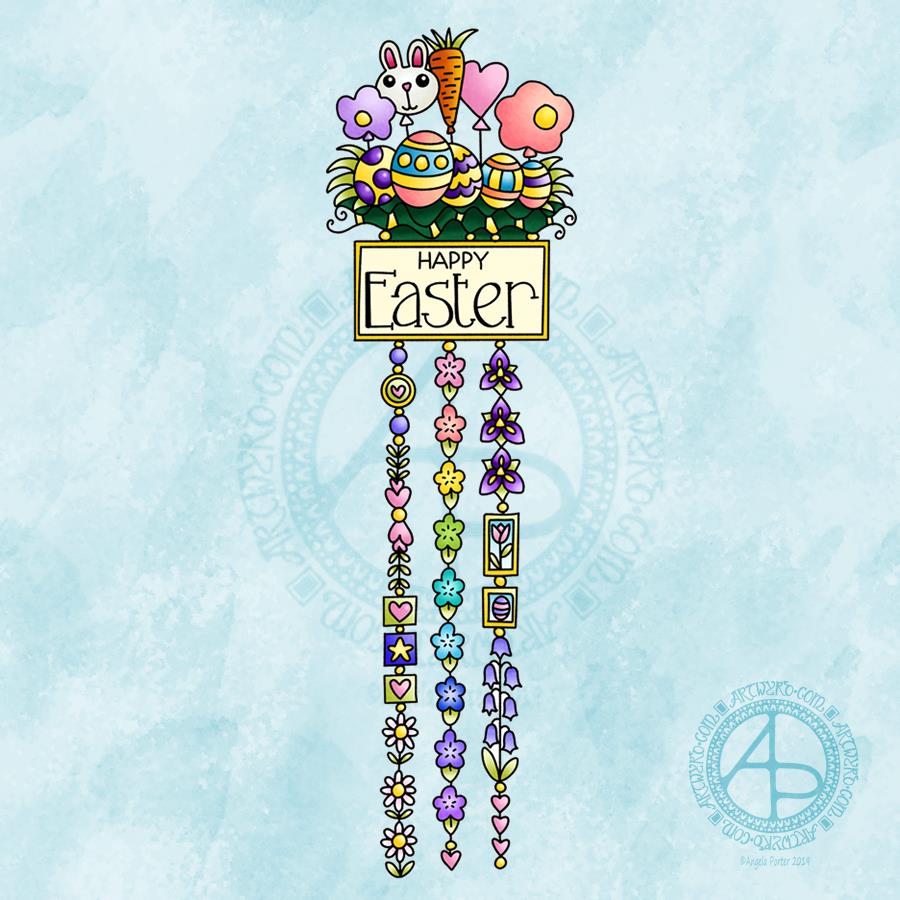
Some of the designs are examples of my organic, entangled style of drawing. Others are repeating, geometric zentangle-style patterns. And then there’s some inspired by Medieval illuminated manuscripts.

I also enjoy working within a clear border. I like the sense of structure it brings to my work. It also satisfies some kind of aesthetic need within me. Every now and then I try work without a border, but the artwork I produce just never feels quite right to me. So, it’s time for me to accept the need for borders is part of my artistic voice.

There is a purpose for me creating these borders. I’m building up a library of them that I can use to embellish quotes and other projects.

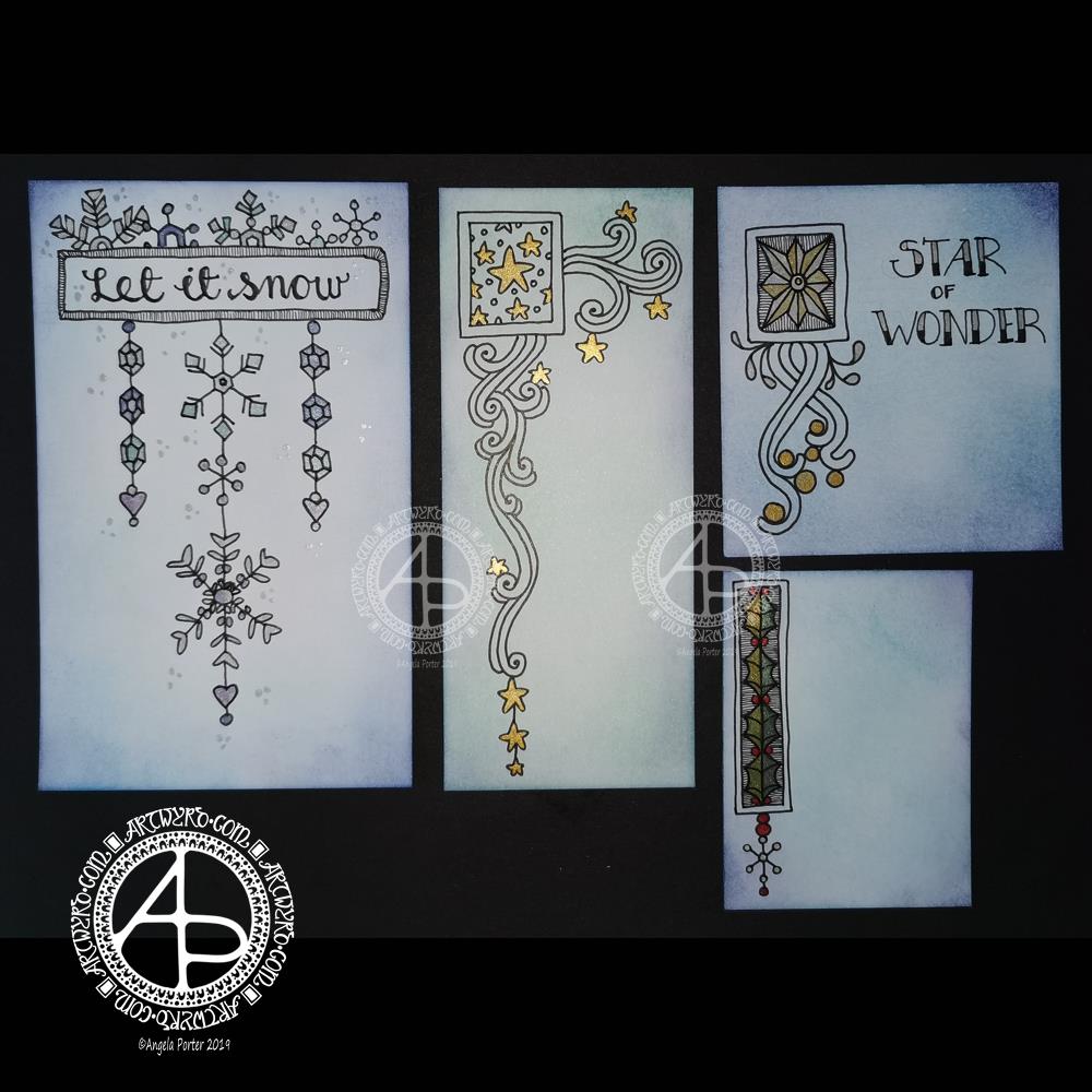
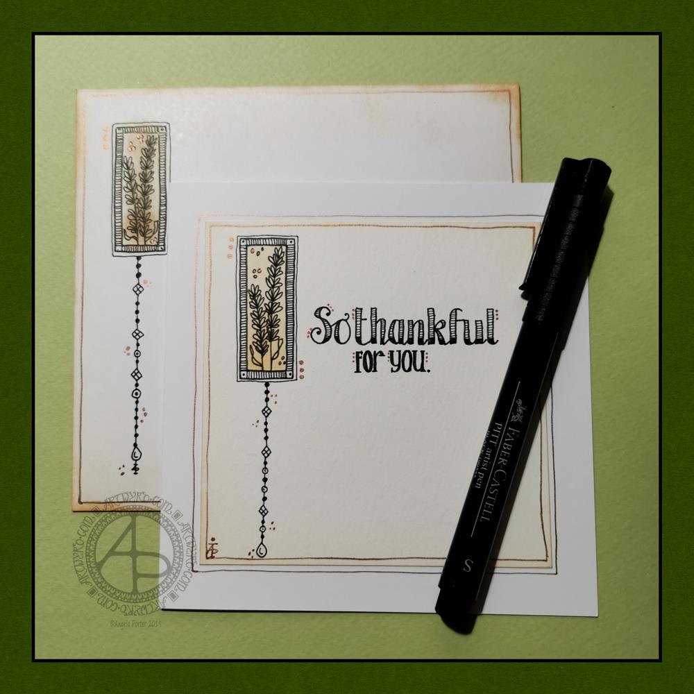
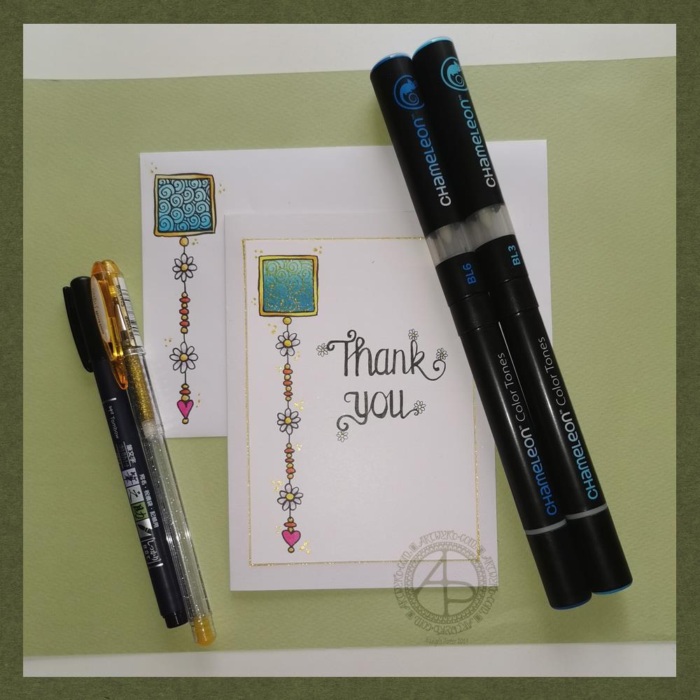
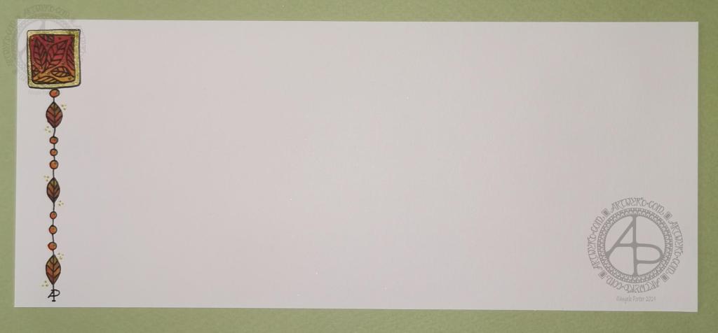
Some of these borders would look fab as greeting cards note cards, bookmarks, and to use in other paper craft projects. They’d also work well as embellishments for BuJo, planner, diary, scrapbook and journal pages.

Others would be a great foundation for dangle designs (my book “A Dangle A Day” is a good place to start drawing dangle designs).

What I do know, is that I find drawing soothing and relaxing. So, I’m going to be spending the rest of my Sunday drawing more borders.

A festive dangle design video

This morning, I made a video of me drawing and colouring this festive dangle design and turning it into a card.

This video shows me drawing in real time, and I hope you enjoy it, despite the wobbliness in places.

Here’s a list of materials I used:

  • 8″x 8″ Winsor and Newton Bristol Board folded to make an 8″ x 4″ card
  • 7″ x 3″ piece of Winsor and Newton Bristol Board to draw the design on
  • Faber-Castell Pitt Artist Pen, medium
  • Pencil and ruler
  • Various Chameleon Color tones marker pens
  • White Uniball Signo gel pen
  • Tombow Mono glue
  • Tumbled Glass Distress Ink and a mini foam blending tool

I hope you have a go at drawing this dangle design and making your own papercraft or craft projects with it. If you do, I’d love to see them!

If you’d like to know more about drawing dangle designs, or would like more inspiration, step by step instructions, and encouraging words, then my book “A Dangle A Day” is a good place to start.

Wintry Dangle Designs

Dangle Designs ©Angela Porter | Artwyrd.com

Yesterday was a crazy busy day with no time for art, let alone blogging!

This morning, I finally had some time to myself. As it’s Friday I wanted to do a dangle design, and I ended up doing four!

I cut the card into the wrong dimensions to create a card, so I thought I’d just make use of the pieces I had and make some custom card blanks and envelopes for them another time.

I coloured the pieces of card with Distress Inks in shades of blue and green. I used Chipped Sapphire, Tumbled Glass, Broken China, Evergreen Bough, Cracked Pistachio and Salty Ocean in various combinations.

These colours gave the card a frosty kind of feel, so I went with some snowy, icy, wintry designs.

I drew the designs and completed the hand lettering with Faber-Castell Pitt Artist pens, which are waterproof.

Plain black lines on the coloured background did look a tad lacking. So, I added some shimmer and colour using Cosmic Shimmer watercolour paints.

I’m not so fussed on the ‘Let it snow’ design. However, I am quite pleased with the others.

I am going to mount them as greeting or note cards. However, the designs would look charming in a BuJo, journal, planner, diary or scrapbook. They could easily be adapted to make bookmarks too, or place cards for a special meal.

I hope you’ll give drawing these designs a go, or use them as inspiration for your own projects. I’d love to see what you create – please tag me on social media so I don’t miss them!

If you’d like to know more about dangle designs and have some guidance and inspiration for them, then my book ‘A Dangle A Day’ is a good place to start.

It’s been nice to have a couple of hours to indulge myself in art. The past four weeks or so have been crazy busy with other projects being quite demanding of my time, mind and energy. However, they will soon be over and my focus can return, properly, to art.

So Thankful

So thankful ©Angela Porter | Artwyrd.com

Today, I have a simple dangle design greeting card along with a coordinating envelope. If you’d like some more ideas, inspiration and step by step instructions for drawing dangle designs then my book, A Dangle A Day, is a good place to start.

Materials and dimensions

4″ x 4″ Strathmore Bristol paper with a vellum finish
5″ x 5″ acid-free white card blank
White envelope that card will fit in
Distress inks in Tea Dye and Rusty Hinge
Small piece of foam and a mini foam blending tool
A piece of card with a 1.5″ x 0.75″ window cut in it to use as a stencil.
Faber-Castell Pitt artist pens in F, S and XS
Ruler and pencil
Adhesive
Glass pen and coppper ink by J Herbin

Making the card.
  1. Use the card stencil and a small sponge dauber to apply a rectangle of Distress Ink in the top left of the 4″ x 4″ top layer. I used Tea Dye to colour the whole rectangle in, followed by a subtle gradient of Rusty Hinge from the bottom up.
  2. Use a mini foam blending tool to add Tea Dye Distress ink to the edge of the top layer.
  3. Use a pen to draw the rectangles around the colour block. I like to do this free-hand as it gives a more organic, human feel to the design.
  4. Draw the sprigs and add the lines to the border. Dots help to add some interest to the more empty parts of the design.
  5. Use a ruler and pencil to lightly draw a vertical line as a guide for the dangle. Also, draw pencil lines as guides for the position and size of the hand lettering. Sketch in the letters of the greeting.
  6. Draw round and diamond shaped beads to form the dangle. I like to finish my dangles with a ‘heavier’ or larger bead.
  7. Ink the letters in. I did some faux calligraphy where I made the down-strokes thicker. I added some lines and shading to the top line.
  8. Carefully erase the pencil lines.
  9. Attach the top layer to the card blank.
  10. I used a glass pen and copper ink to add copper dots to highlight the dangle design and the hand lettering. I also drew a box just inside the top layer and another just outside it on the card blank. Again, I free-handed the lines, embracing the wobbliness.
Making the envelope
  1. I used Tea Dye Distress Ink and a mini foam blending tool to edge both the front and back of the envelope.
  2. I then used a sponge dauber and the card stencil to add a rectangle of Tea Dye ink in the top left.
  3. I drew the design on the envelope as I had on the card, including adding a line border in copper ink.
  4. Finally, I drew similar sprigs on the envelope flap, using the glass pen and copper ink.
Before mailing…

Once I’ve addressed the envelope, I’d apply a thin layer of Distress MicroGlaze to the front and back of the envelope to protect the Distress Ink and drawing from the elements. I’ve done this to other cards and they have traversed the UK and US postal systems with no problems.

Ideas for using the design.

Although I’ve presented this dangle design as a greeting card, which is, I think, a lovely way to share a little bit of artistic loveliness with others, there are many other ways the design could be used, with or without any hand lettering.

In a BuJo, journal, planner or diary it would make a lovely little design to fill in a blank space.

This is a design that would work really well as a bookmark.

I’m sure it would look charming as part of a scrapbook spread.

I also think it would look lovely on a ‘with compliments’ slip or decorating the edge of a hand-written letter.

I’m sure there are many other ways and media that this design would be suited to.

Final thoughts…

I’m really enjoying drawing these kinds of dangle designs. They’re simple and elegant, to my mind anyway. They’re also quite easy to draw.

I do prefer to free-hand the lines and let the wobbliness be part of my signature style. It gives that human, hand-made, hand-crafted feel to the finished project, and a warmth to the finished project.

I work hard at finding a way of drawing digitally that lets me keep this uniquely ‘Angela’ way of expressing myself through line and pattern. I’m still working on it and sometimes get frustrated that, to my eye, my digital art seems too, well digitally perfect.

It’s all part of the process though – learning, developing, experimenting, trying out new ideas, techniques and methods. That’s what helps me grow as an artist.

Dangle Designs 22 Nov 19

Dangle Designs 22 Nov 19 ©Angela Porter | Artwyrd

If you’d like to find out more about drawing dangle designs, then my book “A Dangle A Day” is a good place to start. I’ve created over 120 designs, with step by step instructions, for you to use and inspire you.

It’s Friday, so that means it’s dangle designs today!

I drew these on postcard sized (148mm x 105mm) acid free heavy cartridge paper using a mixture of Tombow fudenosuke and Faber-Castell Pitt Artist pens. I then used Chameleon Color Tones and Color Tops to add some colour to the designs.

Again, I’ve drawn some really simple, cute and whimsical dangle designs that leave plenty of space on the paper for hand lettering or a hand-written note or letter.

Dangle designs are, of course, very versatile. I put these on the edge of a postcard sized piece of paper. However, they could be used as the focal point of a greeting card or note card. Lengthen the dangle, and they’d make cute bookmarks. They’d make interesting designs to fill spaces in a BuJo or scrapbook page. They’d also make interesting focal points on art journal pages.

I’d love to see how you use dangle designs – just tag me in social media!

Thank you card – a dangle design

Friday means it’s time for another dangle design, this time a ‘thank you’ card and coordinating envelope.

In previous weeks I’ve had some fun adding patterns to small blocks of colour. So, I thought I’d run with that idea and turn one into a simple dangle design. The steps I used were the same for the card and envelope.

Card size.

The card is an A6 card and I cut a piece of Winsor and Newton Bristol paper to 5″ x 3.5″ for the card topper. The envelope came with the card blank so is A6 in size too.

How to…

I started by drawing a square of colour using the BL3 (Sky Blue) Chameleon Color Tone pen – no gradient, just pure colour.

Then, I added a gradient of BL6 (Royal Blue) over the base colour. I added pure blender to the Royal blue bullet nib using the mixing chamber. I didn’t use the Color Tops to add Royal Blue to the tip of the Sky Blue pen as I wanted a more subtle colour gradient.

Next, I used a Tombow Fudenosuke pen to draw around the block twice. Then, I added a filler pattern of spirals to the colour block. On the card I used a gold Uniball Signo sparkle gel pen. On the envelope I used the fudenosuke pen.

Now the colour block was decorated I turned my attention to the dangle.I decided to draw one dangle as I thought the design would look too crowded if I ad more. Sometimes, less really is more!

After drawing a faint pencil guide-line, I used a combination of beads, daisy-like flowers and a heart for the dangle. I wanted to keep it nice and simple.

Then it was time to add colour to the outline and design elements. I used the Chameleon Colour tops to add very simple colours. I didn’t do any gradients as the designs were so small. Instead I coloured them in the lightest colour, added a touch of darker colour where I wanted shadow and blended that out with the lighter colour.

I decided to hand letter ‘Thank you’ on the card using a soft nib Fudenosuke pen. I also added some tiny daisies to some of the loops and swirls to tie the hand lettering in with the dangle design.

I then mounted the card ‘topper’ on the card blank and added some gold glitter gel dots around the designs. I also added a gold line around the card topper.

Before I post the card, I’ll use some Micro Glaze from Ranger on the envelope to protect the Tombow pen from water damage.

Reflecting on the project…

Overall, I’m quite pleased with this. In hindsight I wish I’d used the Tombow Fudenosuke pen to draw the spiral pattern on the card. I think it’s a cute, simple and versatile design.

It would make lovely stationery, such as note paper or note cards, along with coordinating envelopes. There are lots of ways the design could be used in BuJos, Planners, Journals, Scrapbooks, and Art Journals. The vertical nature of the design means it would make a lovely bookmark.

How would you use this design? I’d love to hear, so leave a comment!

If you have a go at drawing and using this design then please share your finished products with me – I’d love to see how people use dangle designs!

If you want to learn more about drawing dangle designs then my book ‘A Dangle A Day’ is a good place to start. There’s over 120 designs for you to use as they are or for inspiration for your own designs.

Nearly every Friday I publish a new dangle design on my blog for more inspiration.

A simple and elegant Autumn Dangle Design.

Autumn Dangle Design ©Angela Porter | Artwyrd.com

Hello to November, and farewell Inktober. My blog post today looks a bit bare compared to my Inktober creations. However, I have neglected my dangle designs during October, so now’s the time to get back on track with them

Today, I’ve created a simple and elegant dangle design with an autumn colour scheme that could be used in so many different ways. I’ve also put together a step by step set of instructions how you too can create this design (and hoping that it’s not so simple that I come across as patronising).

This is my first time posting a set of instructions – post a comment to let me know what you think of them and if you’d like to see more of them in the future.

I’ve put the dangle design on one side of a slip of paper that would make a perfect compliment slip or a note to slip in with a gift, or just as a short letter to a friend. It would also be perfect for a coordinating piece of envelope art!

This dangle design would be absolutely charming as an embellishment in a BuJo, planner, scrapbook or art journal. It would also make a darling bookmark.

It would be easy to turn this design into a greeting card as well.

So many possible uses for such a simple design.

I do hope that you will give drawing dangles a go – no matter whether you think you’re good at drawing or not! This design is made out of just simple shapes; it’s the colour that brings it to life and masks all kinds of imperfections.

If you’d like more ideas for dangle designs, then please take a look at my book ‘A Dangle A Day’ – it’s filled with examples of dangle designs with step by step instructions and helpful and encouraging words of advice.

One step at a time to a dangle design.

Step 1

Step 1
Draw a square in the top left corner of a piece of paper. I used a piece of paper measuring approx 8.25″ x 3.5″. I used a Tombow Fudenosuke brush pen to draw the box, and outline it. I deliberately made the squares less than perfect to give that human touch as well as a uniquely ‘me’ way of drawing boxes. The Fudenosuke pen allows me to draw lines of variable width quite easily, which adds to the charm of the box. The ink in the pen is also alcohol marker friendly.
Letting your drawings be less than perfect is what makes them uniquely yours.

Step 2

Step 2
I used Chameleon marker pens (BR3 “Cinnamon” and YO3 “Warm Sunset”) to colour the inner box. Autumn is definitely here in the UK, and the combination of these colours reminded me of the leaves. However, you could use any colour combination you like and any medium you prefer to use.
Chameleon pens make it so easy to create a colour gradient – I prefer them to other alcohol marker pens, even Copics.

Step 3

Step 3
I added a simple leaf pattern to the coloured box using a Sakura Pigma Sensei 04 pen.

Step 4

Step 4
Add the dangle! For this dangle I used the same kind of leaves as in the box for a consistent design. I added some round beads as ‘spacers’. Finally, I added my ‘symbol’ to the end of the dangle.
Also, I did draw a faint pencil line with a ruler to help me keep my dangle hanging straight, more or less!

Step 5

Step 5
I coloured the beads and leaves in using the same colours of Chameleon Markers. I then decided I needed to add some shimmer and shine; I used a Uniball Signo gold glitter gel pen to colour in the border of the box and to add some dot highlights here and there.
The Chameleons caused the Sakura Pigma Micron ink to smear a little – I always forget that happens! I should’ve used the Tombow pen again. Oh well, you live and learn, eventually!

‘F’ Dangle Design

'F' Dangle Design ©Angela Porter | Artwyrd.com
‘F’ Dangle Design ©Angela Porter | Artwyrd.com

Friday is dangle day!

Today I thought I’d create a monogram dangle design for ‘F’ with some cute fish, as well as a couple of shells. Of course a whimsical crown with golden foliage tops the design off just nicely!

Fish means a water theme, so I used blues, and blue-greens quite liberally. However, golds and shades of red and magenta really give a tropical feel to the jolly little fish.

Fairly simple gradient colouring this week. No drop shadows, other than the one around the whole design.

Looking at it now, I think the monogram might benefit from a drop shadow or two. However, it’ll do just fine as it is I think.

It would be lovely on a card for someone with the initial F, especially if they love fish or fishing. Of course the colours can be adjusted accordingly, as can the particular kind of fish. I’m particularly fond of cute, whimsical, happy little fish.

It could happily find a place in a BuJo, scrapbook, planner, journal or diary. Making the monogram narrower and the dangles longer, it would make a lovely bookmark too, I think.

Just a little mention here about my book “A Dangle A Day”. It’s a dangle design tutorial book, Angela -style dangles that is. Lots of monograms as well as dangle designs for use around the year. It’s a good place for beginners, but is also full of ideas for the more experienced among you. And, of course, I add a new dangle design on this blog most Fridays which you can use for inspiration.
I’d love to see what you create! Tag me on social media!

Dangle Day Friday!

May Dangle Design © Angela Porter 2019

It’s Friday so it’s dangle day! Today I’ve chosen to share with you my May dangle design from my book ‘A Dangle A Day

I’ve used the line-art design and just recoloured it. Different colours give a different ‘feel’ to the dangle design!

The design itself is made up of simple, repeating motifs added in chains of charms. Simple, cute, charming, whimsical and pretty too, even if I say so myself.

This would be lovely as the monthly cover page in a BuJo (bullet journal), planner, journal, diary.

A different sentiment could be used in the banner to make it a perfect greeting card or note card.

One of the dangles would look rather cute as a bookmark; it’s easy to lengthen the designs.

Yesterday

I took a little trip out on my own yesterday. It’s one of my goals as I progress along my healing journey from CPTSD to get out and about more. I chose to go somewhere familiar to me, the little town of Glastonbury in Somerset.

I was able to wander around shops, but when it came for lunch I totally balked at going into any cafe at all. Issues surrounding my body size rose up and I just couldn’t go into them.

So I went home.

The whole trip exhausted me. More of an emotional exhaustion though from being brave and keeping it together and interacting with people in shops.

When I got home I had something to eat, which then resulted in an upset stomach/digestive system.

I then went to bed and slept.

I’m still exhausted today.

But I did it. I went somewhere a bit further afield (a round trip of nearly 180 miles is a little further afield to me!) by myself.

I’m surprised at how much the trip has exhausted me given I went somewhere I know, that is familiar, and I used to feel quite comfortable there.

All the same, it’s highlighted some issues I have with how I view myself.

Don’t get my wrong, I am overweight, but my mind seems to think I’m the size of a small elephant and I won’t fit anywhere. I have no idea of my body size other than the size of clothes I wear, which tend to be larger than I need as I think I’m larger than I am.

Is this body dysmorphia? I don’t know.

So, when a cafe or shop is busy I tend to walk away fearing there’ll be nowhere I can fit into, as well as me being overwhelmed in crowds and crowded places.

The complex layers of how CPTSD affects my daily life and activities a lot of people take for granted. It also shows some more of the barriers I need to overcome in order to finally live the kind of life I’d like to, one that isn’t quite as limited by CPTSD as it has been through most of my life.

Easter Dangle Design

Easter Dangle Design © Angela Porter 
From 'A Dangle A Day'
Easter Dangle Design © Angela Porter
From ‘A Dangle A Day’

This cutely whimsical dangle design is from my tutorial book ‘A Dangle A Day’, which has the step-by-step instructions for drawing this design. They really are simple to draw, and the hand lettering is based on your own writing style too.

For this design, I chose spring-time colours, more pastel than bright. Of course Easter eggs and a bunny balloon had to feature, along with all the lovely spring flowers and a sprinkling of hearts. I even snuck a star in, hearts and stars being some of my favourite motifs to include.

This design would make a really cute greetings card or notecard. The dangles can easily be drawn shorter. It would also make a lovely bookmark. As a BuJo page, planner page or an element on a scrapbook page it would be lovely.

Using Nuvo drops or Ranger’s Stickles or similar to make dots where the beads are as well as a sprinkling of them around the top of the design would add some lovely dimension and sparkle for sure.

I do hope you give drawing dangle designs a go. They are so much fun and a lot easier to do than you think they are. They can also be used in many, many ways, especially when it comes to sharing love with others at different times and events throughout the years of our lives.

About the drawing…

When it came to designing the dangle designs and monograms for A Dangle A Day, I started off by sketching the idea out on dot grid paper using either a pencil or a pen. I could then adjust the lines and draw guidelines in to help me with the design quite easily.

When I was happy with the sketch, I scanned it in and then re-drew it in a digital form. For drawing digitally I use a Microsoft surface pen directly on the screen of a Microsoft surface book or surface studio. This is like drawing with pen or pencil on paper, or even painting or colouring.

So, although my designs were created in a digital environment, they were still very much drawn by hand.

I used very little in the way of smoothing lines – only enough to remove the wobbliness that comes from the great sensitivity of the pen and screen position sensoring stuff, and never used the predictive line tools available in Autodesk Sketchbook Pro. I worked out how to set up pens that would leave a line texture similar to the pens I like to use to draw on paper with. I determined I wouldn’t make everything perfect, that there would be that perfectly imperfect human touch to everything that I created. I also made sure I included examples of dangles drawn and coloured on paper and turned into cards, bookmarks and BuJo pages too.

Working digitally to draw and then colour the designs allowed me to edit, erase, adjust and keep the image free of smudges and blots that would require re-drawing. It also made it a lot easier to make the edits my lovely editors suggested to improve the work.

It certainly saved a lot of time scanning image after image in – something I find extremely tedious.

Although I may have used digital tools to draw with, the techniques I used were the same as if I’d drawn on paper with pen and then coloured with various traditional media.

I also have to say that the year to year and a half ago when I was colouring these I was only just starting to explore the realms of digital colouring and I hadn’t quite worked out exactly how I’d like to do it. They worked out good enough, but now I think I’d approach it a bit differently.

I had such a lot of fun creating the dangle designs season by season, month by month, celebration by celebration and I hope you have the same amount of fun doing this too.