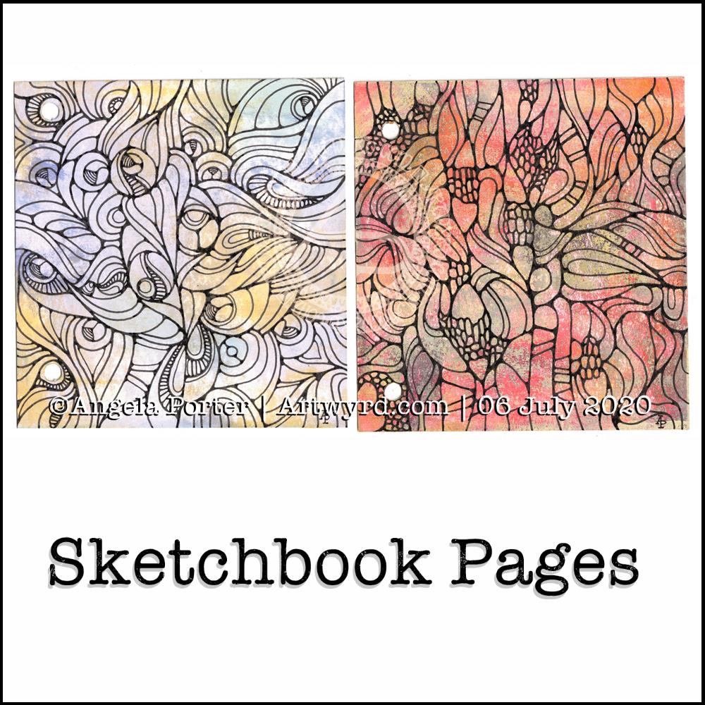
Sketchbook Pages

Yesterday, I made a pair of covers for a custom sketchbook. I also spent some time cutting up watercolour and mixed media paper to go into it. Each piece of paper is approx. 4″ square.

I then added colour to both sides of four of the pieces of mixed media paper (Claire Fontaine brand) using PaperArtsy Fresco paints, Daler-Rowney gold acrylic paint and a piece of Cut’n’Dry foam from Ranger.

I also added watercolour to four pieces of watercolour paper, just on one side. I used this as an opportunity to just play with colour, no idea in my head of what to create.

Later on in the day, I wielded Faber-Castell Pitt artist pens on one of the Fresco paint coloured pages (the one on the right). I just wanted to draw. No preconceptions of what would appear on the page.

It’s been quite a while since I’ve created art like this and I actually got a great deal of satisfaction out of the process. That surprised me, as black lines on colour had really not felt right to me for a long while now. It may be that I just needed a break from this style of art.

This morning, I took another piece of the Fresco paints coloured paper and drew a different design. Again, it was something I really enjoyed doing.

I’m really quite pleased with both designs. I think I’ll be using them for inspiration for some watercolour pieces in the near future. My only problem is whether to draw the designs out in black ink, dark pencil or faint pencil before adding watercolour! I think I’ll need to try these out before settling on a method.

What I also really like is working on a small scale. I’ve always been a ‘dainty’ artist; I find it hard to work on large scale artworks. It’s the fine, intricate detailed drawings and paintings that I enjoy creating, as well as abstract art.

Also, I really like the texture the Fresco paints leave on the paper – both for drawing on and the visual interest they create in the background. I’m so glad I haven’t done that destash and tidy-up yet as I know these paints were some of the items that were due to go. Now, they’ll be kept. I’m also glad I have a good supply of the Cut’n’Dry foam too.

I wish I’d placed the holes in the covers of my custom sketchbook closer together. That way I’d be able to add rectangular pieces of paper more easily. That’s something for me to consider the next time I make such a sketchbook.

I have some discs and a punch for disc binding in my stash. This may be something to consider using for another custom sketchbook as it would easily allow the inclusion of different sized papers in the sketchbook. Now my mind is working on using that! I think I need to jot my ideas down in my journal.

What I like about these kinds of systems is the ability to add different papers in where I want them – to shuffle things around as needed.

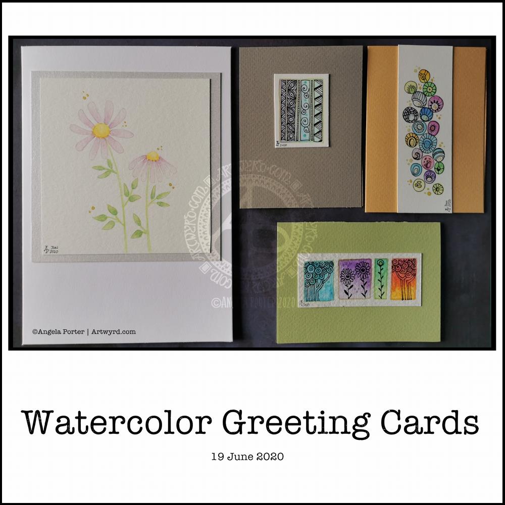
Watercolor Greeting Cards

About the artwork

I needed a quiet morning, again, today. So, I thought I’d dig out my Caran D’Ache Supracolor Soft watercolour pencils and try some stuff with them.

I wanted to use them to draw a flower, or two, and then use water to create a watercolour effect. The result you can see on the left-hand side card. I’ve left loads of white space on this card, which is unusual for me. I couldn’t resist, however, adding some gold dots around the flowers. The colour of the petals was so delicate that I used a 2H 3mm pencil to outline them and the leaves. Just for info, the piece of watercolour paper measures 4″ x 4″.

For the other cards, I just wanted to work with the pencils to create gradients and abstract patterns in colour. I drew on the little panels using a 0.25 Copic Multiliner SP pen and added some lines and details with metallic gold watercolour. These cards are approx 3″ x 4″ in size.

Watercolor pencils are nice to use when it comes to drawing in colour with them, then activiating the colour with water. They really glow on 100% cotton rag paper (bottom right) compared to the other cellulose papers.

Cute and whimsical cards, some very detailed, one not quite so. But a nice way to spend my morning.

Self-care time, again.

There’s a situation going on around me that is draining my emotions greatly at this time. I’m doing my best to not become overly emotionally involved in it, but it’s difficult when it’s to do with people you care about.

It all has a knock on effect with me. I’m anxious, tired verging on exhausted, really grumpy, irritable, and lacking patience at this time. I’m also not able to concentrate too well. These are all behaviours I could do without in dealing with this situation. Yet I’m exhausted by it.

I have been meditating, making sure I take time to do self-calming and self-soothing activities, such as my morning art, Though I have work to do for contracts, I need to take a day away from everything, if I can.

I know there are lessons for me to learn about myself in how I’m reacting ot the situation, stuff from my past that wasn’t processed during my EMDR therapy. If I can work out what it is, I can work through it myself now. Organising EMDR therapy isn’t possible at this time, with lockdown still very much in operation and me being very nervous of going out into the world as well.

So, I’m going to make time today to drink tea, meditate, journal and try to get to the bottom of my own issues and start doing what I can to work through them and heal the past traumas that are causing my reactions at this time.

I think I’ll also take time to crochet (I started a mosaic blanket earlier this week) and watch films or crafting shows on the TV. Eat healthily – I have a yearning for brussel sprouts, of all things! And take time away from social media and news. I may even pick up my flute and play it, for the first time in months and months.

Journal Making – 16 May 2020

The Cover

On waking this morning, I wanted to work on the cover of my journal.

Yesterday evening, I managed to get a coat of gesso on to the cover and painted edge closest to the wire binding with gold. In hindsight, that may not have been the best idea.

I knew I wanted to use my silhouette iris drawing on the cover. Irises are my favourite flowers. Also, my aim for my journal is to use my own art as much as possible.

So, I printed out an arrangement of three irises, tore them out and coloured the paper with Distress Inks.

For the background, I used a piece of Claire Fontaine mixed media paper. I coloured it with Distress Inks – Old Paper, Tea Dye, a touch of Iced Spruce and a dusting of Vintage Photo around the edges and here and there on the main sheet.

This I adhered to the cover. I’d cut it narrower than the cover so that I didn’t have to butt it up against the wire binding. That’s why I wanted a gold border there.

Anyway, I decided to put some old book paper behind the irises. I added some ink to the edges of this paper too. I then glued them in place, along with the flowers.

I drew a border around this page with a copper-coloured Sakura Metallic gelly roll pen. Then, I used a gold glitter Uniball Signo pen to fill the background with tiny spirals.

I wanted to add the definition of ‘journal’ to the front cover. So, I did the typography in Affinity Publisher and printed it. After tearing the meaning out, I used Old Paper and Tea Dye Distress Inks to colour the paper, followed by Vintage Photo to ink the edge.

I then glued this to an old book page, tore that out and edged the paper with ink once again.

Before adhering the page to the cover, edged the paper with Ground Espresso Distress Ink as I didn’t think the edge was dark enough. I also coloured the edge of the journal cover with the same ink to hide the white.

An application of Distress Micro-glaze to seal the page and I could stick it to the cover.

I love the subtle sparkle of the spiral pattern on the cover. The micro-glaze picked up some of the fine glitter. It also makes the cover sheet feel very smooth.

I’m not happy with the gold edge to the journal, but I will, no doubt, find a way to make it look much better. Otherwise, I’m quite happy with the cover. I think it needs something else there, but I’ll work out what that is in the fullness of time.

The first three pages.

Page 1 I’ve shown before, and it’s now complete (apart from me adding journaling to the envelopes and other spaces.)

On page 2, I’ve added an experiment I did with Tombow Dual Brush Pens and a blender pen to draw designs on paper. I have some ATC cards coloured in the same blues/purples as the background of this page, so I’ll be finding a way to display them on the page when I’ve finished them.

Page 3 is a tiered series of simple pockets. I made them by tearing the paper of each page and layering them to create the pockets. The inserts are pieces of Claire Fontaine Mixed media paper that have been coloured in the same colours of Distress Inks as the pockets have been. I used Distress Oxide Inks for the pockets.

I’m not really sure what I’m going to do with the third page, yet. It will come to me, I’m sure!

Adobe Spark

I thought that I’d use Adobe Spark to make a short video rather than posting a montage of photos. I uploaded it to my channel on youtube so I could share it via social media more easily.

Adobe Spark is straightforward to use, and it does have a free option, though I pay about £10 per month for it. It makes creating simple content for social media really easy.

How am I feeling

I’m feeling much better today. The headache and light-headed/dizzy/drowsy feelings were with me for the whole day, including upset tummy and digestive system. I had weird pains in my right eye too. I slept a lot during the day, and just took it easy when I was awake. I wanted to crochet in the evening but found it hard to do even something familiar to me.

My digestive system is still uncomfortable and not quite right today, and I’m now beginning to feel rather tired. Like I’ve already done too much today. So, I’m going to be taking it easy for the rest of the day.

Making a simple sketchbook or journal pocket.

Making a Simple Pocket © Angela Porter | Artwyrd.com

Yesterday, I said I’d like to make simple pockets for my sketchbook-journal to hold my artwork rather than gluing it to the pages. So, this morning, I started my day looking on YouTube for some ideas and this video by joie de fi was the top of the list.

While I was watching it, I thought I’d make an instruction sheet to go in my sketchbook (or my virtual one I’m making in One Note).

I picked up some quadrille paper and wrote and drew as I watched the method for the first pocket. I worked in ink without pencil sketches and I made quite a few mistakes. A Tipp-Ex mini pocket mouse was my friend.

When I’d finished the instruction sheet, I scanned it in and used Autodesk Sketchbook Pro to remove the square grid from the paper, clean up some smudges, and correct minor errors.

Then, I added some colour to help bring out the drawings, but also to help with the instructions.

I’ve yet to make this kind of pocket, but I’m sure I’ll be able to do so quite easily now.

Reflecting on the artwork/illustration

This was a lot of fun for me to do. It’s something I’ve not done much since my days as a science teacher, or a learner in school and university myself. I’d forgotten how much I enjoy creating instruction sheets with my own drawings on them.

Back in those days, I would’ve used a ruler to draw straight lines, pencil for the diagrams, pen for the words, and little or no colour. Here, I free-handed the drawings, wobbly lines and all. The colour also adds life and dimension to the diagrams/drawings/illustrations.

The layout of the instructions may not be the best and easiest to follow through. That’s because I did this as I was watching the first part of the video. I think that for the next one, I need to sketch out the steps and notes first, and then work on organising them more clearly.

Yes, I’m going to do some more instruction sheets like this!

I also really need to do more hand lettering! I’ve lapsed in my writing practice, that’s for sure.

Entangled designs

Entangled Designs ©Angela Porter | Artwyrd.com

I’ve had a nice couple of hours this morning playing around with drawing and paper coloured (and not coloured) with Distress Ink.

I started with drawing the border with the flower straight onto the coloured square of mixed media paper (top right).

For the middle design, I cut a rectangular panel of Distress Ink coloured mixed media paper and glued it to another piece of coloured paper. Then, I decorated the panel along with some simple patterns spilling onto the background.

The bottom right design uses a square piece of plain paper with a small rectangle cut from some Distress Inked paper. I used a die with a stitched detail to cut this panel out along with a Sizzix Big Shot die cutting machine.

I’m not at all fussed on the stitched detail in this case. However, I do like the contrast of the coloured panel against the white background.

I do have a fair few pieces of paper coloured with Distress Inks, so I think some fairly quick, simple and soothing designs will be done over the next day or several.

Not sure what I’ll do with them yet. If you have any helpful suggestions, leave a comment! Also, leave a comment to let me know which design is your favourite.

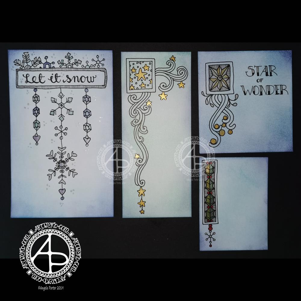
Wintry Dangle Designs

Dangle Designs ©Angela Porter | Artwyrd.com

Yesterday was a crazy busy day with no time for art, let alone blogging!

This morning, I finally had some time to myself. As it’s Friday I wanted to do a dangle design, and I ended up doing four!

I cut the card into the wrong dimensions to create a card, so I thought I’d just make use of the pieces I had and make some custom card blanks and envelopes for them another time.

I coloured the pieces of card with Distress Inks in shades of blue and green. I used Chipped Sapphire, Tumbled Glass, Broken China, Evergreen Bough, Cracked Pistachio and Salty Ocean in various combinations.

These colours gave the card a frosty kind of feel, so I went with some snowy, icy, wintry designs.

I drew the designs and completed the hand lettering with Faber-Castell Pitt Artist pens, which are waterproof.

Plain black lines on the coloured background did look a tad lacking. So, I added some shimmer and colour using Cosmic Shimmer watercolour paints.

I’m not so fussed on the ‘Let it snow’ design. However, I am quite pleased with the others.

I am going to mount them as greeting or note cards. However, the designs would look charming in a BuJo, journal, planner, diary or scrapbook. They could easily be adapted to make bookmarks too, or place cards for a special meal.

I hope you’ll give drawing these designs a go, or use them as inspiration for your own projects. I’d love to see what you create – please tag me on social media so I don’t miss them!

If you’d like to know more about dangle designs and have some guidance and inspiration for them, then my book ‘A Dangle A Day’ is a good place to start.

It’s been nice to have a couple of hours to indulge myself in art. The past four weeks or so have been crazy busy with other projects being quite demanding of my time, mind and energy. However, they will soon be over and my focus can return, properly, to art.

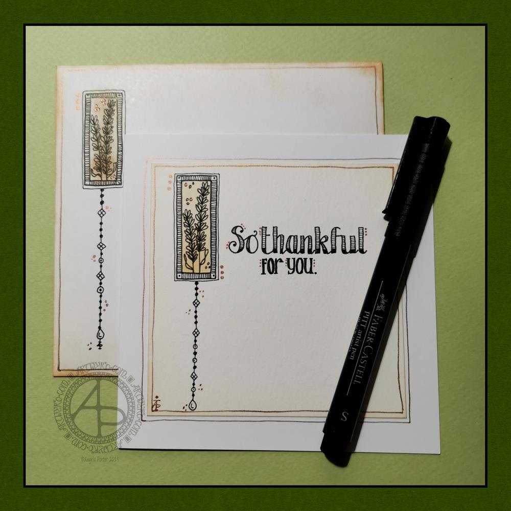
So Thankful

So thankful ©Angela Porter | Artwyrd.com

Today, I have a simple dangle design greeting card along with a coordinating envelope. If you’d like some more ideas, inspiration and step by step instructions for drawing dangle designs then my book, A Dangle A Day, is a good place to start.

Materials and dimensions

4″ x 4″ Strathmore Bristol paper with a vellum finish
5″ x 5″ acid-free white card blank
White envelope that card will fit in
Distress inks in Tea Dye and Rusty Hinge
Small piece of foam and a mini foam blending tool
A piece of card with a 1.5″ x 0.75″ window cut in it to use as a stencil.
Faber-Castell Pitt artist pens in F, S and XS
Ruler and pencil
Adhesive
Glass pen and coppper ink by J Herbin

Making the card.
  1. Use the card stencil and a small sponge dauber to apply a rectangle of Distress Ink in the top left of the 4″ x 4″ top layer. I used Tea Dye to colour the whole rectangle in, followed by a subtle gradient of Rusty Hinge from the bottom up.
  2. Use a mini foam blending tool to add Tea Dye Distress ink to the edge of the top layer.
  3. Use a pen to draw the rectangles around the colour block. I like to do this free-hand as it gives a more organic, human feel to the design.
  4. Draw the sprigs and add the lines to the border. Dots help to add some interest to the more empty parts of the design.
  5. Use a ruler and pencil to lightly draw a vertical line as a guide for the dangle. Also, draw pencil lines as guides for the position and size of the hand lettering. Sketch in the letters of the greeting.
  6. Draw round and diamond shaped beads to form the dangle. I like to finish my dangles with a ‘heavier’ or larger bead.
  7. Ink the letters in. I did some faux calligraphy where I made the down-strokes thicker. I added some lines and shading to the top line.
  8. Carefully erase the pencil lines.
  9. Attach the top layer to the card blank.
  10. I used a glass pen and copper ink to add copper dots to highlight the dangle design and the hand lettering. I also drew a box just inside the top layer and another just outside it on the card blank. Again, I free-handed the lines, embracing the wobbliness.
Making the envelope
  1. I used Tea Dye Distress Ink and a mini foam blending tool to edge both the front and back of the envelope.
  2. I then used a sponge dauber and the card stencil to add a rectangle of Tea Dye ink in the top left.
  3. I drew the design on the envelope as I had on the card, including adding a line border in copper ink.
  4. Finally, I drew similar sprigs on the envelope flap, using the glass pen and copper ink.
Before mailing…

Once I’ve addressed the envelope, I’d apply a thin layer of Distress MicroGlaze to the front and back of the envelope to protect the Distress Ink and drawing from the elements. I’ve done this to other cards and they have traversed the UK and US postal systems with no problems.

Ideas for using the design.

Although I’ve presented this dangle design as a greeting card, which is, I think, a lovely way to share a little bit of artistic loveliness with others, there are many other ways the design could be used, with or without any hand lettering.

In a BuJo, journal, planner or diary it would make a lovely little design to fill in a blank space.

This is a design that would work really well as a bookmark.

I’m sure it would look charming as part of a scrapbook spread.

I also think it would look lovely on a ‘with compliments’ slip or decorating the edge of a hand-written letter.

I’m sure there are many other ways and media that this design would be suited to.

Final thoughts…

I’m really enjoying drawing these kinds of dangle designs. They’re simple and elegant, to my mind anyway. They’re also quite easy to draw.

I do prefer to free-hand the lines and let the wobbliness be part of my signature style. It gives that human, hand-made, hand-crafted feel to the finished project, and a warmth to the finished project.

I work hard at finding a way of drawing digitally that lets me keep this uniquely ‘Angela’ way of expressing myself through line and pattern. I’m still working on it and sometimes get frustrated that, to my eye, my digital art seems too, well digitally perfect.

It’s all part of the process though – learning, developing, experimenting, trying out new ideas, techniques and methods. That’s what helps me grow as an artist.

Dangle Designs 22 Nov 19

Dangle Designs 22 Nov 19 ©Angela Porter | Artwyrd

If you’d like to find out more about drawing dangle designs, then my book “A Dangle A Day” is a good place to start. I’ve created over 120 designs, with step by step instructions, for you to use and inspire you.

It’s Friday, so that means it’s dangle designs today!

I drew these on postcard sized (148mm x 105mm) acid free heavy cartridge paper using a mixture of Tombow fudenosuke and Faber-Castell Pitt Artist pens. I then used Chameleon Color Tones and Color Tops to add some colour to the designs.

Again, I’ve drawn some really simple, cute and whimsical dangle designs that leave plenty of space on the paper for hand lettering or a hand-written note or letter.

Dangle designs are, of course, very versatile. I put these on the edge of a postcard sized piece of paper. However, they could be used as the focal point of a greeting card or note card. Lengthen the dangle, and they’d make cute bookmarks. They’d make interesting designs to fill spaces in a BuJo or scrapbook page. They’d also make interesting focal points on art journal pages.

I’d love to see how you use dangle designs – just tag me in social media!

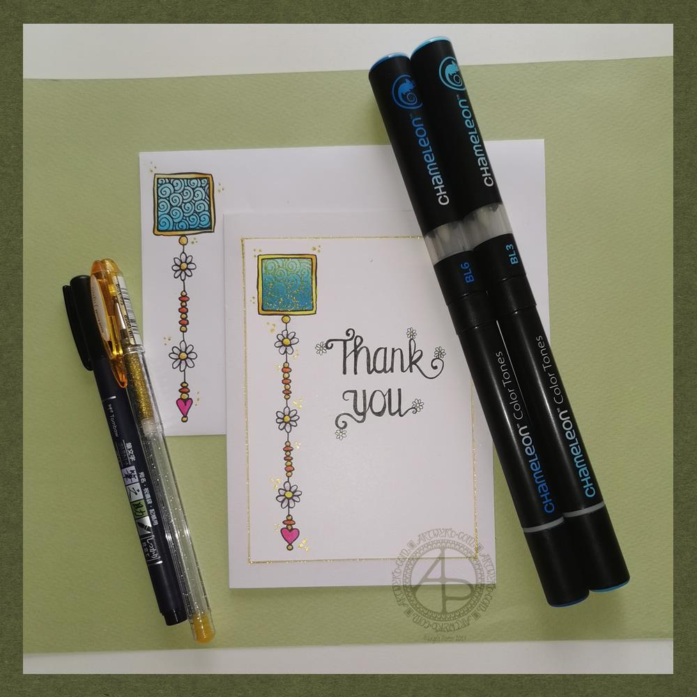
Thank you card – a dangle design

Friday means it’s time for another dangle design, this time a ‘thank you’ card and coordinating envelope.

In previous weeks I’ve had some fun adding patterns to small blocks of colour. So, I thought I’d run with that idea and turn one into a simple dangle design. The steps I used were the same for the card and envelope.

Card size.

The card is an A6 card and I cut a piece of Winsor and Newton Bristol paper to 5″ x 3.5″ for the card topper. The envelope came with the card blank so is A6 in size too.

How to…

I started by drawing a square of colour using the BL3 (Sky Blue) Chameleon Color Tone pen – no gradient, just pure colour.

Then, I added a gradient of BL6 (Royal Blue) over the base colour. I added pure blender to the Royal blue bullet nib using the mixing chamber. I didn’t use the Color Tops to add Royal Blue to the tip of the Sky Blue pen as I wanted a more subtle colour gradient.

Next, I used a Tombow Fudenosuke pen to draw around the block twice. Then, I added a filler pattern of spirals to the colour block. On the card I used a gold Uniball Signo sparkle gel pen. On the envelope I used the fudenosuke pen.

Now the colour block was decorated I turned my attention to the dangle.I decided to draw one dangle as I thought the design would look too crowded if I ad more. Sometimes, less really is more!

After drawing a faint pencil guide-line, I used a combination of beads, daisy-like flowers and a heart for the dangle. I wanted to keep it nice and simple.

Then it was time to add colour to the outline and design elements. I used the Chameleon Colour tops to add very simple colours. I didn’t do any gradients as the designs were so small. Instead I coloured them in the lightest colour, added a touch of darker colour where I wanted shadow and blended that out with the lighter colour.

I decided to hand letter ‘Thank you’ on the card using a soft nib Fudenosuke pen. I also added some tiny daisies to some of the loops and swirls to tie the hand lettering in with the dangle design.

I then mounted the card ‘topper’ on the card blank and added some gold glitter gel dots around the designs. I also added a gold line around the card topper.

Before I post the card, I’ll use some Micro Glaze from Ranger on the envelope to protect the Tombow pen from water damage.

Reflecting on the project…

Overall, I’m quite pleased with this. In hindsight I wish I’d used the Tombow Fudenosuke pen to draw the spiral pattern on the card. I think it’s a cute, simple and versatile design.

It would make lovely stationery, such as note paper or note cards, along with coordinating envelopes. There are lots of ways the design could be used in BuJos, Planners, Journals, Scrapbooks, and Art Journals. The vertical nature of the design means it would make a lovely bookmark.

How would you use this design? I’d love to hear, so leave a comment!

If you have a go at drawing and using this design then please share your finished products with me – I’d love to see how people use dangle designs!

If you want to learn more about drawing dangle designs then my book ‘A Dangle A Day’ is a good place to start. There’s over 120 designs for you to use as they are or for inspiration for your own designs.

Nearly every Friday I publish a new dangle design on my blog for more inspiration.

More mail art

More Mail Art © Angela Porter | Artwyrd.com

After a very late night talking to a friend and not enough sleep, today is a self-care day. I’m going to go back to bed soon and try to sleep some more before driving for four hours tonight.

While waiting for sleep to catch up with me again, I thought I’d make some mail art. The photo isn’t the best; I’ve said it before, I’m not a brilliant photographer. However, I’m sure you get the idea. Also, I wanted to catch a glimpse of the metallic highlights I’ve added to this card, so the angle of the photography was just plain weird!

My brain seemed to have ticked over some ideas while I was asleep and I woke with some things I thought I could try out. This card is the result of some of them.

I started by using a 4″ x 4″ piece of watercolour paper and applying Distress inks to it to create a background.

I used a torn piece of paper to mask off the bottom of the panel so that could use an ink blending tool to apply Pine Needles and Crushed Olive Distress inks to create some land.

A sky was required, so I used Broken China Distress ink to create it so that it faded from top to the land.

I then sprayed the background with a mixture of gold Perfect Pearls and water to create a less perfect appearance.

While this was drying, I flipped through my Zibladone (visual dictionary) and found some motifs I liked. I used Pitt Artist pens from Faber-Castell to draw the motifs on the panel. I chose these pens because they’re waterproof when dry and I knew I wanted to add colour and sparkle to them later on.

To give a sense of dimension, I used black pens for the foreground motifs and a grey brush pen to create the foliage in the background.

To help the seed pods stand out, I used washes of Dusty Concorde and Seedless Preserves Distress inks. Then, I used some Cosmic Shimmer gold iridescent watercolour paint to add the gold highlights.

Once everything was dry, I used a piece of Cut’n’Dry foam to edge the panel with Dusty Concorde Distress Ink. The design was framed nicely by this edging; it also added a sense of dimensionality.

Next, I mounted the panel on a piece of black card and then adhered these layers to a 6″ x 6″ blank Kraft card, all done with Tombow Mono glue.

Finally, I carefully used a gold glitter Uniball Signo gel pen to add lines around the edge of the design panel and also the black mat.

I then turned my attention to the envelope. I drew some more of the seed pods before adding a light wash of Dusty Concorde and Seedless Preserves Distress Inks, being careful not to overwet the envelope. I added dots of gold watercolour paint to the seed pods and the space around them too, making sure I left enough space to write the name and address of the eventual recipient.

I’m quite pleased with the card. I’ve done this style of drawing digitally in the form of a mandala, but never like this. However, as I look at the card, it seems to need a focal motif in the space between the seedpods. I may be wrong; it may just be my constant need to fill up space with line and pattern and the difficulty I have in leaving white space in a design.

I shall let the card ‘sit’ for a while before making my mind up on that issue.