Journal Making – 16 May 2020

The Cover

On waking this morning, I wanted to work on the cover of my journal.

Yesterday evening, I managed to get a coat of gesso on to the cover and painted edge closest to the wire binding with gold. In hindsight, that may not have been the best idea.

I knew I wanted to use my silhouette iris drawing on the cover. Irises are my favourite flowers. Also, my aim for my journal is to use my own art as much as possible.

So, I printed out an arrangement of three irises, tore them out and coloured the paper with Distress Inks.

For the background, I used a piece of Claire Fontaine mixed media paper. I coloured it with Distress Inks – Old Paper, Tea Dye, a touch of Iced Spruce and a dusting of Vintage Photo around the edges and here and there on the main sheet.

This I adhered to the cover. I’d cut it narrower than the cover so that I didn’t have to butt it up against the wire binding. That’s why I wanted a gold border there.

Anyway, I decided to put some old book paper behind the irises. I added some ink to the edges of this paper too. I then glued them in place, along with the flowers.

I drew a border around this page with a copper-coloured Sakura Metallic gelly roll pen. Then, I used a gold glitter Uniball Signo pen to fill the background with tiny spirals.

I wanted to add the definition of ‘journal’ to the front cover. So, I did the typography in Affinity Publisher and printed it. After tearing the meaning out, I used Old Paper and Tea Dye Distress Inks to colour the paper, followed by Vintage Photo to ink the edge.

I then glued this to an old book page, tore that out and edged the paper with ink once again.

Before adhering the page to the cover, edged the paper with Ground Espresso Distress Ink as I didn’t think the edge was dark enough. I also coloured the edge of the journal cover with the same ink to hide the white.

An application of Distress Micro-glaze to seal the page and I could stick it to the cover.

I love the subtle sparkle of the spiral pattern on the cover. The micro-glaze picked up some of the fine glitter. It also makes the cover sheet feel very smooth.

I’m not happy with the gold edge to the journal, but I will, no doubt, find a way to make it look much better. Otherwise, I’m quite happy with the cover. I think it needs something else there, but I’ll work out what that is in the fullness of time.

The first three pages.

Page 1 I’ve shown before, and it’s now complete (apart from me adding journaling to the envelopes and other spaces.)

On page 2, I’ve added an experiment I did with Tombow Dual Brush Pens and a blender pen to draw designs on paper. I have some ATC cards coloured in the same blues/purples as the background of this page, so I’ll be finding a way to display them on the page when I’ve finished them.

Page 3 is a tiered series of simple pockets. I made them by tearing the paper of each page and layering them to create the pockets. The inserts are pieces of Claire Fontaine Mixed media paper that have been coloured in the same colours of Distress Inks as the pockets have been. I used Distress Oxide Inks for the pockets.

I’m not really sure what I’m going to do with the third page, yet. It will come to me, I’m sure!

Adobe Spark

I thought that I’d use Adobe Spark to make a short video rather than posting a montage of photos. I uploaded it to my channel on youtube so I could share it via social media more easily.

Adobe Spark is straightforward to use, and it does have a free option, though I pay about £10 per month for it. It makes creating simple content for social media really easy.

How am I feeling

I’m feeling much better today. The headache and light-headed/dizzy/drowsy feelings were with me for the whole day, including upset tummy and digestive system. I had weird pains in my right eye too. I slept a lot during the day, and just took it easy when I was awake. I wanted to crochet in the evening but found it hard to do even something familiar to me.

My digestive system is still uncomfortable and not quite right today, and I’m now beginning to feel rather tired. Like I’ve already done too much today. So, I’m going to be taking it easy for the rest of the day.

Ephemera

Ephemera ©Angela Porter |Artwyrd.com

I woke this morning with the desire to make a little box to store ephemera in. So I did.

I used a video from PootlesPaperCraft to help me make the box, which is 4″ square with a depth of 2″, so sizeable enough for some of my smaller ephemera such as inchies and little shrink plastic charms (you can just see them peeking out from under the envelopes to the left of the photo).

I used plain, white card for the box base, which I coloured with Tea Dye, Rusty Hinge and Vintage Photo Distress Inks. For the top, I used a piece of Tim Holtz card from my stash that I’ve had for a number of years. This I grunged up with Vintage Photo and Rusty Hinge Distress Inks.

Once I made the box up, I used Aged Mahogany to distress the edges of the box.

I coloured a square piece of white card with Aged Mahogany and Rusty Hinge Distress Inks and then used a light brown pen to draw a zentangle design on it. This panel was layered on a piece of the same Tim Holtz card I used to make the lid, and then I adhered it to the box.

The box really needed a label to identify it’s contents. Now, I could’ve printed the label out, but I thought this would be an opportunity to practice my hand lettering, which I did.

Then, I aged the label with Aged Mahogany Distress Ink, applied lightly over the face and a bit darker around the edges. Next, I layered the label on another piece of the Tim Holtz paper. Before adhering the label to the box lid, I edged the panel with some Rich Gold Starlights paint from Imagination Crafts.

It’s been a long time since I made any boxes, but they really are easy enough to do. I need to make a longer, thinner box to store tags and other bits and bobs in, once I work out the size I need to make.

Art Journal WIP

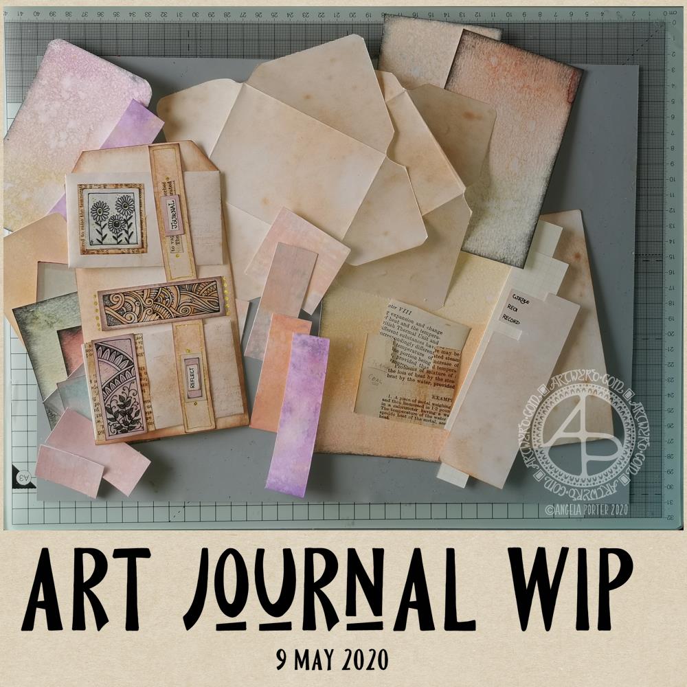
Art Journal WIP © Angela Porter | Artwyrd.com

I’ve been awake since around 4 am yet again, and after watching a couple of journal making videos on youtube by Wendy’s Journal Adventure and Tracie Fox LoveJunk Journals, I wanted to get up and have a go at creating a tri-fold tag for my own art journal.

I had an idea that I can use the little drawings I like to do as ephemera and embellishments and focal points in my art journal, rather than using ephemera from other sources like books, printables, and so on. I’m sure I’ll find more uses for them if I persevere with this project.

So, back to the tri-fold tag. It was my plan to make such a tag for my art journal. However, as usual, my plans often take a slightly different route!

I started by working out the size of tri-fold tag I wanted to make – to fit an A5 sized art journal.

I settled on a piece of mixed media paper cut down to 11.5″ x 7″, which I scored at 3.75″, 4″, 7.75″ and 8″ to create the three tags joined by hinges. I cut the top corners off each tag panel.

I coloured the front and back of the paper using Distress Oxide inks and sprayed water to distress the surface more. Then, I used vintage photo Distress ink to edge all the sides and folds to frame the panels .

I’d chosen colours that would go with some ATC s I was drawing last night while attending a webinair and listening to the speakers. However, the Distress Oxide inks resulted in a much brighter colour and I really wasn’t happy with the result. I will use this panel to use as a reference in future, not so much for sizes but for ideas for pockets and panels and envelopes and so on.

So, I started again. I used Distress Oxide inks, but this time I used tea dye and vintage photo, applying them as lightly as I could. I also coloured some copier paper using the same colours in Distress Inks, with a hint of rusty hinge added to the mix.

I was much happier with the colours this time around.

I liked the idea of using a ‘belly band’ with little envelopes tucked into it. So, I used 5″ square pieces of the coloured copier paper to make some little envelopes (2.5″ x 3″). Two of these would fit neatly on one of the panels. So, I made a 0.75″ x 7″ belly band, and coloured it with the same inks as the panels. I applied thin beads of glue to the ends and centre of the belly band and then adhered it to the panel, off-set to the right of the centre line.

When the glue dried, I had two sections that would hold one envelope each.

My next job was to rummage through my stash of coloured papers to find ones that would go together and were sympathetic with the background.

I drew some panels to add to the envelopes and also the space between them. I backed the panels with vintage book paper. Then, I hand lettered some words on a piece of coloured copier paper. I chose ‘Journal’ and ‘Reflect’ from the selection, cut them out. I used both vintage book paper and a piece of coloured paper behind them to make labels that I attached to the belly band above each envelope.

Finally, for now, I used a gold glitter Signo gel pen by Uniball to add dots and highlights.

It was then that I realised I really wasn’t happy with the tri-fold tag as I’d made it. So, I set about cutting the tags apart so I had three individual tags. I want to join them together in a different way, using hinges of some kind.

But for now, tiredness has caught up with me, as well as the need for some breakfast. So, I will put my project to one side for now and return to it later.

Reflections

I’m not entirely sure where I’m going with this, not yet anyway. I kind of like what I’ve seen other people do as far as ideas go for pockets, tags, labels, envelopes, pouches and all kinds of ephemera for art journals. However, they’re also not really ‘me’. I’d like to find a way of expressing ‘me’ in an art journal.

The one I have, in an A4 sketchbook is fine, and a perfect place to try things out. But, I’d like to do a smaller art journal that has sturdier, mixed media paper in it.

I do know I want to make use of my own artwork. Today, I drew the designs onto the coloured card. However, I quite like the idea of building up a digital library of my own drawings and designs that I could print out on paper and colour accordingly.

Although I hand lettered the words I used today, part of me isn’t happy with them and wants to create them in Affinity Publisher.

All the paper I start with is bright white in colour. Perhaps I could look at using different papers and colours of paper for future projects.

One other thing I’m doing, is keeping notes and diagrams showing templates and dimensions for various ephemera.

I’m babbling here, now. The early morning and lack of enough sleep last night is really catching up with me now. Time to post this then go get breakfast and more tea!

Backgrounds a-plenty

Backgrounds a-plenty ©Angela Porter | Artwyrd.com

I’ve spent a very enjoyable few hours this morning creating a plethora of gloriously coloured and distressed backgrounds for use with my drawings and art. I will be scanning them in to create digital backgrounds too, but only when I’m going to draw on one. I’d get overwhelmed if I tried to do that task all in one go!

How I created the backgrounds.

The papers I used are all mixed media – either ClaireFontine or Daler-Rowney. They were cut to sizes that would be suitable for mounting on cards.
They’re a mixture of the following approximate sizes:
9″ x 3″; 8″ x 2″; 4″ x 4″; 3″ x 5″; 2.5″ x 4.5″; 4.5″ x 2″; 3″ x 4″; 4.5″ x 1.5″
just in case you’re curious.

They are all coloured with Distress Oxide Inks. I only have the first two collections released by Ranger; I do intend to complete the collection in the future.

For some, I used a soft Brayer roller to add the Distress Oxide to a gel printing plate. I then either sprayed water on the plate in a fine spray, or I splattered drops of water colour on to it before pulling the print with a piece of paper.

I tried brayer-ing the Ink directly to paper, but wasn’t all that happy with the results until I sprayed them with water.

My favourite way of adding colour, however, was to use a piece of Cut and Dry foam to add the ink. I tapped the black, denser foam side onto the ink pad and used that to spread the colour around the paper. I then sprayed with water.

Sometimes I’d go back and add another layer of colour, and then spray with water.

I used a heat gun to dry the paper after spraying with water or colour, which helps the distress oxide inks to ‘bleach’.

I’d add some more colour if I thought the background needed it, and then spray again, until I was happy with the end product.

My final task was to frame the backgrounds by adding a black edging. I used a foam finger dauber and black soot Distress Ink to do this, spraying the papers once more to let the edging ‘bleed’ a little.

I’m really happy with most of the backgrounds I’ve made and I’m looking forward to using them to create little pieces of art, and adding to my library of digital backgrounds I can use for my digital art. These are a little small, maybe. However, Now I’ve found out how I like to create a background with the cut and dry foam I’ll be making some A4 sized backgrounds.

Update on my back and other things.

My back is feeling a lot better today. However, I still get stiff all too easily and I still have pain down the sides of my thighs.

My mosaic crochet wrap is coming along – it’s all I’ve been focusing on while my back has been too painful to sit and draw.

The world is greening quickly. I’ve not spent much time at my studio area while my back has been sore, so I’m surprised to see the trees that were bare just a couple of days ago are now clothed in spring hues. That cheers my heart!

I’m coping quite well with the ‘lock-down’. I am trying not to get sucked into the whirling maelstrom of news and views about Coronavirus and other events going on in the world.

The virus crisis is happening, even though it’s not touched me personally. It will occur whether I pay attention to it or not. I know being stressed, anxious, fearful will have a negative impact on my immune system, so the calmer I can stay, the better. That doesn’t mean I don’t care. I do. Deeply. The only thing I can do is to stay home and not be a vehicle for transmission of the virus from person to person.

I now need a fresh mug of tea, so that’s all the words I have…for now.

So Thankful

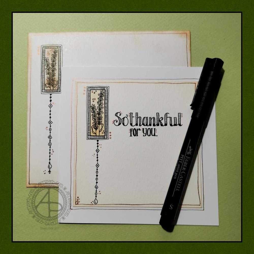
So thankful ©Angela Porter | Artwyrd.com

Today, I have a simple dangle design greeting card along with a coordinating envelope. If you’d like some more ideas, inspiration and step by step instructions for drawing dangle designs then my book, A Dangle A Day, is a good place to start.

Materials and dimensions

4″ x 4″ Strathmore Bristol paper with a vellum finish
5″ x 5″ acid-free white card blank
White envelope that card will fit in
Distress inks in Tea Dye and Rusty Hinge
Small piece of foam and a mini foam blending tool
A piece of card with a 1.5″ x 0.75″ window cut in it to use as a stencil.
Faber-Castell Pitt artist pens in F, S and XS
Ruler and pencil
Adhesive
Glass pen and coppper ink by J Herbin

Making the card.
  1. Use the card stencil and a small sponge dauber to apply a rectangle of Distress Ink in the top left of the 4″ x 4″ top layer. I used Tea Dye to colour the whole rectangle in, followed by a subtle gradient of Rusty Hinge from the bottom up.
  2. Use a mini foam blending tool to add Tea Dye Distress ink to the edge of the top layer.
  3. Use a pen to draw the rectangles around the colour block. I like to do this free-hand as it gives a more organic, human feel to the design.
  4. Draw the sprigs and add the lines to the border. Dots help to add some interest to the more empty parts of the design.
  5. Use a ruler and pencil to lightly draw a vertical line as a guide for the dangle. Also, draw pencil lines as guides for the position and size of the hand lettering. Sketch in the letters of the greeting.
  6. Draw round and diamond shaped beads to form the dangle. I like to finish my dangles with a ‘heavier’ or larger bead.
  7. Ink the letters in. I did some faux calligraphy where I made the down-strokes thicker. I added some lines and shading to the top line.
  8. Carefully erase the pencil lines.
  9. Attach the top layer to the card blank.
  10. I used a glass pen and copper ink to add copper dots to highlight the dangle design and the hand lettering. I also drew a box just inside the top layer and another just outside it on the card blank. Again, I free-handed the lines, embracing the wobbliness.
Making the envelope
  1. I used Tea Dye Distress Ink and a mini foam blending tool to edge both the front and back of the envelope.
  2. I then used a sponge dauber and the card stencil to add a rectangle of Tea Dye ink in the top left.
  3. I drew the design on the envelope as I had on the card, including adding a line border in copper ink.
  4. Finally, I drew similar sprigs on the envelope flap, using the glass pen and copper ink.
Before mailing…

Once I’ve addressed the envelope, I’d apply a thin layer of Distress MicroGlaze to the front and back of the envelope to protect the Distress Ink and drawing from the elements. I’ve done this to other cards and they have traversed the UK and US postal systems with no problems.

Ideas for using the design.

Although I’ve presented this dangle design as a greeting card, which is, I think, a lovely way to share a little bit of artistic loveliness with others, there are many other ways the design could be used, with or without any hand lettering.

In a BuJo, journal, planner or diary it would make a lovely little design to fill in a blank space.

This is a design that would work really well as a bookmark.

I’m sure it would look charming as part of a scrapbook spread.

I also think it would look lovely on a ‘with compliments’ slip or decorating the edge of a hand-written letter.

I’m sure there are many other ways and media that this design would be suited to.

Final thoughts…

I’m really enjoying drawing these kinds of dangle designs. They’re simple and elegant, to my mind anyway. They’re also quite easy to draw.

I do prefer to free-hand the lines and let the wobbliness be part of my signature style. It gives that human, hand-made, hand-crafted feel to the finished project, and a warmth to the finished project.

I work hard at finding a way of drawing digitally that lets me keep this uniquely ‘Angela’ way of expressing myself through line and pattern. I’m still working on it and sometimes get frustrated that, to my eye, my digital art seems too, well digitally perfect.

It’s all part of the process though – learning, developing, experimenting, trying out new ideas, techniques and methods. That’s what helps me grow as an artist.

Two little books I made

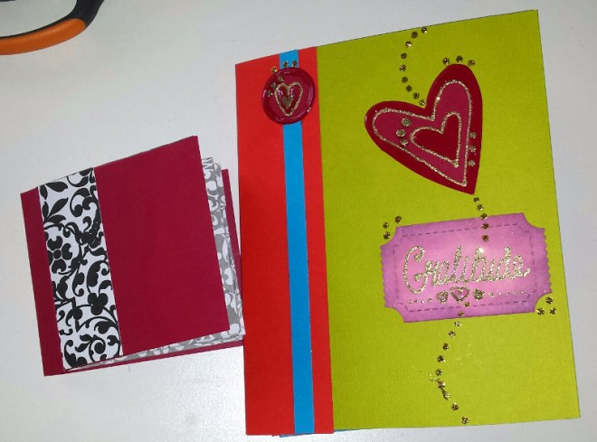
TwoLittleBooks_AngelaPorter_Artwyrd_8March2015

I’ve spent much of the day so far making these two little books.  The smaller one is made out of one piece of 12″x12″ designer paper and some raspberry red cardstock with some strips of designer paper for the front.  The interior of the book has little pockets as well as places for words and pictures on the front and back of the pockets.  It’s not perfect, not by a long shot, but it’s a learning experience.

The bigger one is made from envelopes – I have blue and red ones that vibrate against each other.  I’ve decorated the front but am not too happy with it.  I’ve not done a brill job of putting the book together either.

However, in both cases I see it as a learning experience, and they are perfectly imperfect given that they are my first attempt at such projects.

This youtube video from split coast stampers shows how to make the small meander book.

This youtube video from papertreyinks shows how to make the envelope mini book.

Planting seeds of love work in progress and a new little pretty…

Planting Seeds of Love – Work in Progress

Planting seeds of love WIP 8Apr12 © Angela Porter 2012

This is a work in progress, and I’m not at all sure about it.  I had the title first (I’m working on loving and accepting myself), then a mental image of what I wanted to do, but I’m not at all sure about what has resulted from it.  Usually by this stage in a piece of art I know if it’s working or not, and this one … well I’m not at all sure.  I have to complete the outlines, add textures/patterns and metallic/iridescent accents, but I’m not entirely sure I actually want to finish this one.  I’m wondering how much the resistance to this piece of art comes from my lack of satisfaction with the art itself and how much comes from what it is representing – my inner work at this time… An interesting point to muse, eh?

I’ve had a lot of emotional turmoil in the past few weeks while I’ve been off work with laryngitis, much of it to do with allowing myself to love, respect and care for myself and to let go of various negative belief systems from the past.  It’s also involved a change in my value system, and something that hasn’t been easy to do. The words/mental idea sprung up from this work, as I’ve already mentioned.  It’s been a bit of a tough time, and sometimes it’s hard to find balance.

It’s also had an effect on my creativity.  Instead of painting/drawing/sewing I’ve been lost in either reading or knitting and watching DVD after DVD.  A positive from this is that I have created, after 30 years or so, a knitted throw/blanket – which has amazed me as I’ve always got bored with the process after a little while, but not this time.  It isn’t a pretty thing, it’s very random in terms of colours and knitted patterns and crocheted squares, but it’s mine and I love it very much, mainly because it’s proven to me that I can persevere with a project such as this, and there is benefit for me in doing something that is simple, creative in a crafty way, and also rather meditative in nature.

I now have another blanket/throw on the go – and it’s certainly going to be ‘different’, but very much ‘me’.

Little Pretty 7April2012

Little Pretty 7 Apr 12 © Angela Porter 2012

This is a teenytiny piece of textile art, approx. 4.5cm x 4.5cm (1.75″x1.75″) that I completed yesterday. The silver japan threads were added during a sewing/craft afternoon at O’Callaghan’s Coffee House yesterday.  The other stitches and beads were added later.

It will eventually be for sale on Etsy, when I work out what price to put on it, and whether to offer it framed or ready to frame … I dislike trying to put prices on my creations.

Why is that, I wonder?  I think it’s linked to me still not quite believing my artwork has value, or that my ‘doodles’ are truly art.  I have made the leap to the recognition that what I think of doodling is really my version of intuitive art, art that expresses who I really am, what I am inside, and the richness of that inner self and my love of colour and flow and swirl and abstract pattern.

I really do need to work on a statement of me as an artist that fully expresses who I am in terms of art and what my kind of art represents.  Now that’s a scary thing to do as it will lay part of me bare -though those who read my art aright will already have sussed that part of me out!