Pen drawing on 5.5″ x 4″ (14.5cm x 10cm) Canson Imagine paper coloured with Victorian Velvet Distress Ink.
I’m not at all sure about this design. It started fairly well with the hand-lettering and corner designs. But it went a bit downhill from there, in my opinion. In hindsight, the use of pink metallic pen was a bit of a mistake too. Seemed a good idea at the time though!
By the end of the drawing process, I think it is more a melange of heart-themed tangle patterns than anything else. That is how I’d describe today’s video for sure.
It’s Saturday. I woke early and got to work in one of my sketchbooks where I’m drawing thumbnails and design elements with a focus on things starry. I needed a break from that, so turned my attention to creating a mandala.
Pink seems to be a bit of a thing at the moment, today it being a dusky shade of pink.
Oddly, the mandala has a star-shaped motif in the centre. That was not a conscious decision!
Anyway, it’s been a nice way to spend an hour or two while listening to podcasts. But, after another mug of mocha, I’ll be going back to work in my sketchbook. Which is also pleasurable, but in a different kind of way. My drawings are definitely sketchy, but that’s the whole point! Just getting ideas down. A nice way to spend a lockdown day.
It’s funny how colours seem just right one day, and the next day I wonder what on earth I was thinking at the time.
Yesterday’s mandala, with it’s kind of yellow-brown background just doesn’t seem ‘right’ today.
I often mention about how I feel I really struggle with colour at times, but feel much better if I stick with simple color palettes, even monochrome ones, more or less.
So, this morning I wanted to draw a mandala, as is so often the case. They give me a chance to practice drawing digitally and using pattern and texture within them too.
The drawing was just fine and dandy, nearly always a pleasurable experience and I end up with a design I like well enough.
Then, there’s the coloured background. Today I wanted a soft pink colour. I like the colour I’ve chosen. Black lineart would look start on it, to my mind, but a soft, warm, cream was just perfect. It looks almost like lace.
And I can breathe a sigh of relief as my faith in my colour sense is restored somewhat. Monochrome is the way to go, unless it’s coloring templates. Though perhaps I should try a monochrome colour scheme for them, or at least analogous colours with a pop of complementary here and there. I’ll see what happens.
For the rest of my day, I’m going to be gathering sketches of ideas and elements for the coloring book I’m working on, and creating a mandala has got me somewhat in the right frame of mind to do this.
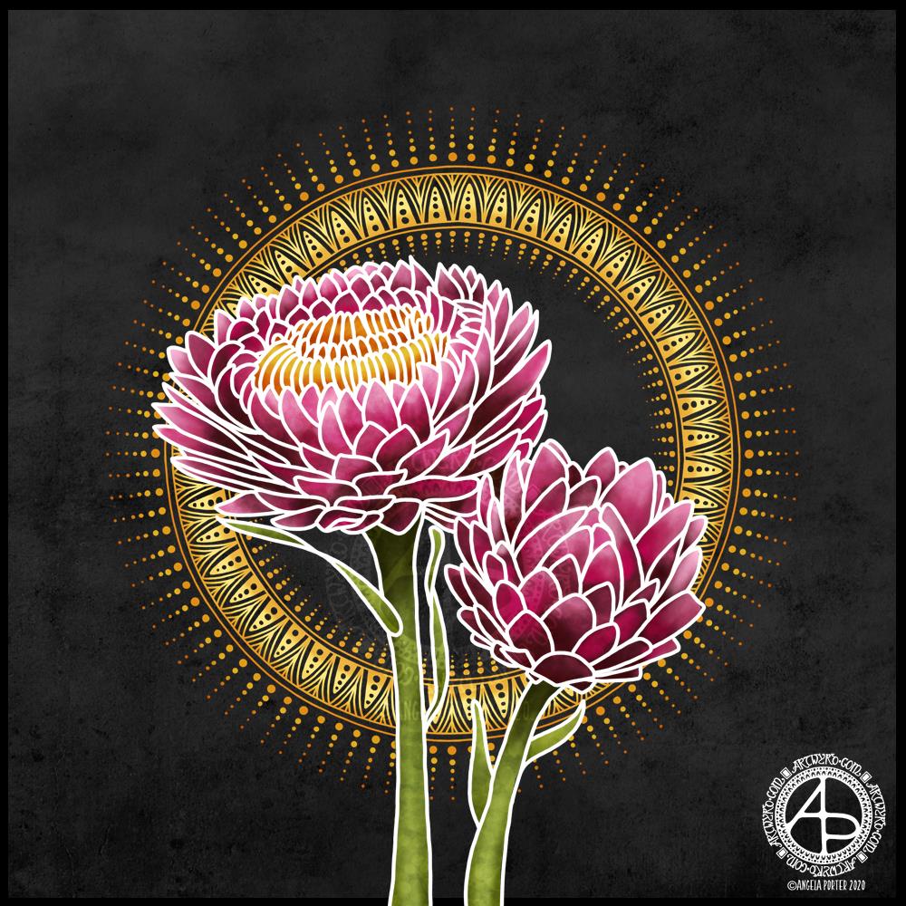
Yesterday, I was out with the DSLR and my friend Liz. We had a need to visit the sea. As we live in the Valleys of South Wales in the UK, we’re not far from either the sea or mountains, towns or country. So, we paid a visit to The Glamorgan Heritage Coast, specifically Southerndown and Newton in Porthcawl. If you’d like to read more about our day out and see some of my photos, visit Curious Stops and Tea Shops.
Today, after a busy week with people and errands, I need a day at home. I also needed some time to just create.
I turned to my folder of photos from my trip to the National Botanic Gardens of Wales last August and found a picture of flowers that inspired me to create this floral design.
I started with the line art with the intention of using it as a guide for painting each petal. However, once I’d completed the line art and added the base colour and some of the brighter tones, I realised I wanted to keep the white lines because it was reminding me of batik or silk painting, particularly as I’d chosen a black background to work against.
I love the vibrance of the colours against the dark background, again very reminiscent of silk painting/batik.
I reined in my usual inclination to intricate, detailed mandalas and kept this particular one quite simple. I decided to echo the golden tones of the stamens in the centre of the flower, and I think that has worked out really, really well.
If I were to try to change something in this artwork, I may try a gold outline – metallic gold. But I like it very much, just as it is.
My tools were Autodesk Sketchbook Pro, Microsoft Surface Studio and Microsoft Surface Slim Pen.
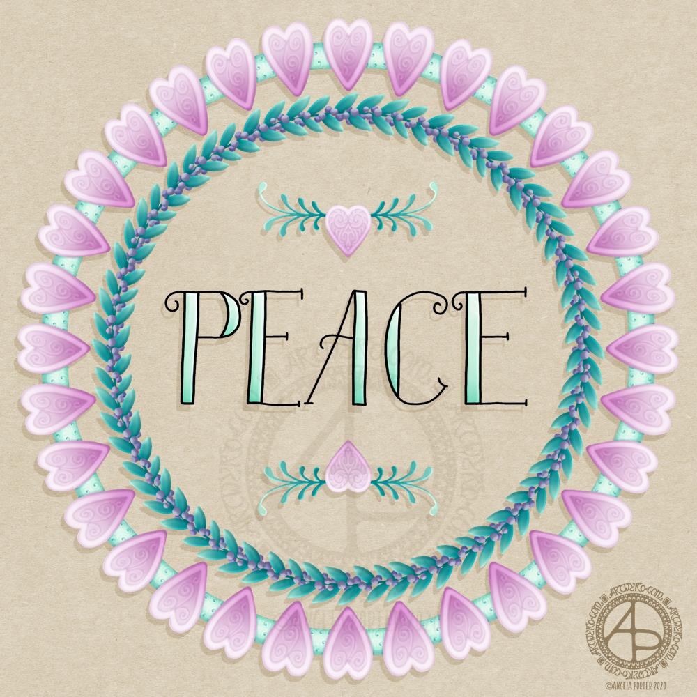
The border was a design I drew back in January using Uniball Unipin and/or Sakura Pigma micron pens on dot grid paper. I’ve added colour and texture digitally, as well as the typography.
Artistically, I’m feeling cute and whimsical this morning. So a little bit of hand lettering along with some simple, cute and whimsical wreaths have satisfied this feeling.
Pretty hearts with some spiral details that remind me of iced biscuits (cookies to you lovely people in America). Soft pink for love. Evergreen foliage for peace and compassionate love to grow and flourish around this planet. Purple berries to create a harmonious balance of awareness and peace.
Perhaps there’s more symbolism and messages in my art, something that belies my belief I’m just creating pretty things.
I did create this art digitally using Autodesk Sketchbook Pro, Microsoft Surface Studio and a Microsoft Surface Pen.
I woke earlier with the need for some self-caring, self-soothing art and a mandala is the only thing that does that at times.
I created a background using various shades of pink and red Distress Inks (Worn Lipstick, Abandoned Coral and Candied Apple). I scanned it in and then drew the mandala digitally.
I needed pink as a soothing colour, so I chose a monochrome (more or less) colour scheme for the mandala.
I knew I wanted a Star Wars quote, and I chose this one from The Clone Wars. I feel a Star Wars marathon coming on later today; something else that I find soothing.
First, though, I want to get some work done on colouring another illustration for the Spectacular Sea-life coloring book. This is yet more self-soothing.
I enjoyed creating yesterday’s skull on top of a mandala-like ring that I wanted to do another one. I particularly enjoyed using the monochrome colour scheme that gives the mandala element an ethereal, ghostly feel.
Today’s prompts from the Instagrammers’ lists are:
Badger skull from @book_polygamist
Agaricus mushrooms from @nyan_sun
Dreamdex tangle pattern from @havepen_willdraw
A pink badger is an in-joke amongst some champions and staff at the Time to Change Wales campaign; pink is also the dominant colour in the Time to Change Wales logos and so on. So, using pink as my monochrome colour was a no-brainer.
As badgers live amongst trees, mushrooms and falling leaves needed to be added, also giving a nod to it being Autumn here in the northern hemisphere.
I enjoyed drawing this illustration. I also think my shading on the skulls is improving. It’s taken some time to get more confident with higher contrast shades of colour to get the dimension I’d like.
On a related note, yesterday I received a copy of ‘Skulls’ by Simon Winchester – a book full of photographs of all kinds of skulls. I’ve not had a good browse of it yet, but it looks fabulous. I think it’s safe to say that I’ve fallen in love with drawing skulls – in a few different styles. I’m sure I have a lot more to explore in the remaining days of Inktober and the days, weeks, months and years ahead.
Today I thought I’d create a monogram dangle design for ‘F’ with some cute fish, as well as a couple of shells. Of course a whimsical crown with golden foliage tops the design off just nicely!
Fish means a water theme, so I used blues, and blue-greens quite liberally. However, golds and shades of red and magenta really give a tropical feel to the jolly little fish.
Fairly simple gradient colouring this week. No drop shadows, other than the one around the whole design.
Looking at it now, I think the monogram might benefit from a drop shadow or two. However, it’ll do just fine as it is I think.
It would be lovely on a card for someone with the initial F, especially if they love fish or fishing. Of course the colours can be adjusted accordingly, as can the particular kind of fish. I’m particularly fond of cute, whimsical, happy little fish.
It could happily find a place in a BuJo, scrapbook, planner, journal or diary. Making the monogram narrower and the dangles longer, it would make a lovely bookmark too, I think.
Just a little mention here about my book “A Dangle A Day”. It’s a dangle design tutorial book, Angela -style dangles that is. Lots of monograms as well as dangle designs for use around the year. It’s a good place for beginners, but is also full of ideas for the more experienced among you. And, of course, I add a new dangle design on this blog most Fridays which you can use for inspiration. I’d love to see what you create! Tag me on social media!
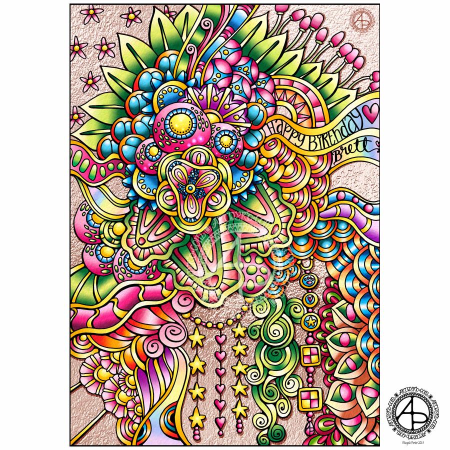
I drew the design on Winsor and Newton Bristol Board using Unipin pens and then I’ve added colour digitally, as well as a rose gold coloured and textured background.
I chose pink as a fairly dominant colour as Brett loves pink so much.
Oh, to colour I used Autodesk Sketchbook Pro, Microsoft Surface Pen and Microsoft Surface Studio.
So Angela, how have you been?
I’ve been quiet on social media over the past few days. I’ve needed some quiet time to myself, which has involved an awful lot of crocheting. I’ve not even done anything much that has been arty either.
The reason for this is that I’ve not been feeling all that well. Nothing serious. just not well. I had a migraine on Sunday that took all day to go and left me exhausted.
Also, I’ve not been feeling right in my digestive system/stomach for a few days. This happens on a fairly regular basis (monthly) but this time it was rather unpleasant.
Last night, it hit new highs as I woke hot, sweaty, nauseous and headachy. Thank goodness it was rather chilly here in the UK and I had the windows open. The cool air was pleasant as I lay uncovered. It all passed eventually without me being sick, however I still feel yeuchy today and very, very tired.
Yesterday I had EMDR and that was an interesting session that left me rather tired later in the day. Another inner child made their presence known and I had help to communicate with them, which was so much easier after last weeks session. This child was all to do with loud voices, arguing voices and being startled and upset by them. So, we did some EMDR work with the emotions that came up from that child. A lot of body work was being done with pains around my body as the trauma was being processed with EMDR. Also, lots of memories of raised voices, harsh voices, argumentative voices…and just noisy environments.
I’ve known for a long while that I can be triggered into startle or panic mode when I hear a sudden loud voice or noise around me. I try to remember to take noise cancelling headphones or earphones with me so I can listen to music and not hear such sounds when I’m out and about, especially when I’m feeling rather fragile.
Saturday I flinched and became a bit panicked as I was talking to someone while waiting for a meeting outside a building in my local town. Sunday evening someone spoke quite harshly to me. I don’t think they realised it, but the response in me was one of upset and to withdraw from the situation, permanently.
So, we work with this in EMDR to heal those traumatised parts of me represented by these children.
Hmm, I wonder if these different aspects of me from times when I’ve been traumatised are coming forward so easily because I have so few concrete memories of events.
Either way, as crazy as it may seem to you, it seems to be helping me, and that is all that matters as far as I’m concerned.