Draw With Me … A pattern, tangle pattern and motif sampler sketchbook page – part 3

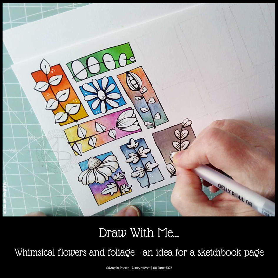
Another couple of panels were completed on this sampler this morning. I like something like this to gently start the day and a bit of a drawing warm-up. If you’d like to draw with me, then click on this link to see today’s video on YouTube.

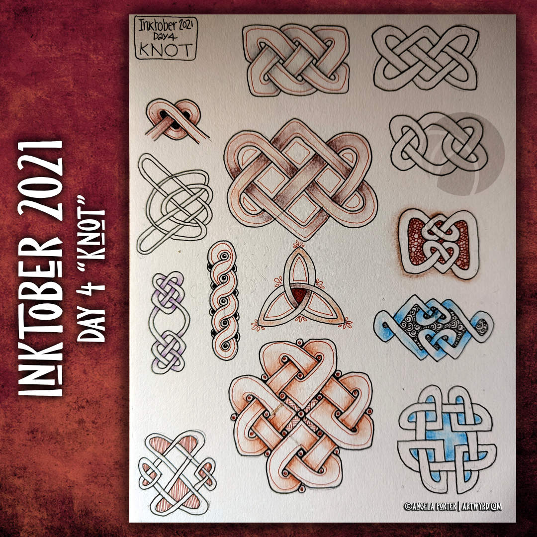
Today I’ve added the tangle pattern Kos, deconstructed by Anica Gabrovec CZT, known as Zen Linea. This panel is to the top and centre-right. The other panel is towards the bottom left and is one inspired by Rebecca Blair.

It’s funny how the internet seems to conspire to remind me of my early artwork nearly 20 years ago. One of my drawings turned up on Pinterest today. And it was this kind of sampler, but with patterns from Romanesque architecture, nature and textures drawn in pen and white ink on a kraft paper background. Seems I was doing this kind of thing before I’d heard of Zentangle or Rebecca Blair or many other artists and CZTs!

I keep trying to settle on a clear artistic voice, if not chorus, and it may always have been there, but I just don’t seem to accept it for some reason.

Perhaps these kinds of synchronicities are nudging me to accept this is something that I like to do and need to work more with. Time will tell, that’s for sure.

I think I’ve accepted, mostly, that I need to put watercolours and similar media to one side and focus on alcohol markers. I like the control I have over them. And using digital art to add colour, shadow and highlight too.

As much as I like the fluid, random effects you can get with water-soluble media, my ability to work with these media seems to be limited. Still, no doubt I’ll keep returning to them in the hope I’ll have a different outcome at some point in time. I’m not going to hold my breath on that, though!

I also think that I’m zeroing in on the best way for me to work with colour – monochrome or analogous colour schemes, maybe with a pop of complementary colour here and there.

Draw With Me… Fungi and other organic things. An idea for a sketchbook page

I had to revisit this idea by using the correct kind of paper for alcohol markers. And bullet tipped markers.

I really enjoyed doing this. Adding the details made a difference for sure, as did adding some shadows to the motifs.

If you’d like to see me draw these and, perhaps, draw along with me, then take a peek at this video on YouTube.

Draw With Me… Whimsical flowers and foliage – an idea for a sketchbook page

If you’d like to see how I created this partial page for my sketchbook, take a look at this video.

I spent an hour or so doing some warm-up drawing before turning my attention to inking in some colouring pages for “Fanciful Birds”, my next colouring book in the Creative Haven series.

Whimsy is always a welcome thing, flowers and foliage in particular. I also wanted to work with colourful backgrounds for each motif.

I really wasn’t fully awake and didn’t think through the type of paper I was using. I knew I wanted to use alcohol markers to add colour gradients to the background. Did it occur to me to use marker paper? Nope! Of course not! So they bled a tad – the Ohuhu brush markers I used for some of the backgrounds are rather juicy, too juicy for the paper. I liked the backgrounds, however, and knew I could fix the bleeds with a white gel pen.

So, I thought I’d switch to Inktense pencils and a damp brush. Not quite sure that they sit well next to the alcohol marker backgrounds. There’s lots of textureand an unevenness in the colour and gradient. Again, partly down to my choice of paper (all media paper from SeaWhite of Brighton).

So, for the last couple of images, I used some Arteza EverBlend markers for the blue and warm brown backgrounds. The bullet tips let less ink flow onto the paper, minimising the bleed. There was still some bleeding, which I made worse by trying to ‘erase’ it with a colourless blender pen.

I made use of the magic of a white gel pen to cover up these bleeds.

I definitely need to write some reflections for myself to add to this page when it gets put in my sketchbook. For now, I’ll just say that I like the last two I completed the most. Those are the blue and brown backgrounds on the bottom row. I do like the other alcohol marker backgrounds too, but there’s something about the more neutral backgrounds. I just can’t put my finger on what it is.

Right then, time to finish my mug of tea and get some more inking of colouring templates in!

My current sketchbook page

This page is just a kind of doodleart that I’m exploring, along with working with alcohol markers and trying to understand how I can best work with them.

All these ‘doodles’ turned out kind of organic in a kind of mechanical way, possibly. I’ll be turning my attention to them again this evening.

Inktober 2021 | Day 4 “Knot”

What else would the word ‘knot’ conjure up for me but Celtic knotwork!

I’ve loved it since I was a child. The intricacy and puzzlement about how they were created, the repetition and symmetry are all things that please my arty heart.

From Early Celtic art of the Iron Age (La Tene), to Anglo-Saxon and Viking ornamentation and sculpture, to the wonderful illuminated manuscripts of the early Medieval period, to the present day, knotwork has a fascination that seems to speak to the human psyche in some way.

It’s been many long years since I had a go at learning how to draw knotwork. I seem to remember I found it easier than I did today! Perhaps my younger brain was able to deal with the intricacies. However, once I found a method I could follow I found it easier, though not without mistakes.

I dug out my copy of “Celtic Knotwork Designs” by Sheila Sturrock, and re-created these few, simple patterns.

Not perfect. Not finished. Wibbly, wobbly grids and lines mean they are imperfect, but perfectly imperfect and somehow feel more an expression of my inner being. I may continue exploring knotwork now I’ve opened the door on it once again.

Sketchbook Page

These are two drawings I’ve been working on over the past three or so days. The whole page is A4 in size.

To draw them, I’ve been using Pilot Kakuno fountain pens with black ink. To add shadow and colour I’m using a mixture of Stabilo Carbothello, Daler-Rowney Artist’s Drawing and Prismacolor Ebony pencils. Along with some paper tortillons to blend the colour out. I’m also keeping the colour palette pretty limited – graphite black, two green Carbothello and Sanguine and Sepia Drawing pencils.

It’s fun to draw with a fountain pen. It’s also a lot of fun to use graphite and colour to bring depth and dimension to the drawing on paper rather than digitally for a change. I like to work both digitally and traditionally. Art is art!

I suspect the rest of the day is going to be filled with artsy pursuits, including finishing adding colour to these drawings.

We had snow overnight and the air is filled with a white fog too. Even though the layer of snow is just a couple of centimetres thick, it’s enough for me to want to stay inside. Snow is pretty to look at, but my sense of balance means it’s safest for me to stay cwtched up in the warm!

Sketchbook Page

Over the past few days I’ve been sketching in a black paper sketchbook. I’ve been indulging myself in sparkle and glitter, as well as using Derwent Colorsoft pencils, a Derwent blending pencil and a white Sakura Gelly Roll pen for these particular sketches.

In both cases, I started using coloured pencils. Only when I had finished the design did I add the white pen work to see how it would look.

I also enjoy the contrast between the sharp, bright white pen work and the softer, more fuzzy and hazy coloured pencil areas of the designs.

There is also something fascinating and enjoyable about bringing pattern, form and light into to the dark. Which works well as a metaphor for abstract art bubbling up out of the depths of my unconscious mind.

I enjoy creating abstract patterns. Like all my art, it brings peace, contentment and joy to my creative heart. By manifesting these designs on a page, I bring further ideas for art in the future.

Sketchbook Page

Sketchbook page

Yesterday, I spent some time adding colour to paper to add to my custom sketchbook. This is one of the papers that I created, with an abstract drawing on it, that is finished enough for the sketchbook.

The artwork measures approx 4″ x 6½”. I used a piece of ClaireFontaine Paint-on mixed media paper which I coloured with Distress Oxide Inks followed by some sprays and splatters of water to create a distressed look. The colours used were Seedless Preserves and Fossilised Amber.

I first drew the basic outline of the design with a M Pitt Artist pen from Faber-Castell. To add colour to the design, I used Distress Inks in Seedless Preserves, Fossilised Amber and Ripe Persimmon like watercolours.

Then, I started to add patterns, lines and stippling to the design to bring out the patterns and add depth, interest and dimension.

I think it’s worked out fairly well. I may well go back to yesterday’s ‘Blessings’ artwork and add colour and more patterns to it at a later date.

I went out!

My blog post is a little later as I decided to go out for a walk this morning. This was a big deal for me. Especially after the effects of the high anxiety/stress I experienced last week.

I went to my local cemetery, Glyntaff Crematorium. It’s fairly large, with lots of paths and roads sectioning the cemetery up. I wandered around the older section, which is full of fascinating funereal sculpture. I had my DSLR camera with me, and managed to take over 100 photos this morning, not just of gravestones, but textures too.

It was so nice to be out in fresh air, moving my body around more than I have done for nearly four months. I had nice music on earphones so that any loud sounds wouldn’t startle me. There was work going on around the crematorium as well as grounds work.

It was also nice to drive my car again. It’s been a week, and I really miss the freedom of just being able to take a drive. It’s important that we still stay home as much as possible and to limit our time where there are people. I think my choice to visit the cemetery was a good one. Very few people, alive or dead, haunt cemeteries!

I think I fall into the group of people known as tapophiles – people who are interested in cemeteries, gravestones and funerals. It’s not a morbid interest, just an interest about the changing styles of funerals, funerary sculpture , practices and how they change over time with society and culture.

I discovered the fascination with gravestones when I walked to and from school through this cemetery. It took me longer to get home than it did to get to school. On the way home I had the time to linger and explore and indulge my curiosity. I remember being too scared to look in the chapels there, but enjoyed popping into the columbarium, which has recently been renovated and reopened.

I think I’ll be looking for other cemeteries fairly local to me to visit in the weeks ahead, ones that offer me a good walk as well as interesting graves to look at.

Sketchbook Page

The art

At 4¾” x 2¾”, this is a fairly small drawing.

I used a variety of PaperArtsy Fresco paints to colour a 5¾” x 3⅜” piece of ClaireFontaine Paint-On mixed media paper. I chose, for me, an unusual mixture of colours. It’s ended up looking like old, distressed and grungy painted walls.

Next, I drew the abstract design with Faber-Castell Pitt Artist pens. I did the basic outlines, leaving my decision whether or not to add details for later on.

Then, I tried adding some colour to the background with Inktense Pencils and a damp brush. As this is a sketchbook page, I tried different colours out to see which ones would work well with the background. The finish on the Inktense-d areas was rather chalky and dull, though a subtle colour was achieved on the acrylic paint background. I’m not sure if I like it or not.

I find it difficult to resist a bit of shimmer and shine on my art, so I used a Uniball Signo gold glitter gel pen to fill in some of the circles in the design.

Finally, I added some more complex patterns to some areas in the design. I could’ve filled in more areas, but I’ve decided that this is enough.

Other stuff…

This wasn’t the only piece of paper I coloured with the Fresco paints. As they’re for the sketchbook, I coloured each piece on both sides. So, I now have quite a few prepared pages in my custom sketchbook to draw on as time goes by.

I think I’ve finally settled down after the trip out on Tuesday. I seem to be more settled, for sure. Meditation, self-care, self-soothing and enough rest has worked it’s magic once again. Sunshine today is helping as well, along with the refreshing breeze that is gently flowing in through the windows.

The simple things in life are often the ones that bring most peace to me – art, meditation, quiet times, sunshine.

Template Thursday

©Angela Porter | Artwyrd.com

Another week in lock-down has passed us by here in the UK, as well as many places around the world. That means it’s time for another weekly coloring template.

This week, the inspiration for this template has come from the pages full of capsules, pods and seeds in my sketchbook. Lots of opportunity to experiment with colour, but also adding little details to each tiny picture.

If you’d like to download and print this template, then pop along to the facebookgroup – Angela Porter’s Coloring Book Fans – and you can do so for free (terms and conditions for use do apply).

Drawn using Sakura Pigma micron pens (05 and 01) on ClaireFontaine dot grid paper.
Clean up of drawing, colouring and typography done digitally using Autodesk Sketchbook Pro along with a Microsoft Surface Studio and Microsoft Surface Slim Pen.