Template Thursyay! Adding colour to the template…

Yesterday, I shared a partly digitally coloured version of this week’s coloring template. Today, I’ve coloured some of the original template using Tombow Dual Brush markers with a waterbrush.

The template is now available in the Angela Porter’s Coloring Book Fans facebook group.

I filmed this process and turned it into a vlog. I speeded the footage up, as the original colouring took over an hour and a half.

I then spent another half hour or so experimenting with fineliners and white, metallic and glitter gel pens to add texture and pattern to the coloured areas. I didn’t film that though, but the results are in the photo above.

I set myself three intentions for this morning:
a) enjoy the process of working with the media
b) experiment with fineliners and pens to add pattern, highlight/shadow and texture
c) to not invest in the outcome or fret about colour choices

I think I achieved those intentions.

Sometimes, often even, just enjoying the process of creating, with no expectations or pressures of any particular outcome is so important. To be able to relax and enjoy the process, the colours, the way the media work is as valuable an experience as producing for a specific purpose.

It’s nice to be able to take the time to do this, without worrying about any particular project. Being able to put aside the “I should be doing x, y and z” and realising that just taking time to do something that makes me smile inside is as important as doing projects that fulfill a contract or business thingy.

Exploring media and papers

Today’s vlog is all about me trying out various media on different papers, particularly the Zig Clean Colour brush pens on Fabriano Toned paper.

Exploring different ways of working is important to me; it’s how I learn and work out what works for me. Often, I’ll return to media and techniques I may have tried in the past that didn’t work for me then, but now I can see how they could work for me, particularly in the context of a sketchbook.

In my disc-bound sketchbook, I’ve assembled various kinds of paper, mostly toned. Now, I’m working out what media would be good to have in a pencil case for sketching while out and about (when I finally become comfortable with out and about again!).

The Zig brushes and Tombow markers work really nicely on the Fabriano paper.

Watercolour Experiments

Firstly, let me apologise for the poor photo. I’ve tried a couple of times to take a photo of the artwork, but I just can’t seem to get it in focus across the paper. I did video all but one of these experiments, and a timelapse video is available on my YouTube channel.

I had a delivery yesterday of Canson Imagine mixed media paper. I mistakenly ordered A4 instead of A4, but no problem, it can be used in my disc bound sketchbook.

I wanted to see how various media would work on the paper so, I used
*Derwent Inktense Pencils
*Mijello Mission Gold Class watercolours
*Kuretake Zig Clean Colour brush pens
*Tombow Dual Brush Pens

In each case I used a barely damp brush; I’d already found out that using rather wet colours left edges of colour rather than the smooth colour I like.

I didn’t draw the designs with pen, just an 0.3mm, 2H mechanical pencil.

The inktense are Ok. The colours spread a little patchily as the pigment/ink grabs onto the paper very strongly quite quickly. As they dry permanent, it’s easy to add a glaze of colour to adjust the patchiness. The colours aren’t as bright as I would’ve expected from Inktense. Maybe the off-white colour affected them, or maybe the pigments/dyes sank into the paper more as they dried.

A dry brush technique is needed for the Mijello paints, and they move too easily on the paper with water. The paper doesn’t really grab them, which is surprising as it’s not watercolour paper. I didn’t really enjoy working with them on this paper. Also, the colours are so dull… the colour of the paper, or perhaps the colours sink into it?

I loved using the Zig Clean Colour pens! The ink moved so easily with the barely damp brush. Getting a gradient was so easy. Also, adding a bit more colour to the still damp area helped with this too. I also tried blending one colour into another, and that worked really well. The colours are so vibrant, I loved working with them. My only regret is I forgot to press record for them! However, I’m sure you’ll see more of them in future videos.

The Tombows aren’t my favourite pens to work with. But, in this instance I really did enjoy working with them. The colour grabbed onto the paper more than the Zigs. This made both blending out to a gradient and blending colours more difficult. The colours though are really vibrant.

I did write notes next to each little experiment with a 0.3 Unipin pen. It was a pleasure to write on this paper, and I think I’ll enjoy drawing on the paper too, so it will definitely be a good addition to the disc bound sketchbook.

Sketchbook Musings

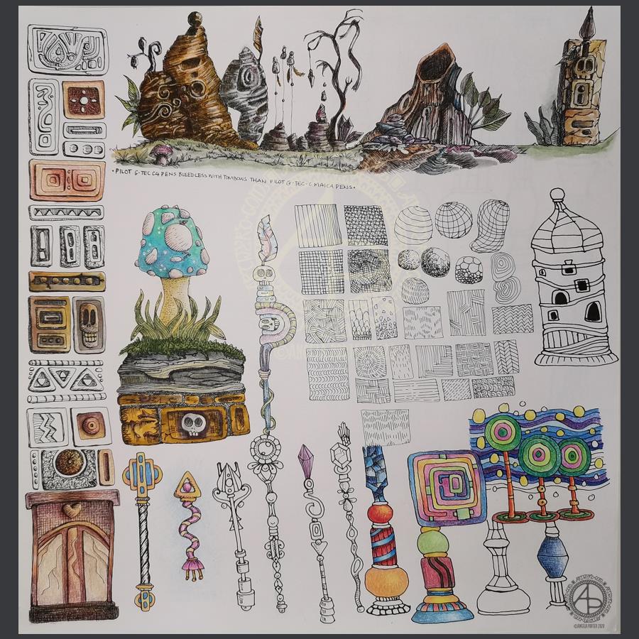
Over the past week or so I’ve been gradually adding to this sketchbook page. It is entirely what a sketchbook should be, in my opinion. Pages full of ideas, sketches, unfinished drawings, practice of techniques, written notes… a visual zibladone for the creative soul!

It is a reflection of what is catching my attention in my world. That world encompasses the inner worlds of imagination and emotion, as well as the outer world of books, nature, architecture, photographs, and so on.

This page includes inspiration from Mayan glyphs/sculpture, rocks, nature, mushrooms, magic wands/staves/sceptres, pen textures and some inspiration from Hundertwasser.

Everything on the page is a bit wonky (not perpendicular), and I’m OK about that – it’s a sketchbook! But then wonky art, particularly colouring pages, seems to be part of my signature style. Perfectly straight lines just don’t look right to me, nor do sharp corners. Perhaps that’s why I like Hundertwasser so much.

The English gardener William Kent said, “Nature abhors a straight line”. Hundertwasser said, ” The straight line is godless and immoral.”

A sketchbook is always a work in progress (WIP), even when every page is full, it’s full of incomplete drawings and ideas, sketches and notes, jottings and doodlings. Nothing has to be perfect. Not a single thing.

A sketchbook is a place to try things out, experiment, just see what happens. With that comes an acceptance that not everything will work out, and where surprising things happen and discoveries are made that may otherwise never happen.

Sometimes the gems of ideas and colour combinations and ways of using media remain hidden until much later. A sketchbook is a place to practice and learn, to note down what is of interest at this time, what needs to be expressed, without any pressure to produce a finished, polished artwork.

That doesn’t mean, however, that a sketchbook can’t be something interesting to look at, even with it’s own kind of beauty. They are a reflection of the artist that creates them and so is a window into their arty heart and feelings. They are very personal things.

A sketchbook encourages me to use media that are gathering dust because I do so much art digitally. In a physical sketchbook, if I want any colour, then I have to use some of these media.

On this one page I’ve used Pilot Hi-Tec C4, Pilot Maica, Rotring Rapidograph and Uniball Unipin pens. To add colour, watercolours, Tombow Dual Brush pens, Derwent ColorSoft pencils, Derwent Procolour pencils, Derwent Inktense pencils have been used.

WIP Wednesday

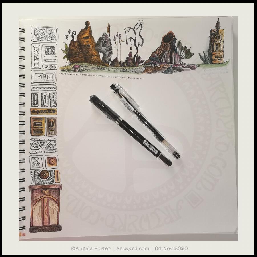
As it’s work in progress (WIP) Wednesday, I’m sharing my current sketchbook page. A sketchbook is always a work in progress.

At the moment, I’m being inspired by a couple of books :
“Fantasy Genesis” by Chuck Lukacs
“Fantasty World Building” by Mark A. Nelson

I’m using an Art Gecko sketchbook that is almost 12″ square along with Pilot Hi-Tec C and Pilot G-Tec Maica pens and Tombow Dual Brush Pens.

I’ve said it before – I’m not really into characters (unless they’re cute, whimsical, fun ‘doodle’ kinds of characters, usually non-humanoid). However, I’ve always loved to draw plants and patterns as well as designs from architecture, nature, machines and even animals (patterns, textures and such more than the animal itself).

My ‘Entangled’ drawings bring together these various elements to create more abstract or whimsical designs. But to put them together to create entirely new things isn’t something I’d ever thought of.

I’ve always admired fantasy and sci-fi artists, but never considered myself capable of anything like that. However, trying new stuff out is how you grow and develop as an artist.

Not that I’m going to become a fantasy artist, but maybe exploring these avenues will allow me to add new things to my art in ways I never expected. In much the same way my adventures in cardmaking, mixed-media journaling, watercolour and other such things have helped me to develop my digital art and drawing.

I’m also realising how important sketches are for my digital art – be it drawing or painting or just colouring in line-art of mine. I think it has to do with me being able to have a good overview of the whole design, something I seem to be unable to do when working digitally, even when I zoom out entirely. I’ve mentioned it before, but I do have a bit of a problem relating to size and scale even in everyday life.

There’s a different kind of sensory pleasure in working on paper – the tactile and sensory feedback is quite different to that gained from digital work. That’s not to say I don’t get pleasure from working digitally, it’s just different.

There’s also the fact that each page doesn’t have to be a complete or finished piece of work. It’s a place to try things out, explore, experiment, and just let the pen/pencil/brush take a walk across the paper to see what happens. Serious work and not so serious work all have a place in a sketchbook.

As do written notes, ideas, observations, sources of inspiration, lists, reflections and more.

Slowtember Prompt list

This morning I needed a quiet, slow, simple time with some arty stuff.

Firstly, I get so frustrated working in a bound sketchbook. The binding always gets in my way even though I like the paper. I much prefer working on loose sheets of paper. I want to keep a sketchbook, or series of sketchbooks. So, the pennies dropped that I needed to put together a discbound sketchbook filled with acid-free cartridge paper and bristol board, and other papers I may wish to draw on.

Yes, I know I’ve got a disc bound sketchbook filled with papers coloured in many ways to draw on. But, my recent forays into art, the realisation that black and white line art is my favourite way of working, needed a solution too.

So, after a while of sorting out such a discbound sketchbook, I thought I’d like a cover page for the Slowtember part of my this sketchbook. It gave me a chance to practice some hand lettering, and to mess around with Tombow Dual Brush markers.

I also added drawings for pancake plant, the prompt for days 10 to 12 which I missed out and went straight to rubber plant!

I suspect that by the end of the month I will have a visual reference for leaves of these indoor plants.

Naturally, I messed up the numbers for the dates for each prompt. My hand lettering isn’t wonderful, nor are the leaves around the title. Let’s not mention the colouring. However, it will do; after all it is a sketchbook page not a finished, polished piece of art. That means no pressure on myself to get it perfect, or as near as I’m happy with. It’s about trying things out and if they don’t work then it’s an opportunity to reflect and learn more about my skills and artistic voice. It’s also a chance to use media that I wouldn’t normally use, and possibly to remind myself why I don’t usually use them as well!

Practice, practice, practice!

I did spend some time working on a second typographic portrait of Aneurin Bevan yesterday, using a photographic reference that had more detail in it in terms of grey scale.

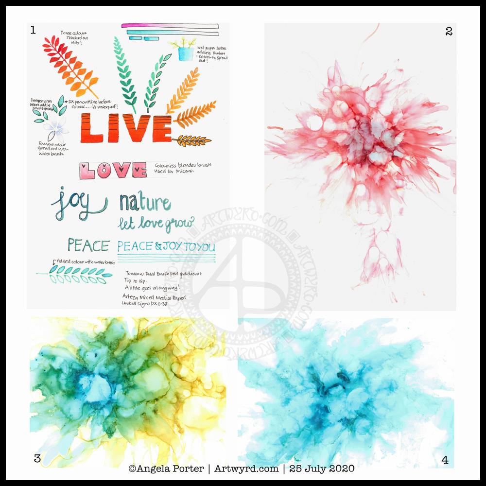
Before bed, I wanted to relax with some colour (1). For some reason, I pulled out my set of Tombow Dual Brush pens and tried working with them on an A5 piece of Arteza mixed media paper. Hand lettering with gradients, with and without black outlines resulted, and then I wanted to try drawing with colour gradients.

To create gradients, I held the tip of one pen on top of the tip of the other. I then used the lower pen to draw or write with. I used the bullet nib for the lower examples. I used the brush nib for the larger lettering and also the leaves and flowers and so on.

I made some notes as I went, to remind me what I did and what I liked about them. I used a Uniball Signo DX 0.38 pen to do this, which is also waterproof. So, I used it to add lines.

This morning, I wanted to start my arty day experimenting with alcohol inks, once again (2, 3 and 4). All because I’d watched a YouTube videos where people use a straw to blow the ink and alcohol blending solution/rubbing alcohol/isopropyl alcohol/propan-2-ol around the yupo paper.

One helpful piece of advice I heard along the way was it’s best to use only a small amount of alcohol ink. Which is what I did. One drop to start with and then add more ink of the same or different colour(s) as needed.

It took me a while to work out not to blow as hard as I could, and to try different angles to hold the straw at, as well as moving the ink in different directions.

I’m much happier with the results this time, though the scans have bleached the colours out a little. I really must work out the best settings on my scanner so that this doesn’t happen.

Anyway, I need to find a way to seal the alcohol ink so I can draw on top of it without wrecking the pens. I also want to do some better scans so I can make use of these alcohol ink backgrounds in digital art.

Today I want to continue work on the typographic portrait. This second one seems to be building up more quickly than the first one. I think that’s all due to me becoming familiar with the process and accepting that my hand lettering based on my handwriting is good enough. I’m also working out my own ways to fit letters to curves and the shapes at the ends of the sections.

So, all of these activities – using waterbased media, hand lettering, hand drawn typography, and alcohol ink backgrounds all have one thing in common – practice, practice, practice!

Microbial

Microbial © Angela Porter | Artwyrd.com

I started this yesterday before I hurt my back. I started with a Distress Ink background. Next, I used water and a brush with Tombow Dual Brush pen ink to create the circles and splashes. Finally, I added some line and pattern to the ‘blobs’. As I was finishing it up this morning, they reminded me of microbes, so that’s why I’ve named it ‘Microbial’. A classic bit of abstract, intuitive Angela art, and a bit of a blast to the past as well, but fun.

My back is a bit better today, but as well as painful I’m now stiff and with pain down my thighs. Hot gel pads really work with the pain/stiffness and I’ll be sorting that out very soon, as soon as I’ve finished posting this in fact!

‘J’ Monograms

©Angela Porter 2018

What a troublesome letter J is! Well, as far as creating a monogram. Early sketches showed me that if I add too much fanciness outside of the letter, the letter gets lost in the embellishments! So, here are a few that I’m vaguely pleased with.

I used Daler Rowney Marker Paper to draw these letters on, with a mixture of black pens. I used Copic Markers to colour some of the letters. Others I used to experiment with Tombow Dual brush pens and a blender pen. Chameleon Color Tones pencils were used on a couple more.

The Copics work really well on the marker paper – no surprises there!

The Tombows tend to cause the pen I use to draw the designs with – Uniball Unipin and Sakura Pigma Sensei pens – to smear. I keep forgetting the Tombows do that. So, I tried drawing a J with the Tombow Dual Brush pen and then add the lines and patterns after it had dried. That worked. But white space needs to be created outside of the letter, and again, if I got too intricate, entangled, ornate with the embellishments I would’ve lost the letter. Or perhaps not if it was only the letter that was coloured in.

I was surprised at how easily colour from the Chameleon Color Tones coloured pencils laid down on the marker paper. Surprised because I’d forgotten how nice it is to colour on the marker paper! I did need a good layer of padding paper beneath the 70g/m² or 48lb marker paper.

I foresee similar problems with the letters I, L, and S. Not sure about the other letters I’ve not tried this kind of decorating with yet. Time will show!

What I can see here is that the style of embellishment I’ve used, while not always successful, such as the heart and arrow one (where did that idea come from? Sheesh!), it is different to the previous letters I’ve played around with. That is all down to the shape of the letter and the edges I have to play around with, while keeping clarity of the letter too.

What to do today? Well, I do have the 2019 template to colour for the colour explosion over on the Angela Porter’s Coloring Book Fans facebook group set to run through New Year’s Day. I’m also aware that I haven’t done a cutely whimsical cat monogram dangle design for a few weeks. I also have three templates to colour for ‘Entangled Forests’ so that book can be put to rest ready for publication, before I start on the next one.

Winter Dangle Designs 3 December 2018

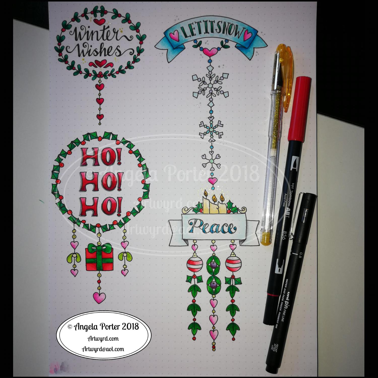
Winter Dangle Designs – 3 December 2018

I have had some fun designing these, as always!

I did use some circle, oval and hexagon templates to help me design the wreaths and snowflakes. The dot grid paper helped me draw mostly straight lines for the dangles.

I did sketch them in pencil first before inking them in with a Uniball Unipin pen. Colouring was done with various Tombow dual brush pen markers and some sparkly elements added with Uniball signo sparkle gel pens.

These would look lovely as greetings cards. In fact, I’m thinking of redrawing them digitally and using them to make my own christmas cards this year. Printing out the black line work and then colouring them with traditional media. In the past couple of years I’ve designed my christmas/winter/yule cards digitally and had them printed professionally. This year, I think I’ll do it the way I suggest in my book ‘A Dangle A Day’.

They’d also look great as note cards or as pages in a BuJo, planner, scrapboook or journal. They’d lend themselves to cute bookmarks too.

These relatively simple and small dangle designs are perfect for practicing hand lettering too. And in these four dangles I’ve used four different lettering styles.

I’ve also kept the finished designs simple by not adding any drop shadows, except around the ‘HO! HO! HO!’. Not only that, a lot of the colouring is very simple too.

I do hope you’ll have a go at designing your own, maybe using these as a bit of a guide.  If you do, I’d love to see what you’ve created.