Nature – an entangled artwork. It looks like batik, silk painting or stained glass!
The design was drawn in pen on bristol board and then coloured digitally in Clip Studio Paint Pro using a textured watercolour brush.
I’m determined to find my way around this piece of software, along with Affinity Designer at some point. The effects are the same as Sketchbook, but just not quite so easy to find the tools I want to use at first. It’s all a case of familiarity and I’m definitely outside of being familiar with the software at the moment.
Having said that, all that I’ve learned about layers, the various effects that can be applied, brush settings and so on, apply to all digital art platforms. It’s just finding my way around the software and learning more about it.
The one thing that’s top of my list at the moment is setting up a custom colour palette.
I’ve discovered that Clip Studio Paint has symmetry tools – phew! And these tools do a thing or two not available in Sketchbook as well as working slightly differently (and making certain things a lot easier for sure.
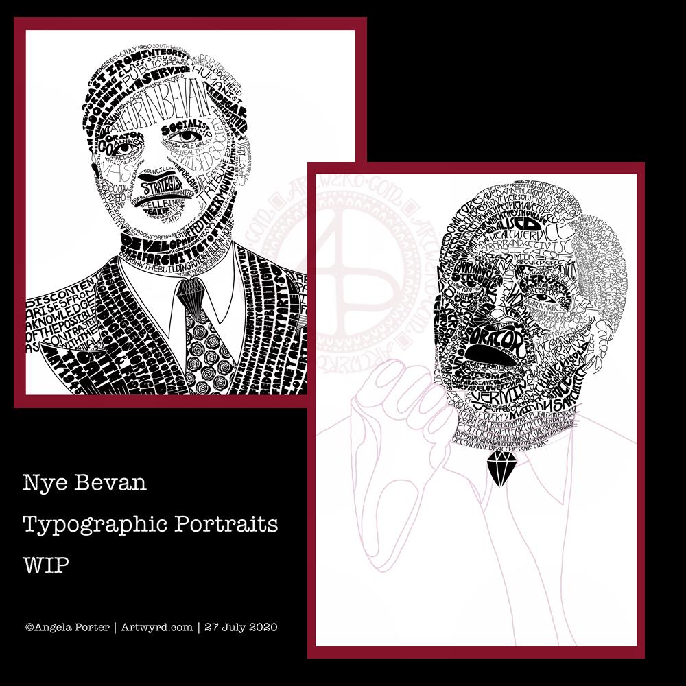
I’ve been working on another portrait of Nye Bevan while I take a break from the first one. I really think I’ve gone over the top with detail in this one. I wanted to do one of him in one of his typical oration-giving stances, but I really do feel I’m messing it all up. I really think that’s because I am trying to get too much in the way of quotes into the portrait.
So, I’ll be going back to the drawing board (or in my case, the Surface Studio screen) to try this one again.
Having said that, I’ve had a lot of hand lettering /hand drawn typography practice and have played around with the brush settings to find one that will work for me!
I also have just noticed that there’s not much differentiation between the different weights of text in the second version, and that adds, I think, to the more confusing appearance of it.
I was struggling with the values of the gesturing fist in the second image. So, I put the photo into Affinity Photo and used the Posterise tool to simplify the areas of shade for me. There’s still a personal interpretation to be done on how I translate these areas into spaces of text.
Hands, feet and faces. These were always the parts of humans I struggled with when doing life drawing.
Drawing typographic portraits is a new endeavour for me. I’m learning, experimenting. One of the main lessons I have to take away today is to not over complicate such a portrait! But there is a fine balance betwixt having enough detail to capture the essence of the person, and having too much so that the essence of who they are is lost.
The first portrait I did, on the left, does look better, but I do think it lacks a bit of detail in the face.
The second one, on the right, is way too busy!
So, my task is to find that point where less really is more.
So, I’ll take a break from them, again, and regroup and try once more!
Yesterday, I had an urge to try colouring my latest mandala design but without black lines, just pure color. This is the result. I’m actually quite pleased with it, and I’ve surprised myself too, in a nice way. I’m quite eager to do more art like this as time goes on.
I chose a similar color palette to the one from yesterday, similar but not the same. I also edited the shapes and lines as I felt I needed to as the design grew out from the centre.
The color palette was of just six colours – two greens, one aqua, two orangey colours and one yellow, all muted, subdued colours. I think I could’ve done with one more colour, or used the darker version of the aqua as the background in the inner and middle ‘circles’ of the design. Of course, I can try that out without ruining this version. That’s the beauty of digital art.
I would never have done this using traditional media. My skills with colours are relatively limited in the physical realms.
The world of digital art is opening up new ways for me to express my creativity, that’s for sure. The skills required are different but equally as complex as traditional media in my opinion.
There’s also a lot of learning and exploring for me to do to get the style of coloring right for ME. The advantage of digital work is that you can try and try again until you get it how you want it to be without having to start over from the beginning. Some see that as ‘cheating’ or ‘making it easy’. I see it as learning and growing and developing in real time. Digital art is very forgiving, but that doesn’t mean it’s any easier. Far from it in my opinion.
I know my limitations with paints, markers, pencils and so on. I’m kind of competent with markers and pencils I suppose. Working digitally, however, allows me to really work at making sure I get the finish I want in each section of the design, with or without my characteristic black lines. I can try things out and adjust to get them just as I wish them to be.
Each time I do something different like this I learn. With this mandala it’s the use of high contrast to gain the depth and dimension I like, and it’s working out how to get that with the various types of brushes and effects that are available to me.
It’s a huge thing for me to use my line art as just a guide and to lose the lines to create a design such as this. It involves learning how to make the different sections separate from each other using shadow/light as well as color, something I’ve rarely done in my artistic journey.
This is definitely something I’m going to do more of in the future and develop my skills in creating art in this way too. It’s taking me a long while to get my head around it all, but little by little my digital art is developing I think, and I’ll find my own voice with it for sure, or maybe another voice.
I used my usual trifecta of Autodesk Sketchbook Pro, Microsoft Surface Pen and Microsoft Surface Studio.
Here’s two dangle designs for dangle day Friday. Simple designs, perfect for getting into the weekend vibe.
These are both experiments where I’ve worked on vellum/parchment, the kind that is used for Pergamano.
The one on the left – the monogram A – is nowhere near as garish in colour in real-life; I really don’t know what the scanner has done to the colours. I drew the design with a metallic gold Sakura Gellyroll pen. I then used Tombow Dual brush pens to colour the design on the reverse. I used shades of yellow, orange, red and magenta, but the scanner seems to have removed much of the red. I also managed to smudge the colours too. I don’t think I’ll be using Tombows on Vellum again.
I do like the gold linework and I think I’ll draw this design out again and colour on the reverse with coloured pencils, like in the dangle design on the right.
You may recognise the design on the right as last weeks dangle design. I traced that design onto vellum using a white Uniball Signo pen. I altered some of the details and the style of lettering.
Next, I did a little bit of ‘whitework’ on the reverse. This gave the highlights on the design that help to give the illusion of dimension as well as some texture. I let the design rest under a heavy book for an hour or so.
Finally, I used my Chameleon coloured pencils to colour the design in, again doing this on the reverse.
I like the colours on this one. The vellum mutes the colours somewhat, but it also softens any imperfections in the colouring.
I’m not sure about the white lines though. I need to try this one with some coloured paper underneath to help the lines stand out a bit more. I’ll post an image of it if it works.
I’d like to draw this design in gold and see how that looks. I may try black too. As well as using coloured pencils, I want to try using Copic or Chameleon markers to colour the designs in, to see how they work on vellum.
These certainly were experiments, which I’ve learned from. Not only that, I’ve got some ideas to try out the next time I use vellum. I’m trusting I’ll find the combination of line colour and colouring medium that works for me and my style of working.
What would I do with these designs? Well, they would both work really well as spreads in Bujos, planners, journals and scrapbooks. I also think the monogram would make a lovely bookmark. They’d both make nice greetings cards or notecards. I’m sure there’s lots of other things they could be used for, such as framed pictures.
If you have any suggestions for how they could be used, leave a comment.
I’ve spent a couple of hours this morning experimenting with UV resin, and these are the results.
First off, I thought I’d try Yupo paper with various pens – Sharpies, Posca Paint pen and alcohol markers (Chameleon Duotones). You can see the results of these on the top three experiments, left to right.
The Posca pen gives lovely dark lines which I like. The Sharpie is more grey.
For some reason I expected the alcohol markers and Sharpie to bleed with the resin; they didn’t. Neither did the Posca pen.
The flower on the bottom left I drew on Yupo paper with Chameleon pencils. They gave a lovely, soft colour, but all the imperfections were magnified with the resin.
The last experiment, on the bottom middle, was a flower I drew on some paper I’d coloured with Distress Inks. I drew the flower with a UniPin pen. I was pleased that the pen didn’t bleed and the colour of the Distress Ink didn’t seem to bleed into the resin either. I had to try a layer with some glitter in it (that inner raven of mine just loves glitter and shimmer!), which works nicely, but did obscure the drawing a little. You live and learn, and that’s why I’m experimenting!
One thing that happened with some of the experiments the Yupo or paper warped as the resin cured under the UV lamp. I think that’s because the resin contracts as it cures; it was more noticeable with the smaller pieces of Yupo and the paper .
So, I had fun, learned a bit more about resin, and have more ideas to try out another day.
One thing I did find very useful were some of my colour shaper silicone ‘brushes’ with tapered ends. They are perfect for adding resin to the pieces and helping it to spread out to the edge. I had used toothpicks on the hearts I did the other day, but they were so fiddly and a bit of a pain to use. So, my colour shaper silicone tools are the way to go!
Now, I need to go source some bezels I can use to set little drawings into. I do have some silicone moulds that I can play with too, but not today. Time to turn my attention to other matters I think.
Yesterday, while looking for a particular book, I stumbled upon a copy of “A First Aid in English, Revised Edition”. I’d forgotten that I’d bought this book several years ago simply because I stumbled upon it on Amazon and it brought back warm memories of primary school. I remember with fondness enjoying working through it, working neatly in my English book, while left to my own devices while everyone else in my class was practising for the competitions for the Urdd Eisteddfod. I wasn’t with them as I wasn’t deemed good enough for any of the competitions; my accent was too English, I was too clumsy and uncoordinated to dance or act, and was told I couldn’t sing either. So, I was left with maths and English work to do in the classroom by myself.
Fond memories of being left by myself? Yes, that is the case. I have always enjoyed learning, working, and producing beautifully written notes/work. I guess this was something I could excel at when everyone else thought I couldn’t excel at anything else. Also, I had and continue to have a love of words and phrases, and the First Aid in English fed that love.
Other fond memories crop up, such as being able to choose a photograph from a huge, numbered collection to use to inspire story writing. This could be done once the set work was completed and while others will still working on that. I’ve occasionally remembered about this activity and thought I could use it now as a source of inspiration for creative writing.
Anyway, once I found the book, I had to sit with pen and paper and work through some of the exercises, and found great pleasure and comfort in doing so. I realised how much I’d forgotten, and how much the book seemed to have been cut down compared to the one I used when I was in school, but that may just be the warping effect of time on the memory.
I know, it’s sad, but it’s also true!
Similes
And this is where the title of this post comes in! Clowder is apparently derived from clutter, which would describe a pile of cats all together, very much like a furry cloud!
Kindle is more obscure, coming from Old Norse ‘kynda’ which meant ‘to kindle’. Maybe it’s just a cute sounding word to describe a pile of cute cuddly kittens making apt use of alliteration.