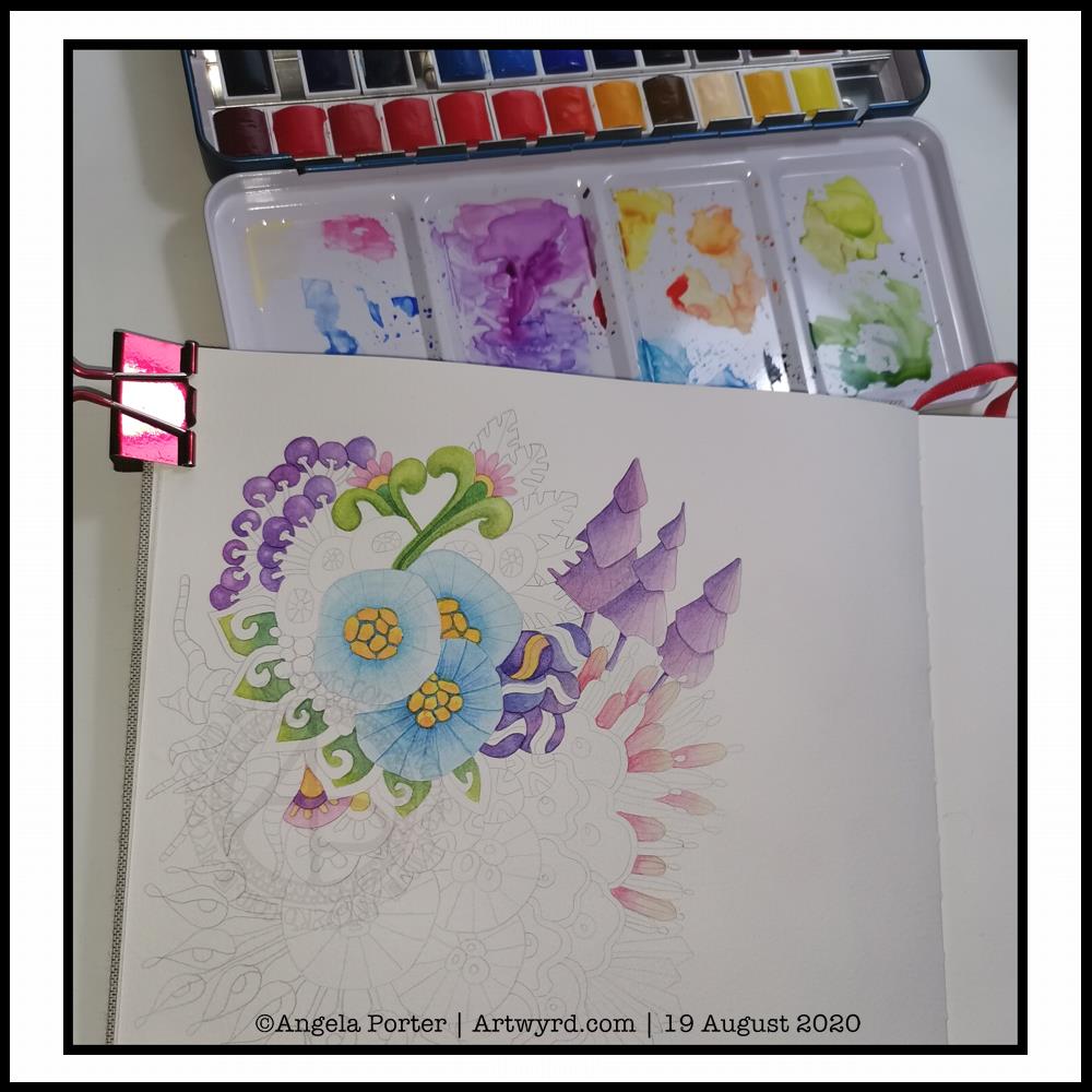
Experiment in watercolour
It’s WIP Wednesday, so here’s a work in progress I started this morning.
I woke thinking it was about time I tackled rendering one of my abstract, stylised, imaginary botanical designs in watercolour.
I think I’ve gained a bit of experience with watercolours, kind of have a feel for them and how I like to work with them. Or so I thought.
Anyways, I started by drawing the design lightly in pencil. I used a 0.5mm mechanical pencil by mistaked; I had intended to use a 0.3 mm one instead. No matter, this is an experiment, a trial in my Arteza watercolour sketchbook.
Once I was happy with the drawing, knowing I can always add more to it or alter it before painting it, I started to add colour.
I started with the bottom right blue seed-poddy/stylised flower motif. I thought I’d use two different shades of blue alternately around it, adding shadow and depth. That didn’t work out too well. I tried dry brushing on the ‘spokes’ of the motif. My reaction was ‘yeuch! Angela what were you thinking???’.
I didn’t give up at this point, though it would’ve been easy to do so. I continued on, reminding me this is an experiment, I’m trying something out that I’ve not had much success with in the past; just keep going.
So I did. And I know I have work to do to recognise when the wet paint has dried enough for a different wet colour to spread nicely, but not too much, when dotted into the first colour.
As time was going on, I was becoming more comfortable with how I was adding colour. I was working out that adding glazes was a way to darken areas, and that I could gently blend the edges out while the glaze layer was still damp so I didn’t get harsh lines.
Slowly but surely I coloured in different motifs, careful not to do wet next to wet.
All in all, I’ve worked on this painting for around three hours. There’s a lot more to do, but I can pick at it from time to time.
What I have noticed is, however, how much I want to add colour in the same way I do when working digitally. An interesting observation, the implications of which I have not even started to unpack yet.
Therapeutic art once again…
Once again, I turn to art to help me manage my unsettled emotions and thoughts. I am so tired, again. The stress of the past week or so has taken it’s toll. However, like the heavy rain and rather windy weather we’re experiencing here in the Valleys of South Wales, these will eventually blow over and I’ll be able to focus on my contracted work.
I’ve learned that when I’m all out of balance, it’s best for me to focus on art that is soothing, that no one expects anything from me, that I don’t have to worry about messing up. If I try to do art that others need to be happy with too, then I get frustrated and negative about myself, doubt myself.
So, for today at least, I will be creative in ways that will give me the time and space to heal my frazzled emotions and gradually work my way back to mental and emotional well-being once again.
After a life-time of putting everyone else’s needs and happiness first, I’m gradually learning to take care of my own needs first.
I felt guilty and selfish to say ‘my own needs first’. But it isn’t selfish to look after myself. It’s a recognition of being responsible for myself and my own needs and well-being.
And so, today I art, for art’s and heart’s sake.
I just wish it wasn’t so darned rainy and blowy. The rain alone I’d be happy to go and walk in, or the wind alone. But not both together. It is forecast to ease off in a couple of hours, so maybe I’ll get a walk this afternoon, with brolly and waterproof jacket. I’d like that. But for now, I’m going to go and drink tea, draw the design for Template Thursday, and have the quiet time I need to heal, recharge and refresh.

