Can you believe that September is nearly over? I swear that the older I get the faster time seems to go.
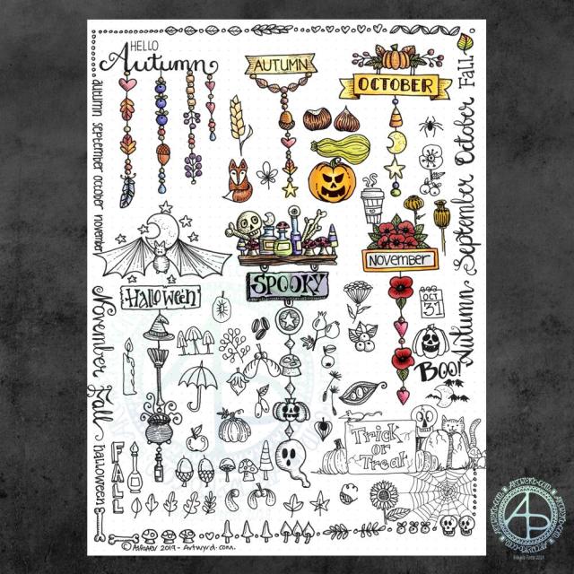
Anyway, a new month on the horizon means a new colouring template for the members of the Angela Porter’s Coloring Book Fans facebook group. There just has to be a Hallowe’en theme for October’s page, and you can see a sneak peek of it above. I couldn’t resist colouring some of it in as a way of trying out some new digital brushes and some ideas too.
I put some of my favourite All Hallows’ Eve motifs into the drawing, including a raven, skulls, fungi and a vampire cat! I always enjoy drawing stuff to do with Hallowe’en; it’s my favourite time of year because I don’t have any past traumas associated with it.
If you’d like to colour this template, pop over to the Angela Porter’s Coloring Book Fans facebook group and become a member; each month I do one drawing exclusively for group members (terms and conditions of use and sharing apply).
About the art
I used a combination of fountain pens and fine-line pens to draw the design on dot grid paper. I then scanned the drawing in and cleaned up smudges and smears digitally.
Then, I set about adding colour digitally using my usual tools – Autodesk Sketchbook Pro, Microsoft Surface Pen and Microsoft Surface Studio. I also added a background and surface texture that I had purchased via Creative Market.
I am really quite pleased with how the colour is bringing the illustration to life, especially the skull in a jar. I hope to be able to continue to add colour as the month progresses, though I do know I have quite a bit of work to do and focus on.
To Inktober or not Inktober, that is the question.
Last year, I really enjoyed taking part in Inktober. Inktober has become a really popular social media event where artists and creatives use a daily prompt to draw (or create) something based on that prompt and share it on social media.
There is an official prompt list, but people do create alternative lists and I may look at some of them as there may be variations that might be less time intensive than last years’ was!
I shall see what I find and go from there I think.
So, Angela, how are you today?
Tired. However, I’m am quite content, my mood is good enough today. I do have EMDR later on, and I often feel ‘flat’ before my therapy session. I think my unconscious mind starts to bring stuff up in preparation for EMDR.
I know that the likelihood of me being exhausted later is rather high, so I’m not planning to do loads of stuff later on. Self care will be the order of the late afternoon and evening.
I’ve spent an hour or so creating this small design; the paper is 4″ (10cm) square. It’s been an enjoyable time. I needed to spend some time warming up my pen skills before returning to drawing the October colouring template for the Angela Porter’s Coloring Book Fans facebook group.
My first step was to use a Tombow fudenosuke pen to hand letter ‘believe’. I wanted to make sure that the word stood out from the rest of the design, so I used a Faber-Castell Pitt Artist Pen to draw two ‘auras’ around the word.
The rest of the design flowed onto the page, starting with the flowers to the top right of the word. I used a variety of nib thicknesses in the drawing. I used quite a few of my favourite patterns and motifs in this design; this makes the drawing quite soothing for me as I don’t really have to think and concentrate on constructing the design elements.
Once I was happy with the design, I decided to add some shadows with some grey-coloured pencils. I’m not satisfied with this at all. The pencil ‘leads’ were too hard to get a soft line. In future I need to remember to use a 2B or softer graphite pencil and some kind of blending tool.
I am happy with the design though, apart from the bit I let spill out to the edge of the paper. I also need to note that I’m happy with my hand lettering here too! Using fudenosuke pens with flexible tips for drawing has allowed me to develop the pressure control I need to complete the brush lettering. The brush nibs on the pens are quite small, so the contrast betwixt thick down-strokes and thin upstrokes isn’t as noticeable as with a broader nib, but all the same, I’m still quite happy with it.
I have no idea what I’m going to do with this little panel. It could become the top layer of a greeting card, or frame it and hang it. Perhaps I may add it to my BuJo. It could, of course, end up amongst the piles of artwork I have stored away.
Why did I choose the word ‘believe’?
It’s something that I’m working on – believing in myself. Believing that I deserve better in life than what I grew up with and unconsciously seek to replicate to try to get a different outcome (one of the features of CPTSD). I am beginning to believe that I can turn the negative beliefs I was taught as a child into positive beliefs about myself.
Part of this is believing in my art, believing in my self-expression and not looking to others for approval and validation of what I’ve created. I want to believe that it’s enough to create art that makes me smile, and hopefully other people too. There are plenty of artists in the world who make social statements, political statements and thought-provoking images with their art. I’m not one of them. I just want to add some prettiness and smiles to the world.
Sometimes, part of my art may have quotes that are thought-provoking in them, but the art is, I think, pretty.
To believe that I am the opposite of what I was brought up to believe myself to be (which wasn’t very nice).
There’s so much more I could add here, but I’d need to explain it, and I’m not up to doing that in public. Maybe in the future I will, once I’ve overcome those negative beliefs about myself.
So, Angela, how are you feeling today?
I believe I’m feeling quite content, though that tiredness has sneaked up on me once again. However, there is that contentment there, and that’s a good thing.
I believe I’m feeling quite content, though that tiredness has sneaked up on me once again. However, there is that contentment there and that’s a good thing.
It’s been a while since I did any whimsical dangle designs, so here’s an A4 sheet full of ideas!
There are six complete dangle designs on this sheet along with lots of ideas for motifs to use. I’ve also done some hand lettering, something I don’t do often enough these days.
I know there are likely to be things associated with autumn missing from the sheet, but it is a collection of some of my favourites. I had a lot of fun filling in some of the space around the dangle designs with the lettering and design elements.
I used Tombow Fudenosuke and Faber-Castell Pitt Artist pens to draw and hand letter on an A4 sheet of dot grid paper by Claire Fontaine.
After scanning in, I decided I’d like to add some colour digitally. I used a different kind of brush setting – natural blend with an airbrush. I’ve not quite worked out how it works, but I like the way it’s turned out here. The colour blends turn out quite soft and gentle, however this brush setting does need some more experimentation by me.
These are lovely, simple designs that would be perfect for using in bullet journals (BuJos), planners, diaries, scrapbooks and journals as well as for greeting cards, bookmarks and more.
My book “A Dangle A Day” is a great resource for dangle designs and design elements (called ‘charms’ in the book), even if I say so myself. It also has easy to follow step by step instructions for beginners to more confident creatives, as well as lots of inspiration – there’s nearly 200 dangle designs in the book!
So, Angela, how are you feeling today?
I’m feeling content, fairly upbeat and the exhaustion of the past few days seems to have mostly subsided. There’s still some tiredness there, but I feel more able to cope with the demands of daily life.
I do have to venture forth into the world; in my rather emotionally fragile state the thought of going grocery shopping filled me with, well not horror but trepidation. Fortunately, I keep a fairly well stocked fridge, freezer and cupboard, but now I do need to go get some fresh fruit and veg, which I will do in a short while I expect.
It is good to be back to having the contentedness the dominant feeling – it’s not as strong as it has been which tells me there’s still some emotional distress lingering. However, it is the prevalent emotion.
I’ve weathered another emotional storm. I do try to remind myself that I’ve come through plenty of hurricane force emotional and mental storms in the past and I can come through them again. Nowadays, I know what contentedness feels like and during emotional storms it acts a lighthouse to guide me back to emotionally calm waters.
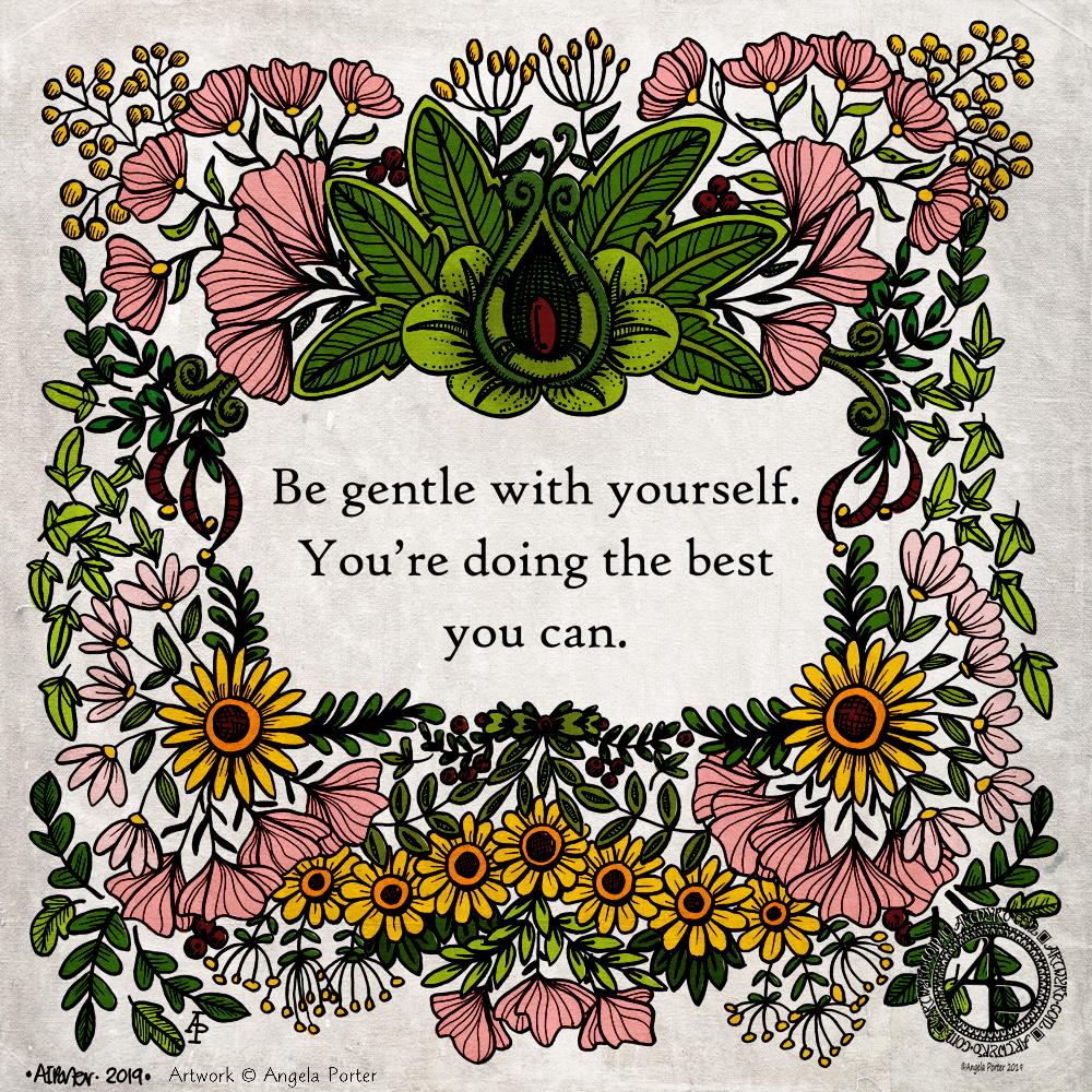
This is the same illustration I used for yesterday’s quote, however, after adding some textural lines to the drawing, I’ve coloured the design.
I decided to use flat colours as it brings a feeling of a coloured wood cut or lino cut print to the design. I used a grungy texture overlay to enhance the vintage feel of the coloured design.
The line art was drawn using Tombow Fudenosuke and Faber-Castell Pitt Artist pens on paper, but the colouring, textures and text have been added digitally. I used Affinity Publisher to produce the typography. A Microsoft Surface Pen and Surface Studio along with Autodesk Sketchbook Pro were used to complete the colouring
It’s always interesting how just small changes can make such a big difference to artwork.
So, Angela, how are you feeling today?
I’m feeling fairly content and quite optimistic. I am, however, still a little tired to say the least.
My trip to Llandridnod Wells yesterday left me exhausted. I went there to give an antistigma talk as a champion for Time to Change Wales. Telling my story of cPTSD still leaves me emotionally exhausted and vulnerable. This is, however, a small price to pay for giving people food for thought and getting people talking about mental illness.
As I was feeling so emotional after the talk I didn’t take a walk around Llandridnod Wells. When I’m feeling the way I was it’s all too easy for me to panic and enter flight-mode when I’m overwhelmed by noise or an unfamiliar place. The anxiety I feel about getting myself turned-about and lost and not able to find my way back to the car just adds to the vulnerability.
So, I thought I’d drive back and see if I could find the courage to stop at a cafe on the way. I’d passed a nice-looking one called the Wye Knot. However, I just couldn’t bring myself to stop there. I was still too overwhelmed.
My brain kicked in and I thought I’d head to Honey Cafe in Bronllys. I’ve been there a few times before and it’s a familiar setting to me. However, when I went in there were so many people milling around the counter and others coming in the door and pushing past me that I went into flight-mode and dashed back to the car in tears.
I just drove home then, doing a mental inventory of what I had in the way of food.
I had something quick to eat and a big mug of tea and then I curled up in bed to sleep; a nap is one of my self-care activities. I know that if I can sleep for a while I wake feeling refreshed and more resilient than I was.
The exhaustion comes not just from being emotionally overwhelmed and triggered but from the effort of keeping a happy smiling mask up. Yesterday the mask wasn’t as ‘solid’ as on Monday, but I knew it was still there. Once the talk was over, I let the mask drop and I was suddenly exhausted.
This is, as I mentioned earlier, worth getting the word out about the stigma and discrimination that surrounds mental illness, giving people some advice on what to and what not to do, and starting conversations.
I’m beginning to flag here; tiredness/exhaustion is catching up with me. I have managed to get some work done this morning. However, before I try to do anything else I need some more sleep I think.
So, I’m taking the advice of today’s quote – I’m going to be gentle with myself today.
Emotional Pain – A quote. Artwork by Angela Porter of Artwyrd.com
About the art
This Nicola Lyons quote is another that resonated with me and brought some tears to my eyes and echoes of pain to my heart too. I just had to make it pretty – Angela style of course.
I used a script font and printed the quote out in a square format. I added the illustration around it using a combination of Tombow Fudenosuke and Faber-Castell Pitt Artist Pens. I kept to a small number of repeating motifs in this design. I can now see that I may go back and add some texture and pattern to the leaves, berries and some flowers that are quite bare to help to bring them to add depth and dimension.
I scanned the drawing in, cleaned it up digitally and then added a background to it rather than colour the elements in. I may return to colouring the design in, but I think I’ll use colours that are reminiscent of linocut artworks – flat colour and letting the lines add the shadow and texture, depth and dimension to the image.
So, Angela, how are you feeling today?
I’m tired. I got to sleep early enough but I woke around 3:30am and couldn’t get back to sleep until gone 5am. I’d set my alarm for 7:30am as I have to be in Llandridnod Wells before 11am to give an anti-stigma talk on behalf of Time to Change Wales.
I expect that I’ll be drained after the talk – I usually am. So self-care will be important later on in the day. I need lots of tea before I leave – I have less than an hour to sort myself out.
Warning – the following may contain triggers.
The quote above relates to me being a ‘people-pleaser’, which is one way that CPTSD presents in me.
From as early as I can remember, I tried to do and be what would make others around me like me or love me, even if it meant doing things that made me feel horrible. It’s a pattern of behaviour that carried on through my life.
It never worked though; other people would get what they wanted and in return I would not get what I was hoping for or was told I would get. I’ve been left believing that I am unlovable and unlikable and not good-enough. There’s a good helping of shame around all this too, along with a lot of grief for what never was and never could be.
Nowadays, I’m more aware of my emotional, physical and mental needs now, thanks to EMDR therapy. However, I can still default to this ‘people-pleaser’ setting when I’m anxious or emotionally vulnerable.
It took a lot of work in various forms of counselling, self-reflection and EMDR for me to recognise that I have been a people-pleaser. Once aware of this tendency I could start to change my behaviour. I don’t know how successful I’ve been. One coping strategy I have is that I don’t let people get close to me, yet I yearn for meaningful, deep connection with like-minded souls, kindred spirits.
It’s a conundrum and I’m not sure how I’m going to solve it other than by valuing myself in a healthy way, being able to put up healthy boundaries, and being able to say ‘no’ if I’m uncomfortable about something or it would cause me difficulties.
I don’t know who said these words, but they resonated with me when I stumbled upon them. Not only did they resonate, but they also brought tears to my eyes and my heart too. I have words for one of my goals for recovery from cPTSD. This is why I had to do something with the quote in my own inimitable style.
So, I took the words and chose a pretty font for them, arranged them as I wished and then printed them out onto acid-free paper. I trimmed the paper to approx 21cm x 21cm and added some pencil guidelines for space around the quote and the edge of the paper.
Next, I used Tombow Fudenosuke and Faber-Castell Pitt Artist Pens to draw a design. I stuck to just a few motifs that I repeated to fill the space. I also let the design elements to spill over the pencil margins here and there to give a more organic feel to the artwork.
Finally, after erasing the pencil lines, I scanned the drawing in, increased the contrast a little to remove most of the remaining pencil marks. I then added a grungy, colourful, autumnal background.
I’m pleased with this one. I really like the way the Fudenosuke pens work for me now. I love the variation of line and the bolder line that I have used. I also think that using just a few design elements and repeating them to fill the space results in a more cohesive design.
I think I could have left a bit more space around the quote; however, it is good enough.
So, Angela, how are you feeling today?
And for me to say something is good enough is a sign that I am recovering from a bad day yesterday. I’m still somewhat emotionally fragile and vulnerable, but I’m able to see that my art is good enough.
Yesterday, nothing I did was good enough. I lost faith in my crochet, my digital art, my drawing. Nothing seemed to work out, and I really was doubting my abilities.
EMDR therapy for my cPTSD was rather distressing and left me exhausted. Mind you, I was exhausted to begin with. Monday I wore my protective mask as I had to go somewhere where I’d be with people I didn’t know, doing something I was really anxious about, and I didn’t know the place I was going to. I was exhausted after keeping my mask on for just four or so hours.
How on earth did I find the energy to keep the mask up for all those years?
One good thing has come from this experience – I can see how exhausting it is to keep up a mask for even a short time. I wonder how on earth I managed it for most of my life!
Anyway, after EMDR, I was more exhausted and came home and slept. In the evening, I thought I needed to be creative. It all led to me being hard and overly critical of myself. Little comments made to me just made it worse, even though the comments weren’t negative, my emotionally vulnerable and exhausted state twisted them that way.
Even though I was emotionally vulnerable and caught up in a storm of thoughts and feelings, I was still aware of this contentedness inside me, but I just couldn’t anchor myself fully to it. I was a little bit adrift in the turbulent waters of my emotions and thoughts.
I should know by now that I need to choose what activities I do carefully at times like this. Last night, I didn’t do that. However, I eventually got back to sleep, and I woke this morning feeling more content.
There’s not quite the sunshine within present today; there are still some emotional clouds covering it up. However, I know that they will not persist and will move along as I practice self-soothing and self-care and do creative activities that won’t push me too much and won’t engage the inner critics.
I’m still drained, physically, mentally and emotionally, but I am in a better place today. I think my drawing above shows that too.
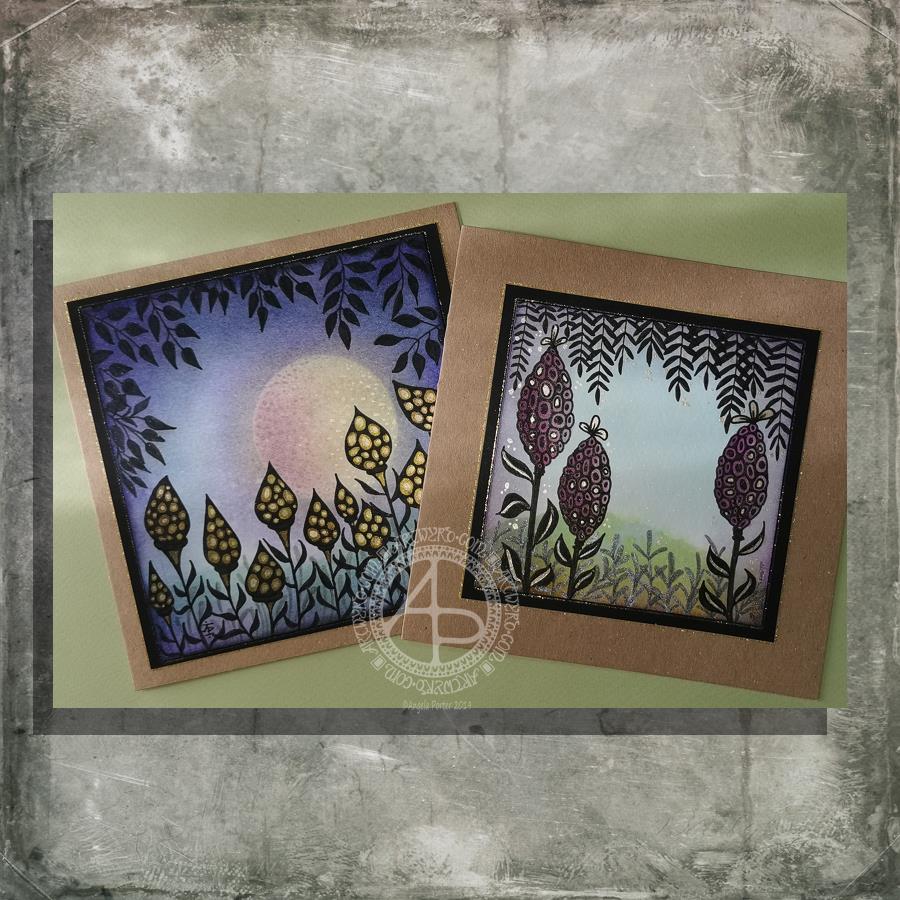
I had a lovely time this morning making the card on the left. Before I started drawing, I added a moon or planet to the background. It really adds something to the card, I think. Something like this is needed on the card to the right I think. However, as I’ve assembled the card it’s not going to be easy to alter!
How I made the cards.
I used Distress Inks and a mini-foam blending tool to colour the backgrounds. I used a circle of paper as a mask for the moon/planet in the left-hand card. To create the land, I used a torn piece of paper to mask off part of the card.
Once I was pleased with the backgrounds, I sprayed the image with a mixture of Perfect Pearls and water and let it dry.
The next step was to draw the designs. I used black and grey Pitt Artist Pens by Faber Castell.
Metallic/iridescent highlights were added; I used Cosmic Shimmer watercolour paints and a fine brush.
The final steps were to adhere the top layer to a black mat, and then this to the card base. Finally, I edged the mat and the top layer with a gold glitter Uniball Signo gel pen.
I have made coordinating envelopes for each card.
My thoughts on the cards.
I think you can tell that the card on the left is the second made. I can see how I’ve learned from the first card. I do like them both.
I would, if I could, add a moon/planet to the right hand card. It would fill that space rather nicely and give a more magical, mystical, ethereal feel to the landscape.
As to the left hand card, I wish I hadn’t done the pods all in black; they appear a tad ‘flat’. In hindsight, I could have used just black outlines and then filled the pod with a colour gradient before adding the metallic highlights.
I also am glad I didn’t try to add a spine to each leaf as I did on the right hand card. However, a highlight at the top of each leaf, suggesting the moon/planet light is reflecting from them.
Oh the whole, however, I am pleased with these cards. They are a new style of working for me. leaving open space is never easy for me, but I’ve managed it with these cards.
Would you like some happy mail?
I’ve already got some recipients in mind for these cards. However, if you’d like some happy mail then send me a message.
I had a lovely time this morning making the card on the left. Before I started drawing, I added a moon or planet to the background. It really adds something to the card, I think. Something like this is needed on the card to the right, I guess. However, as I’ve assembled the card, it’s not going to be easy to alter!
How I made the cards.
I used Distress Inks and a mini-foam blending tool to colour the backgrounds. I used a circle of paper as a mask for the moon/planet in the left-hand card. To create the land, I used a torn piece of paper to mask off part of the card.
Once I was pleased with the backgrounds, I sprayed the image with a mixture of Perfect Pearls and water and let it dry.
The next step was to draw the designs. I used black and grey Pitt Artist Pens by Faber Castell.
Metallic/iridescent highlights were added; I used Cosmic Shimmer watercolour paints and a fine brush.
The final steps were to adhere the top layer to a black mat and then this to the card base. Finally, I edged the mat and the top layer with a gold glitter Uniball Signo gel pen.
I have made coordinating envelopes for each card.
My thoughts on the cards.
I think you can tell that the card on the left is the second made. I can see how I’ve learned from the first card. I do like both cards, though.
I would, if I could, add a moon/planet to the right-hand card. It would fill that space rather nicely and give a more magical, mystical, ethereal feel to the landscape.
As to the left-hand card, I wish I hadn’t done the pods all in black; they appear a tad ‘flat’. In hindsight, I could have used just black outlines and then filled the pod with a colour gradient before adding the metallic highlights.
I also am glad I didn’t try to add a spine to each leaf as I did on the right-hand card. However, a highlight at the top of each leaf, suggesting the moon/planet light is reflecting from them.
Oh the whole, however, I am pleased with these cards. They are a new style of working for me. Leaving open space is never easy for me, but I’ve managed it with these cards.
Would you like some happy mail?
I’ve already got some recipients in mind for these cards. However, if you’d like some happy mail then send me a message.
I’ve already got some recipients in mind for these cards. However, if you’d like some happy mail then send me a message.
After a very late night talking to a friend and not enough sleep, today is a self-care day. I’m going to go back to bed soon and try to sleep some more before driving for four hours tonight.
While waiting for sleep to catch up with me again, I thought I’d make some mail art. The photo isn’t the best; I’ve said it before, I’m not a brilliant photographer. However, I’m sure you get the idea. Also, I wanted to catch a glimpse of the metallic highlights I’ve added to this card, so the angle of the photography was just plain weird!
My brain seemed to have ticked over some ideas while I was asleep and I woke with some things I thought I could try out. This card is the result of some of them.
I started by using a 4″ x 4″ piece of watercolour paper and applying Distress inks to it to create a background.
I used a torn piece of paper to mask off the bottom of the panel so that could use an ink blending tool to apply Pine Needles and Crushed Olive Distress inks to create some land.
A sky was required, so I used Broken China Distress ink to create it so that it faded from top to the land.
I then sprayed the background with a mixture of gold Perfect Pearls and water to create a less perfect appearance.
While this was drying, I flipped through my Zibladone (visual dictionary) and found some motifs I liked. I used Pitt Artist pens from Faber-Castell to draw the motifs on the panel. I chose these pens because they’re waterproof when dry and I knew I wanted to add colour and sparkle to them later on.
To give a sense of dimension, I used black pens for the foreground motifs and a grey brush pen to create the foliage in the background.
To help the seed pods stand out, I used washes of Dusty Concorde and Seedless Preserves Distress inks. Then, I used some Cosmic Shimmer gold iridescent watercolour paint to add the gold highlights.
Once everything was dry, I used a piece of Cut’n’Dry foam to edge the panel with Dusty Concorde Distress Ink. The design was framed nicely by this edging; it also added a sense of dimensionality.
Next, I mounted the panel on a piece of black card and then adhered these layers to a 6″ x 6″ blank Kraft card, all done with Tombow Mono glue.
Finally, I carefully used a gold glitter Uniball Signo gel pen to add lines around the edge of the design panel and also the black mat.
I then turned my attention to the envelope. I drew some more of the seed pods before adding a light wash of Dusty Concorde and Seedless Preserves Distress Inks, being careful not to overwet the envelope. I added dots of gold watercolour paint to the seed pods and the space around them too, making sure I left enough space to write the name and address of the eventual recipient.
I’m quite pleased with the card. I’ve done this style of drawing digitally in the form of a mandala, but never like this. However, as I look at the card, it seems to need a focal motif in the space between the seedpods. I may be wrong; it may just be my constant need to fill up space with line and pattern and the difficulty I have in leaving white space in a design.
I shall let the card ‘sit’ for a while before making my mind up on that issue.
Yesterday evening I had a pleasant hour or so using Distress Oxide and Distress inks to make some backgrounds for future card projects.
I used a soft rubber Brayer roller to add distress oxides to a small Gelli Plate. I then spritzed the Gelli plate with water containing either pearl, copper or gold Perfect Pearls before lifting the print with some Claire Fontaine Mixed Media paper. The water in the spray reacts with the inks to give an oxidised look. The Perfect Pearls in the spray add some subtle shimmer to the finished background.
Once the Distress Oxide background layers were dry, I used a rectangular die to cut a section from them.
To create backgrounds with Distress Inks, I used a mini foam blending tool to cover the card with colour. I then sprayed the card with some water containing pearl, copper or gold Perfect Pearls. Again, the water reacts with the Distress Inks, but this time creating small watermarks. The Perfect Pearls again add shimmer.
Making the card.
I chose a background coloured with Wild Honey, Tea Dye, Old Linen and Walnut Stain Distress Inks which were then spritzed with pearl Perfect Pearls infused water.
I wanted to create a dangle design card. From experience, I know that drawing on backgrounds with added Perfect pearls that my fine-liner Uniball Unipin pens can become clogged by the tiny flakes of mica that comprise Perfect Pearls.
So, I tried using a Uniball Vision Elite rollerball pen. The ink in it is supposed to be water-resistant, tamper-proof, fade-proof. It’s also very black, which suits me just fine.
I was surprised at how well the pen wrote on the background – not just because of the Perfect Pearls and Distress Ink, but also because the mixed media paper is lightly textured.
Once I’d completed the design, I used a needle=tip Pentel Energel Liquid Ink Gel pen to add smaller details.
While the plain black line on the coloured background looked OK, I thought it needed some colour to help lift it from the background.
I launched myself into using Copic markers, using somewhat darker colours than I usually would. That meant it wasn’t until I was adding some colour to the ribbon banner that I discovered that the Copic reacts with the inks in the pens and smears them. I was so disappointed in myself for not checking the pens were Copic safe. Oh well, you live and learn!
Rather than start again, I carried on with the card. I wanted to add some clear embossing powder to help the colours of the Copic markers stand out even more. So, I used a Versamark pen to colour over the designs, and then I sprinkled on the clear Wow Embossing Powder. I used a heat tool to melt the Embossing powder and achieve a glossy, dimensional finish on the dangle design.
The final step was to adhere the dangle design to a card blank, after adding some gold dots with a Uniball Signo glitter gel pen.
Fancy having a go at drawing your own dangle designs and not sure where to start? Well, you could start with my book “A Dangle A Day” where I lead you through the process. I have over 100 designs in the book where I take you step by step through drawing them. I have also included ideas for where you can use them including as cards, bookmarks, in BuJos, journals, scrapbooks and more.
Making the envelope.
I used the pre-made envelope that came with the card blank. I decided to keep the envelope white and add a border using some of the motifs from the dangle design.
I did use the Uniball Vision Elite gel pen and Pentel needlepoint pen to draw the design. This time, I coloured the design with some Mitsubishi Uni coloured pencils.
The low quality of the paper envelope wasn’t conducive to really amazing colouring, but it worked well enough.
Reflecting on the card and envelope.
I could’ve kicked myself for not testing the pens to see if they were Copic friendly. I don’t think I could send this card to anyone as it just isn’t up to scratch. I need to remember this in future projects.
Also, the Versamark pen smeared the ink a little too, but nowhere as much as the Copics did.
I used much darker Copic colours than I usually would without thinking that heat embossing them would intensify the colours even more. The colours aren’t as dark as in the photo, but they are still darker than I would like.
The coloured pencils colouring worked much better and perhaps I would’ve been better off using them on the card panel. Again, something to remember for the future.
I also noticed that the anti-static powder I used before using the Versamark and embossing powder has either removed or covered the Perfect pearls. I used the anti-static powder so prevent the embossing powder sticking to places it didn’t belong. This is always a possibility, especially when using Distress Inks to colour the background.
In hindsight, I may have been better drawing, colouring and heat embossing the design before colouring the background. However, I do like to have pre-coloured backgrounds to use for arty projects.
So, Angela, how are you?
I’m OK, still tired from a busy few days at the weekend and start of the week. I also have a flare-up of an ovarian cyst which is rather painful and achy. I’m feeling content and optimistic otherwise, though still tired even though I slept well last night. The exhaustion that comes with interacting with people, therapy and not enough me-time can linger for a good while — the joys of having CPTSD and being an introvert.
Yesterday, I was fatigued, and the flare-up ramped up in intensity as the day progressed. I wasn’t in the right place to create art or focus on work. I needed to practice self-care.
I chose to do some crochet after hearing about Crochyay, the online presence of a young woman called Olivia who makes flowers and leaves them with a little message tag for people to find and keep – random acts of kindness. She uses crochet to help manage her anxiety and depression as well.
I thought it was a beautiful idea and I thought flowers or little amigurumi hearts or similar would be lovely to make. Small, quick to finish projects that I feel I could manage. I’ve lost the oompf to do larger crochet projects such as shawls and blankets, but some little ones would be lovely to do.
I do find crochet and other crafts quite soothing and calming. I also feel I’m doing something, and they can stop me from just sleeping my day away. Little projects like flowers are fab for me when the thought of anything bigger fills me with procrastination and disinterest. Also, I find it much more motivating to do projects for other people than for myself, even if I don’t know those people.
So I managed to make quite a few flowers yesterday. I now need to make leaves and assemble them into little posies. Then, there are tags to make.
I’m also looking forward to making the tags as I can draw and decorate them too! So, little projects in their own right.
Finally, I’ll need to overcome my self-consciousness and anxiety about leaving them for people to find them.
Template for the Angela Porter’s Coloring Book Fans facebook group, September 2019
The first day of a new month means I add a colouring template to the “Angela Porter’s Coloring Book Fans” Facebook group. I make the template an exclusive freebie for members of the group. The group is free to join. Why not pop over get access to this and all other group templates.
I drew the template on Winsor and Newton Bristol Board using a couple of Uniball Unipin pens. I scanned it in, cleaned up some smudges overruns.
As it’s September, my mind is on the changing seasons; we’re heading into autumn here in the UK. The rowan and hawthorn trees are laden with red berries already. The sycamore helicopters and ash keys are turning golden and are visible amongst the still-green foliage.
It is my favourite time of year. I love the comfortably warm days and the chilly nights. It’s a delight to snuggle down in bed with a warm body and a cool head. I sleep so much better too. Mind you, I think my weighted blanket is helping with that.
I love the change in the colour and quality of light – the golden hue delights me. I’m also looking forward to seeing the relatively rapid colour-changes that happen as the dull, dark greens of summer give way to the fiery conflagration of autumn.
So, my September template has autumnal motifs in it, though they’d work for any season no matter where you are in the world.
I will continue to add colour to this template throughout the month, hopefully. Then, at the close of September, I’ll show the finished coloured version.
I always look forward to seeing how different people colour the drawing. I love to see the different colours, media and techniques they use.