Template Thursday

This week, a little more than usual, my thoughts have been on peace.

Mother Theresa said, “I will never attend an anti-war rally. If you have a peace rally, invite me.” The essence of this is that if we want peace, our thoughts, words and actions need to be on peace. That resonates with me a great deal, and I did before I’d heard of this particular quote!

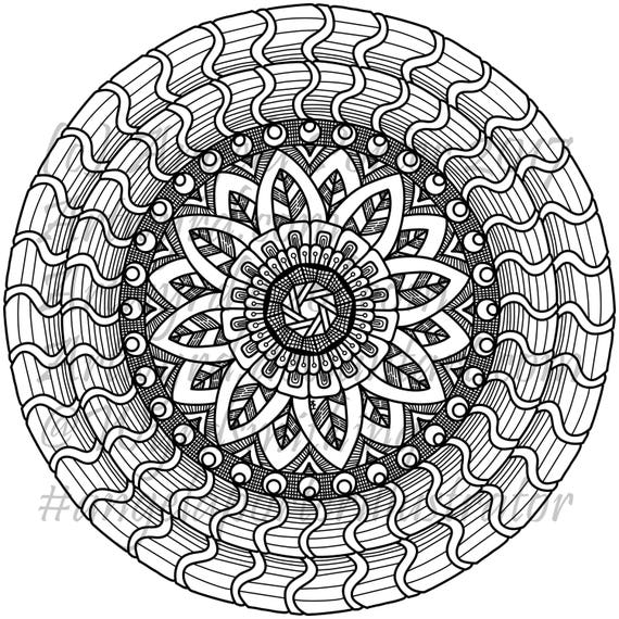
So, with peace on my mind, I’ve drawn not one but two colouring pages/colouring templates this week. They are available to Angela Porter’s Coloring Book Fans Facebook group members.

However, if anyone wishes to send me an email to Artwyrd at AOL dot com, I can send them to you.

I was born in the early 1960s and have a sister who is ten years older than me. I was, from my birth, surrounded by music and imagery of the hippy era. So, it’s natural that some of the symbols of that time can be seen in my drawings.

Art is my way of not just expressing my creativity but is a way to take my mind off worries and troubles and to focus on more positive thoughts. Any creative activity that you can lose yourself in, not being aware of your thoughts, brings a sense of peace and calm, relaxation and pleasure. Colouring has the same effect on the mind as mediation, something else that I do.

Both templates were drawn with fineliner pens on paper. Colours and coloured backgrounds have been added digitally using ClipStudio Paint.

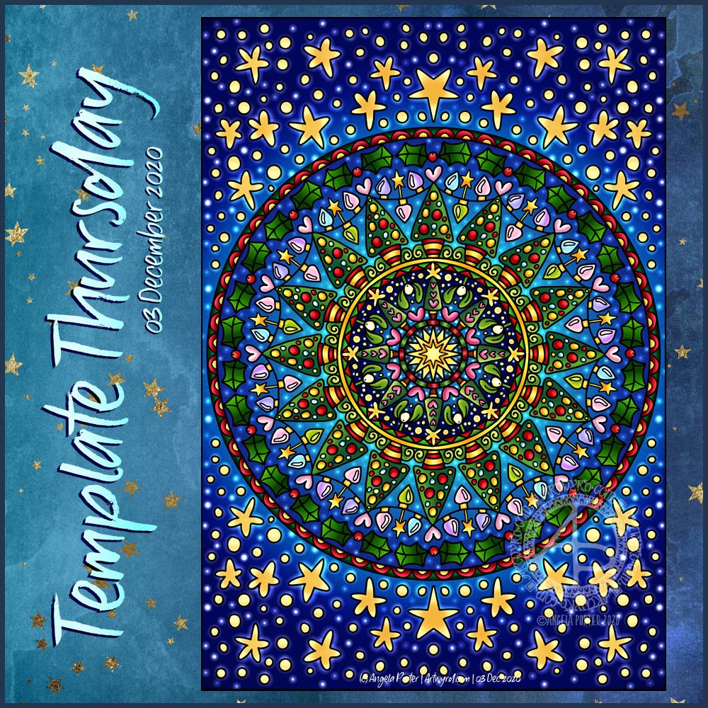
Template Thursday

It’s template Thursday! As it’s December, my templates will have wintry, themes, all with the emphasis on bringing light and colour into our lives during the last weeks of the year.

As I live in the Northern Hemisphere, we’re in the last few days of autumn. However, no matter where you live in the world, there are always starry night skies, and I suspect stars will feature a lot in the templates. Not just because I love stars, but because I’m working on Entangled Starry Skies.

This template is available to members of the Angela Porter’s Coloring Book fans facebook group.

September Colouring Template

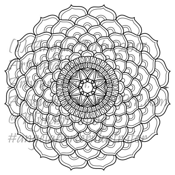
 Template for the Angela Porter's Coloring Book Fans facebook group, September 2019
Template for the Angela Porter’s Coloring Book Fans facebook group, September 2019

The first day of a new month means I add a colouring template to the “Angela Porter’s Coloring Book Fans” Facebook group. I make the template an exclusive freebie for members of the group. The group is free to join. Why not pop over get access to this and all other group templates.

I drew the template on Winsor and Newton Bristol Board using a couple of Uniball Unipin pens. I scanned it in, cleaned up some smudges overruns.

As it’s September, my mind is on the changing seasons; we’re heading into autumn here in the UK. The rowan and hawthorn trees are laden with red berries already. The sycamore helicopters and ash keys are turning golden and are visible amongst the still-green foliage.

It is my favourite time of year. I love the comfortably warm days and the chilly nights. It’s a delight to snuggle down in bed with a warm body and a cool head. I sleep so much better too. Mind you, I think my weighted blanket is helping with that.

I love the change in the colour and quality of light – the golden hue delights me. I’m also looking forward to seeing the relatively rapid colour-changes that happen as the dull, dark greens of summer give way to the fiery conflagration of autumn.

So, my September template has autumnal motifs in it, though they’d work for any season no matter where you are in the world.

I will continue to add colour to this template throughout the month, hopefully. Then, at the close of September, I’ll show the finished coloured version.

I always look forward to seeing how different people colour the drawing. I love to see the different colours, media and techniques they use.

Sneaky peek – Entangled Christmas

Sneaky Peek 2©Angela Porter 2019 - Artwyrd.com
Sneaky Peek 2©Angela Porter 2019 – Artwyrd.com

Today I finished colouring the templates for Entangled Christmas (available for preorder, publication date of 16 October 2019).

I thought I’d share another sneaky peek of one of the four that I’ve coloured for the book.

Unusually, I’ve drawn people in a couple of templates. Drawing people is not one of my better skills to say the least. So here’s part of the angel I’ve drawn, set in an entangled, festive landscape, and a starry sky, of course!

I’ve used my signature jewel-bright colours, of course.

And, because it’s me, I’ve coloured the templates digitally, my tools being Autodesk Sketchbook Pro, Microsoft Surface Pen and Microsoft Surface Studio.

It’s nice to just colour, though keeping to a Christmassy colour scheme can be a little frustrating at times especially as here in the UK we’re enjoying an unseasonably rather warm Easter Bank Holiday weekend!

Entangled Christmas is one of the adult coloring books in the Creative Haven range from Dover Publications.

Etsy Listings for Colouring Pages


In the last day, I’ve uploaded three more colouring sheets to my Etsy shop – Artwyrd.

For each, there’s either a fully coloured, or partly coloured, version of the line art to see.  Yes, I’ve been using them to practice colouring in digitally.

I’ve also started work today on a new book for Dover, the theme for it being eerie.

Colorist Windows App – announcement and review

Colorist

First, the announcement!  I’m doing some coloring templates for the Colorist App, and my first book of ten pages – called DoodleWorlds – is now available for it!


Review of Colorist

fish-1.png

Colorist is the only app that lets you color with exactly the same feel as coloring pencils! Relax on the couch and enjoy coloring a complex design, a vacation spot, or a crazy cartoon cat – tons of pages to choose from. Even color the same picture more than once, to see what else you can do with it. No need to worry about losing your coloring pencils in the couch anymore!

I have tried the Colorist app out, and here’s an honest review of it.

I had a quick look at the app before I agreed to do any design work for Faction Apps as I’d not want to have my artwork on any platform that I didn’t think was a good thing.

I’ve given it a test run using my Surface book and the Surface pen.  I haven’t tried it out in touch mode with my finger. You can see what I did in the image above, which is one of the free downloads as my own weren’t available at the time I did this test.

Here’s a close up of the section I coloured in.

colorist-fish1.jpg


The colour palette

There’s a large number of colours available in the palette, and the bar that appears beside the image retains the last eight colours you’ve used, which is really useful and makes colouring in areas you want in the same colours easy to do.  It also means it’s easy to use many colours to get a smooth colour gradation, something that you can’t do with other colouring apps I’ve seen.

The pencil tool

There’s a slider bar with the tool so you can select the width of the pencil stroke, which is great.  The finest settings allowed me to add patterns to the image.  This is something that sets the app apart from others I’ve seen, which only allow a flood fill.

The finer lines and the ability to zoom in to the area you’re colouring mean you can get into the tiniest areas to colour, which at the original image size may have been a challenge, especially when printed on paper and coloured using coloured pencils.

The line isn’t a solid line, it has texture to it just as if you’re colouring on paper with a ‘tooth’ (texture).  This means that optical mixing of colours is possible, as well as adding texture to that mixing.  It also means that a smooth blend of colours is achievable.

The colours lay nicely on top of each other, thanks to that bitty texture; one colour doesn’t obsure the other, unless you use a lot of pressure and it’s what you want.

Oh, the colours don’t obscure the black outlines of the colouring page, no matter how hard you press.

My surface pen is pressure sensitive, and that makes the colouring experience a lot more comparable to colouring on paper with pencils, but without the mess!  I don’t know what it’s like on a screen that isn’t pressure sensitive, or how it works if I use my finger instead of the pen.

I am really impressed with the results and how the pencil tool works.

Also, I can get a bit irritated when I’m colouring with physical pencils; they often make my arthritic joints ache.  No such problem here; indeed, I wanted to carry on colouring but had to put it aside so I could get on with other things.

Eraser tool and Undo Button

It works!  However, I preferred to use the white from the palette to erase small areas to add highlights as I could control the thickness of the line being used to remove colour.

The undo button would be really useful too.

Together, they are things you can’t do when you’re colouring on paper, well not easily.

Saving your art

You can save your work at any time by using the save button on the app. You can also colour each page in as many times as you like in as many different colour schemes as you like too.

Final thoughts

I like this app, very, very much.  I found it easy to use, quick to master, and it gives really lovely results.  It’s a well thought through app, it does what it says it does, and the experience and results are a lot like using coloured pencils on paper!

I just want to repeat that although I have done some artwork for the app, these views are my own and not influenced by me working for them; if hadn’t htought the app was a good product I wouldn’t have agreed to do work for them!

Coloured doodle-de-doo

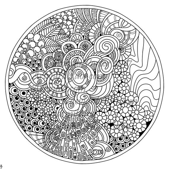
Between a couple of ‘meh’ days, busy days with appointments, I’ve managed to colour this particular illustration of mine.

angela-porter20170127_012

I coloured this one using copics, and the scan has washed some colours out.

New coloring books out!

New year, new books out!

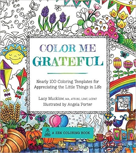
The first is the sixth in the ‘Color Me’ series from Race Point Publishing, part of the Quartos group.  This one is called Color Me Grateful, and is Lacy Mucklow and I  It’s already available in the US, and in the UK from Thursday.

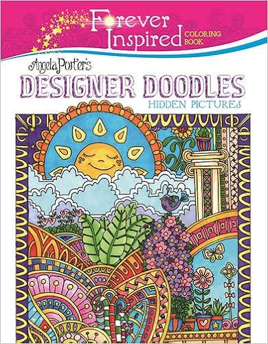
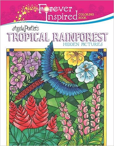
Out now, are two titles in the Forever Inspired series from Skyhorse Publishing – Angela Porter’s Designer Doodles and Angela Porter’s Tropical Rainforest.

To see all the books which have coloring templates designed by me, check out Angela Porter’s Amazon Author Page

Color Me Stamps!

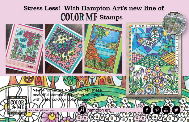
I have designed sets of clear stamps for Hampton Arts.  The range is called ‘Color Me by Angela Porter’.  It’s been a lovely challenge to do, and another string to my artistic bow too.

I’m being sent my own sets of the stamps and I can’t wait to play with them and embossing powder in particular to get the ‘stained glass’ kind of colours that I so love!

Of course I’ll post my versions here.  It’s all exciting for me!  Everything!

Notionsad_Jan2016OL

Testing coloured pencils and methods of blending them.

I have been reading much debate on various facebook colouring groups about the best pencils to use and so on, and some of the things that are said seem to put a lot of pressure on people who are on limited budgets to feel their artwork isn’t any good because they aren’t using the best, most expensive pencils or products or they don’t have loads and loads of products to use.

I may get slated and harangued for this, but I have to say it.

The thing that makes the biggest difference to the end product isn’t so much the exact pencils you use but the way in which you use them.

There’s an old adage that says a poor workman blames his tools, and to a degree this is true.

If you are going to make a work of art that is to last for aeons, then yes, it is important to use the best of the best – acid-free archival quality paper, canvas, board, paints,pencils, pastels, etc etc.

However, is this really what we are doing when we colour in templates on printer paper that is most likely not acid free, or the books we buy?  The chances are not. People colour for lots of different reasons, and you need to examine your reason for enjoying colouring – it is something that should make you feel good in some way, not bad.  It should be an activity that isn’t filled with worries and concerns, it should be an activity that is carefree, relaxing and meditative. It should allow you to take a break from your day to day worries. It is an activity that can fit into anyone’s budget, and no one should be made to feel less because they have a tight budget, and the worry about what others will think will take away from the whole purpose of coloring.

Anyway, getting back to the point …

While the more expensive brands of pencils may make it easier to achieve various effects, that they may be more highly pigmented, that they may be less susceptible to breakage, are the cheaper pencils really that bad?

I admit it.  I use Crayolas as well as Faber-Castell’s Polychromos.  I have Staedtler pencils of different price ranges in my collection.  I have kids pencils, Pentel pencils, all sorts. What makes me choose a particular colour pencil over another is the colour and the vibrancy of the colour more than the make or ‘model’ of the pencil!

Then, it’s down to my technique on how I get the colours to fade out or to blend one into another…

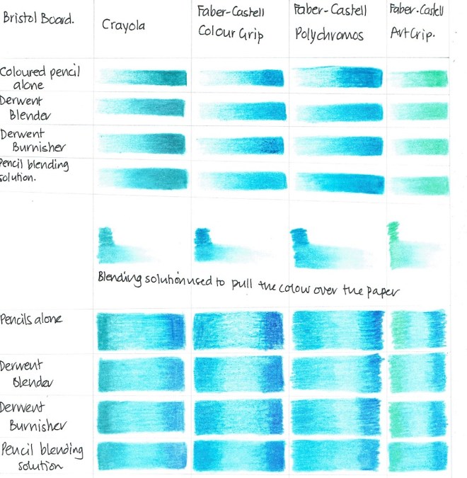
So, what I thought I’d do is to do a little test.  And this image shows the results of my tests!  And I’ll divulge some observations underneath!
Angela Porter Coloured Pencils Test 1

The first rows are just one colour of gradient colouring and various ways of blending out the gradient.  I tried to achieve the same effect, not being too fussy, in each case.

Surprisingly, the Crayola pencil layered onto the paper really easily, much less effort was needed than for the Polychromos pencils, which were the hardest to lay the colour down with.  The Polychromos needed a lot of pressure to get a thick layer of colour down.

The various forms of blending worked well with all the pencils, but the blending solution gave the smoothest blending of all. In all cases, there wasn’t much difference in the final blended version, which surprised me as you’d expect there to be when dealing with pencils from the bottom end and top end of the market.

I then tried the blending solution to see how well it blended heavily laid down colour out over clean paper.

Here, the higher pigment content of the Polychromos pencils showed a bigger area could be blended out.  However, Crayolas and the Art-Colour Pencils weren’t far behind.  The Art-Grip pencils, again by Faber-Castell, were the worst, yet they were the second most expensive pencils tested.

The last rows show how well various shades of pencils can be blended by the different methods.

I was really surprised at how well the Crayolas did – they blended far more easily and smoothly with all the different blending methods!

Of course, the best method of blending for smoothness is by using blending solution.

I will say it again, I did my best to make this a test that compares the different brands fairly and took my time to ensure that the colours were laid down with as equal intensity and with the same method in all cases.

I must admit, I didn’t expect Crayolas to do as well as the other, more expensive pencils.  However, the Crayolas did significantly better, in my opinion, in many instances. What a shocker!

The big advantage that the more expensive pencils have is the huge range of colours available, which makes finding the precise colour you want to use easy and you don’t have to worry about how to mix different coloured pencils to get that colour you want.

The thing going for the Crayolas is their price point, they are easier to lay down than other brands which have harder leads, they blend really well and easily.

I hope this helps.  As I’ve said (typed?), I expect a lot of criticism and haranguing for this, but so be it, I speak as I find, and I found that all the pencils I tried out worked more than good enough for me, and I’m happy with that!